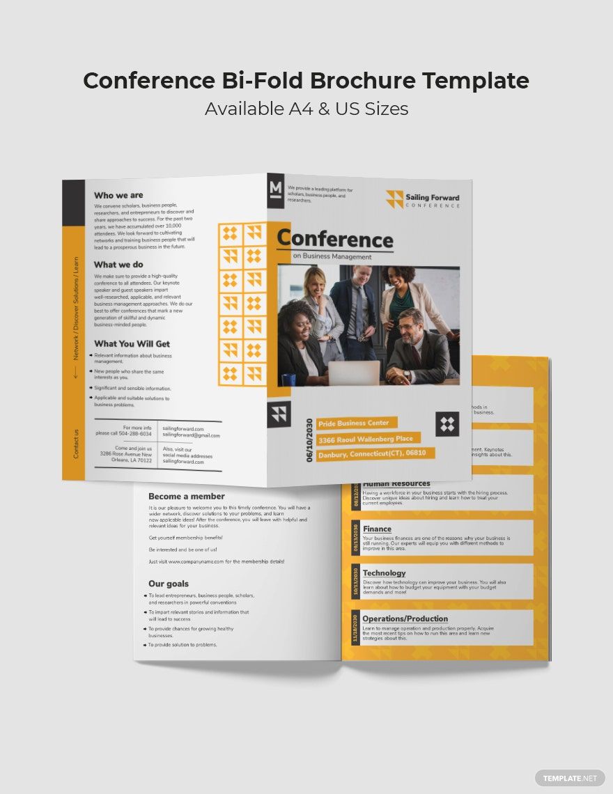
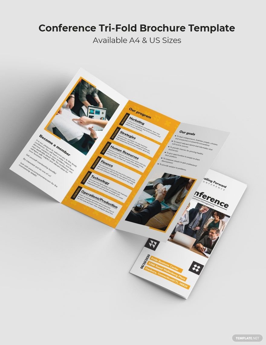
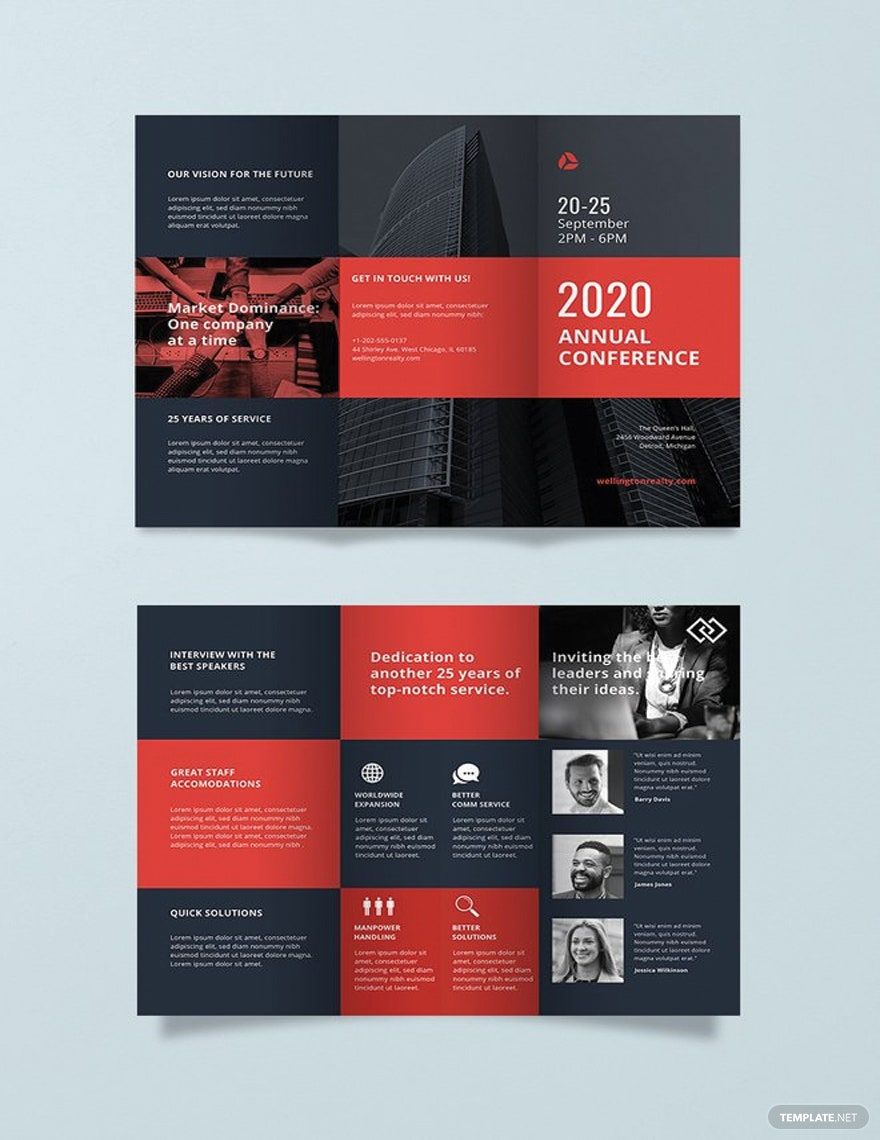
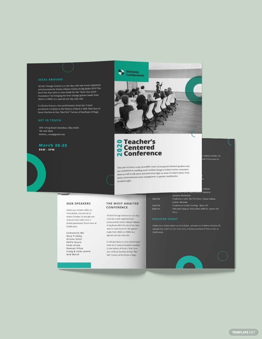
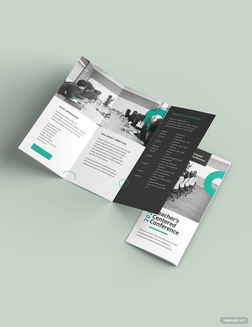
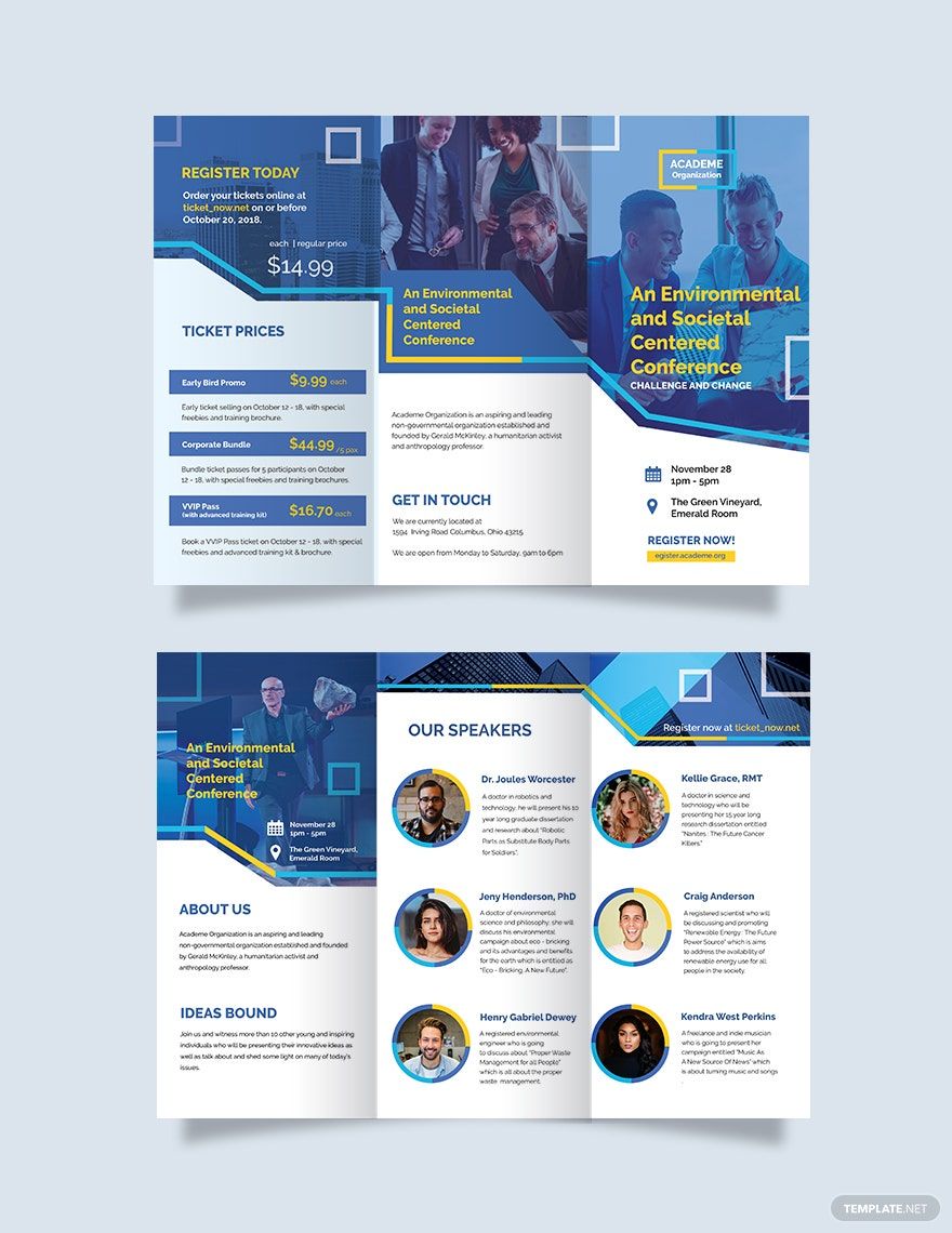
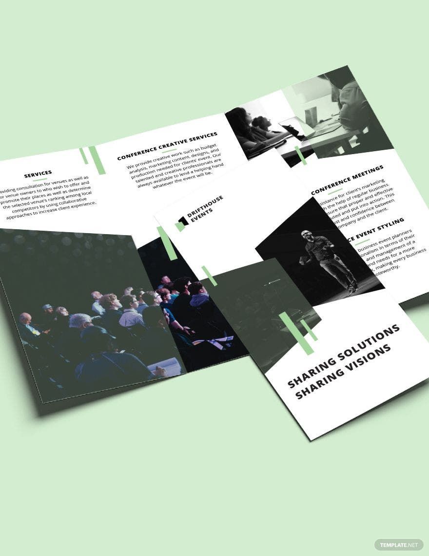
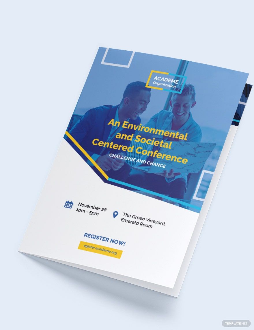
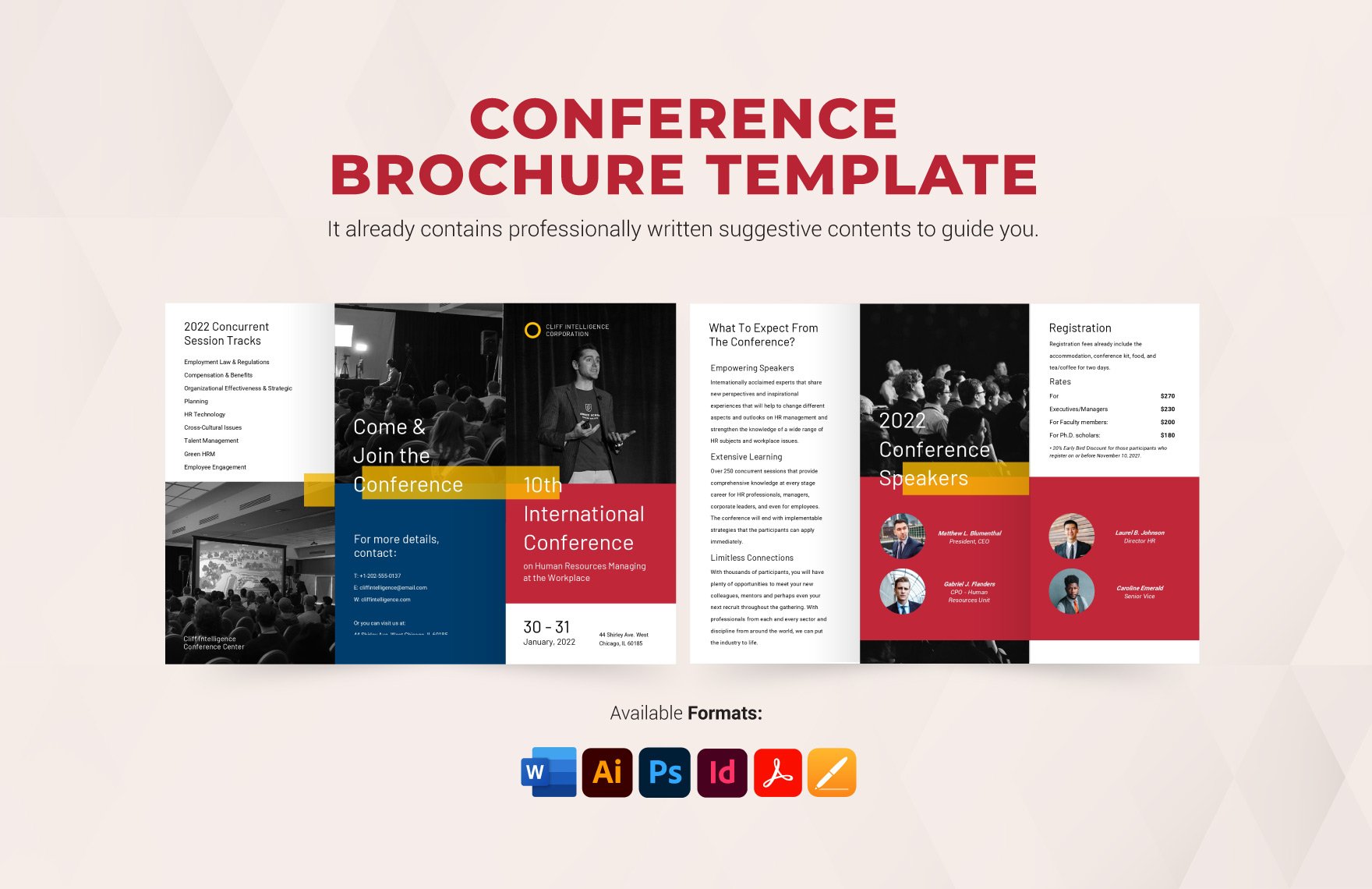
Create a brochure for your conference event containing essential information about your business when you take advantage of our high-quality Conference Brochure Templates. All of them are downloadable, easily editable, and 100% customizable in InDesign. We have the Conference Business Brochure Template, the Event Conference Tri-Fold Template, and the Event Conference Bi-Fold Template. These templates all have premade contents and royalty-free graphics that are customizable in different devices. You can modify and remodel them to your heart’s content until it becomes suitable for your business needs, thanks to their scalable vectors. Upgrade your promotional strategy with these Ready-Made InDesign Conference Templates!
What Is a Conference Brochure?
A conference brochure is just like any other brochure that we know of, but it's exclusively distributed by a business to promote an upcoming conference that they're organizing. The conference could either be a launching of a new product, the announcement of a major innovation, or an annual business gathering. The contents of a conference brochure mainly consist of the conference agenda and the conference program.
How to Create a Conference Brochure in Adobe InDesign?
If your business is organizing an upcoming conference, then it's essential that you create a brochure for it to be known by the market, and gain audiences in the process. To help you with that, we have gathered a few basic tips on how to create a conference brochure that stands out.
1. Choose Adobe InDesign
It's entirely up to your preference on what editing software to use for your conference brochure. However, you should consider InDesign. Why so? InDesign has flexible features that allow you to have complete creative freedom with your brochure's layout and graphic design. Hence, you can expect to have a conference brochure with an elegant design. Moreover, InDesign's user-friendliness makes it easy to operate and navigate even if you're not an adept designer.
2. Decide Whether One Page, Bi-Fold, or Tri-Fold
There's no rule whether your conference brochure should be one page, bi-fold, or tri-fold. It's entirely up to your business's preference and needs. What you must look into when deciding between the three is how many contents will your brochure have. If it's quite short, then you can opt for one page, which is more cost-friendly. But if it's quite long, then bi-fold and tri-fold are best for it.
3. Be Informative
A brochure is not just a material for promotion. It's also an informative material. Due to that fact, you should be informative about the conference your business is organizing. Your conference brochure must contain information about the conference's agenda, along with its program flow. Write it in a way that you're inviting the market to become an audience at the conference. The importance of being informative is to provide the market some insight on what to expect and look forward to should they attend the conference.
4. Attach Elegant Photos
A major criterion for a brochure with high aesthetic quality is the photos it has. With that in mind, you must attach elegant photos on your brochure. The photos you'll attach must provide the market a preview of what's to come during the conference. For example, if the conference is a product launching, then you can attach preview or teaser photos of that particular product. If it's an annual business conference, you can attach photos of the venue or photos of last year's conference. For the photos to be elegant, the best approach is to hire a professional photographer.
5. Enhance Its Design Layout
Another criterion for a brochure with high aesthetic quality is its design layout, so make enhancements with it. What you can do is attach vector images, inject an eye-pleasing color scheme, and set artistic font styles for your brochure's title. However, enhancing the design layout of your brochure won't be a hassle if you're using conference brochure templates and samples. So why not download one from the internet, especially here in Template.net.