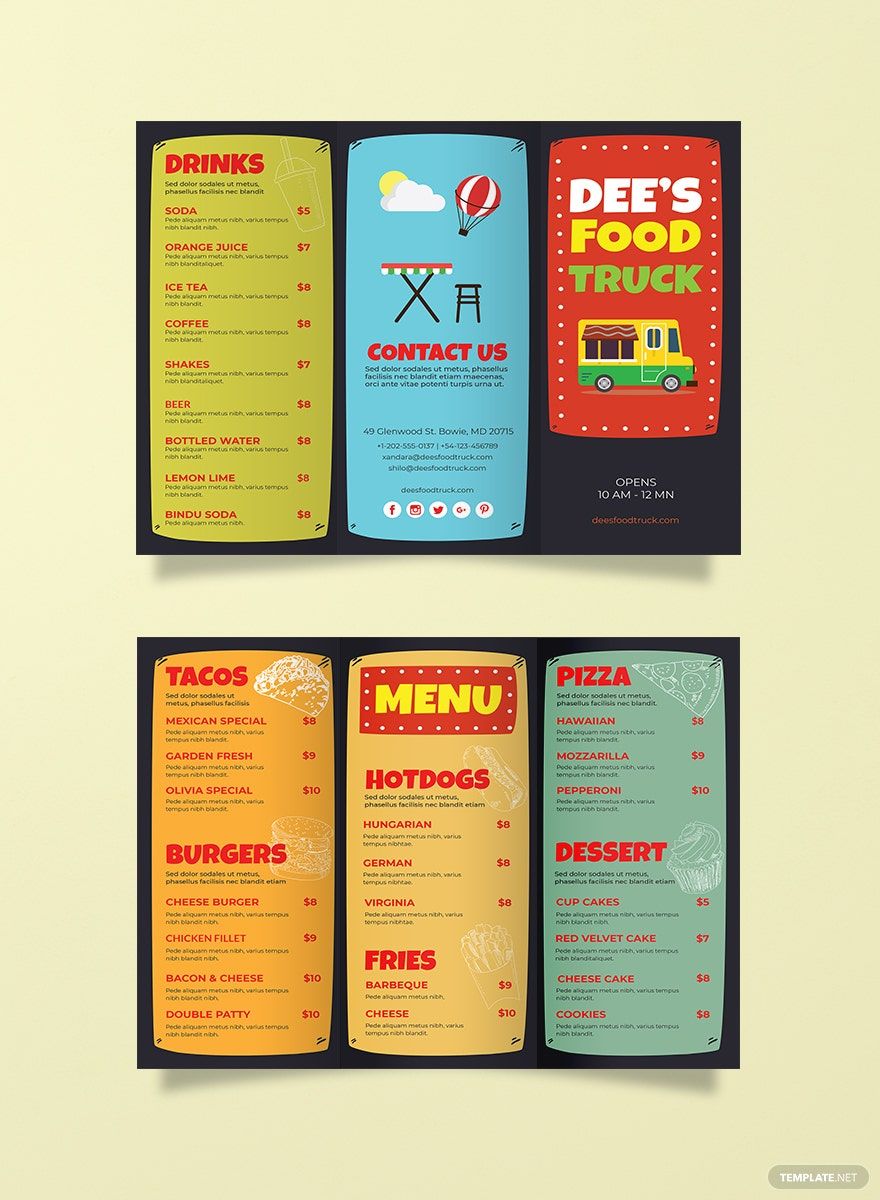
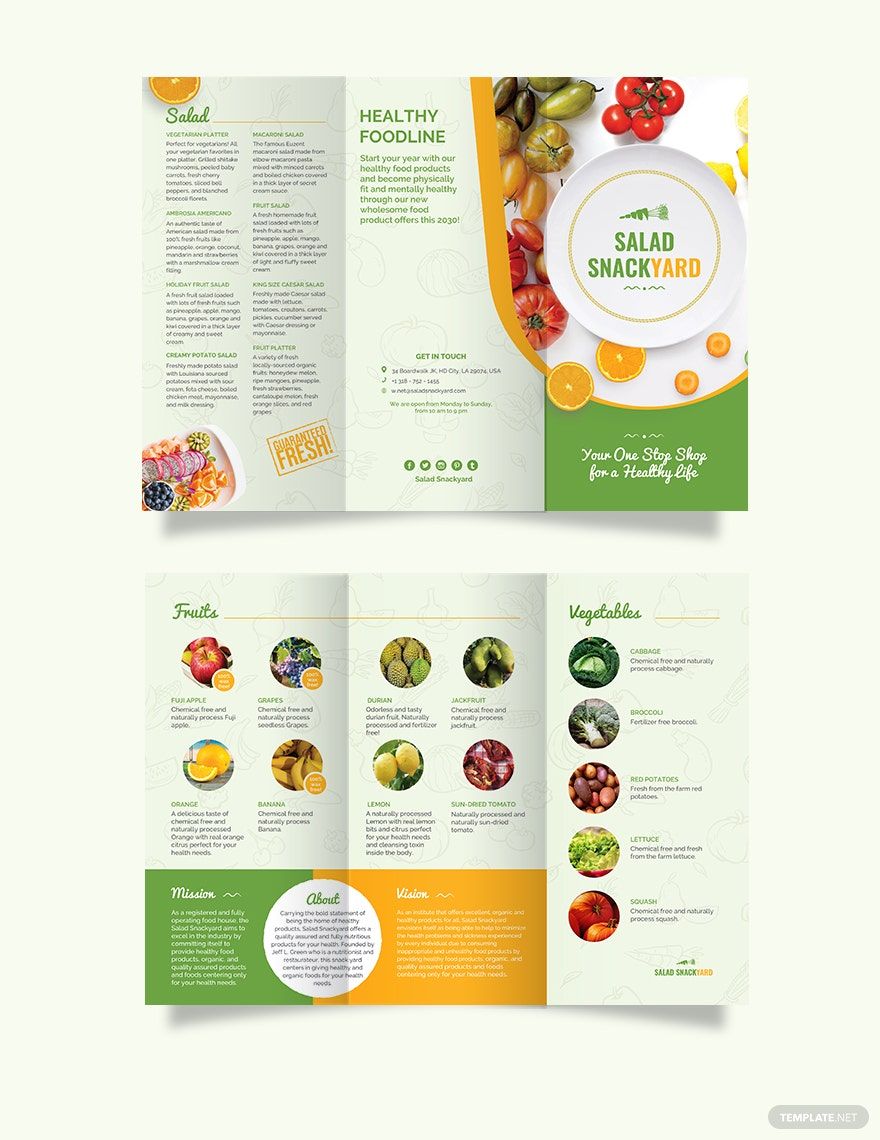
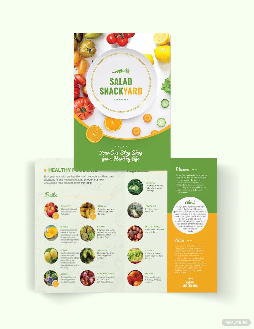
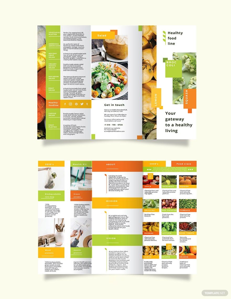
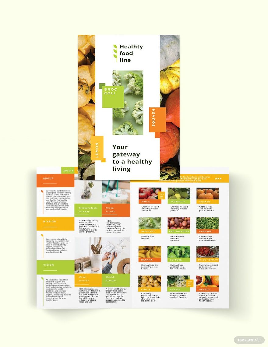
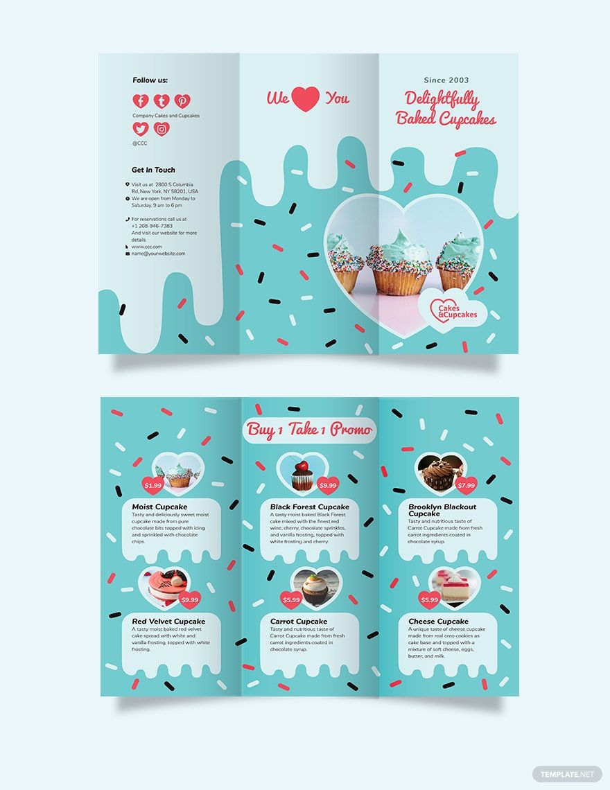
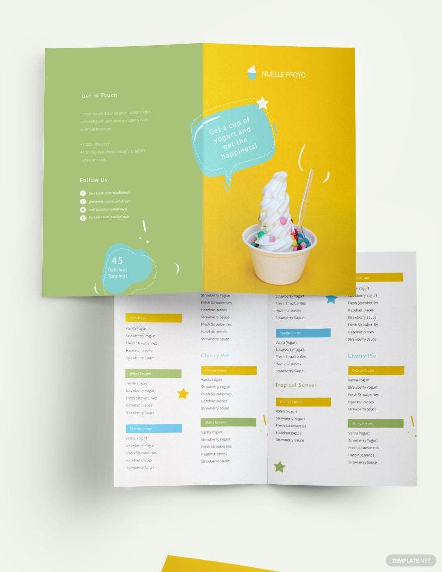
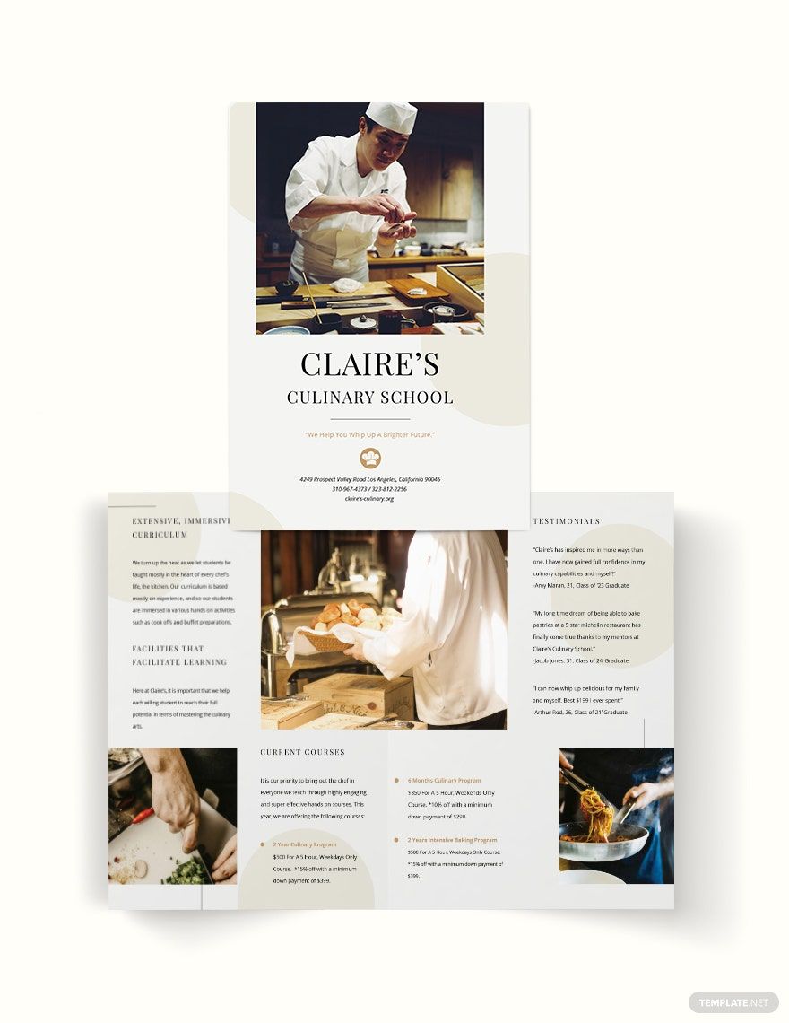
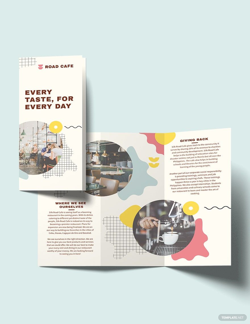
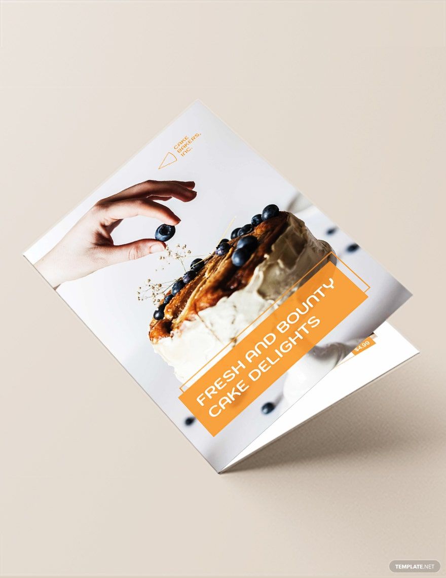
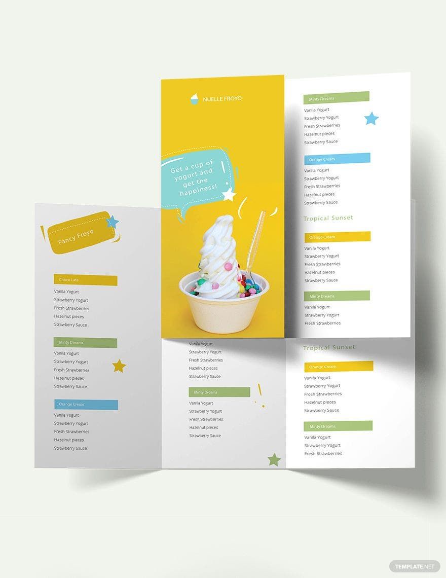
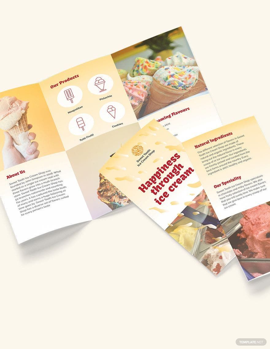
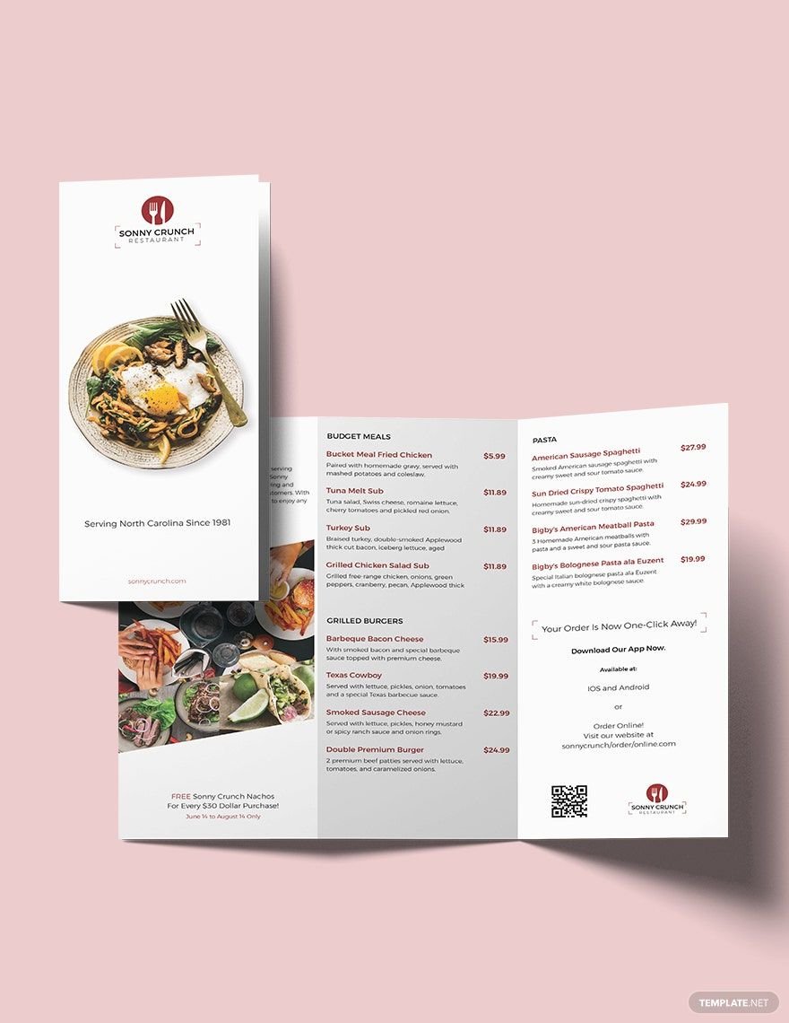
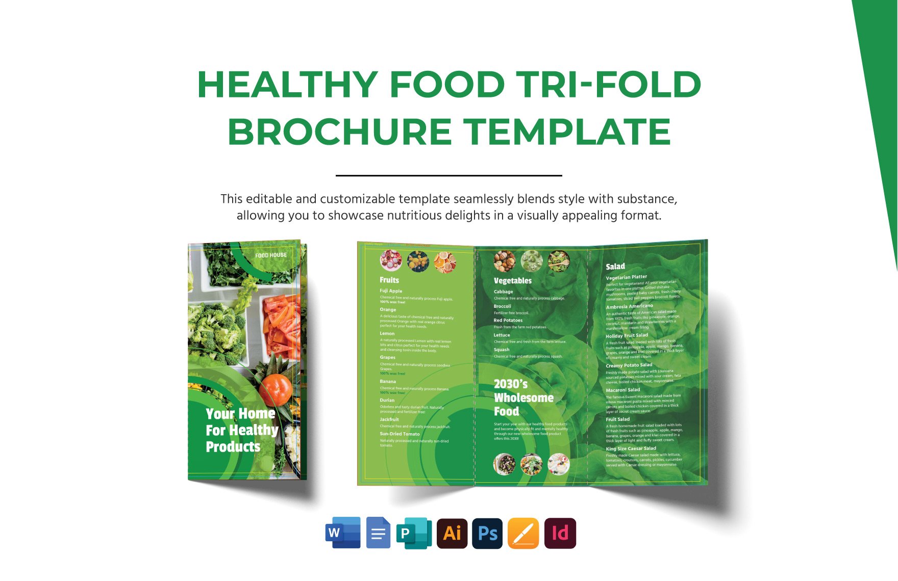
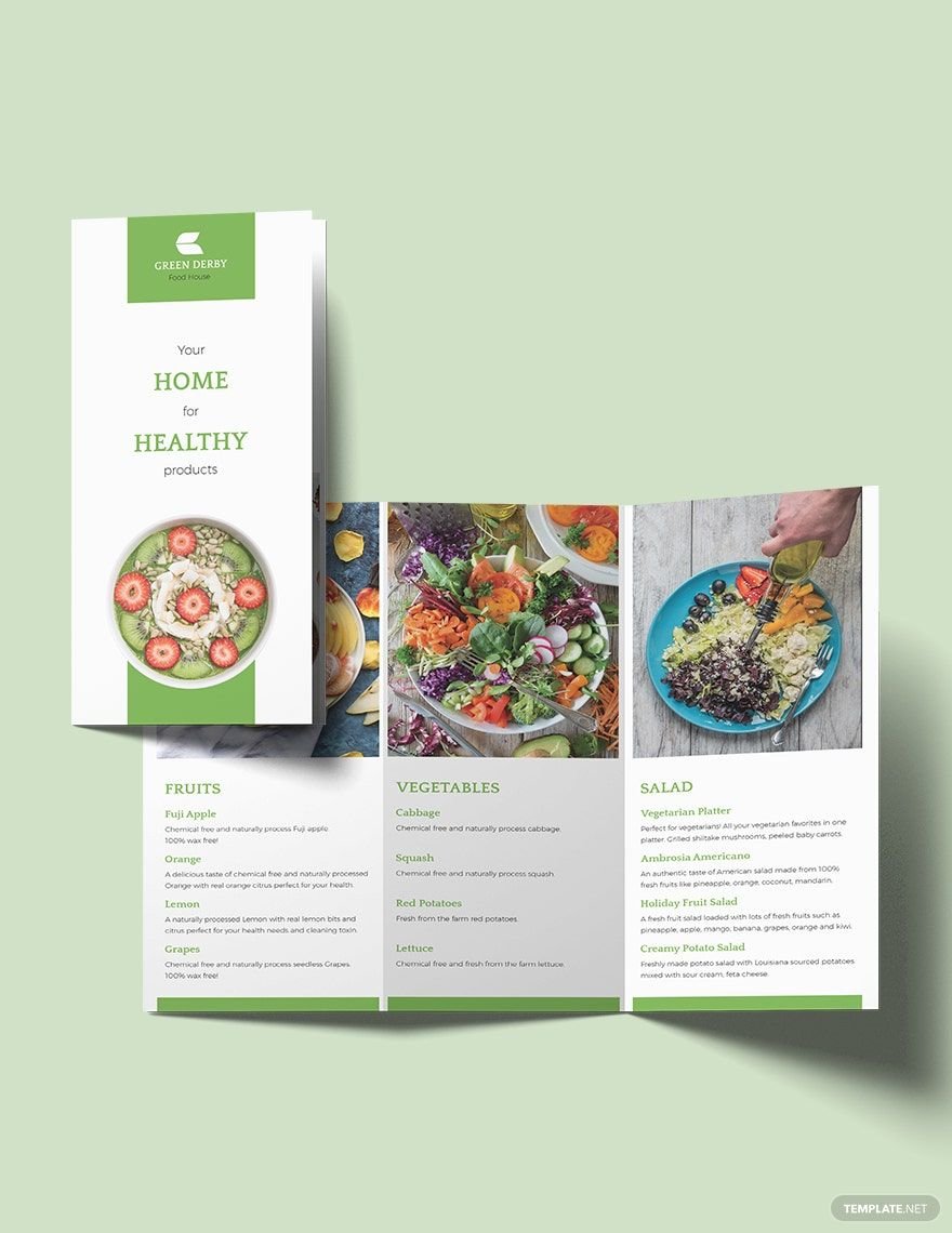
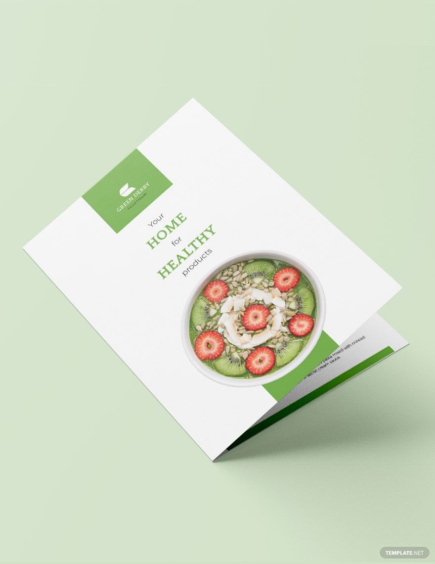
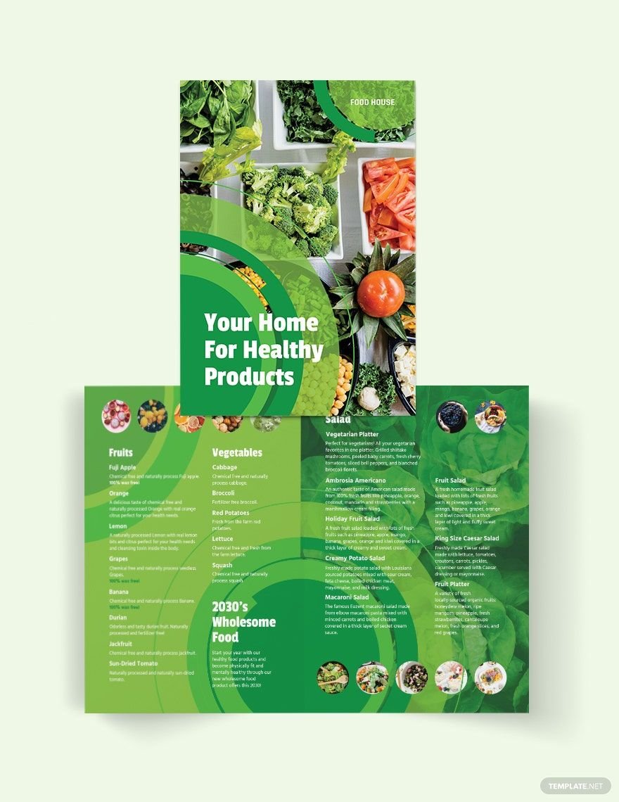
A brochure helps advertise your restaurant for people to know your location, products, services, and any other offers. If you don't want to make one from scratch, take advantage of our food brochure templates in MS Publisher. Among our sample templates available to download are cupcake bakery bifold brochure, health nutrition bifold brochure, cake bakery bifold brochure, health nutrition trifold brochure, and many more. Our templates have high-quality and 100% customizable design for you to effectively promote your business without the need to spend on hiring graphic designers. It is readily available for your Microsoft Publisher and printable to any device. You won't regret downloading any of these food brochure templates in MS Publisher, so hurry and grab one from these food brochure templates in MS Publisher!
How to Make a Food Brochure in MS Publisher
A creative food brochure is a clear reflection of your theme, brand, and quality. It is more than a two-to-three fold piece of paper that would describe your menu and exclusive promos. It would be an effective method of influencing customers to be one of your patrons for a dinner place. With the help of this thin yet informative paper, you can gain a legitimate income source.
Are you planning to make one? MS Publisher would be the best brochure maker software program as it is user-friendly and accessible to any digital devices. Here is a list of must-dos in making your food brochure.
1. Make it Minimalist
Lengthy brochures would trigger confusion to people, and they will get tired of making their choice. Preferably, brochures for cafes and bistros are minimal (one to two pages). For the catering service, they are usually longer as it would cover a large amount of information. Remember that you need not show the whole food menu as it would be intimidating for your customers. Instead, showcase the best food from each of the categories. A long list of dishes on your restaurant's menu would make your brochure look crowded, cheap, and disorderly.
2. Prioritize your Audience
It is essential to know about your customer's demographics as it can be your basis for your food brochure. For instance, if your restaurant serves meals for families with young children, you can include potassium-rich foods into your printed brochure. In that way, it can be relatable for every family member. Also, you need to use language that is understandable for your audience. On the other hand, if you opt to cater to a more upscale elite crowd, you need to write it in a polished manner.
3. Deign your Brochure
Design a theme-appropriate brochure personally, or you can hire someone to make your printable brochure design. In writing your food brochure, you need to be aware of how much space you are going to work. To give you an idea of where to place your texts, place items on the right side of your brochure. Also, put your specials on the first or last space of your brochure as they are typically the most ordered dishes.
4. Stick to your Food Business Identity
The central concept of your marketing brochure is the concept of your food business. Usually, the idea comes from personal taste, personal experience, and local ingredient availability. Whatever it is, your unique identity should mirror how you would detail every dish in your brochure. The main goal of this step is to immerse your customers in your concept and grow comfort to it.
5. Highlight the Specials
Do not highlight too many dishes as it would lose the sense of "specialty." If you think everything is exclusive, then nothing is truly exclusive. For your restaurant food brochure, dedicate one whole page to showcase your special offers and incorporate relatable images in it.
6. Make your Customer's Mouth Water
Unleash your creativity within accomplishing this step. While you make sure of the language you will use, tantalizing terms would be appreciated. The main goal of your healthy food sales brochure is to market your food business so make your customers hungry when they aren't.
7. Be Smart About Money
It will greatly affect the customer's choice with how and where you place the price. You can take away the dollar sign so people would tend to forget about spending. Others spell out the price because it would encourage diners to spend more.