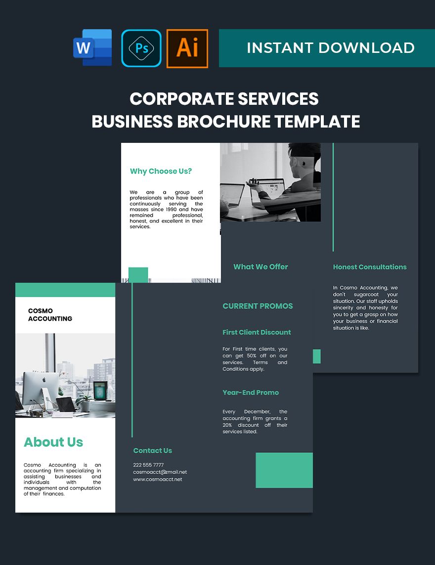
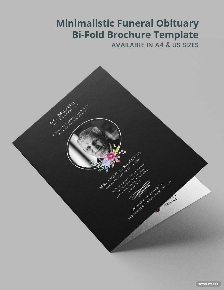
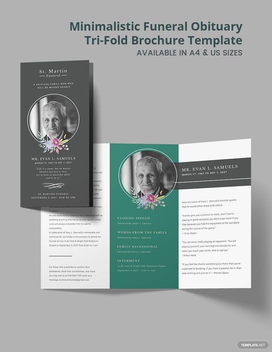
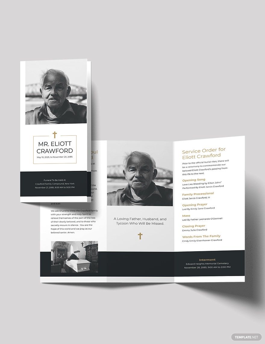
Sometime's, the best brochures are ones that are simple in design. Should you ever wish to make one like that, then we have exactly what you need. Our beautifully designed and professionally made minimal brochure templates will help you promote just about anything in an easy and straightforward manner. Know that they can be opened and edited in all versions of Adobe Illustrator. They also come in different formats such as .psd or .docx so that you can use other software and applications that are more convenient for you. So what are you waiting for? Start downloading them now!
What Is a Minimal Brochure?
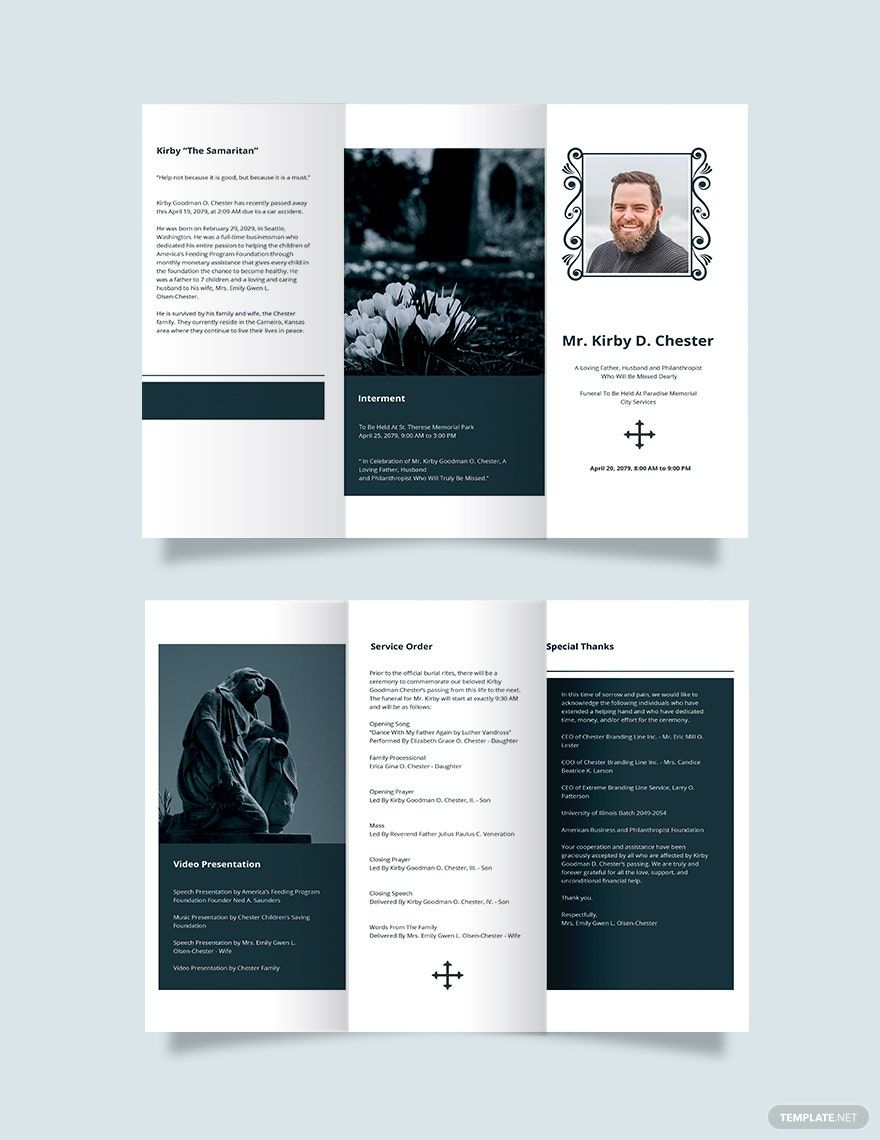
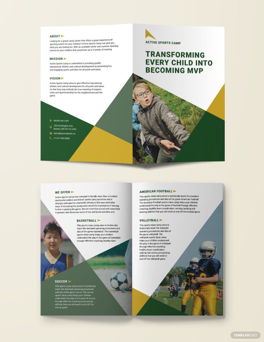
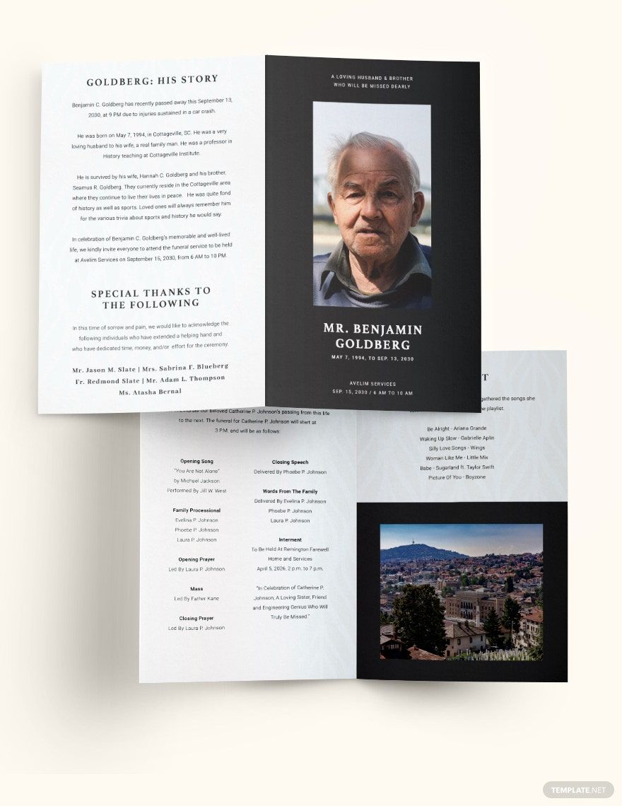
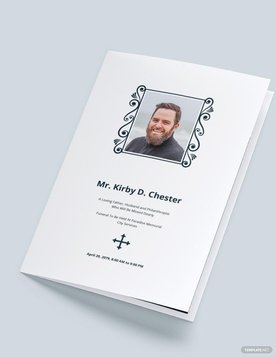
This is a type of brochure that promotes a product, service, or company in a simple yet attractive manner. It is perfect for getting straight into detail with whatever it is that the reader should know about. Coming up with a minimal brochure is also good for those who wish to produce multiple copies in a short amount of time.
How to Make a Minimal Brochure in Word
1. Decide on the Number of Folds
Know that you can choose to make either single-sided, bi-folded, or tri-folded brochures. While the majority go with tri-folded brochures, your decision will depend entirely on the amount of information you want to put in and how you're going to present it. Once you have decided, open Adobe Illustrator and create a crop guide to know where you need to trim your brochure once it's printed. Mark the division of the number of spaces you want by using these guides and placed dashed lines on them. To create a dashed line, use the line segment tool.
2. Come Up With a Good Design
Start with the background. Choose what kind of colors you want by coming up with a color swatch and using it. Then you will have to consider what kind of layout your brochure should have. Think carefully as to where and how you're going to position certain pieces of information, what kind of font and font size your text should have, and what size your brochure should be. Know that you can always check out brochure samples to give you an idea as to how you should go about in both layout and design.
3. Decide on the Pictures You'll Use
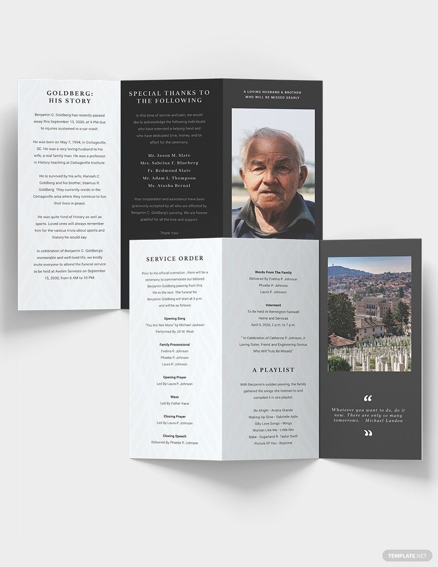
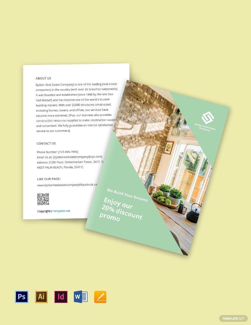
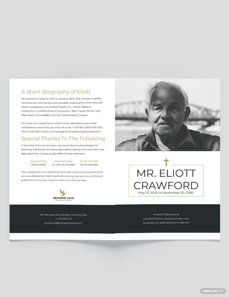
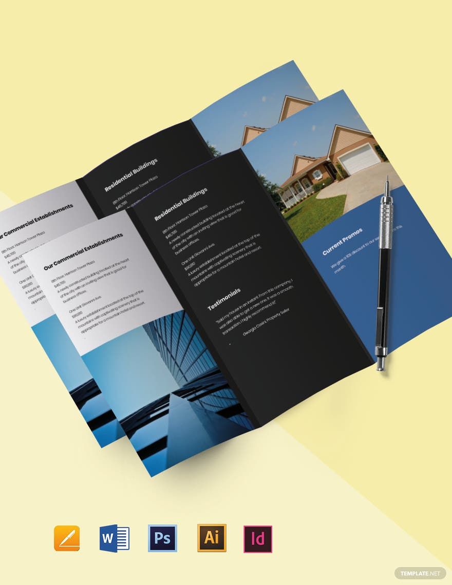
Take note that since you're making a minimal brochure, you shouldn't go too crazy when it comes to choosing what pictures to use. Only put in what's needed to help promote whatever it is that you want to share with the reader. You'll notice that most modern minimal brochures only have at least 1 or 2 images in them. Stick with that amount unless you feel as if it's absolutely necessary to go a bit beyond that. When you've chosen the ones you want to use, simply drag them to the area and page of the brochure that you want them displayed in. Also, don't forget to crop them if you feel that you have to.
4. Put In the Content
Lastly, all you have to do is to put in the text. Remember that this is a minimal brochure so you want to keep things short enough for a quick read, but also detailed enough for the reader to learn everything that he/she needs to. Think carefully about what information you need to be able to share and don't forget to include any important details such as names, prices, contact details, etc. When you're done, simply save your work so that you may use it in the future and print out your brochure.
