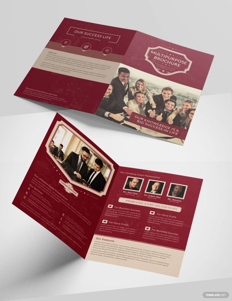
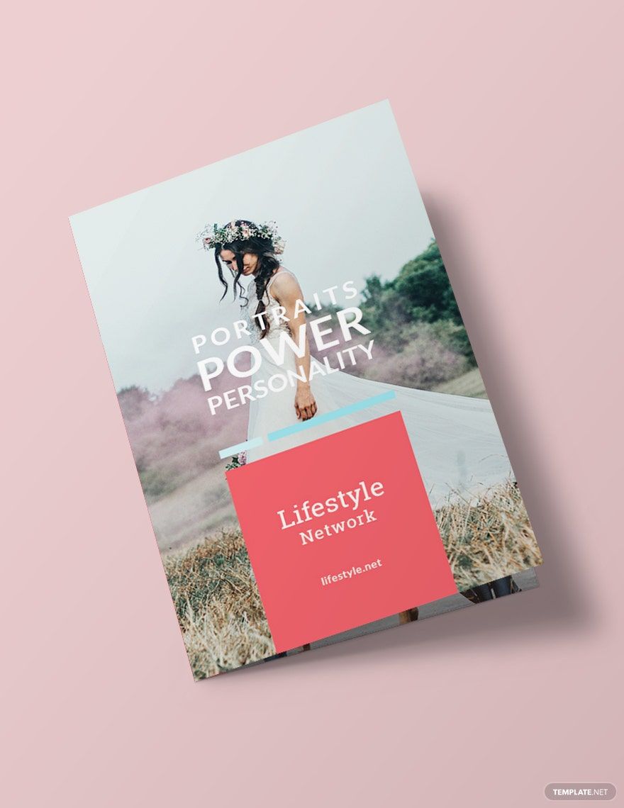
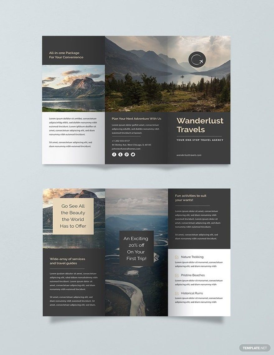
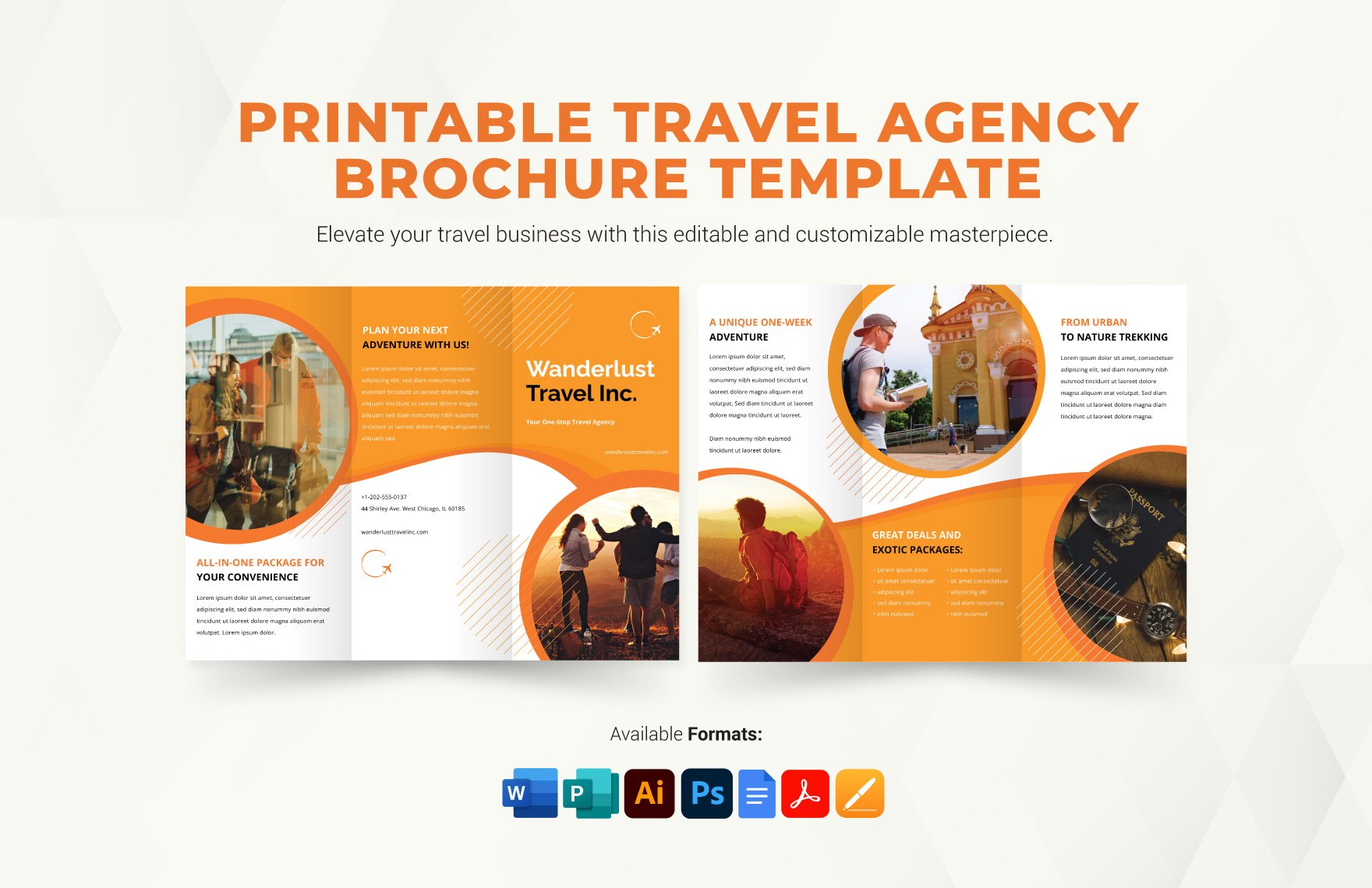
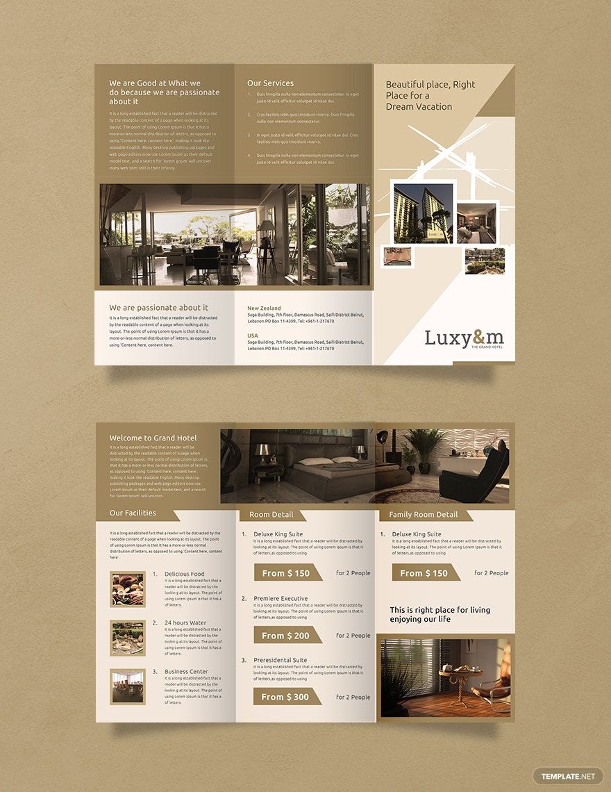
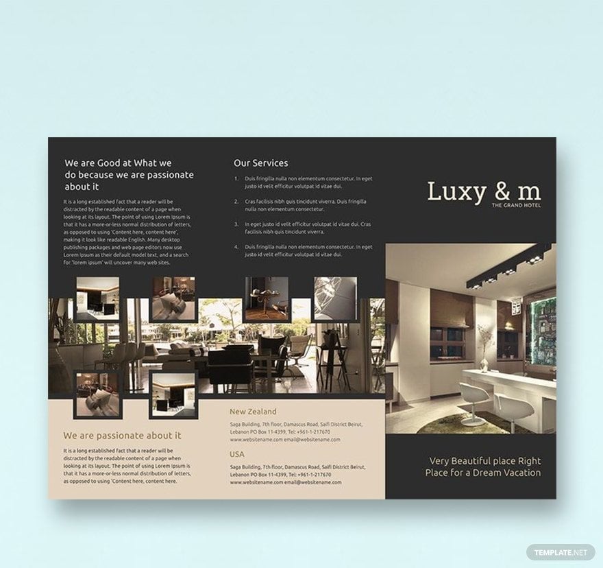
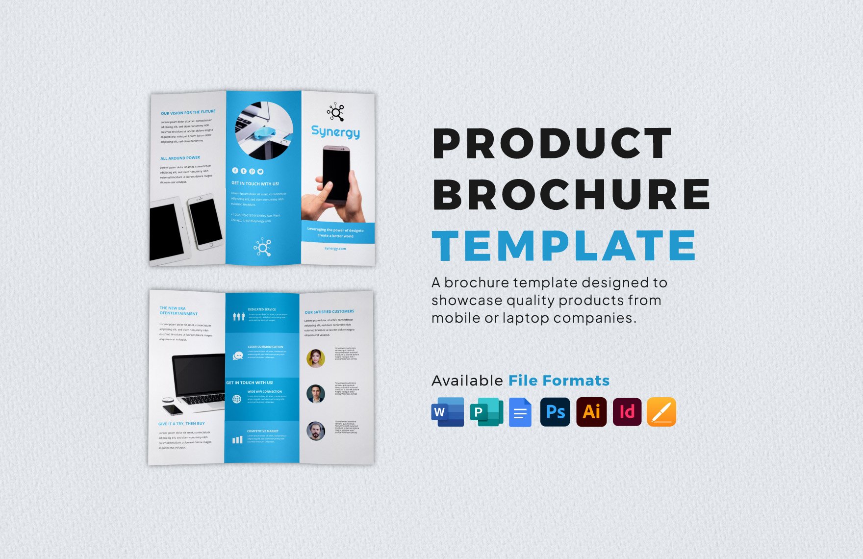
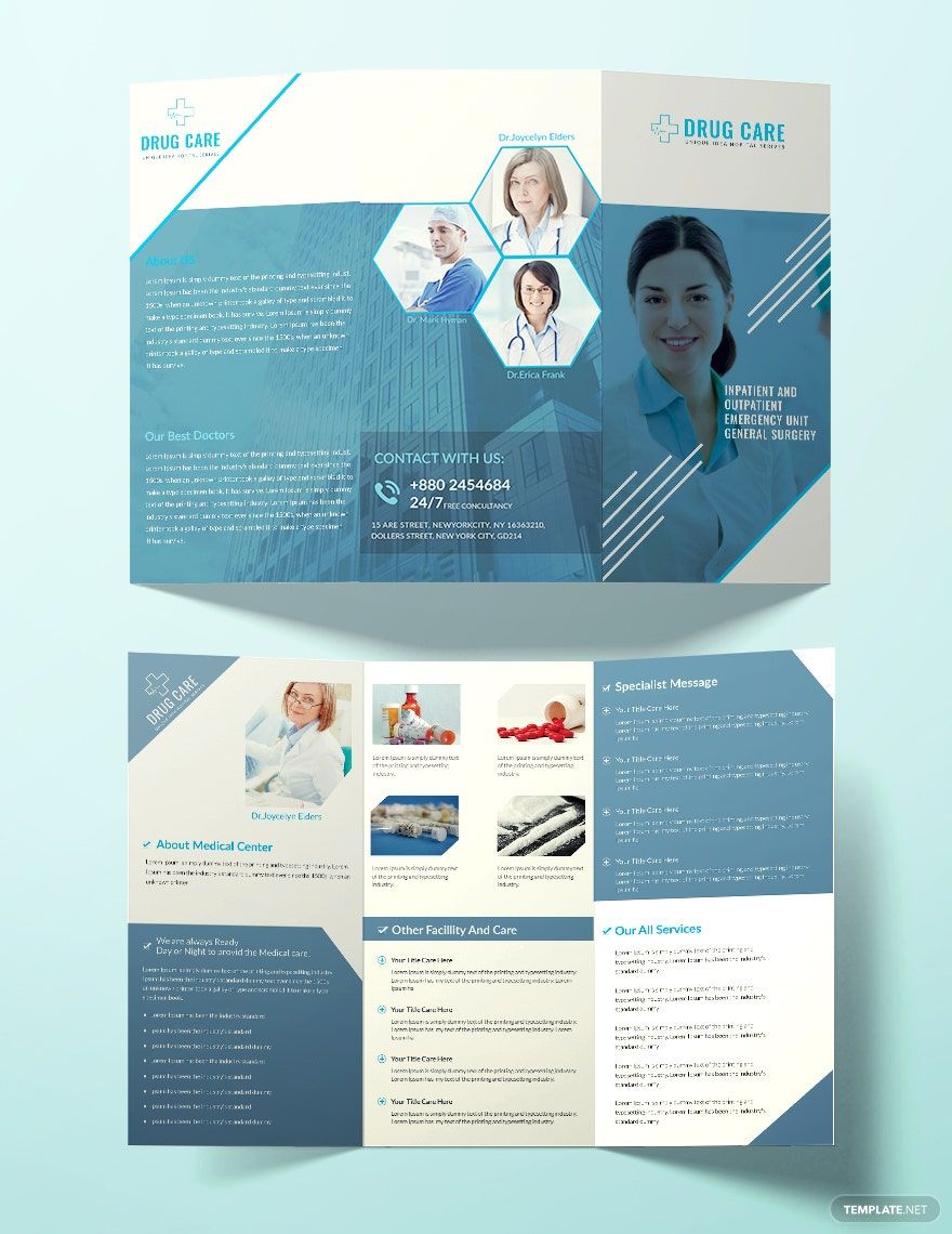
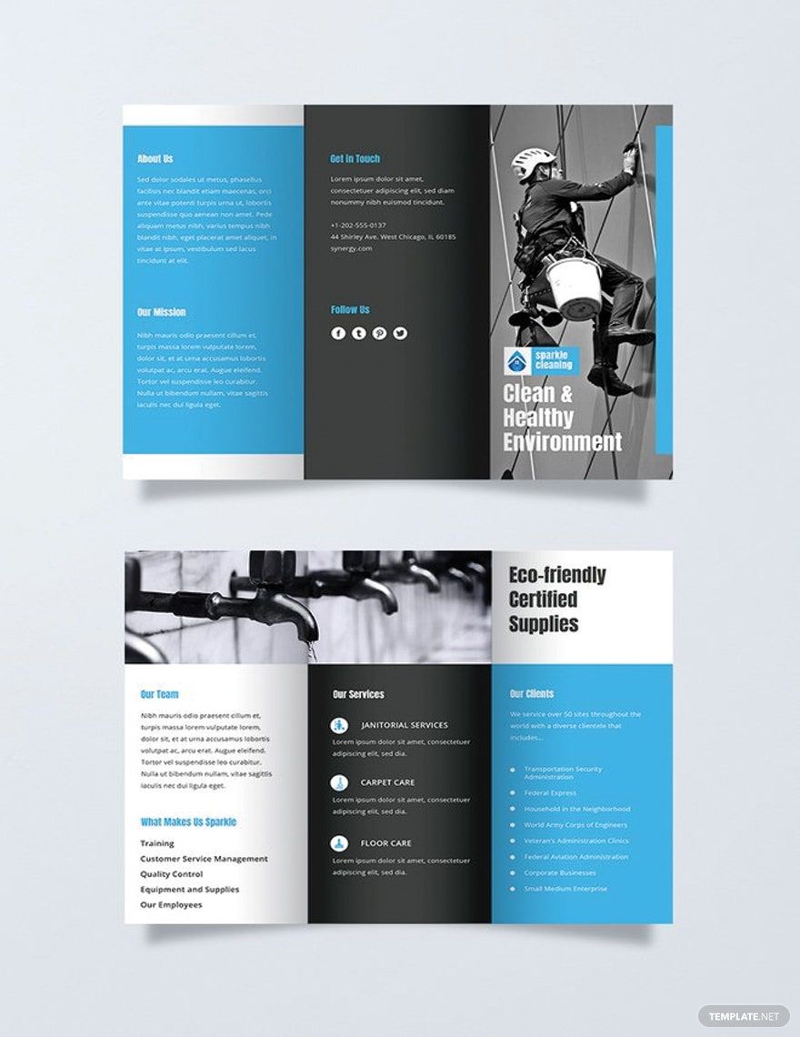
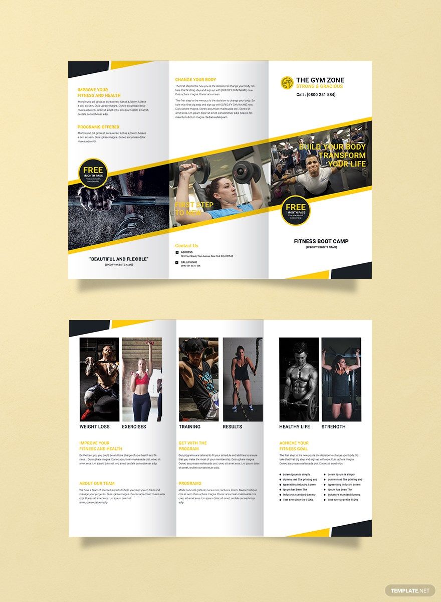
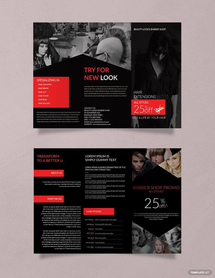
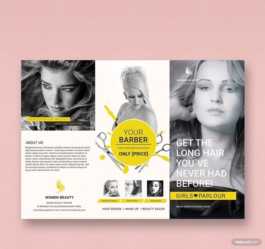
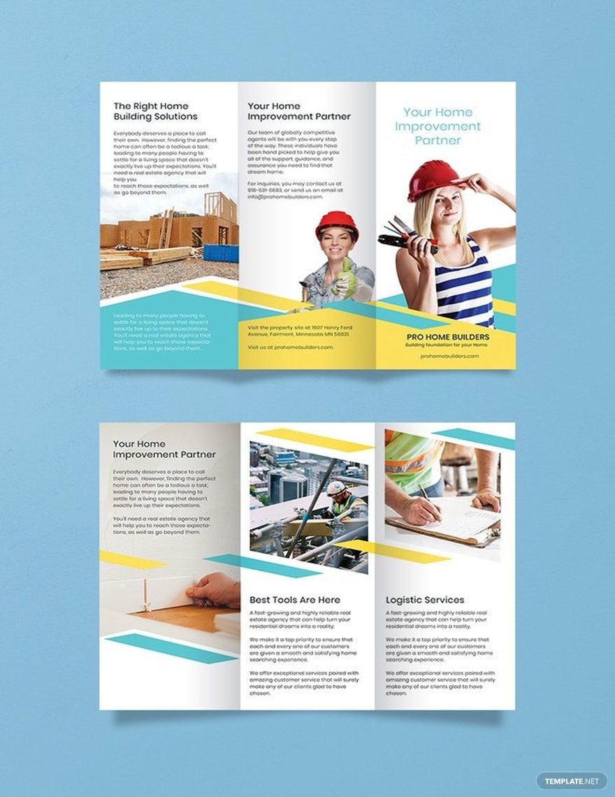
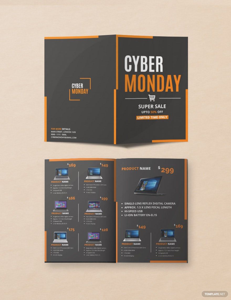
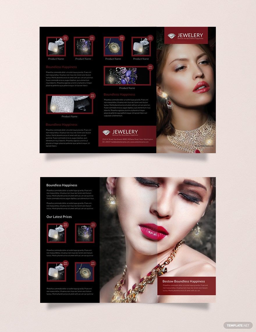
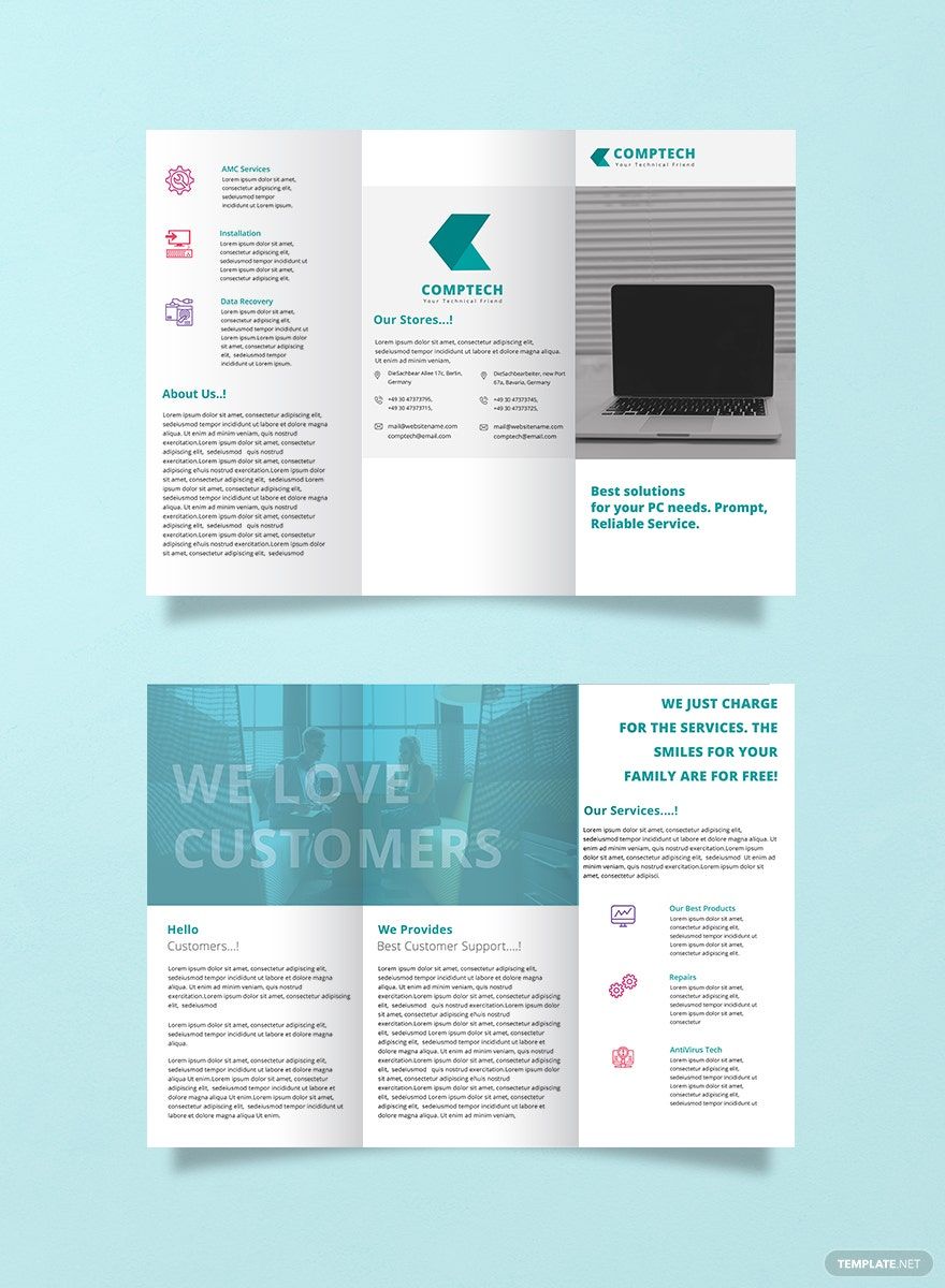
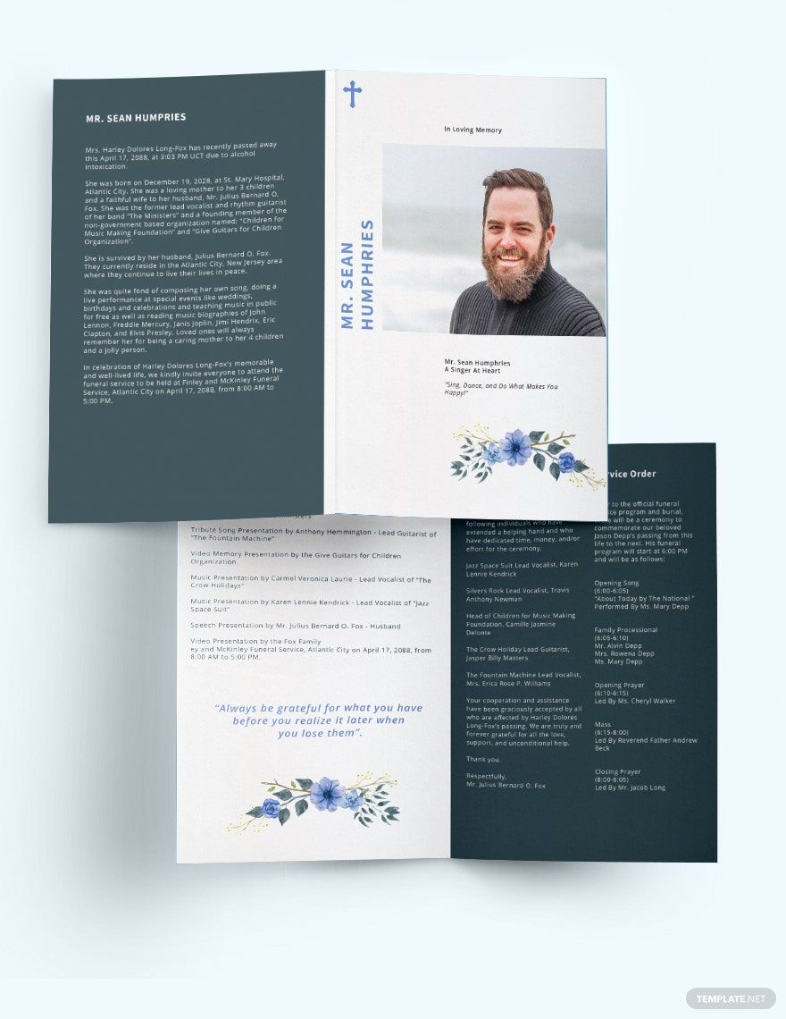
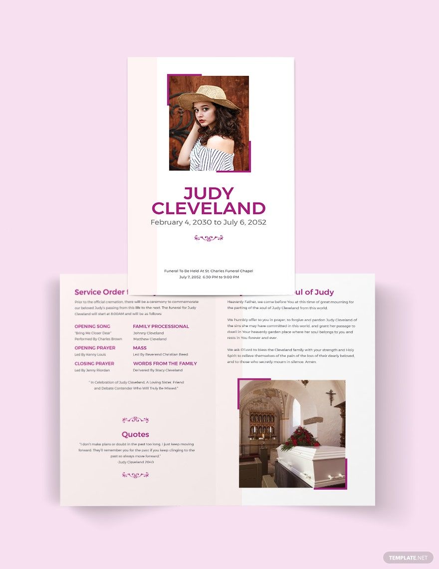
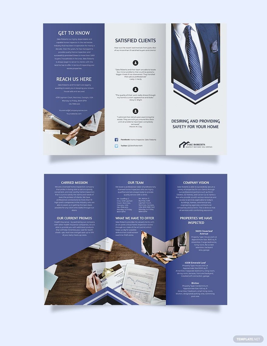
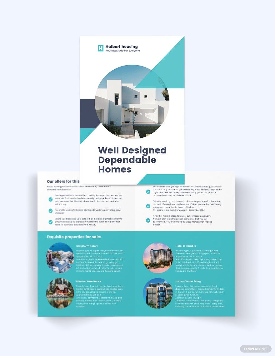
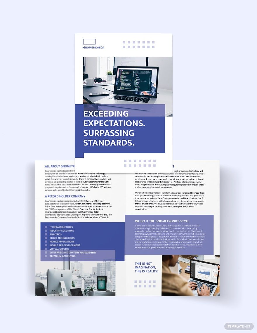
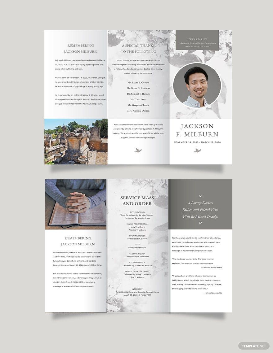
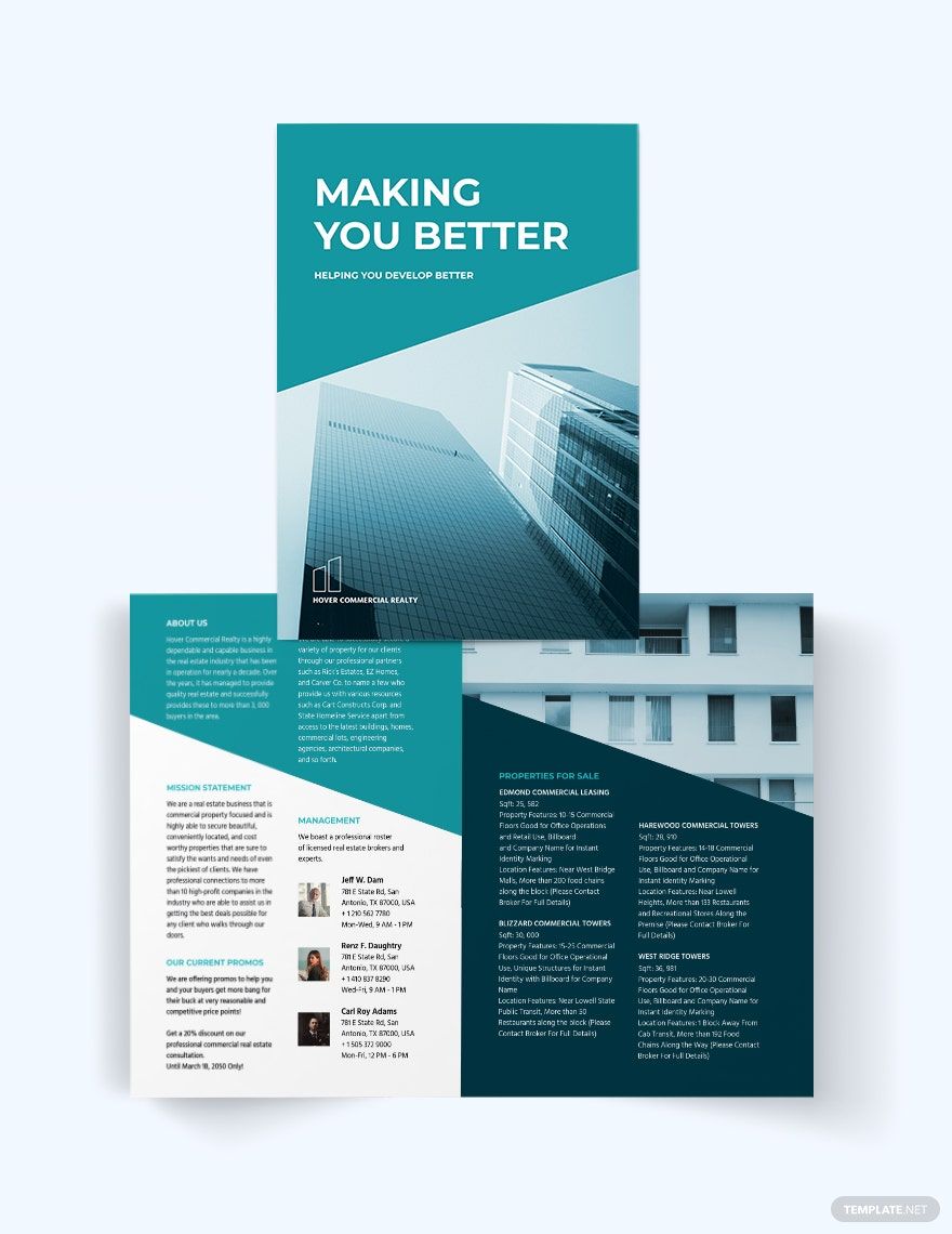
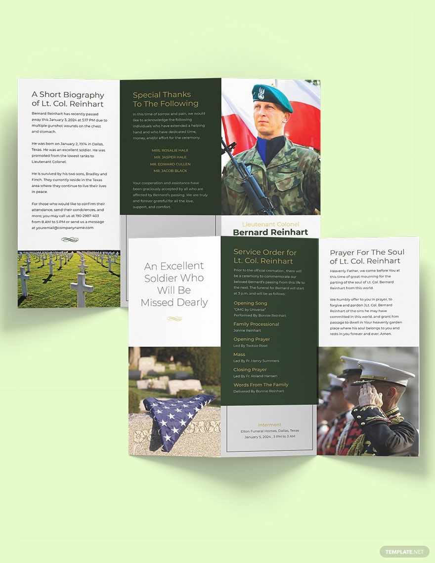
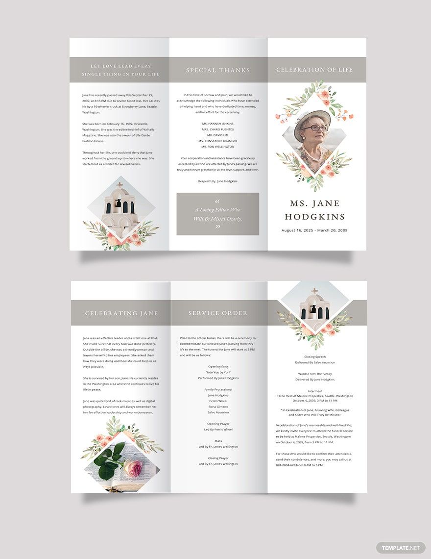
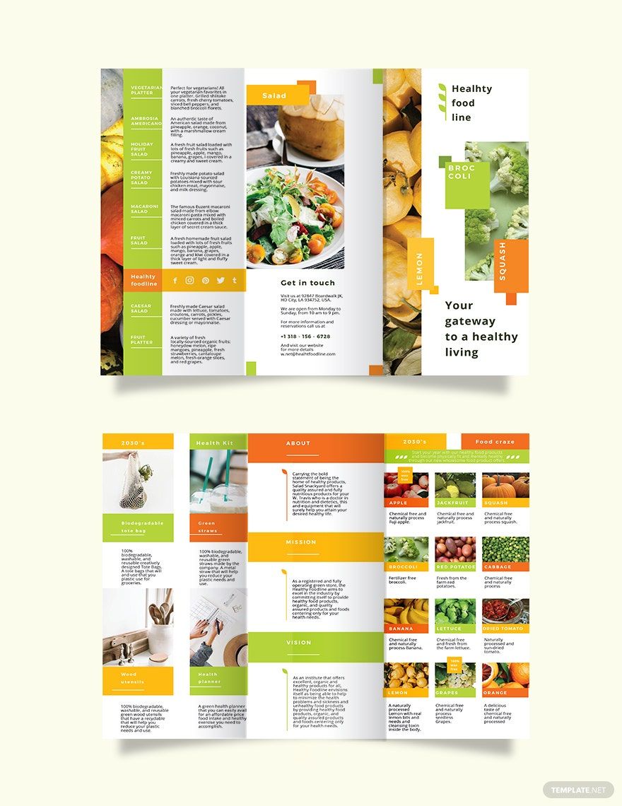
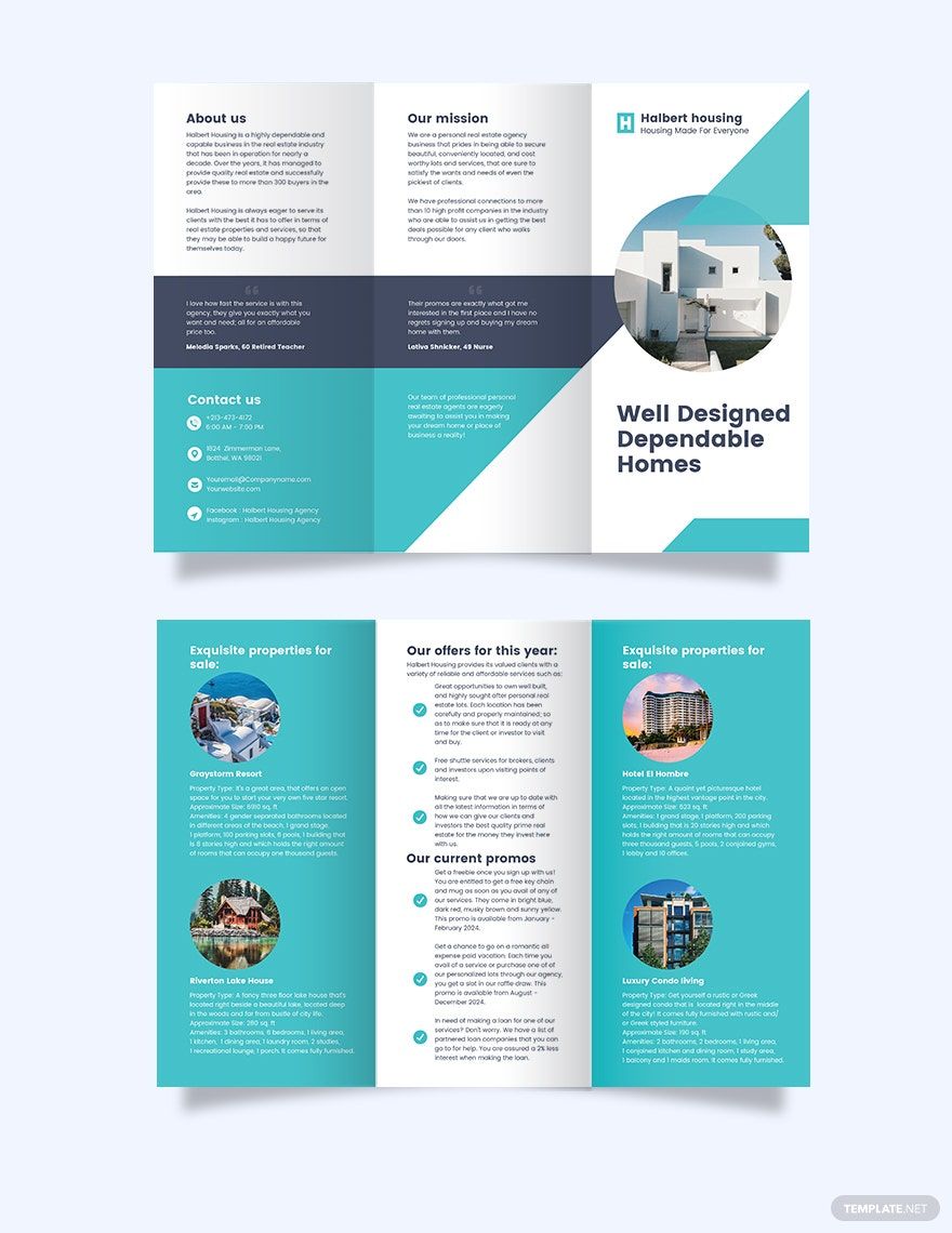
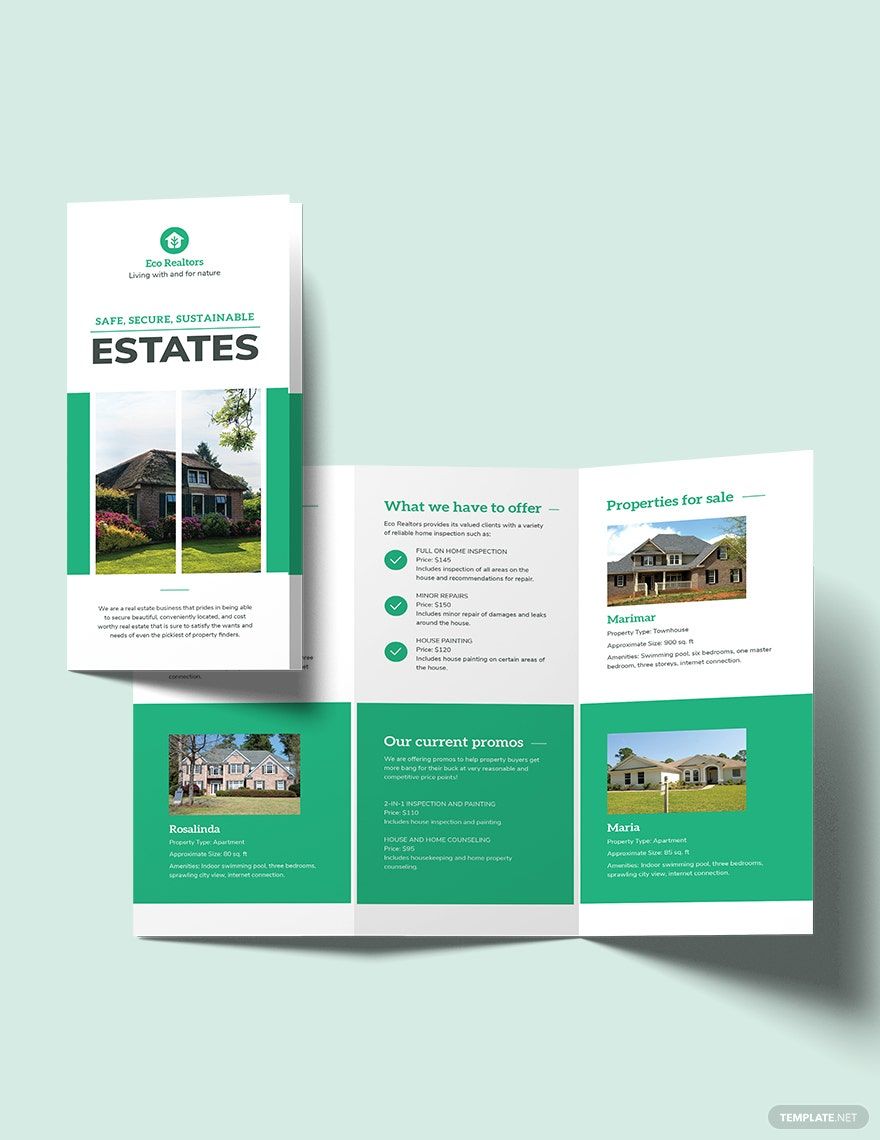
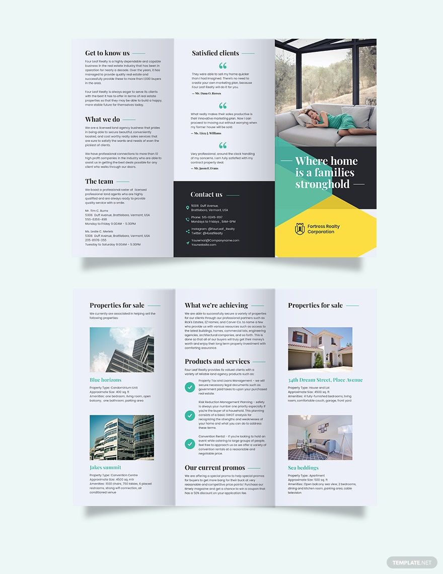
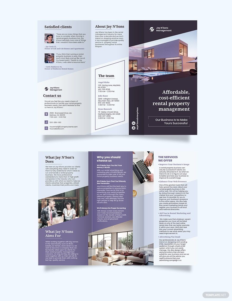
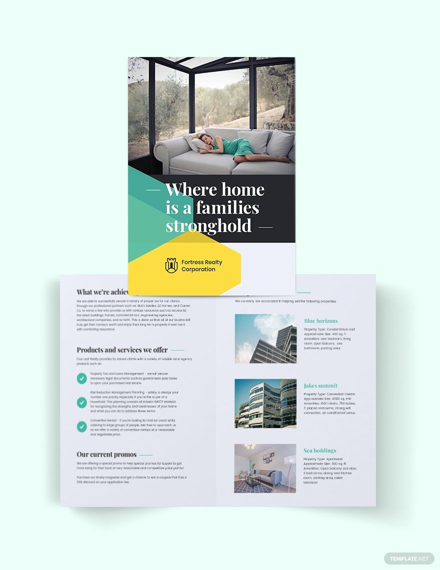
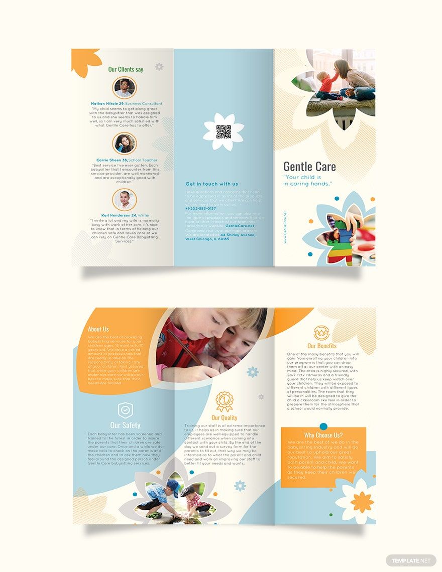
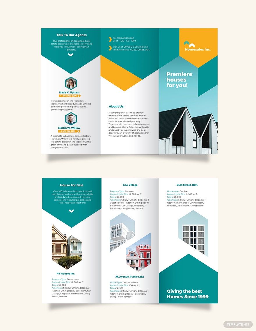
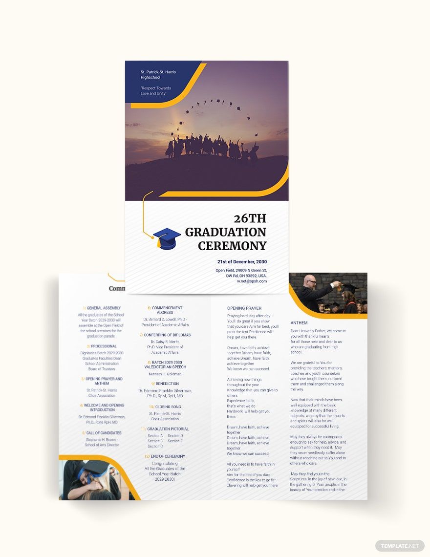
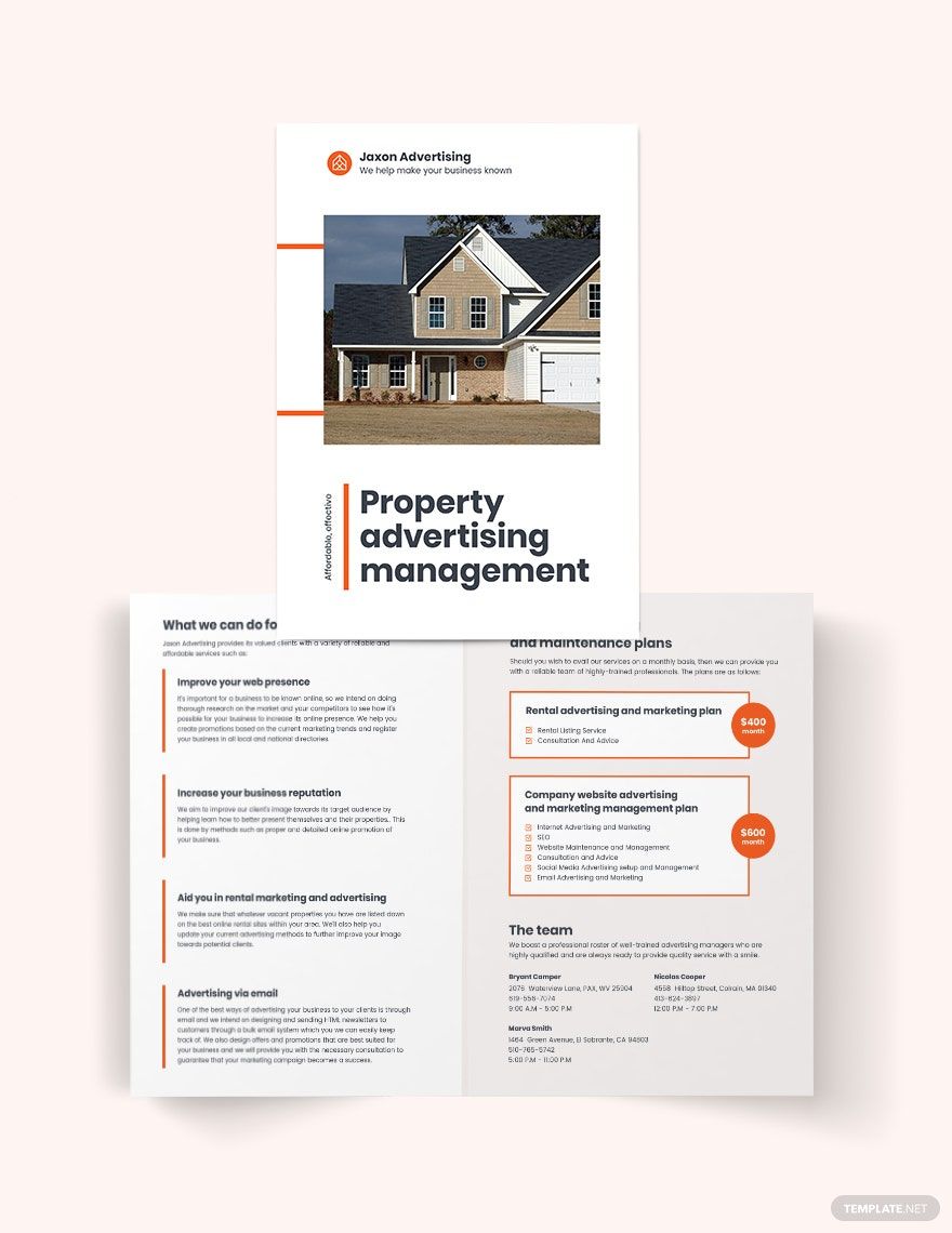
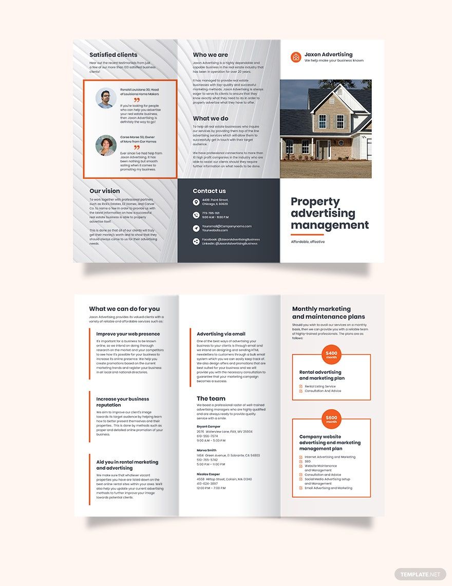
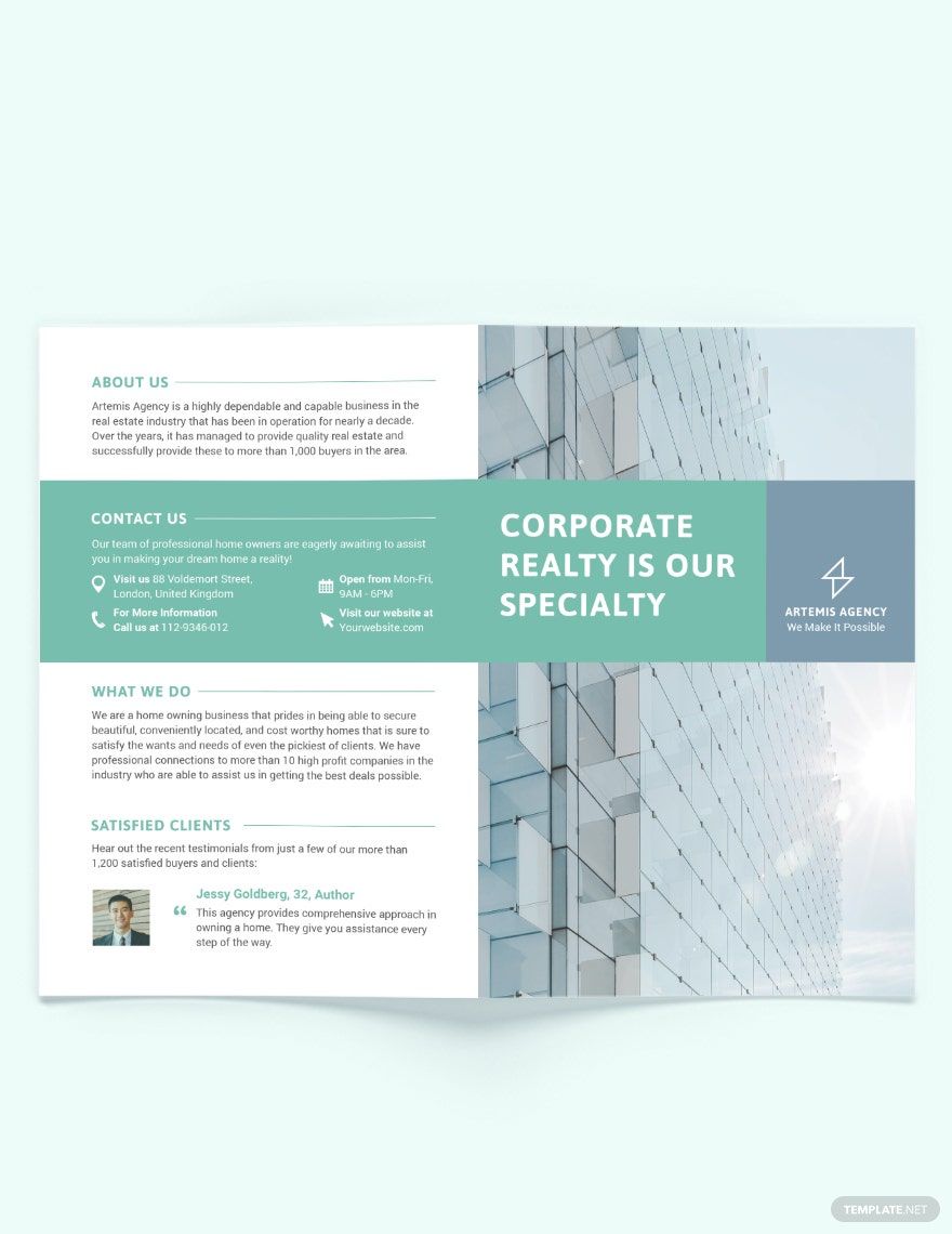
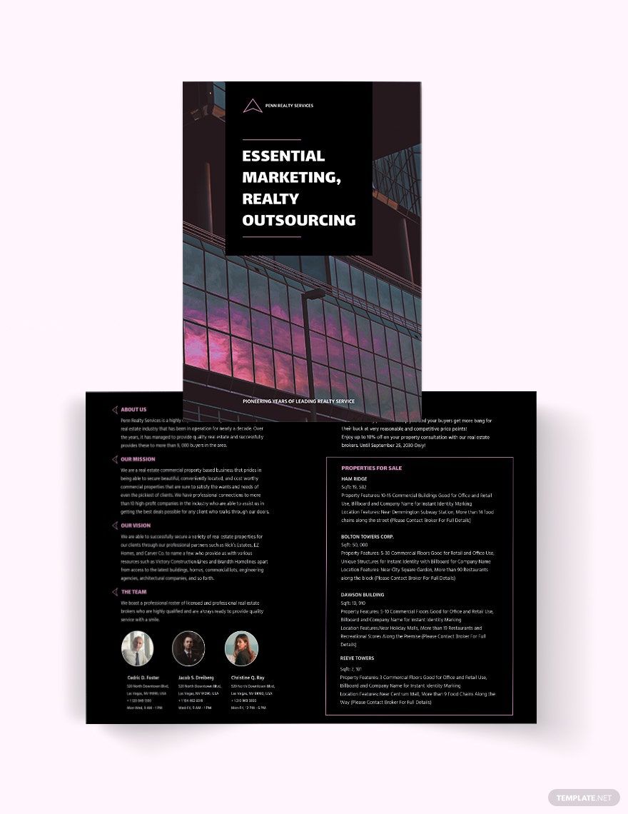
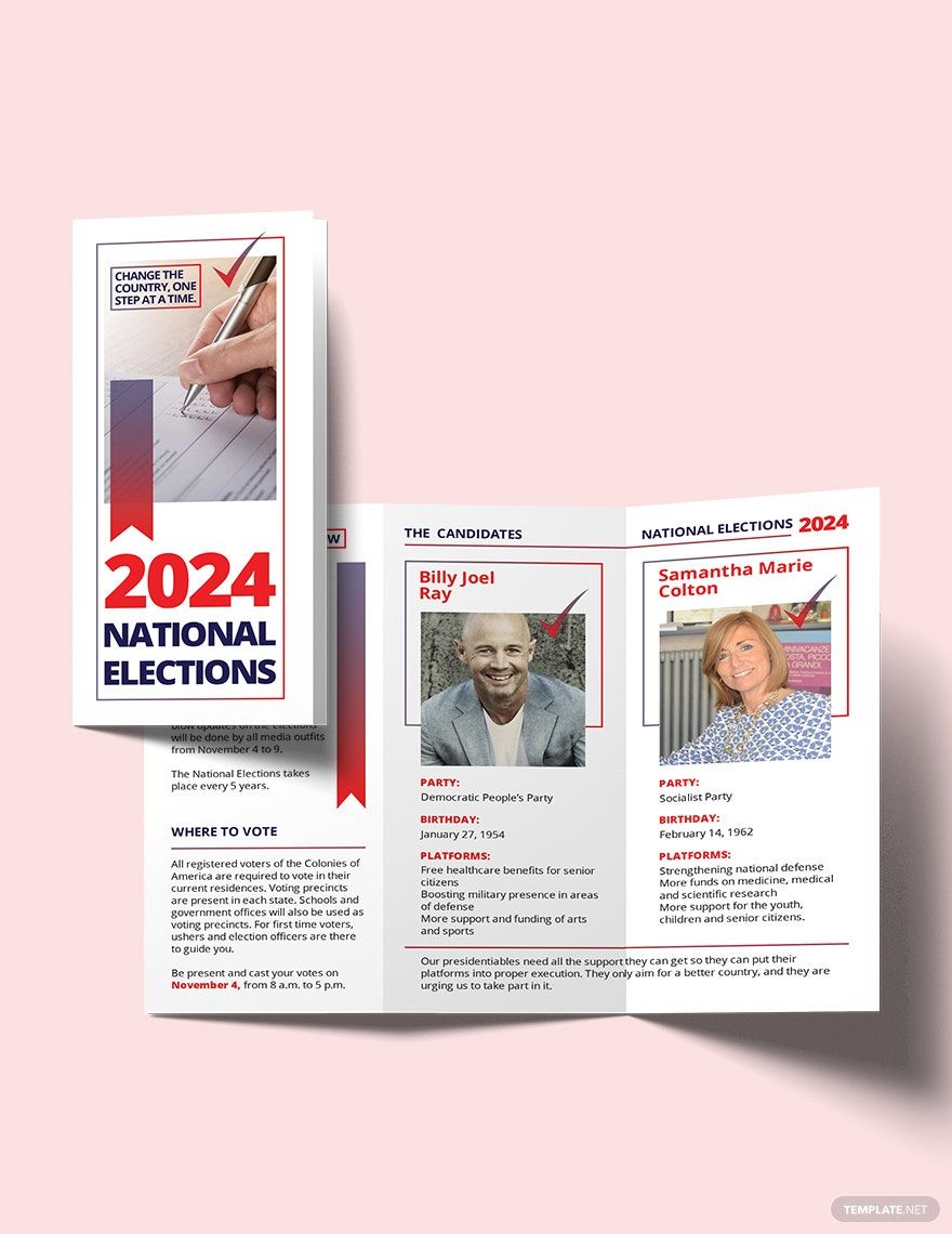
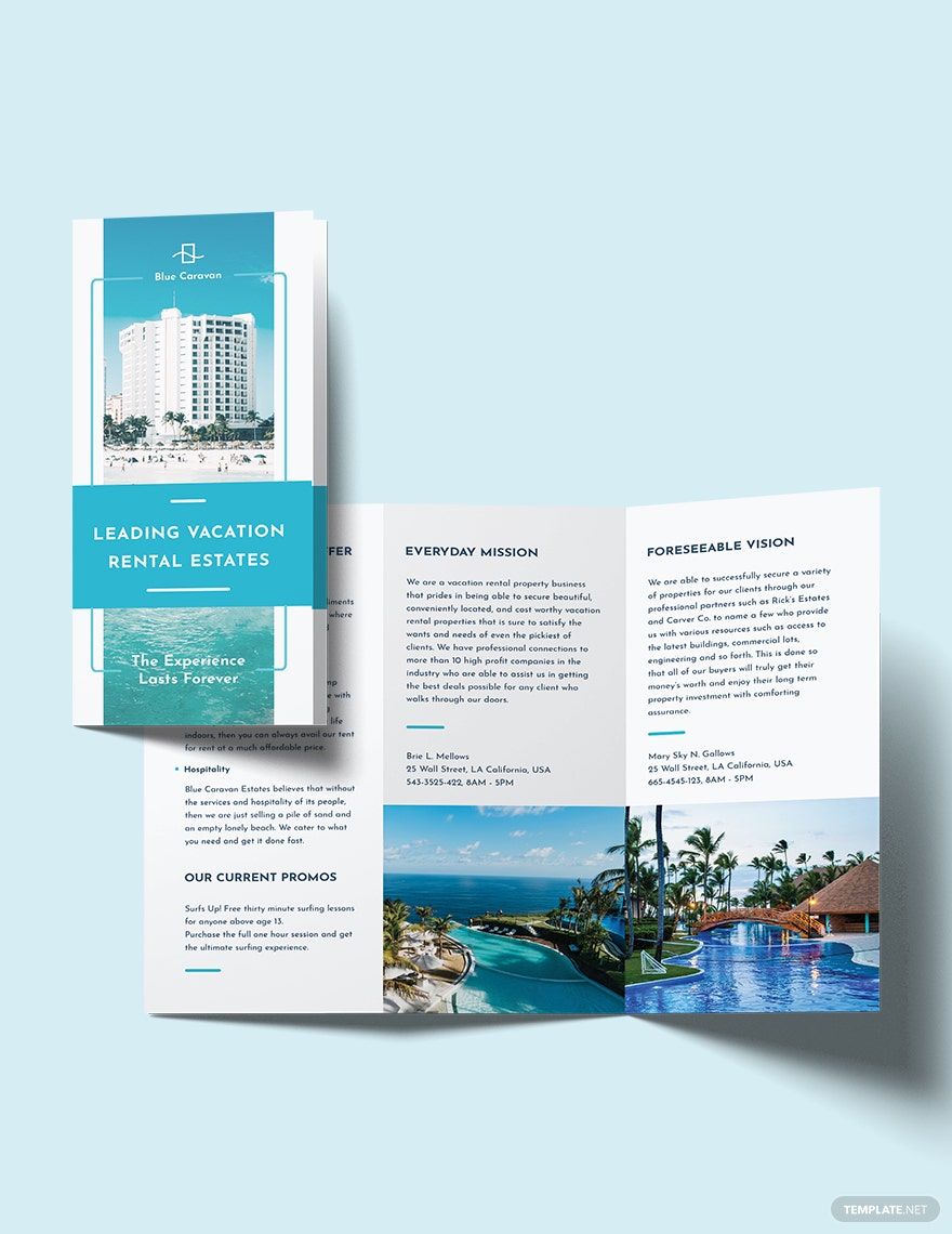
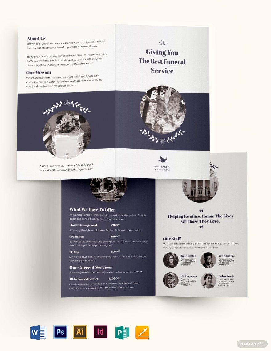
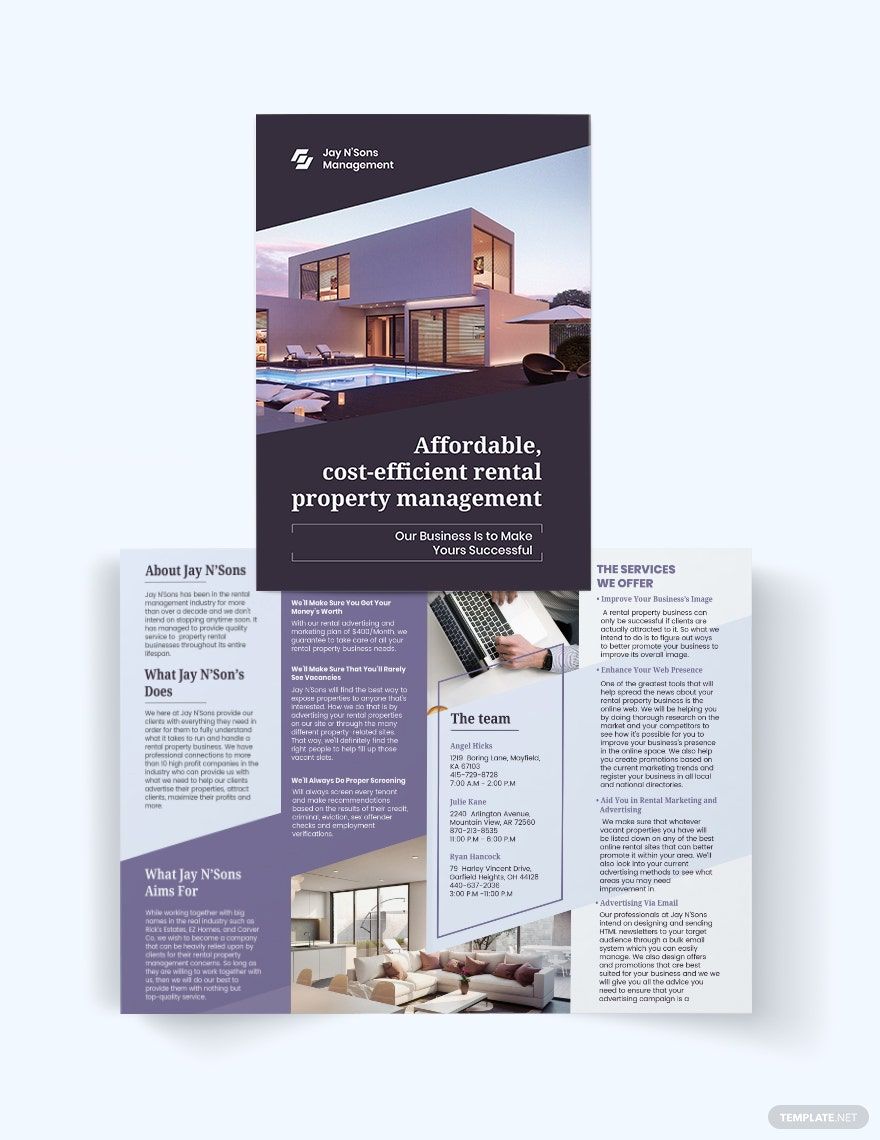
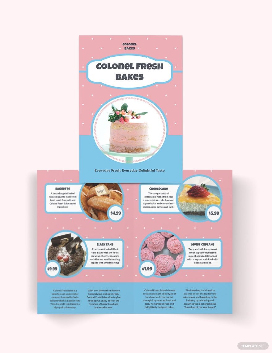
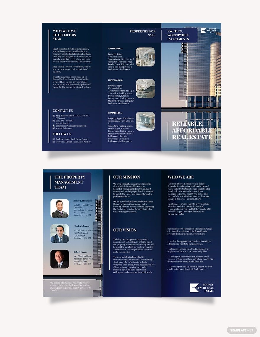
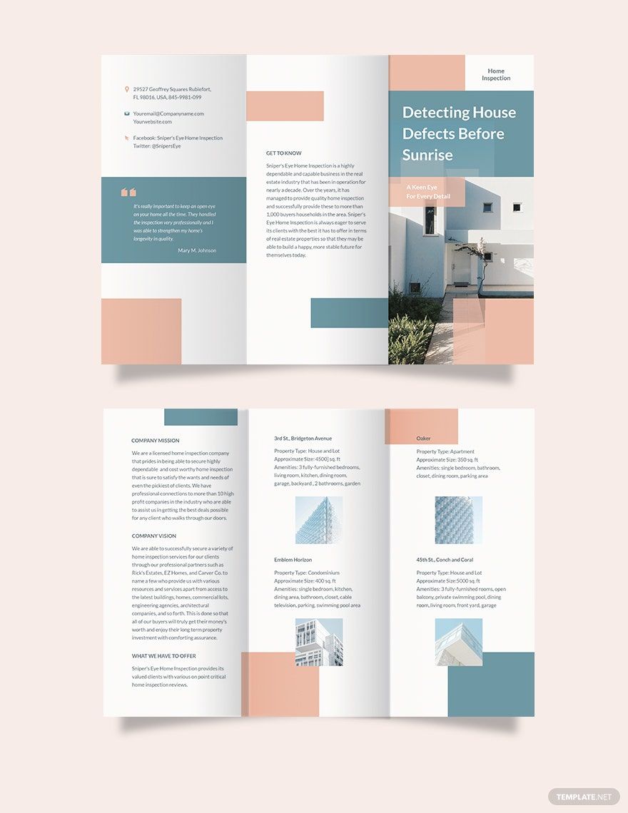
Brochures are a flexible marketing tool that contains different kinds of information. Several businesses use a brochure for advertising their services and products effectively. What's more, they are convenient, making it easier to distribute to a wide range of audiences.
Are you looking for professional brochures to promote your business? We have an array of ready-made Printable Brochure Templates that can be downloaded and edited using Adobe Illustrator. Every template is printable and 100% customizable. We have a variety of bi-fold and tri-fold brochures with great designs you can use for your company's needs. Subscribe now to make use of our free templates!
How to Make Printable Brochure Templates in Adobe Illustrator
A brochure is a multipurpose physical advertising tool used to promote a business. There are many reasons for creating a brochure. It may advertise a travel destination for tourists, inform people about health problems such as hypertension and diabetes, and introducing services like photography or language tutorials. Brochures are also useful marketing tools used by schools and could even work as a product or food menu. To create a brochure, you can follow the steps below to kickstart your project.
1. Know its Purpose
Before making a brochure for your business, first, you have to determine the purpose of why you are making them. You should set a goal for your brochure — what is it that you want to achieve through it? Without objectives, it will be challenging to start making a brochure, let alone producing one. An unplanned brochure is a wasted one. It may look colorful and lovely, but if without vision, it is useless. And you do not want this to happen and lose out not only in sales but also in your target audience. For you to establish effective communication with your audience, find out why they need a brochure, what they would want to read, and what would they get from it.
2. Identify Your Audience
To identify who your target market is, you can start with a marketing demography study. Knowing the characteristics of your audience in terms of buying habits, income, geographical locations, lifestyle, and other helpful information will aid you in creating a strategic marketing plan for your brochure. Your results and the responses you get from the study help you develop contents targeted explicitly to a particular group. Through this, you can engage in their interests, providing them with what they want and need.
3. Make a Rough Draft of Your Content
An eye-catching brochure does not rely on design alone; it also has to have informative content. However, it only takes 5 seconds to grab the attention of your audience, so you need to take note of what matters to them. Write a catchy headline that can get their attention and will prompt them to continue reading. An excellent and compelling headline should be relevant to the topic. According to Neil Patel in his blog in writing powerful headlines, it should follow the rules of 4 U's in writing: uniqueness, sense of urgency, useful and ultra-specific. With these rules, you can make a headline that will make your audience read further after the first line.
Use simple narratives in your content. Readers like it when they are not having a hard time reading through your brochure. The simpler it is, the easier it is for you to engage the audience. Highlight the essential points of your brochure by using bullet points to help them focus on your message. If they understand your message, there is a higher probability of them responding to your call-of-action.
4. Create an Apt Design for Your Brochure
Another factor that compels the audience to pick up your brochure is the design. Begin your brochure-making project with Adobe Illustrator. Use a layout where you can arrange all necessary elements and highlights the visuals of each one. When choosing fonts, pick three at most — for headers, subheads, and text bodies. Use readable serif fonts like Times New Roman or Arial, especially with business brochures. Always consider your readers — prioritize readability. Incorporate white spaces to enhance visual reading space.
Picking colors for your brochures can be challenging. If you have a color that's known to your brand, you can use it. However, you can be creative with them by mixing the brand color with other different shades to give your brochure a new look. Colors always have a way to attract the audience, so don't be afraid to experiment. Utilize professionally-taken photographs. Lastly, before printing, remember to use high-quality stock papers for your brochures. An excellent paper will give your brochure a great look and make it more appealing.
