32+ Free Business Card Templates – AI, Pages, Word
Photorealistic Business cards are used to represent the information on the product and services the particular business provide. Use these…
Apr 30, 2021
A business card is the face of the company, brand or person and shows the important aspects at a glance. It goes without saying that a lot of research needs to be done before designing the right card as this can help in making or breaking a potential contract based on the quality of a card. You can also see Best Business cards.
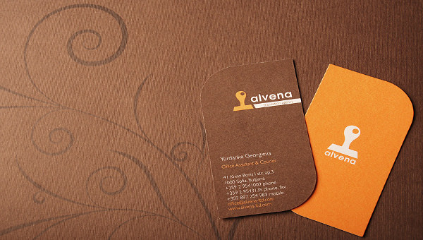
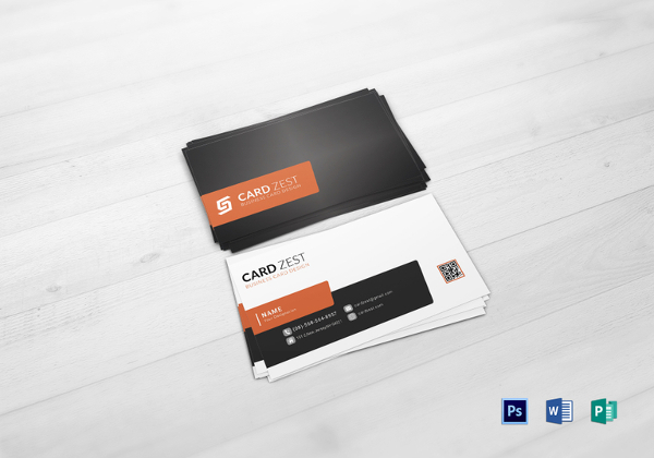
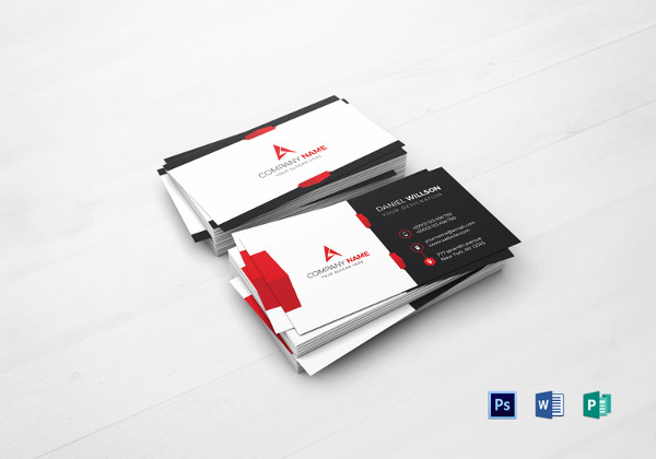
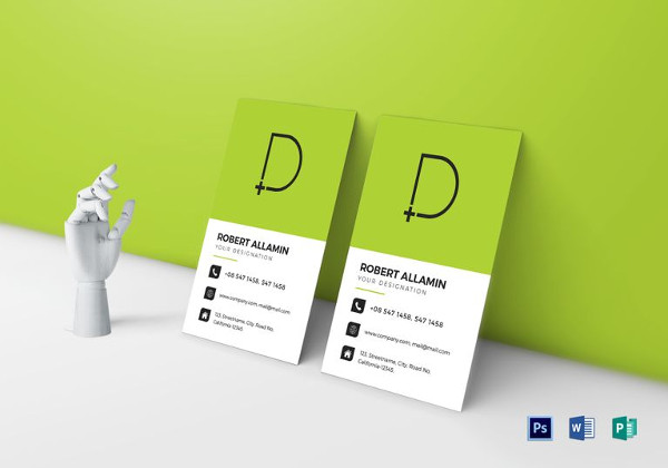
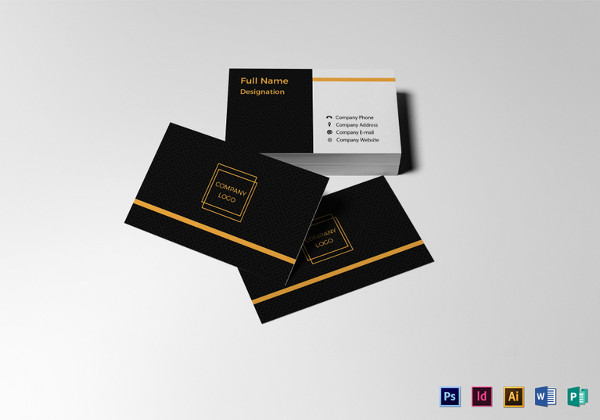
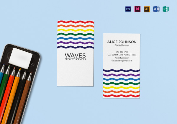
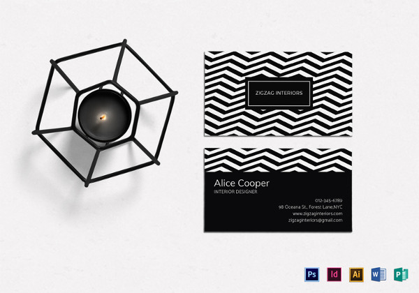
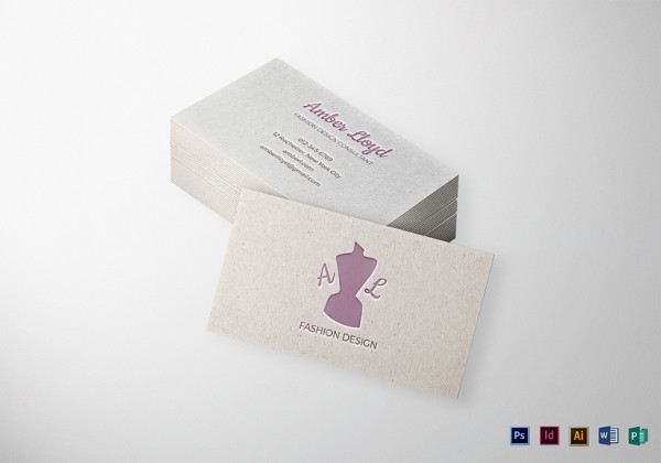
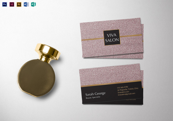
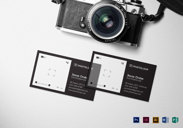
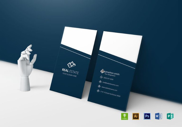
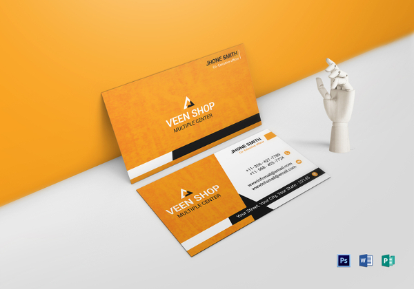
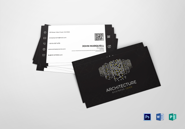
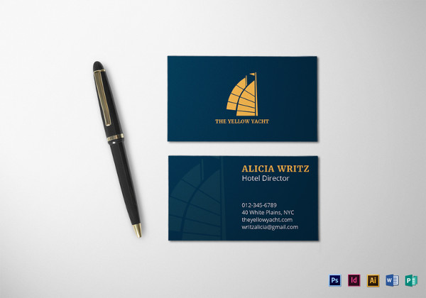
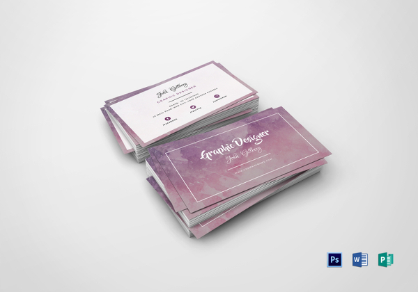
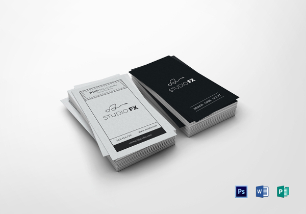

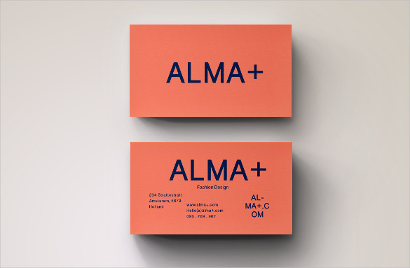
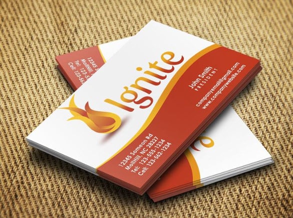
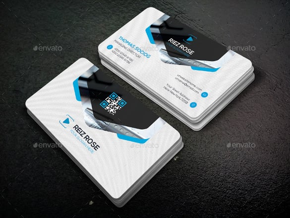
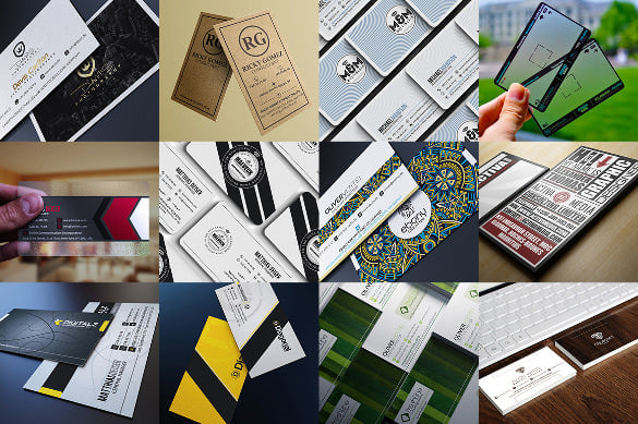
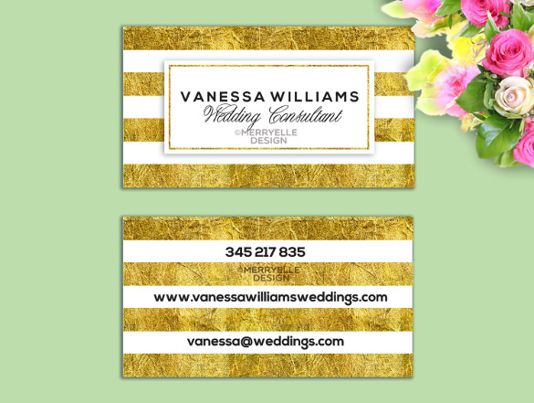

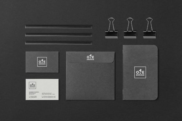
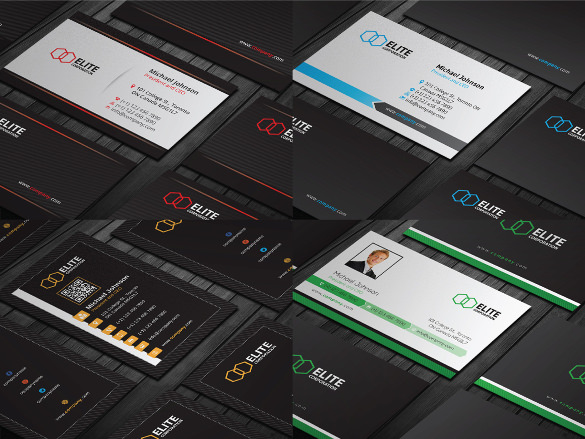
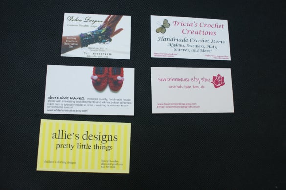
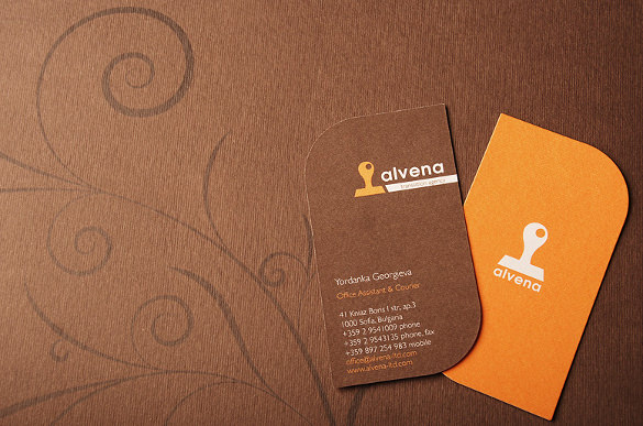
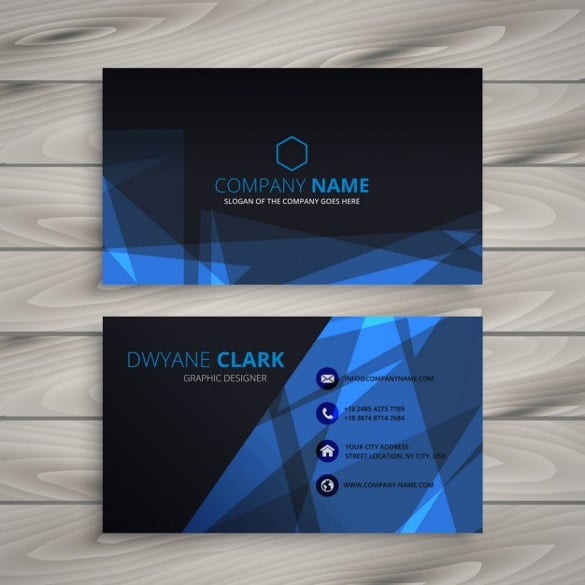
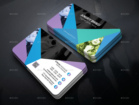
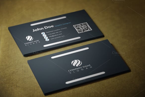
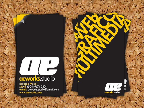
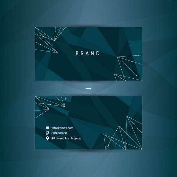
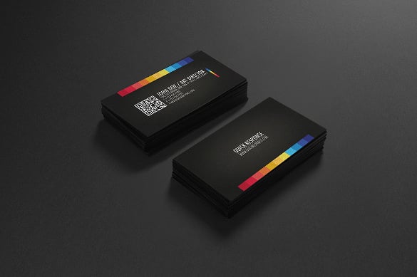
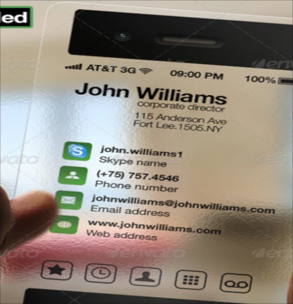
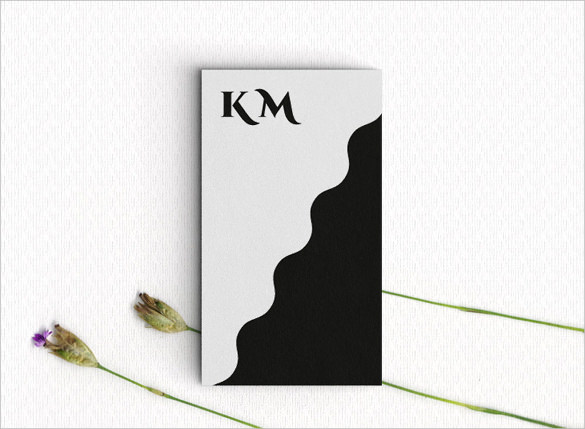
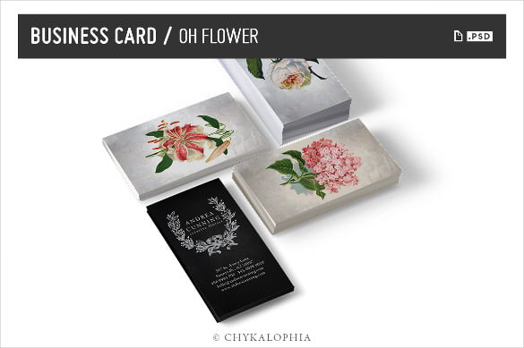
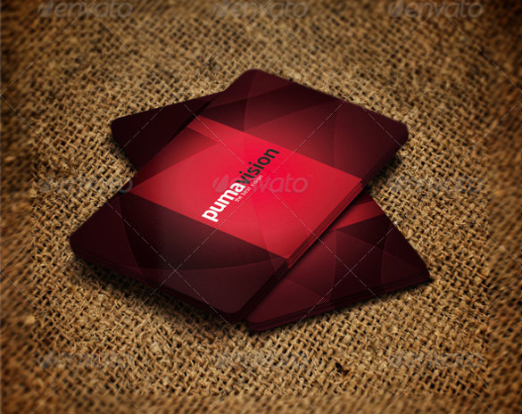
Ask yourself questions about the company, what type is it? Is it an advertising company? Or is it a fashion design brand? Different businesses require different features, like in the above example, an advertising company would usually go with more space and a bigger font to get their company name and contact details across and less emphasis on other elements. While a fashion design company would give more importance to Company Logo creation and have more striking fonts as compared to just a plain approach.
Another important factor is readability. The card would lack quality if all it has is design value and you are unable to make heads or tails of what is written on it. It is incredibly important to have 10 out of 10 people know exactly what is printed on the card to promote your company name. Using clearer and precise fonts help generate coherent words.
Fonts have one purpose and that is to catch the reader’s attention in a unique and personal way. You should be using fonts to create a strong yet simplistic approach to drawing attention with a business card.
Bold, dark and perfect to convey power without shying away. This Free Fonts takes an ‘in your face’ approach and pretty much stands out in the open. It shows a lot of clarity.
At first glance, this font gives the impression of subtlety over substance. Great for keeping it simple and classy.
Everything about this font points to style. It is a font that is quite preferred by people who prefer a larger text with the touch of elegance.
Is not too bold and not too subtle but at the perfect balance of things. It’s also great to showcase a sort of a gritty demeanor.
Certain fonts only cause confusion and just feel out of place when you use them. It is extremely important to avoid using fonts that curve all around and make the reader guess twice what the card is trying to convey. Try to avoid using fonts such as Arial, Comic Sans, Times New Roman, etc. These are basic and completely bore the reader.
Card color brings a psychological effect on a business and often conveys a theme depending on your brand. Let’s understand them with some of the follow-ups.
If you choose to Digitally Design the card using graphical templates. They are an array of widely found designs but trust us to guide you through to picking some of the most popular collections to help you design your way. If you want something along the lines of casual but formal, the Sine-wave template is your pick. If you prefer to add a more natural touch, The Holistic Lotus is what you are looking for. A more traditional setup? Try the Cool Rustic Business template as well as the Professional Vintage Art Deco template. For a more in-trend approach, the Modern Corporate template and if you prefer a more colorful template, you can’t miss the Florist Business template.
Stick with the formula of ‘Never fix what isn’t broken’. Avoid designing large cards, stick to the 3.5 by 2” rule. It is a good idea to use eye-friendly colors and not colors that would seem like it was a greeting card. The print should never be small, what can’t be read is a lost opportunity.
Most people leave it blank, others prefer a quote to inspire confidence, some put the logo of their company. It is also a good idea to link a QR code that leads to the website of the company for people to gain additional information without having to search.
Ultimately, it is up to the designer to come up with unique and thoughtful designs to conjure up the right taste catered to each individual or business. Never stop to be creative but also never experiment beyond your control. A business card is not only a Wealth of Information to someone’s brand but it is the first impression about them. It speaks about their taste, character and their personality, all this in a few seconds of looking at it.

Photorealistic Business cards are used to represent the information on the product and services the particular business provide. Use these…
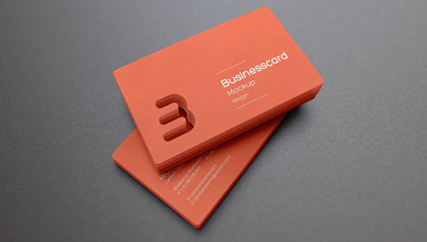
Just like in real business cards, online v-cards are the first impression of your business. Because the first impression is…
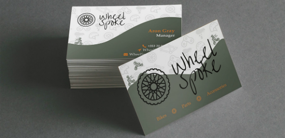
Money may indeed be a material possession but without it, people cannot buy goods that can sustain or fascinate them.…
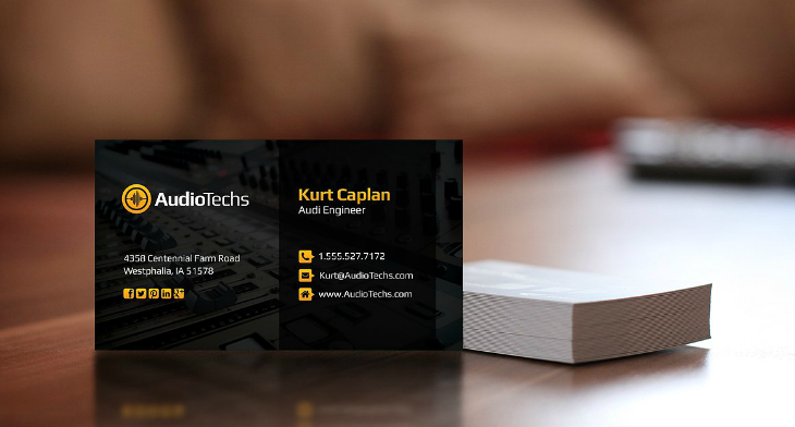
Planning to become an engineer? Or are you actually a licensed engineer? There may be a lot of job opportunities…
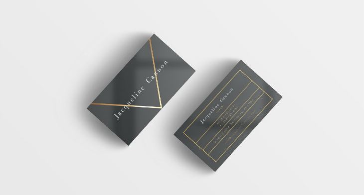
If you are a lawyer, we are well aware of what you’ve been through just to be able to get…
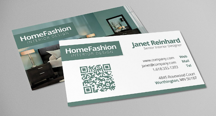
Do you think you have what it takes to be an excellent interior designer? If you are just starting your…
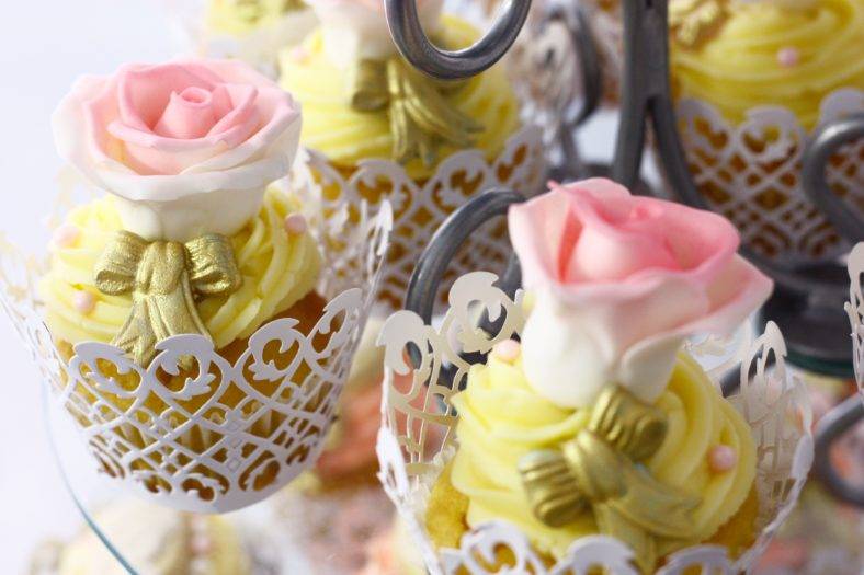
Cupcakes are cute little minions and are likely causes to make one crave for sweets. They are the heralds of…
Electrical services are commonly offered by electrical companies. But, if you are an independent entity and would like to promote…
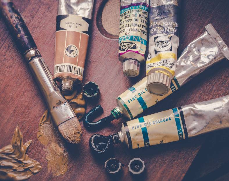
To be an outstanding painter requires a tremendous amount of talent and skill. And as expected of you, the things…