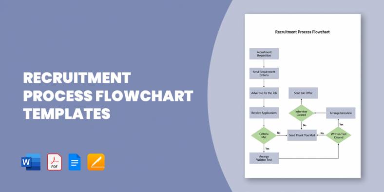
15+ Recruitment Process Flowchart Templates in PDF | MS Word
A flowchart of the recruitment and selection process, also known as recruitment workflow, is a design that outlines out the…
Jan 29, 2020


May 08, 2020
Looking for simple, intuitive ways to show quantitative data? One good option is the stacked bar chart. This kind of graph is a visual representation of how a whole value is broken down into its component parts. Think of it as a pie chart in bar graph form, where each column in a bar graph is segmented into different colors. You have probably seen such a graph without knowing its name, since they are just a form of bar graph.

To create this as a Chart Template in Microsoft Excel might take some time for those unfamiliar with the tech details. Download and use these free stacked charts and save yourself the trouble.
 excelcampus.com
 lacher.com
 nces.ed.gov
When do you choose a stacked bar graph instead of the usual line graph or a simple bar graph? Thanks to its nature, a stacked bar graph is best used to display and analyze cumulative values. Your data has to make sense when added up to a total.
With that in mind, there are two ways you can format this graph:
A common use for a percentage stacked bar is in poll results for two values.
Any data set that can be shown in a pie chart can be translated into a percentage stacked bar graph.
Thanks to these templates, you don’t have to. You can create an Excel Chart Template for most types of visual data presentations, and creating a stacked chart on Excel with these templates is just a matter of coding in your data set.
As opposed to the usual bar graph with multiple columns, one downside to using the stacked bar chart is that the more segments are involved, the harder it is to read (and you can run out of colors quickly too).
It is also common to mistake what kind of data can be or should be presented in this manner.
 ustunel.bilkent.edu.tr
The usefulness of a stacked bar chart is limited to specific types of data sets, mainly cumulative data.
If your data doesn’t fit into any of these templates, or if it starts to seem too complicated, you might want to look at other charts we have here on Template.net. If you’re looking for more ways to show data visually, start with the Flow Chart Template and the Waterfall Chart Template.
Click down on the Business tab on our homepage and select “Charts” for even more options.

A flowchart of the recruitment and selection process, also known as recruitment workflow, is a design that outlines out the…
Logistics management is a tough job, as you are to handle a vast network of processes. Plus, the system incorporates…

All businesses require great management, so all operations run smoothly and easily, and management applies to logistics as well. Maybe…
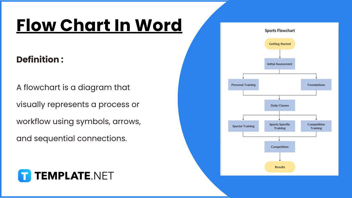
Flowcharts in Word offer a convenient way to visually represent processes, workflows, and systems. With easy-to-use shapes and connectors, Word…
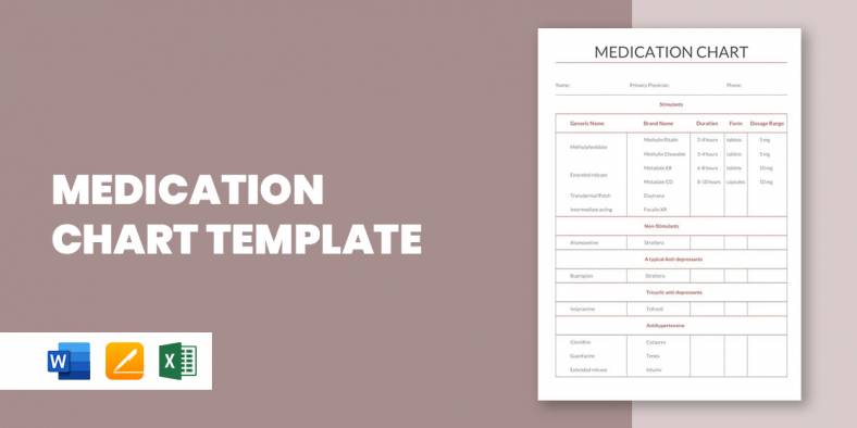
A medication chart template is really handy when you have to keep track of the number of medications prescribed for…

If you have ever had to prepare a flow chart, you’d thoroughly understand that it could be a back breaking…
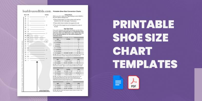
Going shoe shopping soon? Here is a Chart Template to help you avoid the annoyance and embarrassment of getting the…

If you plan to show the basics of guitar playing or just want to show how to play a song…

One of the important parameters of the body that needs to constantly be checked and measured is the blood pressure.…