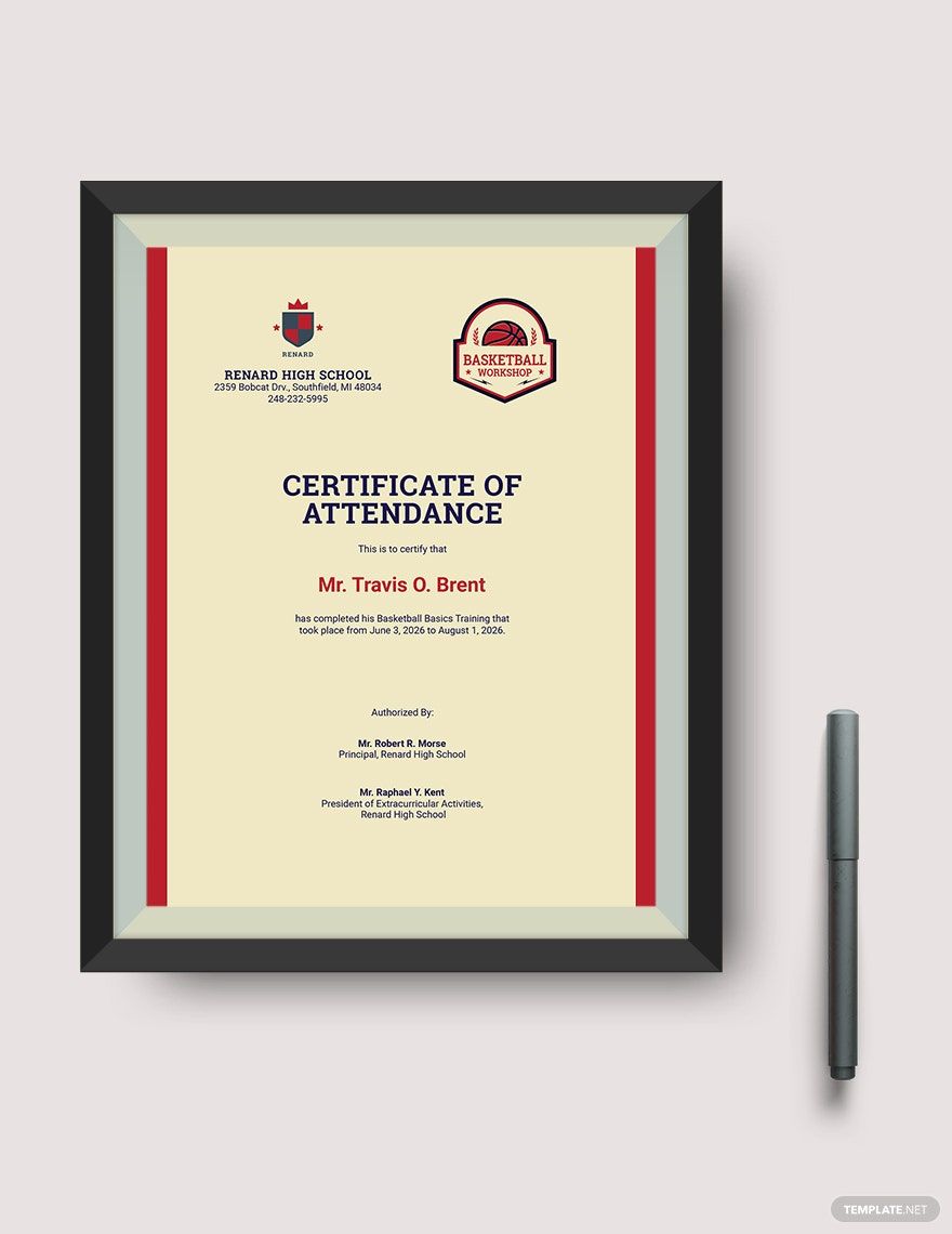
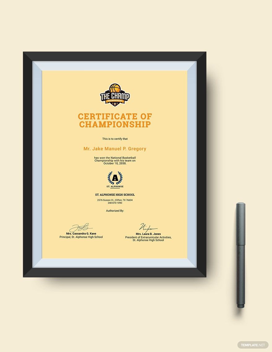
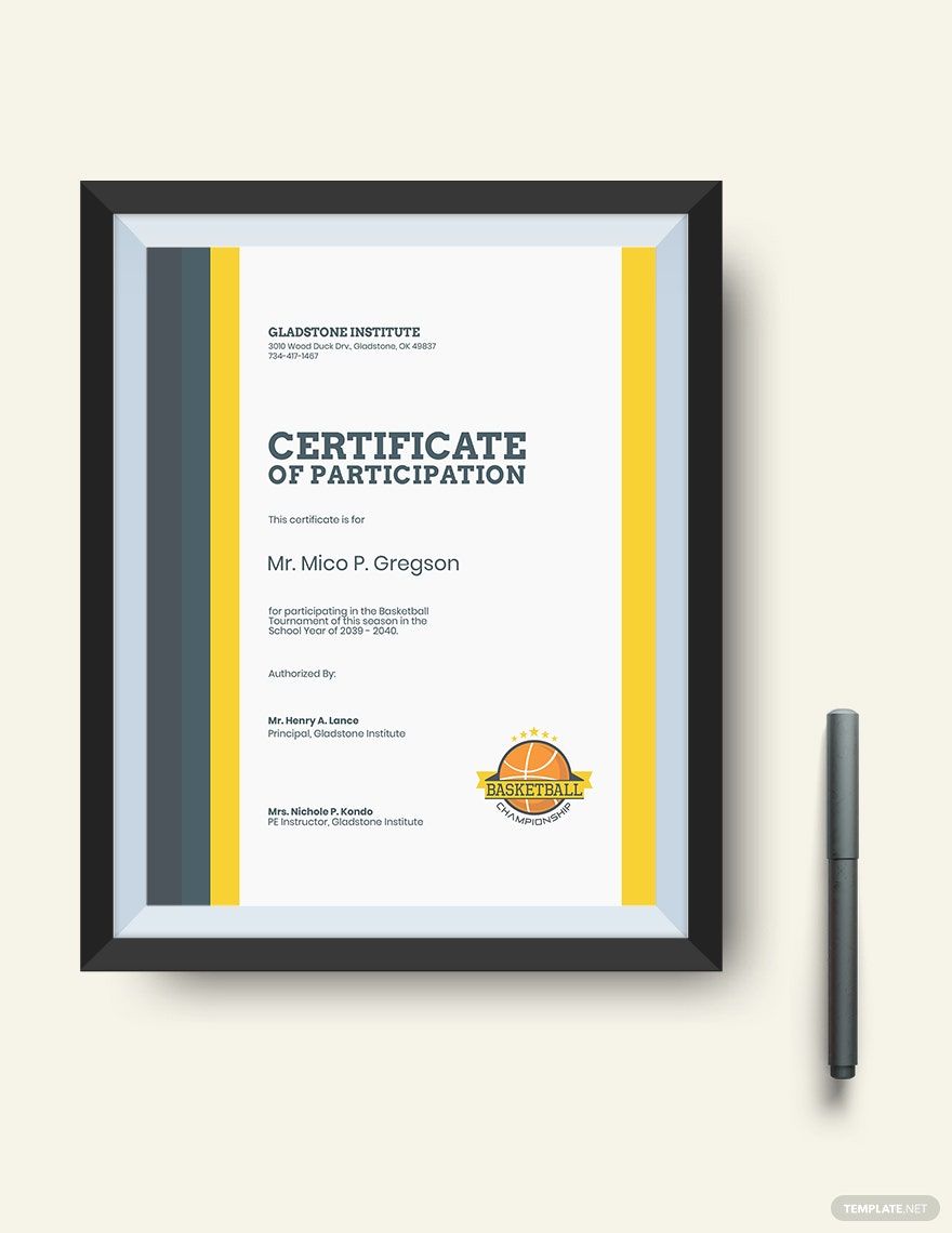
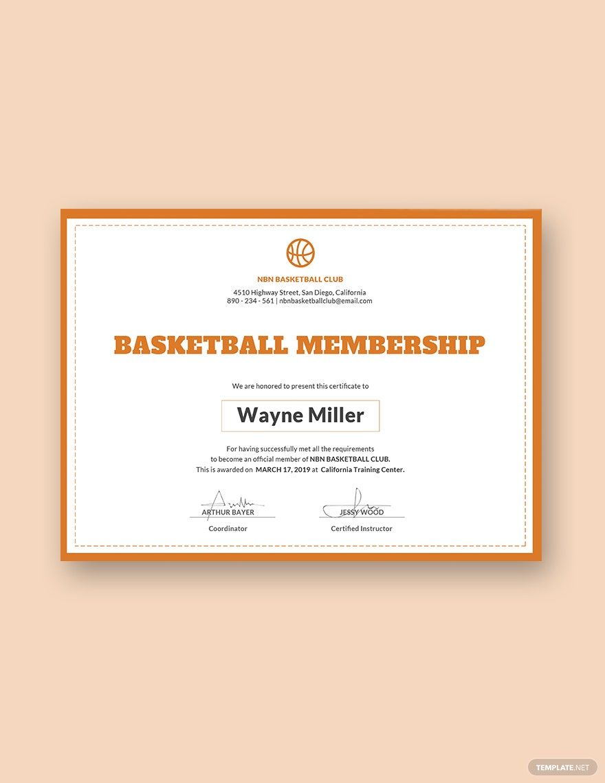
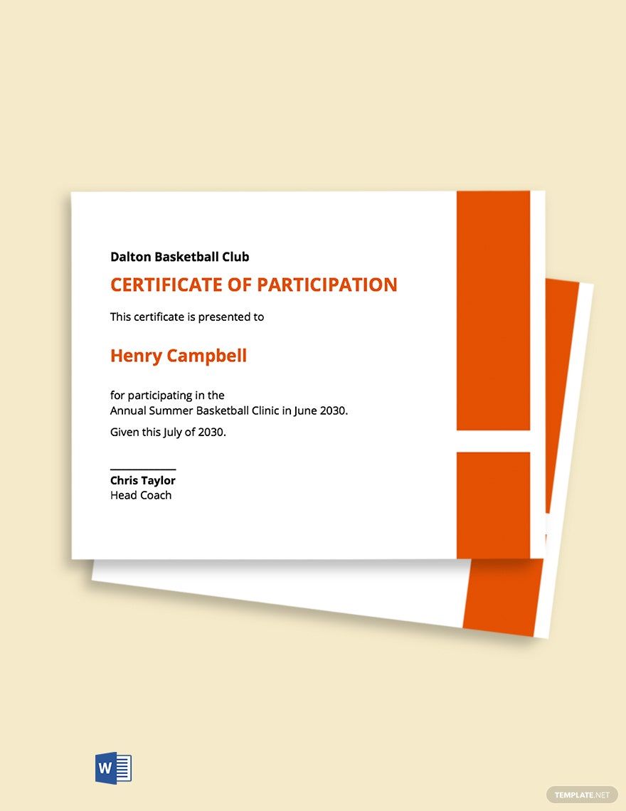
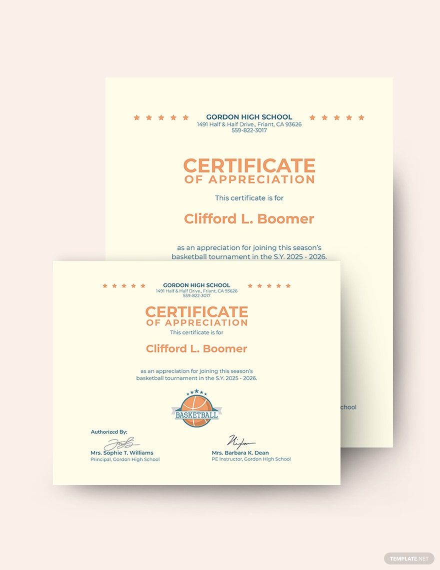
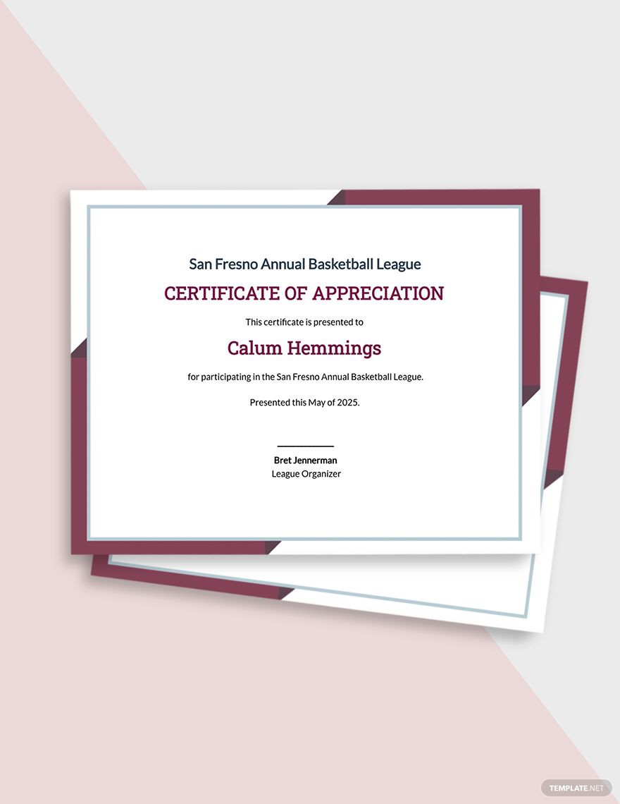
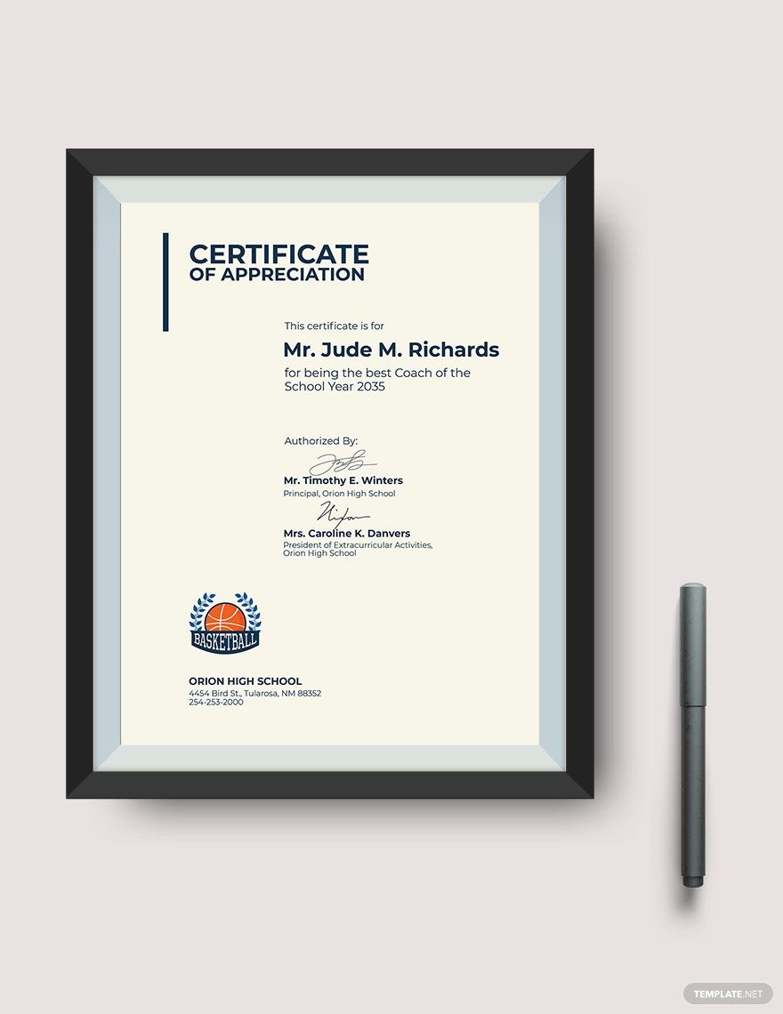
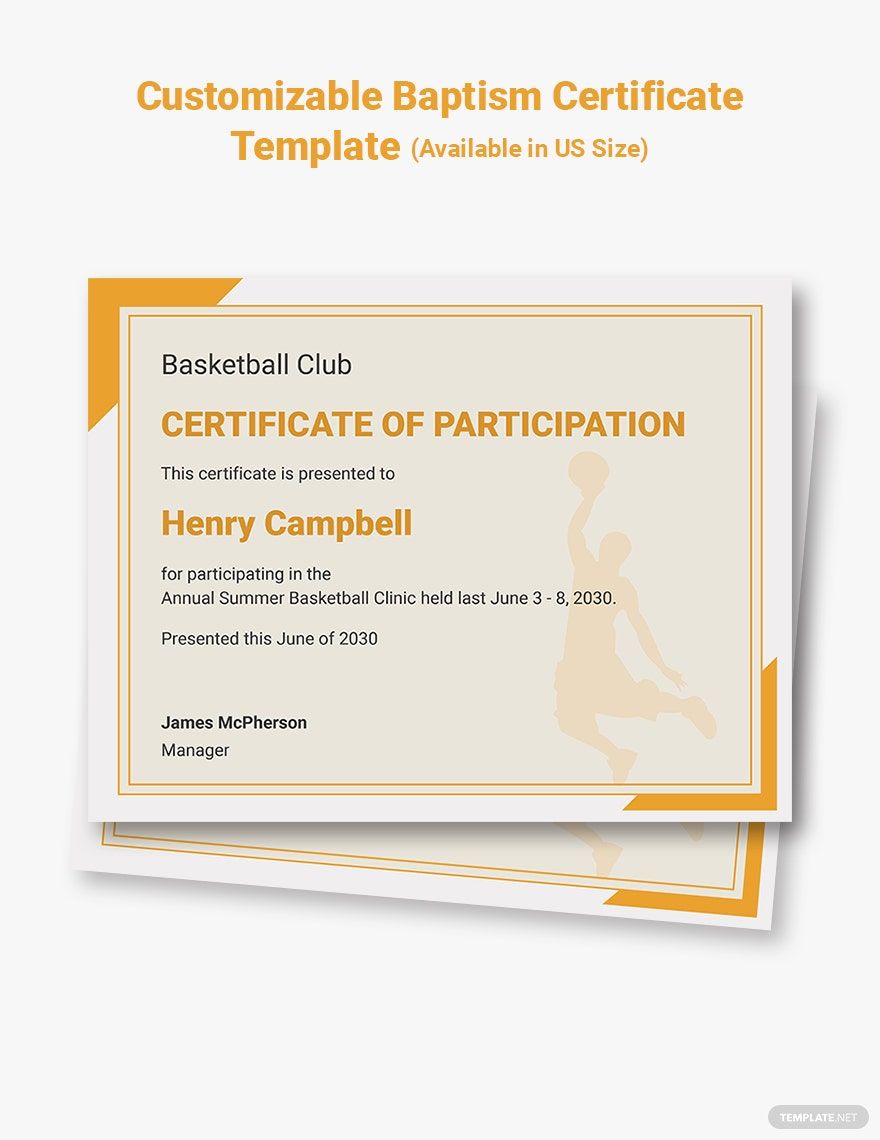
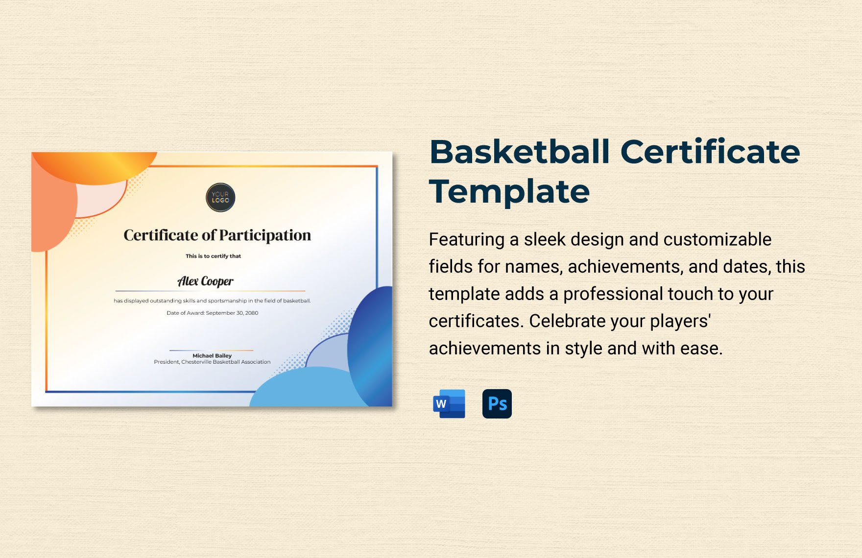
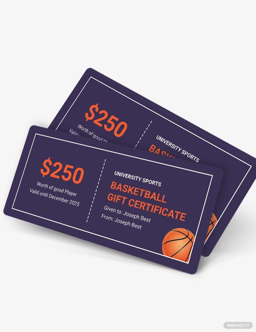
Winning is not constant and losing is a natural occurrence in any competition. However, teamwork and dedication go hand in hand and are a perpetual recipe for success. A team that huddles and struggles together have already triumphed even before the start of the ball game. Acknowledge effort and reward unfailing diligence with our topnotch selection of Basketball Certificate Templates in MS Word. These high-quality and easily editable templates are laid with excellent graphic designs in scalable vectors. This permits 100% customization across various devices for easy editing. Avail of our best designs when you take advantage of any of our subscription plans and make them yours today!
How to Make a Basketball Certificate in MS Word
Psychology Today presented how science certifies the fact that appreciation is a vital part of sports. In this article, the author Dr. Bradley Donohue suggested the Reciprocity Awareness method, where an appreciation is extended to another person and the recipient expresses how the compliment is appreciated. This communication technique forges bonds between coaches and players and produces desirable actions and attitudes.
Another way to reinforce appreciation is by handing out certificates and tokens for small successes (e.g., finishing a tough routine, completing training attendance, etc.) This not only produces a positive response but also urges every team player to accomplish other tasks diligently.
1. Determine Your Purpose
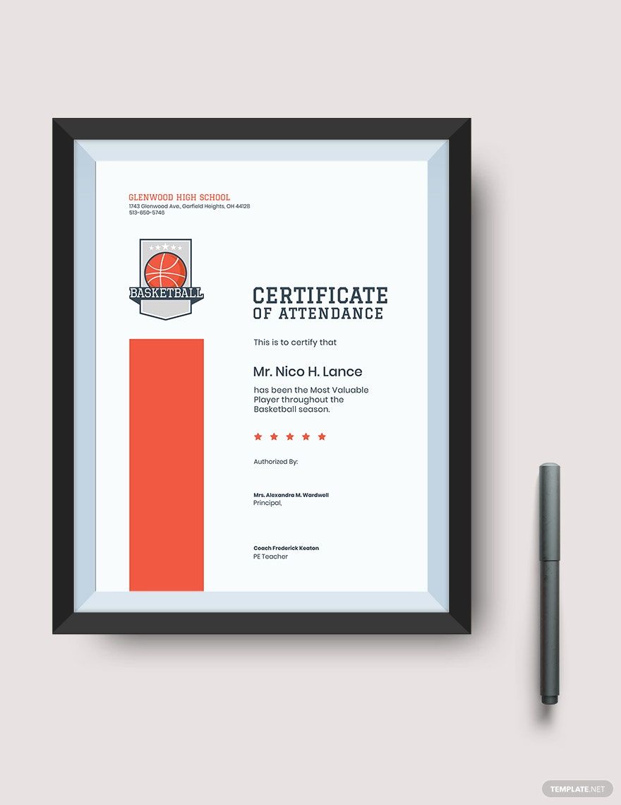
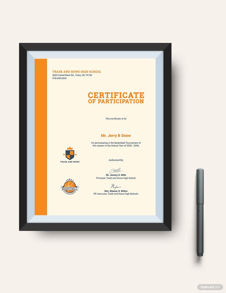
Before designing a basketball appreciation certificate, your first thoughts must include how you would present it visually. This is where deciding what purpose your output will serve becomes essential. This will not only guide you on what context to write, but it will also direct you on what theme your layout should follow. You might want to differentiate the designs for the most valuable player, overall team champion, and the participation appreciation certificates. If it’s a neighborhood basketball tournament, you can use a basic certificate with an added sports theme.
2. Layout According to Theme
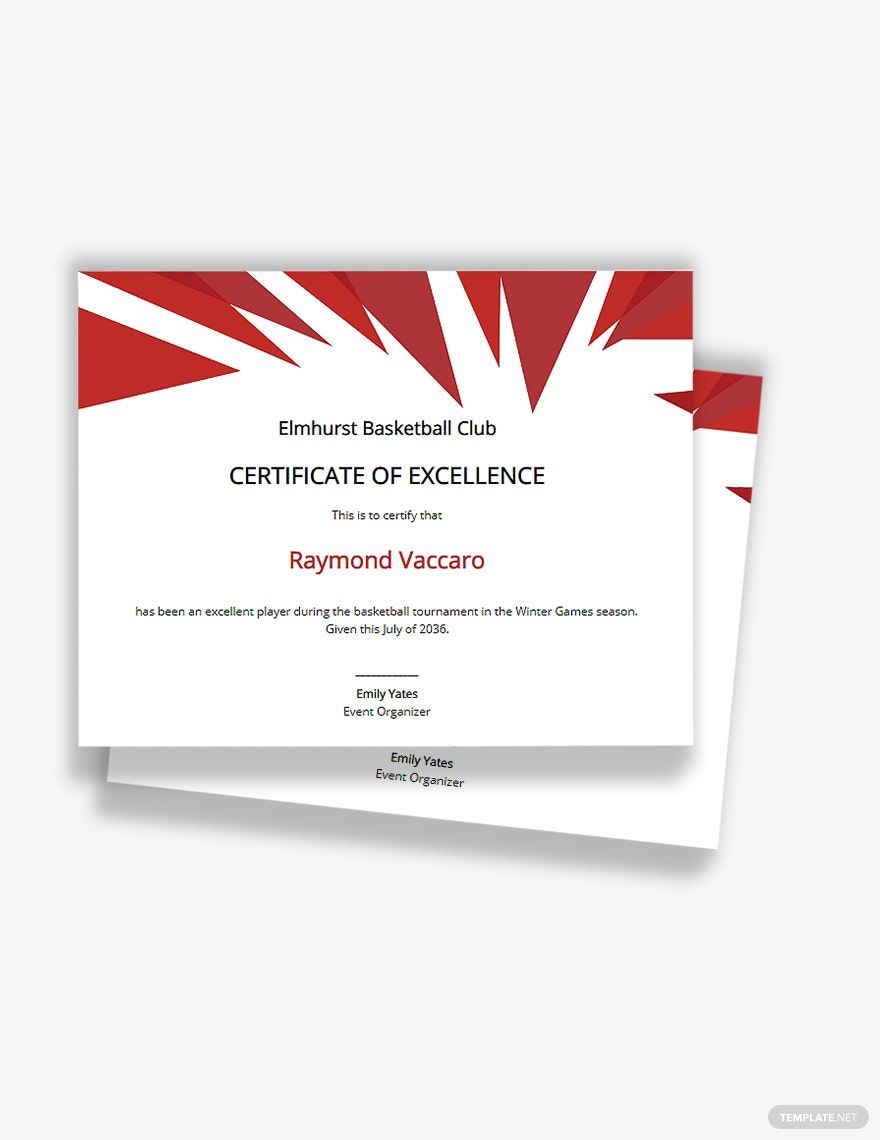
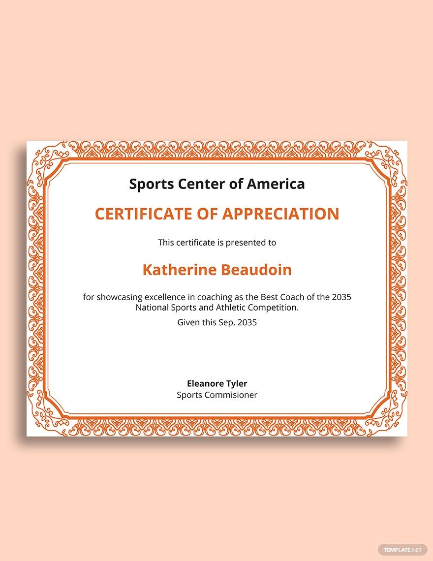
Don’t stray away from your planned theme and purpose. Make it your blueprint and gather your graphic ideas from the topic. If it is intended to be given at a state championship, go out of your way to make it worthy of its title by adding a professional and elegant touch of metallic streaks against muted or classic tones. If it is a children's basketball clinic, layout your canvas with artworks and colors that attract the eyes of young ones. If the event has a designated motif or color scheme, it is ideal that you apply these designs to identify the achievement certificate with the occasion.
3. Aim to be Minimal
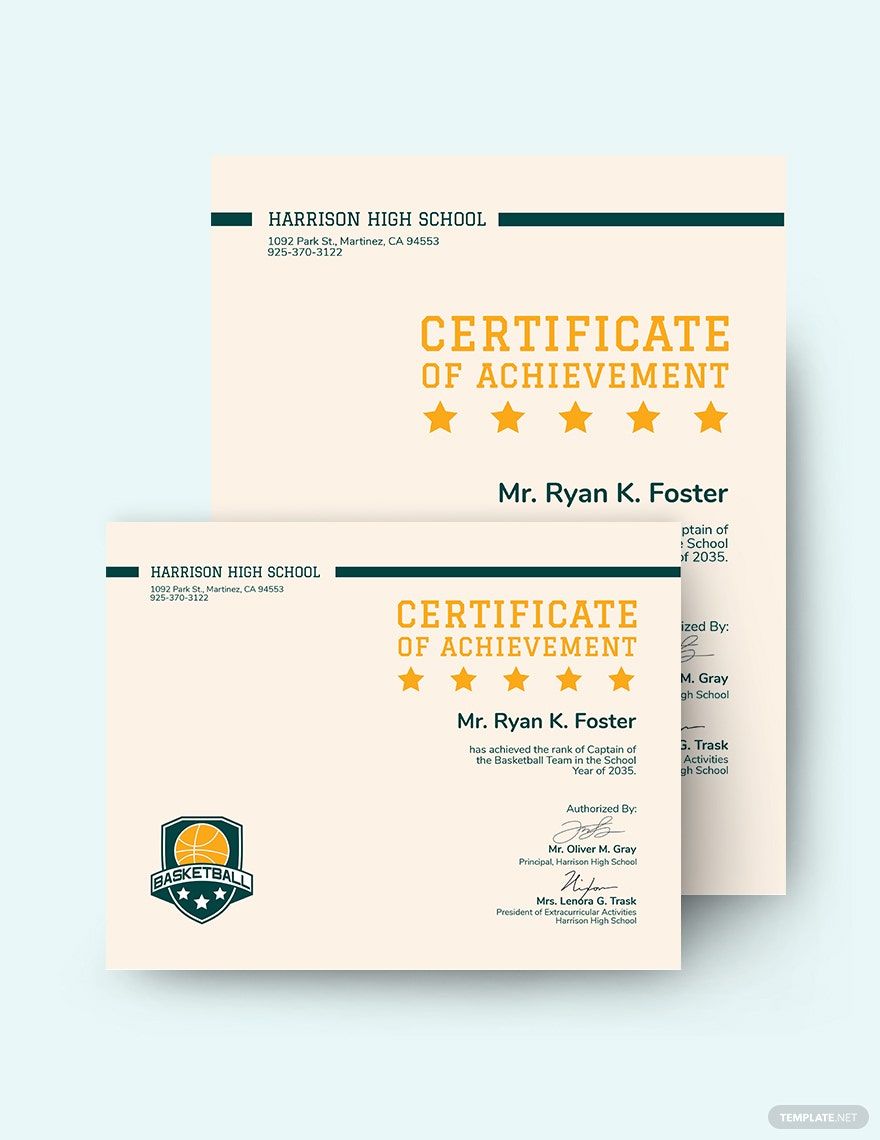
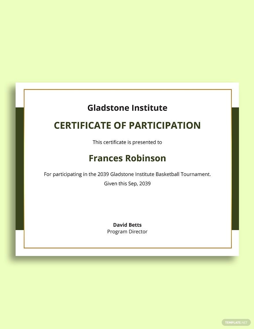
Avoid wordiness. An award certificate is a memento of an achievement, not a reading material. Stick to what’s essential. The layout should be spacious and the font should be large enough to be visible at a display. Limit your typeface choices up to two selections only and highlight important details with a larger and heavier font. The large spaces from the border to the context don’t only make it legible for viewing but also gives a touch of class to the certificate.
4. Employ a Certificate Template
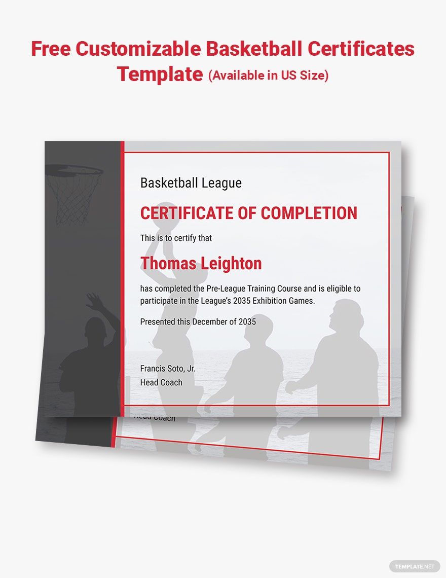
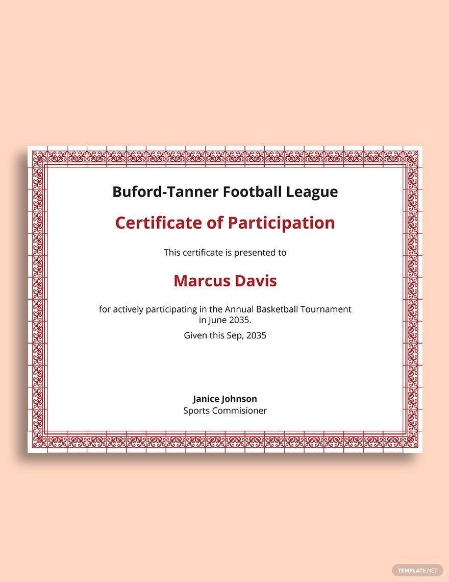
Instead of having to start from scratch and take up a huge amount of your time, why not take advantage of a creative certificate template? If you do, consider the ones offered on our website. They come in a complete set of a professionally curated graphic outline with all the needed borders, shades, and font styles. They also come with original suggestive content that you can edit to incorporate personal details. Choose a template that goes perfectly with your purpose and theme so you’ll only need to alter the content. Using a template will help assure a superb output minus the stress.
5. Be Meticulous with the Details
Every disaster involving a sports certificate presentation involves misspelled names or words. Incidents like this would be very humiliating and awkward for both the presenter and the recipient. Review the written content and make sure that everything is spelled correctly most especially the recipient's name. Since certificates are meant to be displayed for everyone to see, make quality the top priority.