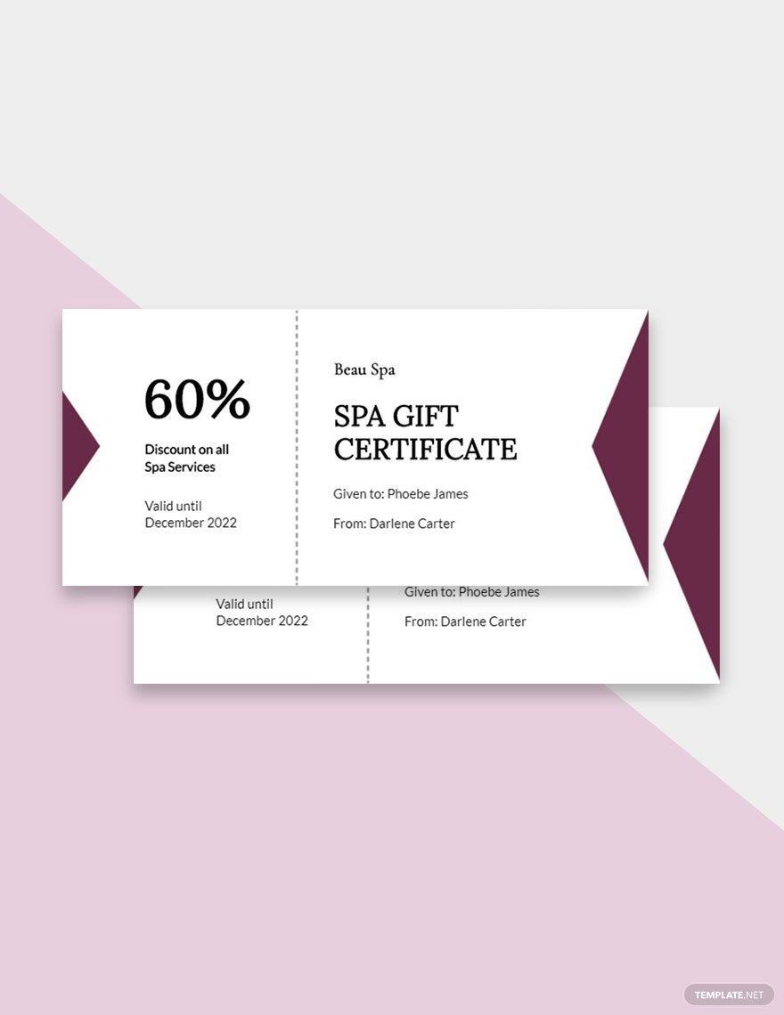
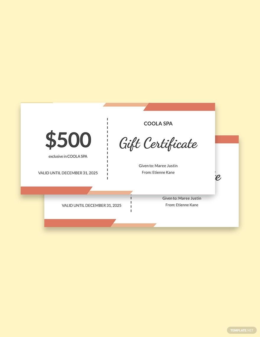
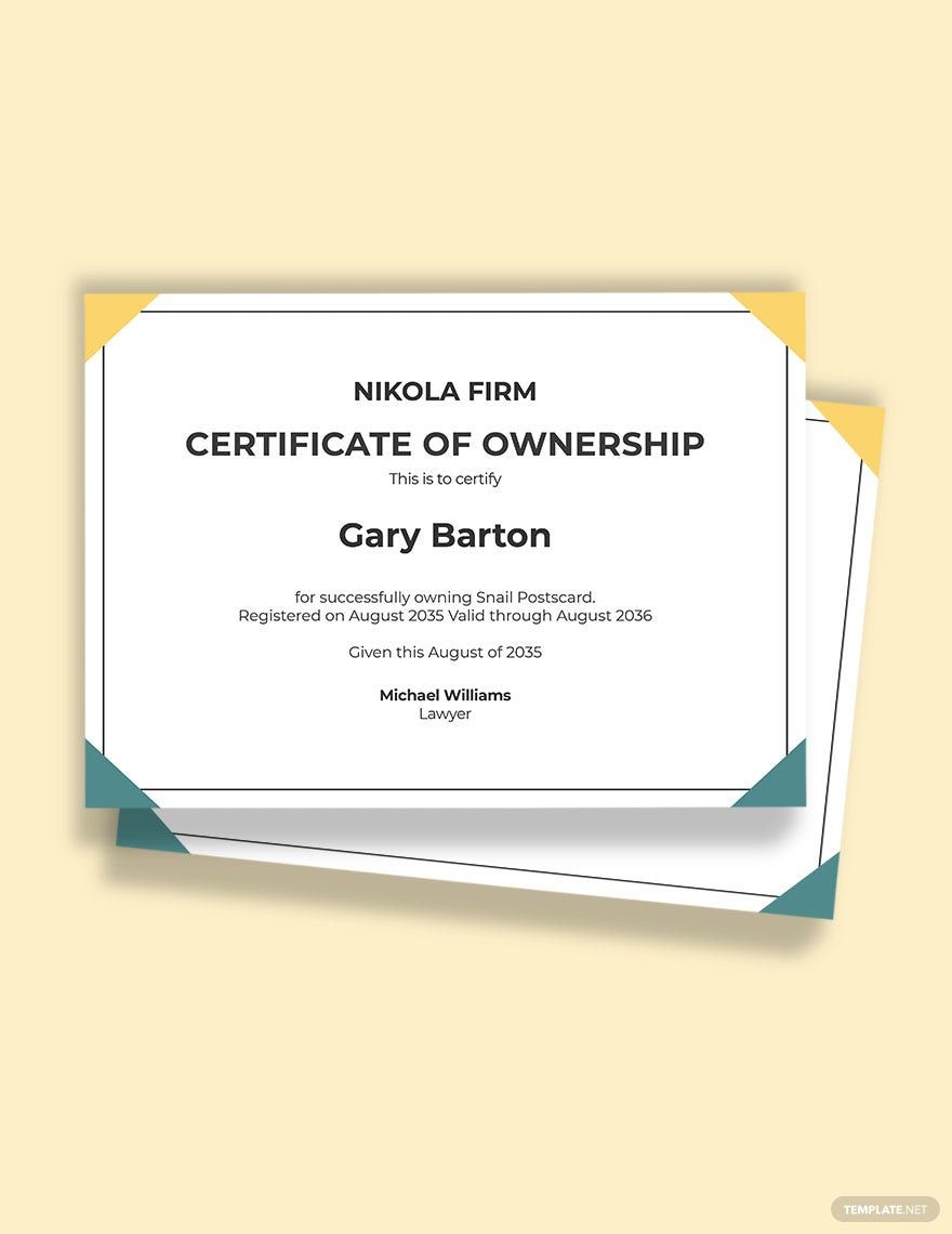
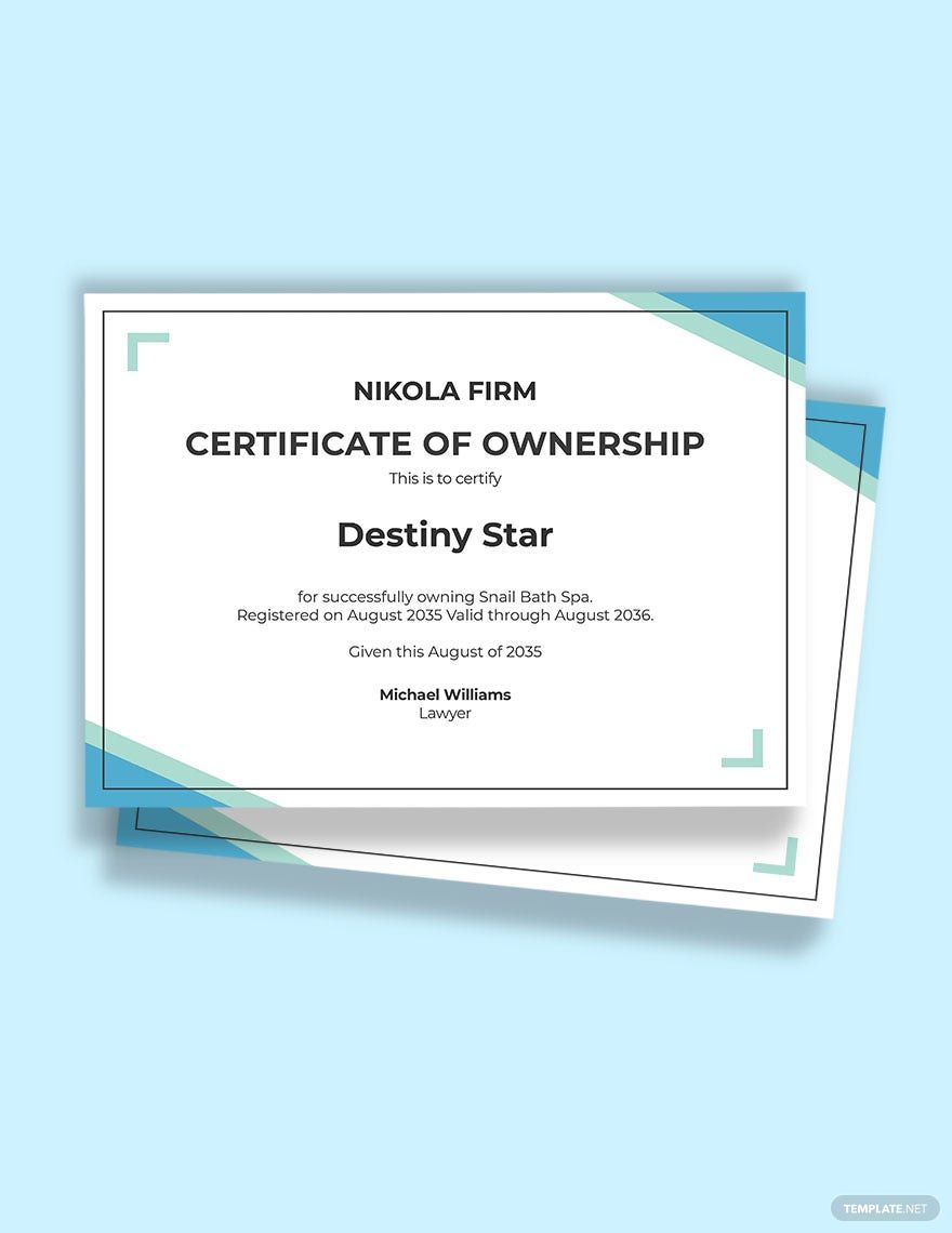
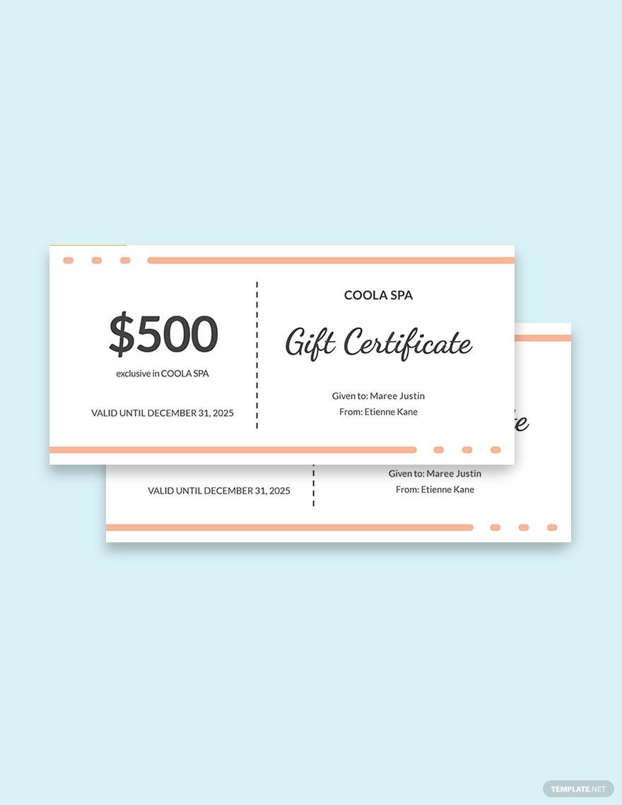
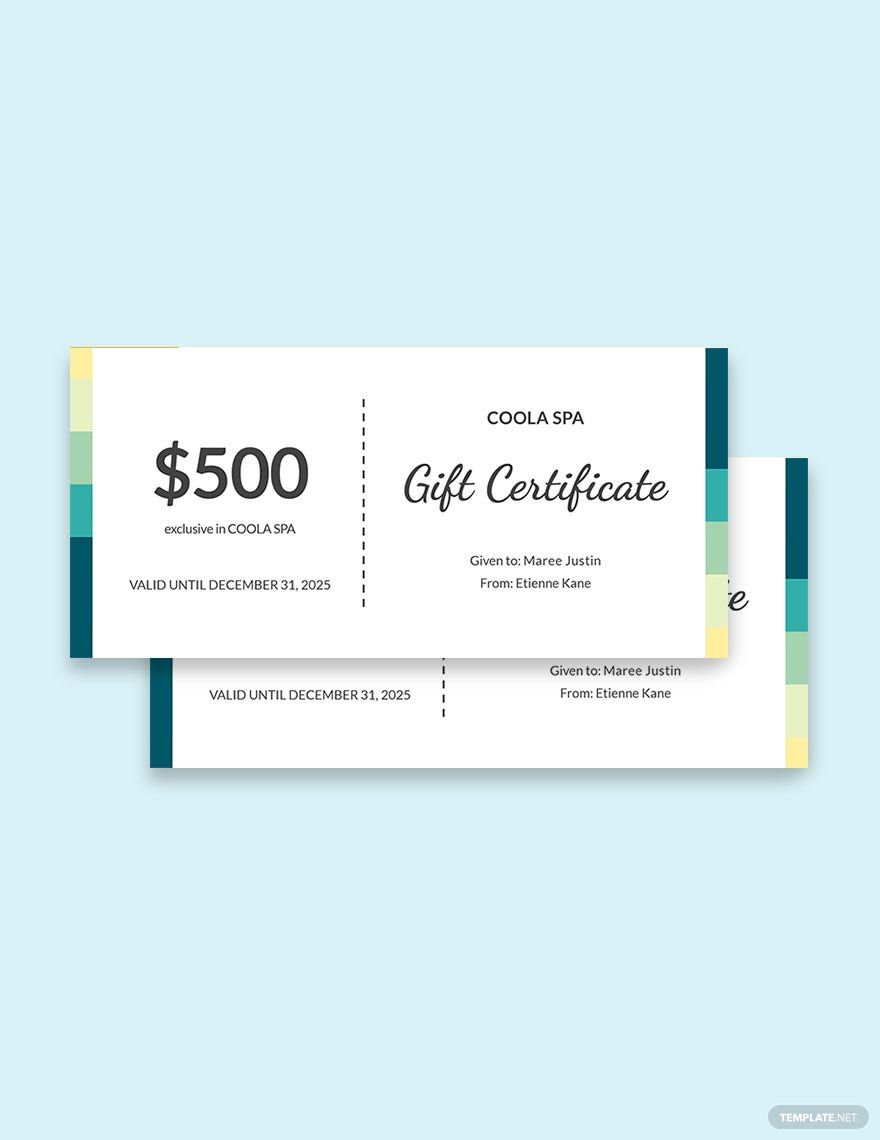
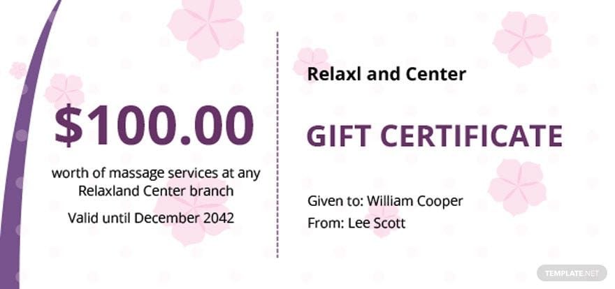
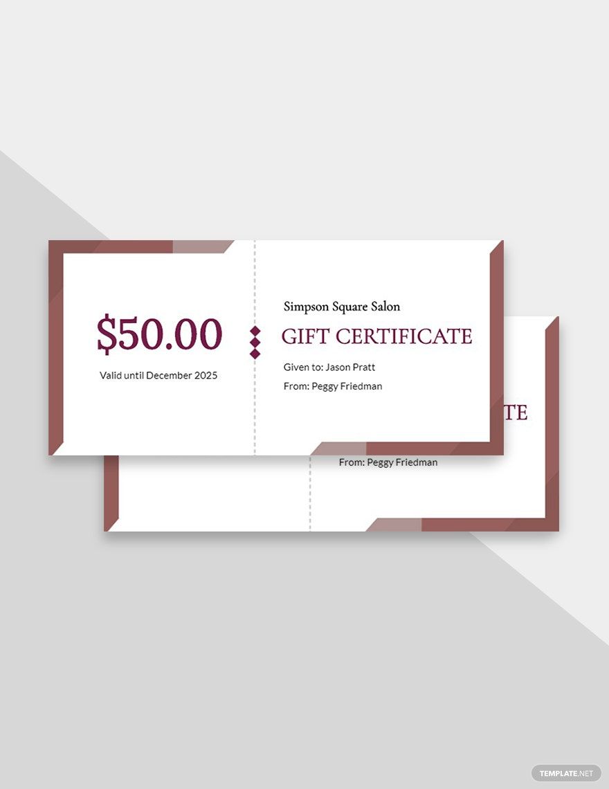
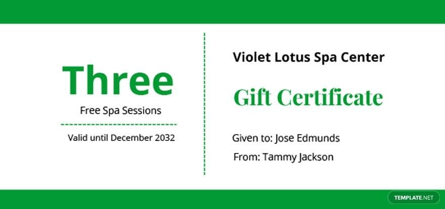
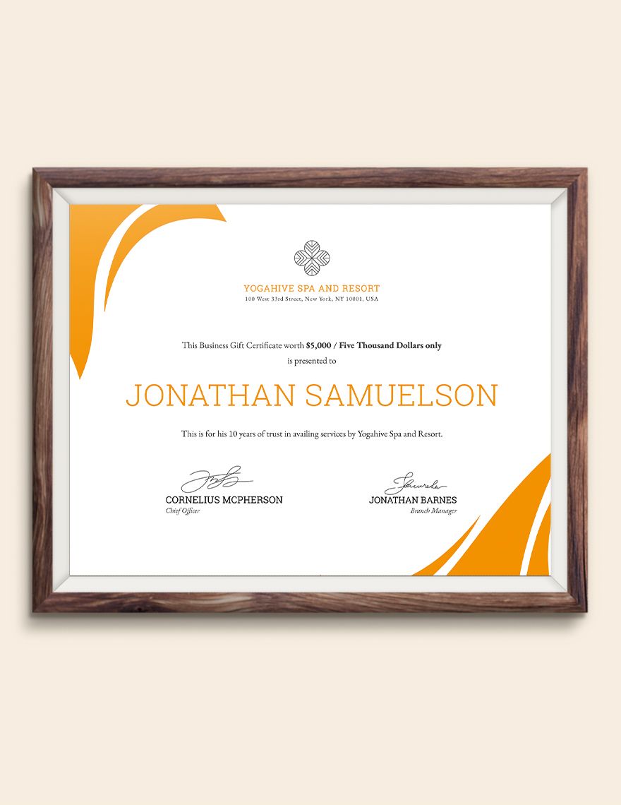
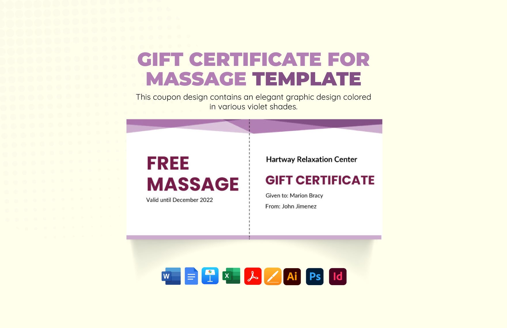
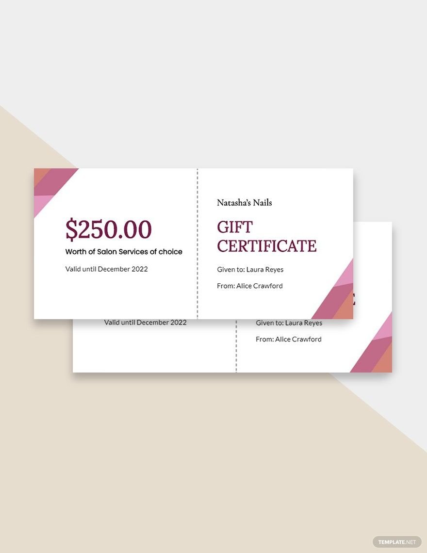
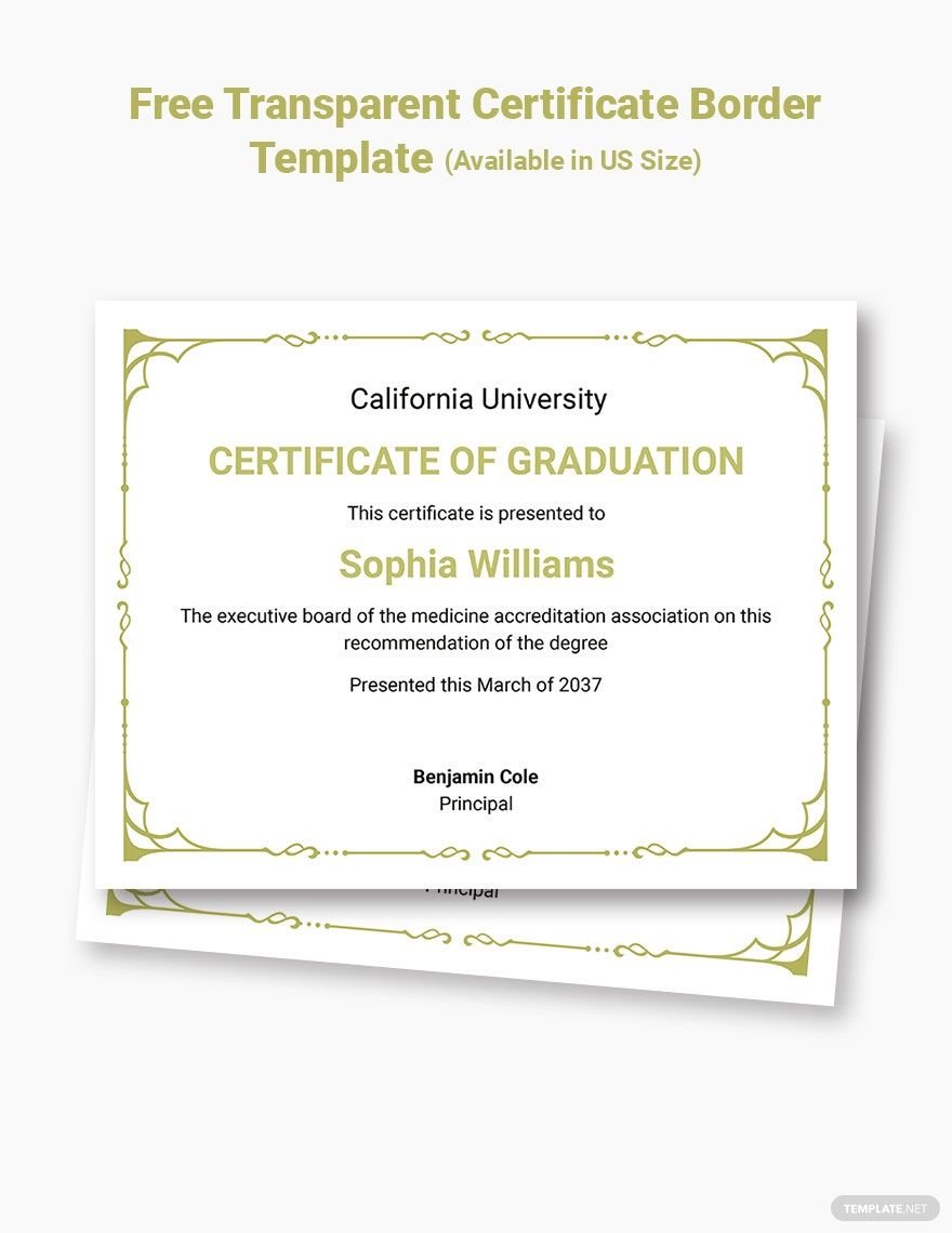
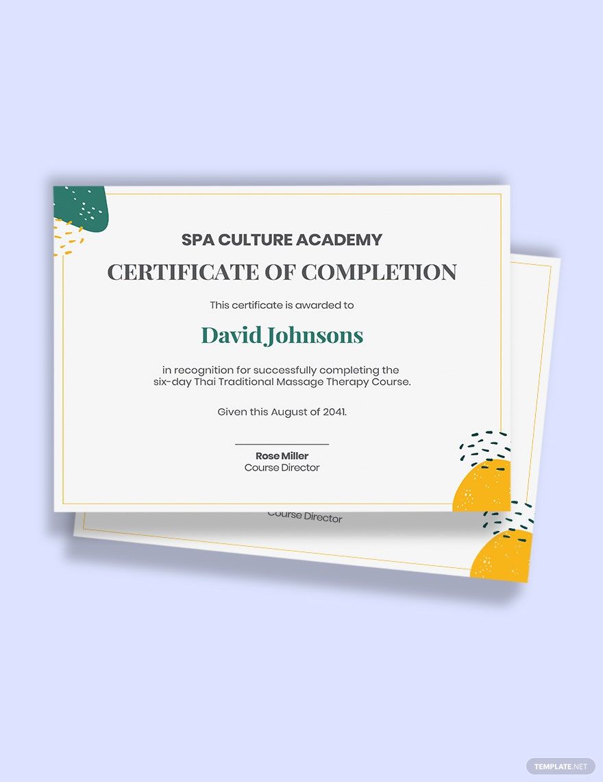
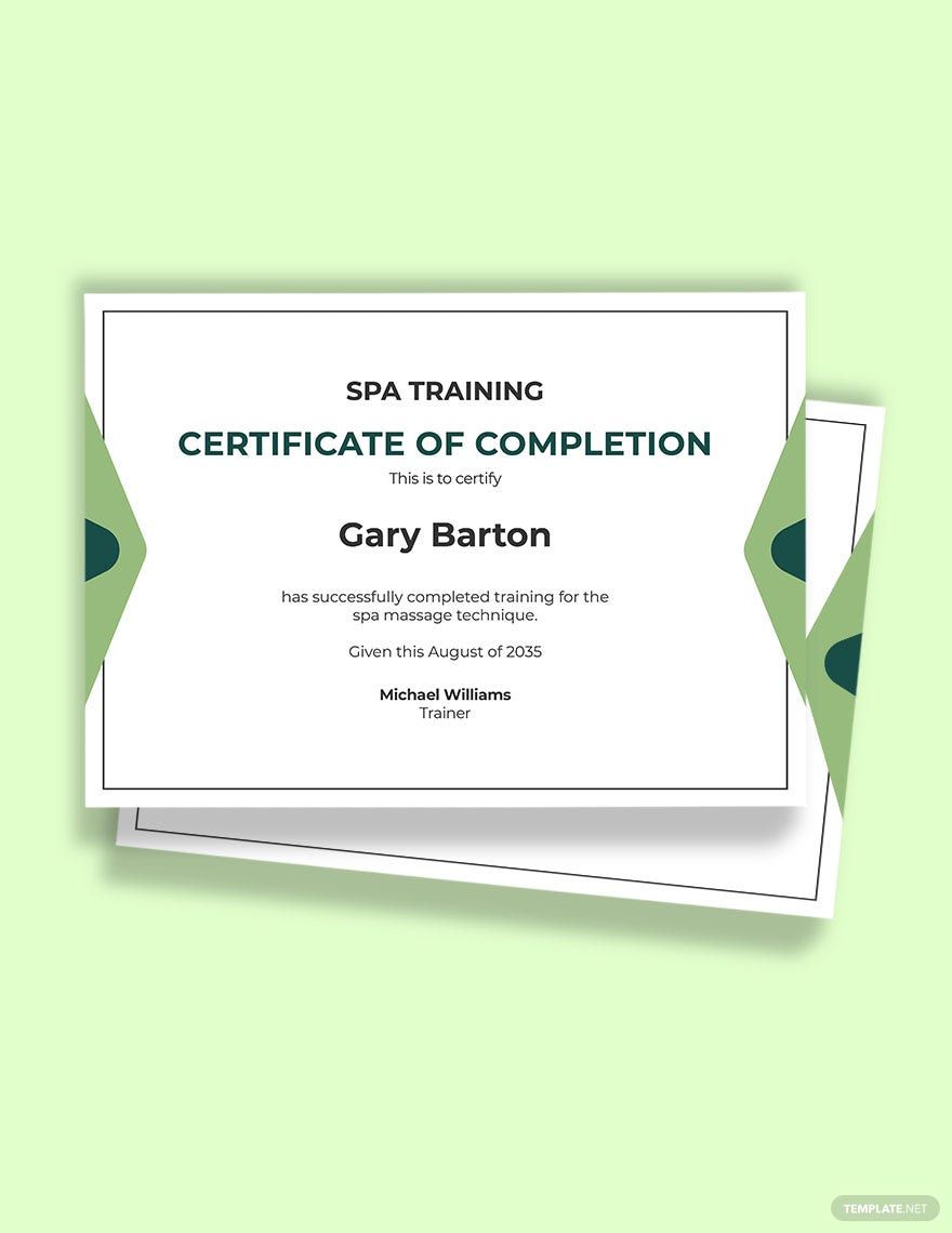
Certificates are useful for both presenting credibility or proof, and marketing. Your spa business can make use of certificates to gift your loyal clients discounts or salon credits for massage and other wellness services. Our ready-made Spa Certificate Templates in Microsoft Word are perfect if you have novice editing skills. These templates are complete with royalty-free artworks, creative font style, and professional format that you can use to highlight your brand and services. With its easily customizable feature, you can change these templates to suit your standards. Using these templates guarantee that you can create a fantastic certificate to market your spa business. Get these printable templates today!
How to Create a Spa Certificate in Microsoft Word
Just like a gift card, a gift certificate gives customers value or store credit that they can spend to purchase in-store. Gift cards or gift certificates became a thing when Blockbuster invented them in 1994. Twenty-six years later, gift certificates are still an effective marketing strategy for businesses.
If you create one in Microsoft Word, you want to make use of certificates for your spa business. We have some tips below that you can use as a reference when you decide to make your own spa certificate.
1. Use Your Branding Wisely
Branding is not only your business name and logo; it also includes your brand positioning and purpose. In your certificate, you can add a slogan to establish what position you want to take, i.e., give back to the community through discounts. You can also use images to support goals and purposes.
2. Find the Balance between Design and Texts
Although design elements are essential in making your spa certificate more appealing, they should not overshadow the details that are relevant to the purpose of the certificate. Find a balance with the position and amount of designs and texts to include. If you want to highlight your details more, you can use line illustrations and other simple yet attractive designs to make it more artistic.
3. Use a Simple Layout
The more complicated the layout, the more you make your certificate challenging to read. There must be a continuous flow with your designs and texts to ensure details are easily understandable. Avoid using up too much space when there is only little to include; leave some white space to make the details flow more smoothly.
4. Create a Visual
Creating a visual is related to finding a balance with your designs and texts. You can elevate your certificate by knowing how to mix colors to achieve an eye-catching look. You can also use images and icons to present your purpose stylishly.
