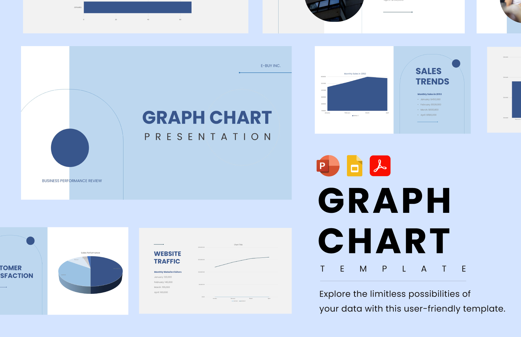
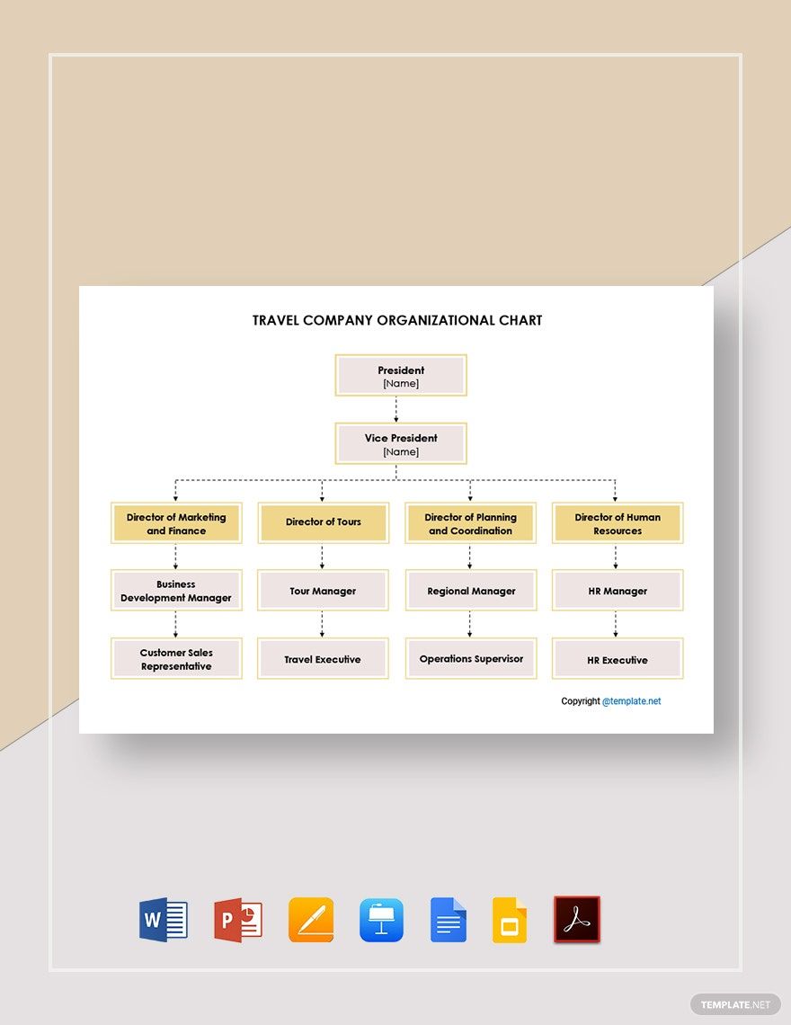
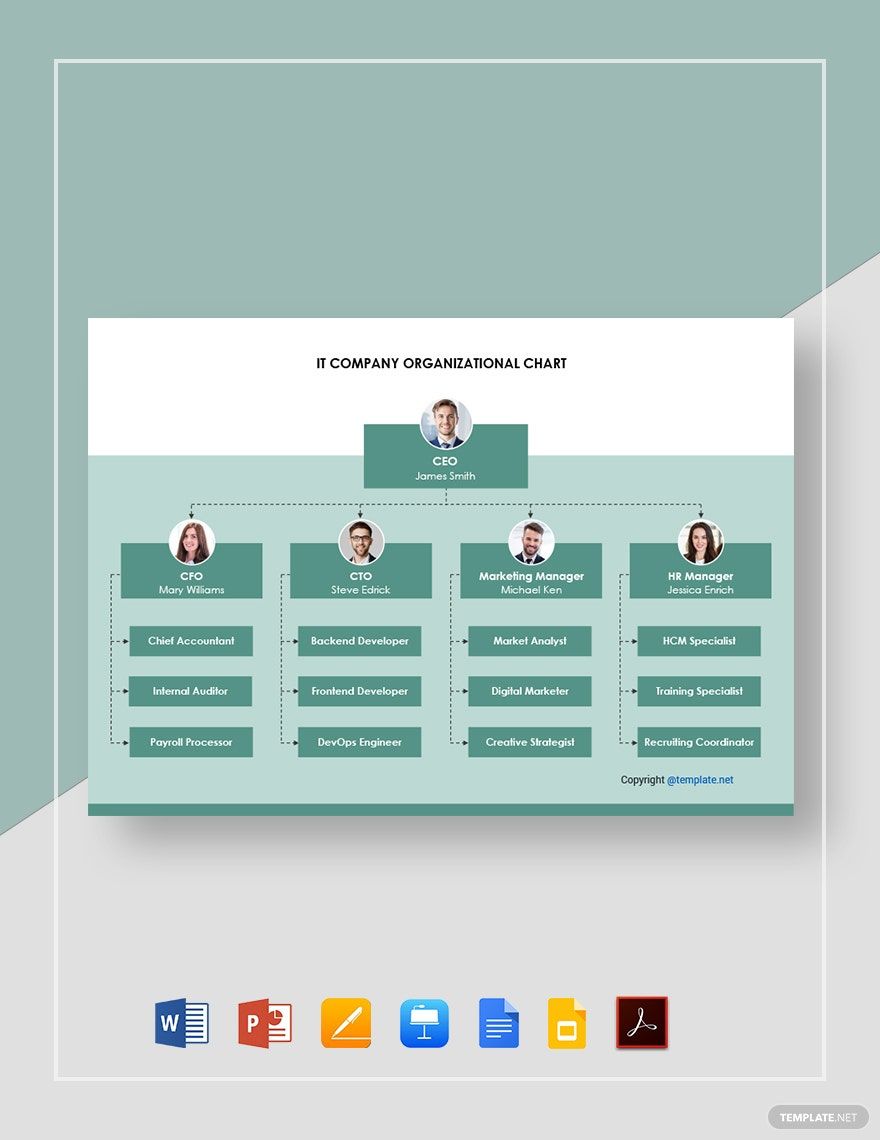
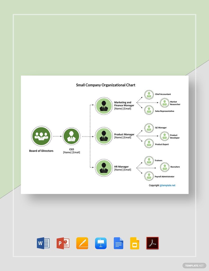
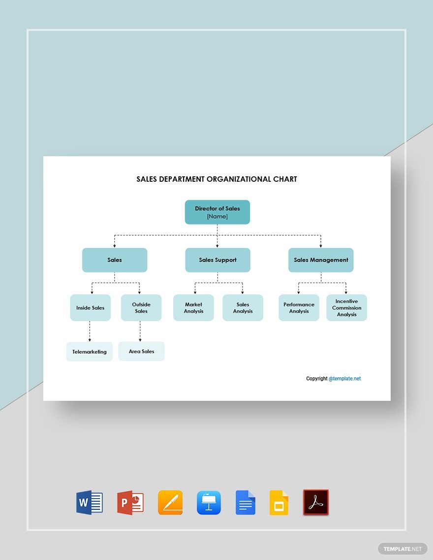
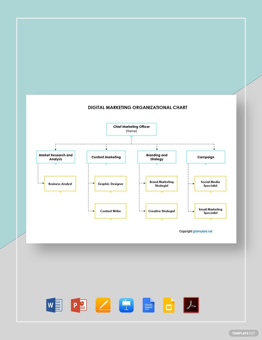
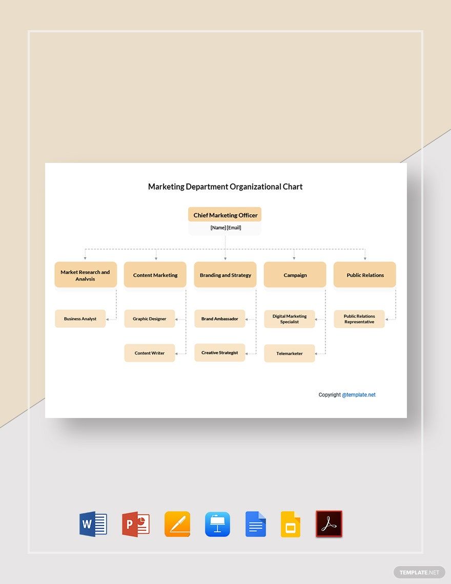
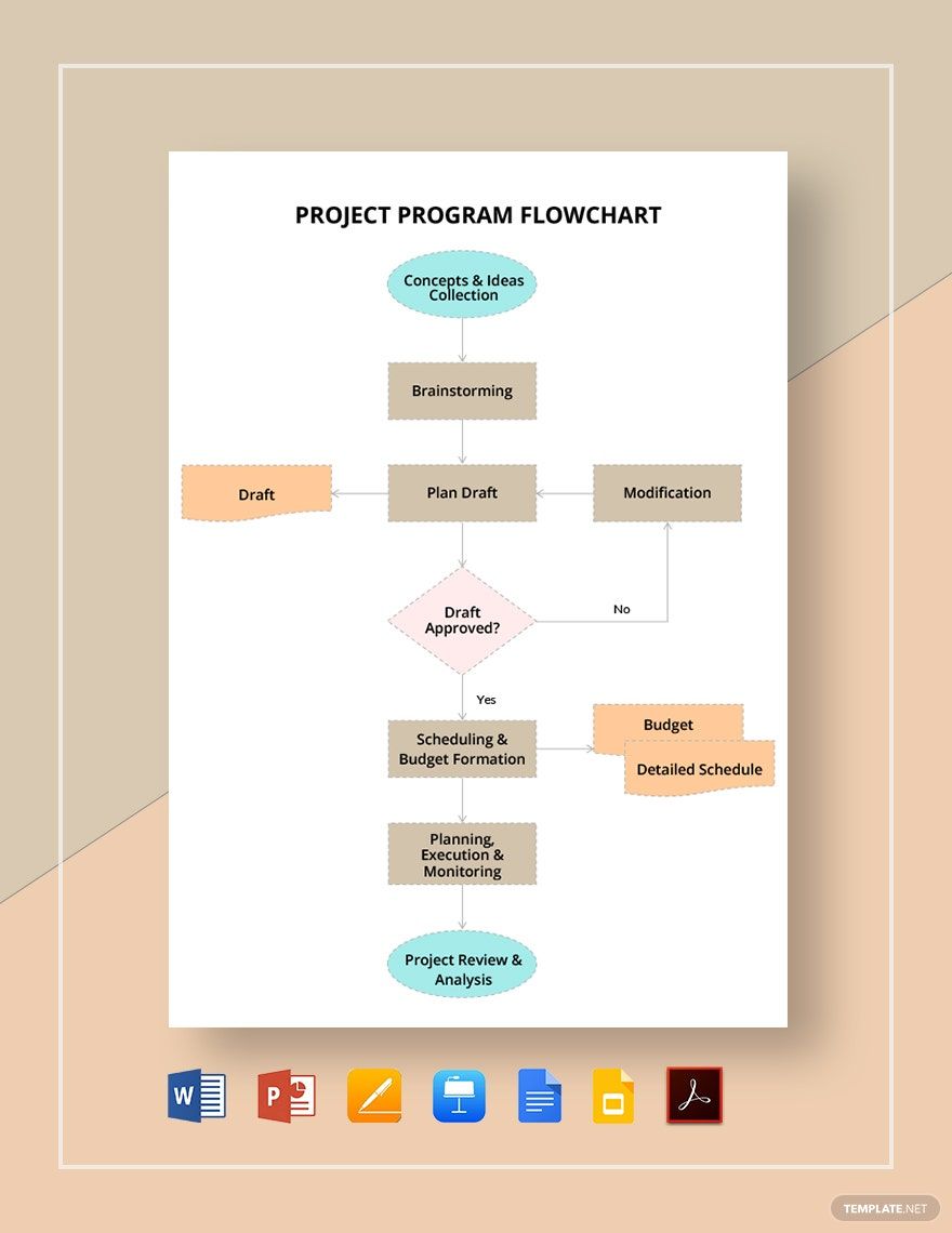
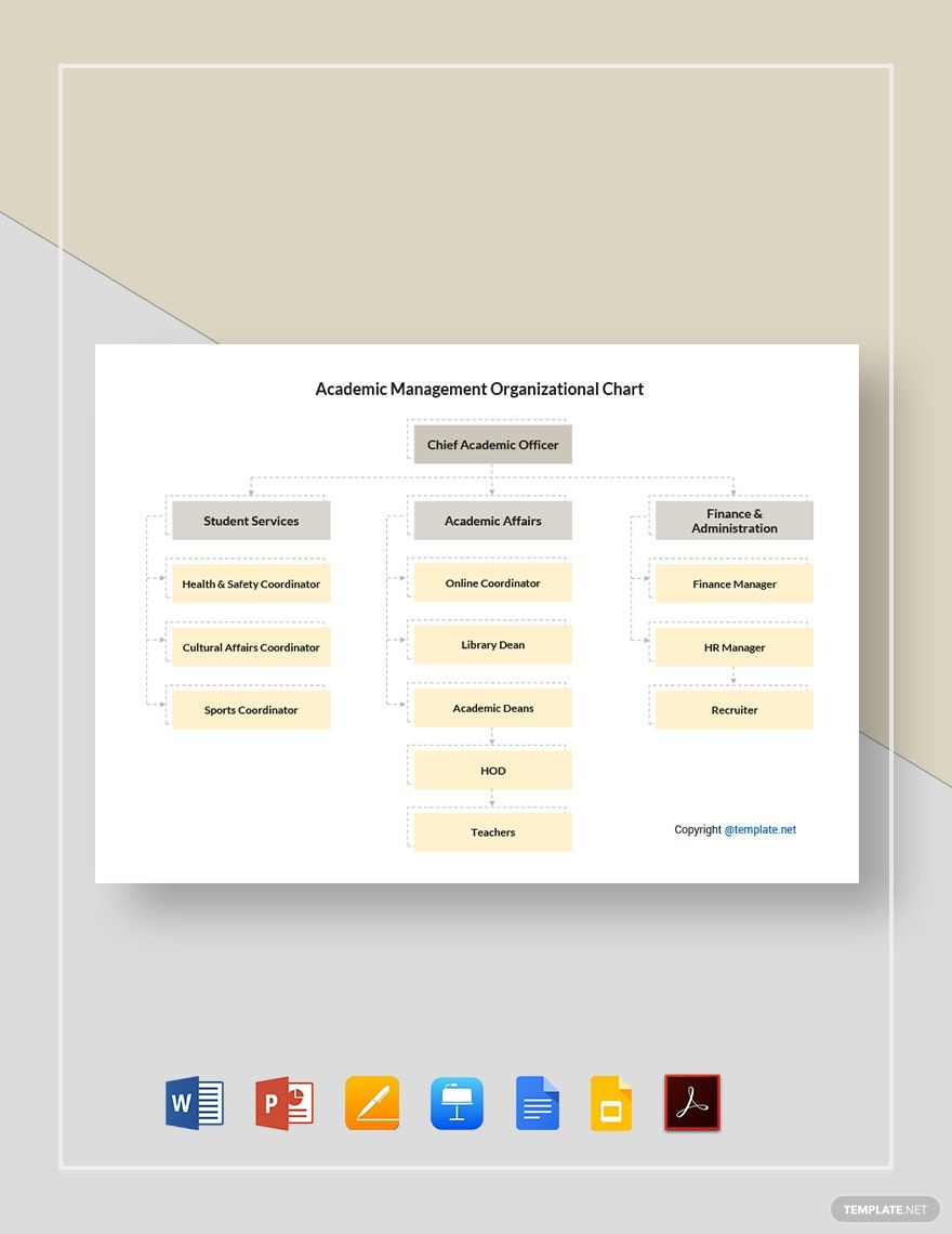
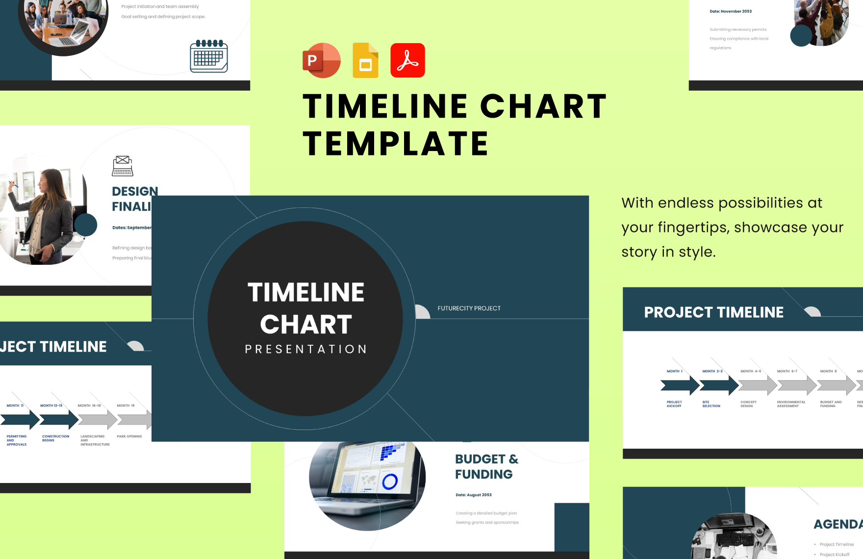
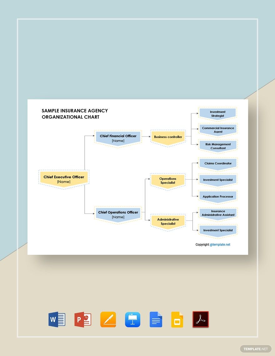
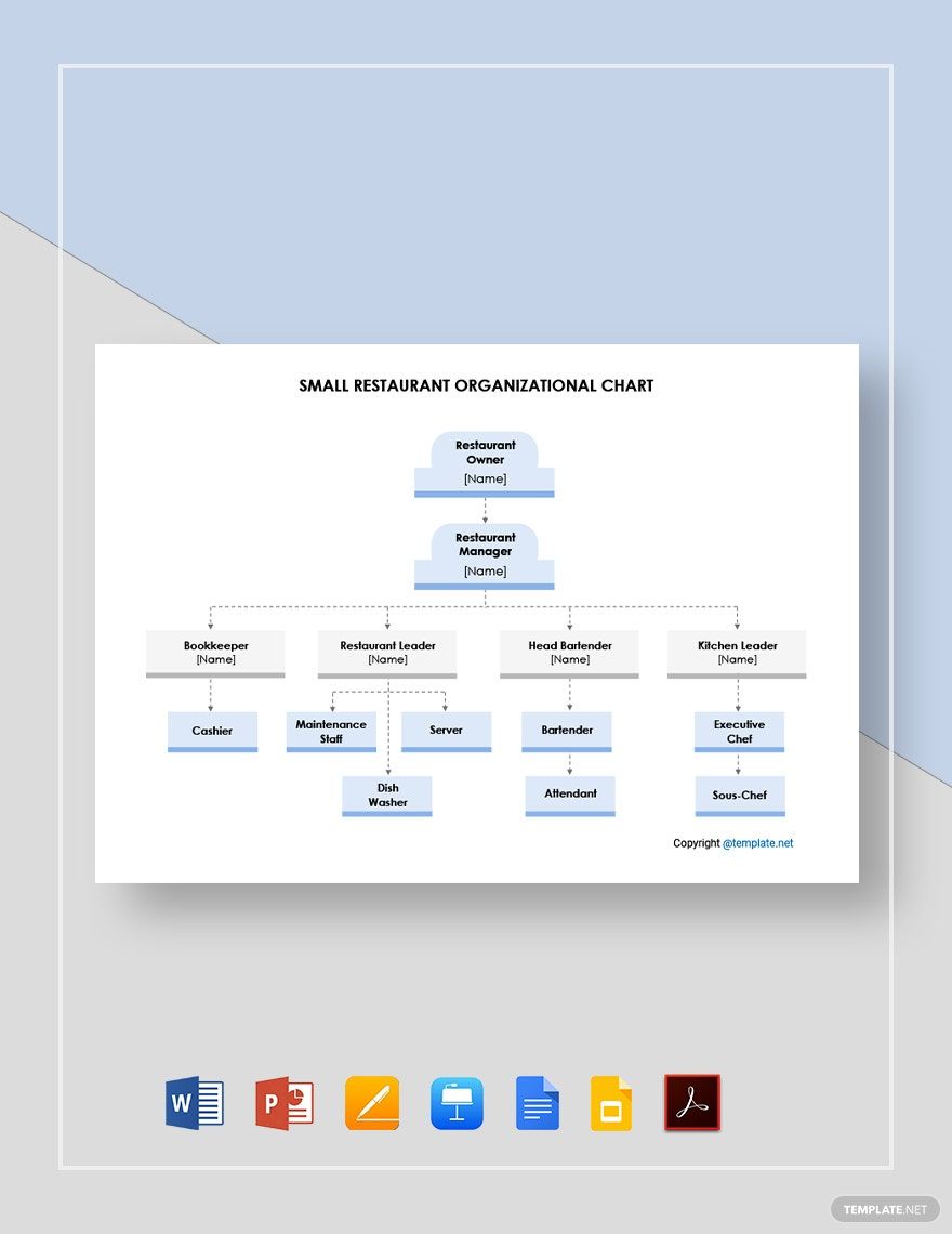
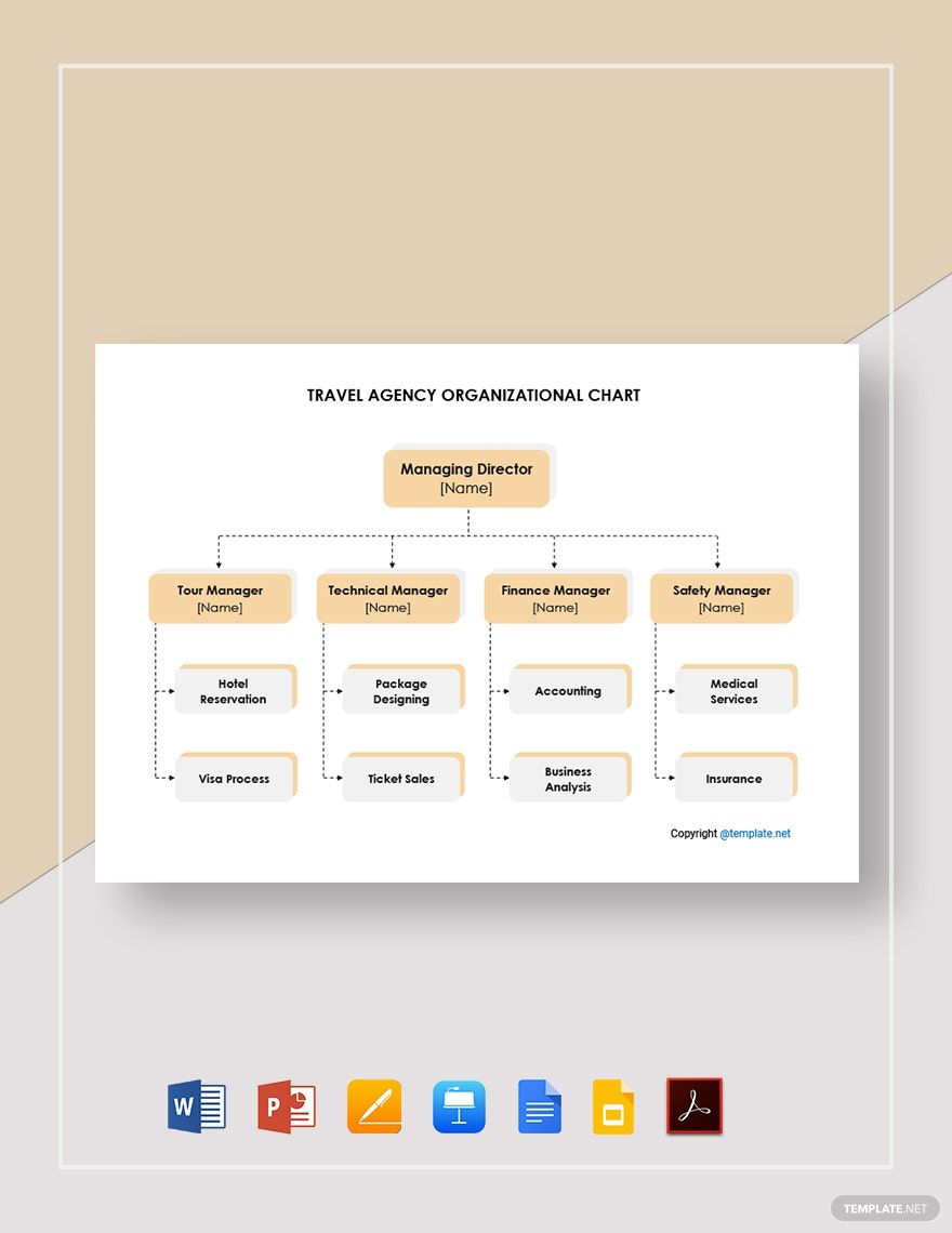
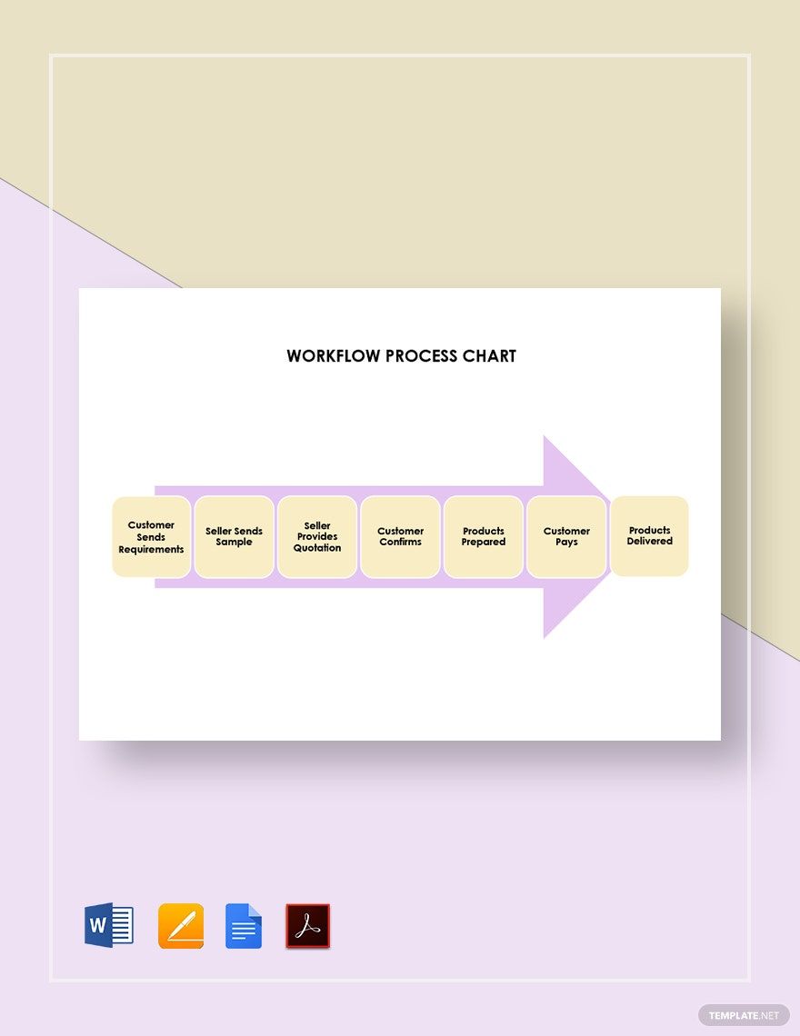
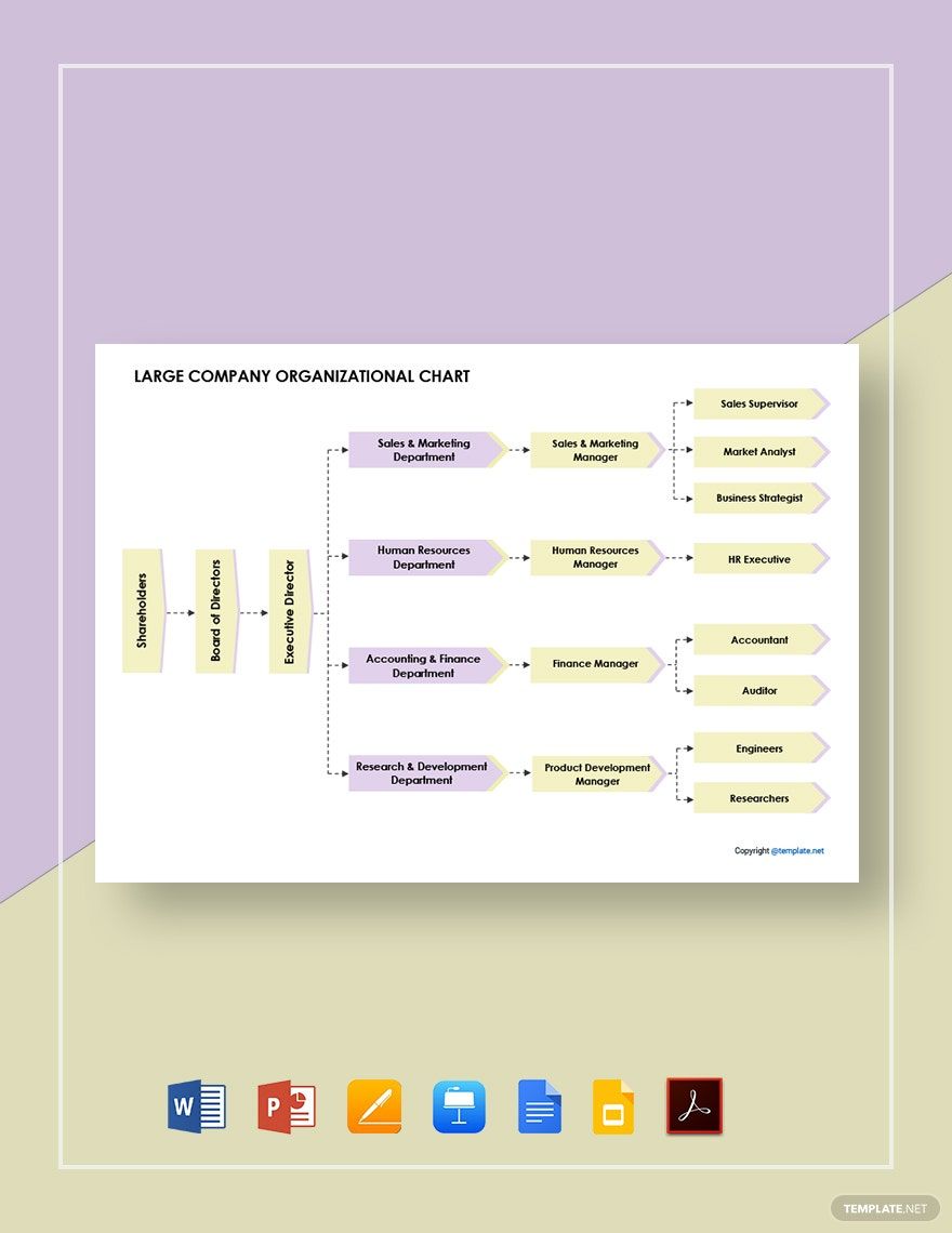
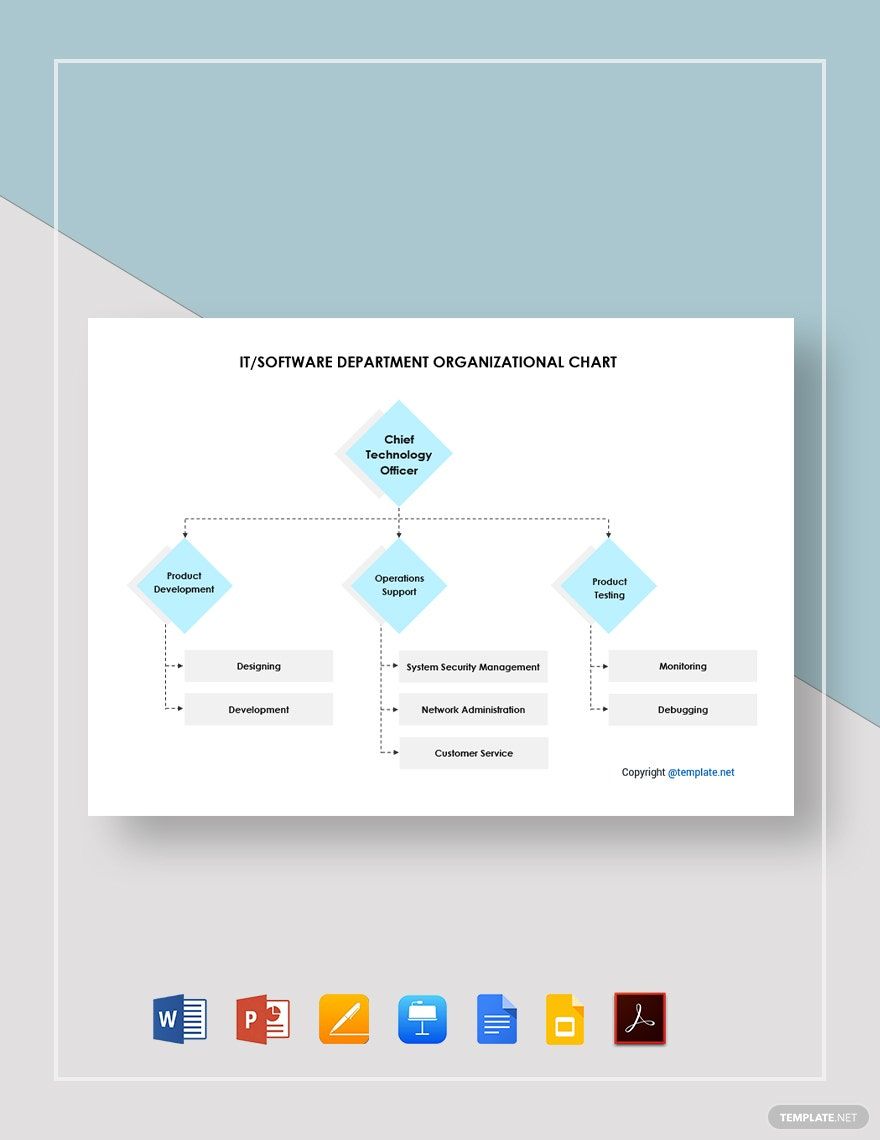
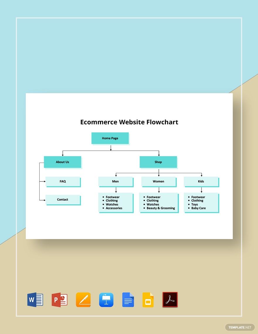
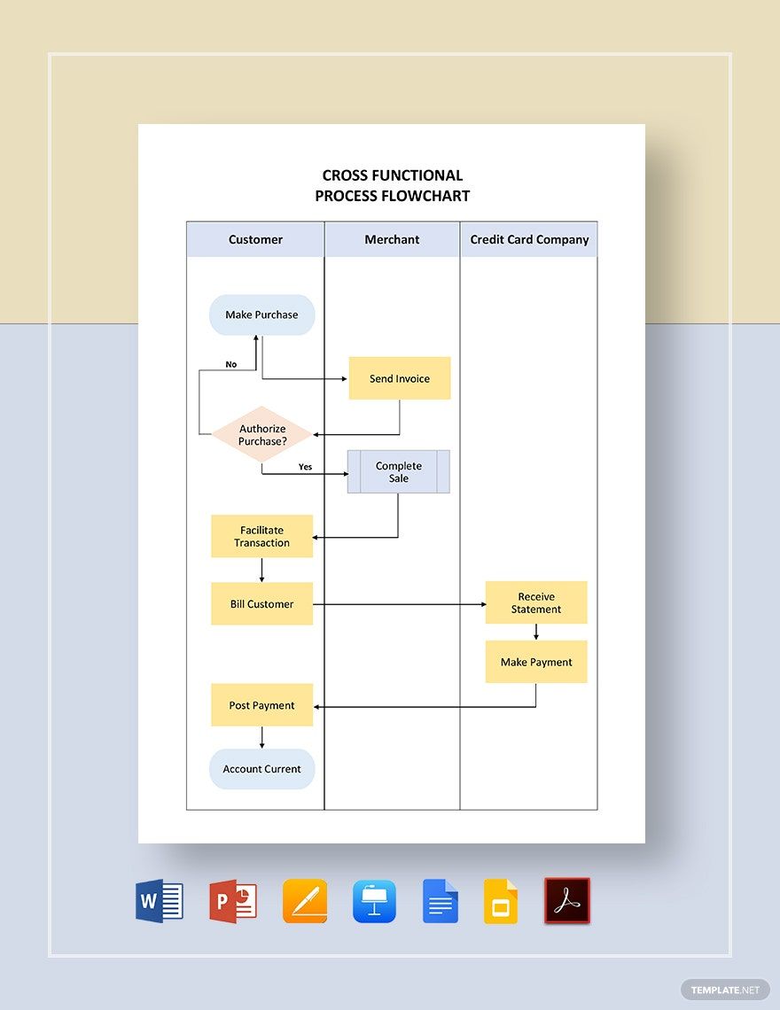
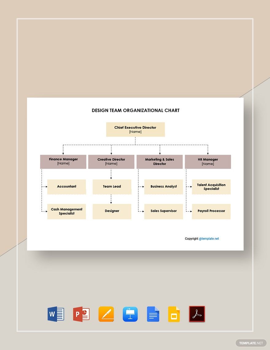
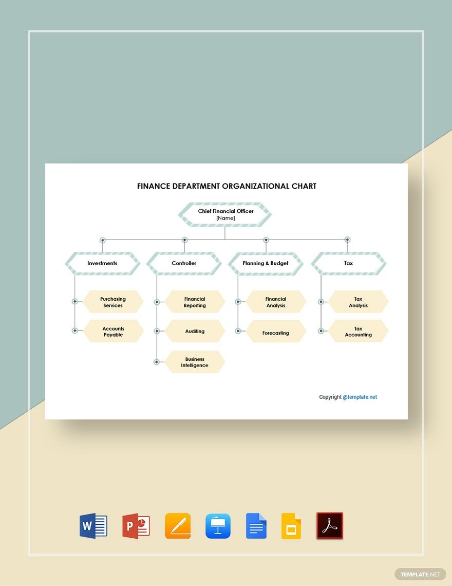
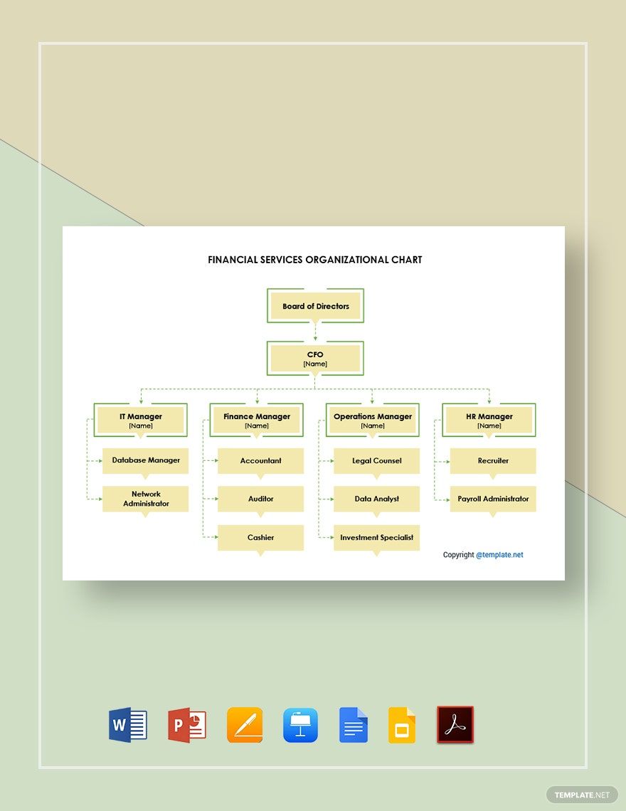
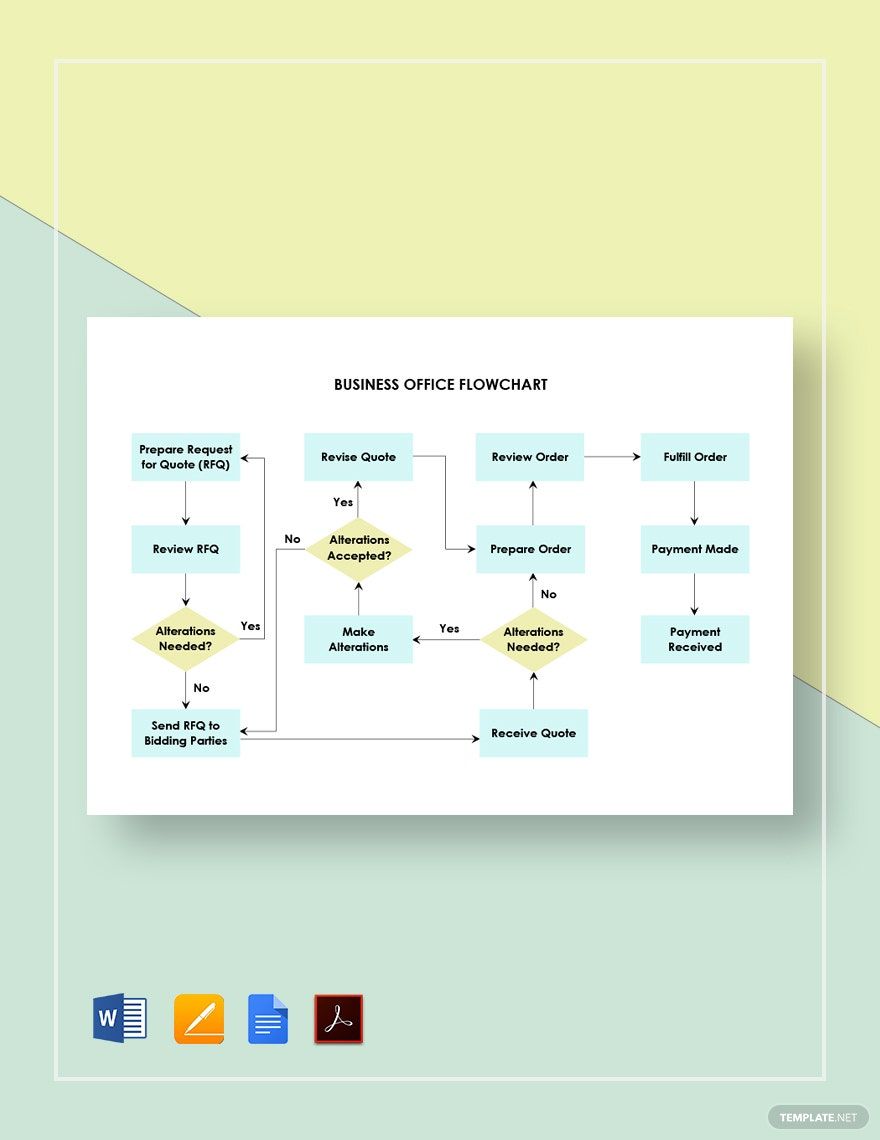
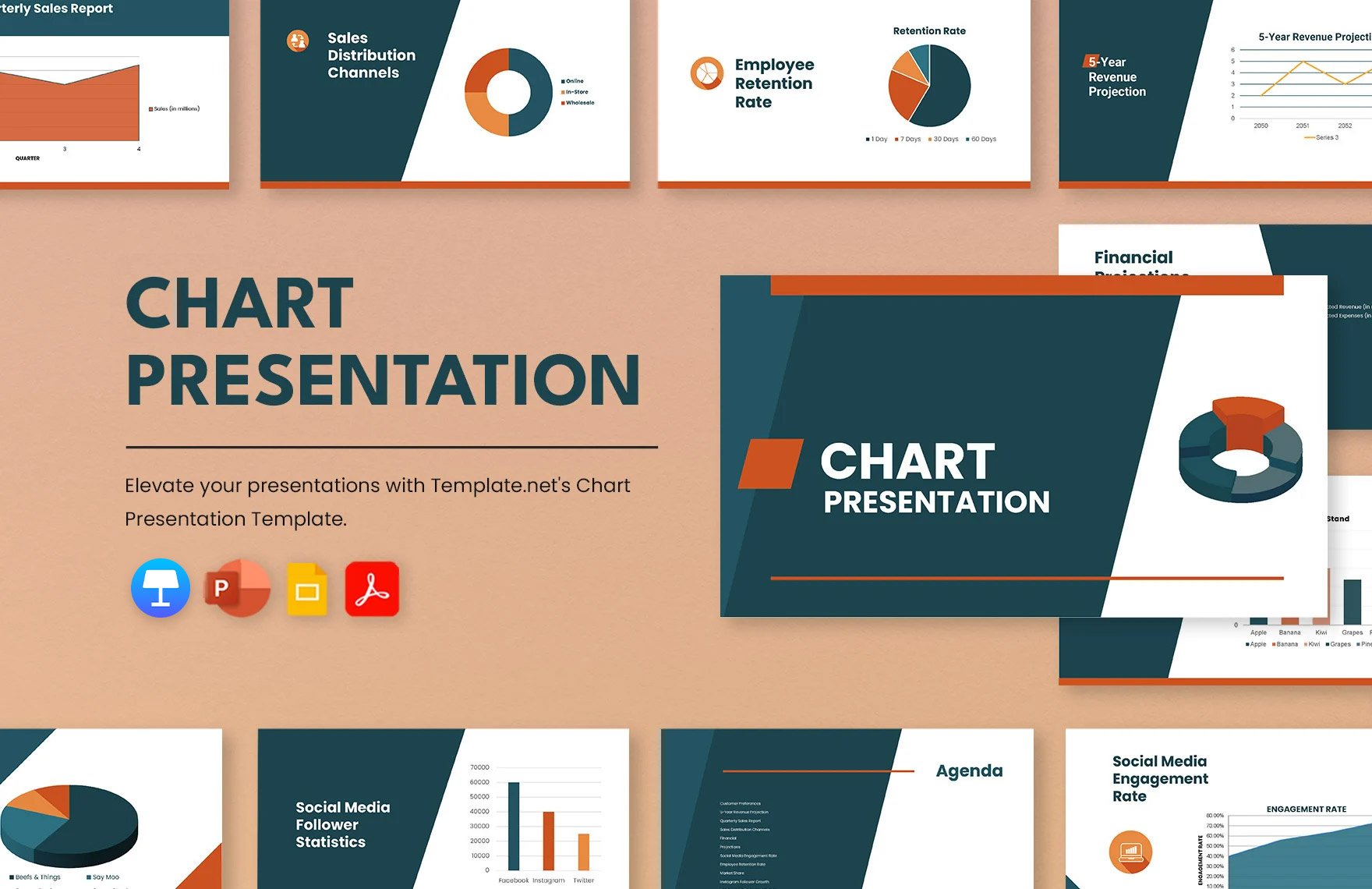
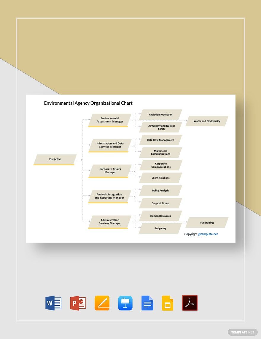
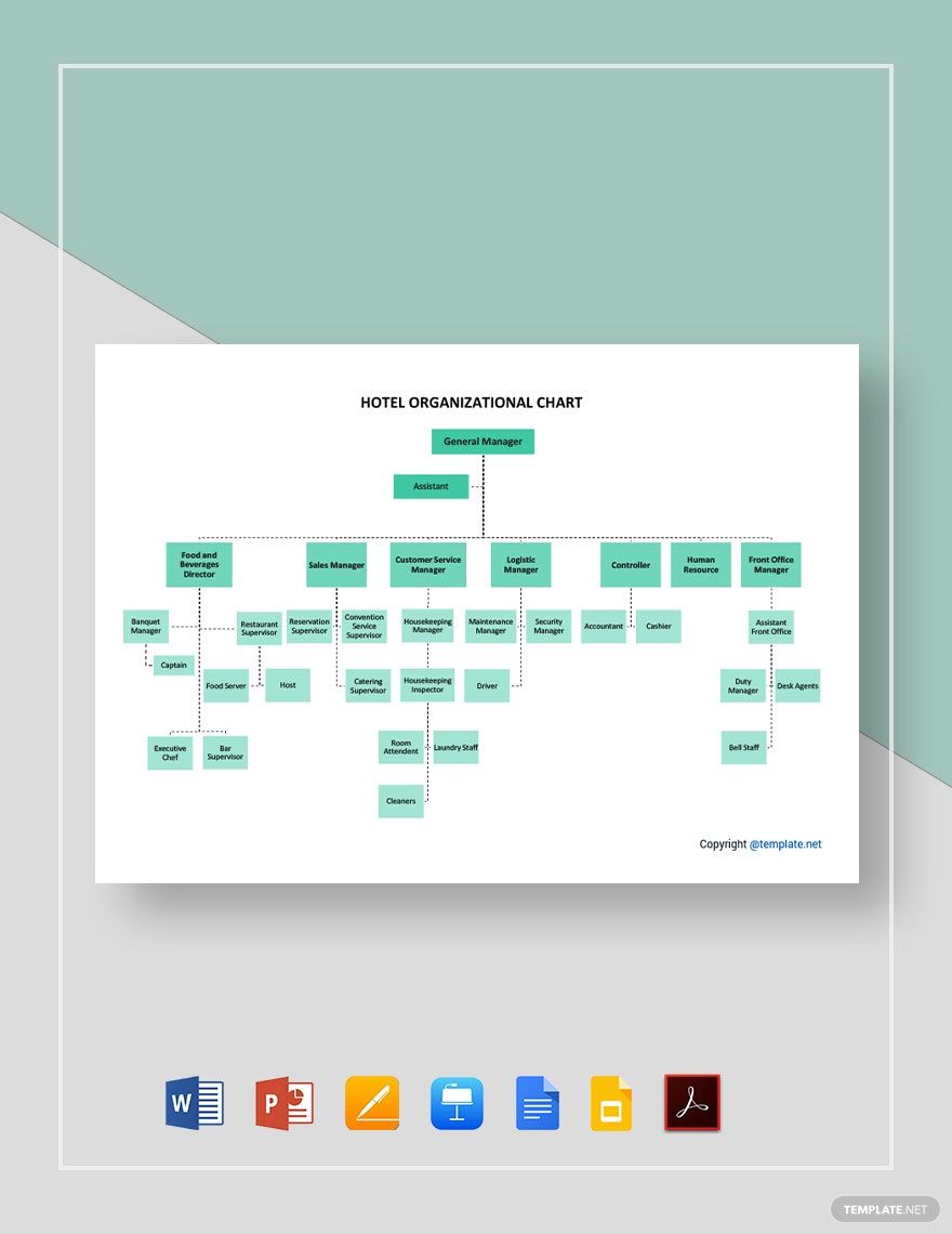
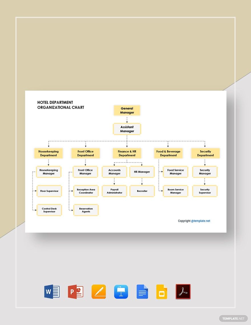
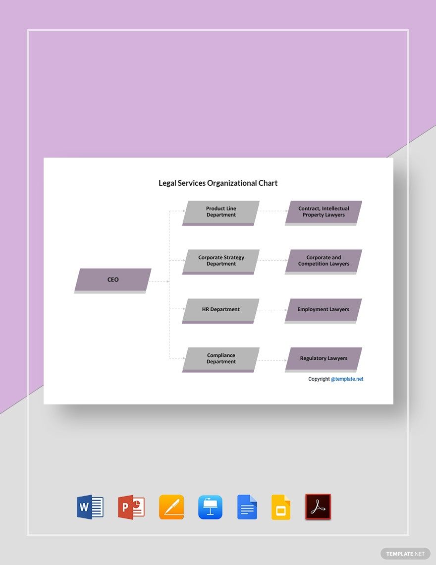
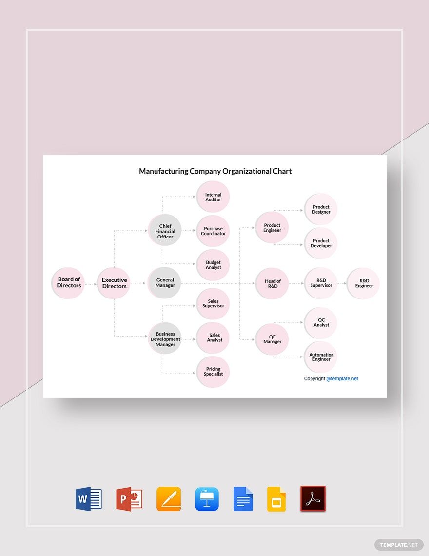
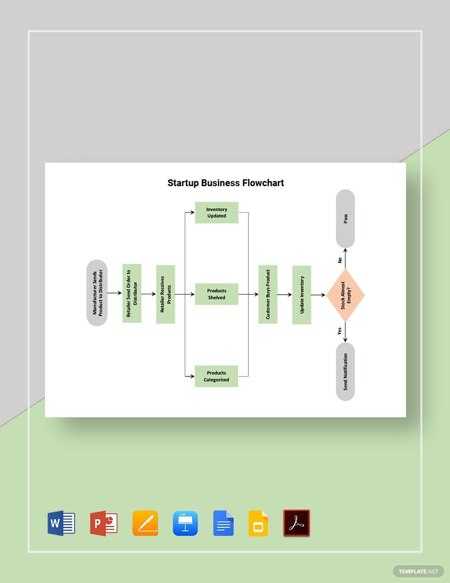
Whether it’s for school or business, charts are extremely useful when you need a diagram for interpreting data. And we have just what you need to make one with our easily editable Chart Templates! By incorporating our samples, you can quickly create simple yet informative visuals to monitor or elaborate on critical information. Plus, if you prefer using Google applications, you can customize our content in Google Slides. So, go ahead and download today—put together a statistics graph, flow diagram, and more!
How to Make a Chart in Google Slides
Charts work by using visuals to convey and process data. An article from Chron (a business publication) explains that charts are quite useful when handling the tasks and issues of a business. Whether you need to make a comparison or keep track of progress, charts are valuable tools for your work.
Google Slides is a great platform for creating charts. However, if you need some advice, consider reading our tips below.
1. Give Your Chart an Appropriate Title
When using a chart in your Goold Slides presentation, it’s essential that your audience immediately recognizes the content. After adding a new slide for your diagram, select the box marked with “Click to add title” and type in a simple yet descriptive title, like “Organization Budget Distribution” or “Performance Comparison Table.”
2. Choose Which Chart Type You Want
Add a fresh chart to your Slides document by going to Insert > Chart and selecting the option that best suits your needs (Pie, Bar, etc.). Once the chart is visible, you can resize it by click-dragging the blue squares on its sides and corners. Reposition the chart by click-dragging it to the desired spot, and rotate it by using the blue circle just above.
3. Edit Your Chart’s Contents
To customize the data and contents in your chart, select the chart and click the dropdown arrow in its top-right corner before selecting “open source.” Afterward, the chart’s reference table will open in Google Sheets, where you can input whatever data you want for your chart.
4. Make Additional Alterations to Your Chart
Besides the data, there are other chart elements you can edit in the Sheets window. Select the chart (in Sheets) and double-click the object you want to alter—this opens the Chart Editor menu for the selected object. Use the Chart Editor to customize chart paint, text size, object label, and so on.
And that does it for our tips! Lastly, if you want easy-to-use samples for a digital or printable chart, remember to download our Chart Templates!


