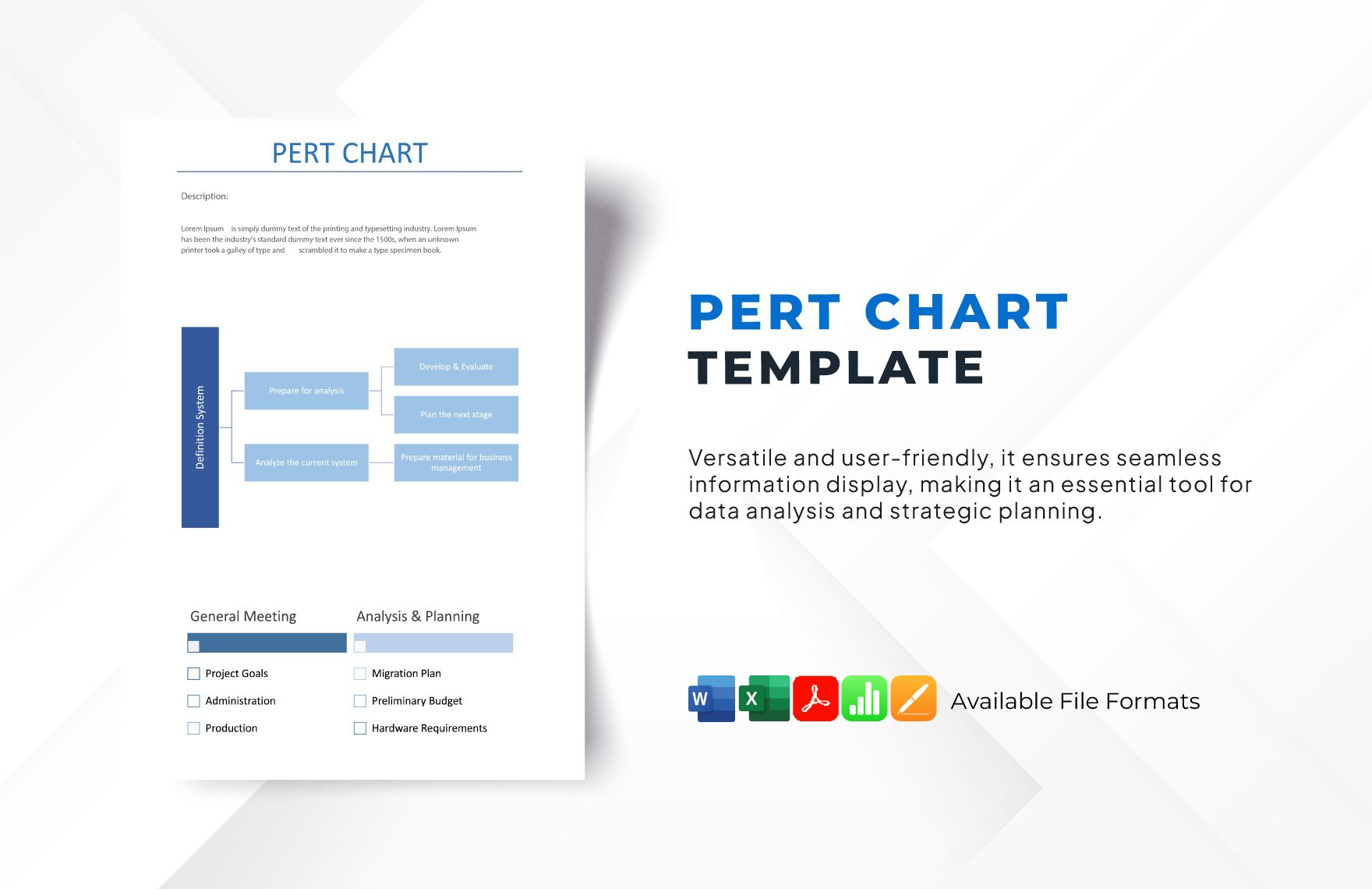
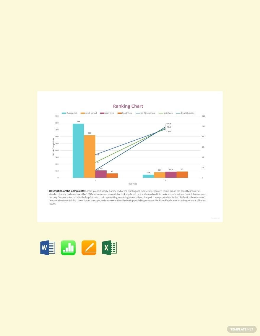
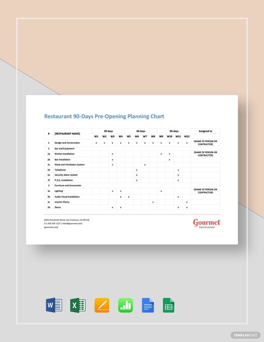
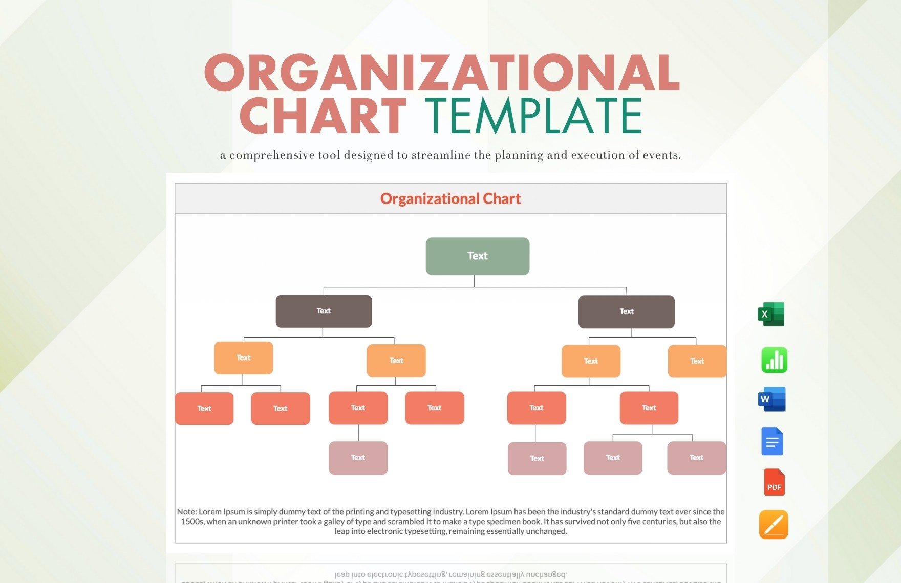
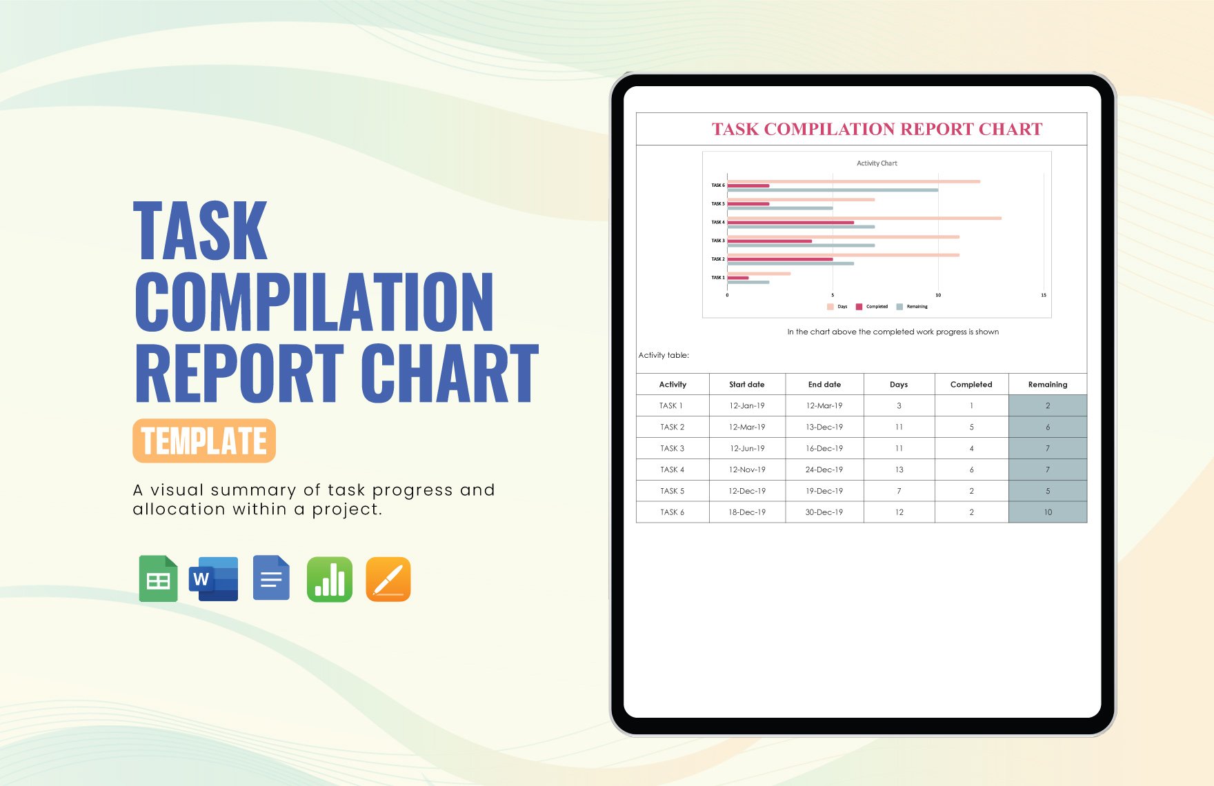
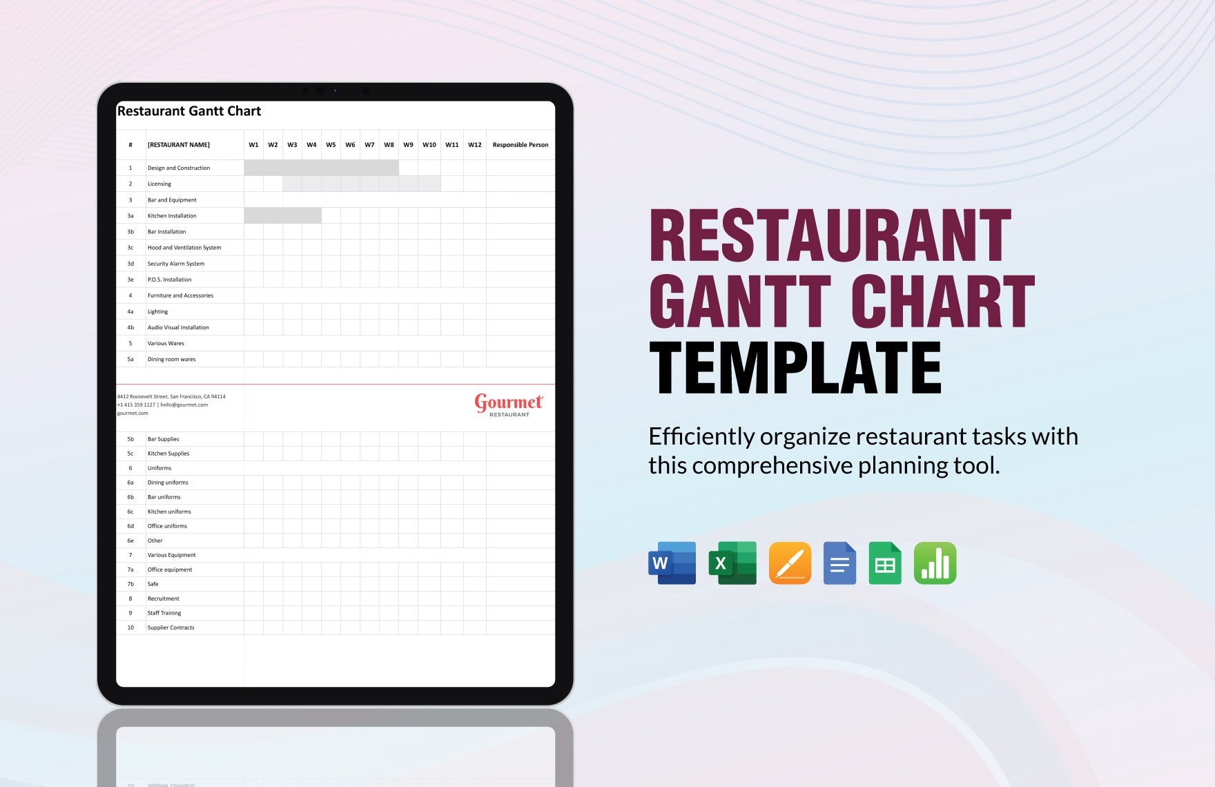
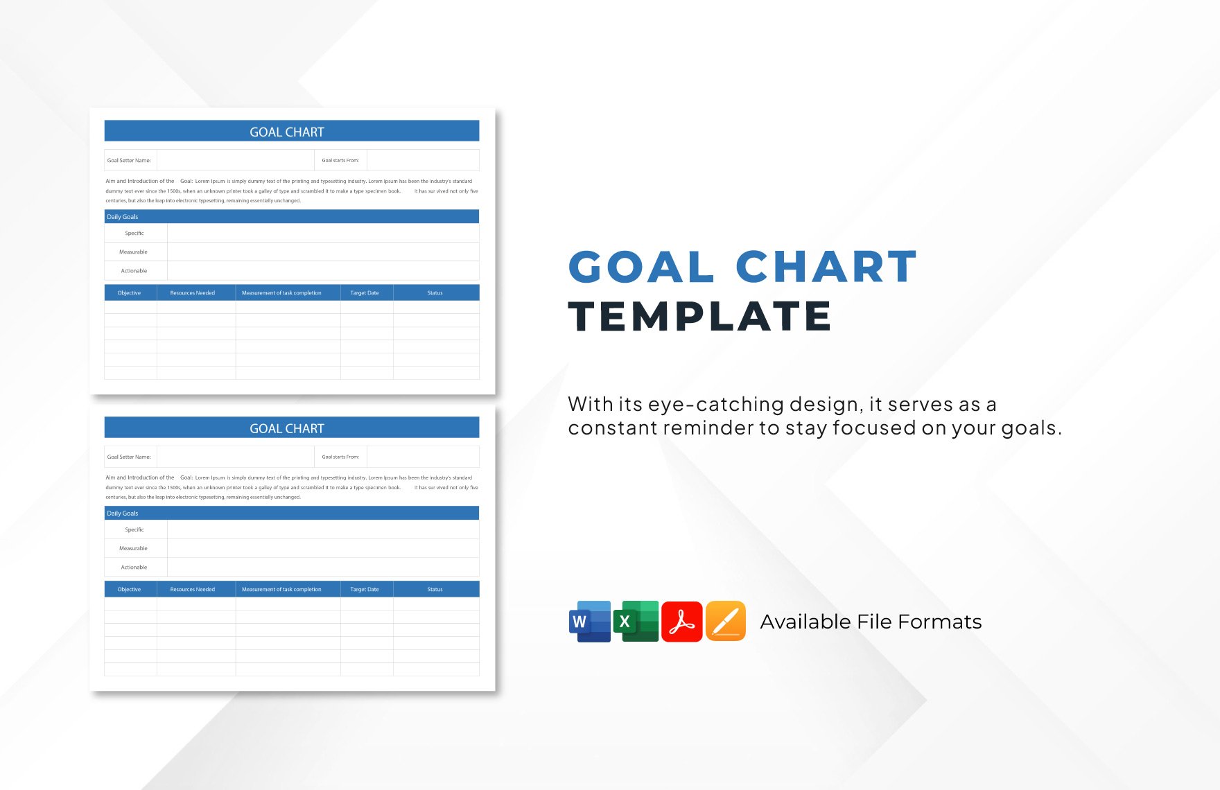
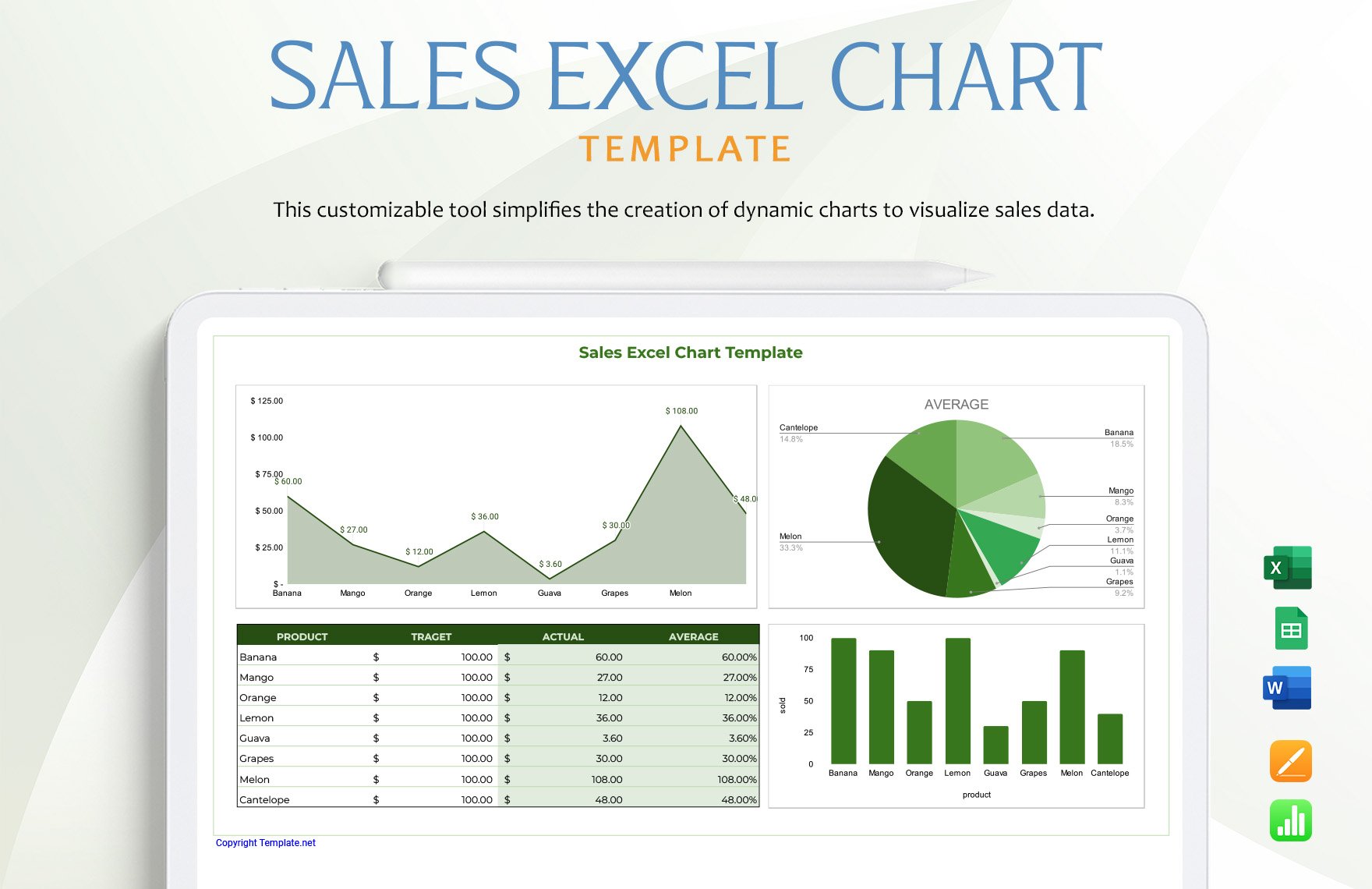
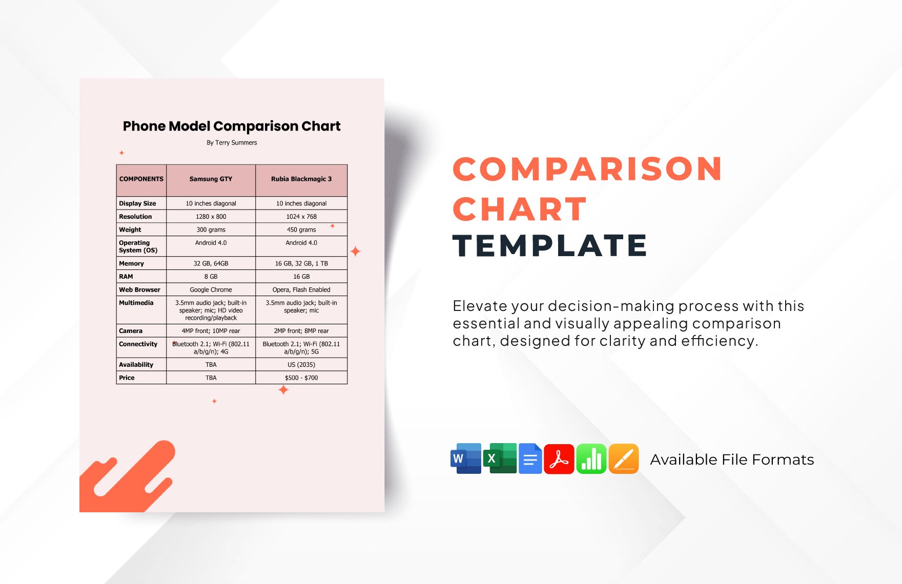
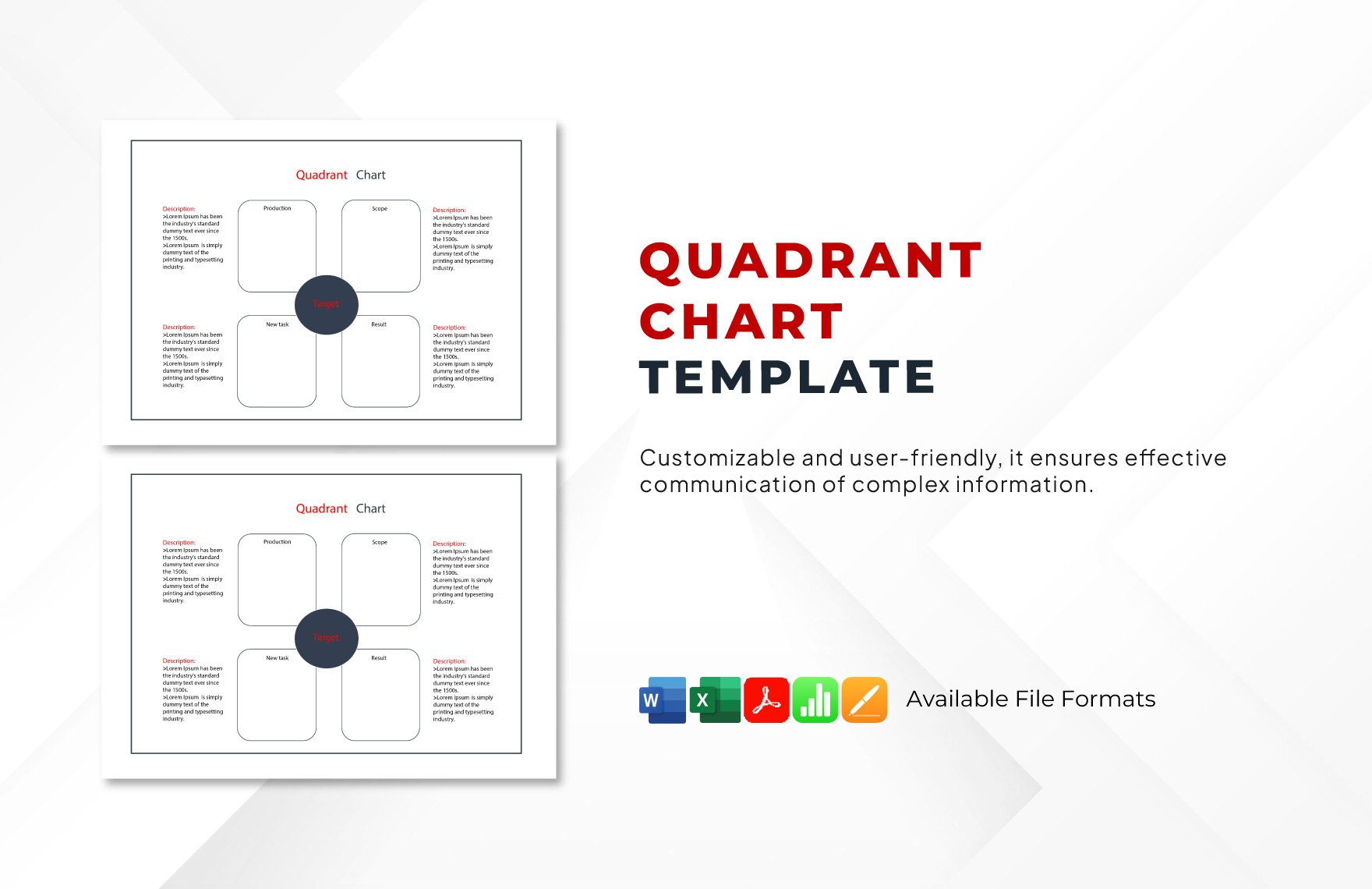
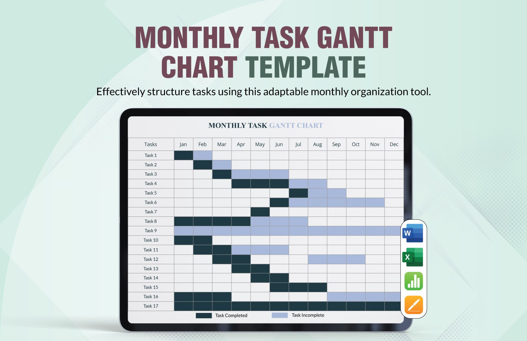
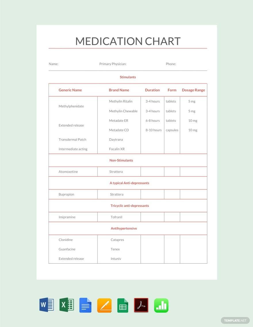
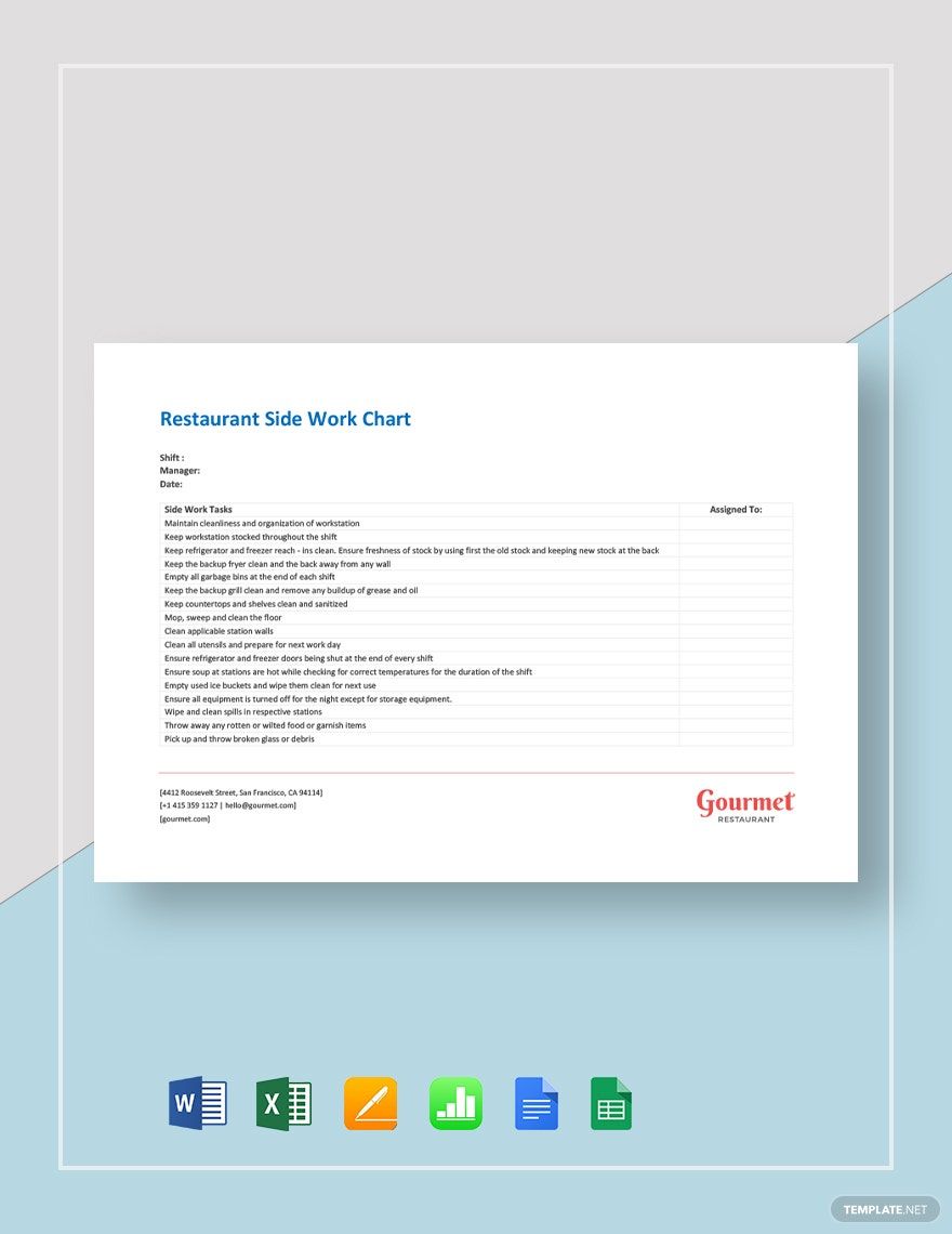
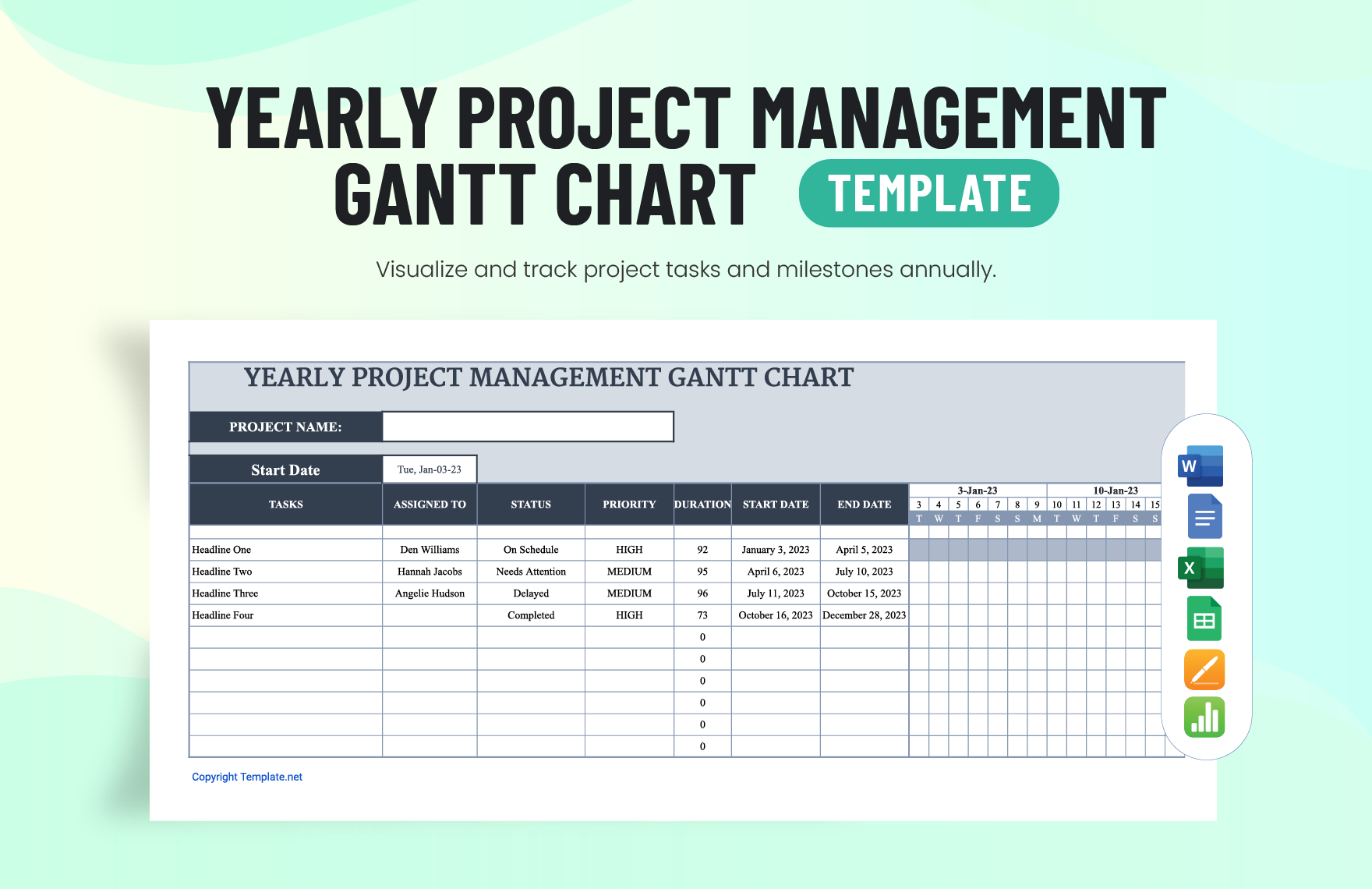
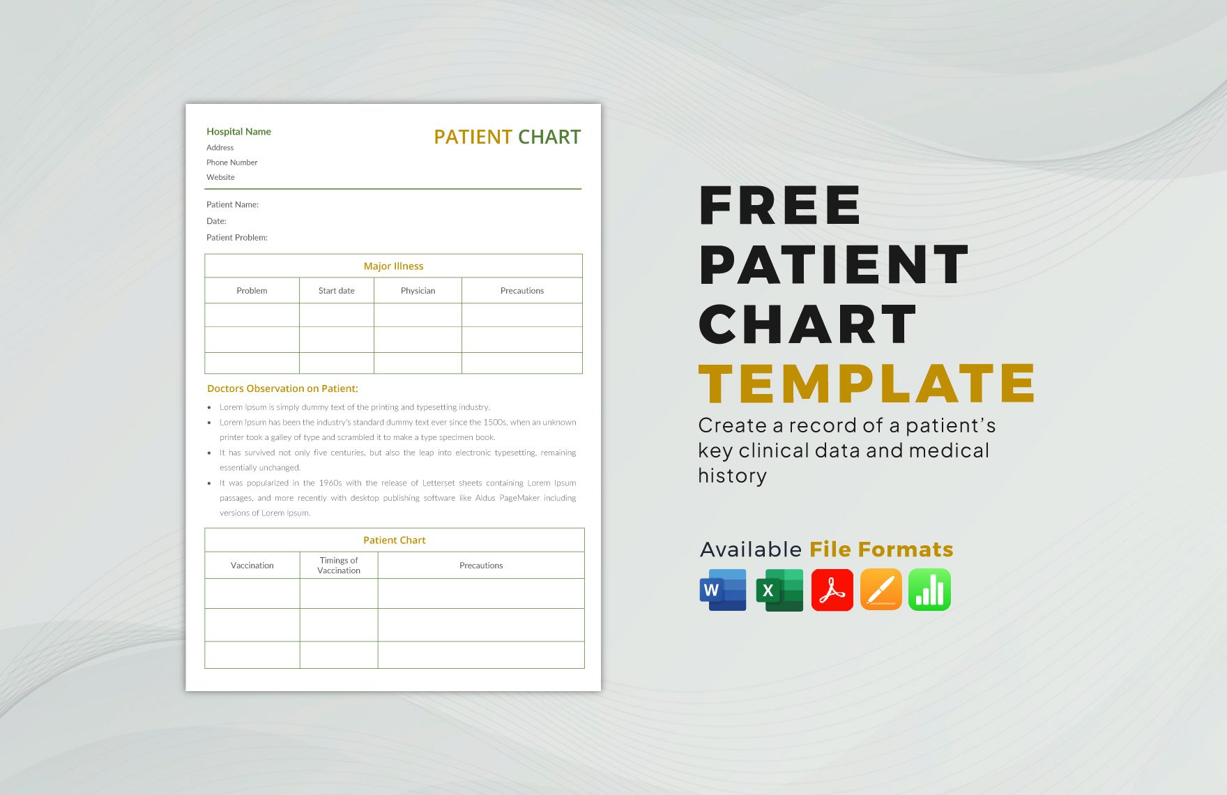
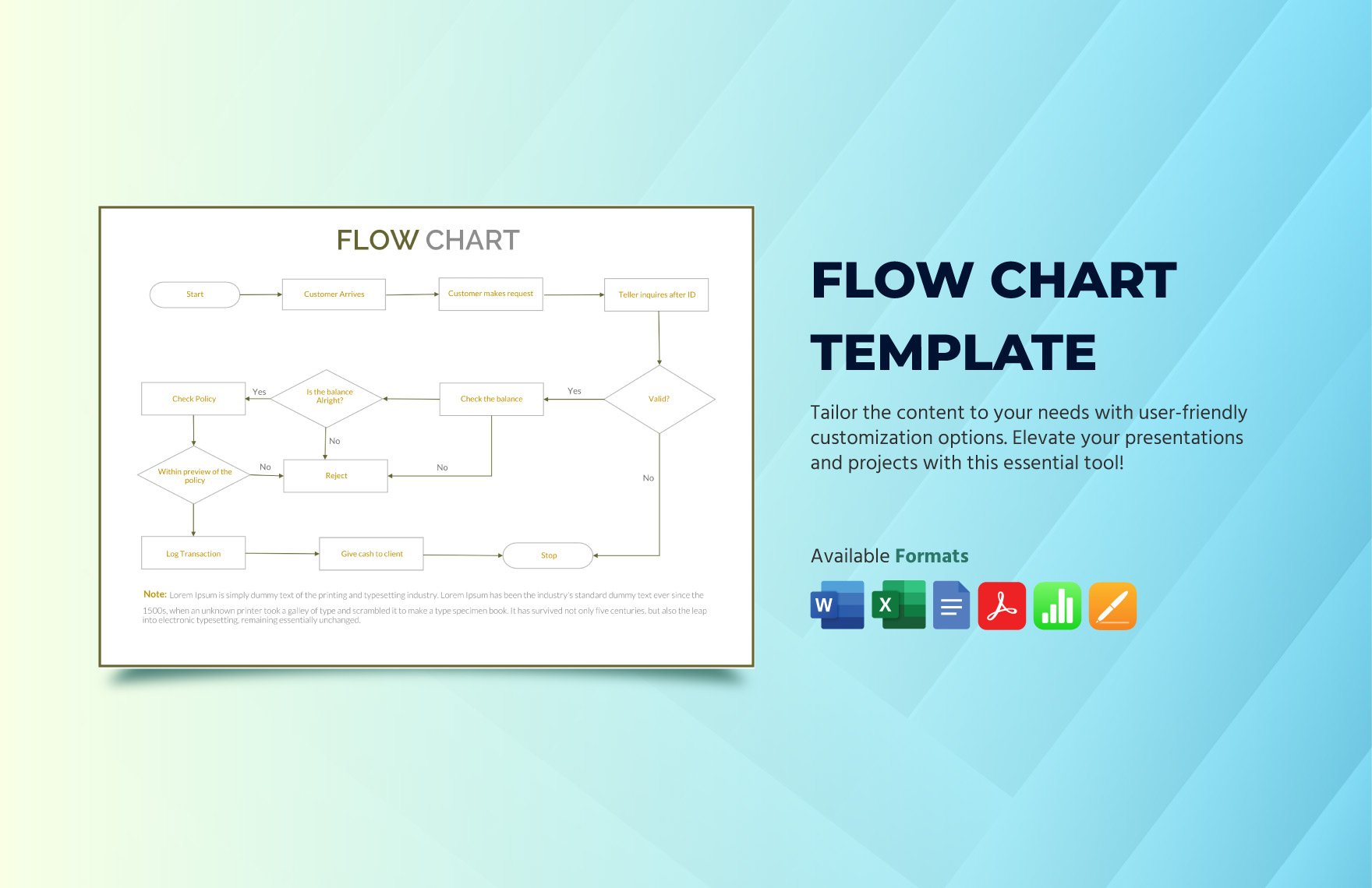
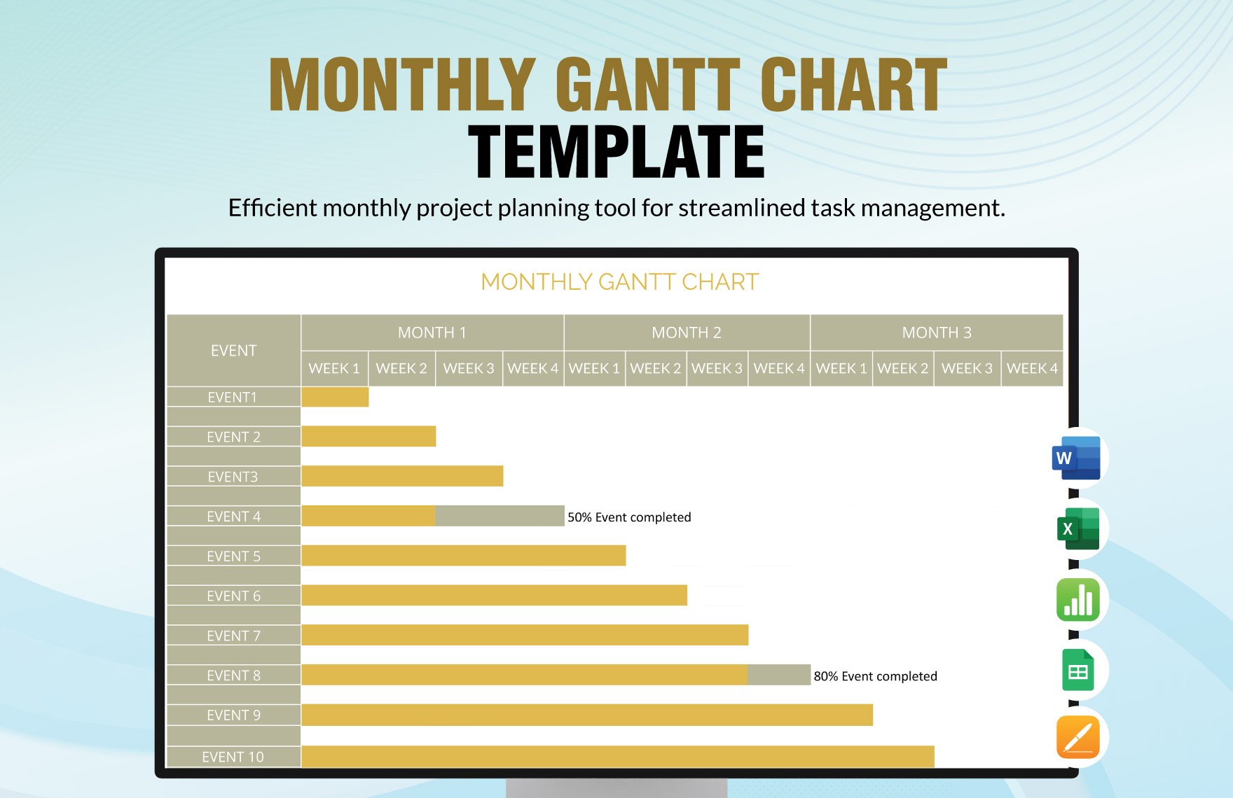
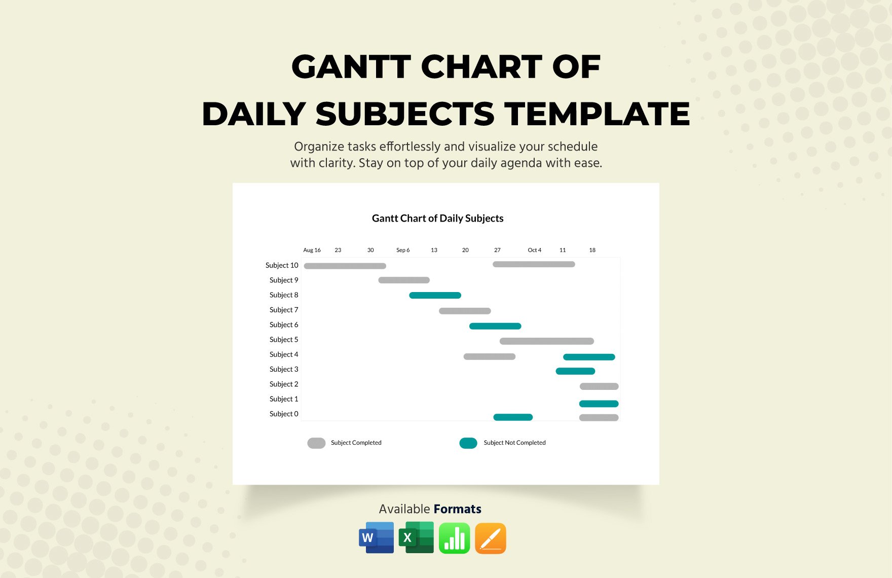
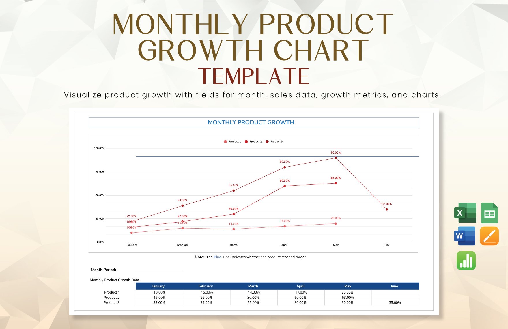
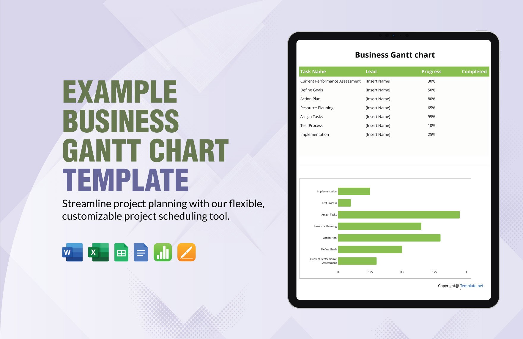
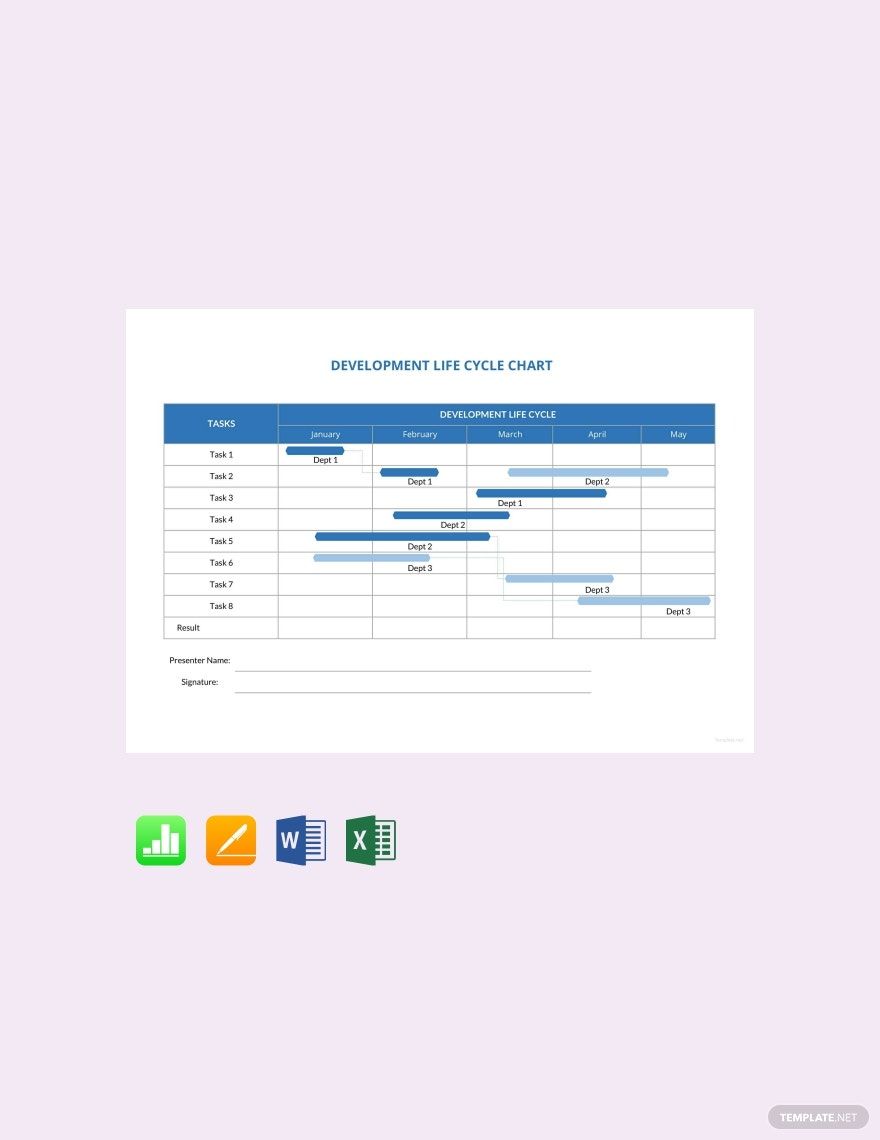
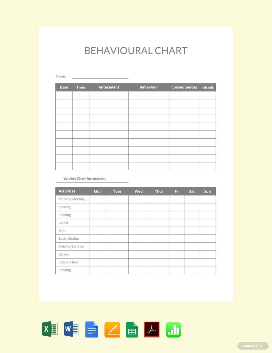
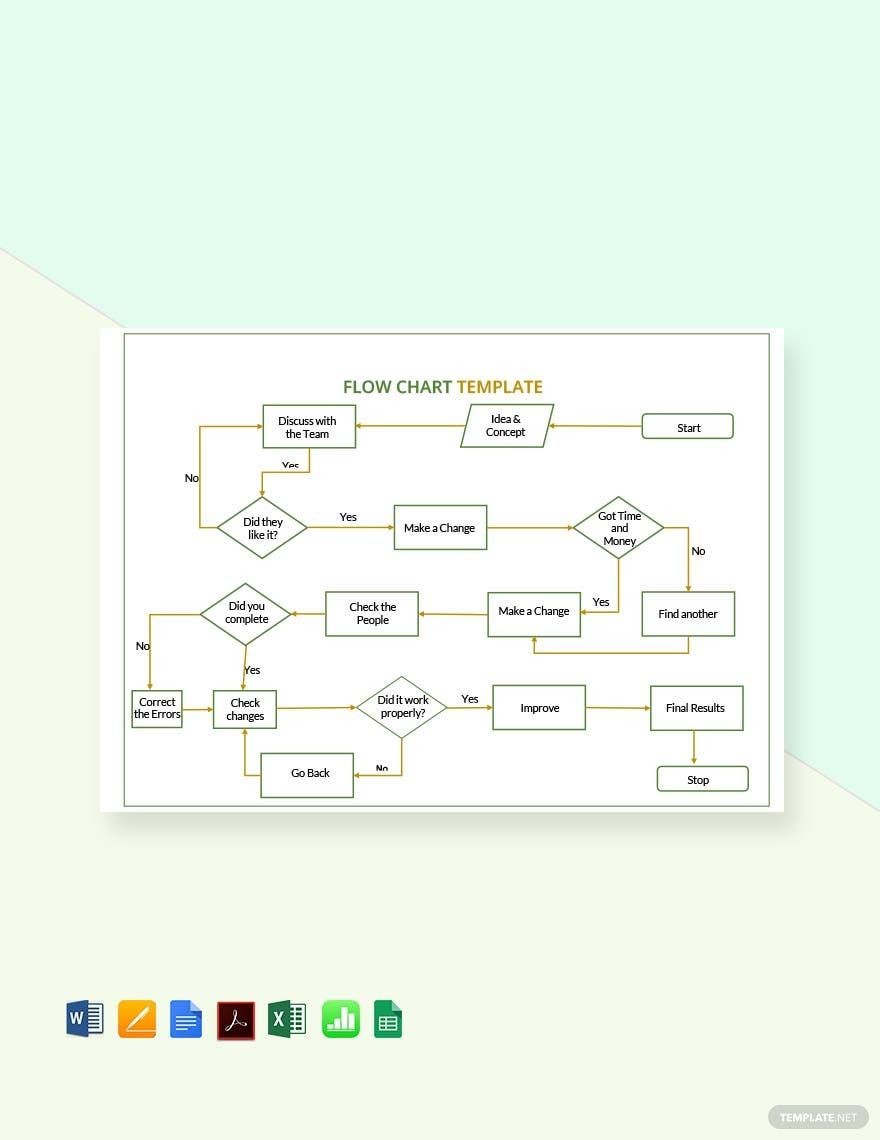
Open your Apple Numbers software program and start designing a chart for a project or presentation with ease using one of our ready-made Chart Templates. These files are 100% customizable and easily editable. They make use of high-quality and professionally designed content you can modify to suit your preferences. Charts are used to represent tabular numeric data, often in large quantities, to understand the relationships between parts of the data. Our chart templates are useful for businesses, organizations, schools, processes, and tallies. These files are printable, perfect for commercial as well as personal printing. Download one now for free and get started on that presentation. Save the downloaded file on your PC or mobile device. Available in A4 & US Sizes.
How to Create a Chart in Numbers
Charts are one of the most vital tools for representing information. A basic chart is known as a graphical or visual illustration of information in which it is represented by symbols like bars in a bar chart, slices in a pie chart, etc. Charts are used to simplify raw data to ease understanding of large amounts of information and the relationships between parts of the data. Usually, charts can be read more quickly than raw data. They are used in a wide variety of fields and can be created by hand or by computer using a charting application.
If you are planning to illustrate your data in a powerpoint presentation, a well-organized and compelling chart is a must-have. Read and follow some helpful tips provided below.
1. Choose a Chart Type that Fits your Needs
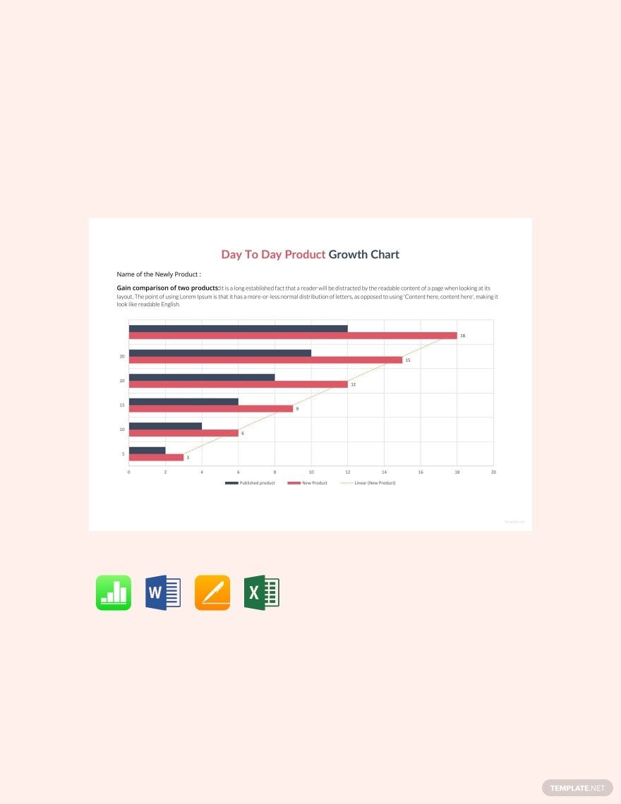
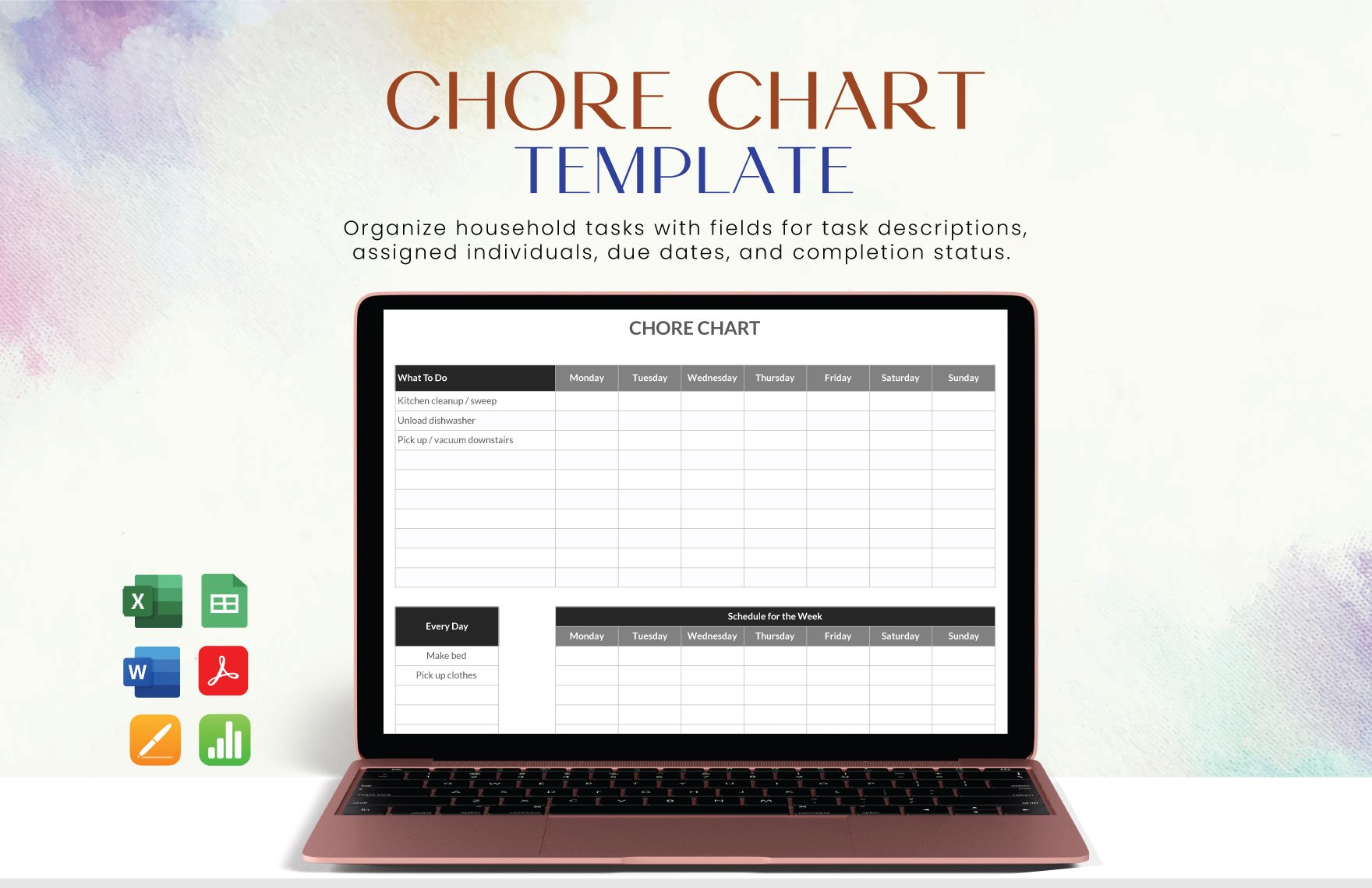
First off, you need to pick the best chart type that will help you effectively convey the information. To clearly highlight your point, it is necessary to use the right chart during your presentation. Different chart types like bar, line, and pie charts may tell different interpretations of your data. If you are making a comparison chart, flow chart, organizational chart, or chore chart, choose one type that fits. Take note, to make your chart easy to follow, arrange your chart data from biggest to smallest or in a chronological manner.
2. Be Minimal
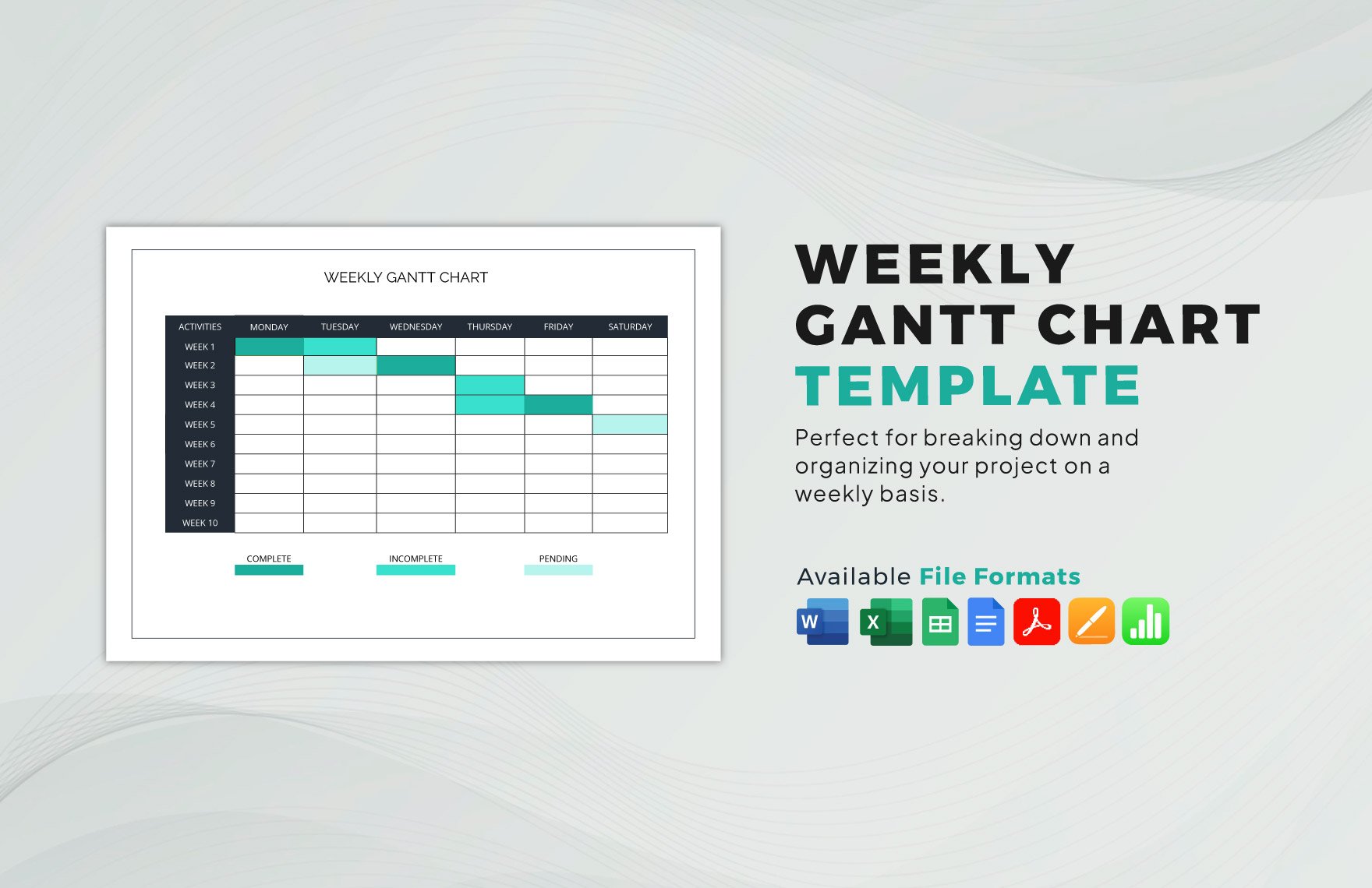
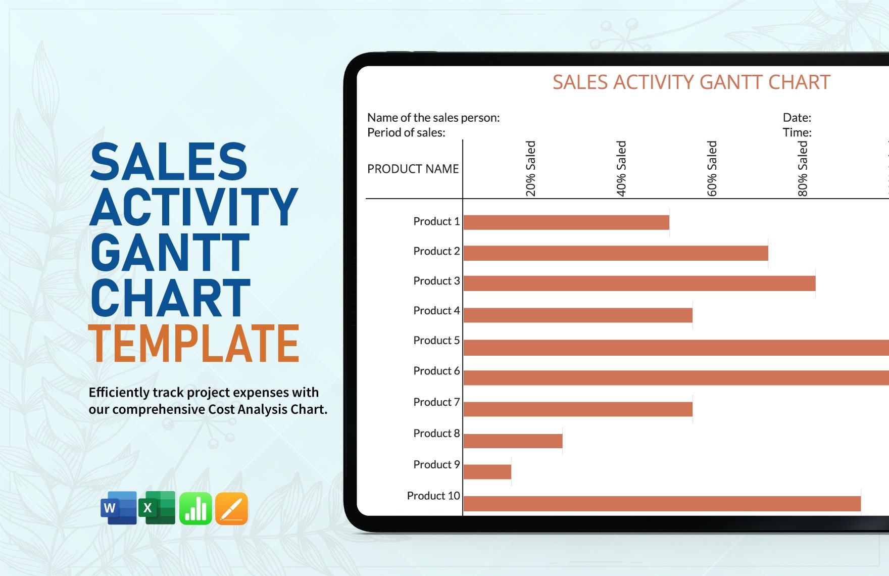
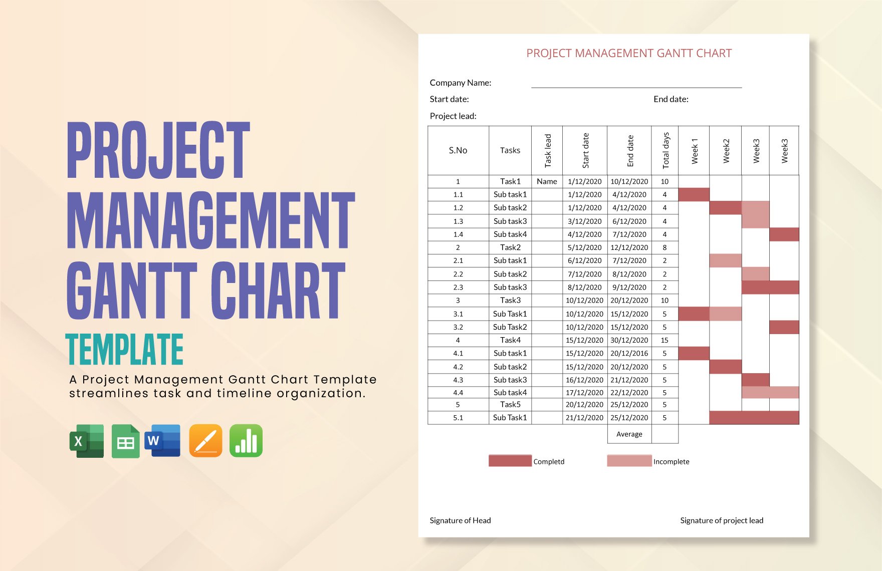
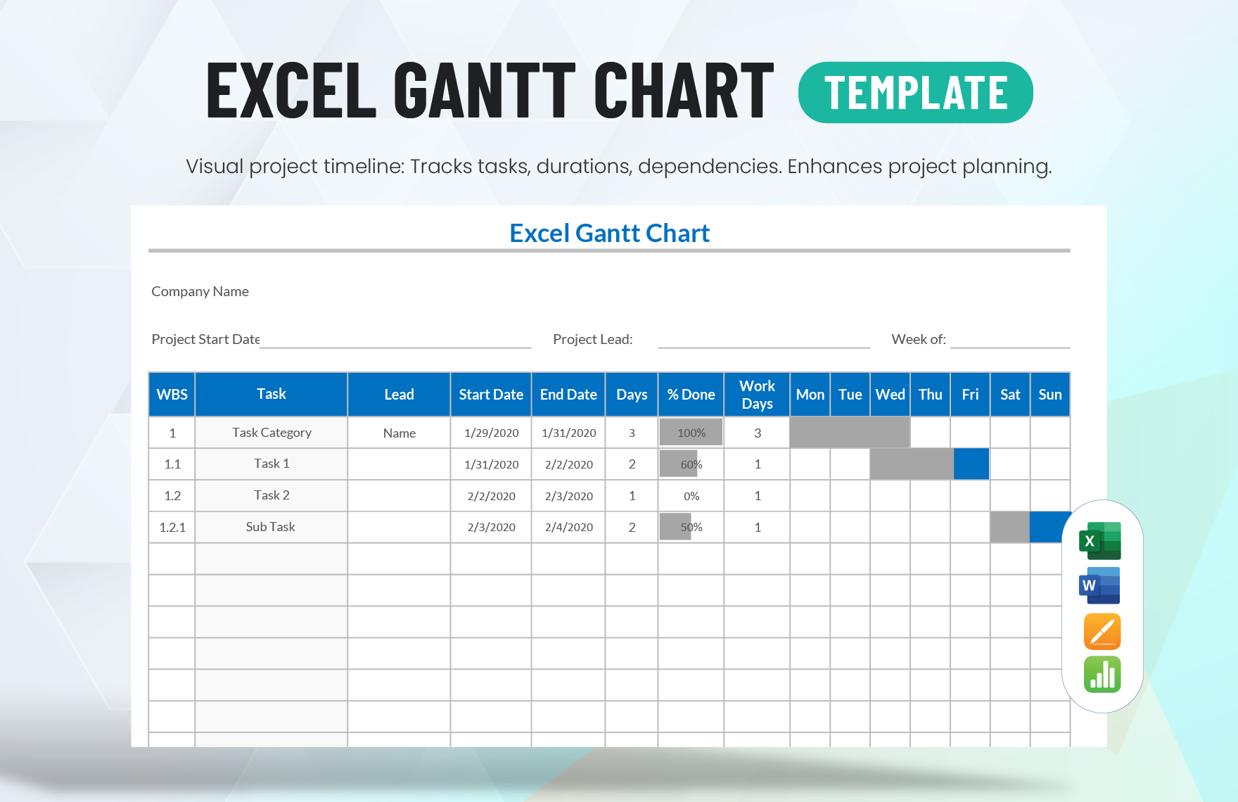
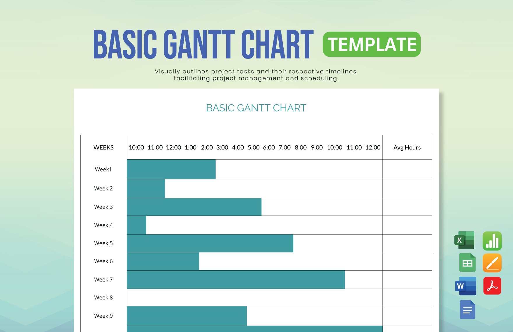
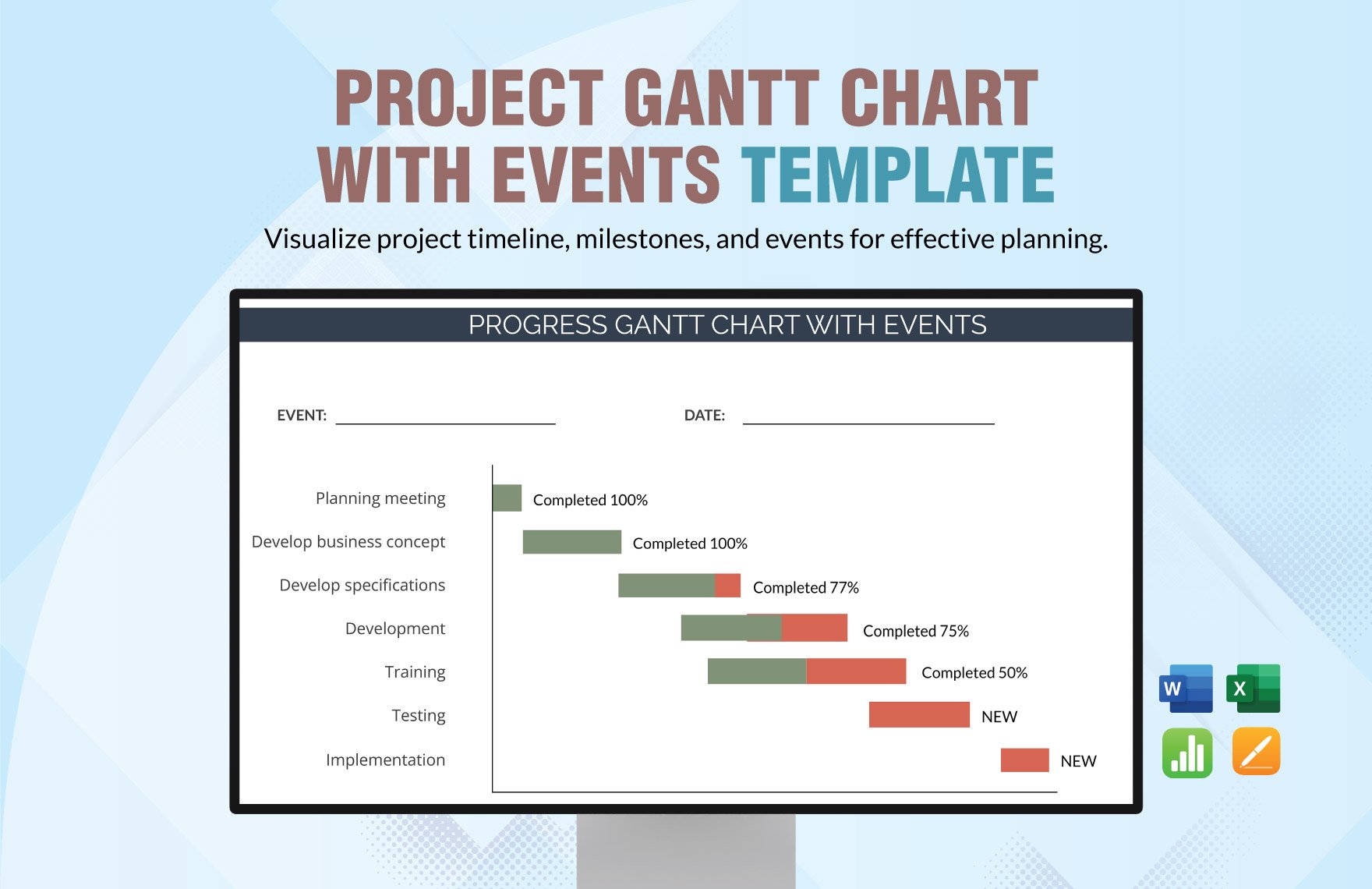
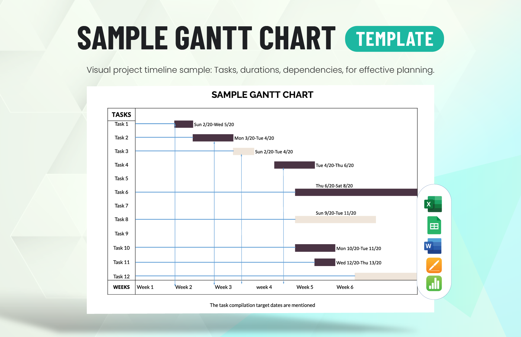
Your goal is to deliver a clear and easy to grasp data. In designing your chart, do not be tempted to put too much design elements on it. As much as possible, maintain simplicity. For instance, in creating a Gantt Chart, avoid using too many colors. Cling to one color that is most associated with your brand. Keeping it simple will help your data stand out. Also, do not use 3D effects. It will only make your data harder to read. An article suggests that vertical lines are much better to see the lowest and highest variety of valuation.
3. Remove Unnecessary Lines in the Chart's Background
To make a simple chart, remove the gridlines as its background. These lines are unnecessary, ineffective, and confusing. Let the viewers focus on the essential points illustrated on the chart.
4. Download a Suitable Chart Template
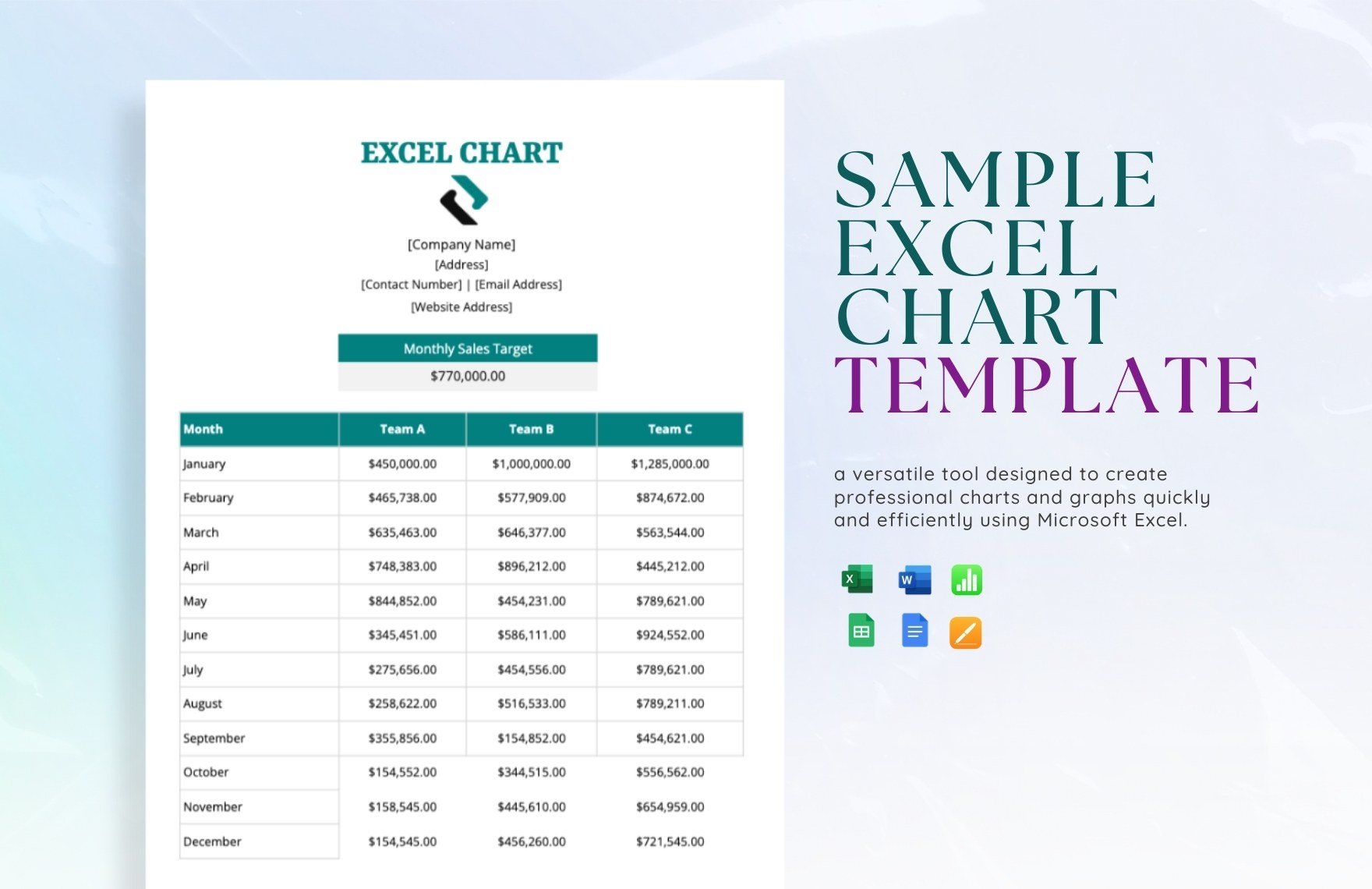
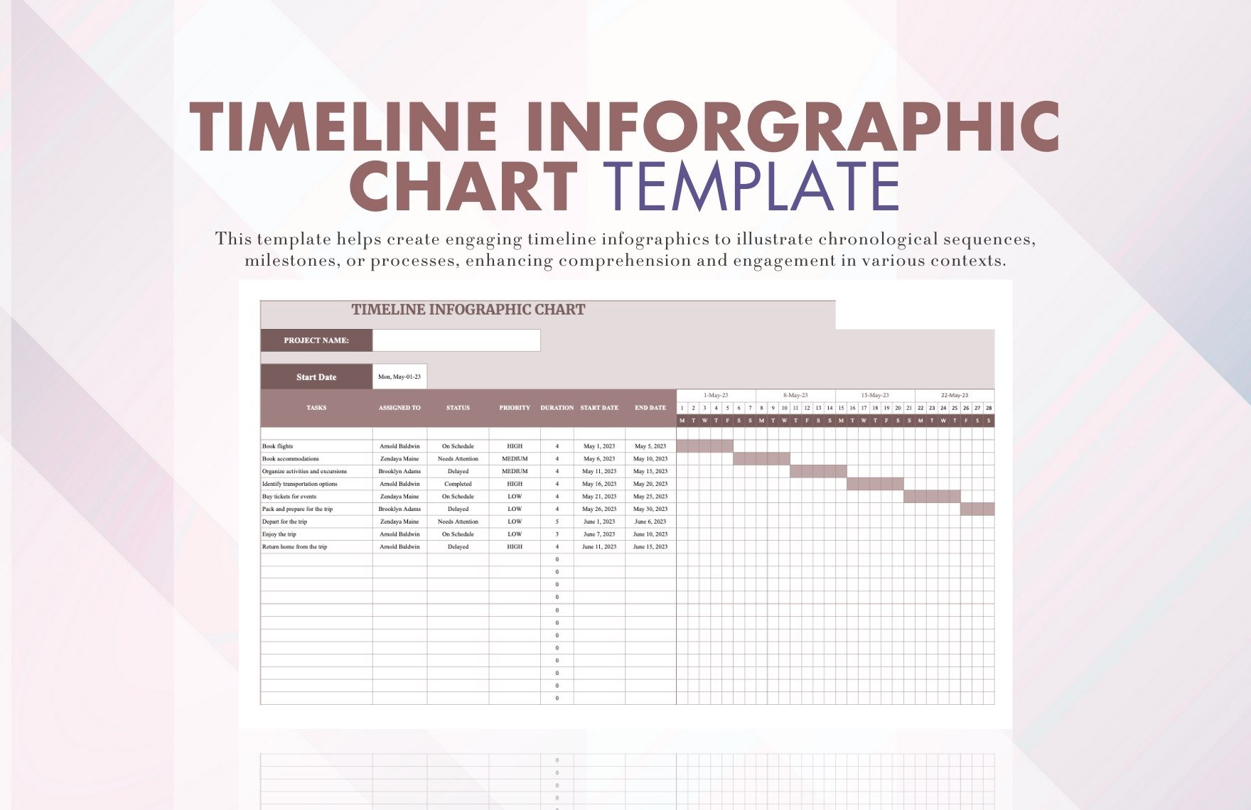
Starting from a blank template can be hard. You may opt to download printable chart templates if you are having a hard time creating one. Check out samples provided on this website. There, you see plenty of templates such as flow charts, sample charts, infographics, etc.
5. Edit Using Numbers
After you have chosen your desired template, you can now edit and customize it using Apple Numbers. It is a great alternative for Mac users. According to an article, using Apple Numbers can help you emphasize trends in your chart by changing the appearance, position, or spacing of one or more of the data series.


