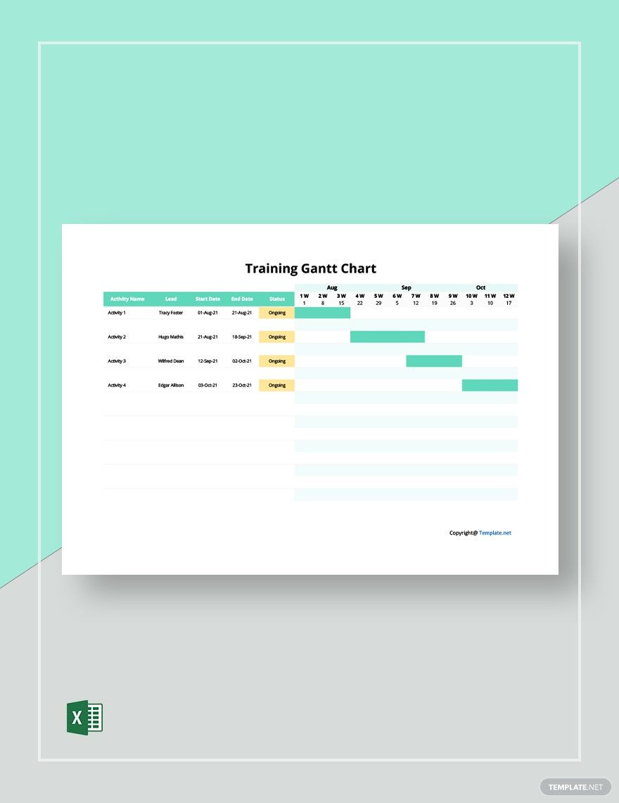
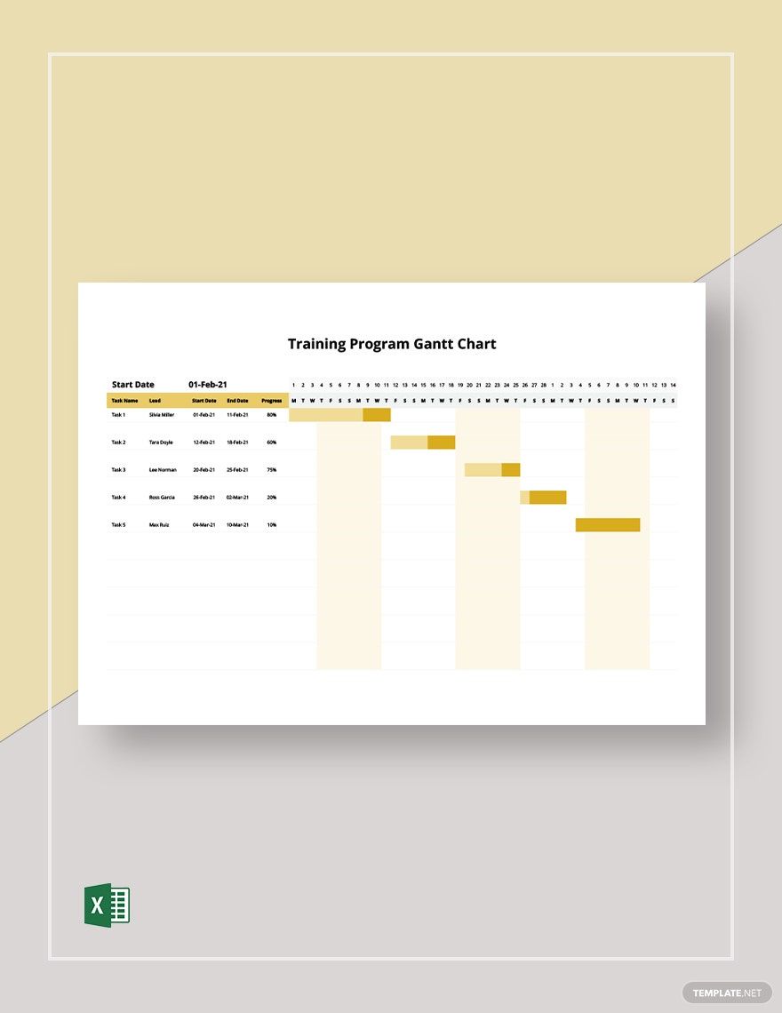
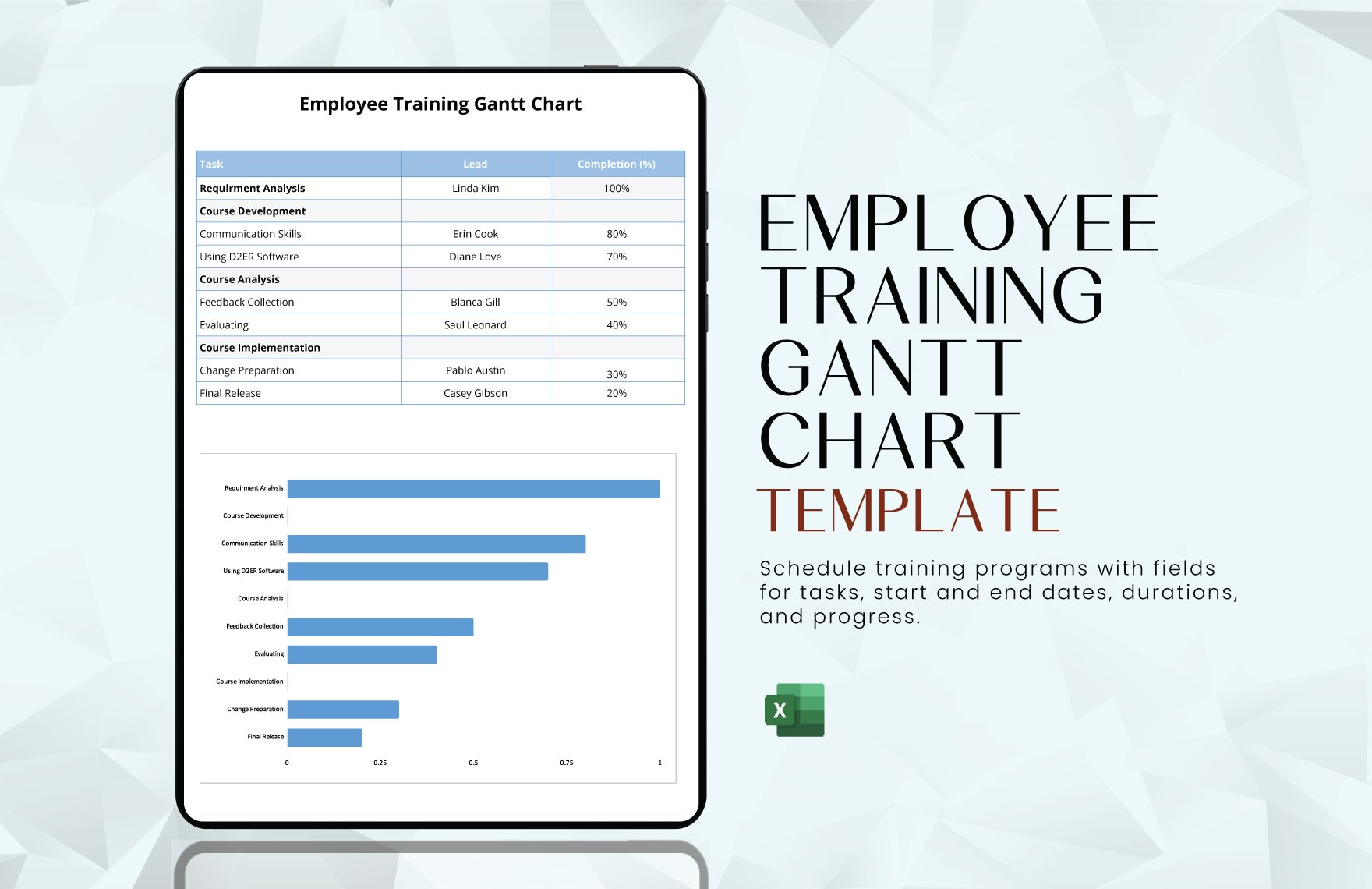
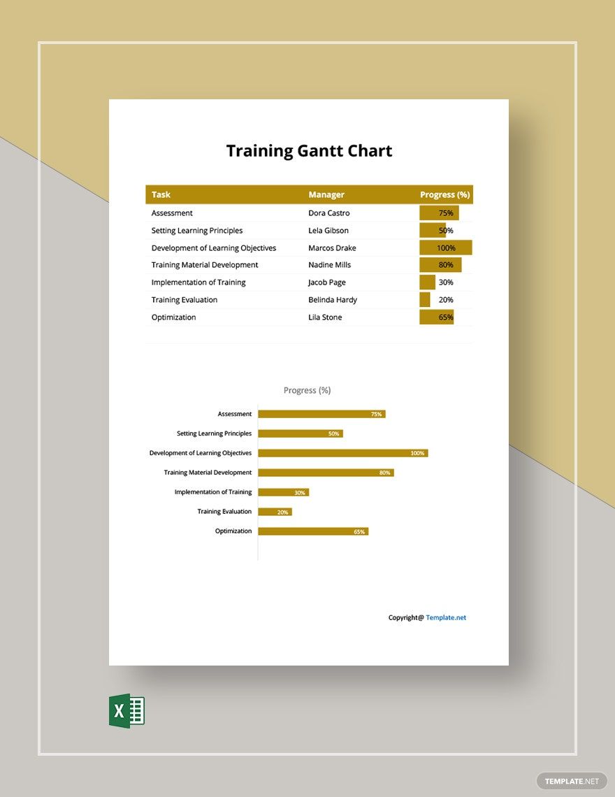
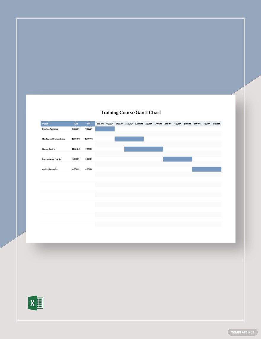
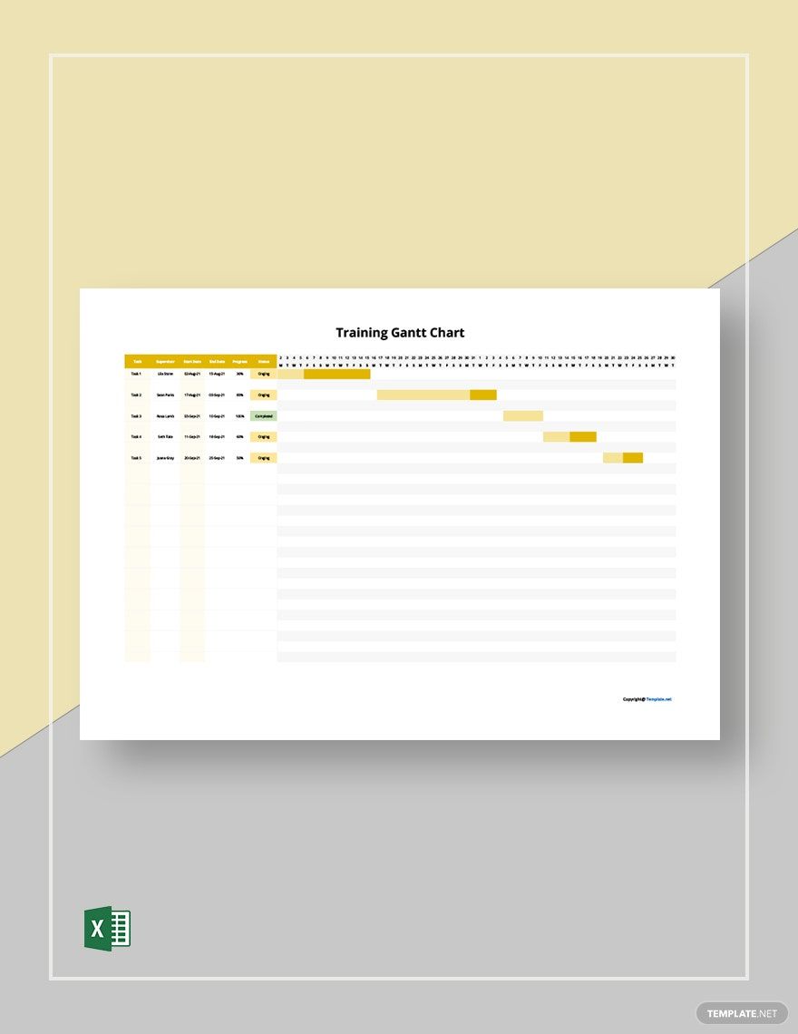
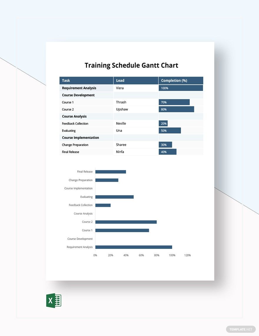
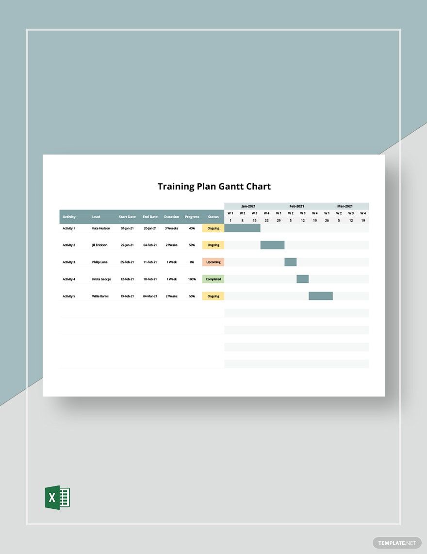
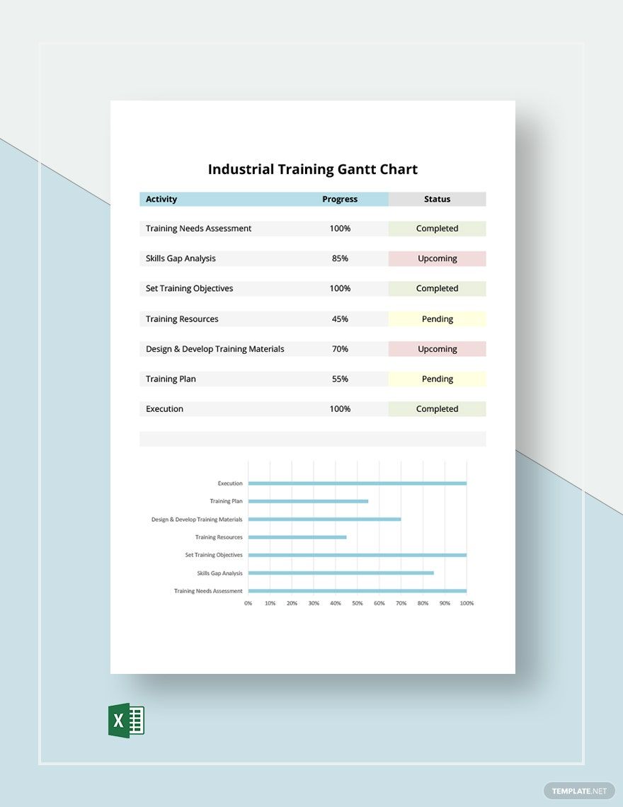
Training is an essential phase that an employee must go in order for them to better understand the nature of their employment. According to statistics, 68% of employees say that training must be the top priority in the company’s policies. With that, you must start planning your training timeline immediately. Make one now by having any of our comprehensive, high-quality, and professionally written Training Gantt Chart Templates. Unlike others, these templates have original content that you can edit and customize in any of your devices. Also, you can have and print them in Microsoft Excel format. Be prepared with your employee’s training with our templates now!
Training Gantt Chart Templates in Excel
Get creative and organized with our customizable training Gantt chart templates in Microsoft Excel. Professionally designed, free, and printable. Download now!

Get Access to All Chart Templates

How to Make a Training Gantt Chart in Microsoft Excel
Gantt charts are widely used by businesses to handle things project management or employee training. Especially as the current generation is using digital documents for their work plan, making a training Gantt chart would really do the work for you. But, manufacturing one is not as easy as you think. With that, we have conducted our research and gathered some of these effective tips that you can follow in making a training Gantt chart.
1. Think About Your Initiative
Before touching the aspects of Gantt chart making, you need to make sure that you set your mind into your goals. What do you want to achieve in the training? Who should participate in the training? When would the training take place? Doing this, you would have a clear direction to ensure that what you envisioned will be possible.
2. Sort Your Data
Now that you have set yourself into your chart, you can now sort your data. As you have your list of training tasks, you need to determine which tasks are dependent and independent. Some tasks can be completed simultaneously and others cannot if a particular task is not yet completed. Doing this would help you determine the appropriate to associate with each task.
3. Allocate Time
After sorting your training tasks, you can now allocate time. To do this, you need to make sure that you know the duration of the training. Will you do it daily, weekly, or monthly? Determining this would give you the idea as to how you would divide the time befitting to the tasks in your document.
4. Add other Information
Your Gantt chart would serve as your outline for your training, so you need to make sure that every task has descriptions. While you are adding other information, you need to make sure not to clutter your chart. But, remember that there is not much room to it, so you can find alternatives to do it. You can allocate a single page for the descriptions.
5. Assign Ownership
Tasks are meant to be assigned to people to be completed. Depending on what type of training that you wanted to conduct, divide the tasks into respective person involved in the event. Usually, employees training involve supervisor, training manager, training mentors, and employees.
Frequently Asked Questions
What are the types of training?
The following are the types of training that you can conduct:
1. Induction Training
2. Job Instruction Training
3. Vestibule Training
4. Refresher Training
5. Apprenticeship Training
6. Managerial Training
7. Quality Training
What are the types of charts?
1. Column Charts
2. Bar Charts
3. Pie Charts
4. Doughnut Charts
5. Line Charts
6. Area Charts
7. Scatter Charts
8. Spider Charts
9. Gauge Charts
10. Comparison Charts
What is the difference between the Gantt chart and PERT chart?
Although both are utilized for task scheduling, there is a big difference between the two. A Gantt chart is visually presented through bars and is considered a bar chart, while a PERT chart is presented through network diagrams.
What is the difference between the Gantt chart and PERT chart?
Although both are utilized for task scheduling, there is a big difference between the two. A Gantt chart is visually presented through bars and is considered a bar chart, while a PERT chart is presented through network diagrams.
How do you differentiate charts from graphs?
Charts are visual representation of a particular set of data through graphs, diagrams, or tables. Graphs shows the mathematical relationship between the data and is interpreted through charts.
