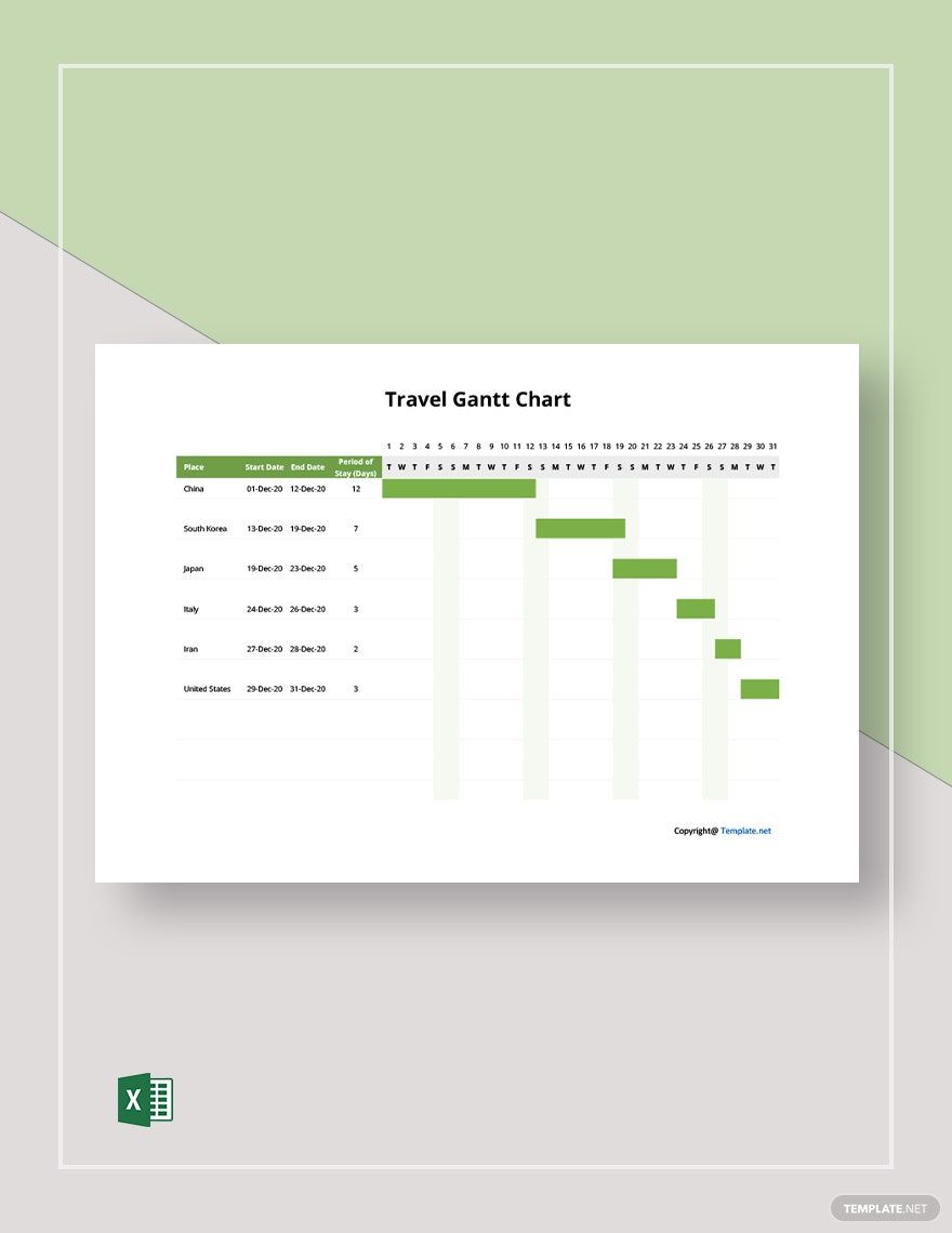
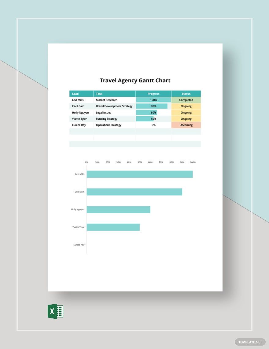
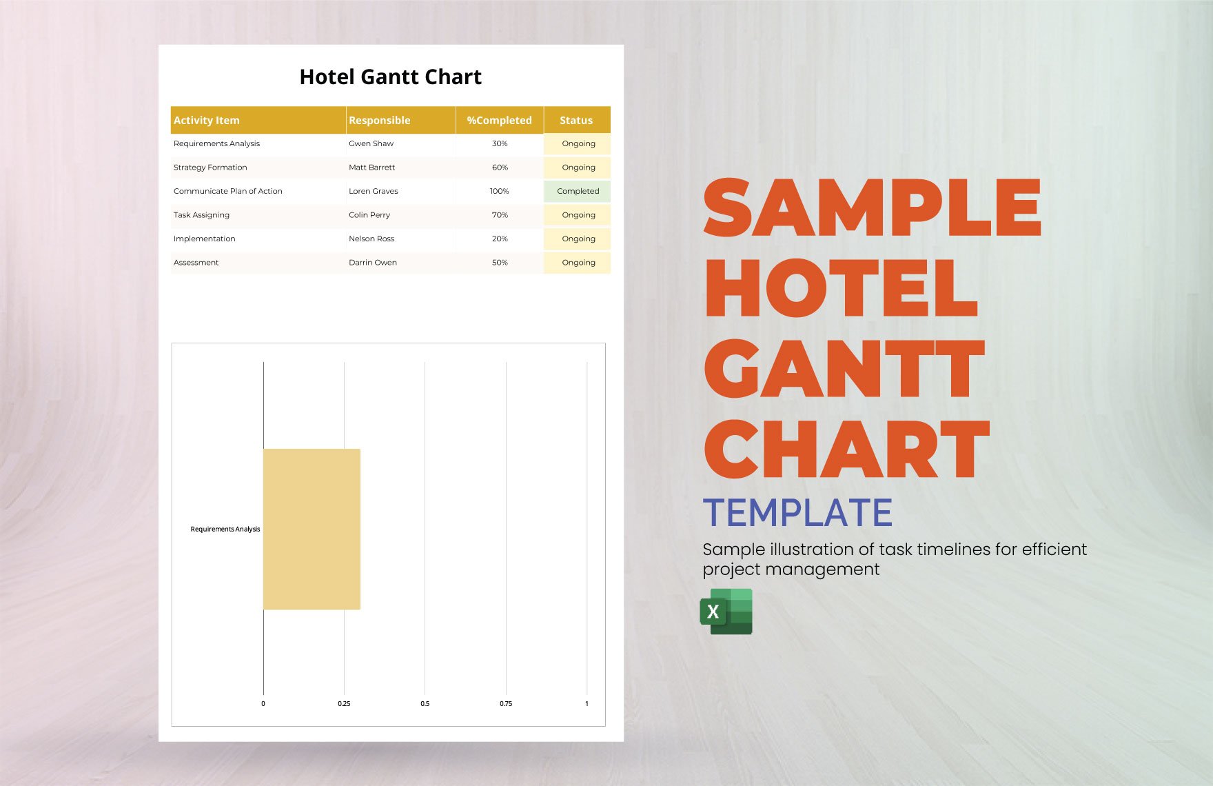
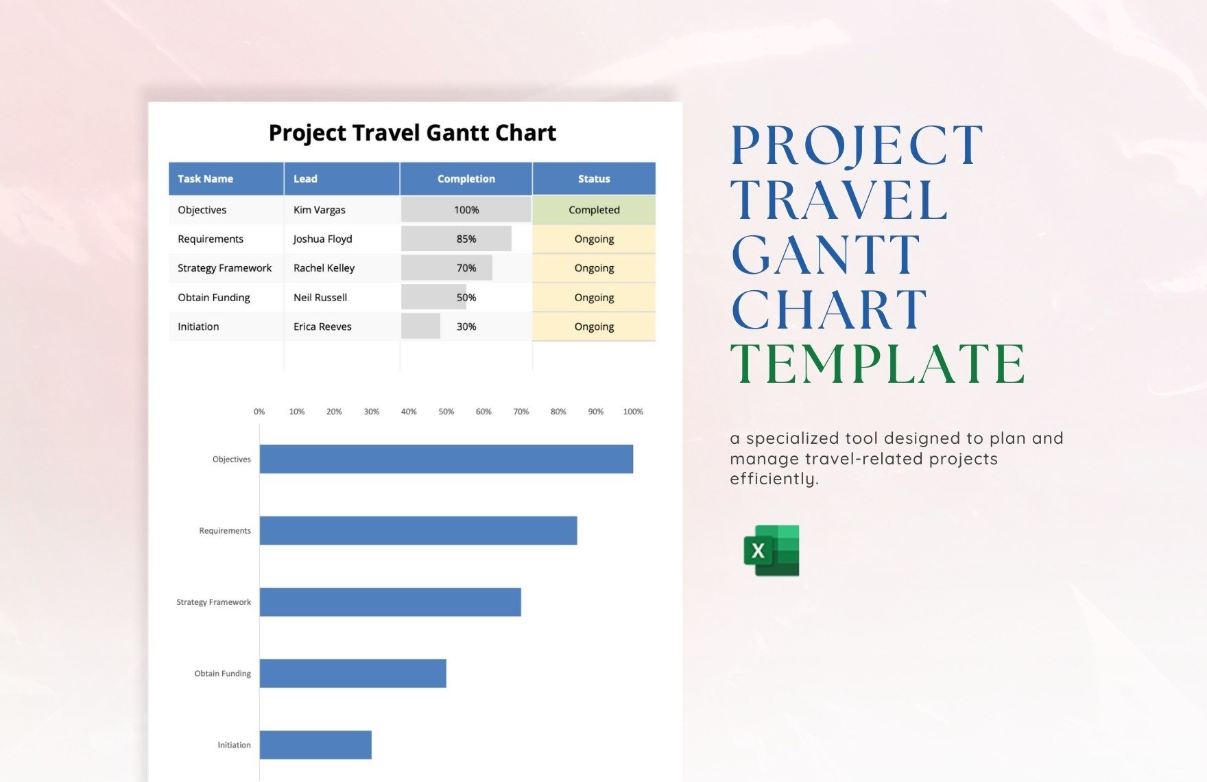
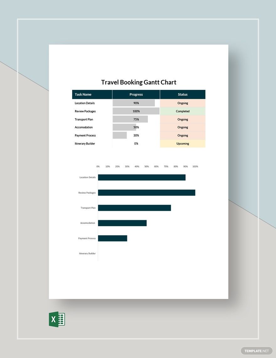
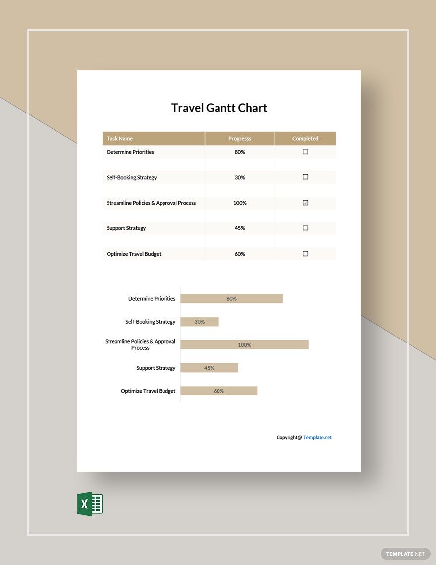
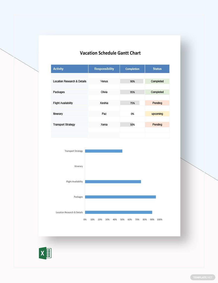
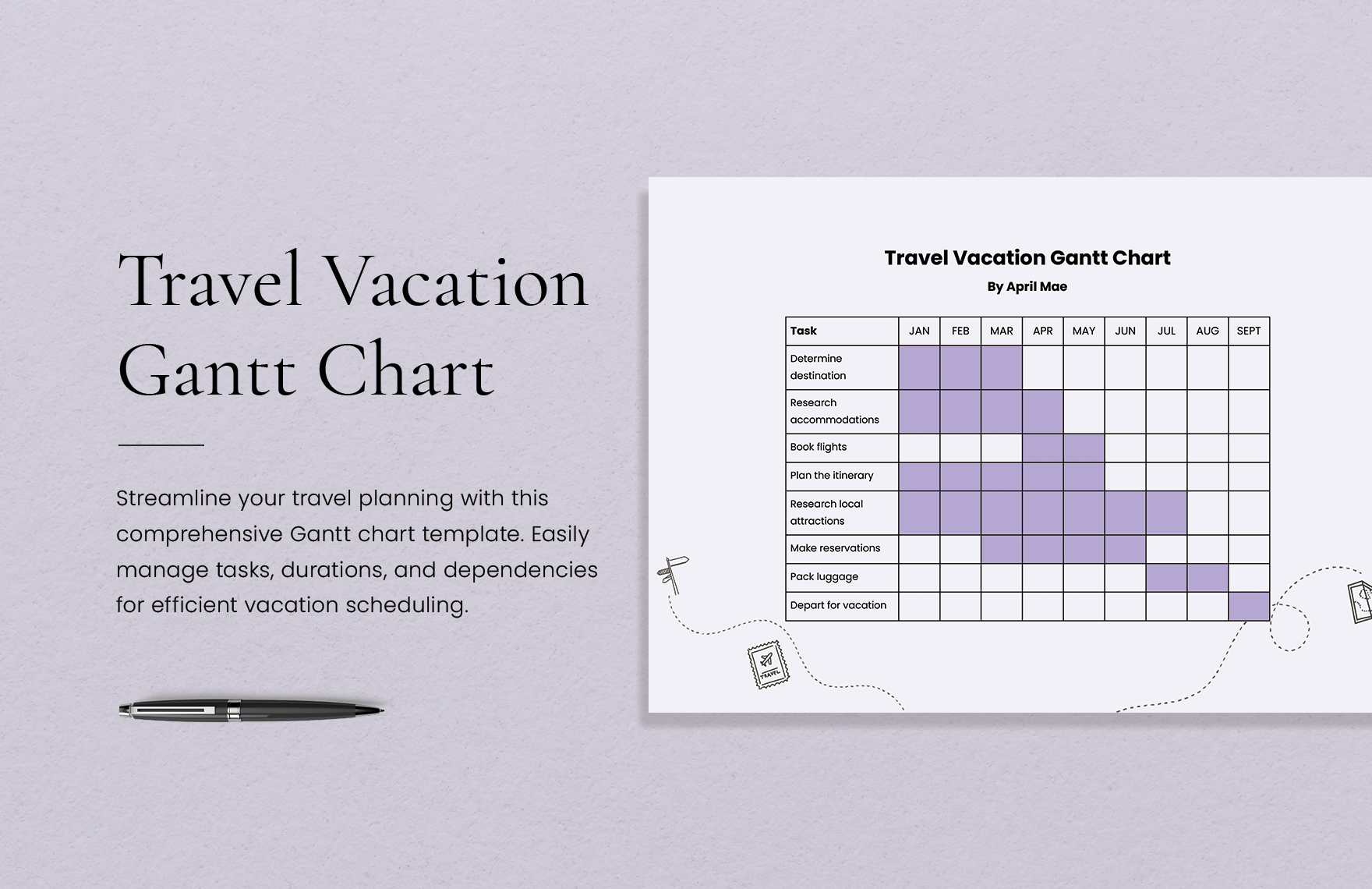
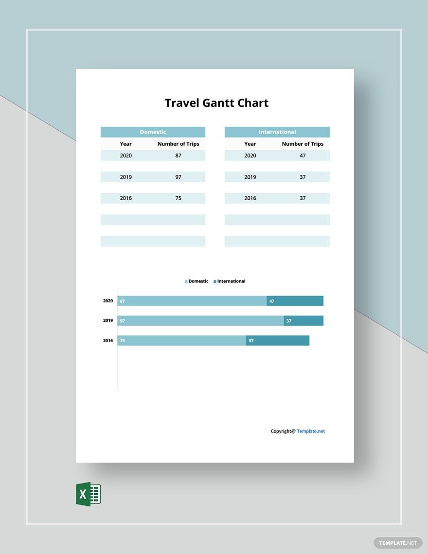
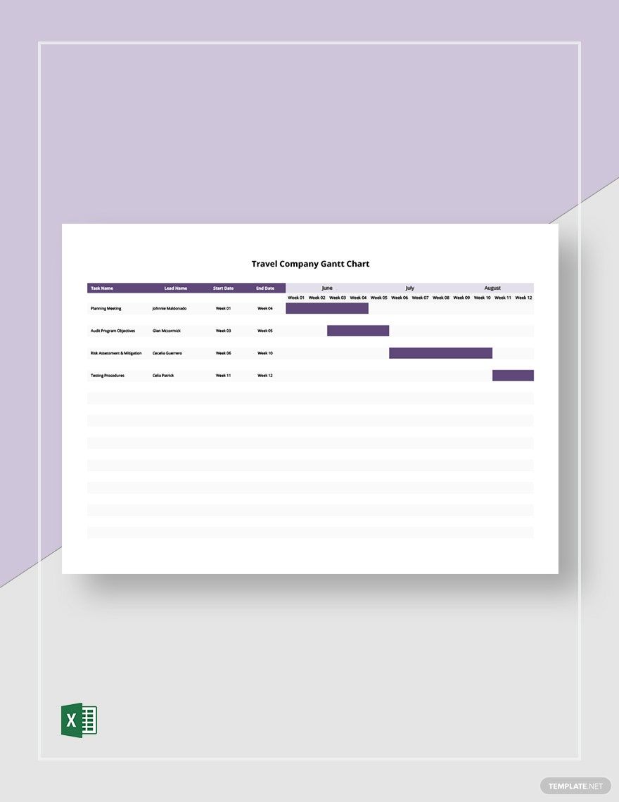
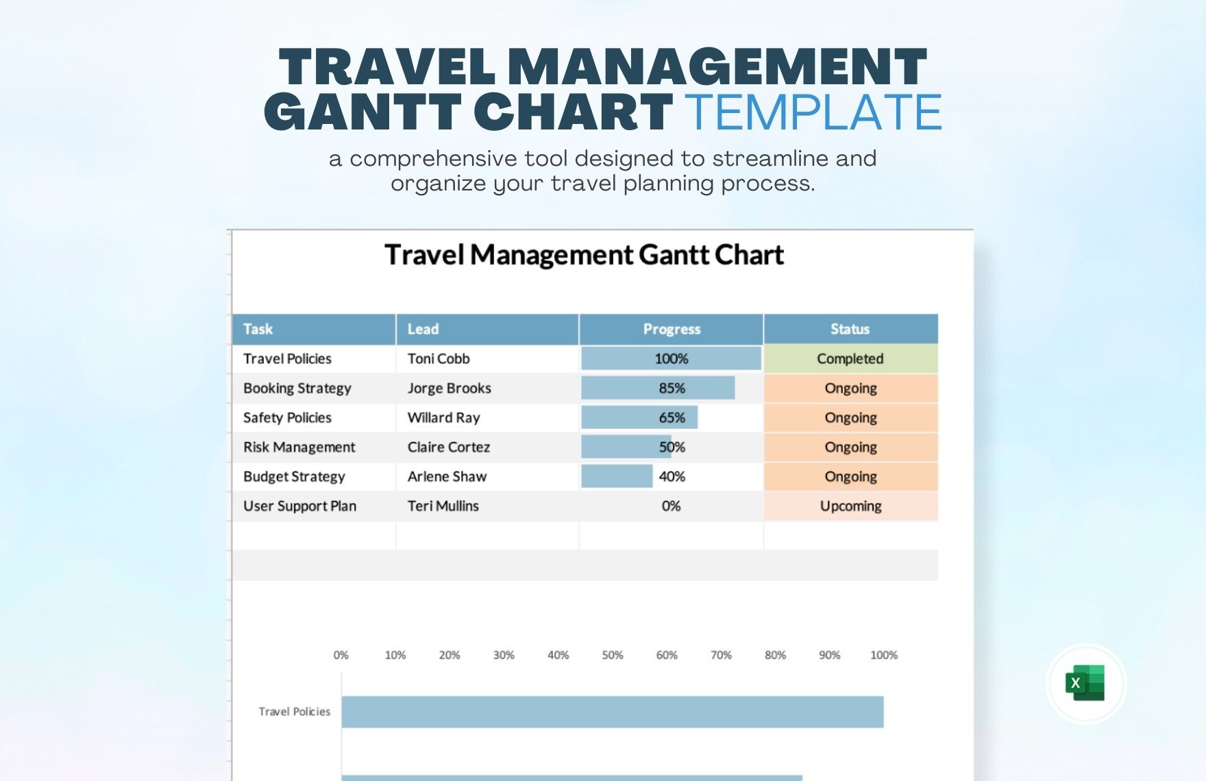
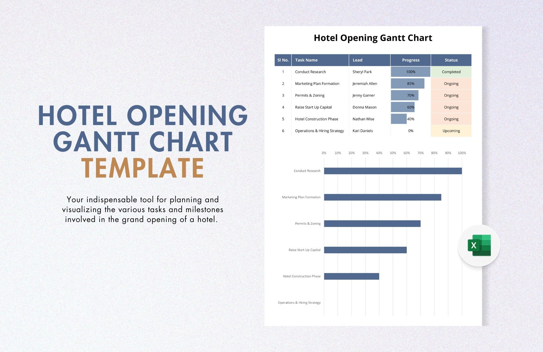
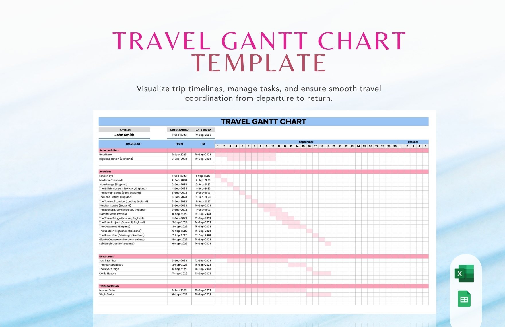
Do you run a travel agency? Are you putting together a vacation trip? Whether you’re assigning project tasks to your agents or coming up with a family beach activity, utilizing an easy-to-use chart can really come in handy for your travel-related needs! One of these helpful charts is the Gantt chart, which is a simple yet effective diagram that allows you to quickly manage different task timelines. So, allow us to assist your chart composition with our professional Travel Gantt Chart Templates for Microsoft Excel! Create a task and schedule plan with our easily editable content, available in both US and A4 letter sizes. Download now and make travel planning less of a hassle with our customizable samples!
How to Make a Travel Gantt Chart in Microsoft Excel
From business to leisure, effectively sorting out travel plans takes plenty of time and effort. Luckily, the use of a Gantt chart can help tremendously in this regard!
As investopiedia.com describes it, a Gantt chart is a kind of schedule diagram that’s used in monitoring the different tasks involved in a plan or project. Not sure where to start? No problem--just check out our tips (found below) on making a travel-based Gantt chart in Microsoft Excel.
1. Put Together a Data Table
For your chart to work, it needs a data table/datasheet to refer to. So, after opening a fresh file/document in Excel, reserve at least three series of columns to the left side of the sheet; you might need more columns, depending on how many series you want your chart to monitor.
Next, on the top cells of your columns, label each of them with the categories that you want your chart’s series to reflect. For example, you can label the columns as Task, Start Date, and End Date. Once that’s done, input your data/information into their appropriate columns. Additional columns could also be Days to Complete, Assigned to, or whatever else you might need.
In regards to travel-related plans, the columns could contain progress about activity itineraries, transportation budgets, lodging processing, or whatever else you need to keep track of!
2. Insert a Bar Chart
Now that you’ve made a data table in your sheet, click the Insert button at the top of the Excel window and then choose the Stacked Bar Chart. Once it shows up in your sheet, you can click-drag it around so that it doesn’t get in the way of your data table.
3. Link Your Data to the Chart
With the blank chart ready, it’s time to use put your data table to use. Right-click the chart and choose Select Data from the list; highlight one of the data columns and set the parameters in the pop-up accordingly. After confirming, your data should now be measured in the chart! Do the same thing for the other columns.
4. Spruce Up Your Chart
After taking care of the essential elements of your chart, you can make it more readable by using options for colors, text alignment, bar colors, and so on. When saving your document, be sure to pick a folder/location that’s convenient to access when you need to use or update the chart.
Need some ready-made chart examples for handling travel-based plans? Then remember to have a gander at our Travel Gantt Chart Templates!


