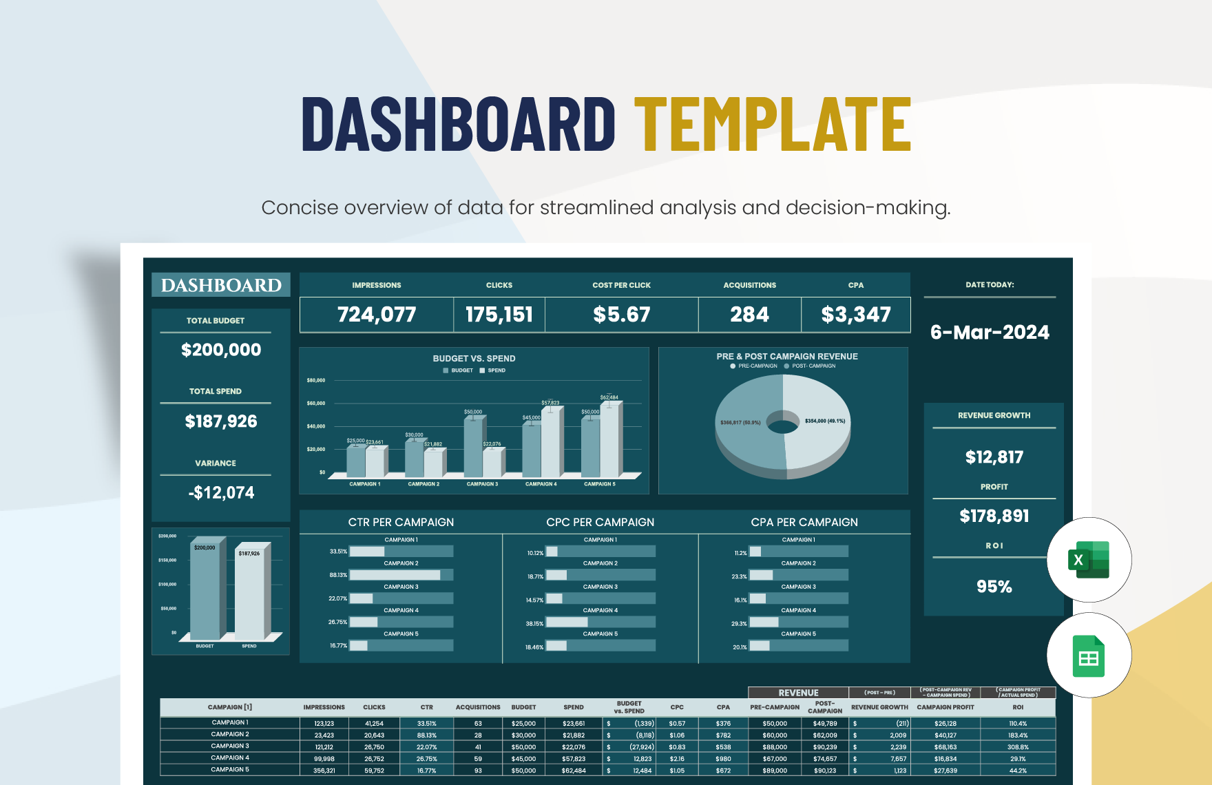
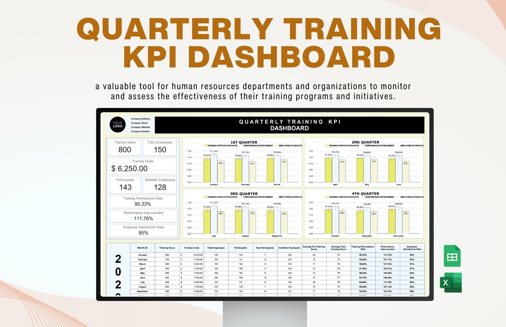
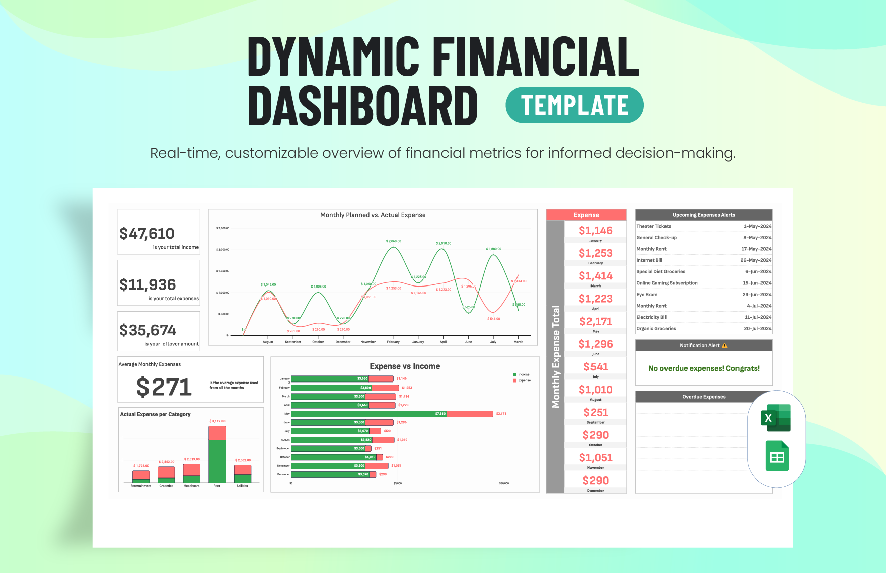
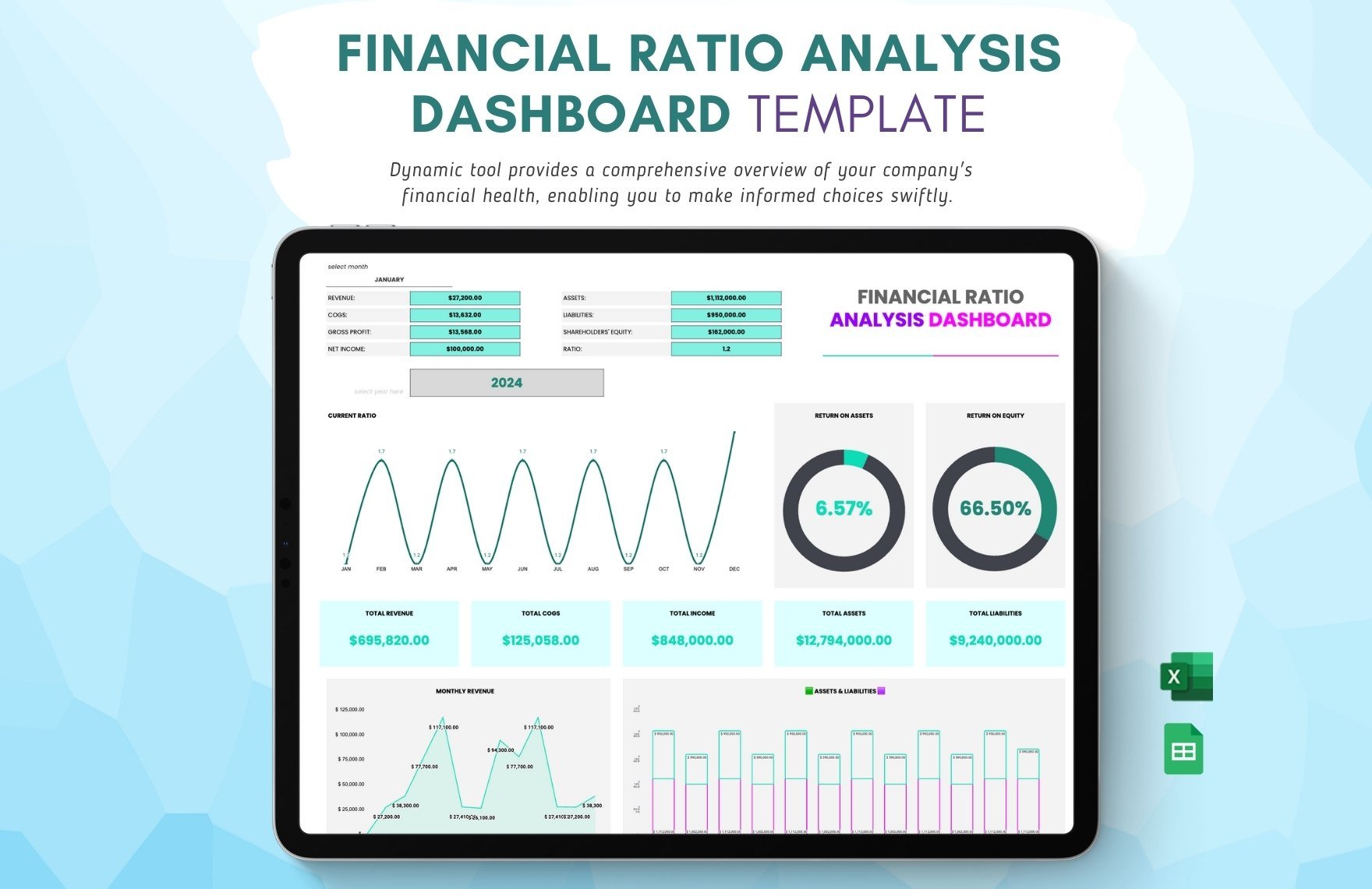
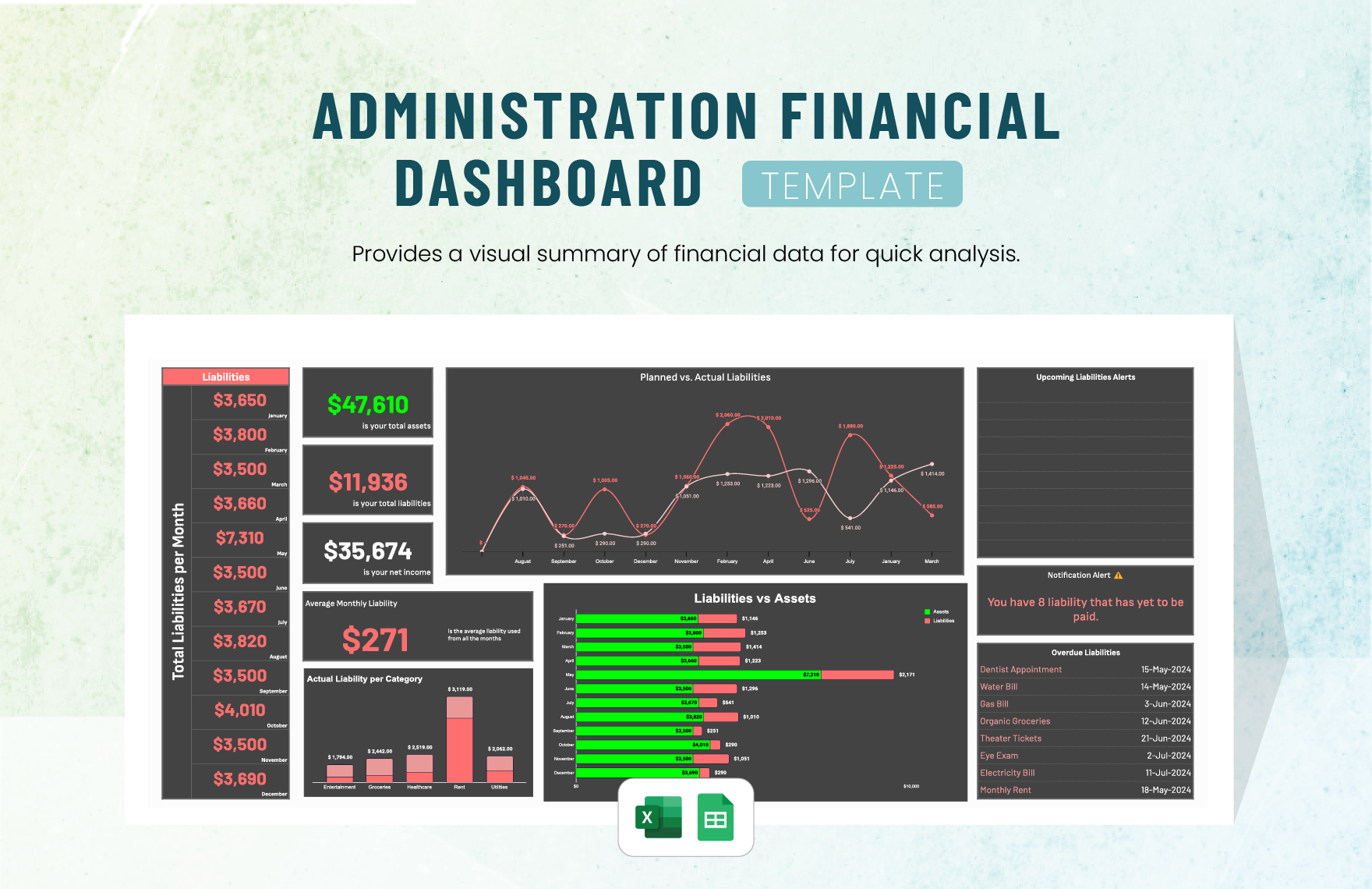
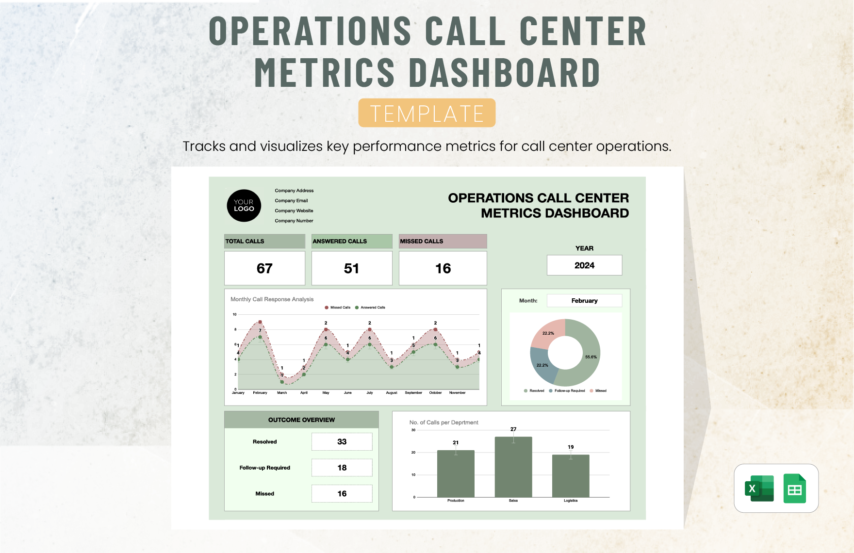
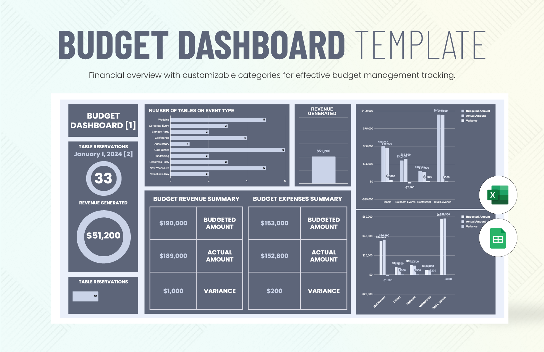
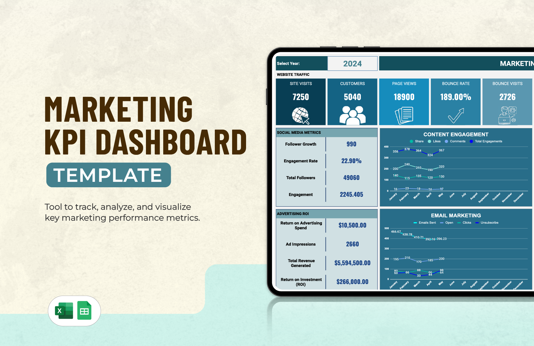
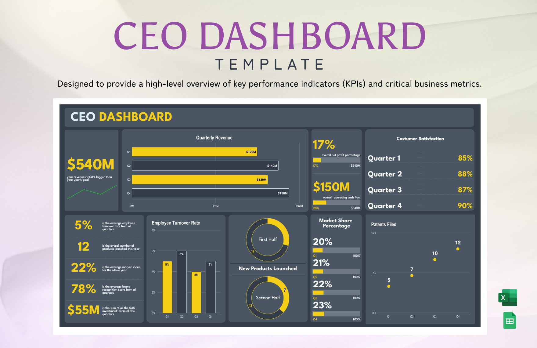
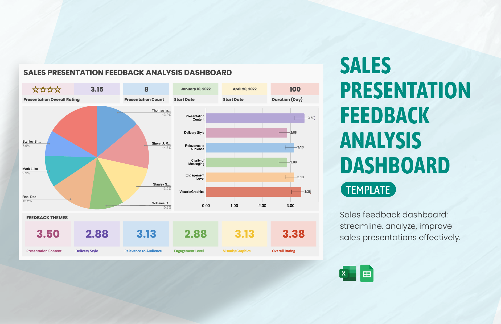
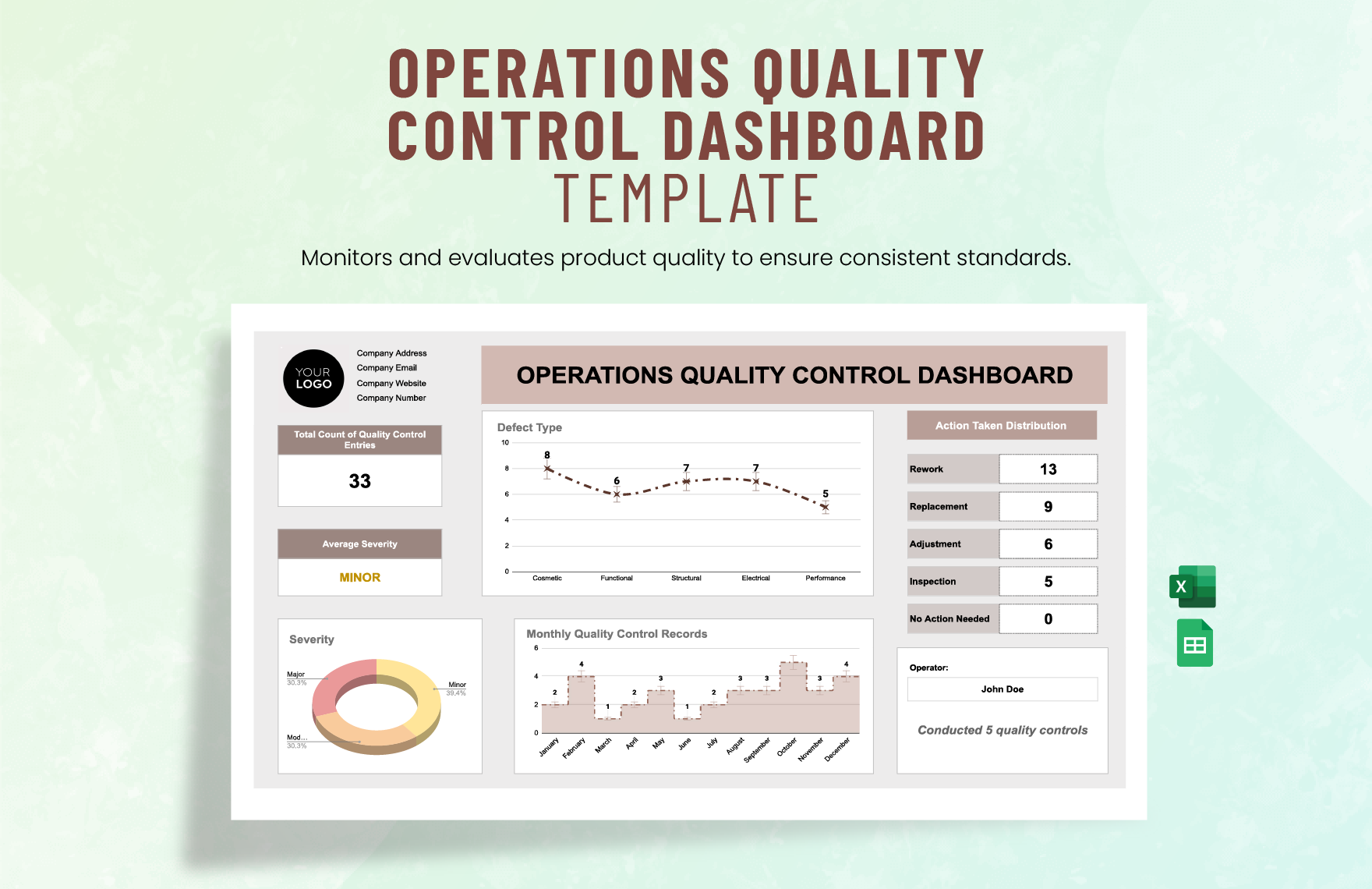
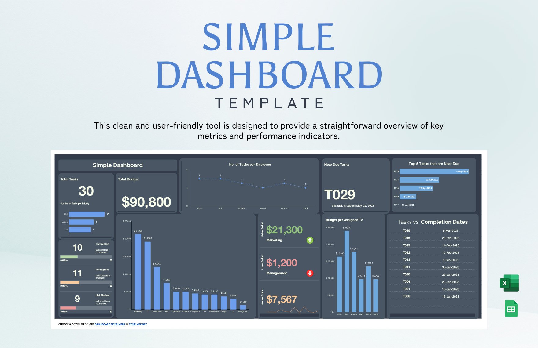
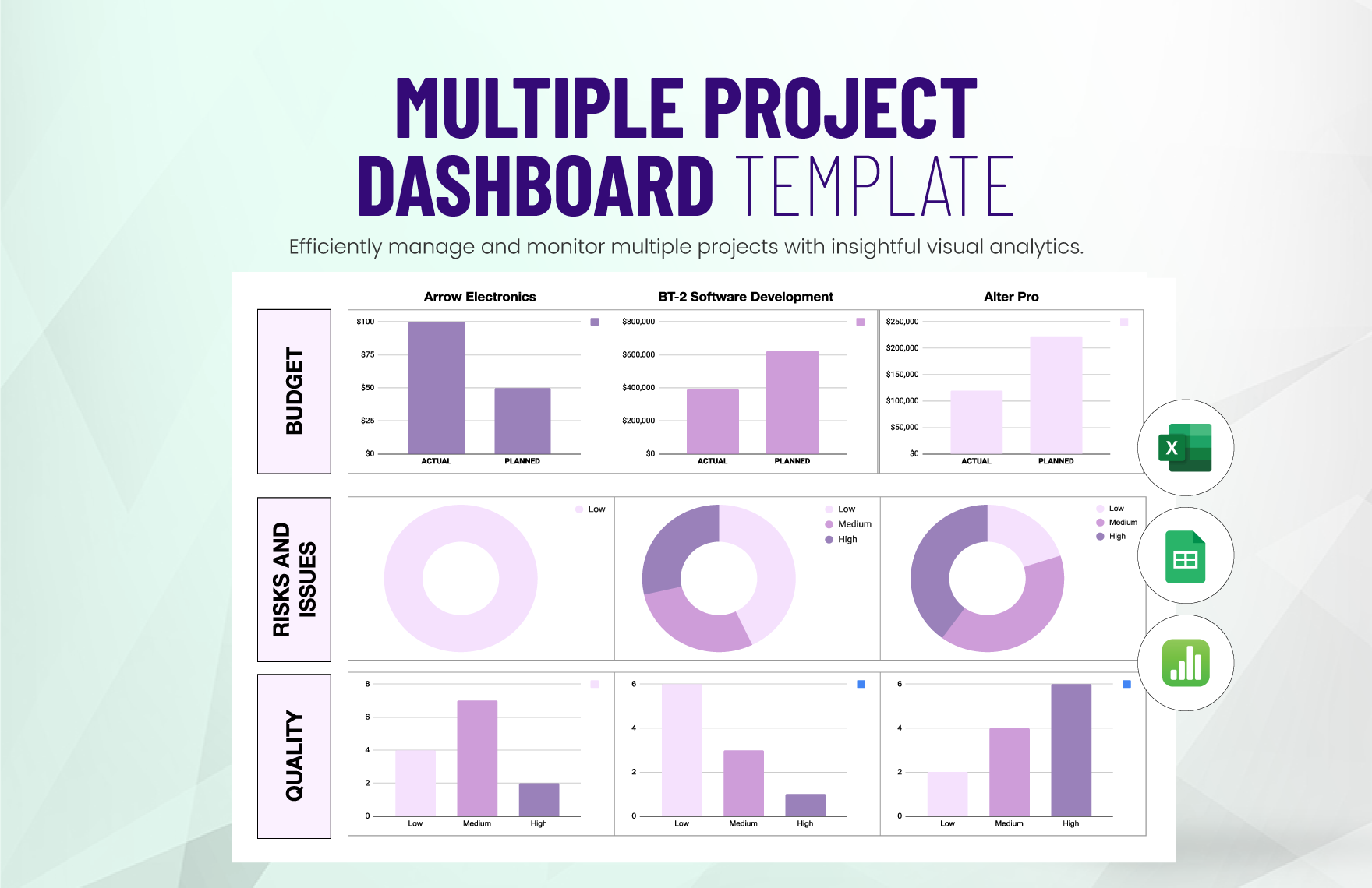
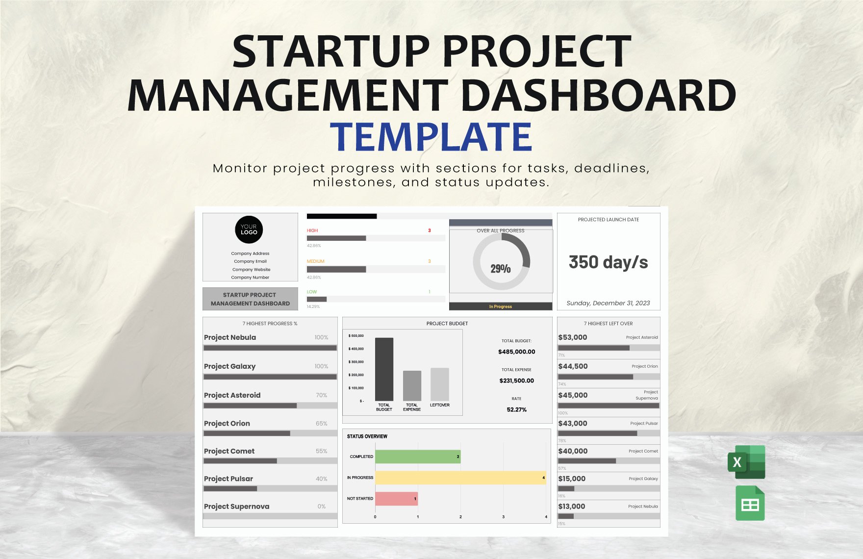
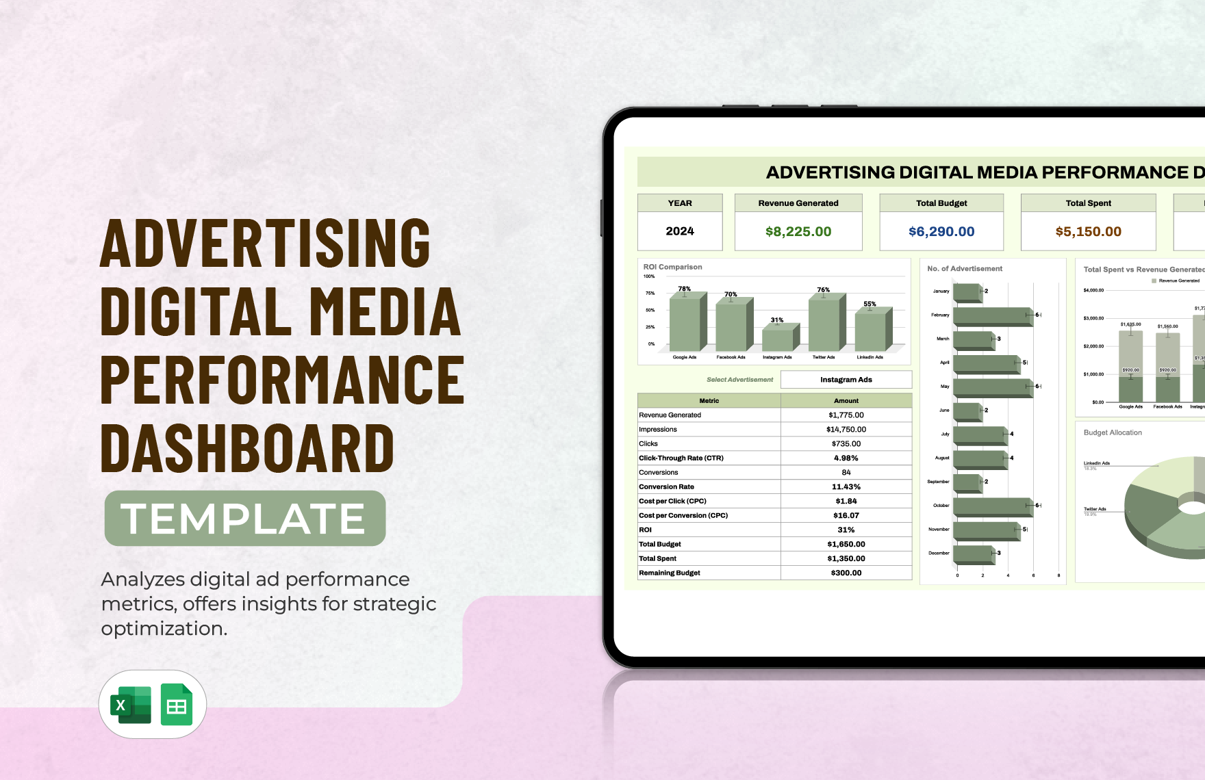
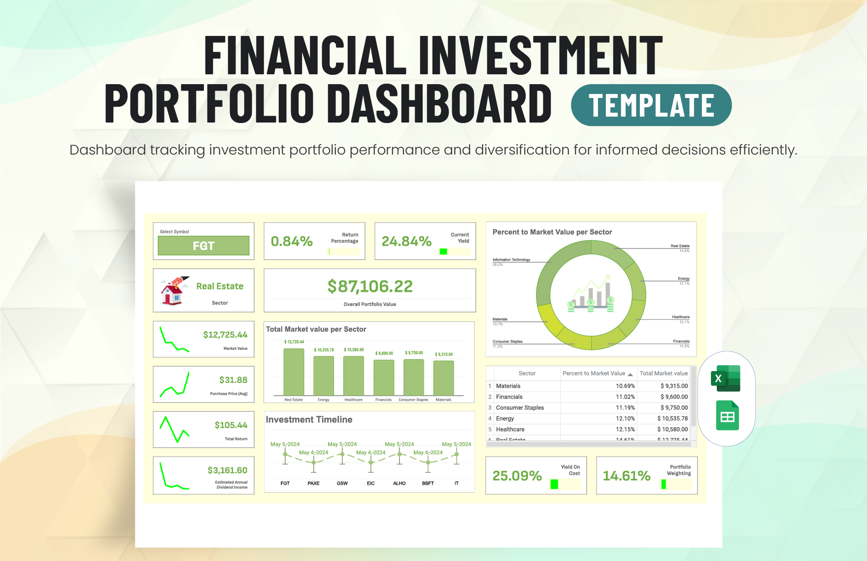
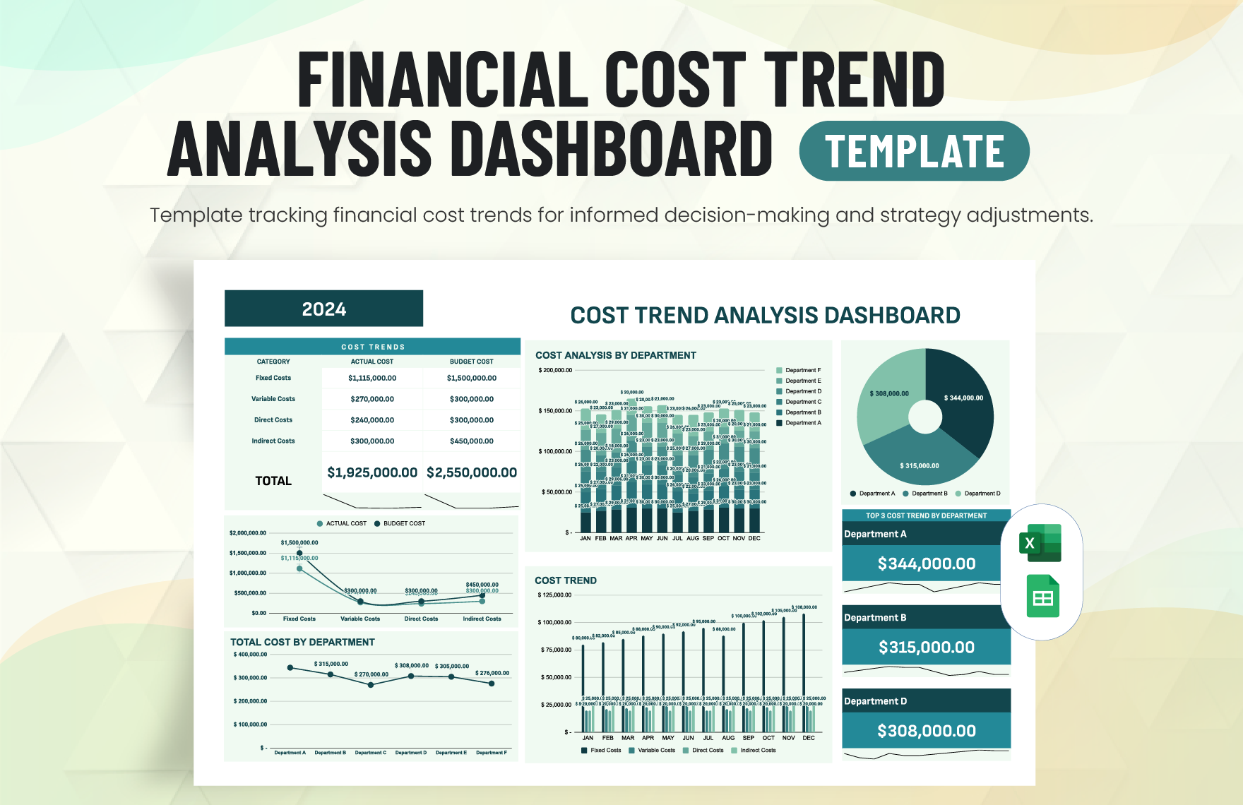
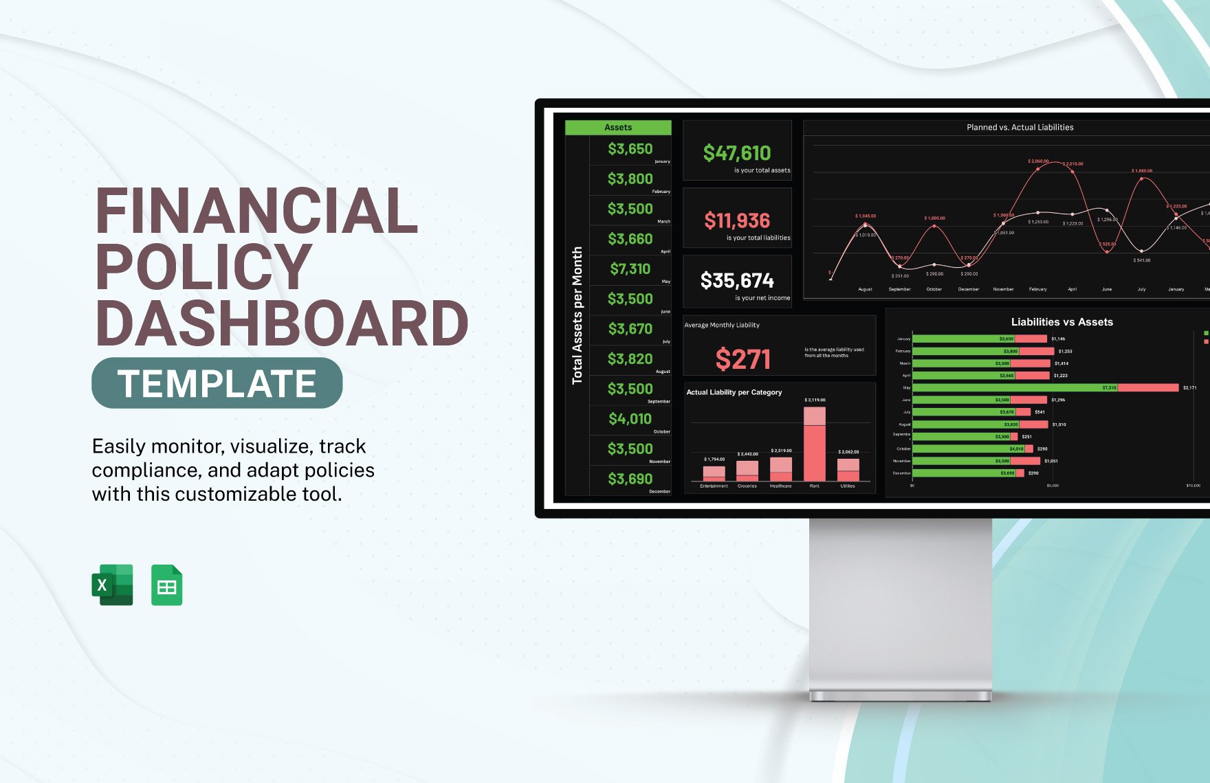
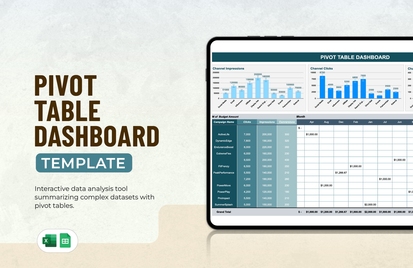
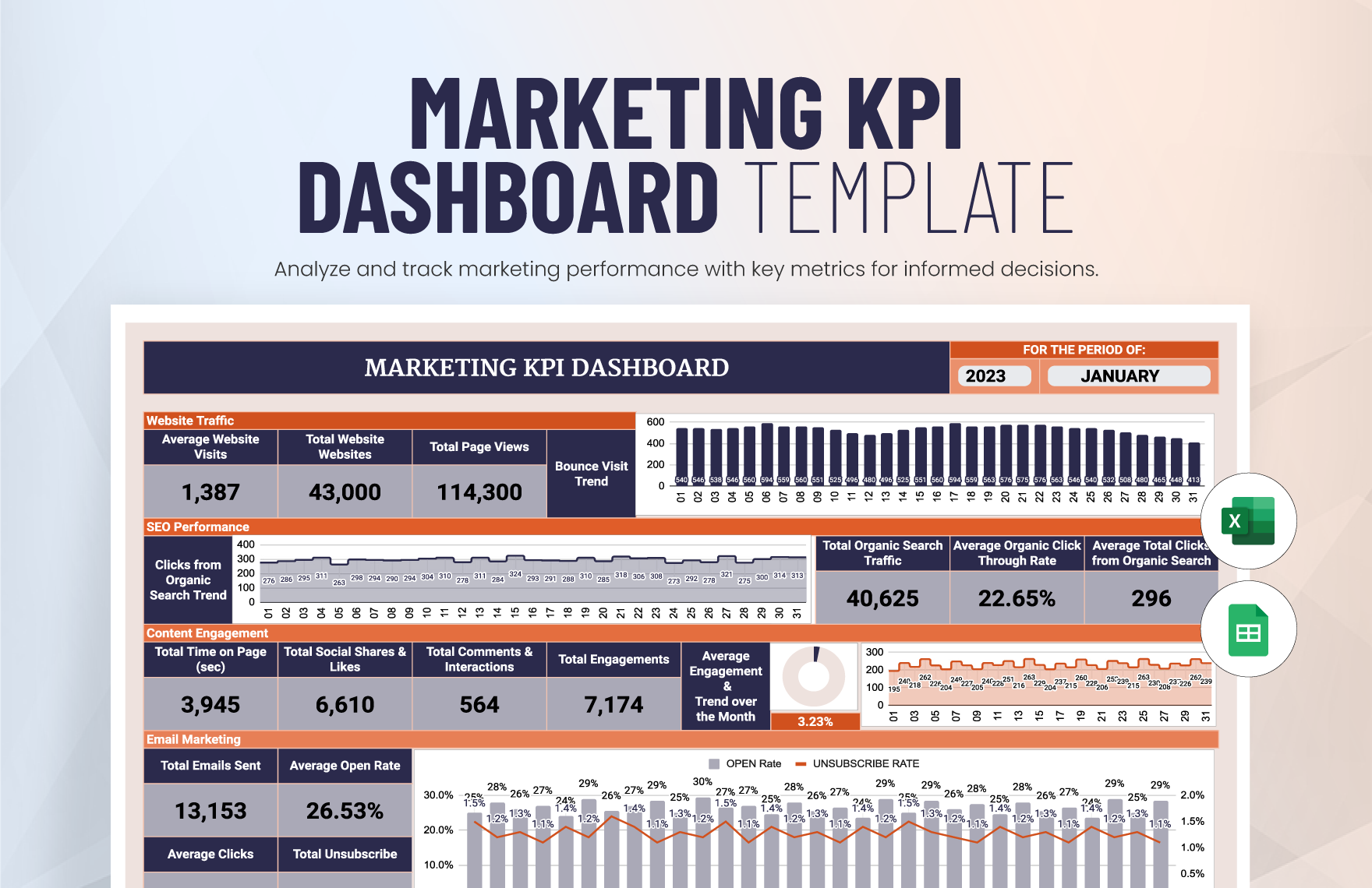
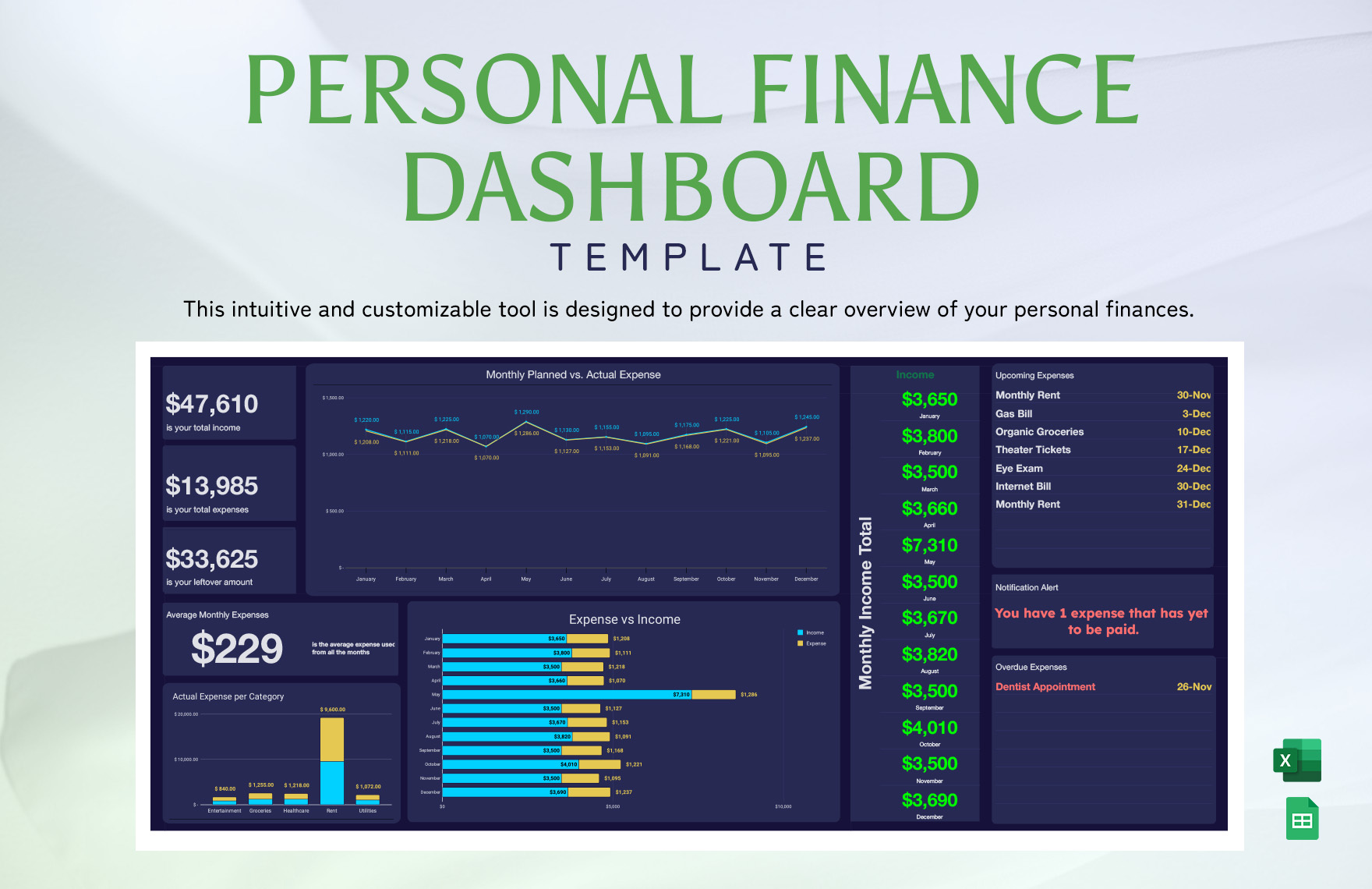
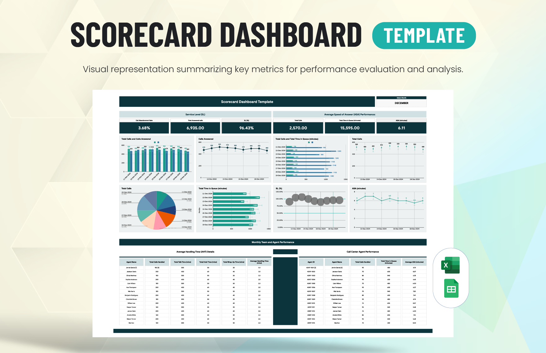
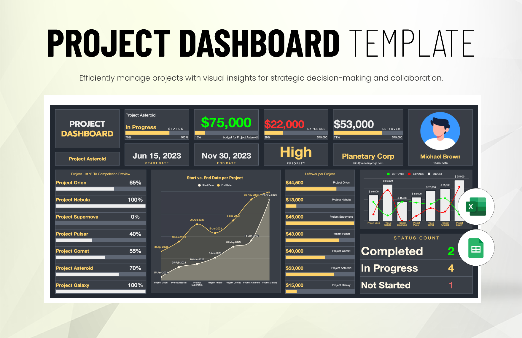
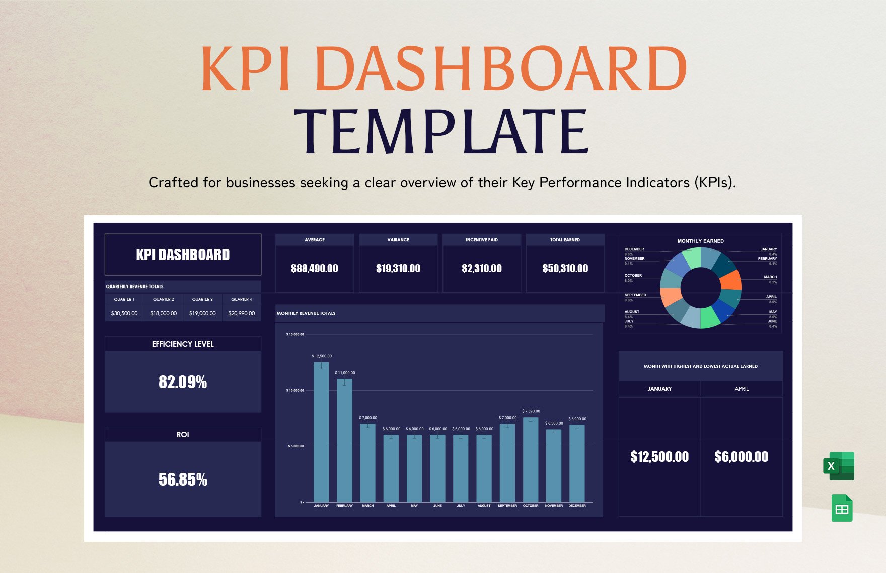
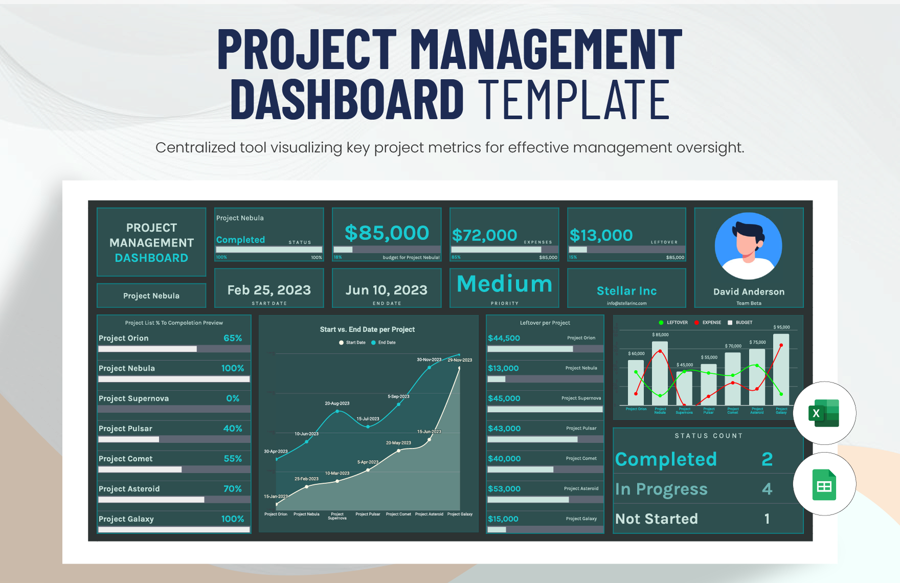
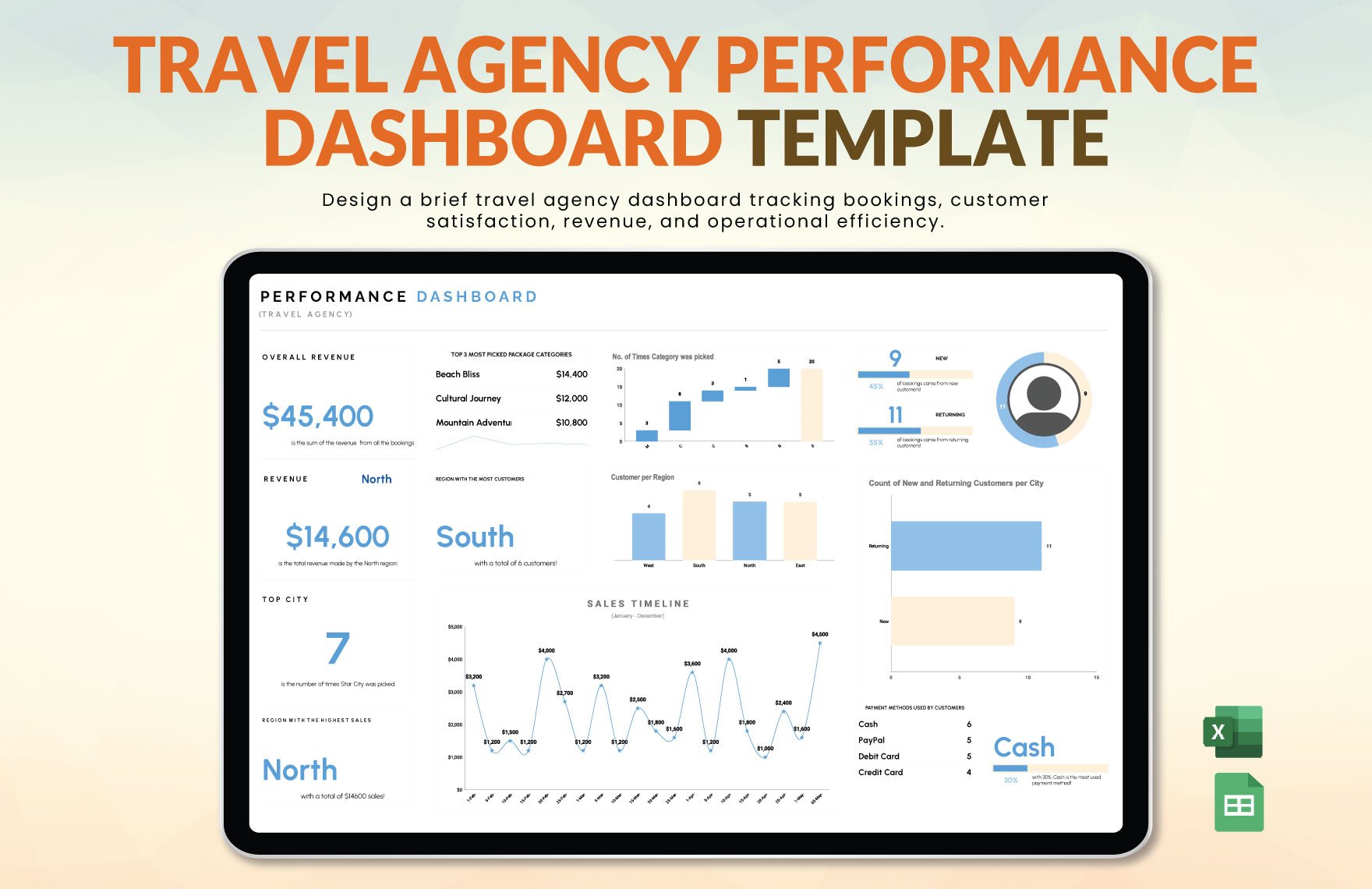
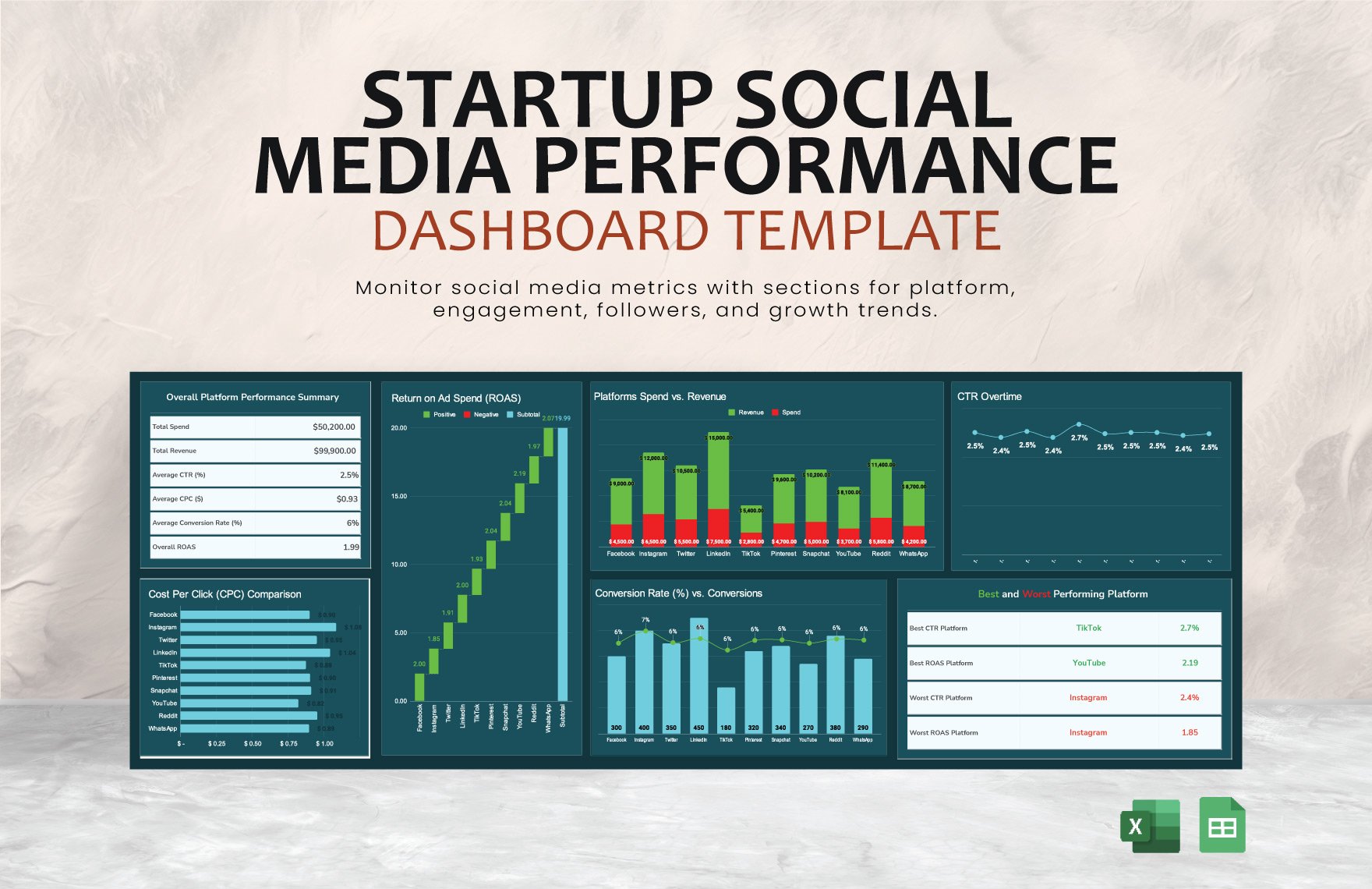
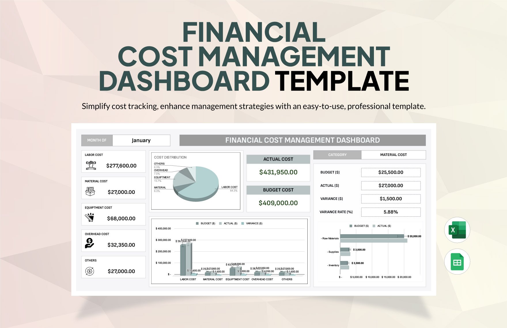
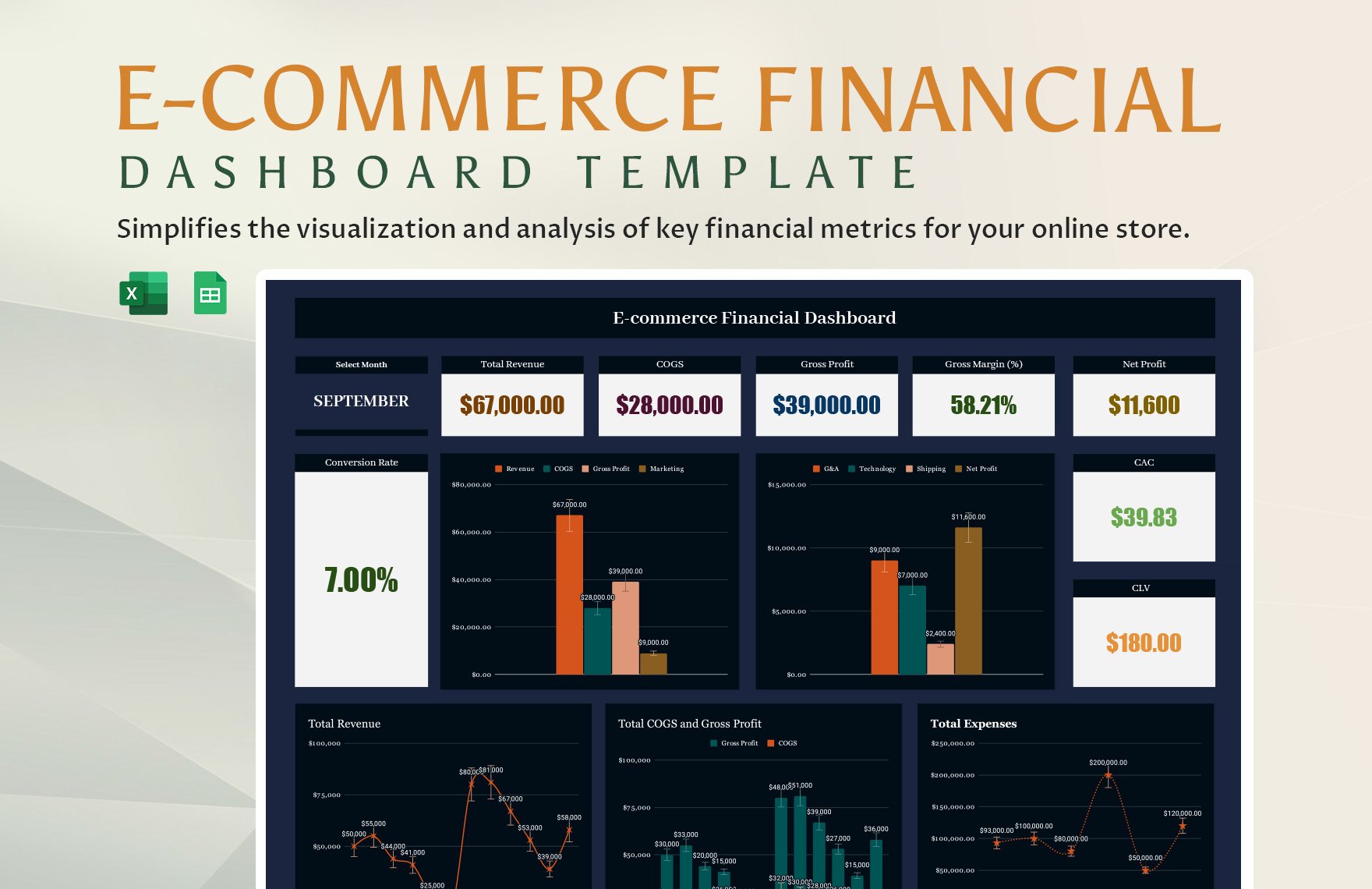
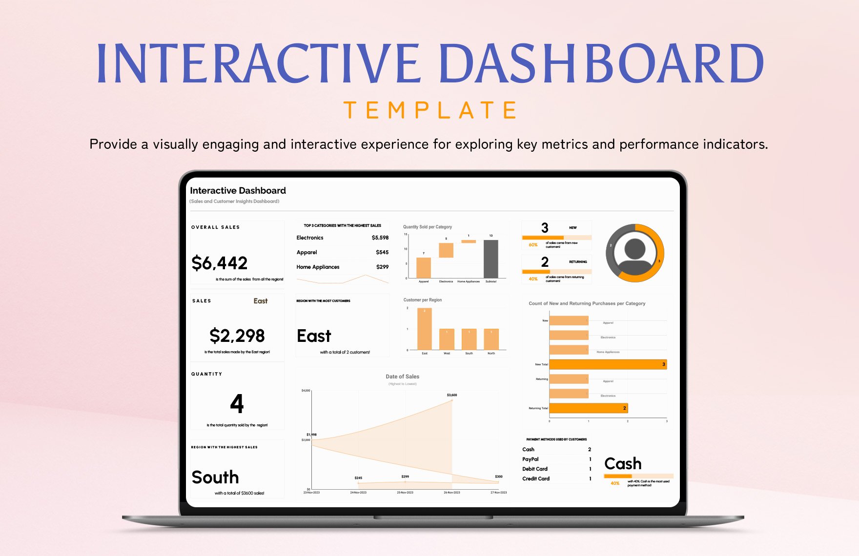
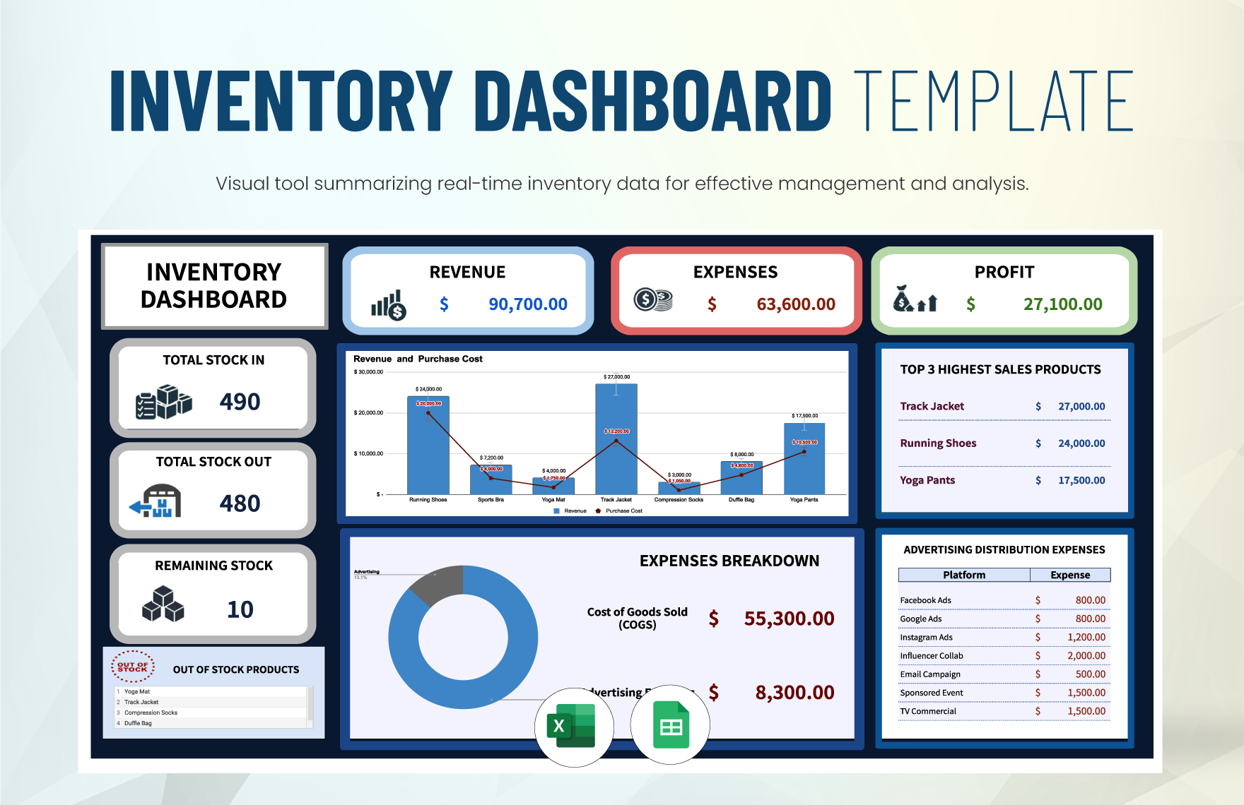
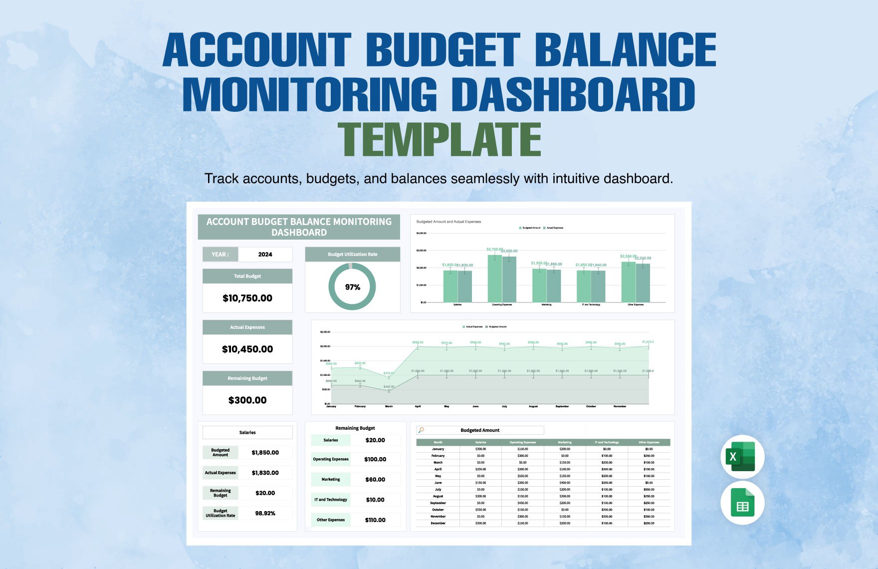
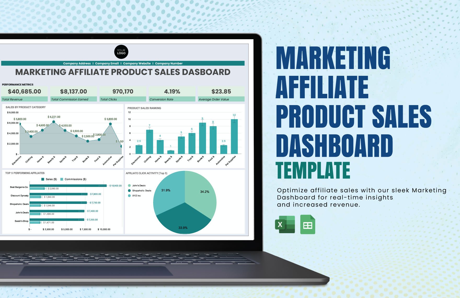
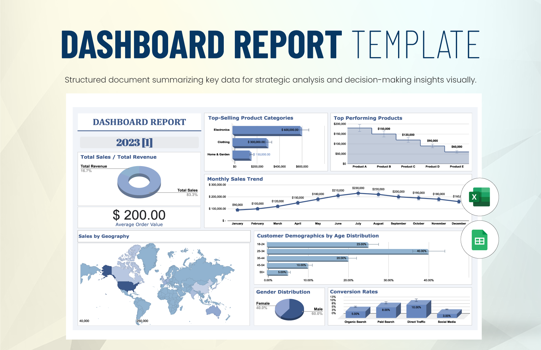
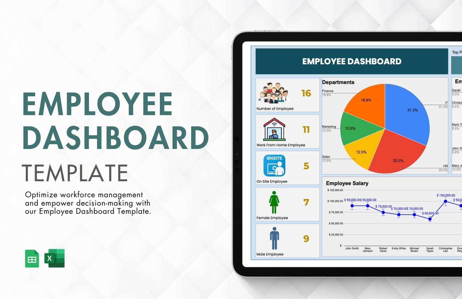
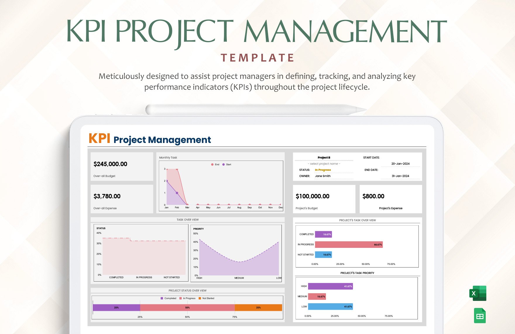
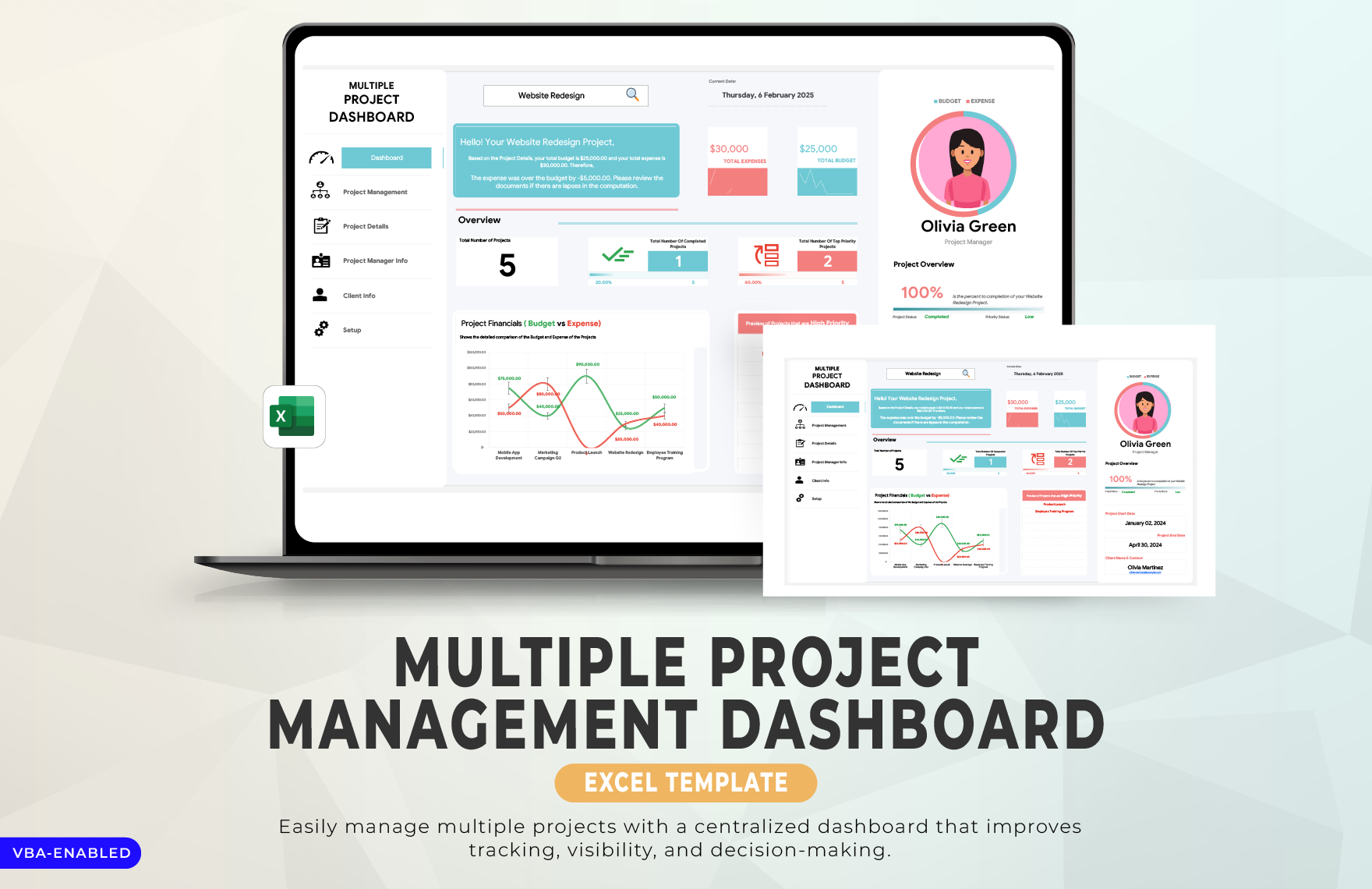
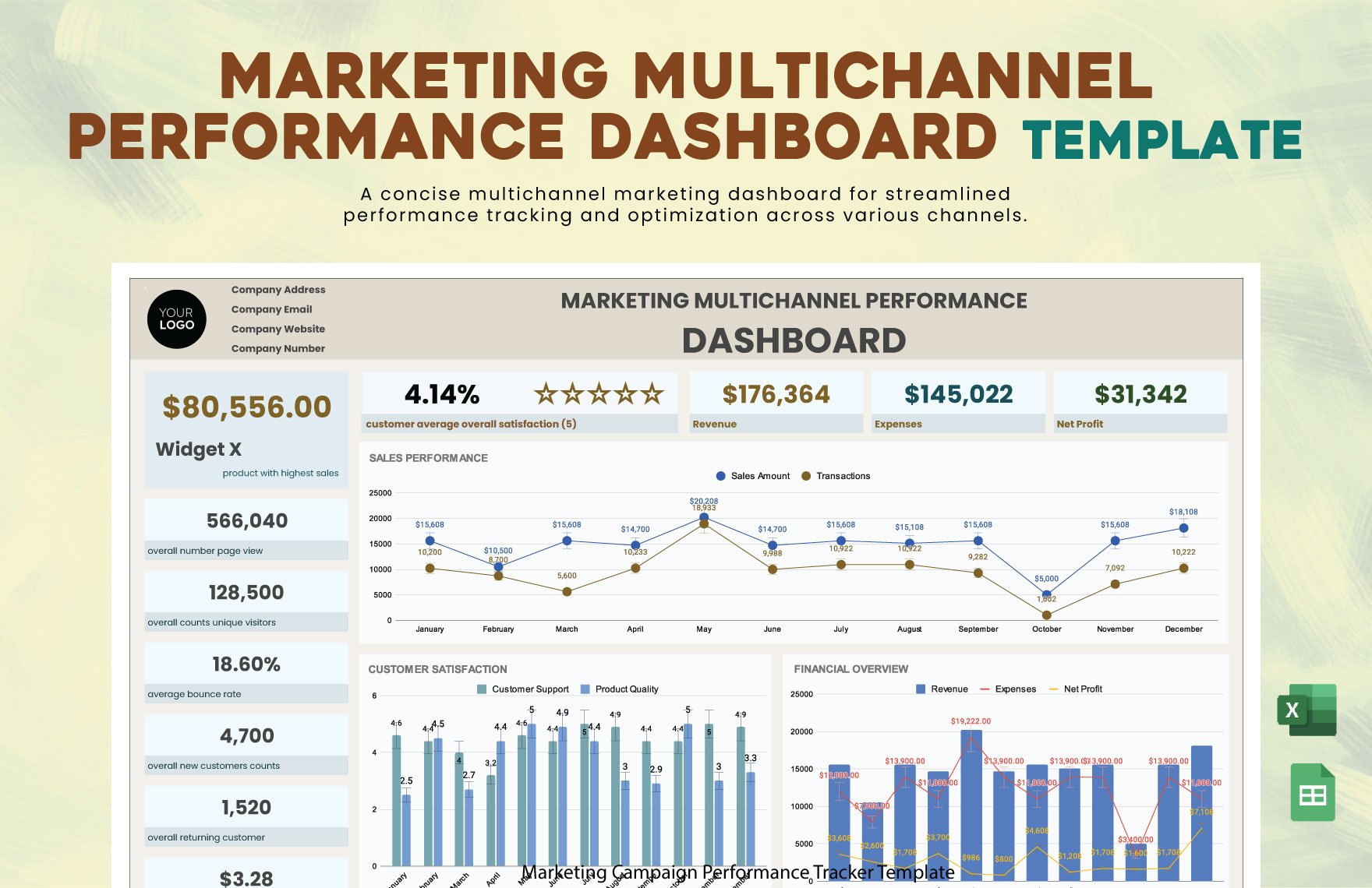
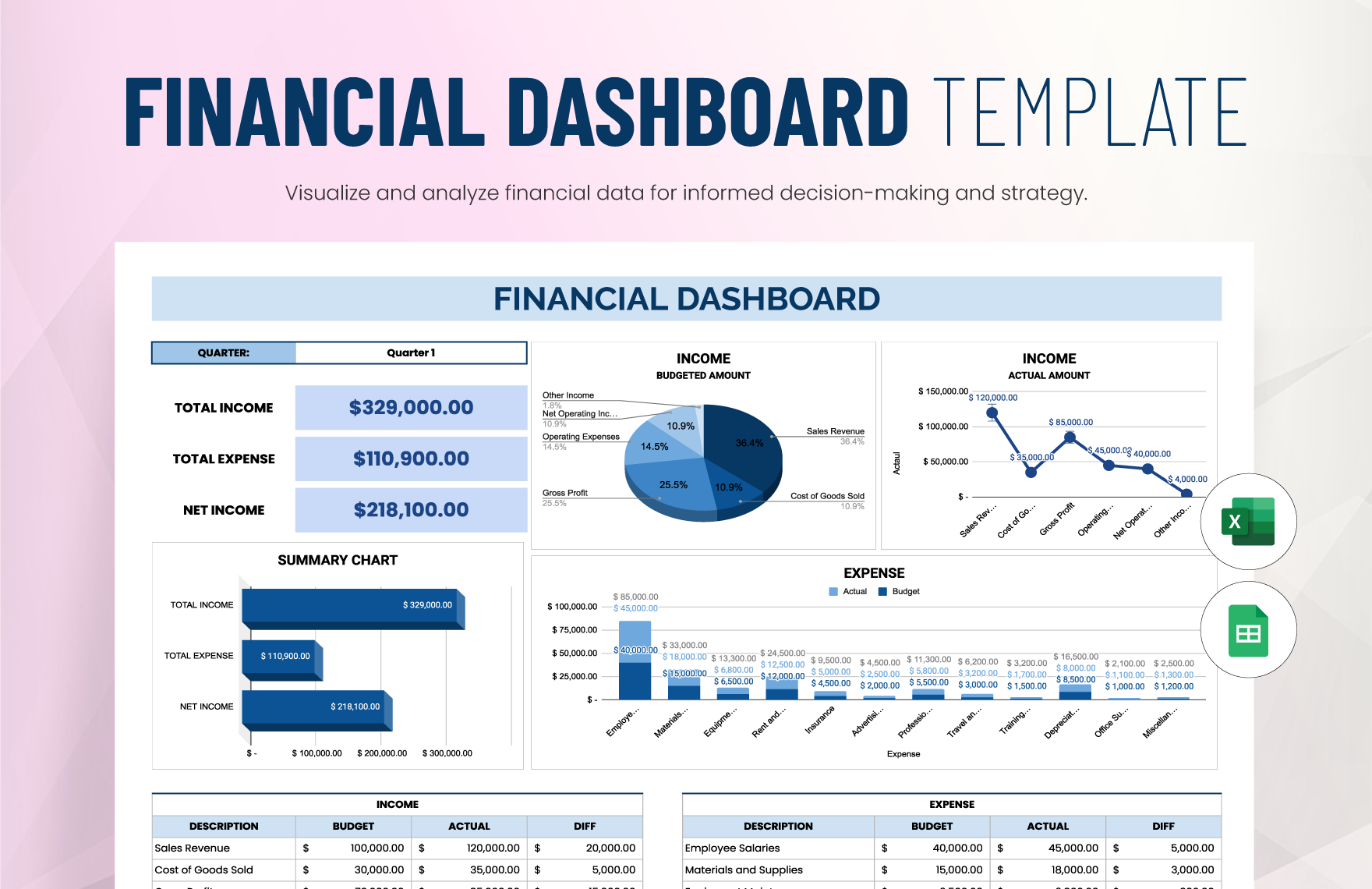
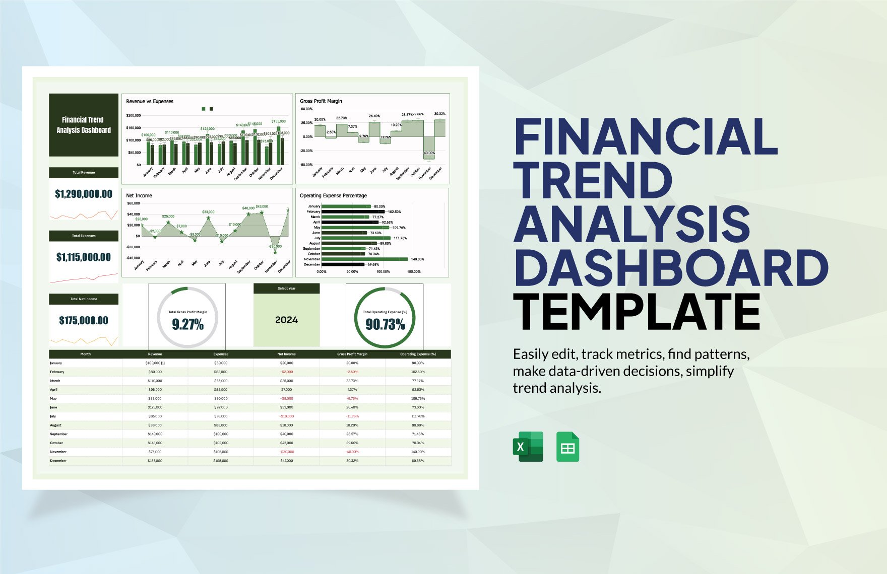
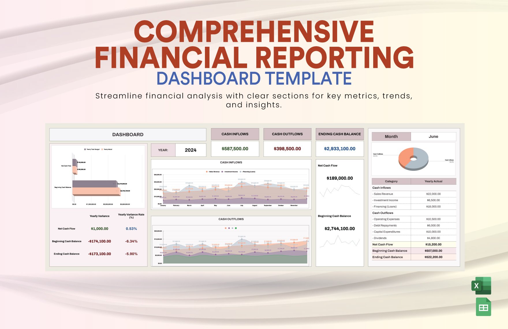
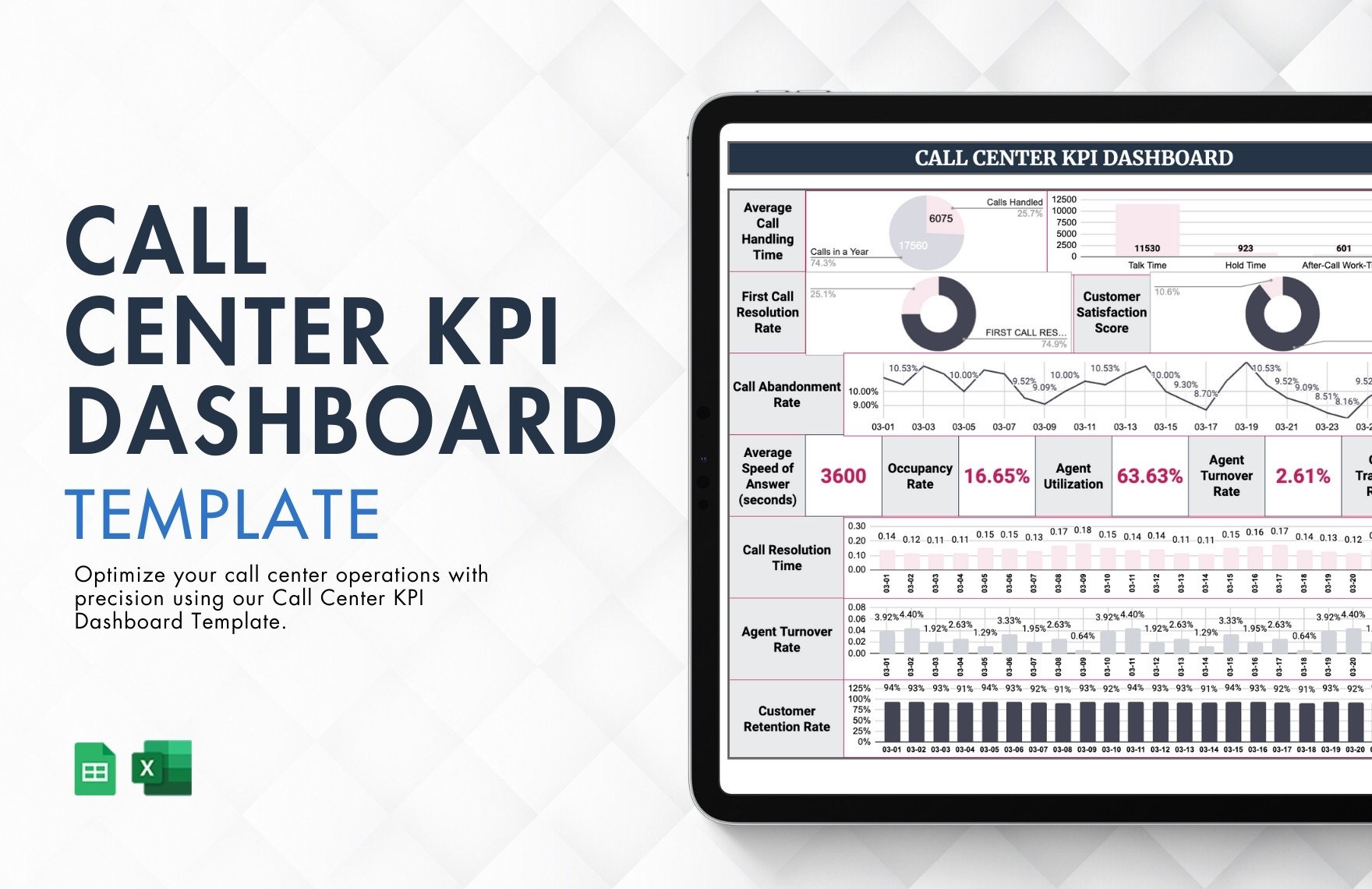
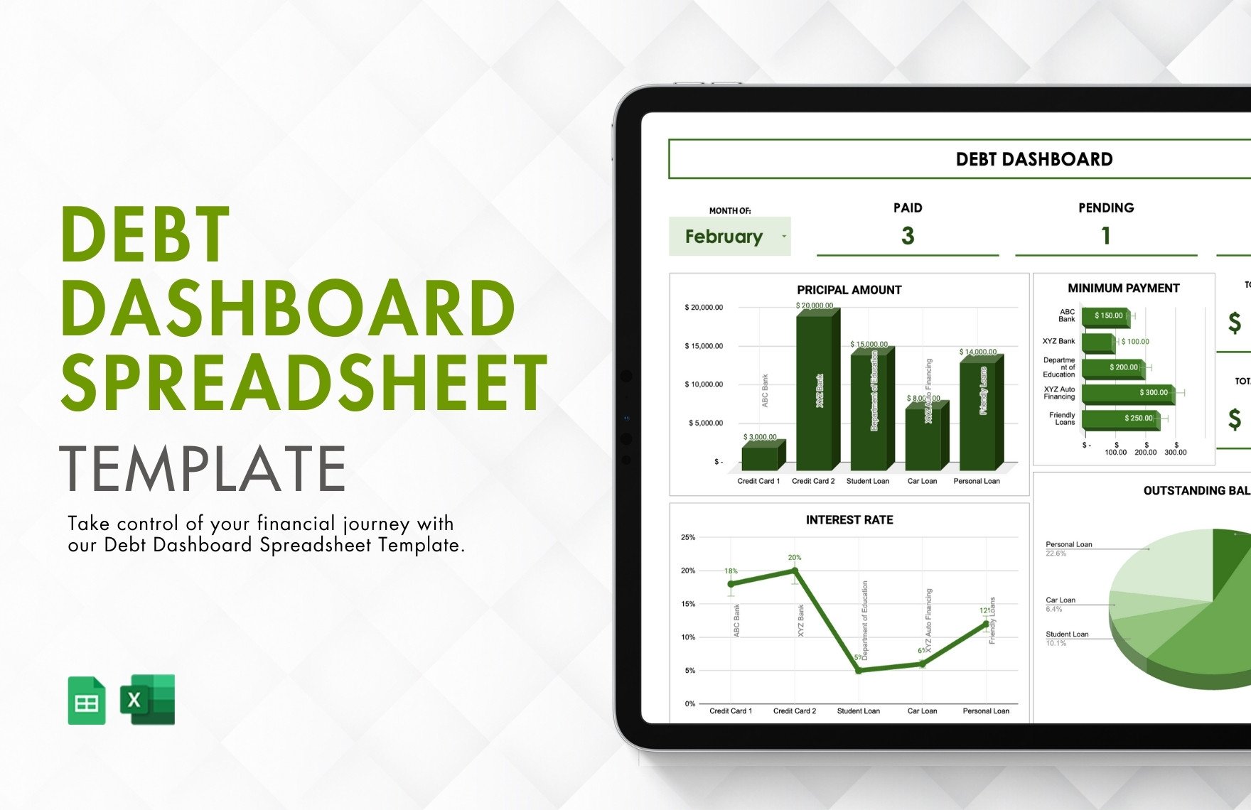
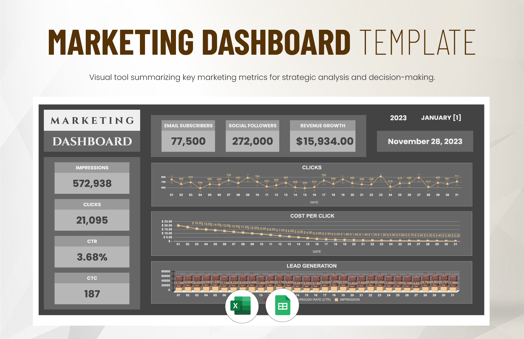
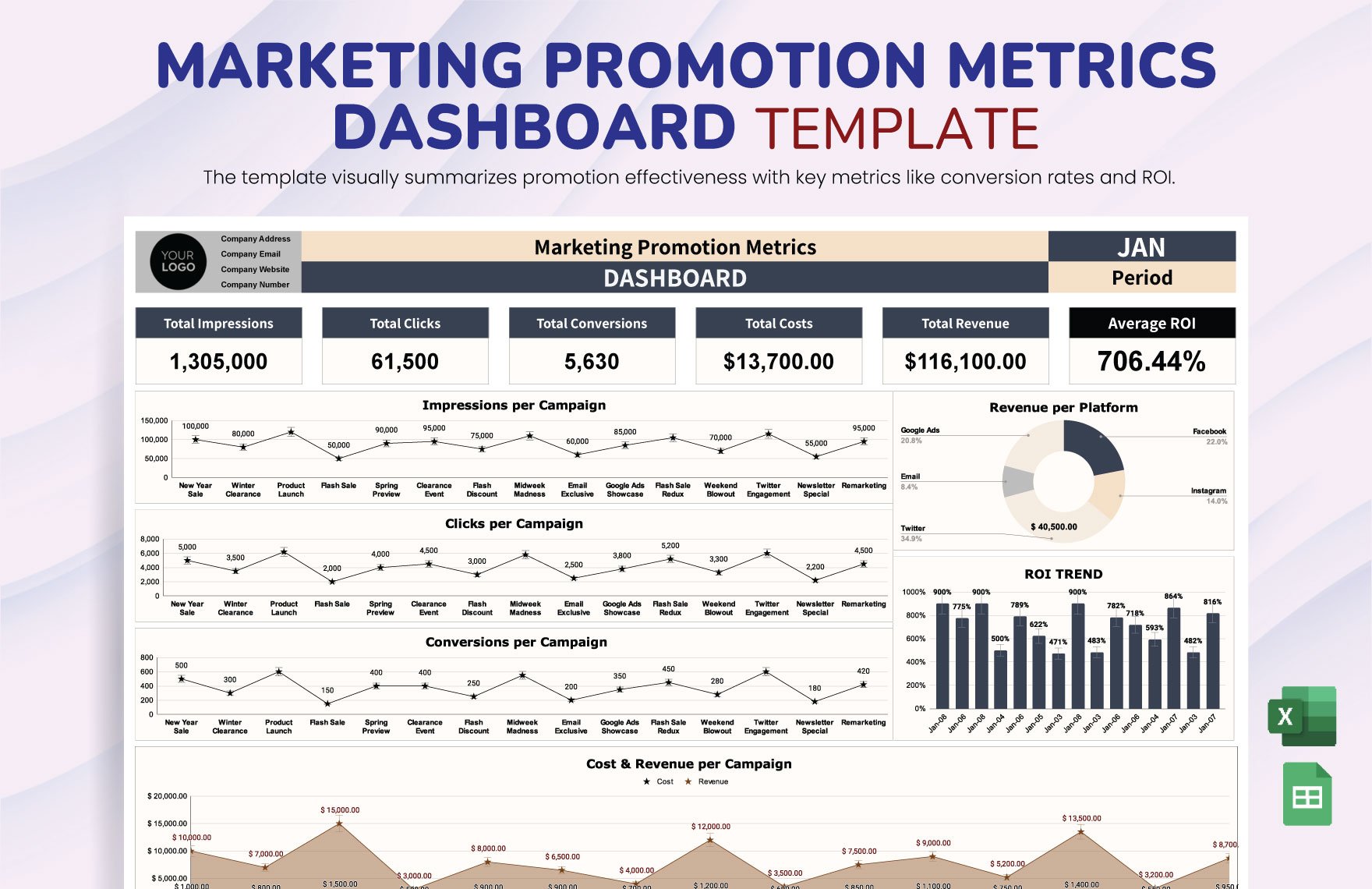
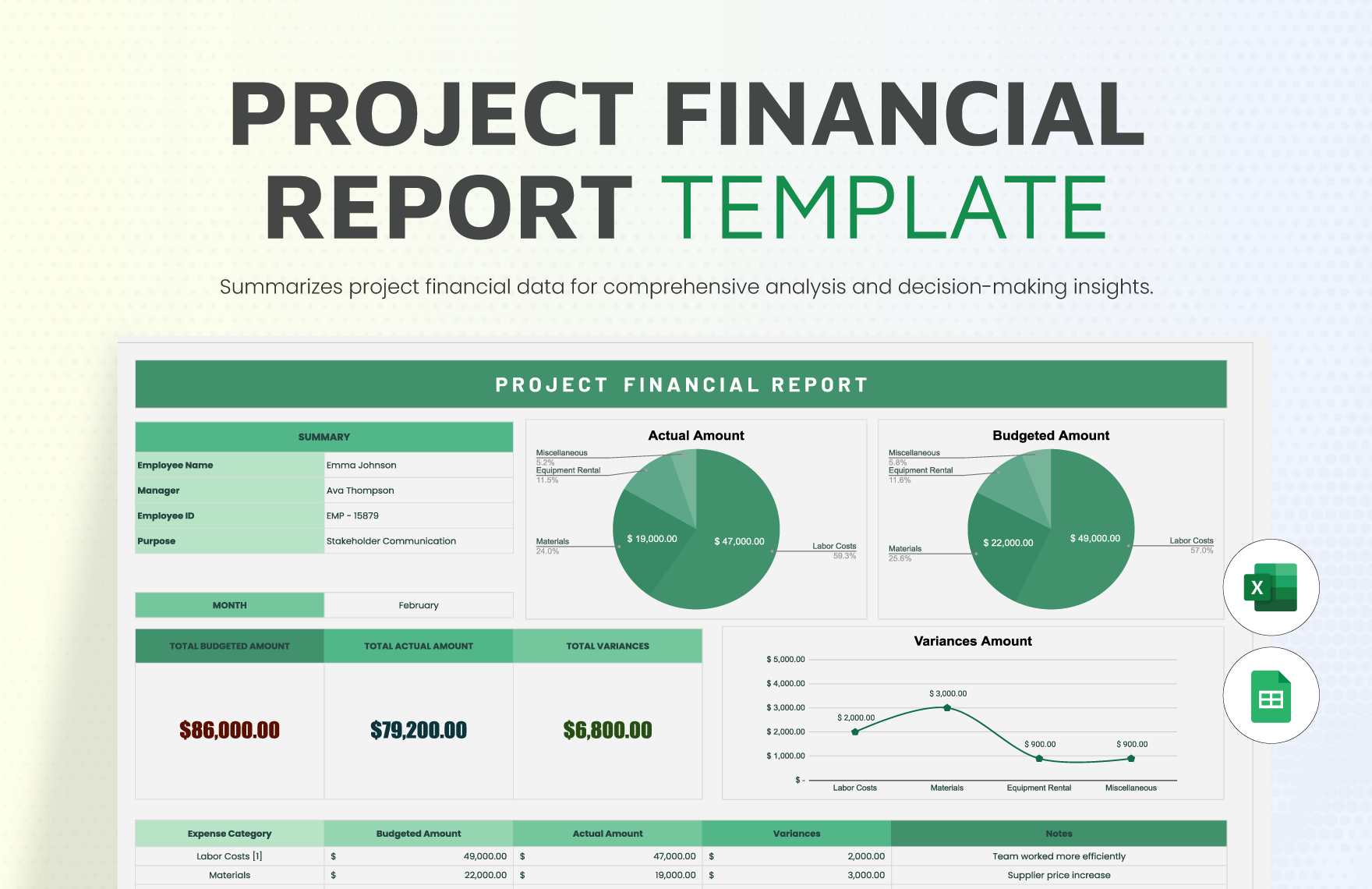
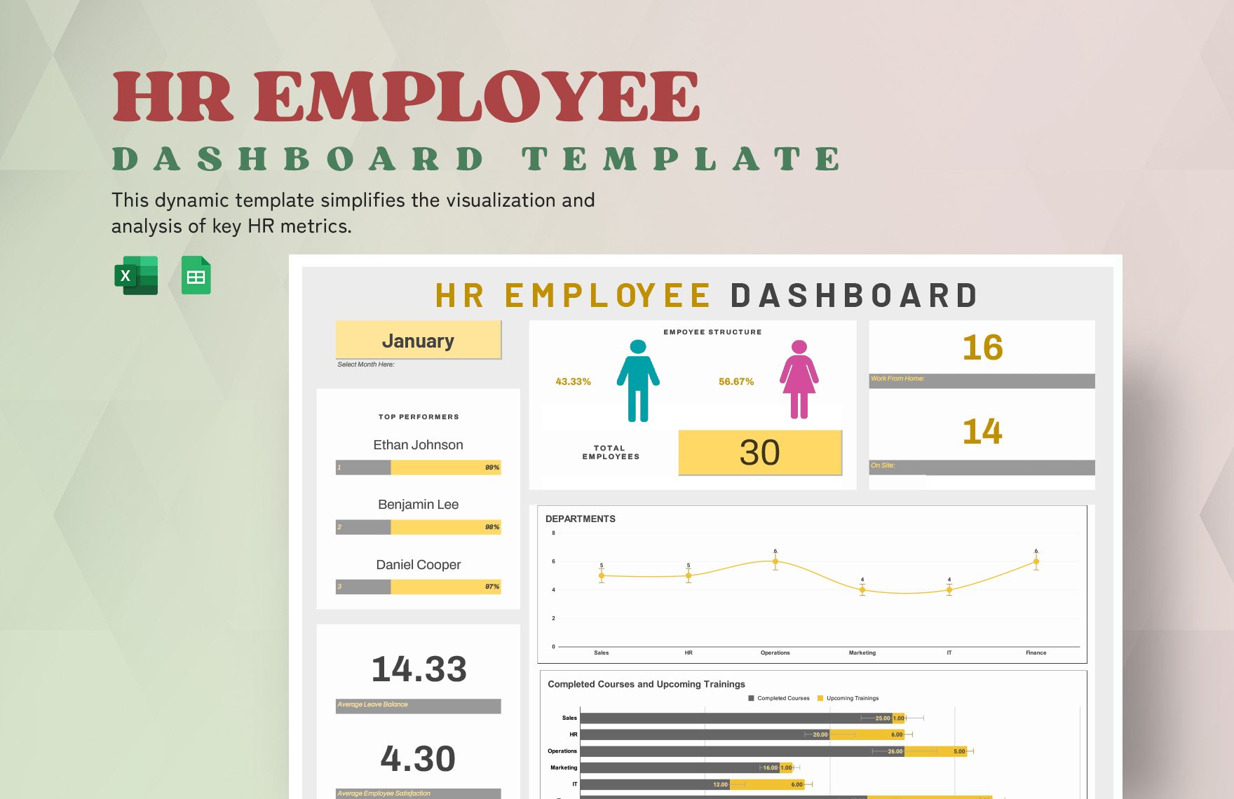
When it comes to monitoring and reporting on important data, dashboards are indispensable. Do you need customizable designs to make a diagram for school or business? Then consider downloading our Dashboard Templates to expedite your content creation. Easily keep track of employee KPI, healthcare analytics, and more by incorporating our professional content. If you’re on Windows, then you can take advantage of Microsoft Excel to edit our samples. Download today—put together a digital or printable infographic for your work!
How to Make a Dashboard in Microsoft Excel
Forbes (a publishing company) explains that dashboards are essential to executive work, as they interpret data into simplified visuals. From staff performance to inventory management, you won’t be short on uses for a dashboard!
Not familiar with how to create a dashboard? No worries—read our tips (below) on making one using Microsoft Excel.
1. Put Together Tables for Your Data
For your dashboard to work, it needs source data to pull information from. In Excel, keep your work tidy by preparing your data in a separate sheet tab.
To add a new sheet, click the + button near the bottom of the Excel window. Double-click a tab to rename it.
2. Add Charts to Your Dashboard
Use charts in your dashboard document to measure various data (i.e., project budgets, financial expenses, marketing statistics). And utilize different chart types in the same tab to give you various ways to interpret that data at once.
It’s possible to insert a new chart that already refers to your chosen data. Do so by using CTRL+click-drag to select the desired information in your data tab before tapping ALT+F1.
Transfer the chart to a different tab by selecting it and using CTRL+X to cut it out. Then, go to the chosen tab and use CTRL+V to paste it in.
3. Customize Your Charts
While a chart is selected, use the Design ribbon menu and Format Chart Area menu. These menus let you edit the chart’s type, layout, colors, and so on.
To edit a chart’s text, simply select a text field and type. And to add a linked image, select a chart and go to Insert > Pictures before picking an image file from your storage library.
4. Give Yourself a Tidier View
Open the View ribbon menu and go to the Show section. Its options let you either show or hide the gridlines, ruler, formula bar, and headings. The ribbon can also be hidden by using Ribbon Display Options in the top-right corner.
And you’re done with our tips! Don’t forget to use our Dashboard Templates to speed up your design process!


