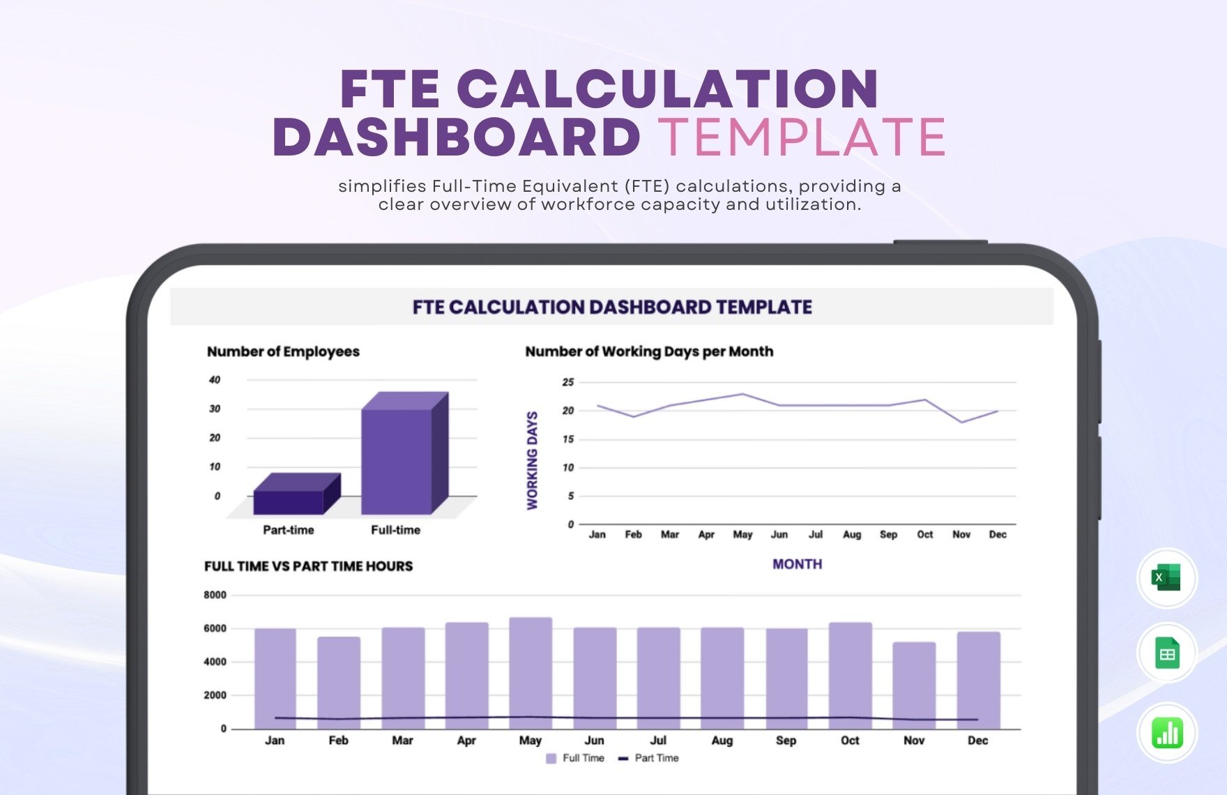
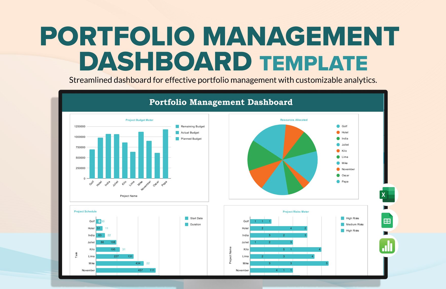
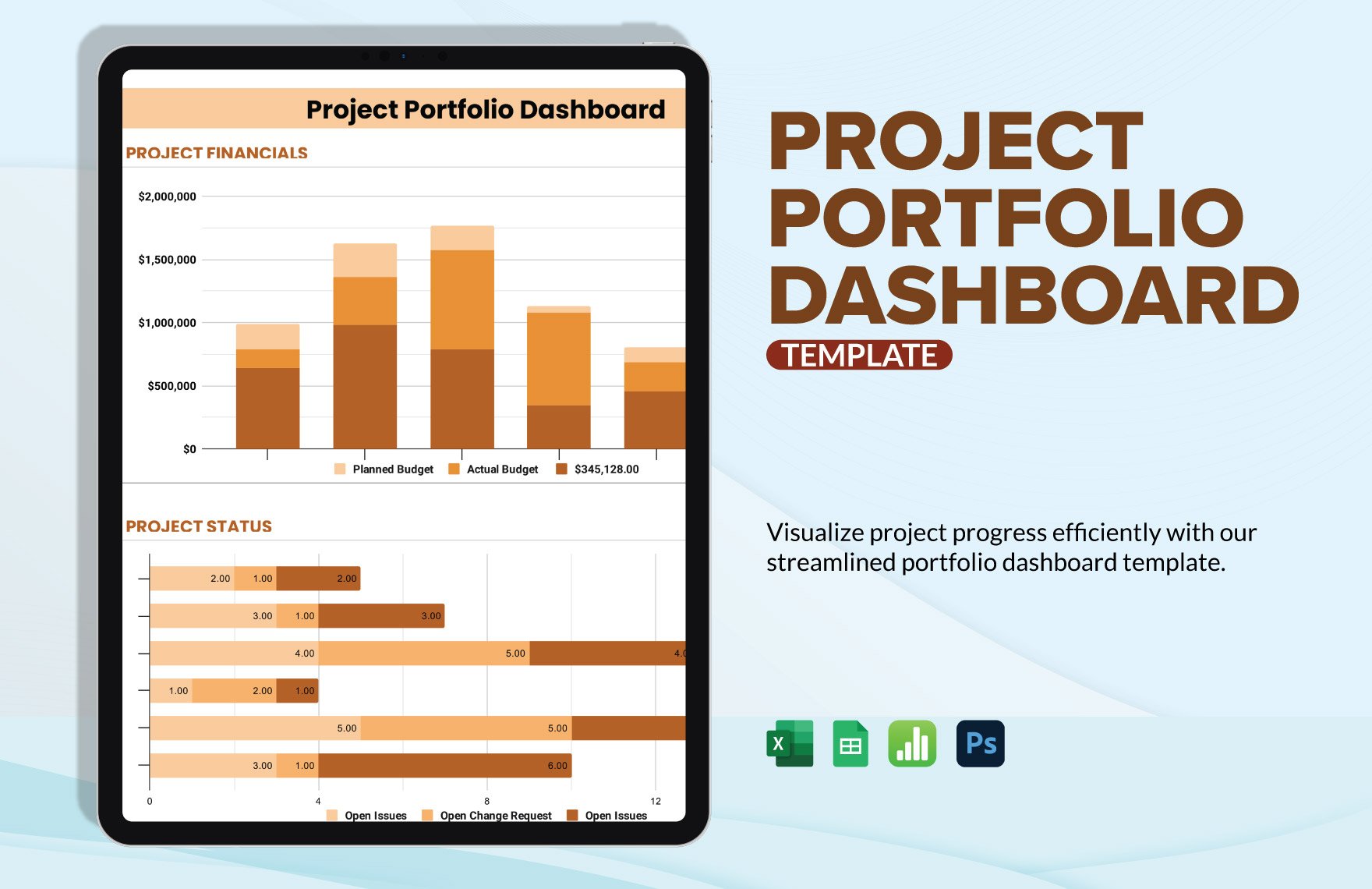
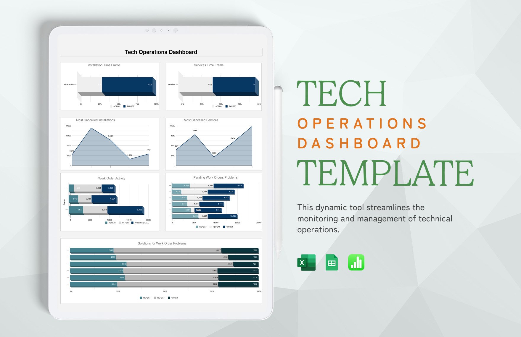
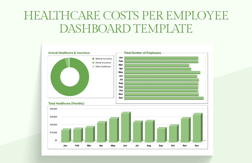
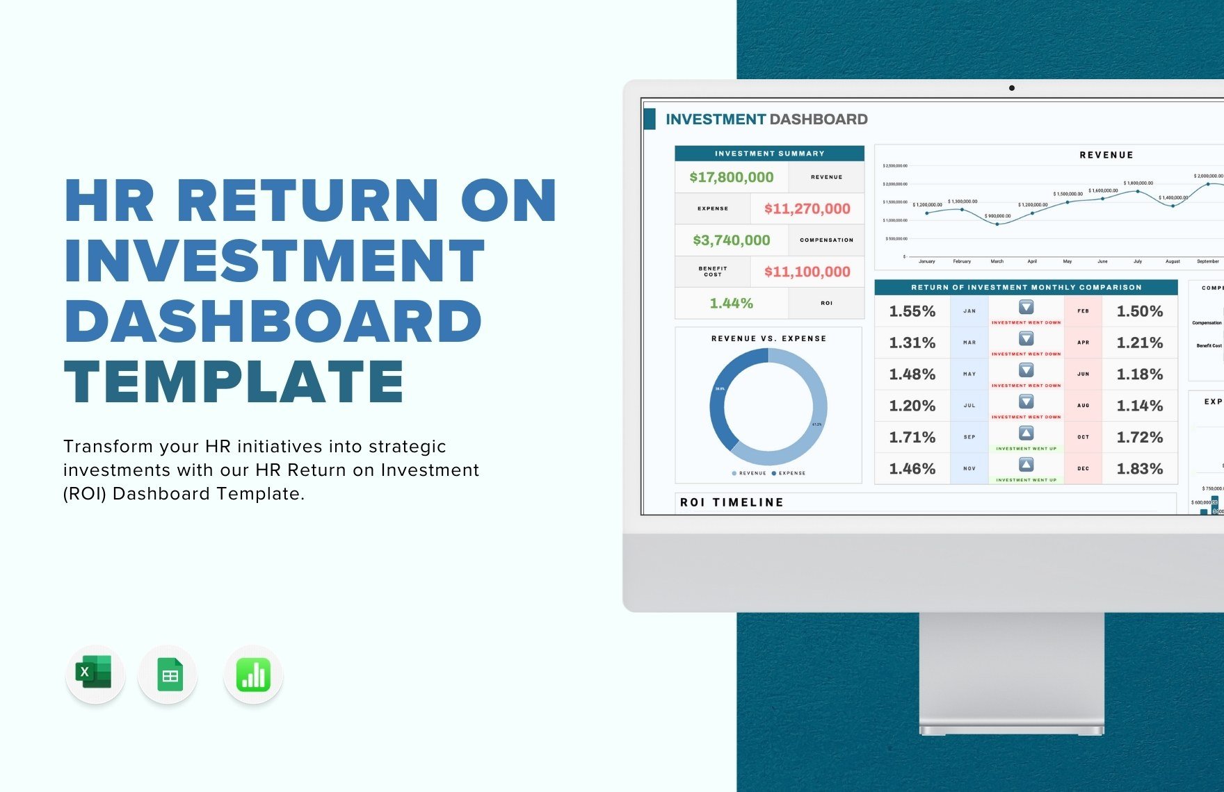
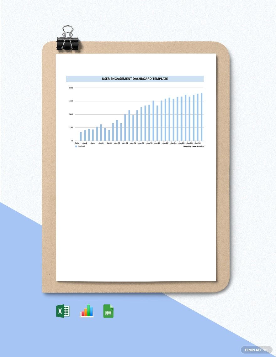
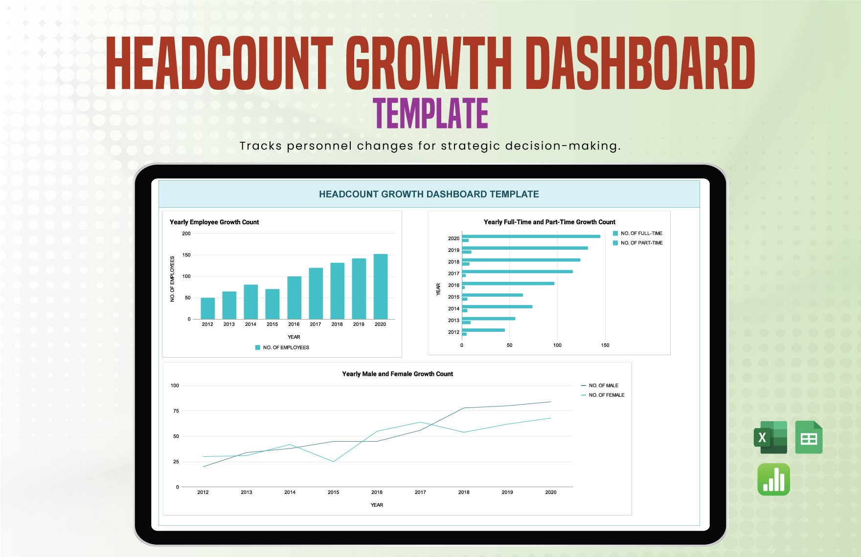
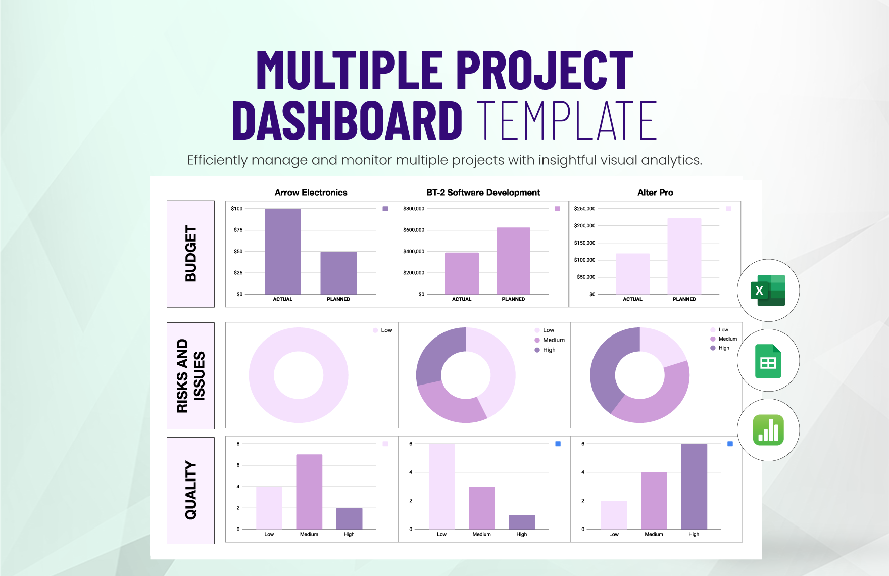
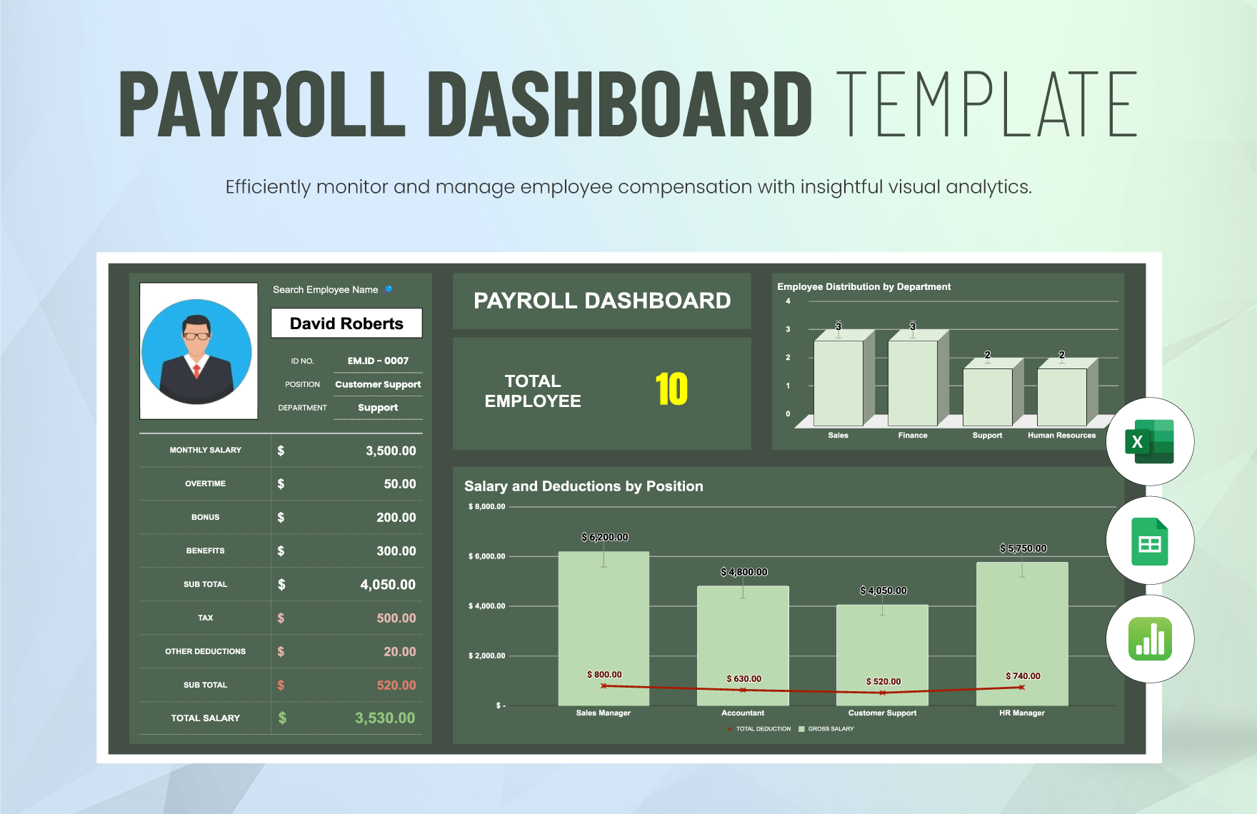
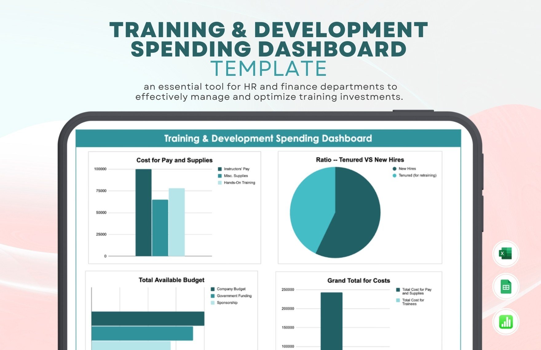
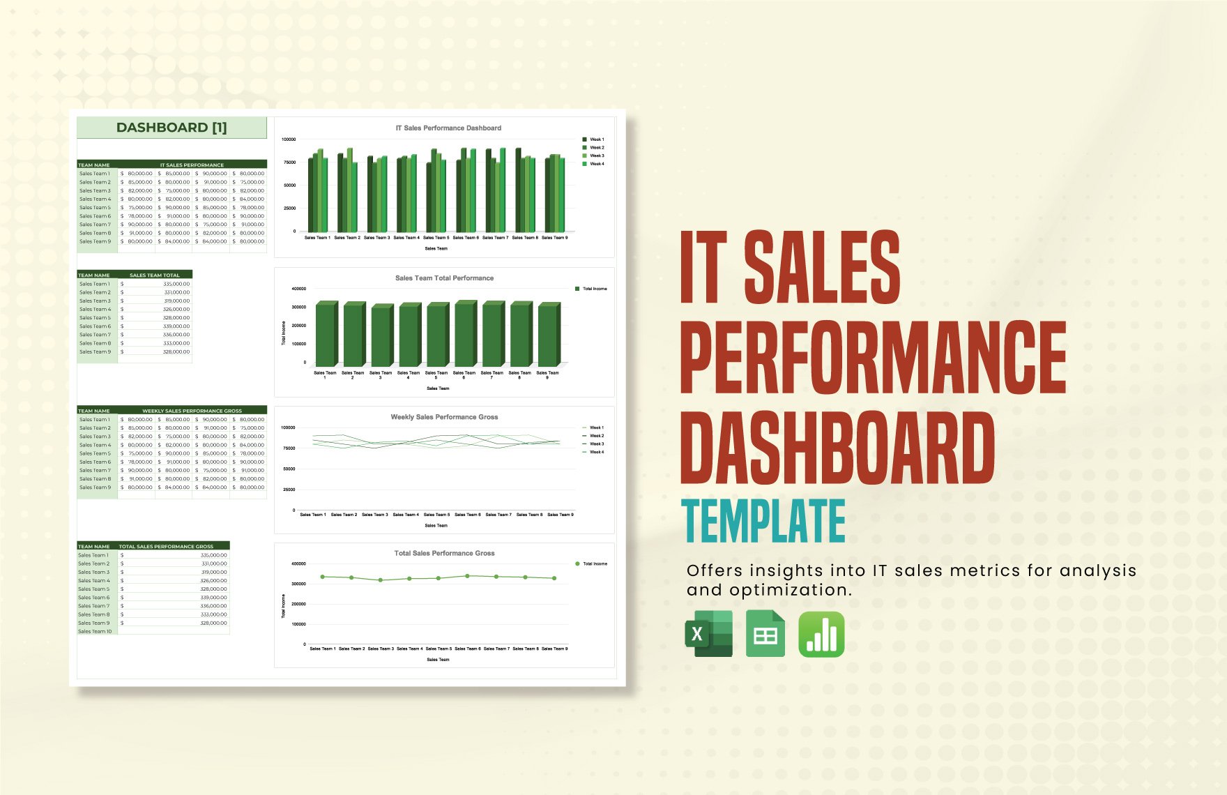
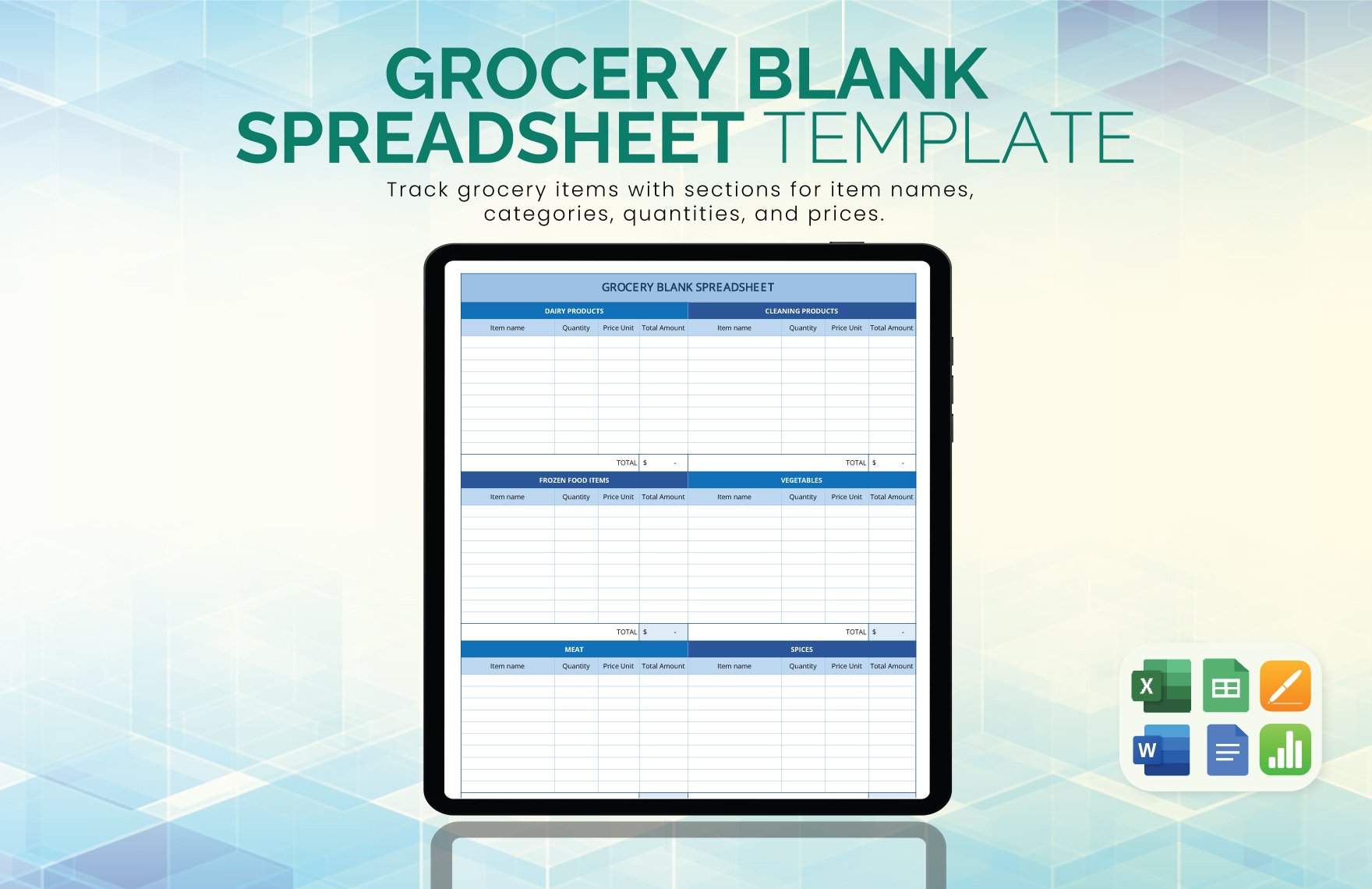
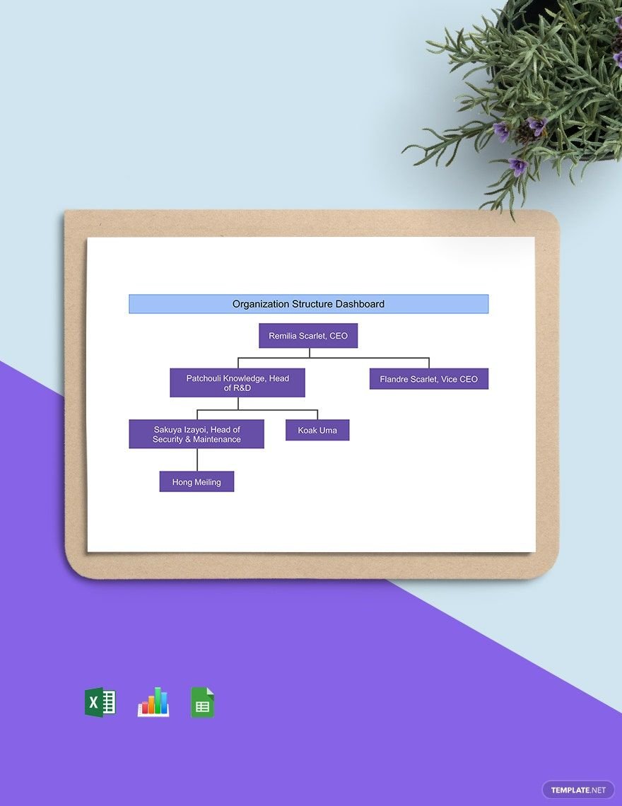
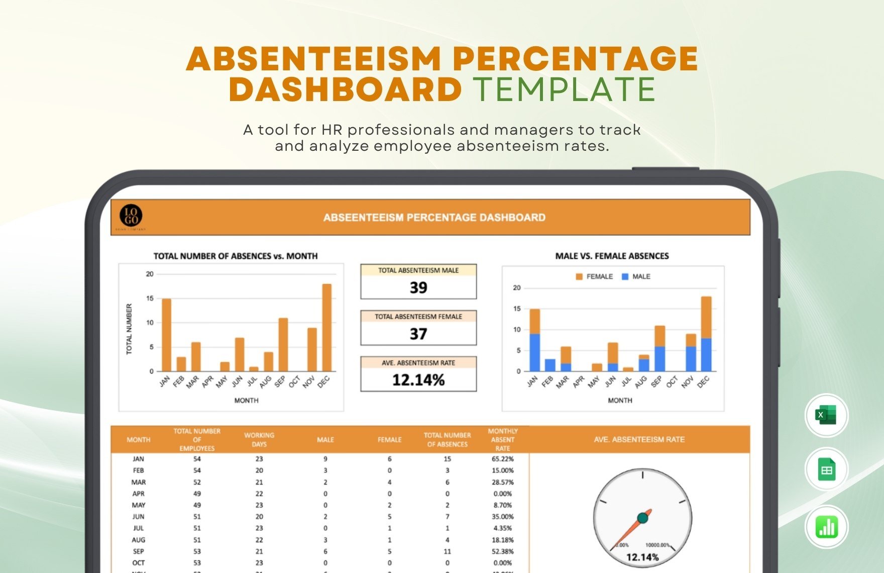
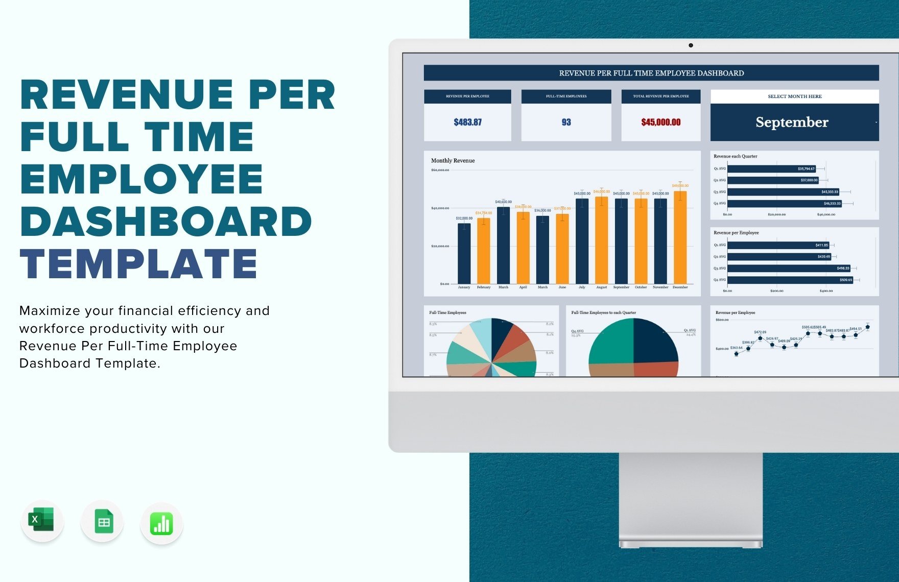
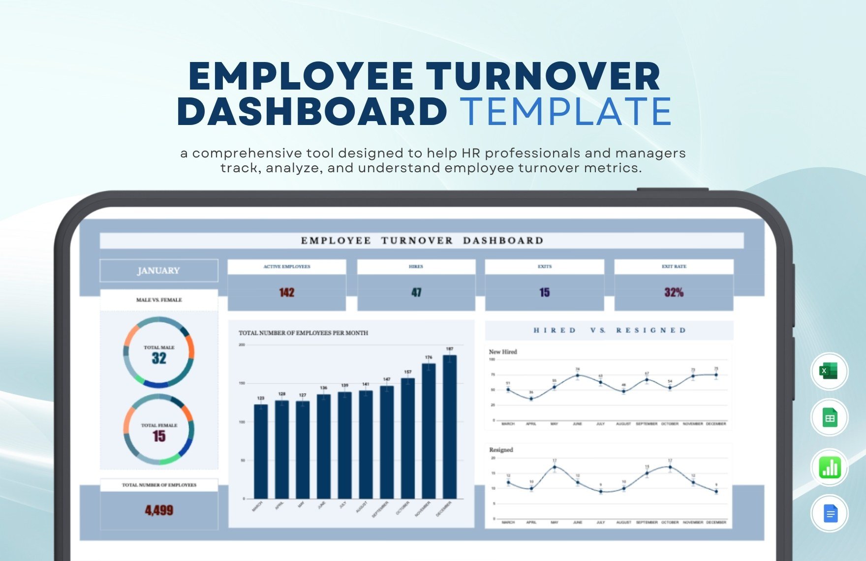
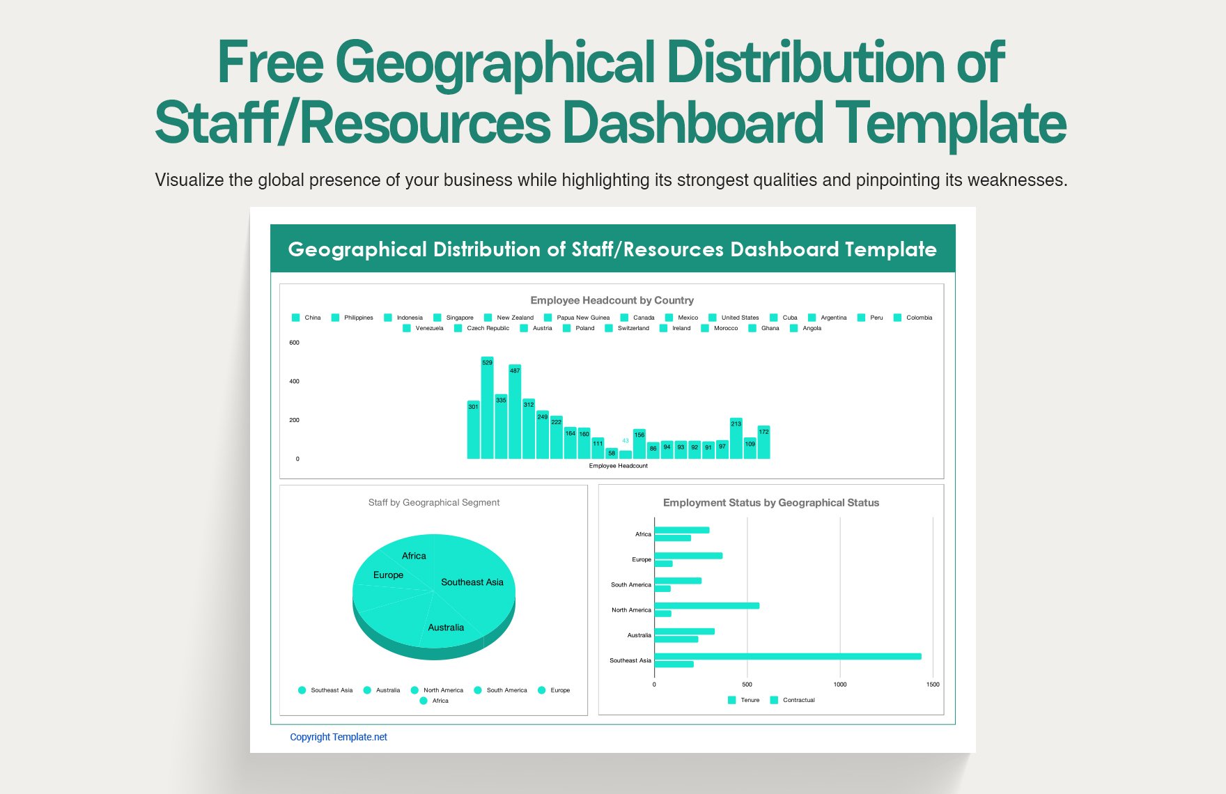
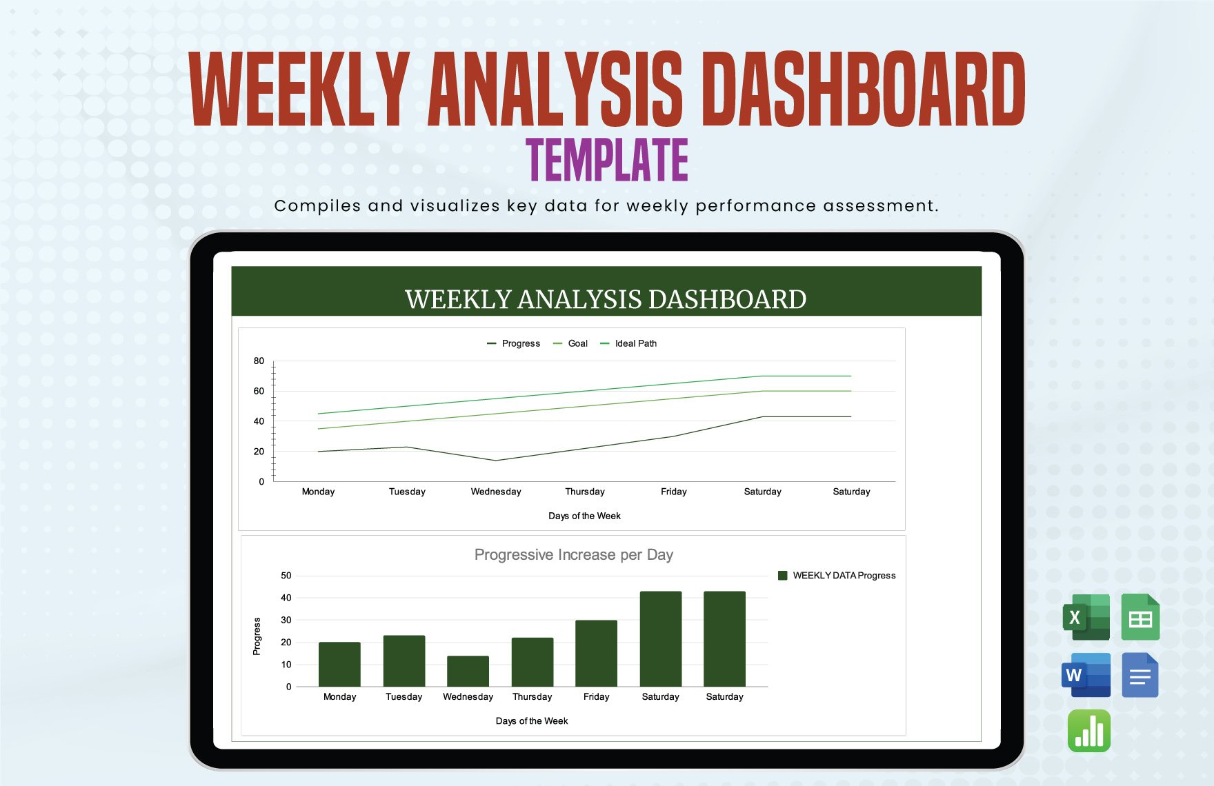
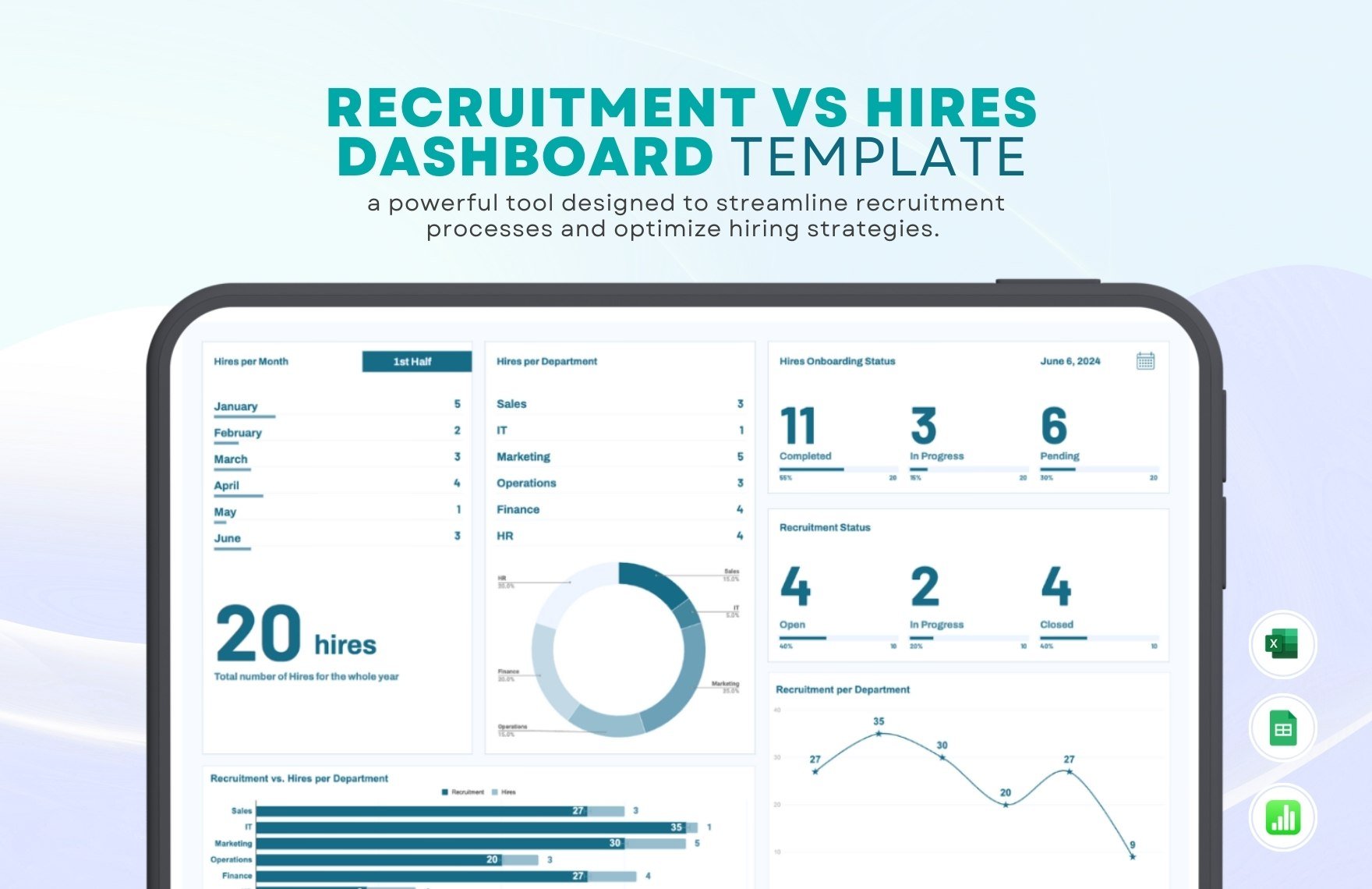
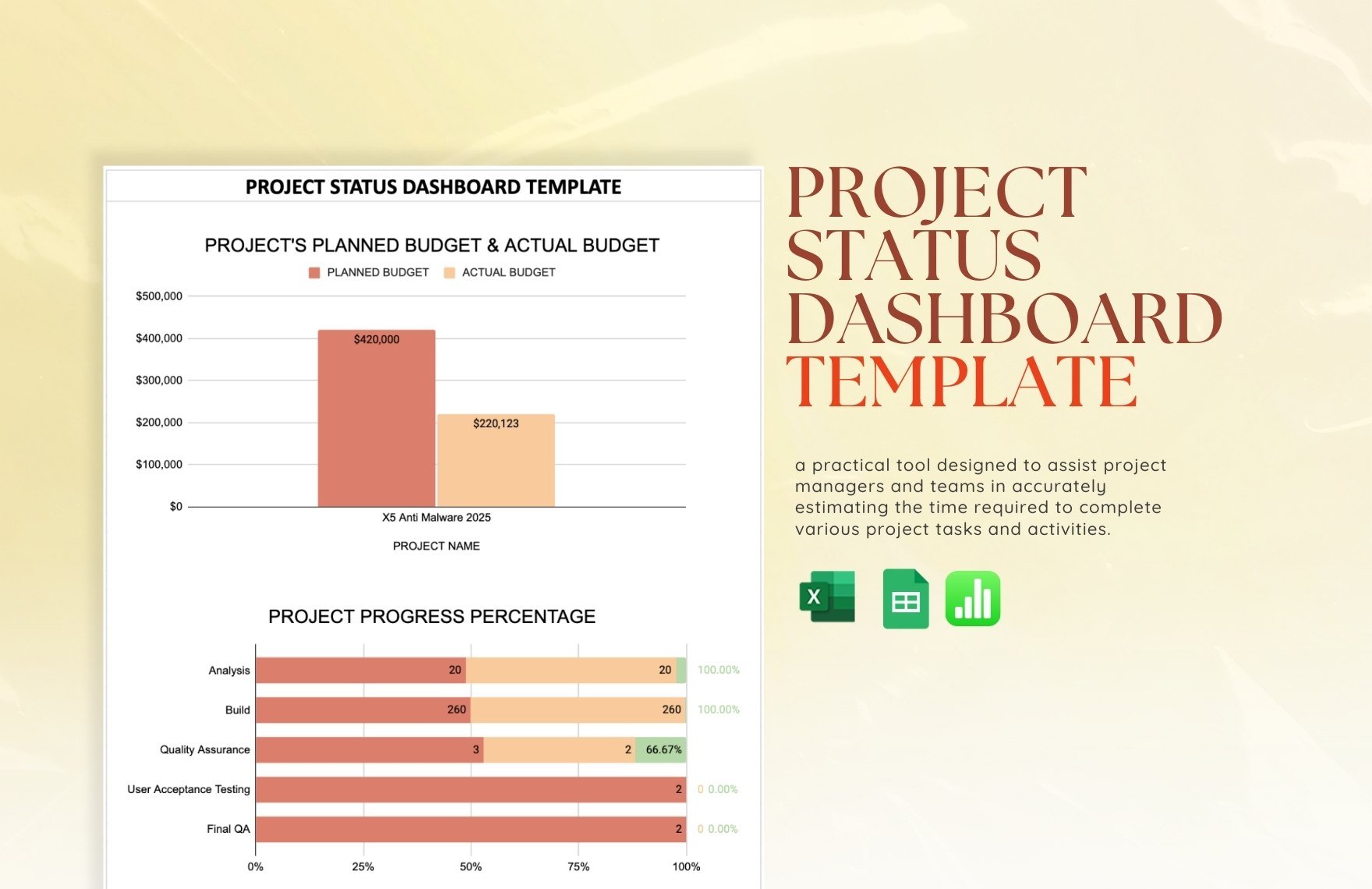
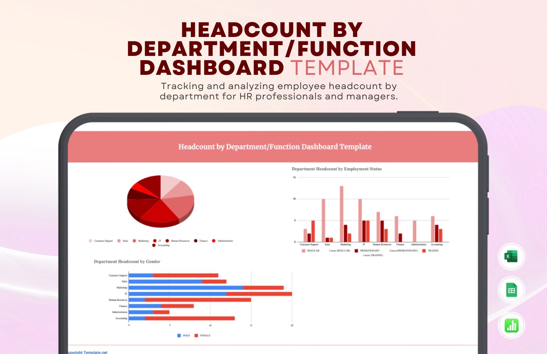
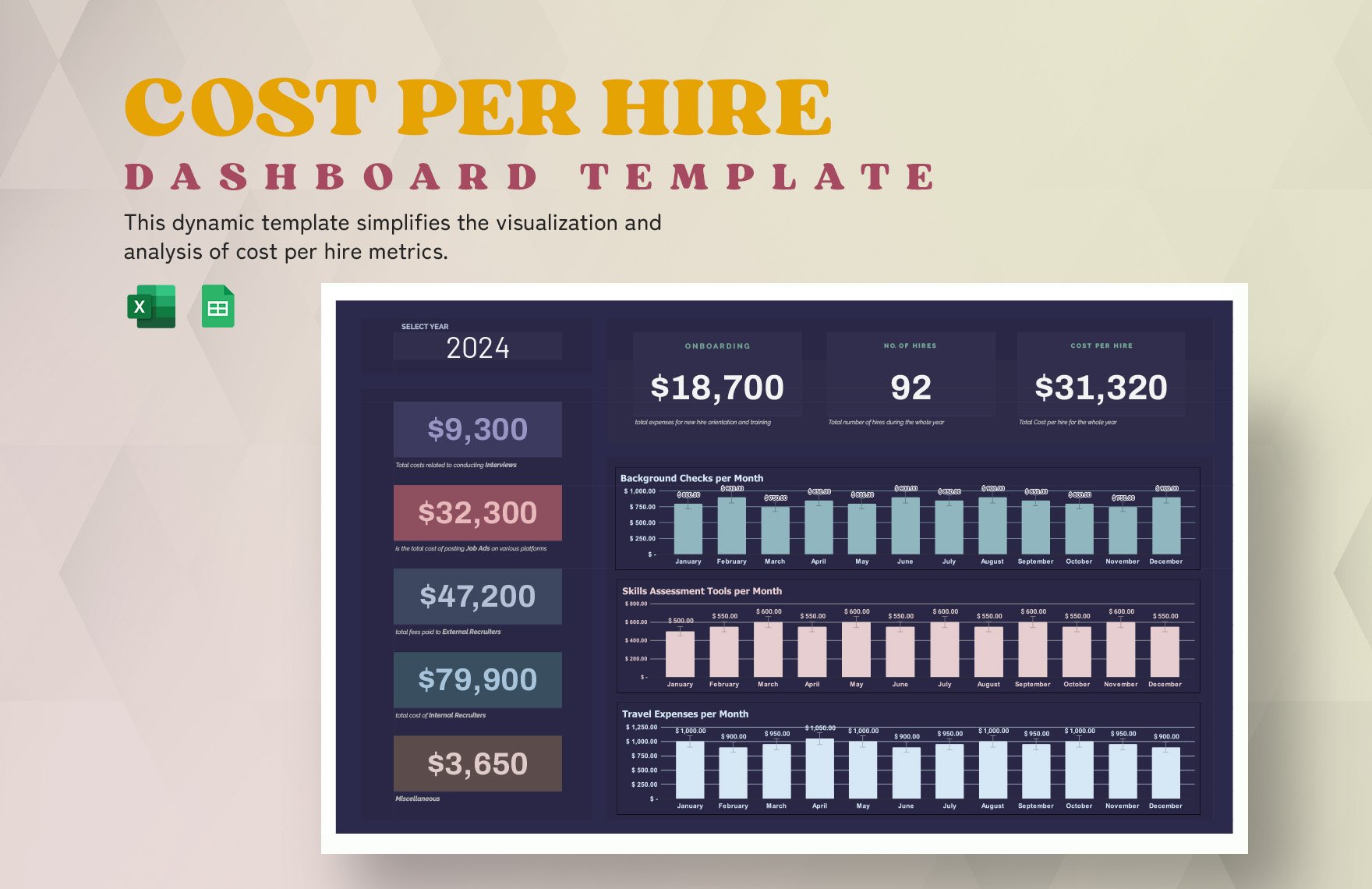
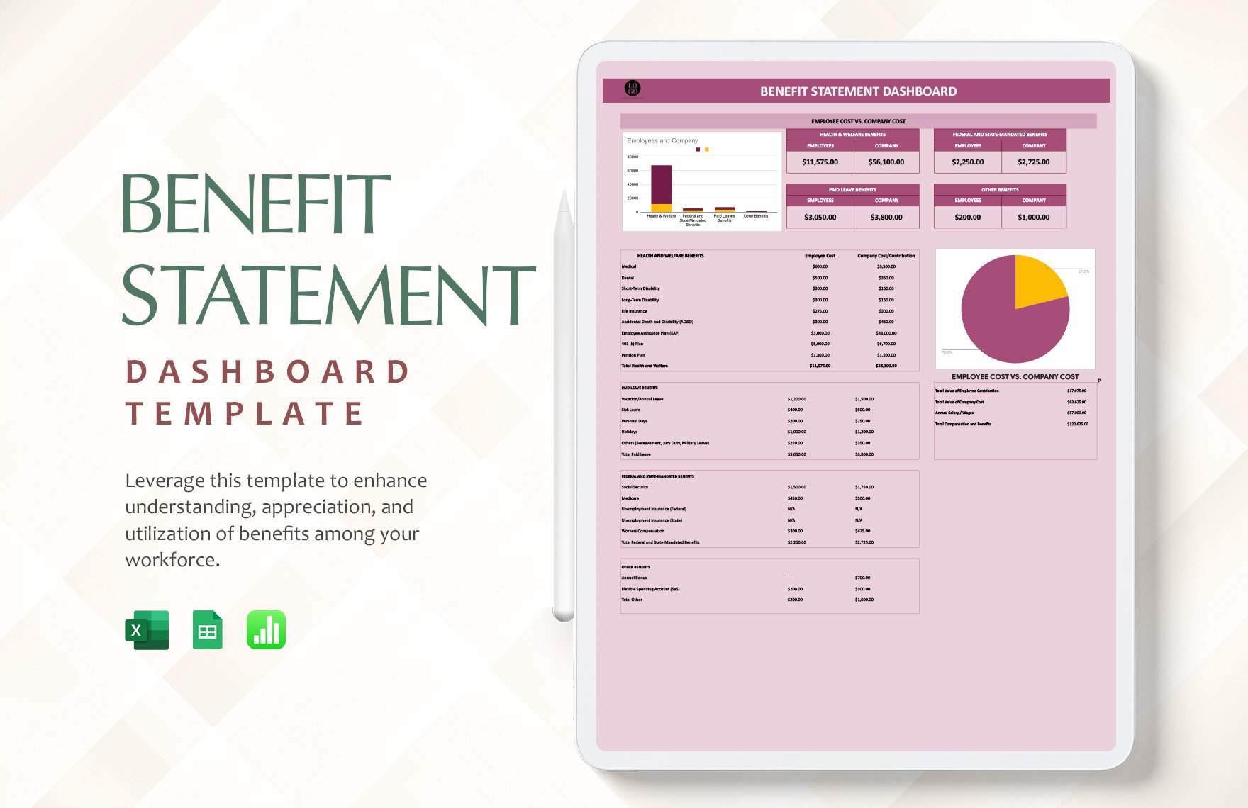
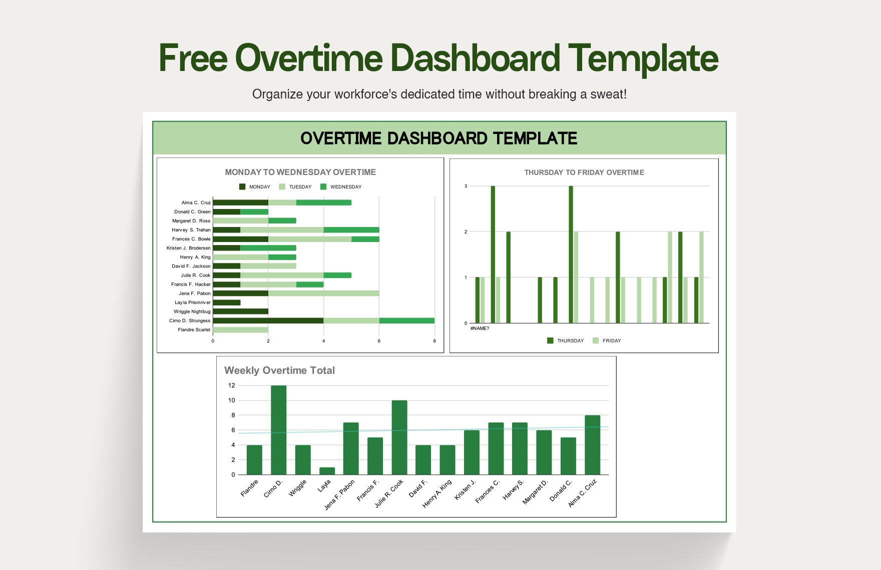
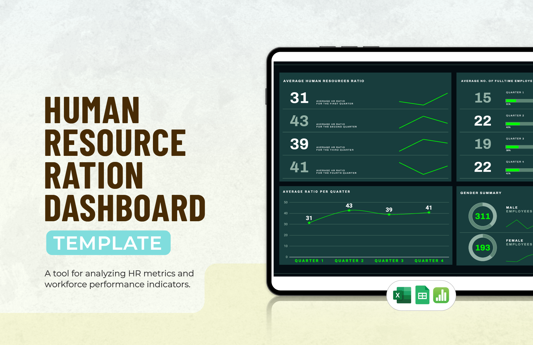
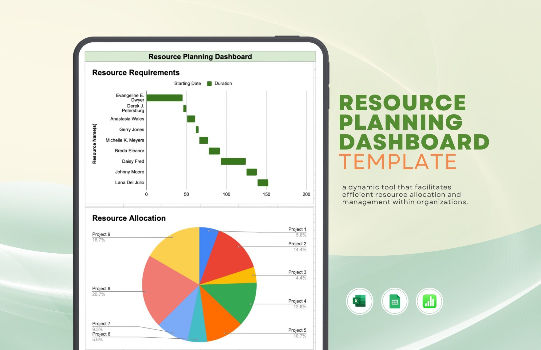
If you need useful infographics for your executive work, then dashboards are always an excellent choice for such tasks. So, put together a custom dashboard design of your own by downloading our professional Dashboard Templates. Put together an effective diagram by incorporating our easily editable samples. Plus, if you’re on Mac, you can use our content with Apple Numbers. Go ahead and download our templates—create a dashboard for KPI data, marketing analytics, financial performance, and more!
How to Make a Dashboard in Apple Numbers
From healthcare metrics to business projects, dashboards are integral to a company executive’s work. Dashboards help process data and visualize them into simple graphs (as explained by Forbes, a publishing brand).
Apple Numbers is a great platform for creating a digital dashboard. If you’re new to using this application for that purpose, then feel free to read our tips below.
1. Create a Table for Your Data Reference
To function, your infographic needs an organized grid table containing all the necessary data for measuring. In your Numbers document, add a table by opening the Table menu (in the upper toolbar) and selecting a preformatted option or setting up a custom layout. Use the uppermost row and left-most column as your header labels for organizing your values.
2. Add a Linked Chart to Your Dashboard
Charts act as the interface for interpreting the data and values in a dashboard document. Apple Numbers lets you insert charts that already refer to your data upon creation.
In the data table, select the desired values by Shift-clicking to highlight multiple cells at once. Next, open the Chart menu and choose the type you want.
3. Customize Your Dashboard Chart
To maximize the readability of your chart, it’s essential to make any required changes to it. With a chart (or an element with it) selected, click the Format button above the side toolbar. While the Format menu is open in the toolbar, use the various tabs to customize the chart however you want.
4. Change the Chart Type as Needed
Different chart types give you different ways to interpret the same data. While selecting your chart, go to Format > Chart in the side toolbar and use the Chart Type list near the bottom of the menu.
And with that, you’re done with our tips! You’re now ready for monitoring and reporting on data about performance, inventory, and more. Finally, consider our Dashboard Templates for quick and easy diagram creation!


