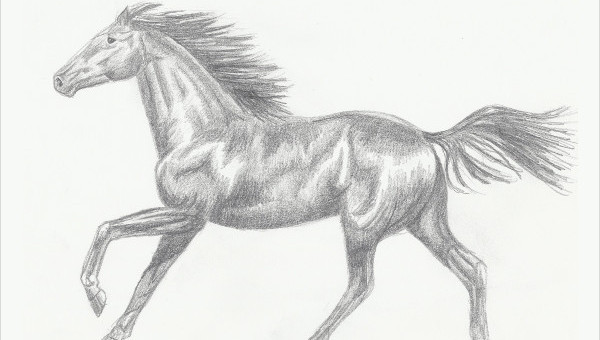
9+ Horse Sketches
Horses are one of the most popular animals in art. For several centuries, they had played an important part in…
May 10, 2021
Typography is an important aspect of designing. Today, with so much of evolution in design and technology, typography is also taking on the graphic aspect of designing. Yes! Artists and graphic designers have gone out of their ways to creatively used typography in designing. As a result we have had some fantastic graphic designs with a creative and intelligent use of typography. We have some examples of animal typography here that would help you in understanding the art and how to conceptualize it. You see how typography has been used to create a graphic like figure of various animals given below.
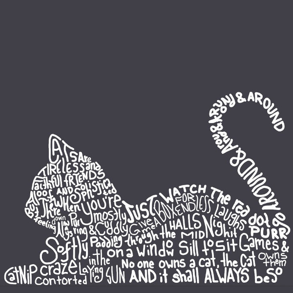
The art plays very interestingly with color, design, graphic and typography. The image describes a cat with a creative amalgamation of graphic and typography.
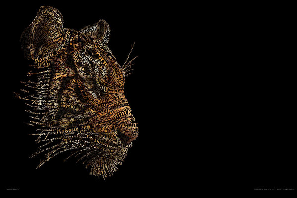
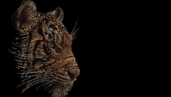
This one looks very realistic. This is a fine work of graphic design,combining rich graphic with typography. The tiger here looks very realistic in spite of being formed out of typography. This is the magic that detailing and hard work brings.
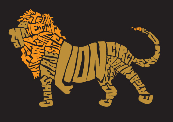
Animal typography is not an easy task. It requires a well perceived mind and a knack for designing. We loved the execution of the animal typography given here.
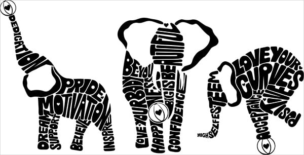
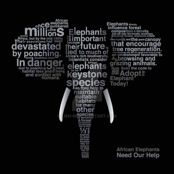
This typography poster is a part of an awareness campaign created for World Elephant Day which is celebrated every year on 12th August. It brilliantly uses typography to bring out the issue and the main subject of the campaign. We loved how elephant has been projected with typography.

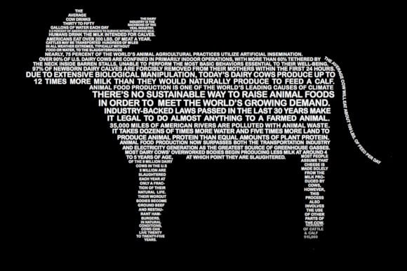
This digital art looks awesome and wonderfully portrays a camel with the help of typography.
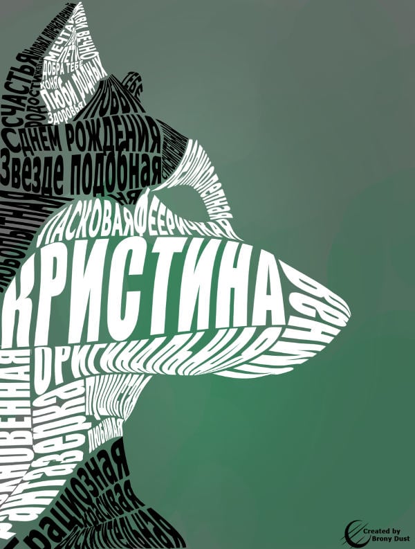
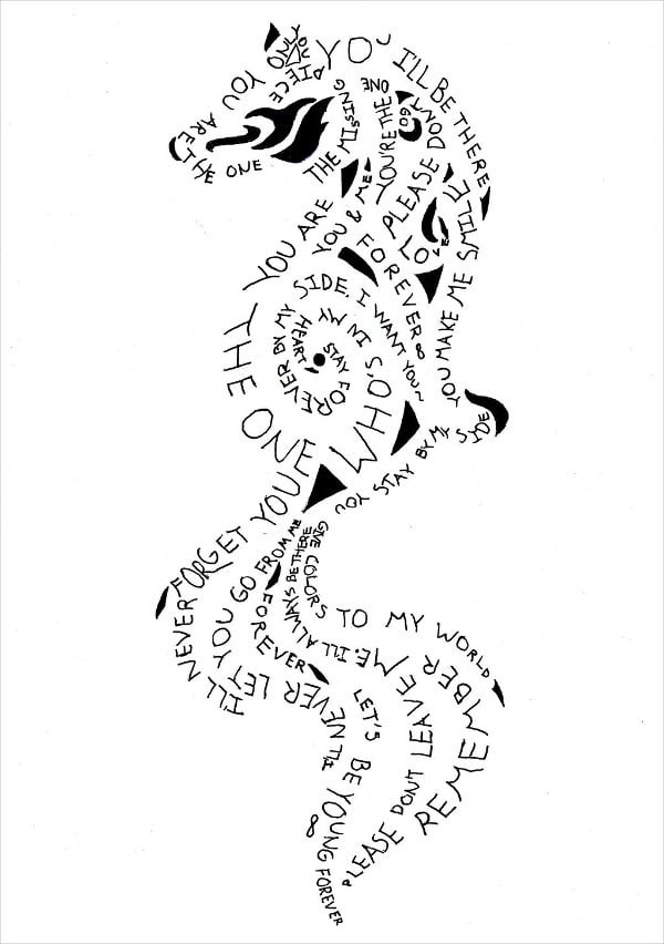
This animal typography has the regular element of graphic and typography but what is more interesting about this art is the use of colors and how various shades of the same colors have been use to make it look realistic.
Another exceptional work of art is here. It has used the letters in the Dinosaur to create a caricature of the animal. Not only is it looking like an animal, moreover it is looking the skeleton of the animal giving a surreal vibe to the work done here.
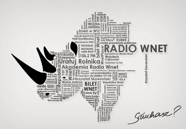
WWF used a brilliantly designed poster that used typography to bring forth the issue surrounding the endangered Rhinoceros. The typography given here forms the shape and outline of a Rhinoceros which happen to be the main subject of the campaign.
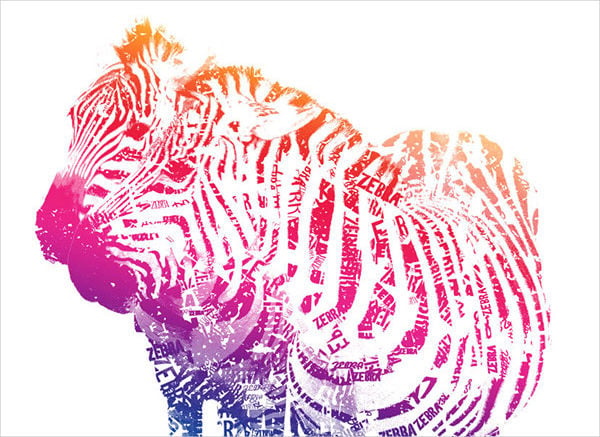
And here are some more colors. If we imagine a zebra we would imagine it as black and white for the obvious reasons. The artiste here has well perceived his subject and has given the animal a different dimension by including colors in the typography.
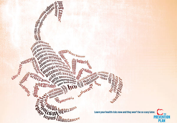
Another example of brilliantly used typography for an advertisement campaign. This poster was used to issue a public service notice for The Prevention Plan campaign. Apart from scorpio, the campaign used snake and fish typography.
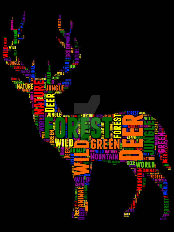
We love the color, the art, the typography and the concept of the given typography design.

Horses are one of the most popular animals in art. For several centuries, they had played an important part in…
Simple. Genuine. Artistic. Black-and-white arts are always something to look forward to. It is not only pleasing to the eyes,…
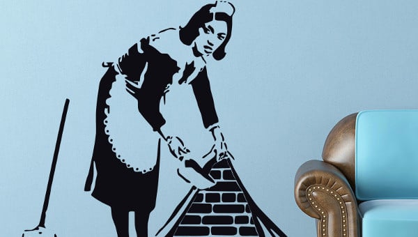
Made popular back in the early 1980s, stencil art is the one where a pattern is made beforehand and spray…
Another year has passed, and feelings felt just the same as the day you met. Not everyone gets to continue…

Typography is an important aspect of designing. Today, with so much of evolution in design and technology, typography is also…
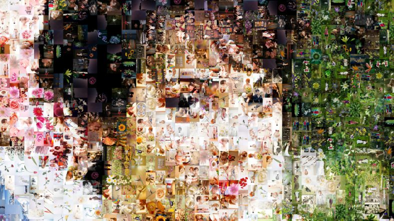
Below are some selective mosaic paintings in pristine condition. Here they are put together and thus we are posting them…
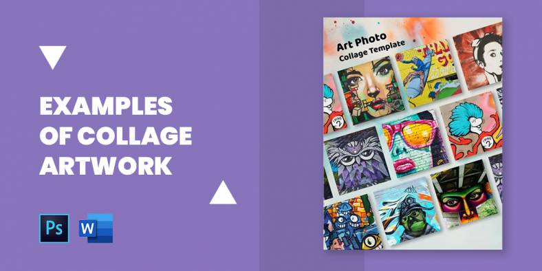
What is the need of an art? More than anything else, expressing an idea or feeling. Below are some collage…
Do you know that using negative spaces technique, you can create a “wow!” to your images? If not go through…
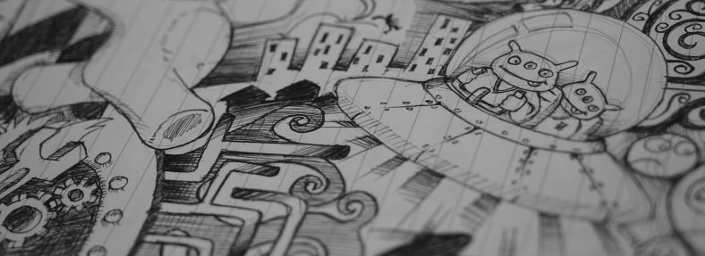
By now, it is an open secret that most of us stand guilty of doodling during meetings and lectures. Many…