
9+ School Name Tags in Illustrator | MS Word | Pages | Photoshop | Publisher
When it’s a new school year, we are bound to prepare to see a new environment and new faces. How…
Feb 12, 2025

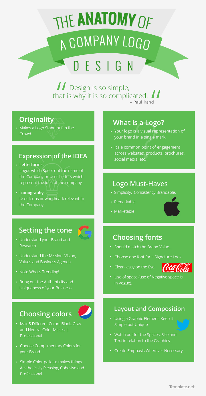
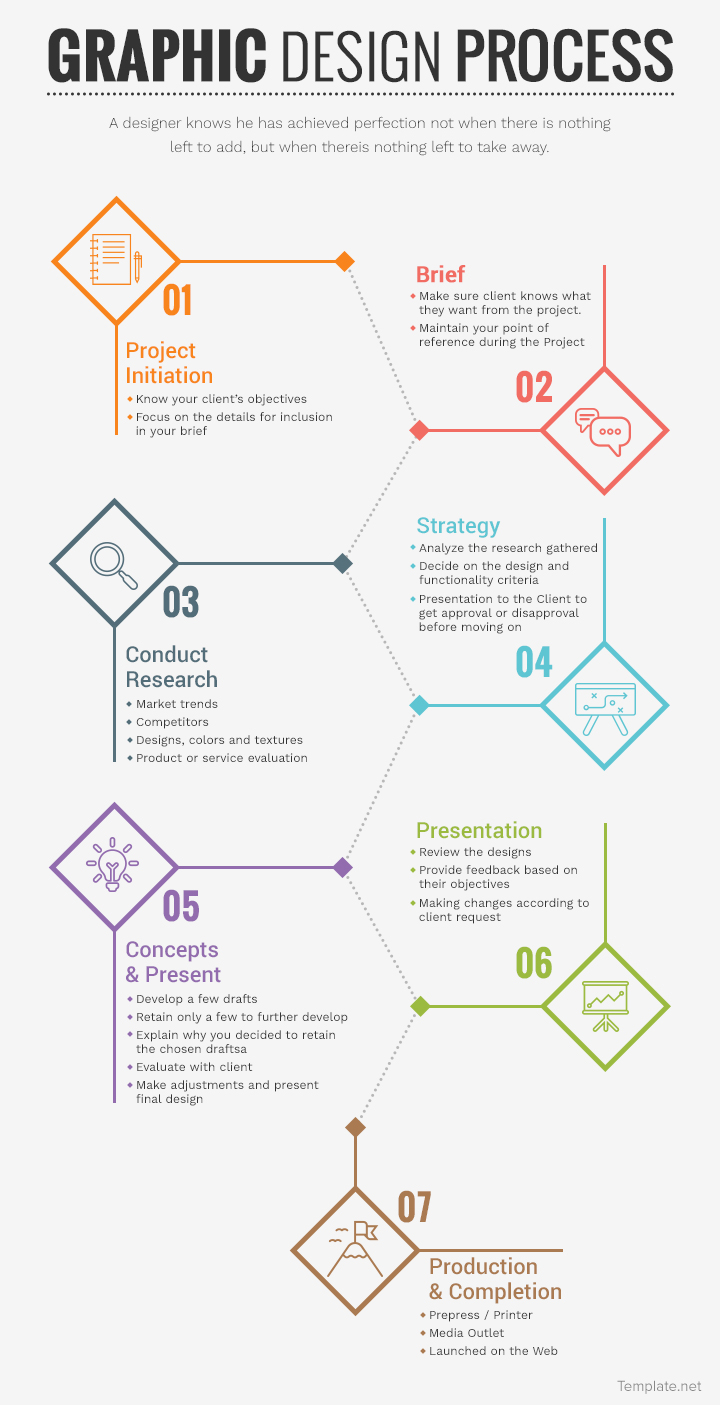
Company logos are the most powerful symbols that represent the essence of a business. By themselves, logos represent powerful reminders of the brands behind them. The more popular they are, the more people recognize the logos (even without the brand name). They’re visual reminders of stand-alone symbols that represent company brands and serve as advertisements to the companies they represent.
A Company Logo represents the aims and objectives of the Company. It also represents the company’s goals and delivers a consistent statement of commitment, service, and professionalism. And hence the importance of understanding how to design the best logo.
These are the traits that will become the trademark of a company logo whenever customers see them. Our definitive guide to creating a company logo will guide you through the step by step process of creating an effective and powerful logo for your business that will carry your brand name through the years.
Steps Involved in Designing a Logo:
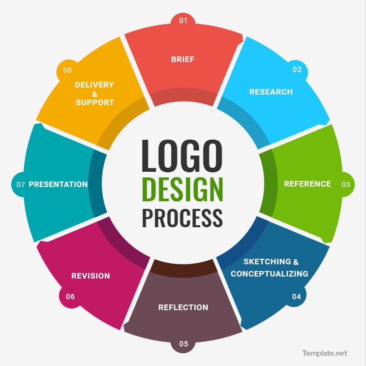
Step 1: Design Brief
A brief outline and synopsis of a proposed logo based on the client’s opinion and interview about plans for the logo.
Step 2: Research
Step 3: Reference
Step 4: Sketching and Conceptualizing
Step 5: Reflection
Step 6: Revisions
Step 7: Presentation
Step 8: Delivery and Support
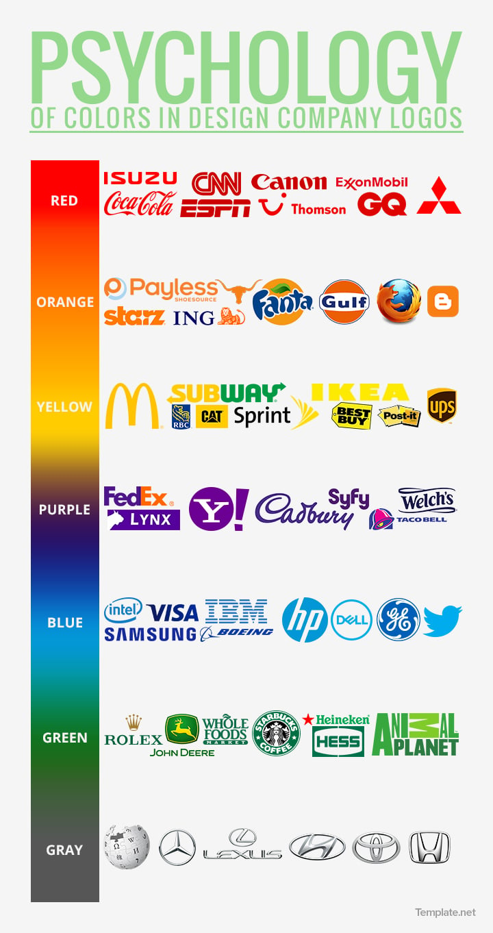
Consumers, according to Psychology, are heavily influenced by color. In fact, studies suggest that 90% of snap judgments made about products are based on its color alone. Similarly, it has also been found that colors affect how customers see the “personality” of a brand, which in turn influences their decision whether or not to patronize a company’s products.
Marketers and advertisers understand the importance in choosing the right colors to represent your company but it is up to you as the business owner to be able to incorporate these colors into your company’s branding.
When choosing a color scheme for your logo, you should first take note of the basics of color. Choose the right combinations and color schemes to determine which would fit best.
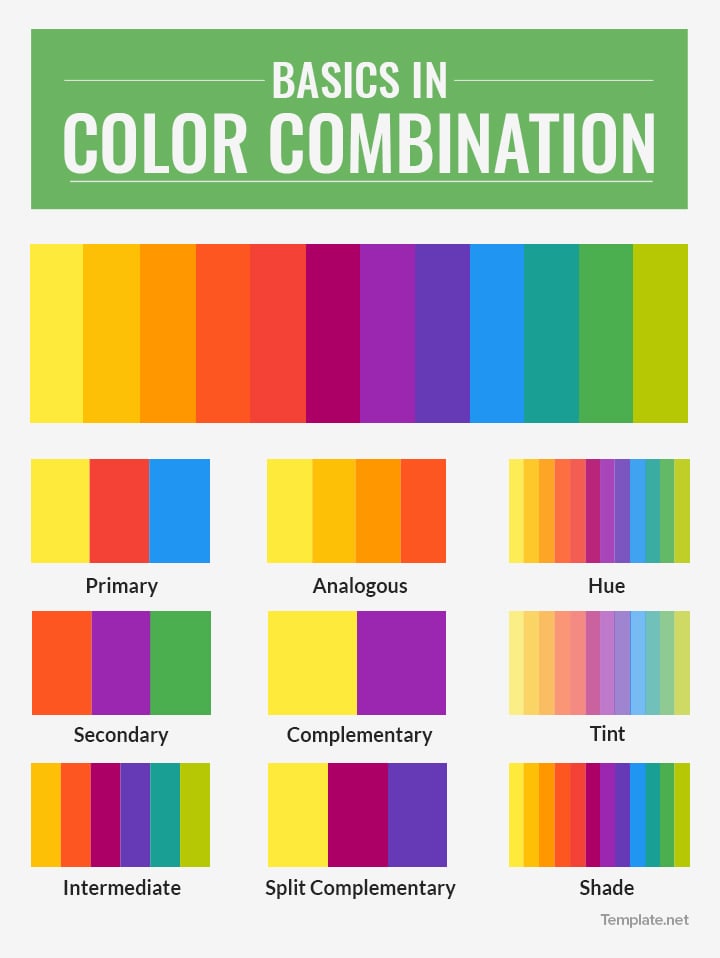
When choosing the colors you want to include in your business logo, there are a number of factors to consider. These factors include:
Studies have shown that there are colors geared towards attracting men and colors geared toward luring women. This could be the reason why you’re likely to find a lot of black and silver power tools but rarely any colored hot pink.
In a study conducted by Joe Hallock entitled Color Assignment, Hallock finds that there are notable differences in men and women’s preferences when it comes to color and the glaring disparity when it comes to the color purple. His findings are interpreted in the charts below:
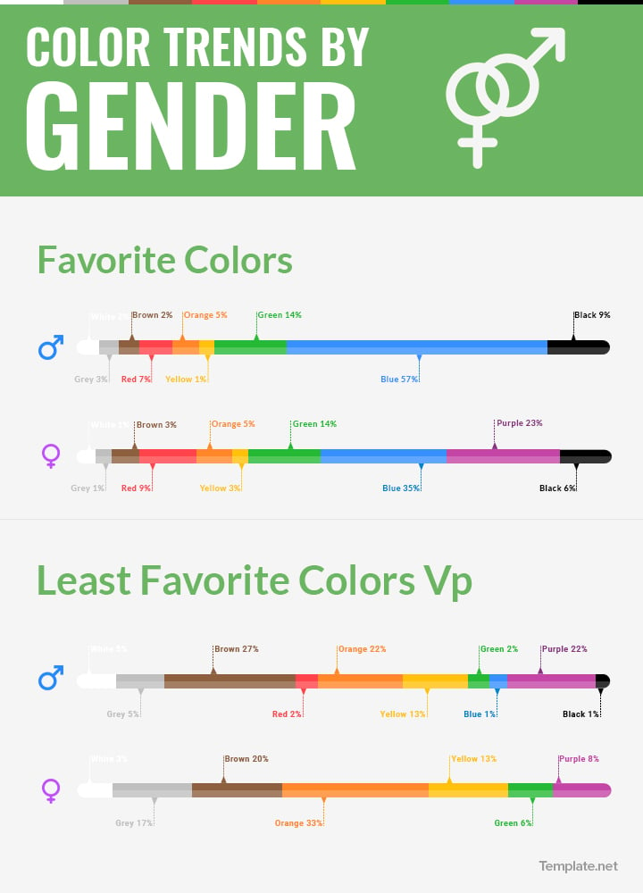
Further research in Color Psychology suggested that there exist prominent differences in preference between men and women when it came to tints, shades, and hues. Men were more likely to prefer bolder colors and were more likely to choose shades of their favorite colors as compared to women who were more likely to be more receptive to tints of their favorite colors and showed a preference towards softer and more muted colors.
Despite the long-established “male colors” and “female colors,” it’s not difficult to notice that companies who break from the norm and work outside the gender stereotypes gain recognition for being “different,” “new,” or for breaking the norm.
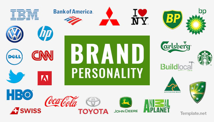
You may have come across different articles saying color evoke some sort of emotion. What is important to note is that our perception of colors is rooted in the personal experiences and is merely a perception. However, it still cannot be denied that many colors are associated with certain attributes.
Blue
The color blue is generally perceived to be calm and collected. It is also one of the most widely used colors in corporate logos as it implies integrity, professionalism, authority, and success.
Red
The color red is usually associated with passion, energy, and romance. It creates the feeling of excitement and movement as well as stimulates appetite. The color red is a widely used color in the logos of non-luxury car companies and fast food restaurants.
Green
Green is a color often associated with nature, health, peace, and tranquility and is thus used by spas and whole food groceries. Additionally, it is also often associated with being minty and refreshing. Green is also used to promote environmental preservation.
Before you click on that paintbrush tool, always think twice. As mentioned multiple times here, choosing the colors in your logo is not as simple as picking your favorite colors. The colors you choose must mean something, symbolize something, or must be in there for a purpose.
Remember that you must make use of every aspect of your business and make sure that they work to your benefit, and your logo is a big contributor to your identity. Something as little as choosing the right colors could make the biggest difference between your logo being a mere placeholder or an identity and brand.
![]()
The colors behind logos must have a purpose behind them. From telling a story, being a strong symbolism, or to exude an emotion, here are some of the logos of popular brands and the story of the colors behind them.
Perhaps the most popular soft drink brand around the world, the company is renowned for its utilization of the color red. Often, a red can is almost immediately recognized as a Coke can that the color came to be known as Coke red.
The bright red that the cola company uses is physically stimulating, thus affecting nerve impulses, and encourages appetite. The color of Coke red is also reinforced to the memory of a cool drink of Coke, thus possibly igniting a feeling of thirst.
Ranking as the top fast food chain in almost every country around the world, McDonald’s is known for its iconic yellow M on a red background. The company makes use of two primary colors that invoke a playful mood – yellow – while the use of red stimulates the appetite. The combination of these two bright colors attract the attention of young children but are found to be agitating to their parents, facilitating faster customer turnovers.
The combination of these two bright colors attract the attention of young children but are found to be agitating to their parents, facilitating faster customer turnovers.
Red Bull utilizes the same colors as does McDonald’s but for different reasons. The colors are great choices for the energy drink company as the two red bulls charging toward each other in front of a yellow spot represent power, risk-taking, speed, and aggression.
Isuzu, Toyota, Mitsubishi, and Honda are car companies who market their vehicles to the public as affordable yet reliable. The use of red in their logos are apparent as the color is physically stimulating and is associated with excitement, movement, and passion.
Mercedes-Benz’s use of silver showcases the brand’s status of being sophisticated and timeless. The brand is reputed to be expensive and only available to those who belong to the upper class and their logo reinforces this reputation. A car bearing this logo is sure to turn the heads of those who recognize it.
Although bearing the same reputation of being exclusively for the rich as that of the Mercedes-Benz, Porsche’s logo takes a different direction from Mercedes-Benz’s elegant icon.
Porsche, known for its race cars and sports cars, utilize a combination of gold, black, and red not only to give the impression of luxury and exclusivity but also to represent speed, passion, and energy.
Over the years, Pepsi has been almost annually modifying their logo, symbolizing being in tune with the changing of the times. What they did retain, however, is the blue that marks them. Pepsi’s utilization of the calming color reminds its consumers that no matter how much could change, you can always come home to Pepsi.
Fun fact: Facebook’s creator, Mark Zuckerberg, is red-green colorblind. The color he could see best is blue. Because of this, he chose blue to be the main color of the popular social network. Due to Facebook’s popularity, other social media and instant messaging applications have followed the lead and took on varying shades of blue for their logos.
Twitter’s logo has the relatively same color combinations of that of Facebook’s and Messenger’s. There is only a difference in the shade of blue that Twitter has incorporated in their logo. Because blue is the preferred color of the majority and is not straining to the eyes, this color is widely used in Mobile apps and social media as users can look at it for long periods of time.
Not only calming, studies have also shown that the color blue increase productivity. A blue logo gives the impression that your company is logical and professional. Thus, it is used in the American technology company, Dell, who produces laptops and personal computers. The logo invokes a feeling of trust in the users that the products are reliable and durable.
Post-It, a company that produces sticky notepads, uses the color yellow in their logo and products. The color yellow is attention grabbing and is thought to symbolize friendliness, is cheerful and warm, which encourages communication.
Starbuck’s iconic logo used to be brown, as coffee beans are harvested from the earth. Starbuck’s current logo adopts a dark green shade that symbolizes their environmental efforts and to establish a reputation of being a place you could relax in after a long day at work. It is no wonder Starbucks has now become a lot of people’s comfort food.
The color green has long been associated with healthy vegetation and the environment friendliness. Wholefoods Market utilizes this color so popular with organic and vegetable brands to emphasize the healthy and organic brand they strive for.
Baskin Robbins, a shop known best for their varying flavors of ice cream and Coffee Blast, utilizes the color pink as it gives the impression of sweetness and invokes a feeling of playfulness. The color is also largely popular with other ice cream and doughnut shops.
A pink logo gives the market the idea that your products are targeted toward the more feminine population, just like what Victoria’s Secret did with their line, Pink. The company embraces a “girly” image, establishing the brand to be what is perhaps one of the most popular lingerie brand for women.
Apple has a reputation for being clean, established, and sophisticated. Their logo, even without the company’s name in it, is easily recognizable at a glance. The color black in their official logo gives the market the impression that the company is well-established and has a strong reputation already embedded in it.
Choosing the right color in your company’s logo plays a role more immensely significant than most people presume. Take a look at these popular brands in a different color scheme:
Doesn’t quite have the same effect, does it? Even road signs look strange in other colors.
Whether or not the peculiarity is due to how accustomed we’ve been to how things are, facts remain that people now have unconsciously associated certain colors with certain emotions and instructions. While the perception of color may be largely influenced by personal preferences, previous experiences, and cultural background, statistics has been able to evaluate how these seven popular colors used in marketing have come to affect the general public.
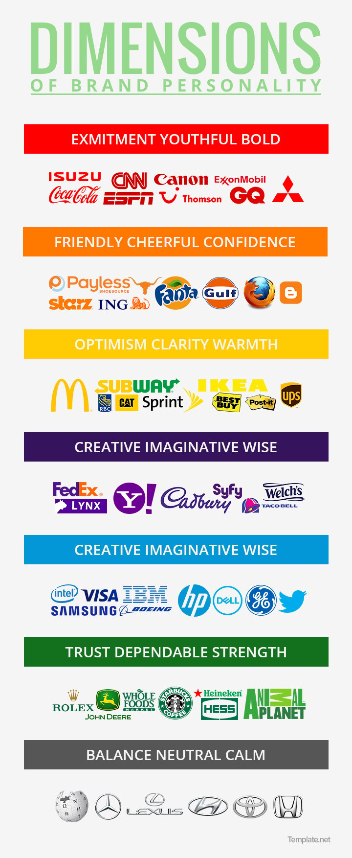
Some companies choose logos that tell a story, others use a logo as a marketing scheme. If you’re aiming for the later, then choosing the right colors for your brand’s logo is a job that requires much thought put into it. Advertising experts have found that when trying to establish your brand’s personality, each dimension has a corresponding color that would best help incorporate certain traits.
When choosing a logo for your brand, make sure to consider what the colors might imply and whether or not they will be attracting the market you hope to.
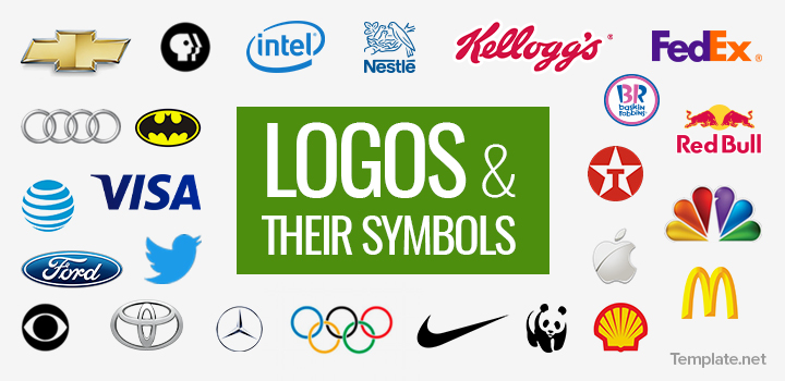
When making logos, the essentials of marketing identity and brand are interrelated with each other perfectly. In this part, we explore their relationships with each other and why symbols in logos are as important as the brands they represent.
A logo is basically the most definitive and graphic mark that remains the symbol of recognition for any brand that they represent. Some of the best commercial brands are easily recognizable to the public and do not need further introduction. Achieving that kind of status is the ultimate dream of most businesses whether they are start-up companies or engaged in small and medium business ventures.
The primary use of logos is to identify, symbolize and tell the story of the company all at the same time. They aim to become a trademark or a badge that can either inspire or inform and become an emblem of a trusted brand that is already a successful strategy in itself. Logos of famous brands, however, didn’t always begin with the logos we see today.
Most famous logos have undergone several evolutions over the years and they usually carry their names along with them. Over the years, famous brands altogether dropped their names and became standalone symbol logos that people would recognize even without carrying the name of their brands.
Symbol logos are known as such because the public can easily recognize them even without their accompanying brand names. These “quiet” brands give testimony to the success of their company and are symbols of an outstanding testament that most companies would hope to achieve. The term “quiet” is used to denote the symbols as being wordless but have attained the status of worldwide recognition even without their names.
Making a good logo symbol, whether these are graphic or standalone, should have the tone and feel needed to convey a brand’s rich history that goes along with each logo. The symbols are intended to inform, shape and create the perception of the company that consumers would be able to relate to and instill loyalty like the samples above.
There are two ways to relay a brand’s story and identity: Reading and Visual representation. After a brand’s story is being relayed through print and media advertisement, the next step would be to visually relay its message.
A visual representation actually tells a greater story and has more impact than a written history of a brand. This is because of symbols, colors, and designs are more pleasing to the human eye than words put together. On its own, a logo’s image, design, and color can say so much about the brand that can attract people.
As anyone may have noticed, some companies employ clever marketing ploys by advertising full page ads with just their logos on a whole page. These are usually done by new companies who need to break into the market and test their product prior to launching. By launching their logos ahead of the product itself, they give testament to how powerful logos are. That’s in recognition to the fact that visual impressions actually make an imprint on the mind longer than words do.
These are usually done by new companies who need to break into the market and test their product prior to launching. By launching their logos ahead of the product itself, they give testament to how powerful logos are. That’s in recognition to the fact that visual impressions actually make an imprint on the mind longer than words do.
Creating a brand logo must, therefore, be done with great care to capture the entire brand’s concept. This can be done through various arrangements of image, color, and composition.
Some logos may look simple, but the concept and design of producing them actually take a lot of time before the final design is produced and accepted. How these logos are able to effectively relay all the company’s stories and ideas are crucial before circulation to all media outlets.
These may include flyers and business cards for distribution in areas that are considered target markets. Once circulated, the logo becomes the face of the company and will stay as long as the company exists. It may go through several changes like some of the most famous logos as time went by, but the concept and the message remain the same.
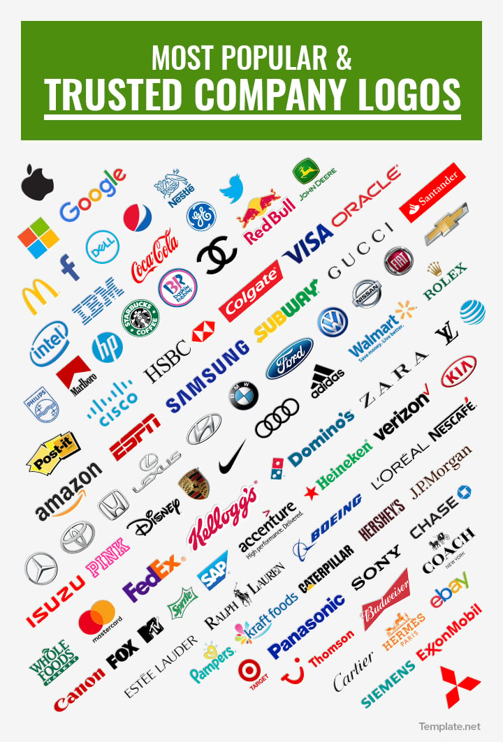
One of the most important aspects of any brand, whether new or already established, is undeniably its logo design. For companies who are just starting out, you may want to take a hint on how to establish a custom logo that can make an impact on consumers. To help companies achieve success on their branding needs, we take a look at the logos of some of the top companies whose businesses are making an impact on the financial world.
Apple’s logo is exceptionally simple, with just a silhouette of an apple with a bite on it, yet it is probably the most recognizable logo whichever part of the world one is located in. Admittedly, it has something to do with the brand itself and Apple’s reputation for reliability. Then again, the logo is every bit a part of Apple’s success since it represents imagination and innovation.
There was a time when more than 90% of computer users used Microsoft’s operating systems and every time you turned on your computers and laptops, Microsoft’s logo would pervade the screens. Since then, there has been much criticism on its Windows OS but Microsoft remains one of the most powerful tech companies on the planet. Its logo designs have gone several changes over short durations but the basic window-type logo concept remains one of the most widely recognized logos in the world. The colors on Microsoft’s logo are not accidental but are meant to convey the company’s software and hardware ventures including its gaming and entertainment ventures like the XBox, which is represented by the color green.
Google meanwhile, with its chosen primary colors and design that’s pleasing to the eyes, has endeared it to millions of users worldwide. The primary colors of blue, red and yellow are mixed with green to signal independence and nonconformity. Primary colors are done to recognize the arts and the rest of the colors are for software designs. On that note, the Google logo has successfully mixed the collaboration of art and technology that convey a powerful message to its users.
Beverage giant Coca-Cola’s design logo is so iconic, it’s recognized in all parts of the world. Ask anybody, even the ones you don’t know and you’ll realize nobody, not even one, will say they hate Coke’s logo. That’s how well-loved the brand is. It may be below Apple in terms of revenues but if a logo’s popularity is made the basis for the list, no doubt Coca-Cola will be number one. Coca-Cola red, the logo’s color as it has come to be known, remains the most important component of the design. Though the iconic logo has undergone several changes, the primary Spencerian script used during the 19th century is still very much the same today.
The famous golden arches of McDonald’s logo has become a cultural icon so much so that during anti-American demonstrations that crop up every now and then, Mcdonald’s branches would be targeted since it has become a deliberate victim and perhaps an unfair symbol of American culture and capitalism. No matter the situation, the McDonald’s bold colors of yellow and red appeal to everyone, even kids who’ve come to relate the logo’s symbol and color with toys, not just fast food. The logo is equally appealing to adults who easily recognize it as a symbol of a quick meal on their busy schedules.
When Samsung first started out, their logo represented three stars, a derivative from the Korean word “twister”, which basically what Samsung means in Korean Hanja. The number three symbolized power and everything big and powerful. Fast forward several years later and the word Samsung which is represented by the colors blue and white came to be recognized today regardless if any of its customers speak Korean or not.
While the color blue symbolizes trust, reliability and commitment in its brand, the elliptical shape on the background signifies the world and, depending on how you interpret it, symbolizes either Samsung revolving around the world or the world revolving around Samsung, a very powerful message indeed. In a world dominated by Japanese brands before, Samsung has seemingly conquered the appliance and electronic world by becoming number one in such a short period and its logo becoming such a powerful icon.
General Electric is one of the largest companies in the world with more than 300,000 employees working in several of its ventures that cover not just technology and electricity but health care as well. In fact, GE is the fourth most recognized brand in the world and its logo is even more widely recognized than the brand itself. This is the ultimate proof that the logo is more popular than the brand itself!
GE’s logo has undergone rebranding from its original design from the 1890’s but very little has been changed and the essence of the design remain largely unchanged. Though added with color blue to signify commitment and trustworthiness plus the dedication to service, the primary design exudes a neutral and comfortable appearance that’s pleasing to the eyes and pleasantly recognizable the world over.
Though added with color blue to signify commitment and trustworthiness plus the dedication to service, the primary design exudes a neutral and comfortable appearance that’s pleasing to the eyes and pleasantly recognizable the world over.
Facebook has of course been on a steady upward course. It’s no accident that Facebook’s logo has been overly simplified. Mark Zuckerberg is said to be red-green colorblind so the best color chosen for Facebook is blue. Whether this is really the true reason behind Facebook’s logo design, it cannot be denied that its logo’s neutral appearance and cool blue color makes it pleasing to the eyes and can help relax the mood.
No wonder that Facebook has become the number one social media site in the world. Facebook is now worth about $350billion and its logo is fast overtaking other established logos and it would come as no surprise that it will take the top spot someday.
Forbes Magazine, one of the most reputable sources of business news and famous for its list and rankings of the world’s top companies, has put together the top 100 most valuable brands in the planet together with their net values and assets.
This is not exactly to point out each company’s earnings, but we’ll determine and break down how their logos are being used effectively in a statistical graph that can be useful to create your own logo by looking at several hints based on these top companies’ logo designs:
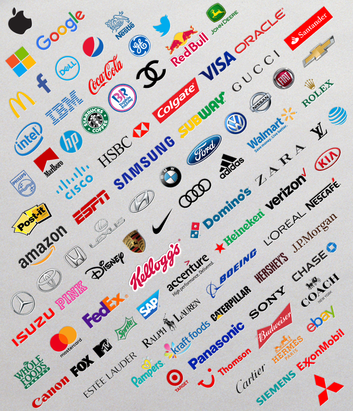
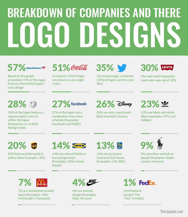
As discussed extensively in Chapter III, color psychology is very much evident in these top brands because choosing the right color is very important in how companies are being perceived and what kind of consumers they appeal to. Most companies prefer to use only two-color schemes, which consists of almost 85% of the top companies, as evidenced in the logos presented above.
Logos that are designed with an emphasis on their shapes instead of lots of color combinations are aimed to fit properly on different screen sizes and on devices at any scale. These are also intended for product packaging that uses only black and white color schemes.
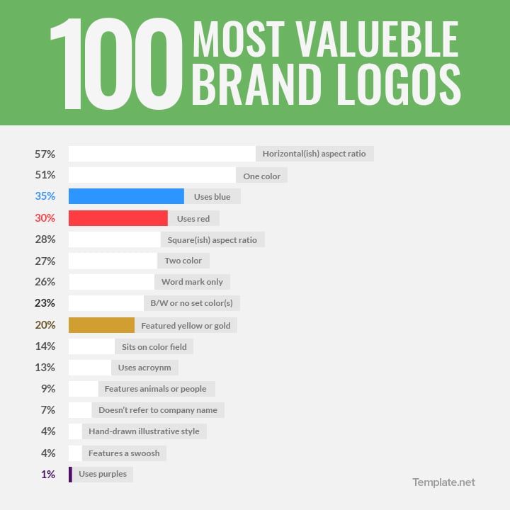
Blue is definitely on top at 35% since it’s the most appealing color and exudes professionalism, productivity, and trust, traits that companies are trying to convey to their customers. Foremost among its users are Facebook, Boeing, Samsung and General Electric.
Red came in next at 30%. The most famous company to use this color extensively has been Coca-Cola to convey active passion and urgency, something meant to convey immediate quenching of thirst and excitement. That kind of message has come across to consumers all over the world, proof that Coca-Cola got it right from the very start.
On the single-color, noncombination category, black claimed the third spot.
Chief among its users are Apple, Inc., JP Morgan, Cartier, and Zara. When you see these companies grouped together, you begin to see why they chose that color: Black exudes formality, tradition, etiquette and nobility. These traits are usually associated with institutions that transmit an aura of superiority. These companies are meant for consumers who want something special, those that are not common and conventional that stand out from the crowd.
Here’s the rest of the Statistical Breakdown of Companies and their Logo Designs:
Everything changes through the years and companies are no exception. Fashion trends change over time and what was popular back then isn’t necessarily popular now. Fads change and just like fashion trends, logos tend to change over time to adapt to customer needs and perceptions.
A lot of companies undergo evolving and changes, some of them not necessarily good, like when it’s on the verge of receivership. The result is either a takeover or another company buying it. When the company who buys an existing company happens to be a bigger brand image, the merger would result in either a total makeover of the logo or bonding the two companies together to create a new logo with both their names on it.

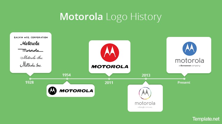
This was the original Motorola logo back in the early 90’s when the company was making millions, being credited for making the first handheld mobile phone and the later success of the DynaTAC. This paved the way for the company’s successful venture into the mobile phone business until it was eventually overtaken by Nokia in 1998. By 2007, Motorola had lost over $500 million and was thoroughly in trouble. By January of 2011, it had split into two entities, each having their own venture and independent from each other.
In May of 2012, Google had announced that it had acquired Motorola for $12.5 billion. As a result of the acquisition, the Motorola logo was redesigned to include Google’s trademark colors and name.
Following the acquisition on October 30, 2014, by Chinese Technology Firm Lenovo, Motorola’s current logo now has Lenovo’s mark on it.
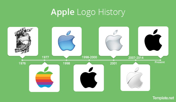
1976: The Newton Crest
When Apple first started, its logo stayed true to the roots of Sir Isaac Newton’s apple. Designed by Apple 1 manual-maker Ronald G. Wayne, the logo depicts sir Isaac Newton under a tree with an apple dangling above his head.
A phrase outside the portrait reads, “Newton—A Mind Forever Voyaging Through Strange Seas Of Thought—Alone.” Even by 1970’s standards, it looked too ancient and dated, that when Ronald Wayne shortly left the company, the logo lasted merely a year before Steve Jobs had it replaced.
1976-1998: The Rainbow Apple
Apple’s rainbow logo survived longer than Steve Jobs’ tenure in the company and stayed as its logo for 22 years. Graphic designer Rob Janoff was asked by Steve Jobs to design something more modern and true to the company’s name. The result? Unsurprisingly, the apple design was chosen, but with a twist: A bit off the side. As simple as this design was, it’s to date, the most recognizable and iconic corporate logos in history.
The bite in the apple was to designed so people wouldn’t confuse the apple with a tomato. It also had another meaning: The “bite” actually meant “byte”, in reference to the company’s computer business.
As for the rainbow colors, some have criticized the wrong order of colors, but according to Janoff, the colors weren’t necessarily placed to follow the colors of a rainbow. The green was placed on top because green represented a leaf’s color. Former Apple executive Jean-Louis Gassee however, said Apple’s symbolism together with the bite, represented lust, hope, knowledge, and anarchy, representing the proverbial apple in the garden of Eden and Apple founder Steve Jobs’ authoritarianism that invoked both fear and criticism. The multicolored logo was to stay until 1997 when, upon Steve Jobs’ return, he had the colors removed because it was too expensive to print.
1998-Present: The Monochromatic Logo
When Jobs returned to Apple in 1997, the company was in a bad shape and it was decided to make the logo more prominent and universally recognizable. Together with the launching of Apple’s products, the monochrome logo was placed on such venerable products as the iMac, Powermac and later on into the first generation iPod and iPhone, which continued until today.
The rainbow logo would have been great if it continued until today, what with all the colors lighting up when you switched on your iMac, but when Jobs took back Apple in 1997, it was a failing company and he wanted to do away with the past and turn the company around with its cutting edge products. It was only natural that Apple’s logo also changed to signify the company’s successful turnaround into an industry leader.
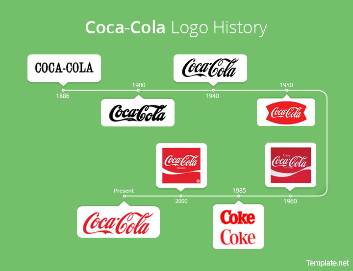
Coca-Cola is one of the most famous and easily recognizable brand logos in the world, with the soda drink either loved or loathed equally, whichever side you’re on with the soda issue. Since its inception in the 1880’s, the logo had undergone so many changes that it would take a whole book explaining each one. In this section, we’ll focus on the more important logo changes that Coca-Cola had undergone through the years.
1886: The Original Logo Design
When John Pemberton first experimented with a drink as an alternative to painkillers, he inadvertently mixed carbonated water with the base syrup made up of kola nut and damiana (among other ingredients). The result was the drink we all came to love, but back then, it was advertised as a health tonic. The original logo design was simple with no curves and very little design since it wasn’t then advertised as a soda drink but rather a health drink.
The original logo design was simple with no curves and very little design since it wasn’t then advertised as a soda drink but rather a health drink.
1887-1900: The Spencerian Script Design
John Pemberton’s bookkeeper and partner, Frank M. Robinson, also made the advertising labels and came up with the idea of making the design based on the popular business correspondence style of Spencerian Script, which was prevalent before the invention of the typewriter.
Both men believed or rather predicted accurately, that the two C’s would become a popular advertising logo. The “Trade Mark” word was later added to the tail of the first C.
1890-1890: Extra Swirls
While it is unclear what prompted the change in design, extra swirls were added on the two C’s to help make an even more unique and dramatic advertising logo. Thankfully it lasted only for one year before it was decided that the Spencerian script style was still the best design that needed to be carried on.
1900-1941: Same Style, Different Colors
Between 1900 to the 1920’s, three different color schemes were used alternately that used black, white and red with the logo inside a rectangular design. The tail on the first C was also improved and the trademark word was later moved below the logo.
Another feature from the 1920’s to the mid-1930’s also featured the logo inside an angled design for a unique look in a design so prevalent back then in advertising style:
The 1930’s saw the Coca-Cola logo first used inside a red circle on print ads. The circle would go on to be used well into the 1960’s with gradual updates:
By 1941, the word “Trademark” was totally dropped from the logo and the wordmark became the longest used design that lasted well into the present. (Refer the image above)
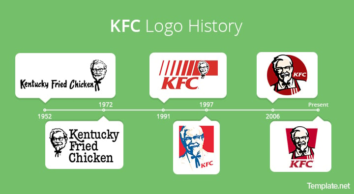
Ever since Colonel Harland Sanders introduced Kentucky Fried Chicken with “11 different herbs and spices” in Louisville, Kentucky in 1952, the KFC logo has become one of the most popular and recognizable logos in the fast food industry. Like any famous logos, however, the KFC logo underwent a lot of changes while staying true to the Colonel’s features that had made the logo so discernible.
Ever since its inception in 1952, the KFC logo has always depicted the company’s iconic founder but the changes made were more for practicality rather than aesthetic reasons. In this part, we’ll trace the evolution of the KFC logo through the years.
1952-1978: The Original Logo Design
The original logo design featured all the words, not the three letters, with a rather serious countenance of the Colonel. This logo would last 26 years before it would be redesigned with minor changes.
1978-1991: Minor Changes
By 1978, the Colonel’s likeness was moved to the left side of the logo and the typeface for the words was improved. The Colonel’s face had also been refined and this logo would be used until 1991.
1991-1997: KFC Abbreviation
1991 saw the logo being improved with broken red lines and the Colonel’s visage compressed and Kentucky Fried Chicken words reduced to just “KFC”. The abbreviation was done in an effort to do away with the “fried” word which would connote unhealthy foods.
1997-2006: The Smiling Colonel
1997 saw two versions of the KFC logo, the large one with a rather dull red color and an elongated background with deep red color. Both logos now feature the Colonel with a broad smile and these logos can still be seen in other KFC branches in parts of the world.
2006-Present: The Colonel’s Apron
By 2006, KFC commissioned the noted San Francisco-based branding agency Tesser to redo the logo to the current features we’re seeing now in most KFC branches. Unveiled in 2007, the new logo design features a much younger smiling Colonel without the wrinkles and replacing his tuxedo with an apron.
True to its roots, however, the logo retained all the original elements of the Colonel, including the glasses, black bow tie, and goatee beard. He’s now placed on a brighter red round background and the lines are noticeably thicker to make it stand out.
Several versions of the KFC logo were also seen in other branches. (Refer the image above)
2006-2010
This logo sported the slogan “It’s finger lickin’ good!” below the Colonel’s features and was seen in a lot of branches in the United States and other parts of the world.
Other designs used internationally had the words “ So Good” and “Today Tastes So Good” alternately.
This illustration given above follows the KFC logo evolution through the years.
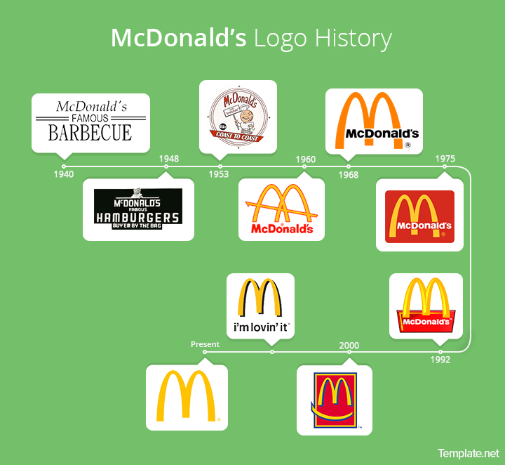
Love it or hate it, the golden arches of Mcdonald’s has become the most recognized and familiar symbol of fast food anywhere on the planet. More than fast food, McDonald’s has become the symbol and cultural icon of everything that’s American.
Along with it comes the symbol of global capitalism and proliferation of American culture that’s become so widespread, it actually helped McDonald’s grow and establish thousands of branches all over the world. Take a look back at the evolution of the fast food chain’s logo as we trace the roots of how the golden arches eventually became what it has become in the image enclosed above. The most famous and iconic fast food logo in the world.
1940-1948: The Beginning
Brothers Richard and Maurice McDonald opened their first restaurant in San Bernardino, California. Their main menu was a barbecue, hence the “Famous Barbecue” name. Hamburgers were just secondary on the menu that can be ordered by customers along the side and fries weren’t even included yet.
Between 1941 and 1948, the brothers had included hamburgers in the main menu and barbecue became secondary as customers preferred the burgers for their fast serving time. This eventually resulted in barbecue being totally phased out of the menu.
1948: Tubby Chef Speedee
By 1948, the brothers had perfected the art of quick fast food service and introduced the “Speedee Service System” that established the principles of fast food still in use today to improve service time.
The brothers designed the winning chef character Tubby Chef Speedee in 1948 to help communicate the message of fast service. It was the first ever McDonald’s mascot that was to be used until it was totally replaced in 1968.
1961-1968: The First Golden Arches
By 1953, McDonald’s Famous Hamburgers was shortened to just McDonald’s. The brothers then commissioned architect Stanley Meston to design their first franchise outlet’s logo. The idea for the golden arches was credited to Richard McDonald who drew a stylized sketch of two half-circle arches which was improved by the artists they hired to improve the design of the arches.
The above logos were several examples produced during that era. These were alternately used with either a logo with the blue circle or a standalone symbol logo with no text nor circle.
By 1961, entrepreneur Ray Kroc had bought most of the rights to Mcdonald’s and established the blueprint for franchising that would become the basis for fast food chain establishments that needed to expand. A change in company mascot was also tried and the successor to Speedee came out in 1962 by the name of Archy McDonald:
Archy McDonald was used on McDonald’s POP and delivery trucks and was featured on the first McDonald’s TV commercials dancing around the counter. Another artist rendition of Archy was seen later on that was of a totally different design.
1968-2006: The Golden Arches Through The Years
The franchise’s continued success paved the way for the company’s expansion but the iconic golden arches had become the permanent logo for McDonald’s. The iconic arches underwent few minor changes but basically, the symbol logo had existed from the 60’s well into the present.
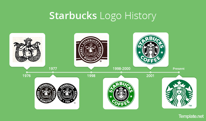
Perhaps the most well-known coffee shop in the world, Starbucks has become home to hipsters, freelancers, and students. Although they have faced criticism for being overpriced and coffee snobs have put the brand down for not being genuine coffee, nevertheless, Starbucks has a loyal following and remains to be beloved by many.
1971-1987: The Early Beginnings
Founded in Seattle in 1971, Starbucks started out as an unknown coffee shop operated by a group of friends. The first Starbucks logo is a brown and white two-tailed, bare-breasted mermaid – a siren – who was meant to represent how enticing the coffee that the store sells is.
At this time, Starbucks only sold coffee beans and the only beverages they had in the store were free samples. Howard Schultz tried to convince the owners to introduce espressos and handcrafted beverages to the menu, to which the owners refused.
1987-1992: Acquisition and Merge
When the owners of Starbucks decided to sell the company, Howard Schultz, who already owned a coffee shop called Il Giornale, bought Starbucks for $3.8 million. Upon his acquisition of the company, the Starbucks logo was changed, incorporating the design that Il Giornale had.
Along with handcrafted beverages, Starbucks also came with a cleaner new logo. While the new logo resembled Schultz’s Il Giornale’s logo more than it did the Starbucks’ original, the company retained the siren as the company’s mascot but giving her a makeover. The siren was remade to have a cleaner, more contemporary look and put her against a black background, making her look more prominent.
1992-2011
Come 1992, the Starbucks logo underwent another change. While it stayed mostly the same, the siren was cropped. She was zoomed in, now showing only her tails and the upper half of her upper body.
Unknown to many is that in the year 2008, Starbucks attempted to revive the first logo, perhaps in an attempt to reach out to hipsters. However, the change was disastrous and doomed from the beginning as the green logo is already heavily associated with the coffee shop’s brand. It didn’t take long for Starbucks to return to their green siren logo.
2011-Present
The Starbucks logo underwent another change in 2011, but none as drastic as the 2008 fiasco. This time, the change was more subtle and was not noticeable to the non-detail oriented eyes.
Despite this, the new logo was received with much criticism by designers and the brand’s followers. It was under a lot of scrutiny for a long time. (Then again, Starbucks undergoes a lot of scrutiny every year since the release of their holiday’s cups.) The new design, done by Starbuck’s internal team, still utilizes the same deep green that Starbucks is known for but that is the only color in the logo.
The white color is used to draw the details of the siren’s crown, face, hair, and two tails. From the words of Howard Schultz himself, “This new evolution of the logo embraces and respects our heritage and at the same time, evolves us to a point where we will feel it’s more suitable for the future. The new interpretation of the logo gives us the freedom and flexibility to think beyond coffee, but make no mistake, we will be the world’s leading purveyor of the highest quality coffee.”
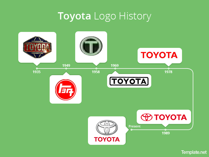
All over the world, Toyota has been enjoying a reputation for being durable, resilient, and tested. From relatively cheap models used as cabs to their line of luxury models, Toyota indeed has mastered the world of car manufacturing. Their emblem is known, recognized, and respected around the world. But before their now famous emblem, it first underwent major changes until it became what it is today.
1963: Before It Was Toyota
Once upon a time, Toyota was first known as Toyoda. It was founded by Kiichiro Toyoda, the son of the owner of Toyoda Automatic Loom Works. The first logos were the Roman letters of the founder’s family name in a diamond-shape emblem.
The name was changed when the company held an open contest to design the company’s new emblem.
The winning logo had the word Toyota written in Japanese. Actually, originally, the actual word still was Toyoda but changing the last syllable from “da” to “ta” seemed significant for these reasons:
Because 8 is a lucky number in Japanese, Chinese, and bunch of other Asian culture, they company decided to remove the two additional strokes and rename the company to Toyota instead. The renaming and rebranding of the Japanese company marked its transition from being a family business to an international company.
When Toyota went international, a logo for the non-Japanese countries were used. The logo is simply Toyota’s name written in black. Throughout the years, Toyota’s emblem undergoes a series of changes. Here are the changes in Toyota’s logos:
Ideally, your company should have a logo customized to establish your brand and personality. However, hiring a designer to design a logo just for you is an expensive investment you are just not ready to make yet.
While having a unique, easily identifiable logo is preferable, there is nothing wrong with plucking inspiration from all around the web. A quick search online would lead you to pages upon pages of allegedly free sites. We’ve narrowed the search down for you and have these websites to recommend:
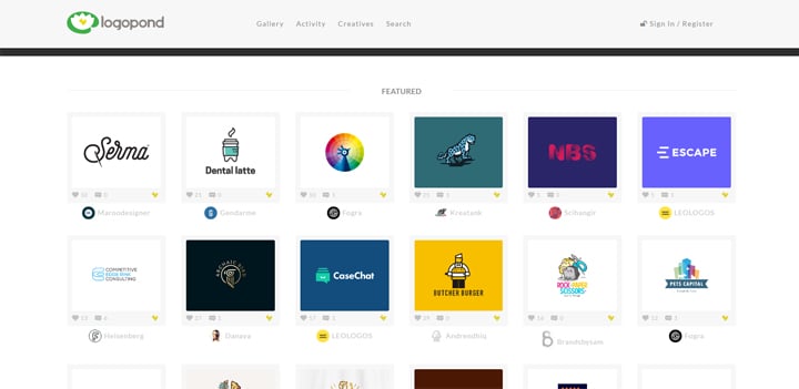
LogoPond features a variety of different templates you could download and use as a guide for designing your own. Upon entering the site, you will be led to a homepage that shows you a sample of the logos they have available and a couple of featured logos. You can scan through these or you can also register into the website to gain more access to the features they offer.
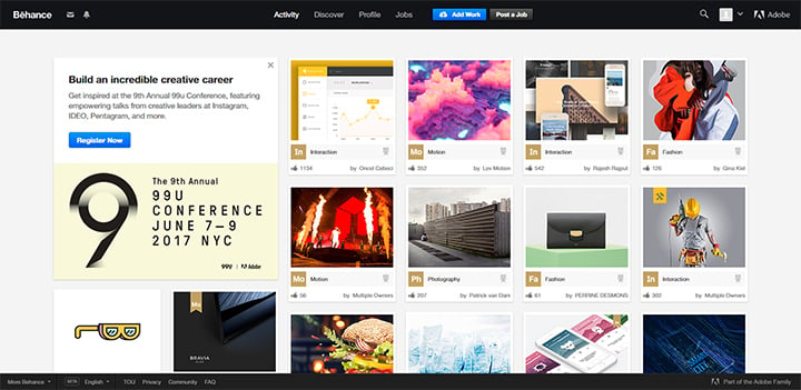
Behance is a site where creative professionals post their portfolios. Some of them include logo designs free for anyone’s use. The Behance link above will lead you to the page of one Mats-Peter Forss who uploads 25 minimalistic designs free for use.
The logo designs are simple, elegant, and modern. A look at it would surely provide some sort of inspiration to help you come up with your own logo design.
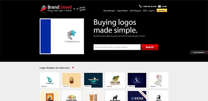
BrandCrowd has an extensive collection of logo designs that covers any industry you could think of. From dating sites to law firms, they are sure to have logo templates on those! On the top right corner of the page, you will find a search bar where you can input any keyword you want to make navigation simpler.
Also, BrandCrowd offers a logo making service you could try out for free!
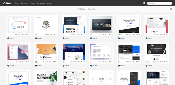
Dribble is a “show and tell for designers” kind of site. Designers and artists post their works here and viewers are free to scroll through and take a look. There are indeed thousands of beautiful logo designs you could pluck inspiration from. Each design has the designer’s name written beneath it so it would be easy to contact the designer should you decide that you want to use their work.
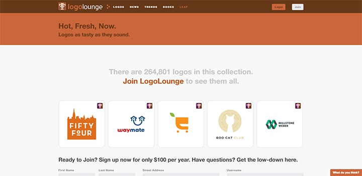
LogoLounge has hundreds of thousands of logos available for you to customize and use for your company. Upon entering their page, you will be led to the homepage where examples of some of the logos they have available on the site are featured. If you click on one of the samples, you will see who designed it and what industry it is best for. This is highly recommendable but be forewarned: complete access to the site requires a $100 a year subscription.
Designing a logo may not sound too difficult, yet you just spent hours scouring the web looking for an idea to help you with your logo design. Well, look no further. We’ve done just that, and compiled all the best logo designing websites.
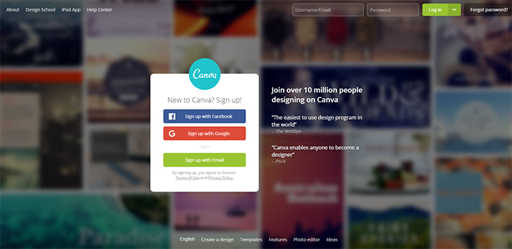
Aside from their website, Canva is also a highly-rated logo editing app. It lets you choose from a few templates that they already have available and you could customize and design these templates to your liking. Additionally, they have a lot of fonts for you to choose from.
If you find their selection lacking, however, they also let you upload your own fonts. While Canva is not as highly customizable as most of the other sites on this list, Canva is completely free. Besides, their templates are beautifully designed so you can be sure that you will end up with a rather attractive logo.
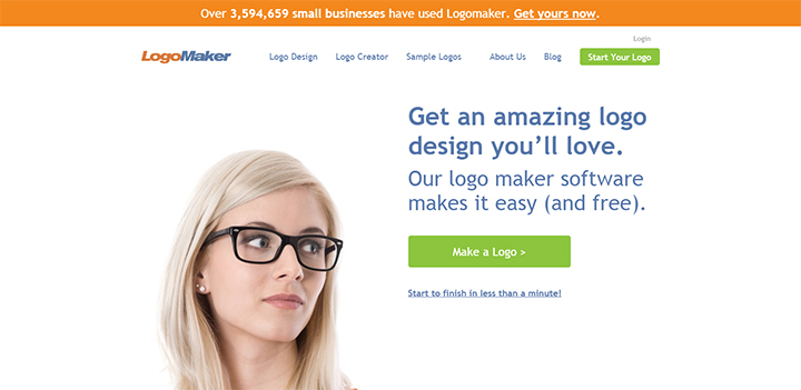
LogoMaker has tens of thousands of icons to choose from when designing your logo. Furthermore, the icons are highly customizable, giving you the option to change the colors of different parts of the ready-made icons as you wish. While customizing, editing, and saving the logos you make is free, to download the file is a different story.
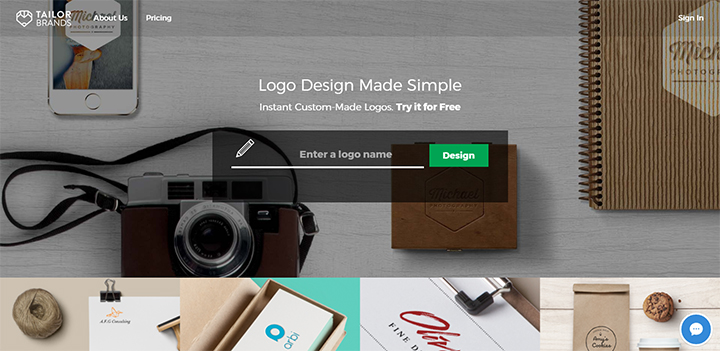
TailorBrands designs a unique logo for your company. Upon beginning the process, you will be asked to enter the company’s name and the tagline. You will then be asked a series of questions including what your company does and what kind of logo you would prefer (name-based, initial-based, or graphic-based).
Afterwards, you will be given a couple of different typographic layouts to choose from so they could match your taste with the logo they will design for you. Sign-in is required to view the logo designs they came up with.
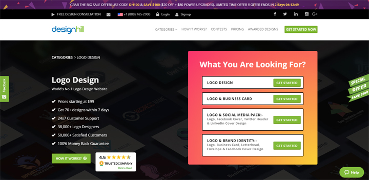
DesignHill not only has an extensive collection of templates and a free software so you could try to design your own logo by yourself, they also offer logo design contests. DesignHill holds the contest open so a lot of different designers can see your contest and submit their entries but, depending on your package, they also send out invites to renowned designers to submit entries as well. Take note, however, that DesignHill charges a 4.5% transaction fee.
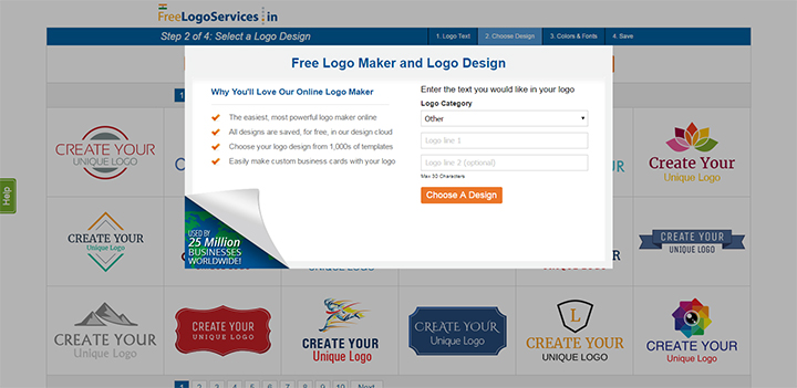
Free Logo Services doesn’t just design your logo, it designs your business cards, too. It offers a wide variety of choices arranged by the line of service your business is in. You could try Free Logo Services for free and they would email your finished design and card to you. Saving the design may be free, but downloading it would cost you about AU$40.
The power of a logo lies in its visual essence. Long after a company ceases to relay its message through media advertising, a logo continues to advertise. People always relate and recognize images better than any text and in the age of multimedia, this rings truer than ever. A well-crafted logo can easily reach out to customers and effectively communicate with the public. It goes down to how the image of your brand reflects the sentiments of your consumers.
These examples are gathered from the finest informative pages that we can find and presented in a single article that’s unique, complete and comprehensive. The research done has both been extensive and exhaustive and great care was taken not to leave out any valuable information.

When it’s a new school year, we are bound to prepare to see a new environment and new faces. How…
![How to Create a Doctor ID Card [10+ Templates]](https://images.template.net/wp-content/uploads/2019/06/featured-img16.jpg)
ID cards are important in the medical field because they act as proof of a healthcare professional’s identity and affiliation.…

For many children, preschool can be a fun place where they can mingle and play with other kids their age.…

Identification cards are important objects to have. In the line of travel, these are important for customers and people to…
College is full of activities like academic excellence, sports participation, and various other extra-curricular activities. one way to inform the…
Instagram is a mobile application that took people’s photography and design skills to the next level. This app has taken…

Event apps still can’t replace the joy and convenience of receiving a printed program. That is why we have crafted…
![How to Create a Teacher ID Card [13+ Templates]](https://images.template.net/wp-content/uploads/2019/03/pexels-photo-1181398-788x526.jpeg)
Institutions need identification cards for their employees to be able to verify that they are the person they claim to be.…
From the times of Ancient Rome to the late Ming Dynasty, newspapers have undergone from being hewn on stones to…