MARKETING TYPOGRAPHY RUBRIC
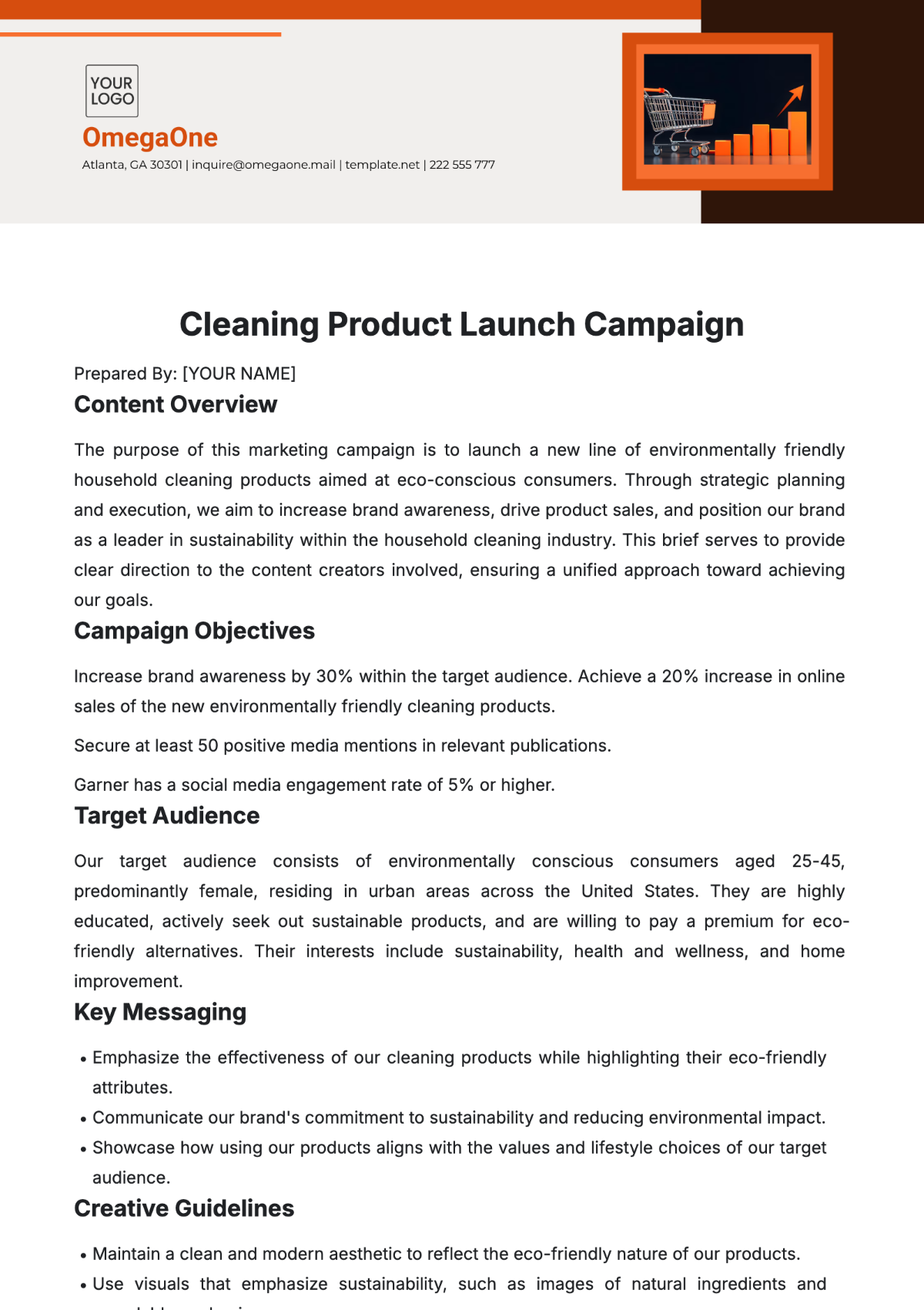
This rubric is intended to guide [Your Company Name]'s marketing materials, ensuring consistency, readability, and brand alignment. As of [Year], the following standards are set to assess and maintain typographic excellence.
Criteria | 5 Excellent | 4 Good | 3 Fair | 1-2 Needs Improvement |
Font Selection | Uses brand-approved fonts consistently. | Mostly uses approved fonts with minor inconsistencies. | Uses a mix of brand and non-brand fonts. | Frequently deviates from brand fonts. |
Readability | Text is easily legible across all platforms and devices. | Text is mostly legible, with minor errors. | Occasional issues with legibility. | Text is often difficult to read, especially on small devices. |
Hierarchy & Scale | Perfect use of typography to differentiate formats. | Good differentiation between textual elements, with minor inconsistencies in hierarchy. | Some effort to differentiate text types, but lacks a clear hierarchy in places. | Frequent confusion between headings and body text. Lacking clear hierarchy. |
Alignment | Text is consistently and appropriately aligned. | Mostly consistent alignment. | Inconsistent alignment across materials. | Frequent misalignment. |
Color & Contrast | Excellent use of brand colors. | Good use of color with minor contrast issues. | Fair use of brand colors. | Frequent contrast issues that make the text hard to read. |
While [Your Company Name] maintains a robust standard in its typographic choices, continuous evaluation and adherence to this rubric are imperative. Regular audits and feedback mechanisms should be implemented to ensure the company remains at the forefront of typographic excellence in its marketing materials.

