Free Digital Marketing Agency Logo Design Brief
Prepared by: [YOUR NAME]; Company: [YOUR COMPANY NAME]
1. Project Information
Project Name:
Digital Apex Logo Revamp
Objective of the Project:
The "Digital Apex Logo Revamp" project aims to redesign the current logo to reflect the company's evolving brand identity and values, appealing to small to medium-sized businesses seeking comprehensive digital marketing strategies, and promoting modernity and adaptability.
Target Achievement:
Visual Identity Reinforcement: The redesigned logo should reinforce our brand's visual identity, making it more recognizable and distinct within the competitive digital marketing landscape.
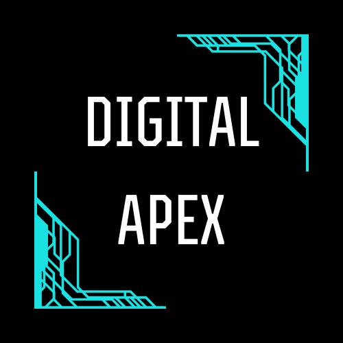
OLD LOGO |
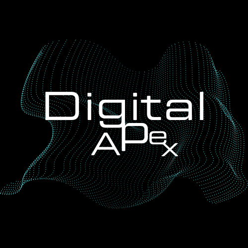
NEW LOGO |
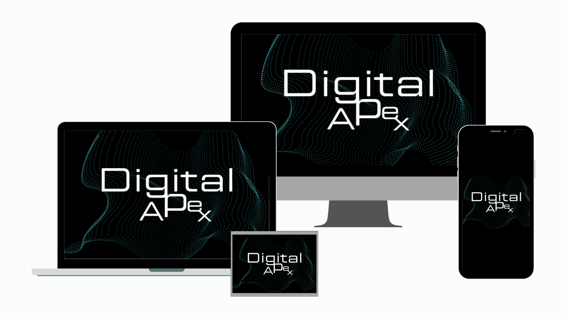
Versatility and Scalability: The logo should be versatile and scalable, easily applicable across various platforms (digital, print, social media) and formats (business cards, website headers, promotional materials) without losing its integrity.
|
Engagement Increase: A refreshed brand symbol aims to increase engagement with our target audience, fostering brand loyalty and recognition. The redesign should appeal to current clients while attracting potential clients by reflecting a cutting-edge, reliable digital marketing agency.
Market Positioning: Through the logo revamp, we aim to solidify our position in the market as a forward-thinking and adaptable digital marketing agency capable of addressing the dynamic needs of businesses in the digital age.
2. Company Information
Providing company details helps us understand more about you, and how we can incorporate your company’s values and personality into the logo design. Fill out the table below with the necessary information.
Company Name | [YOUR COMPANY NAME] |
Industry | [YOUR INDUSTRY] |
Company Size | [COMPANY SIZE] |
Established Date | [DATE] |
Office Location | [YOUR COMPANY ADDRESS] |
3. Logo Design Preferences
Explaining your preferences will allow us to better create a design that aligns with your vision and expectations.
Preferred color scheme: Black, white, and Blue
Logo style preference: Modern
Specific elements you want to include in the logo: Textured Background
4. Design Adversion
Listing down the design aspects you would like to avoid can help us make the logo more suited to your taste and company brand.
Colors to avoid:
Dark Brown or Olive Green: Such colors might look outdated and less appealing in digital contexts, potentially clashing with modern aesthetics.
Overly Bright Red: This can be aggressive and deter the sense of partnership and growth we want to promote.
Fonts to Avoid:
Comic Sans and Papyrus: These fonts are often considered unprofessional and overused in contexts that don't match our industry's professionalism.
Highly Decorative Fonts: While unique, they may not ensure the legibility and clarity needed for a logo meant to be scalable and versatile.
Design elements to avoid:
Cliché Symbols: Avoid overused symbols like globes, arrows, or lightbulbs that may not effectively differentiate our brand in the digital marketing space.
Excessive Shadows or Gradients: These can make the logo difficult to reproduce across different media, especially in monochromatic contexts or when embossed on promotional materials.
Logo styles to avoid:
Photorealistic Logos: These do not scale well and can lose detail when viewed at smaller sizes or in different formats.
Trendy Designs That May Date Quickly: Avoiding design trends that may not stand the test of time ensures our logo remains relevant and timeless, aligning with our brand's long-term vision.
5. Timeline and Delivery Format
Knowing the timeline for the project allows us to deliver the output on time. Your preferred delivery format, on the other hand, will help us prepare the final logo in a form that would be most convenient to you.
Target completion date: March 8, 2050
Preferred format of the final logo: All format should be provided
- 100% Customizable, free editor
- Access 1 Million+ Templates, photo’s & graphics
- Download or share as a template
- Click and replace photos, graphics, text, backgrounds
- Resize, crop, AI write & more
- Access advanced editor
Craft logos that stand out with Template.net's Digital Marketing Agency Logo Design Brief Template. This template guides you through the process of conceptualizing logos that encapsulate client brands perfectly. Fully editable and customizable, it supports creative freedom while ensuring alignment with client visions, with our AI Editor Tool facilitating easy modifications for logo perfection.
You may also like
- Gaming Logo
- Football Logo
- Photography Logo
- Company Logo
- Name Logo
- Real-Estate Logo
- Wedding Logo
- Circular Logo
- Sports Logo
- Restaurant Logo
- Cafe Logo
- Gym Logo
- Education Logo
- Cricket Logo
- Beauty Logo
- Fashion Logo
- Travel Logo
- Construction Logo
- Bakery Logo
- Cleaning-Services Logo
- Music Logo
- Dj Logo
- Church Logo
- Hotel Logo
- Event Logo
- Interior-Design Logo
- Medical Logo
- Flower Logo
- Architecture Logo
- Health Logo
- Marketing Logo
- Finance Logo
- Text Logo
- Youtube Logo
- Podcast Logo
- Non-Profit Logo
- Digital-Marketing Logo
- Spa Logo
- Law-Firm Logo
- It Logo
- Transport Logo
- School Logo
