Heuristic Evaluation
[YOUR COMPANY NAME]
Date: [INSERT DATE]
Introduction:
This Heuristic Evaluation has been designed to assess the usability of user interfaces, with a focus on improving the overall user experience. As a UI & UX Designer, the evaluation aims to identify potential usability issues and areas for enhancement based on recognized usability principles or heuristics. By systematically evaluating various aspects of the interface, we can ensure that it is intuitive, efficient, and user-friendly.
Background:
The evaluation is structured to capture insights into the usability of user interfaces, which is crucial in the field of user experience (UX) design and usability testing. By conducting this evaluation, we can identify strengths and weaknesses in the interface design, prioritize areas for improvement, and ultimately enhance user satisfaction and engagement.
Criteria for Evaluation
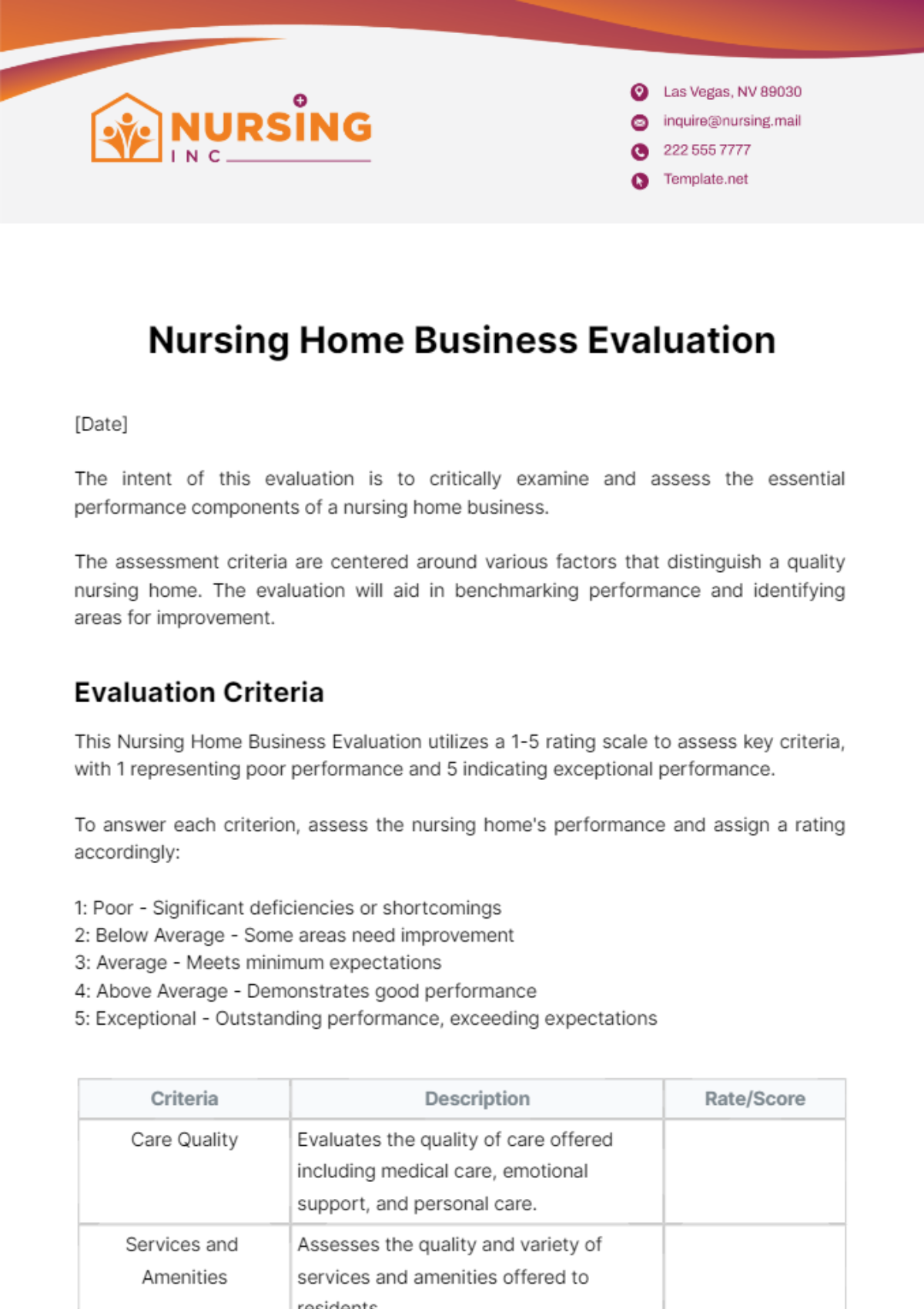
The performance metrics for this evaluation include ease of learning, efficiency of use, memorability, error frequency and severity, and subjective satisfaction.
Criteria | Description | Rating |
|---|---|---|
Visibility of system status. | How well does the interface provide feedback to users about system actions or changes? | |
Match between the system and the real world. | To what extent does the interface follow real-world conventions and language? | |
User control and freedom. | Does the interface provide users with options to undo or redo actions and navigate freely? | |
Consistency and standards. | How consistent is the interface design in terms of layout, terminology, and functionality? | |
Error prevention | Are there mechanisms in place to prevent errors and guide users to recover from mistakes? | |
Recognition rather than recall. | How easily can users recognize and find tasks, functions, and information within the interface? | |
Flexibility and efficiency of use. | How efficiently can users complete tasks, and are there shortcuts or customization options available? | |
Aesthetic and minimalist design. | Is the interface visually appealing and free of unnecessary elements that could distract users? | |
Help users recognize, diagnose, and recover from errors. | How effectively does the interface communicate errors to users and guide them toward resolution? |
Rating Scale:
1 - Very poor
2 - Poor
3 - Satisfactory
4 - Good
5 - Excellent
Additional Comments and Notes
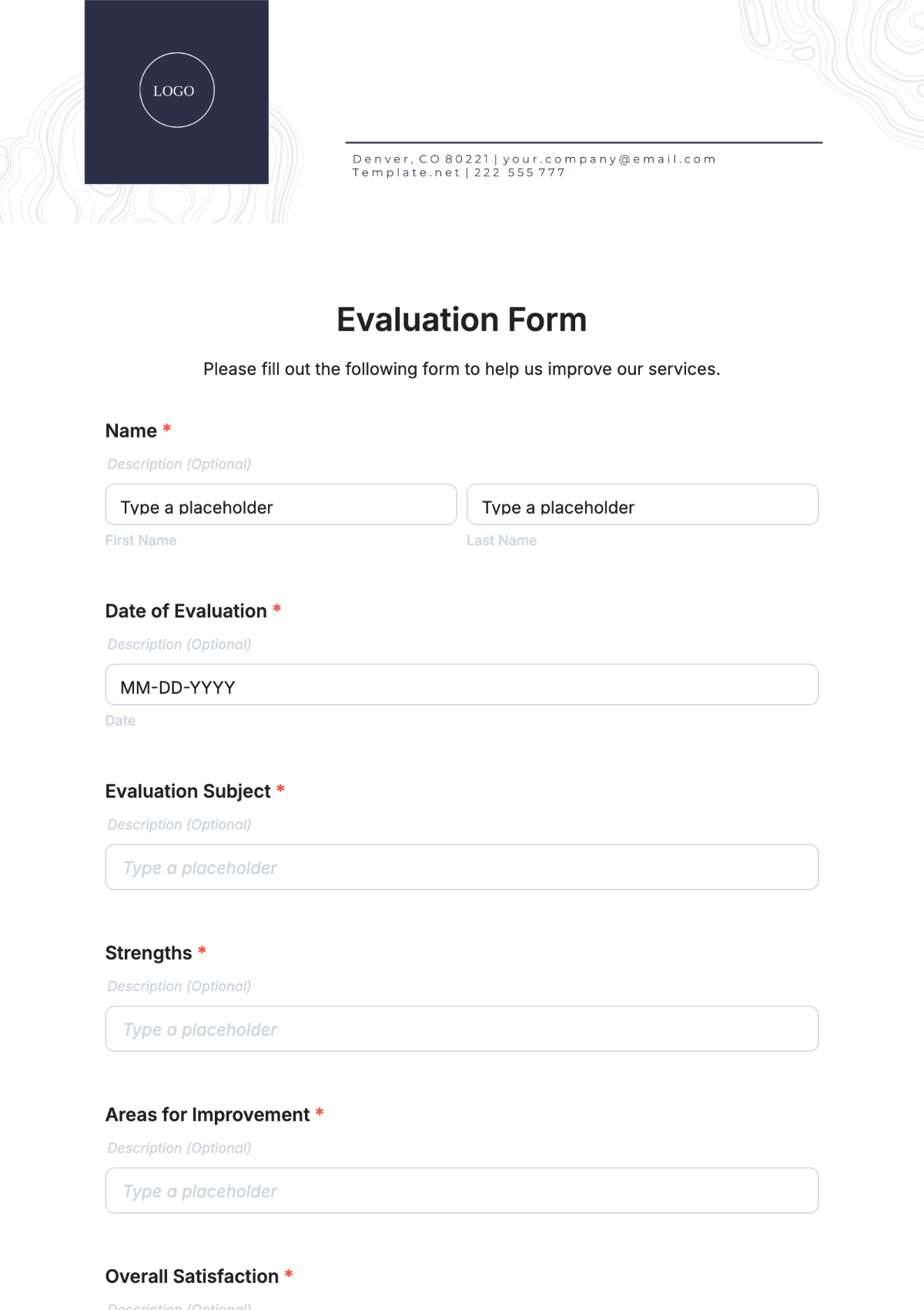
Please provide any additional comments or feedback regarding the usability of the interface:
Comments |
|---|
