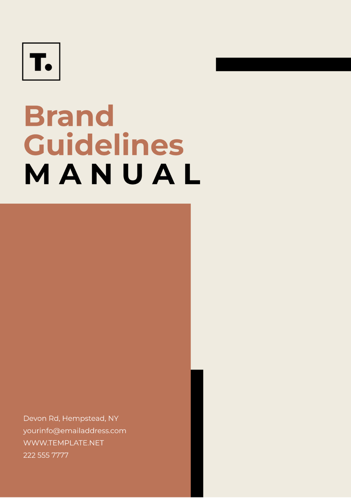
Free Aesthetic Brand Guidelines Manual
Prepared by: [Your Name]
I. Introduction
Welcome to [Your Company Name]'s Aesthetic Brand Guidelines Manual. This document defines our brand's visual and stylistic elements, ensuring consistent representation across all platforms and media. Use it for all design and content projects.
II. Brand Identity
Brand Overview
At [Your Company Name], our brand is a reflection of our core values, vision, and mission. We strive to communicate a sense of elegance, sophistication, and innovation. Our visual identity should convey these attributes in every touchpoint, from our logo to our color palette.
Mission Statement
Our mission is to deliver exceptional products and services that enhance the lives of our customers. We are committed to quality, creativity, and excellence, ensuring that every interaction with our brand is memorable and impactful.
III. Logo Usage
Primary Logo
The primary logo is the cornerstone of our visual identity. It should be used in its original form and should not be altered or distorted.
Logo Specifications
Element | Description |
|---|---|
Primary Logo | Full-color version with brand name and tagline |
Clear Space | Maintain a minimum clear space around the logo equal to the height of the logo's icon |
Minimum Size | Do not use the logo at a size smaller than 1 inch in width for print or 100 pixels for digital |
Alternative Logos
Alternative logos may be used in specific contexts where the primary logo is not suitable. These include monochrome and simplified versions.
Logo Variants
Monochrome Logo: Suitable for black-and-white prints or when color reproduction is limited.
Simplified Logo: Ideal for small-scale applications where the full logo may be too detailed.
IV. Color Palette
Primary Colors
Our color palette is central to our brand's visual identity. The primary colors are used consistently across all materials.
Color Specifications
Color | Hex Code | RGB Code | CMYK Code |
|---|---|---|---|
Primary Blue | #0033A0 | (0, 51, 160) | (100, 68, 0, 25) |
Accent Gold | #FFD700 | (255, 215, 0) | (0, 15, 100, 0) |
Secondary Colors
Secondary colors complement the primary palette and can be used to add depth and variation.
Secondary Color Options
Soft Grey: #F5F5F5
Charcoal Black: #333333
V. Typography
Primary Typeface
Our primary typeface is selected to reflect our brand's elegance and readability.
Typeface Specifications
Typeface | Style | Weight | Usage |
|---|---|---|---|
Garamond | Regular | Regular | Body text, Headlines |
Helvetica | Bold | Bold | Emphasis, Subheadings |
Secondary Typeface
Secondary typefaces may be used for supplementary materials and to provide additional stylistic variation.
Arial: For digital use and informal contexts.
VI. Imagery and Graphics
Photography Style
Our imagery should reflect our brand's values of sophistication and elegance. Photography should be high-quality and aligned with our color palette.
Photography Guidelines
Subject Matter: Focus on clean, uncluttered compositions with natural lighting.
Tone: Use images that evoke a sense of refinement and professionalism.
Graphic Elements
Graphic elements should be used sparingly to enhance the overall design without overwhelming the content.
Icons: Simple and clean, using our primary color palette.
Patterns: Subtle and complementary to the overall design.
VII. Brand Voice
Tone and Style
Our brand voice should be consistent across all communications. It should be professional, approachable, and confident.
Communication Guidelines
Formal: Use for official documents and communications.
Conversational: Use for social media and casual interactions.
Language
Ensure clarity and precision in all written content. Avoid jargon and maintain a focus on our audience's needs and expectations.
VIII. Applications
Digital Presence
Our brand guidelines extend to our digital presence, including our website and social media profiles.
Digital Guidelines
Website: Adhere to our color palette and typography.
Social Media: Use approved imagery and maintain consistent messaging.
Print Materials
Consistency is key in print materials, including brochures, business cards, and advertisements.
Print Specifications
Brochures: Follow the color palette and typography guidelines.
Business Cards: Use the primary logo and adhere to layout specifications.
IX. Conclusion
This Aesthetic Brand Guidelines Manual serves as a guide to maintaining the integrity and consistency of [Your Company Name]'s brand. By adhering to these guidelines, we ensure that our brand remains recognizable and impactful in all communications. For any questions or clarifications, please contact us at [Your Company Email].
Thank you for your commitment to upholding the standards of our brand.
- 100% Customizable, free editor
- Access 1 Million+ Templates, photo’s & graphics
- Download or share as a template
- Click and replace photos, graphics, text, backgrounds
- Resize, crop, AI write & more
- Access advanced editor
Unlock your brand's potential with Template.net's Brand Guidelines Manual Template. This editable and customizable resource ensures consistency across all brand elements. Crafted to perfection, it's easily editable in our Ai Editor Tool, allowing you to tailor your brand guidelines effortlessly. Elevate your brand identity with this essential tool.
