Cafe Menu Design Guide
I. Introduction
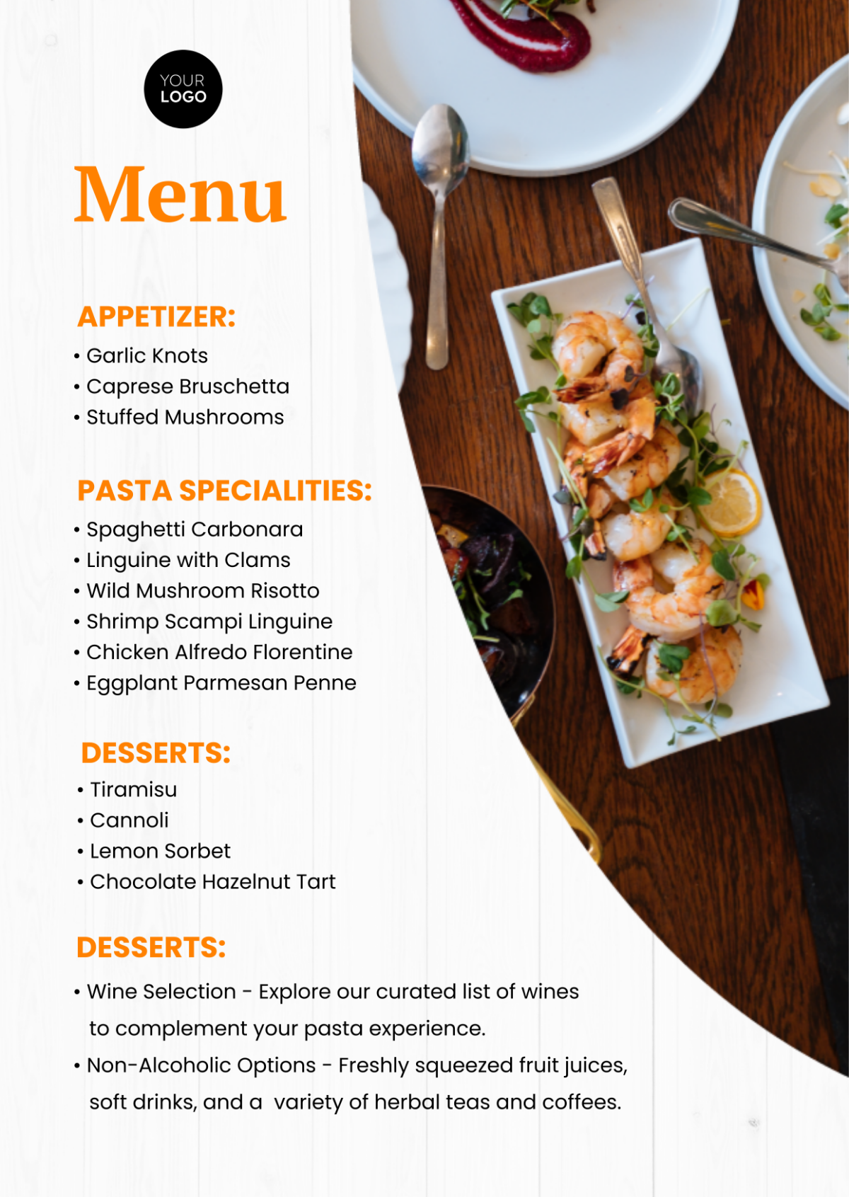
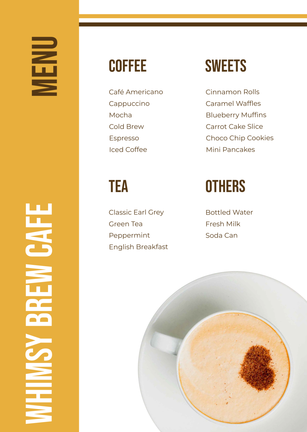
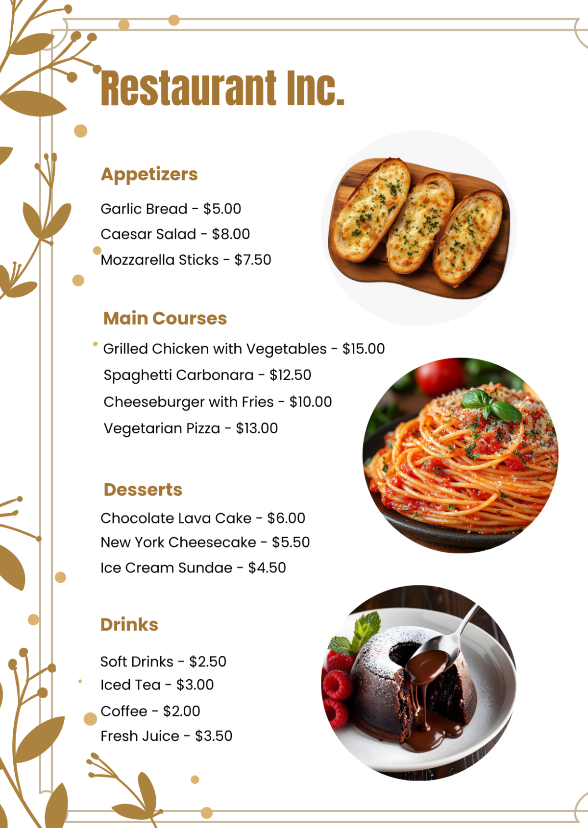
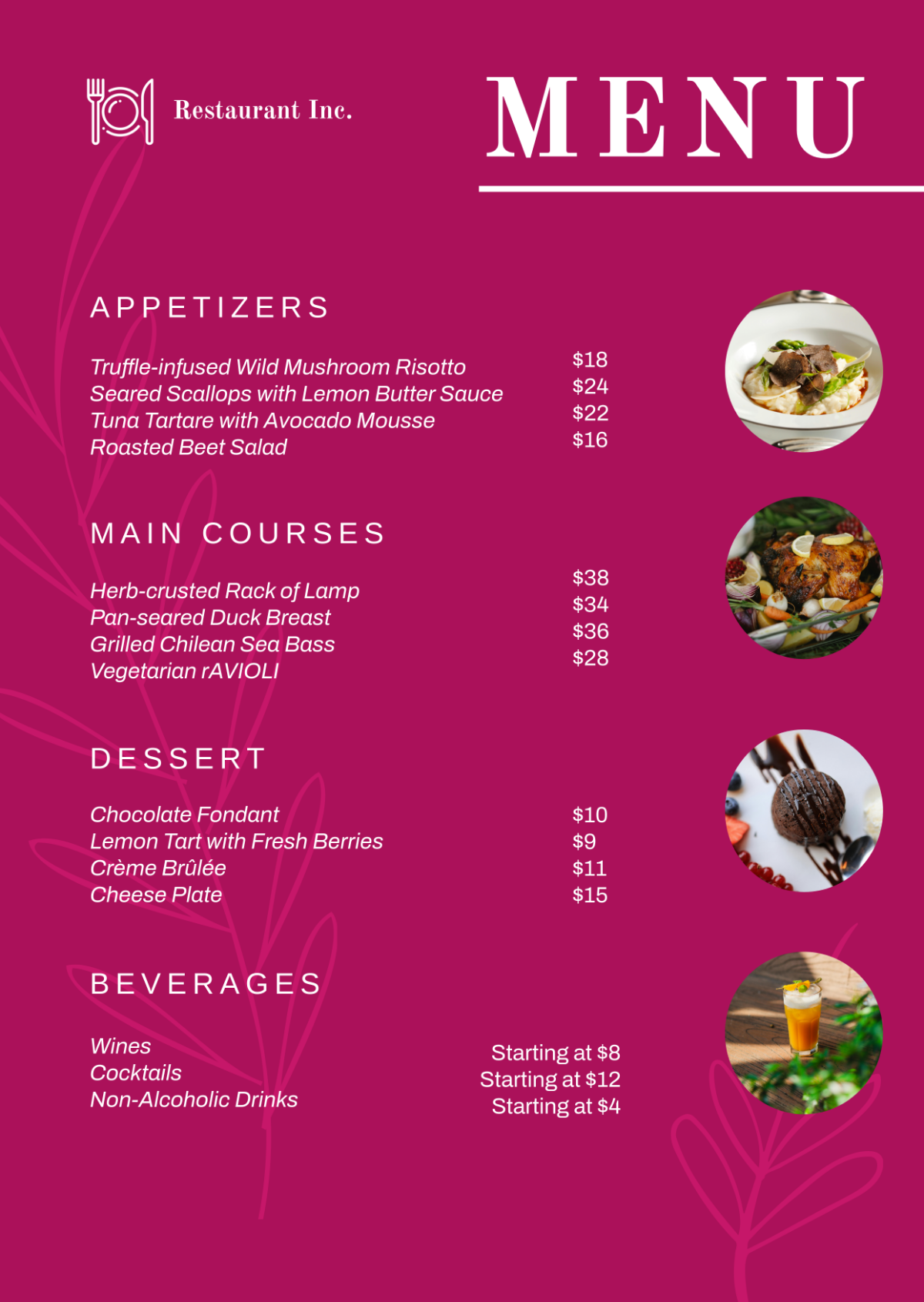
Our menu design guide is intended to provide our team with the necessary guidelines to create an attractive and effective menu. A well-designed menu is crucial for showcasing our offerings, guiding customers' choices, and enhancing their overall dining experience.
II. Menu Layout
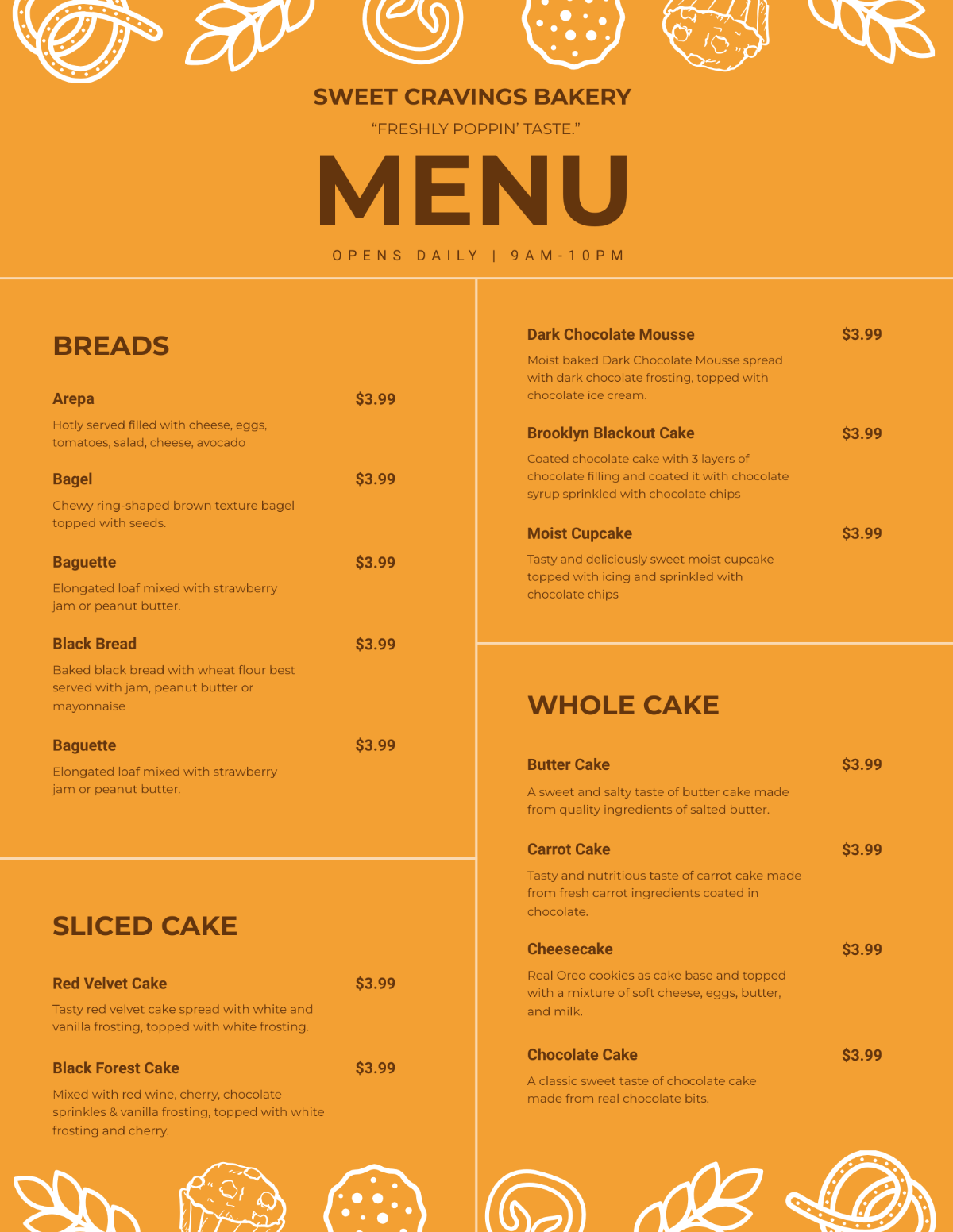
The layout of our menu plays a significant role in how customers perceive our offerings and make their choices. It should be visually appealing, easy to navigate, and highlight our key menu items.
Specific Guidelines
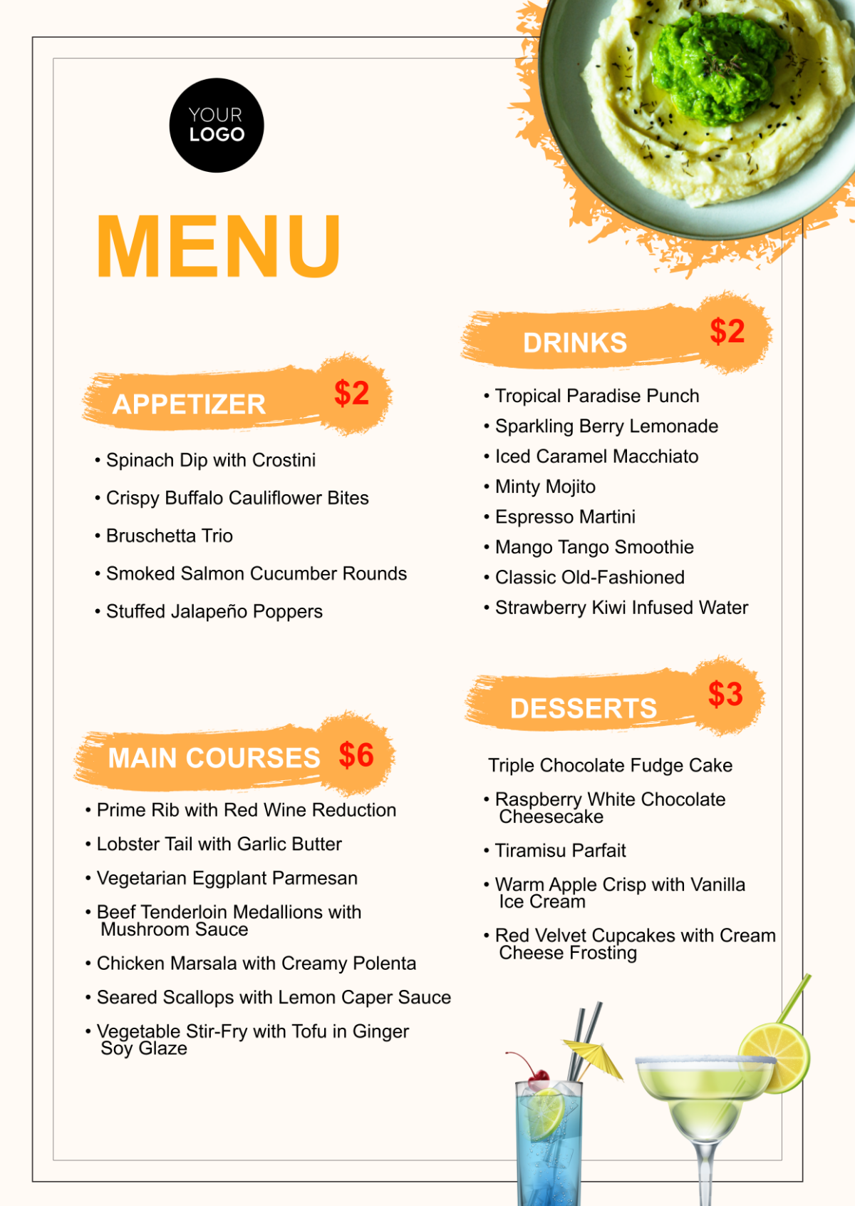
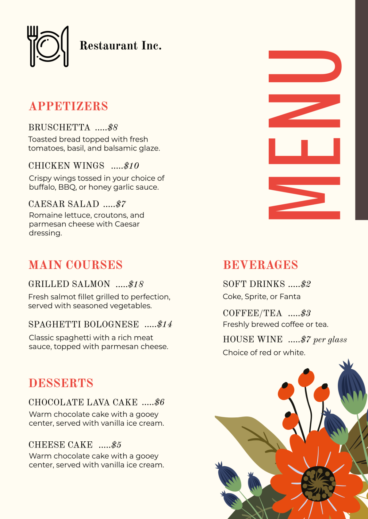
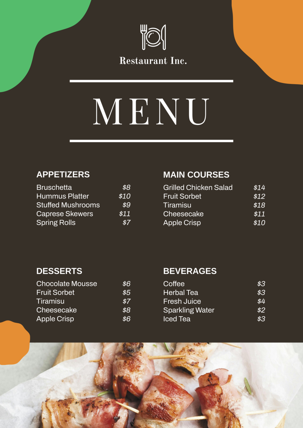
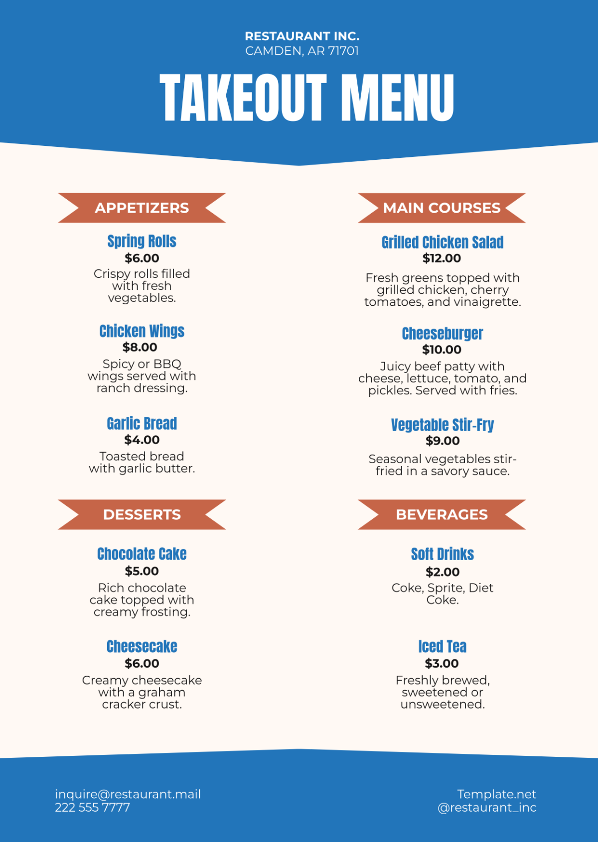
A. Hierarchy: Use a clear hierarchy to guide customers' eyes through the menu. Highlight high-profit items and specials in prominent positions.
B. Spacing: Ensure adequate spacing between menu items, categories, and sections to avoid clutter and make the menu easier to read.
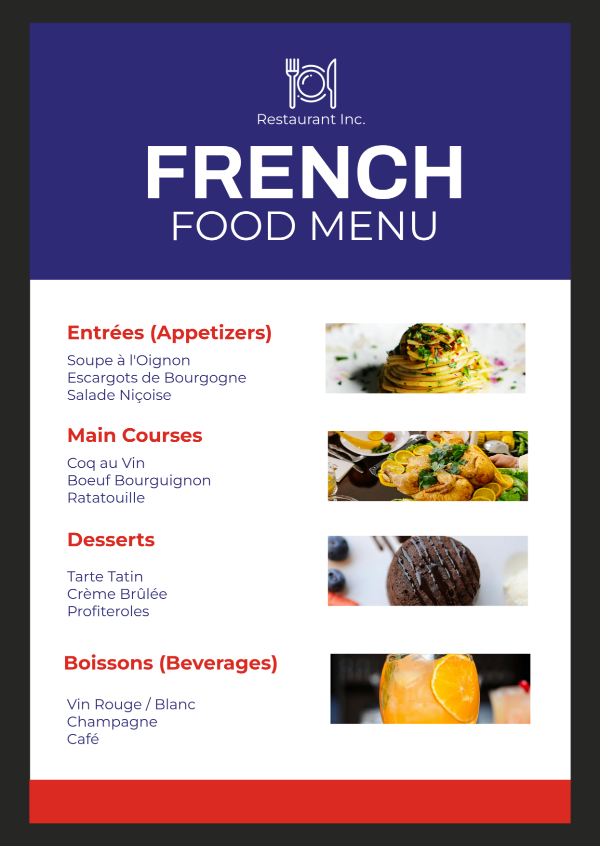
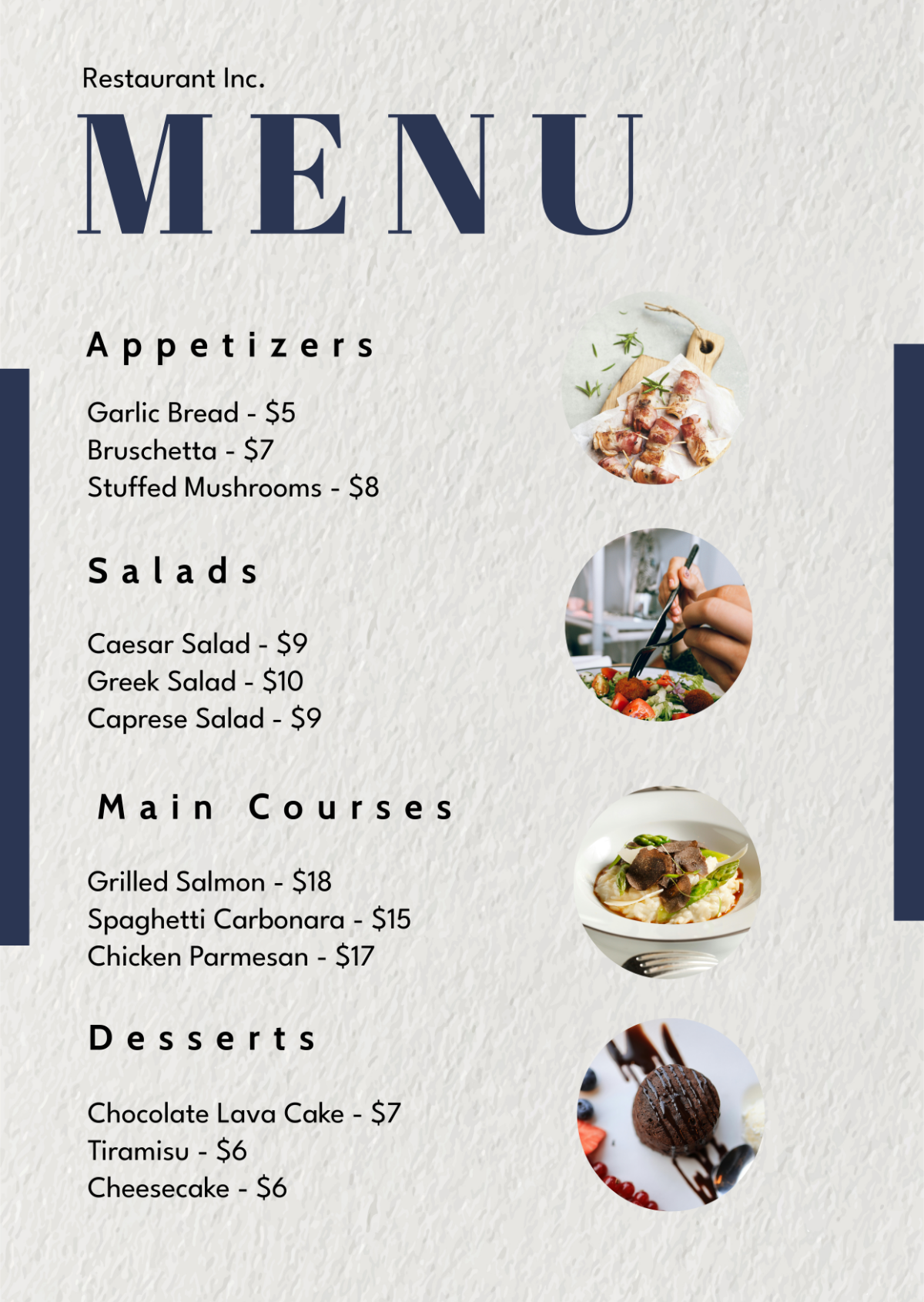
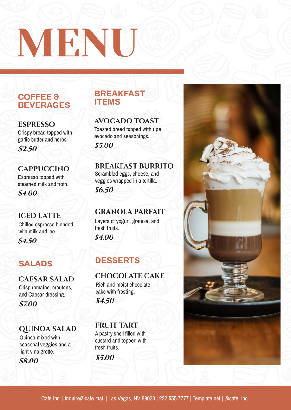
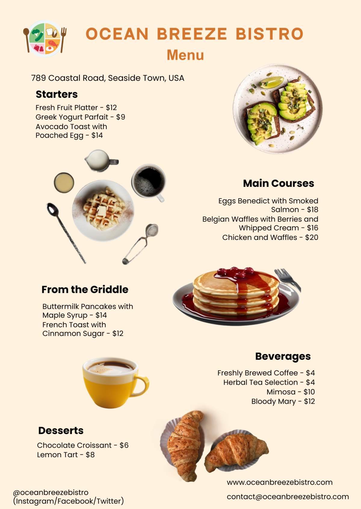
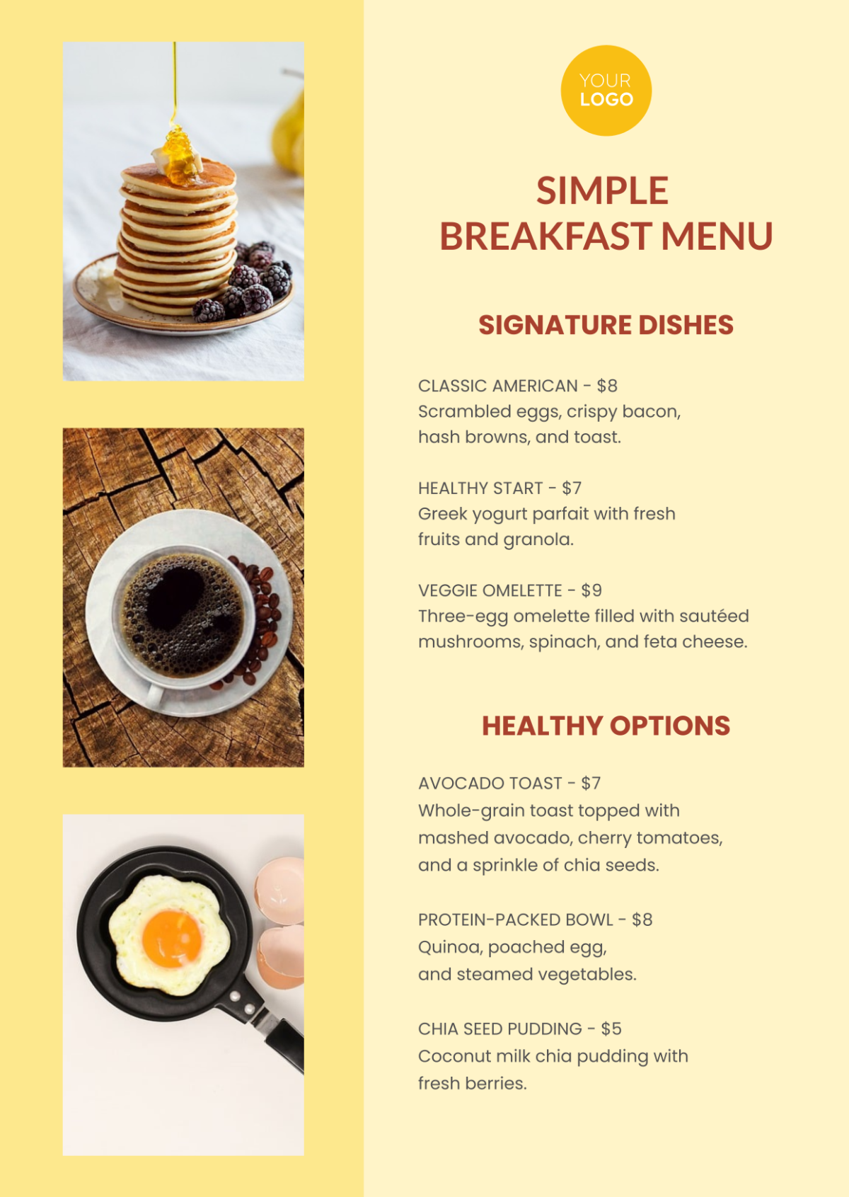
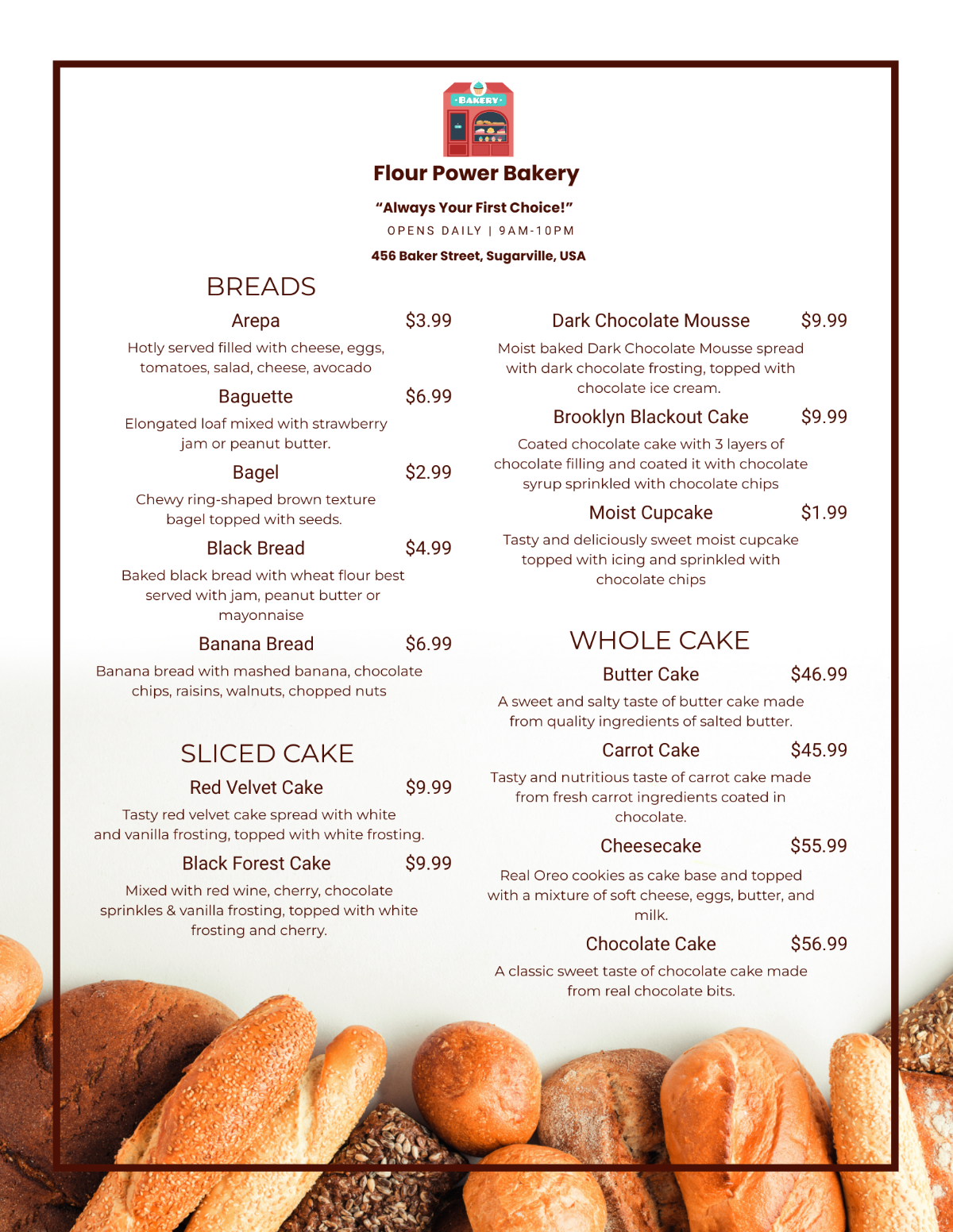
C. Balance: Strike a balance between text and images. Use images sparingly to enhance the visual appeal without overwhelming the menu.
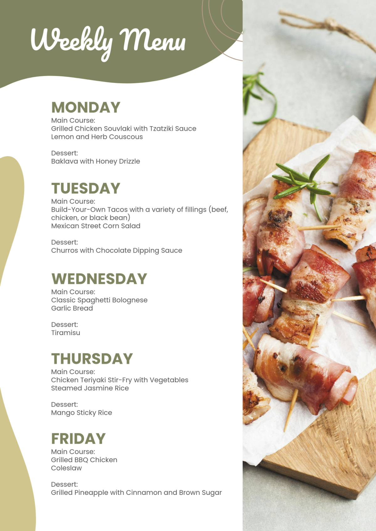
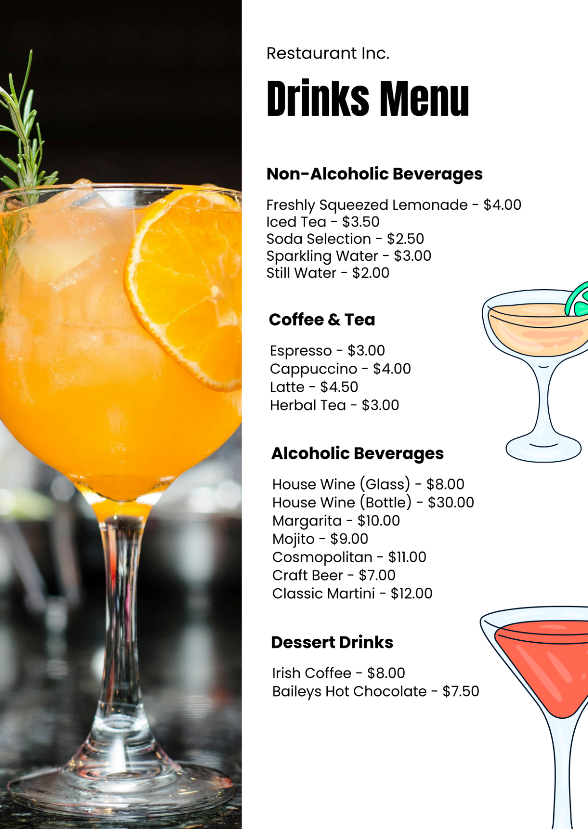
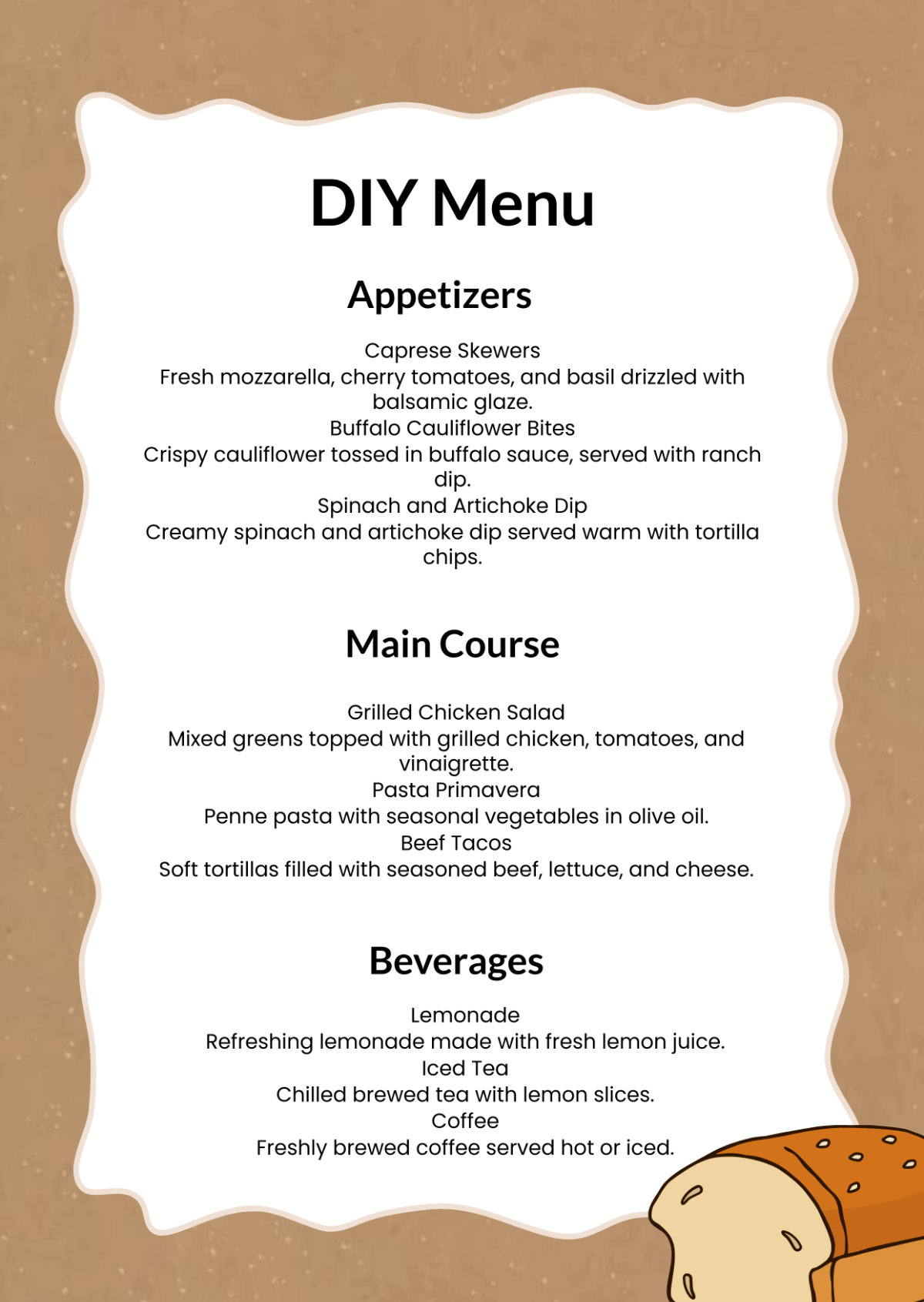
D. Organization: Organize menu items into logical categories (e.g., appetizers, entrees, desserts) to help customers find what they're looking for quickly.
E. Consistency: Maintain consistency in layout and formatting throughout the menu to create a cohesive and professional look.
III. Color Scheme
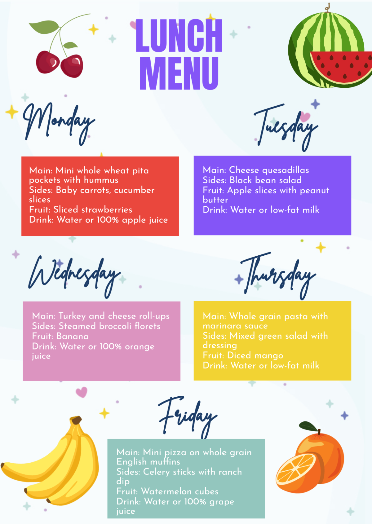
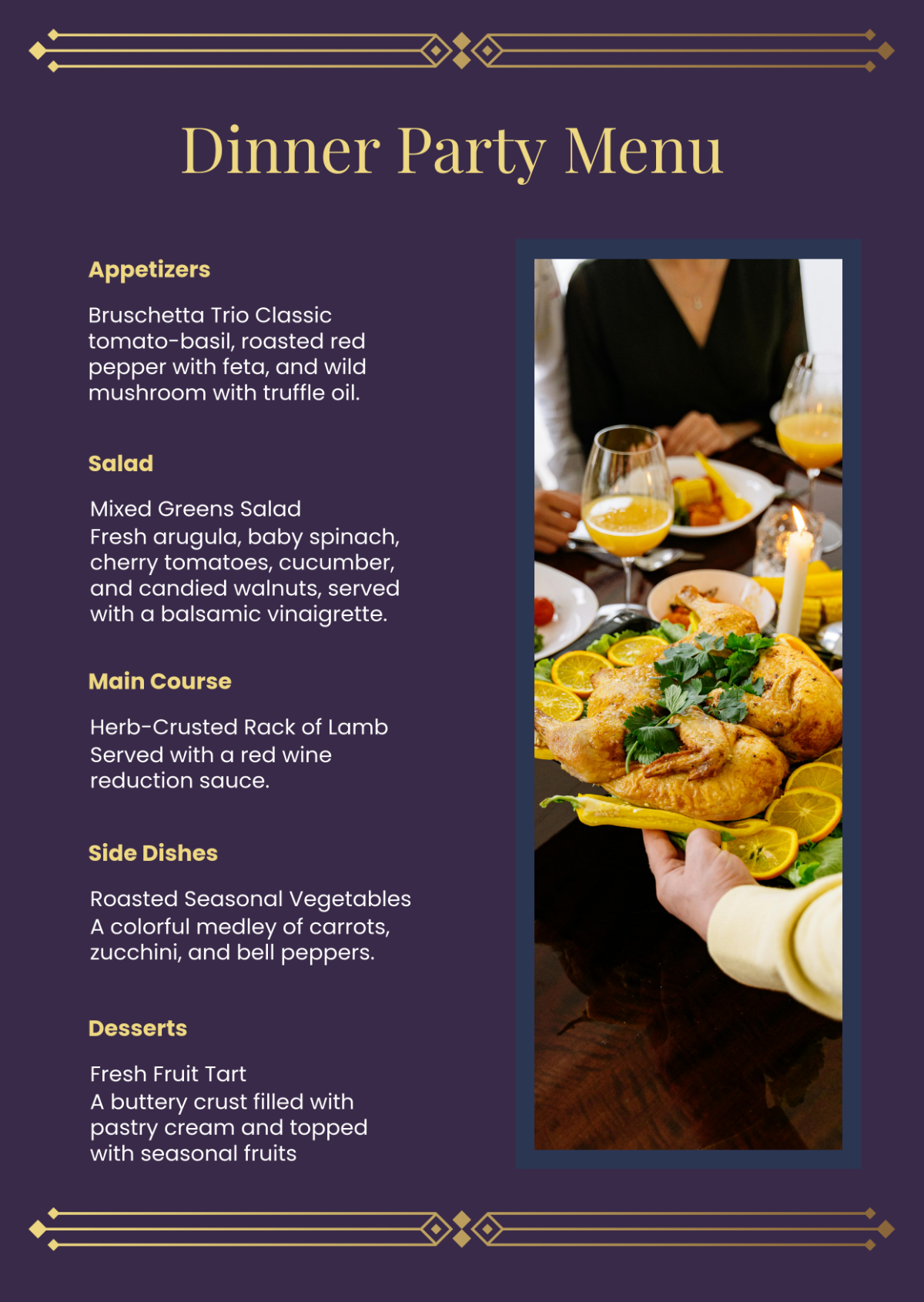
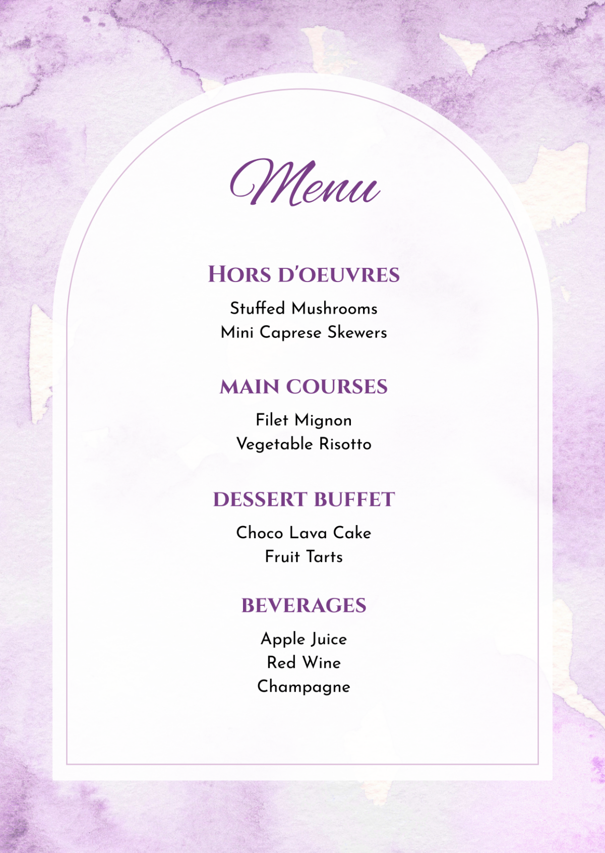
Colors can evoke emotions and create a certain atmosphere. Our color scheme should reflect the ambiance and style of our cafe while ensuring readability and visual appeal.
Specific Guidelines
A. Brand Colors: Use our brand colors to maintain consistency with our brand identity.
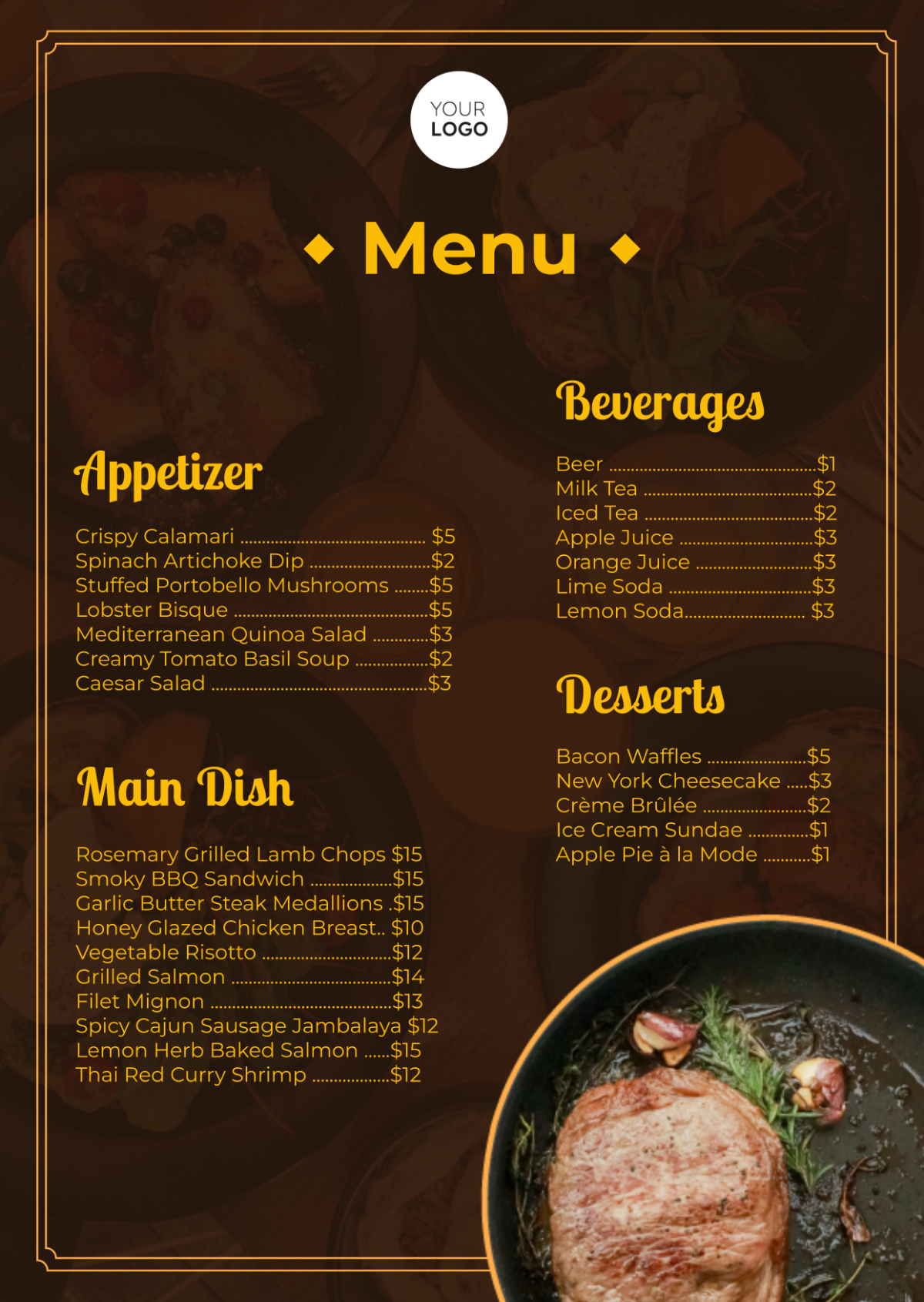
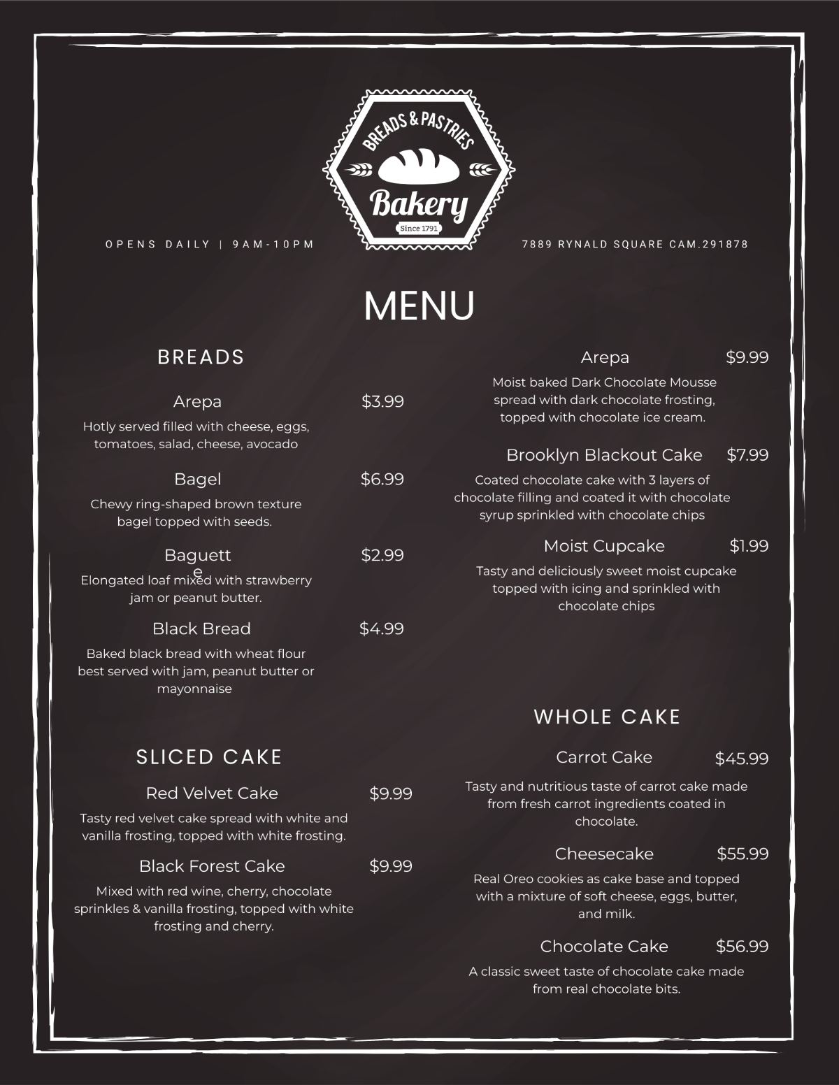
B. Contrast: Ensure sufficient contrast between text and background colors for readability.
C. Limited Palette: Limit the number of colors used to avoid a cluttered look. Choose a primary color and one or two accent colors.
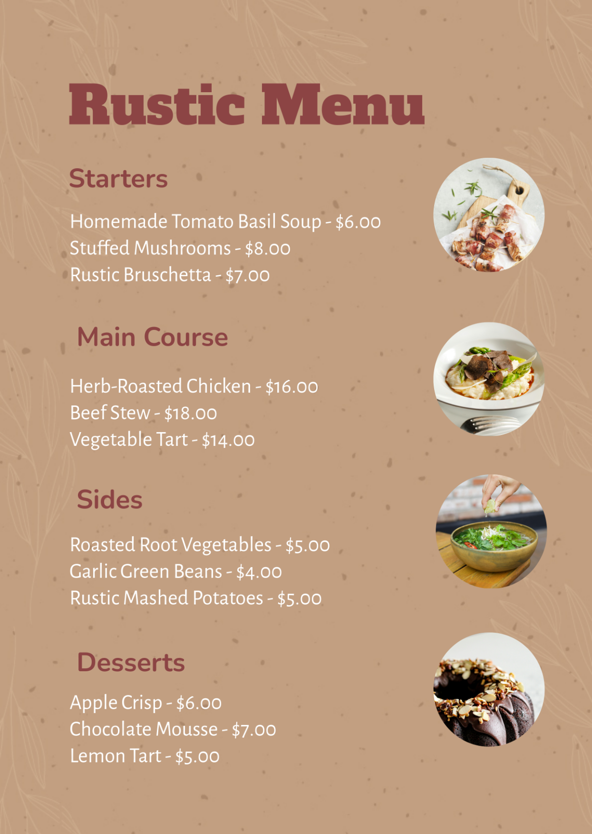
D. Theme: Consider the theme of our cafe (e.g., rustic, modern, eclectic) when selecting colors to create a cohesive look.
IV. Typography
Typography plays a crucial role in how customers perceive our menu. It should be legible, visually appealing, and consistent with our brand image.
Specific Guidelines
A. Font Selection: Choose fonts that are easy to read, such as sans-serif fonts for body text and serif fonts for headings.
B. Consistency: Use the same fonts throughout the menu to maintain a cohesive look.
C. Hierarchy: Use different font sizes and styles (e.g., bold, italic) to create a hierarchy of information, with important items standing out.
D. Spacing: Ensure adequate spacing between lines and around text blocks for readability.
V. Imagery
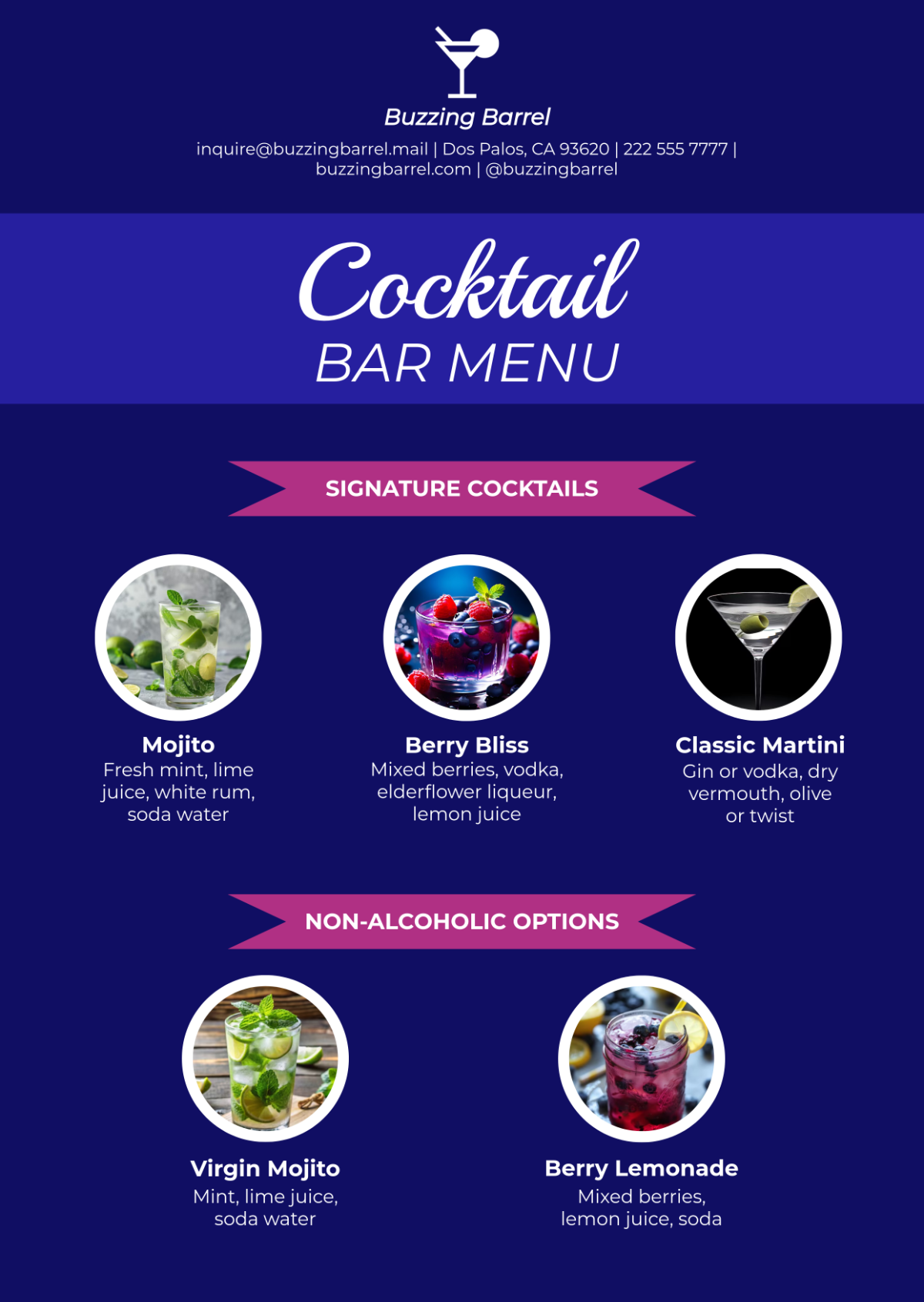
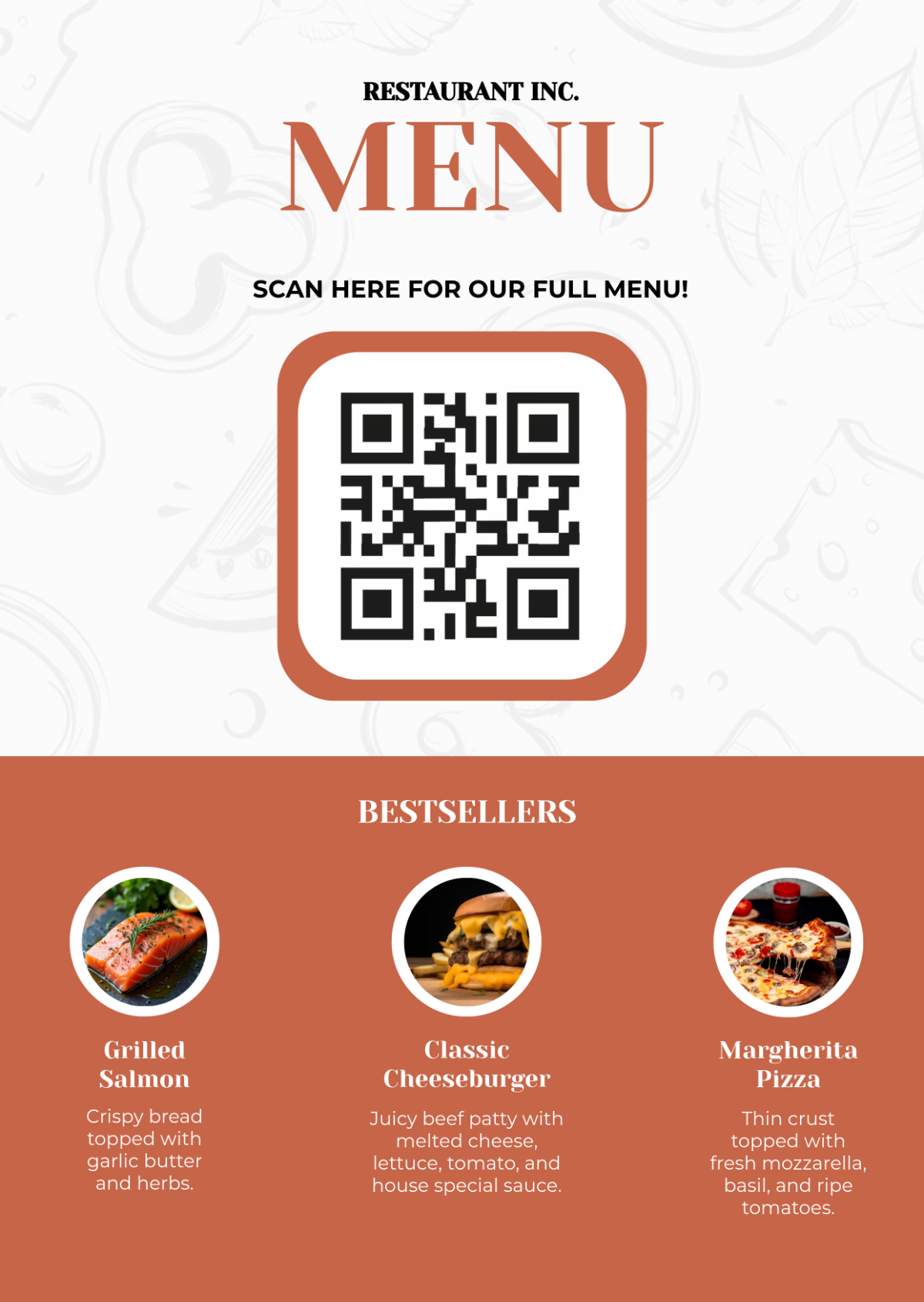
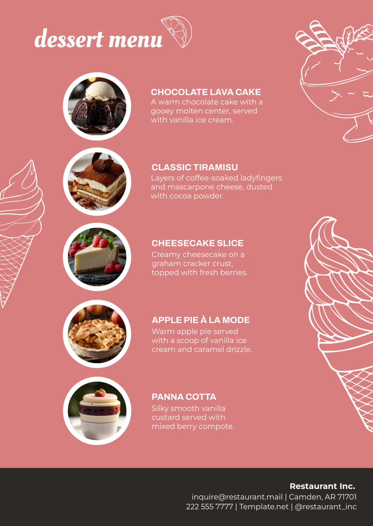
Importance of Imagery: Images can enhance the visual appeal of our menu and provide customers with a preview of our dishes. They should be high-quality and accurately represent our menu items.
Specific Guidelines
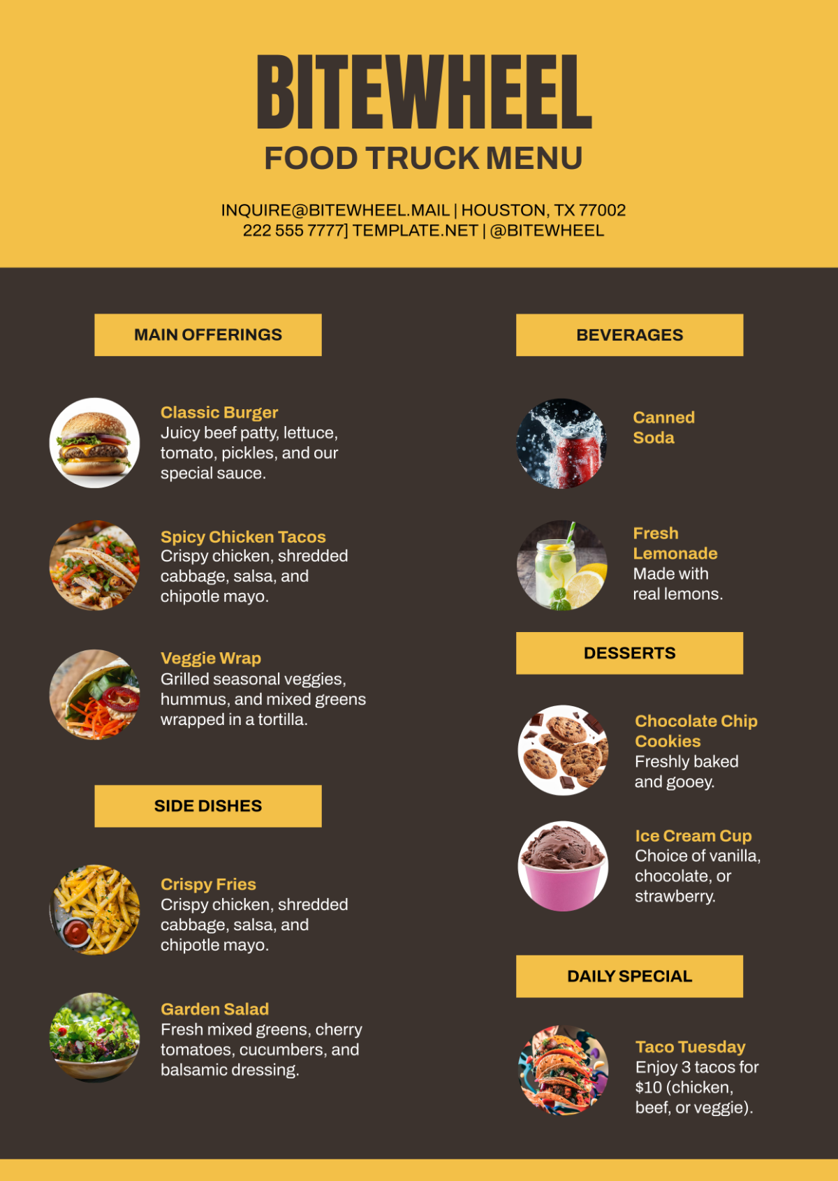
A. High-Quality Images: Use high-resolution images that showcase our menu items in the best possible light.
B. Consistency: Ensure consistency in the style and quality of images used throughout the menu.
C. Relevance: Select images that are relevant to the menu item and enhance its appeal.
D. Placement: Strategically place images to draw attention to featured or high-profit items.
VI. Menu Items
The way menu items are presented can influence customers' choices and perceptions of our offerings. Clear and enticing descriptions can help upsell items and enhance the overall dining experience.
Specific Guidelines
A. Descriptive Titles: Use descriptive and appetizing titles for menu items to entice customers.
B. Detailed Descriptions: Provide detailed descriptions that highlight the key ingredients and flavors of each dish.
C. Highlight Specials: Use design elements (such as borders or icons) to highlight special or signature items.
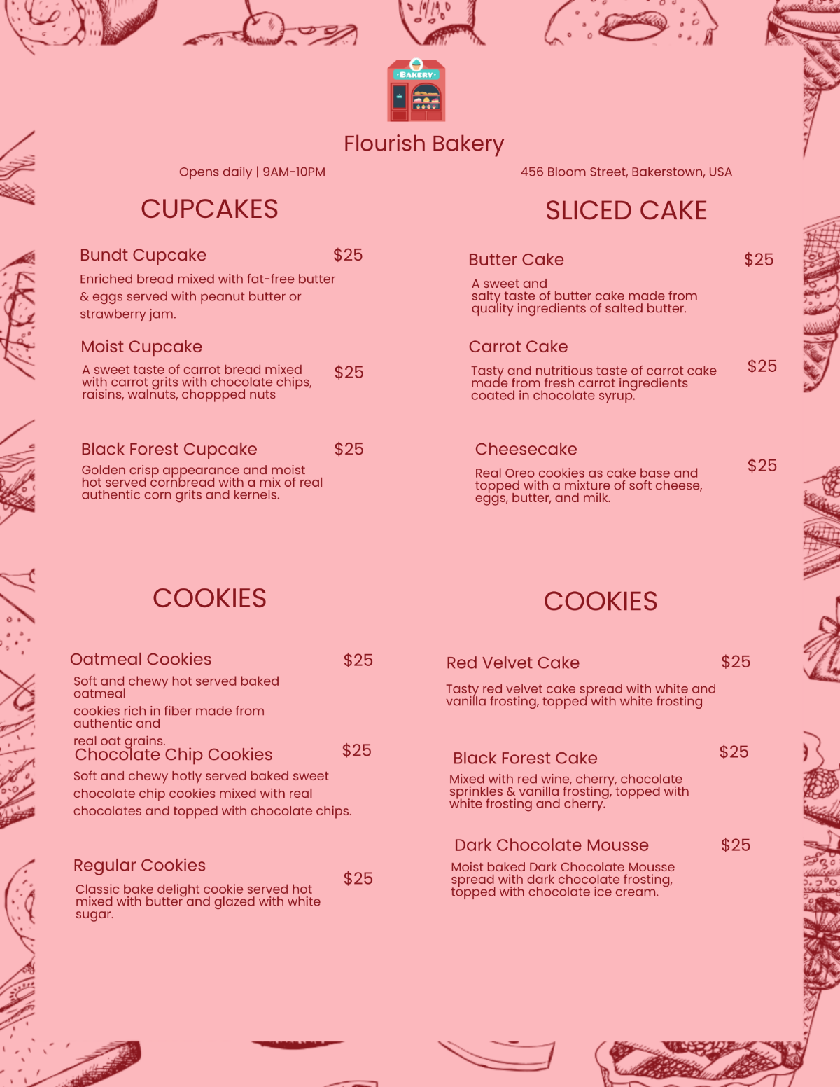
D. Pricing Placement: Place prices either next to or below the menu item, ensuring they are easily visible but do not overpower the item description.
VII. Pricing
Pricing information should be clear and easy to understand, as it plays a crucial role in customers' decision-making process. It should also reflect the value and quality of our offerings.
Specific Guidelines
A. Formatting: Format prices in a clear and consistent manner (e.g., use the same font size and style for all prices).
B. Placement: Place prices either next to or below the menu item, ensuring they are easily visible but do not detract from the item description.
C. Psychological Pricing: Use pricing strategies such as charm pricing (e.g., ending prices in 9 or 5) to make prices more attractive to customers.
D. Bundle Pricing: Consider offering bundle pricing for meal deals or combos to encourage upselling.
VIII. Branding
Our menu is an extension of our brand and should reflect our brand identity and values. It should be consistent with our other marketing materials and reinforce our brand image.
Specific Guidelines
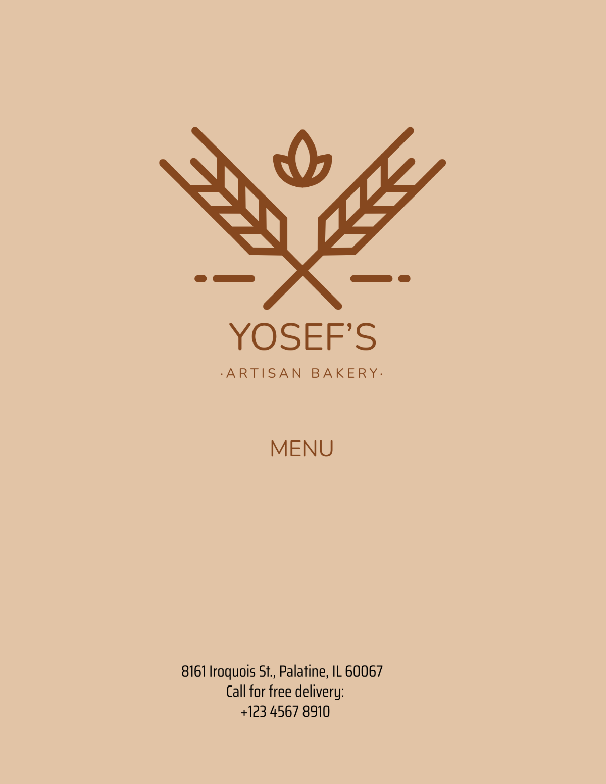
A. Logo Placement: Include our logo prominently on the menu to reinforce our brand identity.
B. Color and Font: Use colors and fonts that are consistent with our brand guidelines to maintain brand consistency.
C. Brand Voice: Use language and tone that reflect our brand personality and resonate with our target audience.
D. Visual Elements: Incorporate visual elements (e.g., graphics, patterns) that are consistent with our brand image and enhance the overall design of the menu.
IX. Special Considerations
Designing a menu involves catering to different formats and audiences. It's important to consider factors such as readability, accessibility, and adaptability for various situations.
Specific Guidelines
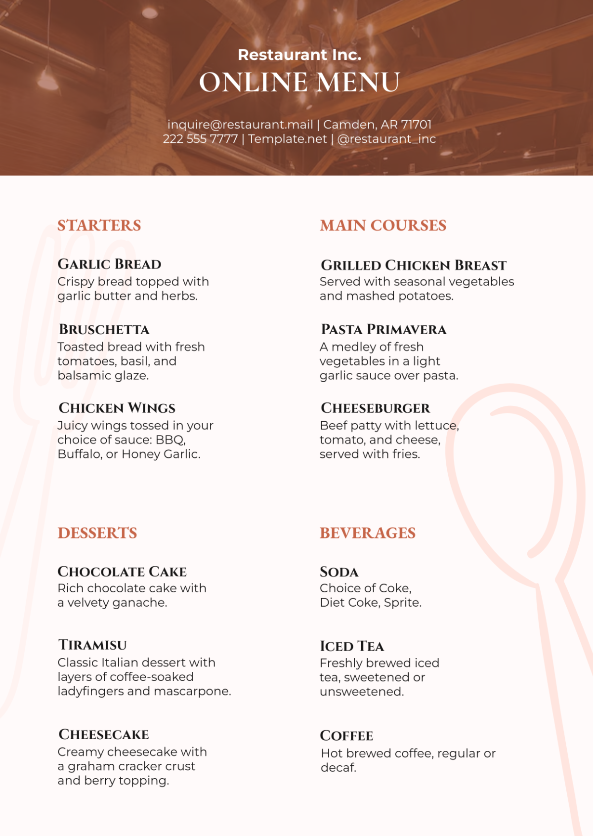
A. Menu Formats: Design menus for different formats, including print and digital, ensuring they are optimized for each format's specifications.
B. Readability: Use legible fonts and appropriate font sizes to ensure easy reading, especially for older adults or those with visual impairments.
C. Accessibility: Consider accessibility features such as high-contrast colors and clear, simple language for customers with disabilities.
D. Adaptability: Design menus that can be easily updated or modified to accommodate changes in offerings or pricing.
