Survey Reporting Quantitative Research
Prepared by: [Your Name]
Date: [Date]
I. Introduction
Survey reporting in quantitative research involves the meticulous analysis and presentation of data gathered through surveys using statistical methods. This process focuses on quantitative metrics such as percentages, averages, and other statistical measures to derive meaningful conclusions about the surveyed population. In this comprehensive report, we outline the methodology, data analysis techniques, and effective presentation strategies used in quantitative survey research.
II. Methodology
The methodology of quantitative survey research involves several crucial steps:
Designing the Survey: Define objectives, target population, and type of questions (close-ended).
Sample Selection: Choose a representative sample size using random or systematic sampling methods.
Data Collection: Administer the survey using various platforms (online, face-to-face, phone).
Data Cleaning: Ensure data accuracy by removing incomplete, duplicate, or inconsistent responses.
III. Data Analysis
Once the data collection phase is complete, the following statistical methods are commonly used for analysis:
A. Descriptive Statistics
Calculating frequencies and percentages to understand the distribution of responses.
Computing measures of central tendency (mean, median, mode) to identify average trends.
Assessing variability through range, variance, and standard deviation.
B. Inferential Statistics
Using t-tests, chi-square tests, and ANOVA to compare groups and determine significance.
Applying regression analysis to identify relationships between variables.
Conducting factor analysis to explore underlying patterns.
IV. Data Presentation
Effective data presentation is an essential component of quantitative survey reporting. Visualizations such as charts and graphs are instrumental in illustrating data patterns and trends. Common types of visualizations include:
A. Bar Charts
Used to display the frequency or percentage of responses for different categories.
B. Pie Charts
Show the proportion of responses in different categories.
C. Line Graphs
Track changes over time or compare trends between groups.
D. Scatter Plots
Illustrate relationships between two quantitative variables.
V. Example Data Table
Question | Response Option | Percentage |
|---|---|---|
Customer Satisfaction | Very Satisfied | 45% |
Customer Satisfaction | Satisfied | 35% |
Customer Satisfaction | Neutral | 15% |
Customer Satisfaction | Dissatisfied | 5% |
VI. Conclusion
In conclusion, survey reporting in quantitative research offers a structured approach to interpreting survey data using statistical analysis. The careful design of surveys, precise sampling techniques, and rigorous data analysis facilitate robust conclusions about the population being studied. Visual tools like charts and graphs play a crucial role in making the data comprehensible and actionable. This comprehensive and systematic approach ensures that survey findings are reliable, valid, and valuable for decision-making processes.
VII. References
American Psychological Association. (2050). Publication Manual of the American Psychological Association (7th ed.).
Descombe, M. (2050). The Good Research Guide: For Small-Scale Social Research Projects (5th ed.). McGraw-Hill Education.
Field, A. (2050). Discovering Statistics Using IBM SPSS Statistics (5th ed.). SAGE Publications.
VIII. Appendices
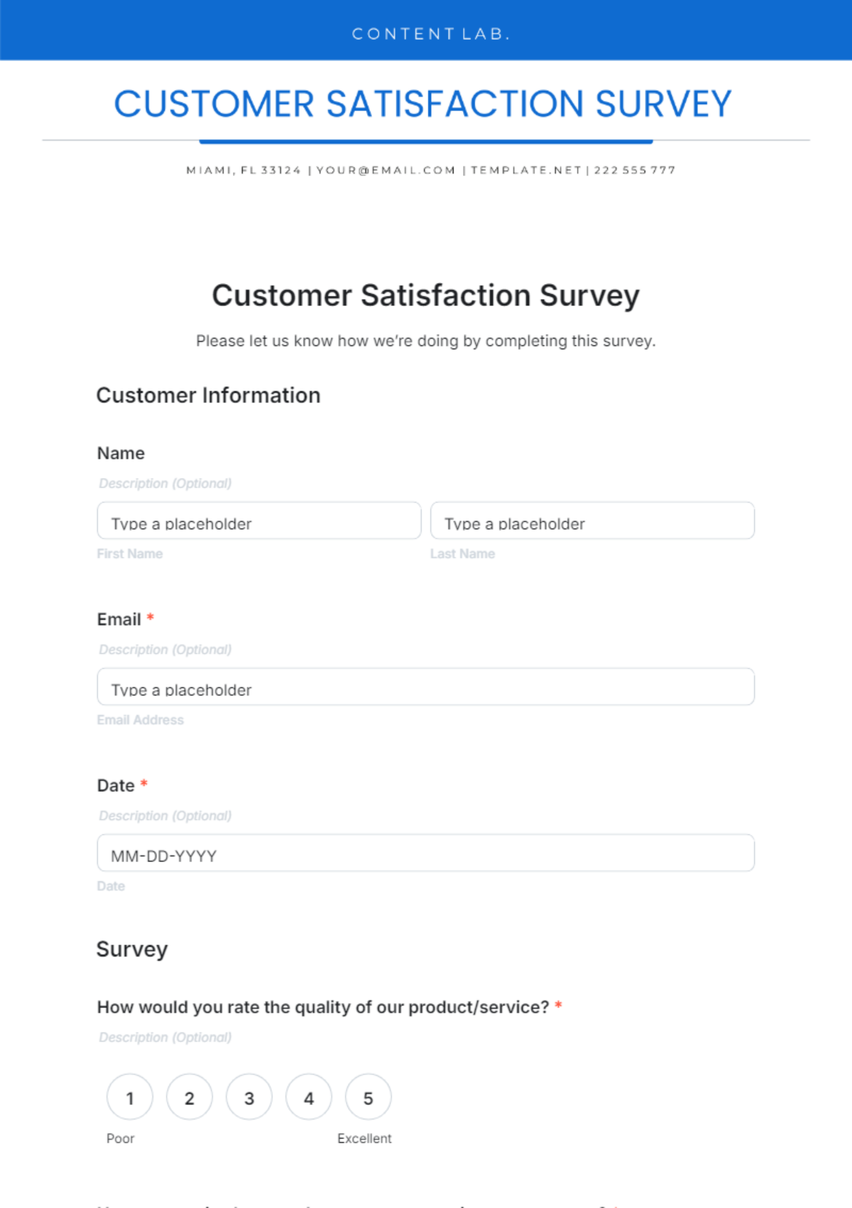
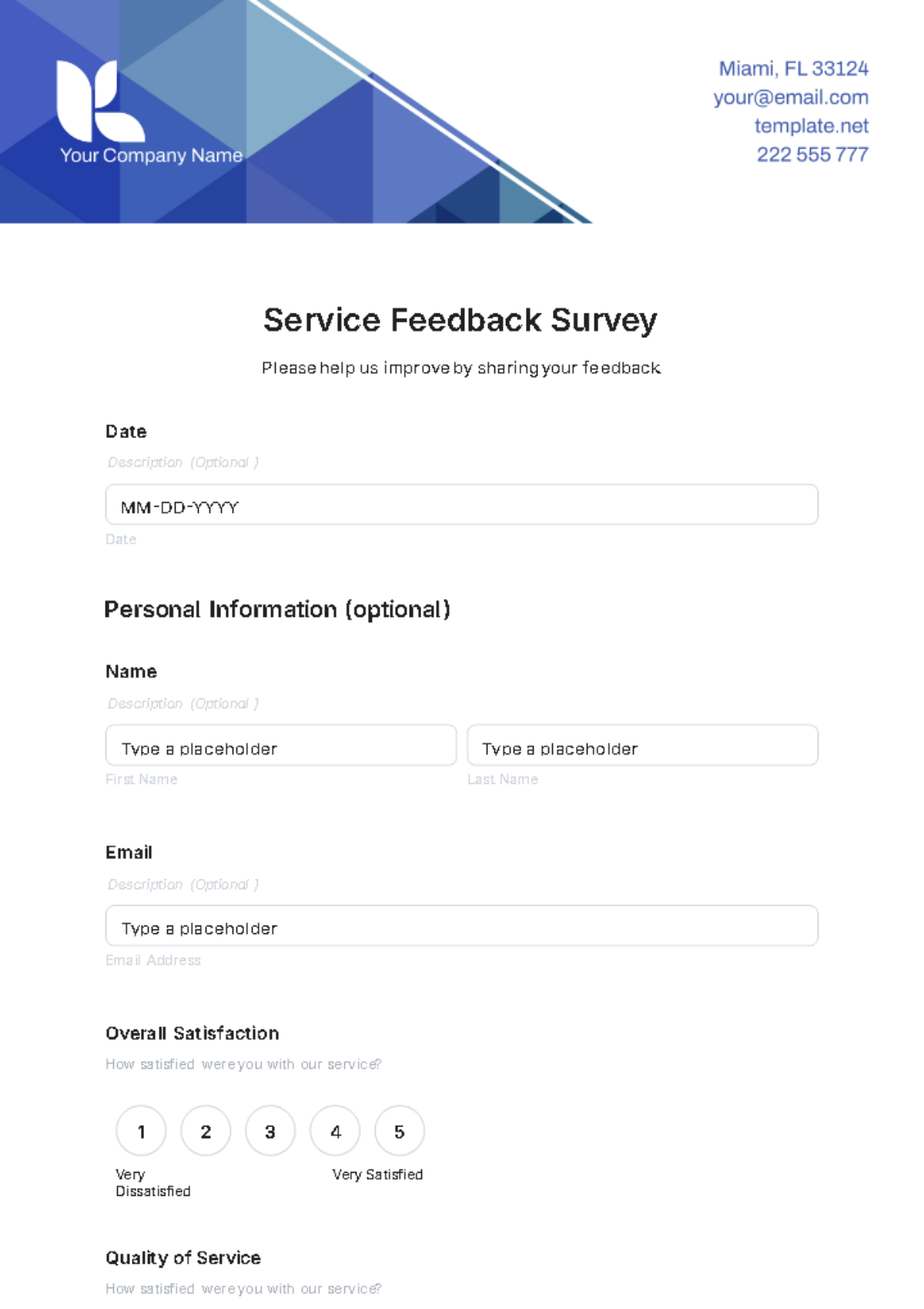
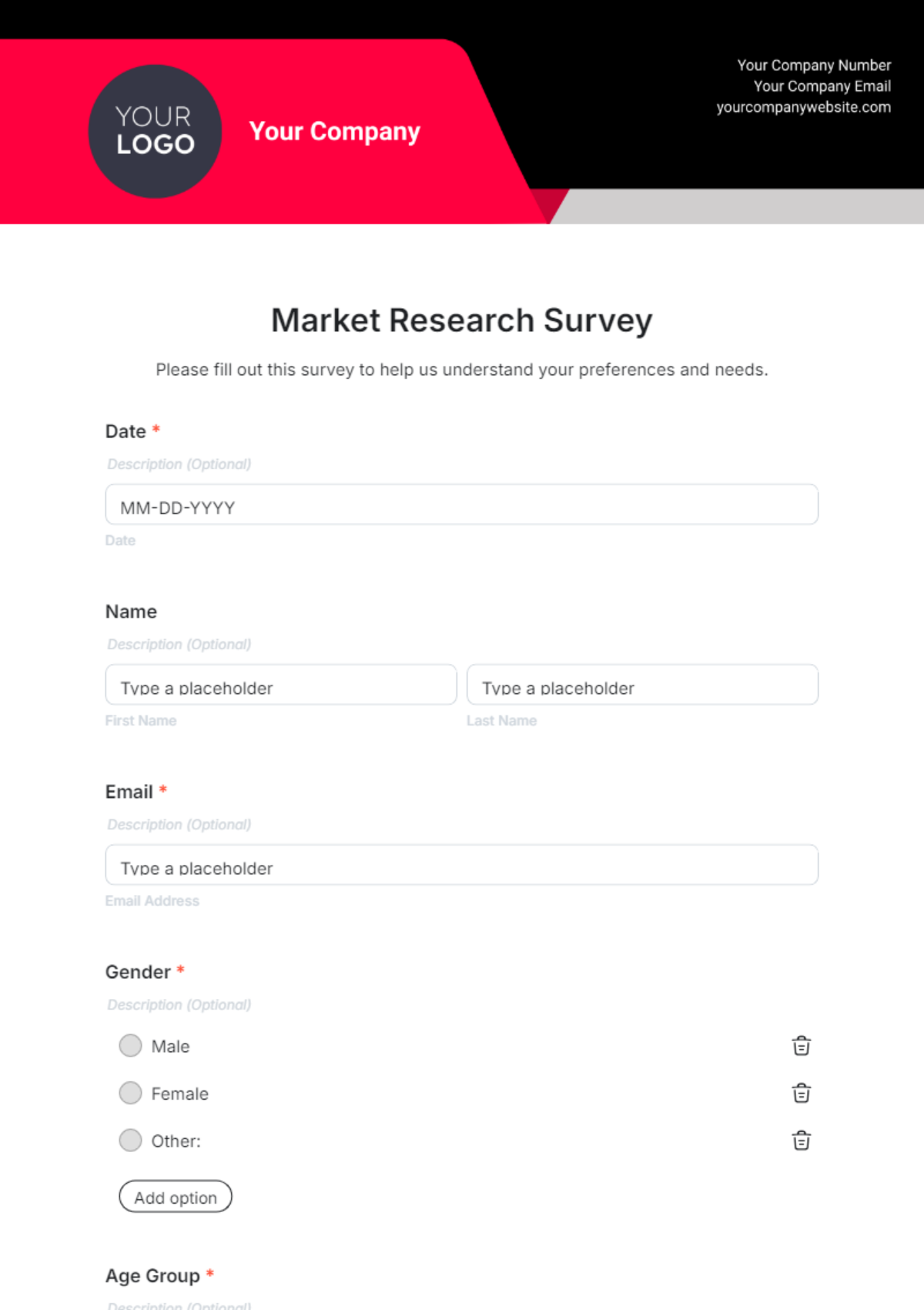
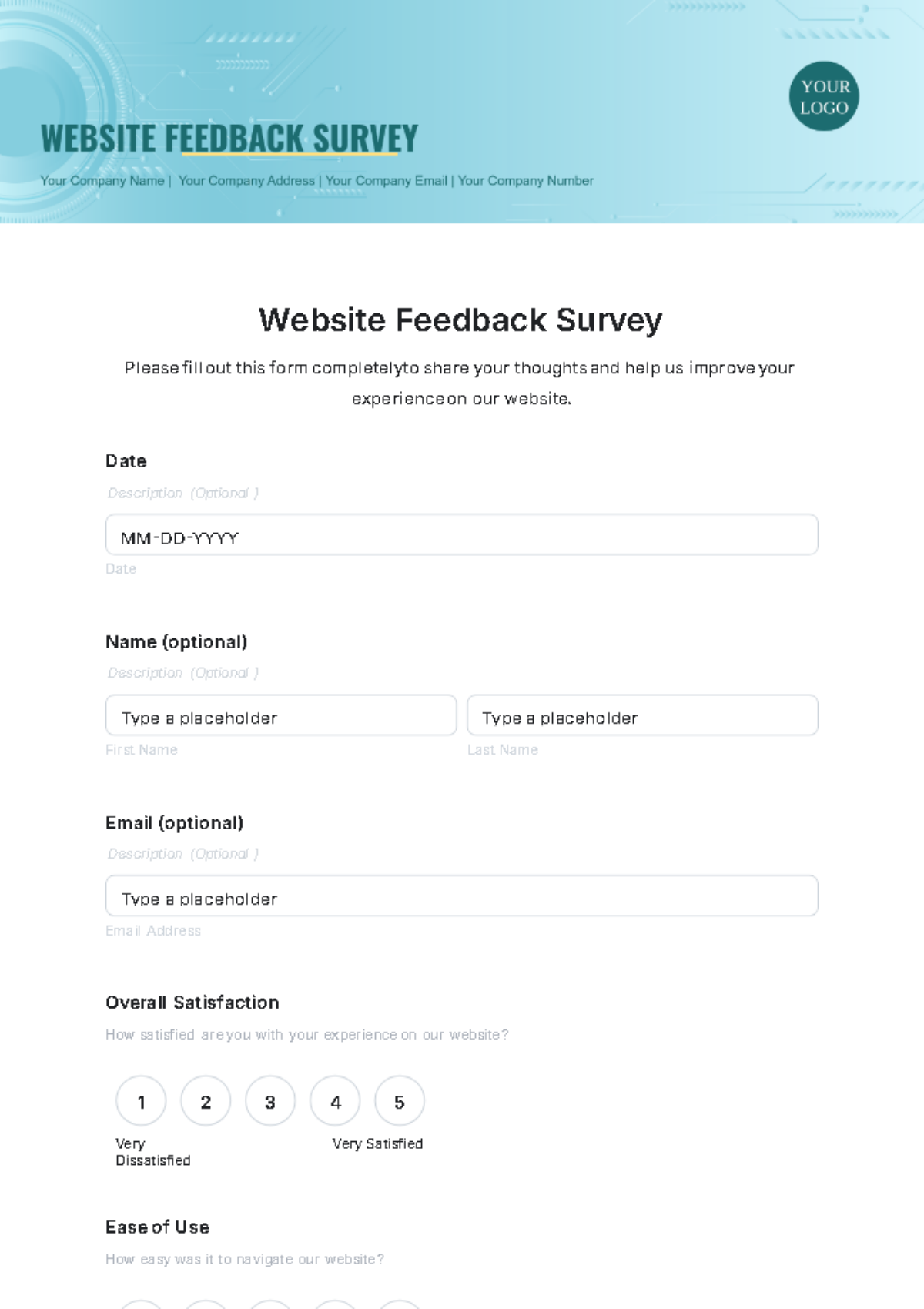
Appendix A: Survey Questionnaire
Appendix B: Sampling Procedure
Appendix C: Data Cleaning Process
Appendix D: Statistical Analysis Code
Appendix E: Additional Data Tables
Appendix F: Visualizations
