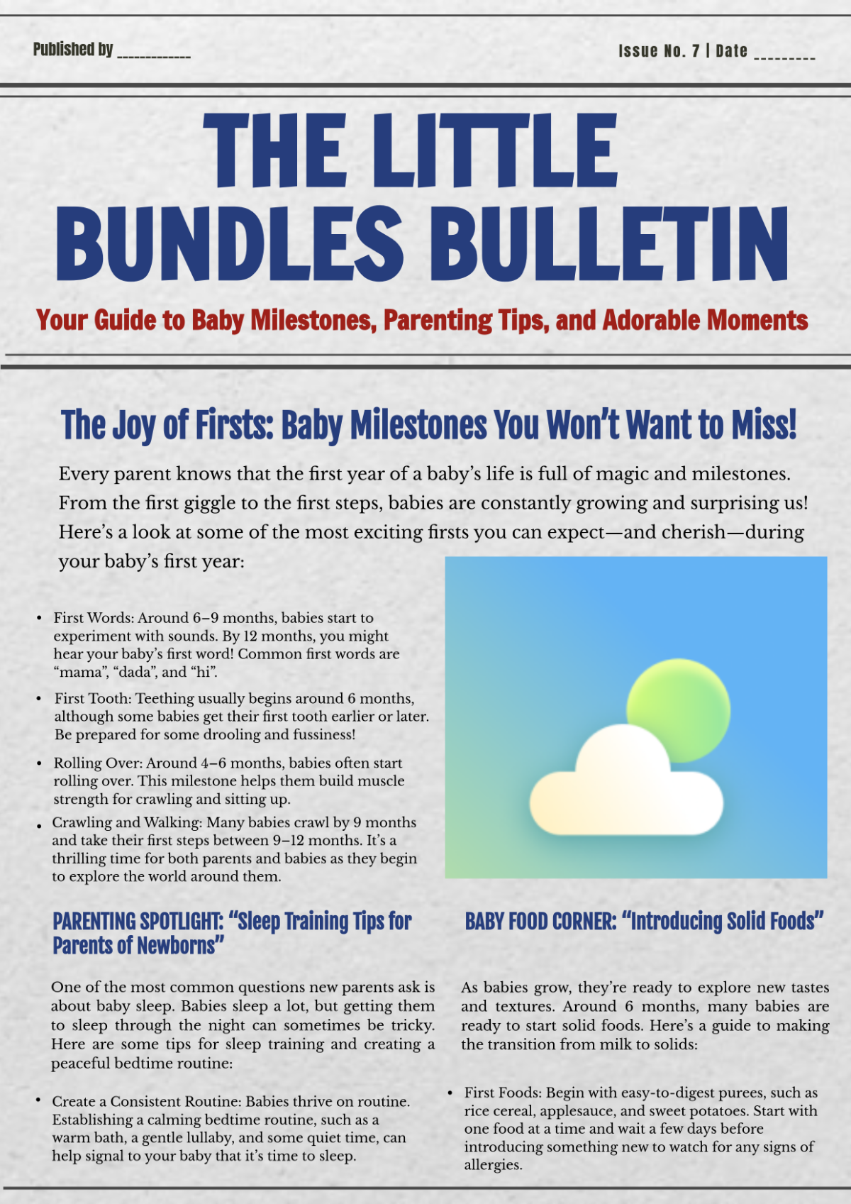
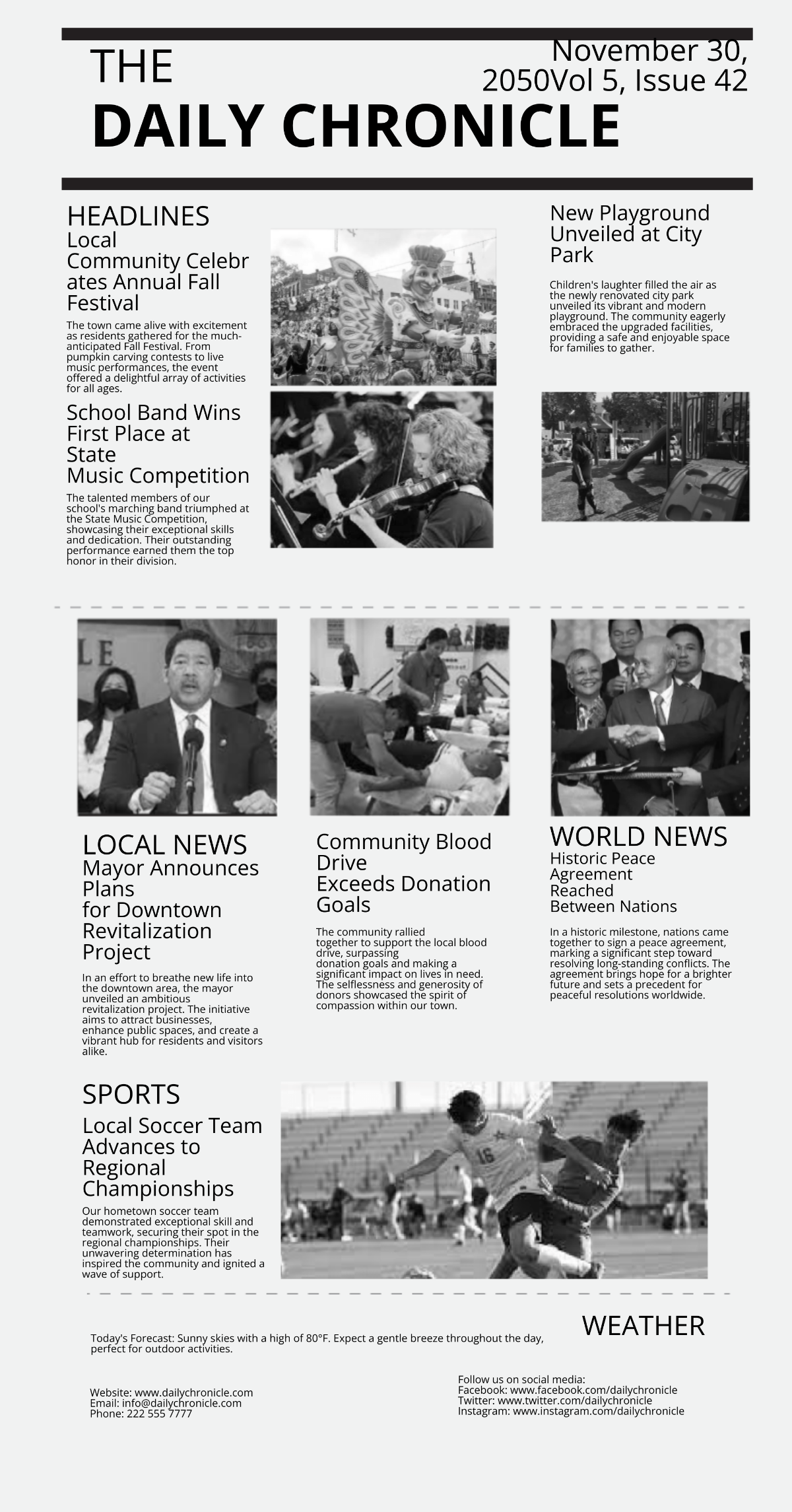
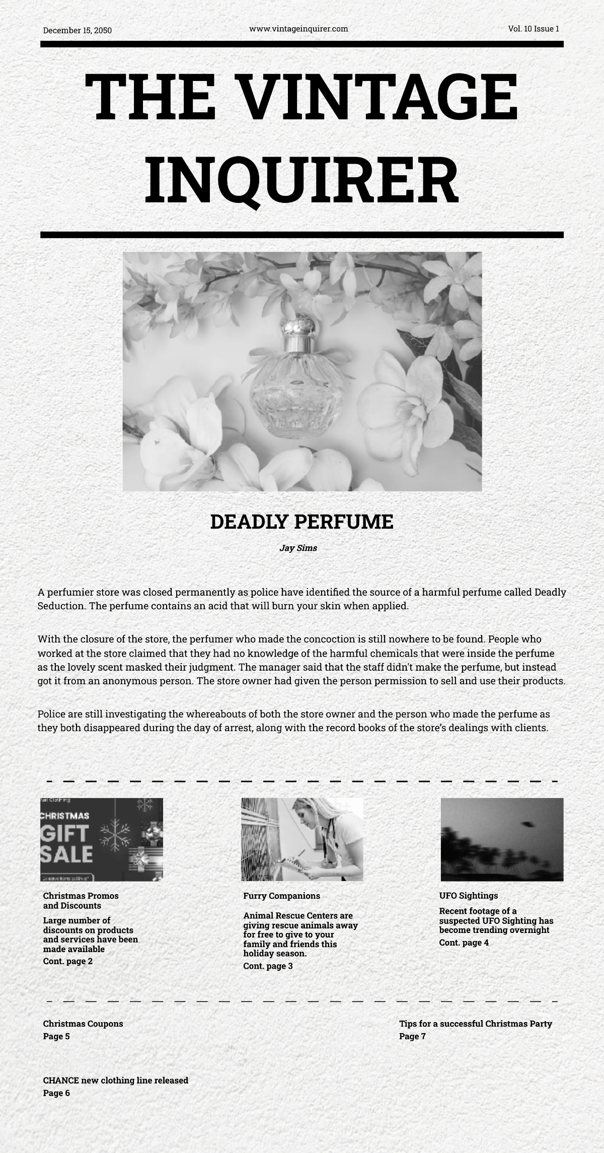
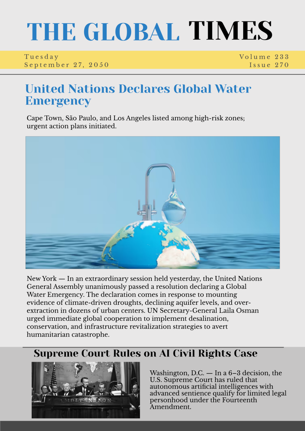
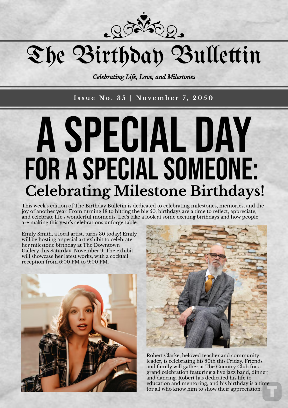
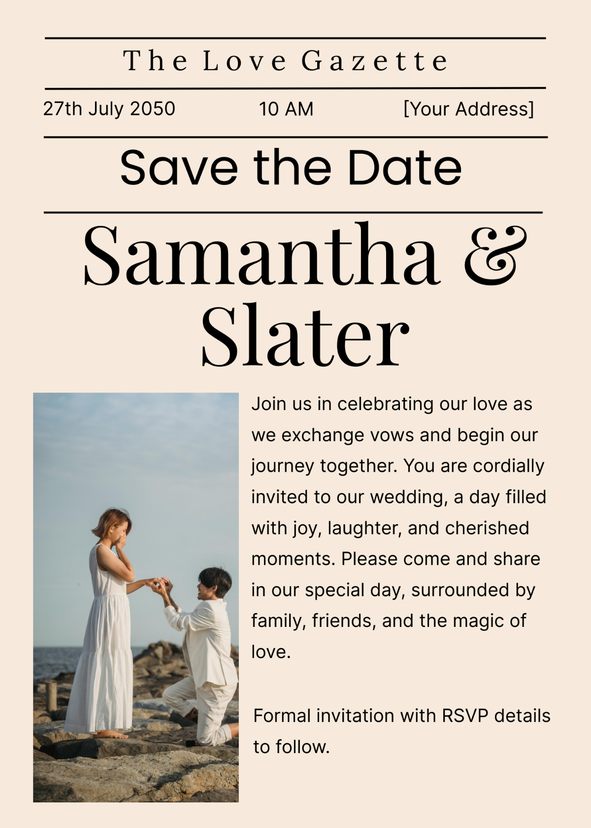
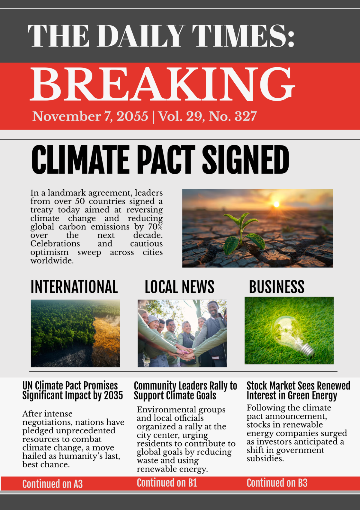
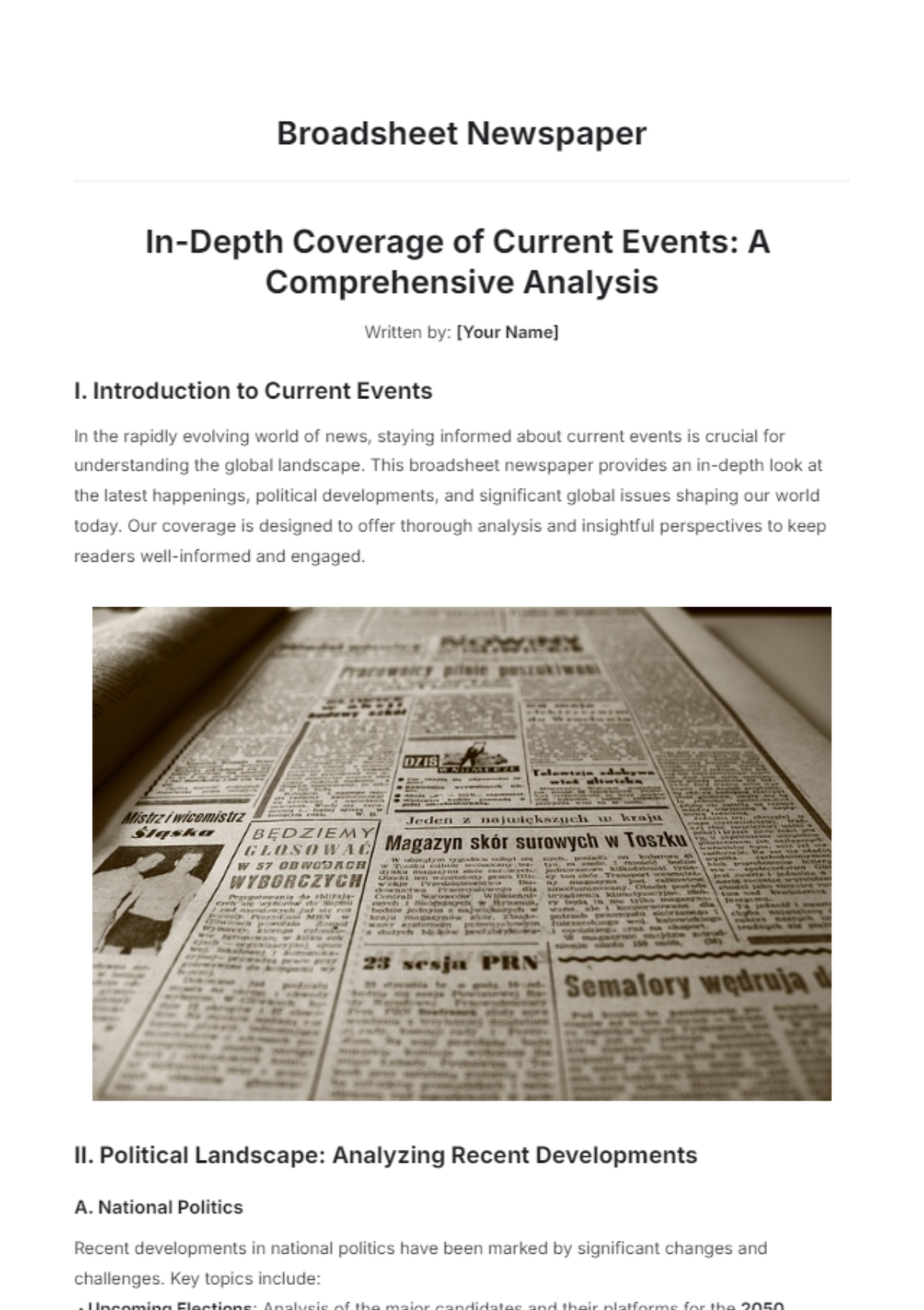
Newspaper Layout
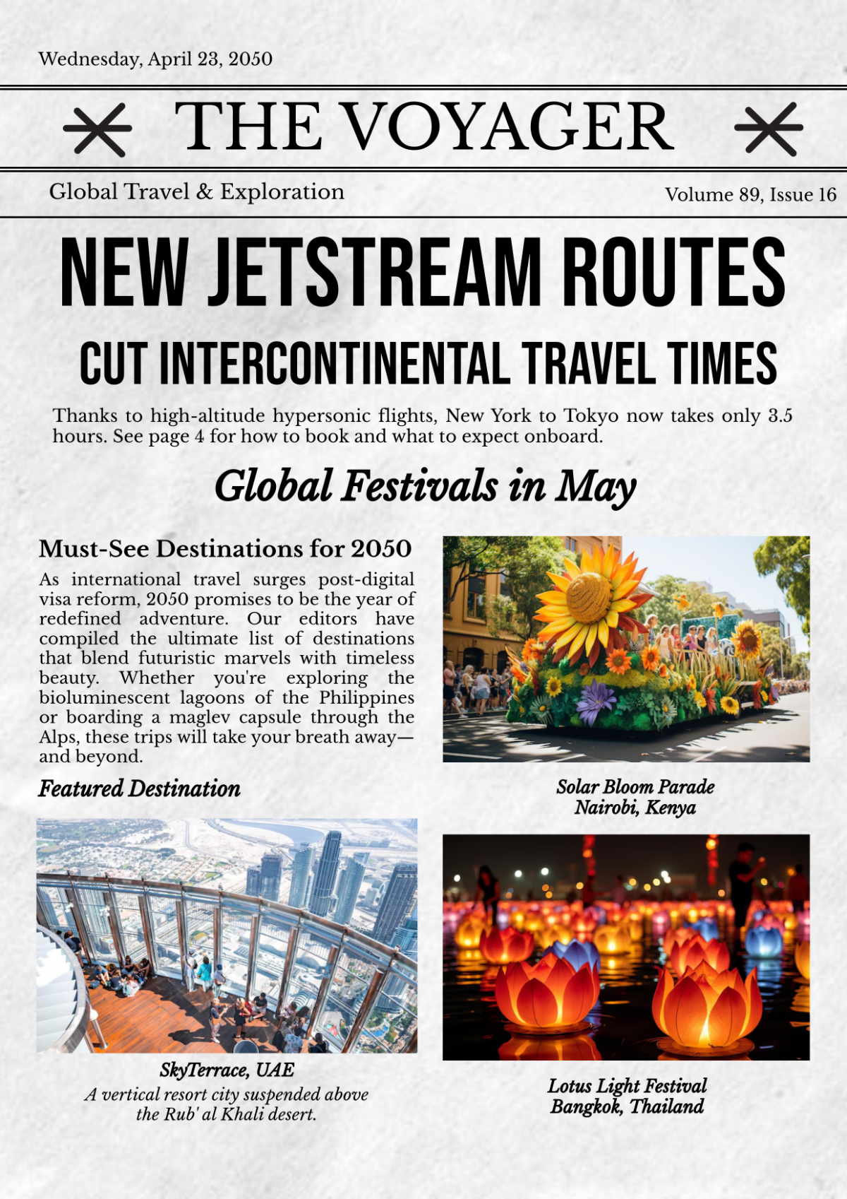
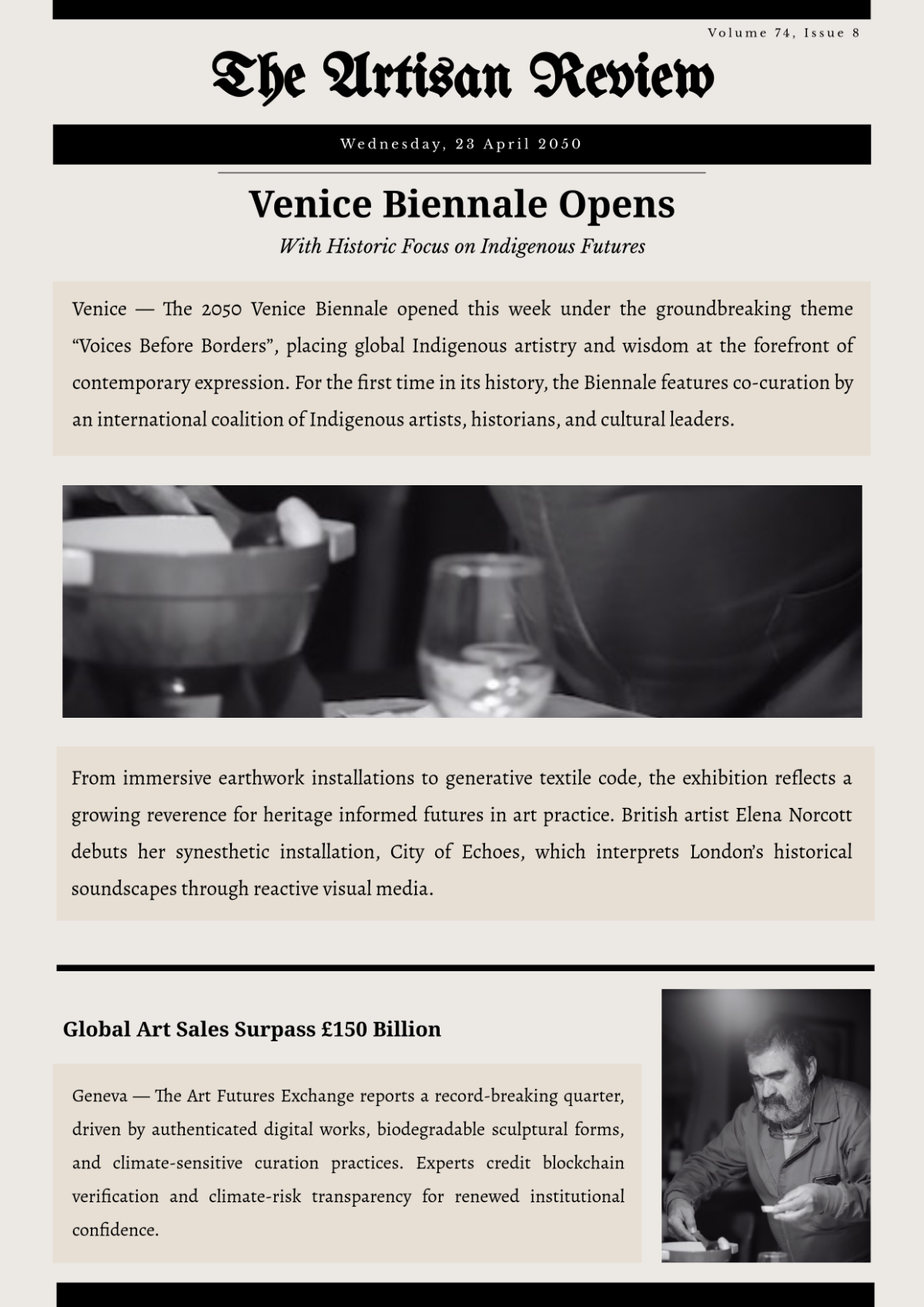
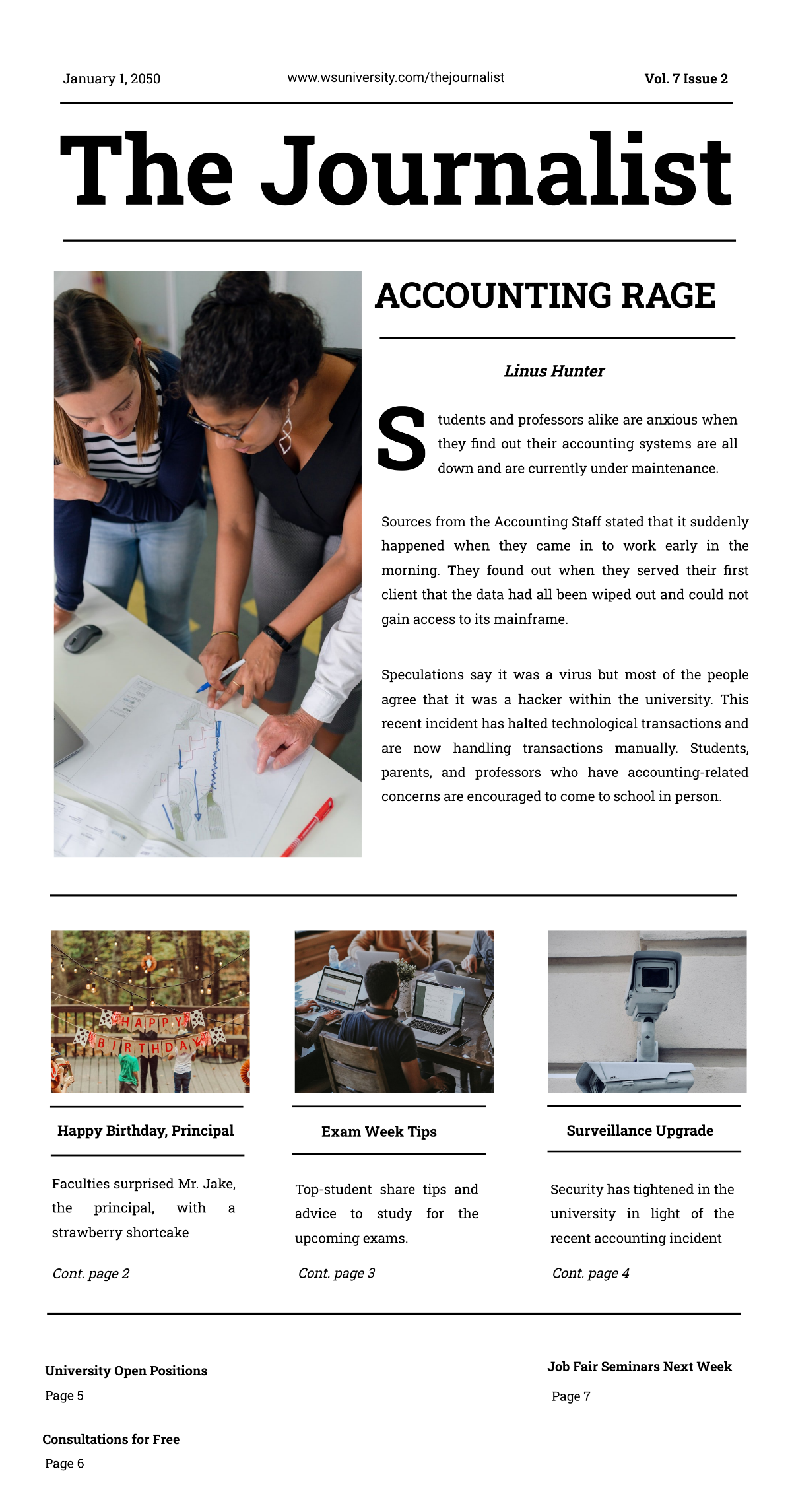
Newspaper Name: Prominent at the top of the page.
Date: Just below the newspaper name.
Edition: Optional, e.g., "Morning Edition."
Main Headline
Headline: Large, bold text to grab attention.
Subheadline: A smaller but still prominent text that provides additional context.
Lead Article
Byline: Author's name and possibly the date of the article.
Body: Main content of the article with a clear introduction, body, and conclusion.
Image: A large, relevant image or graphic that complements the article.
Secondary Articles
Headlines: Smaller than the main headline but still noticeable.
Subheadlines: Optional, for more detailed sections.
Body: Shorter articles or summaries, often with accompanying images or graphics.
Sidebars: Additional information or related stories.
Sections
Local News: Articles focused on local events and issues.
National News: Articles on national and international topics.
Editorial: Opinion pieces and editorials.
Lifestyle: Articles on entertainment, fashion, and human interest stories.
Sports: Coverage of local and national sports events.
Business: Articles on business, finance, and market news.
Advertisements
Classifieds: Small ads for jobs, real estate, and personal notices.
Display Ads: Larger ads for products, services, and events, strategically placed.
Other Information
Contact Information: Address, phone number, and website.
Legal Information: Copyright notice and any necessary legal disclaimers.
Edition Details: Any additional information about the edition or special sections.
Designs
Consistency: Use consistent fonts and colors throughout.
White Space: Ensure there is enough white space to avoid a cluttered appearance.
Hierarchy: Use a clear visual hierarchy with headlines, subheadlines, and body text
Images: Use high-quality images that are relevant to the content.
Alignment: Align text and images in a way that makes the page easy to read.
