Free Newspaper Article Design
Written by: [Your Name]
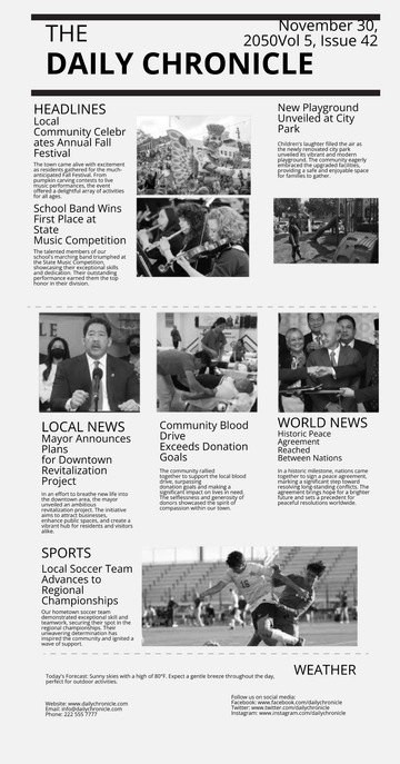
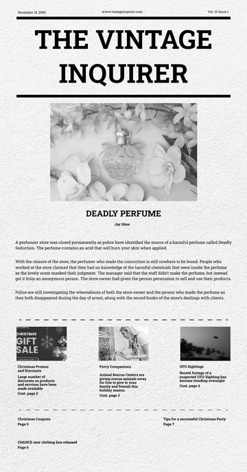
1. Headline Section
Position: Prominently at the top of the page.
Design: Large, bold font, typically in all caps or a distinctive typeface to ensure immediate reader attention.
Purpose: Captures the essence of the article with a compelling title, setting the tone for the content.
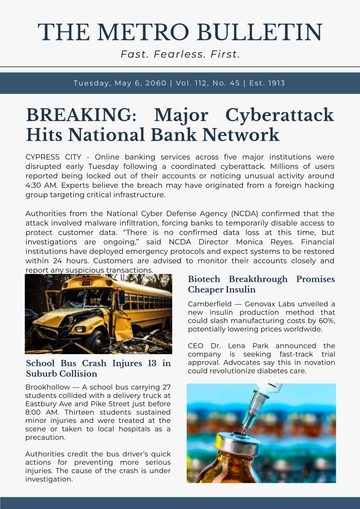
2. Sub headline Area
Position: Directly beneath the main headline.
Design: Slightly smaller font than the headline, often italicized or in a contrasting style.
Purpose: Offers a brief summary or key details, providing readers with context and enticing them to read further.
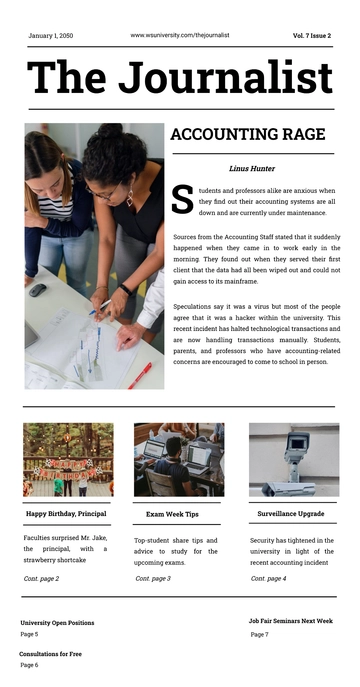
3. Byline and Date
Position: Aligned with the left column, near the top.
Design: Subtle font, often italicized or in a smaller size than the body text.
Purpose: Credits the author and marks the publication date, adding authenticity and a timestamp to the article.
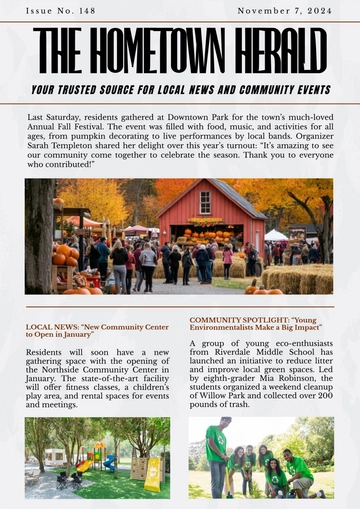
4. Article Body
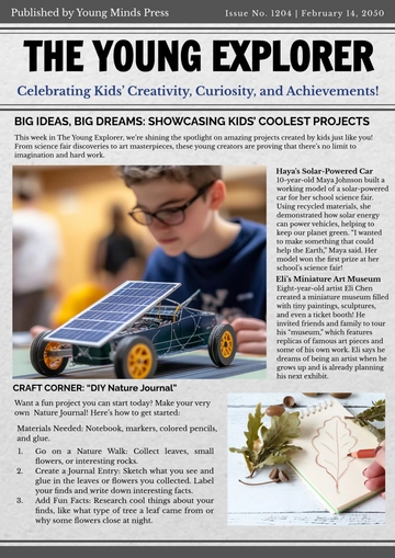
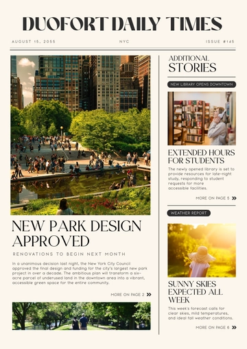
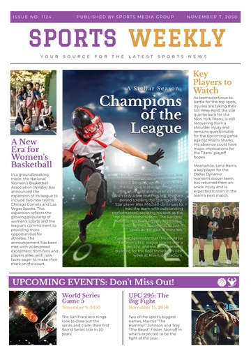
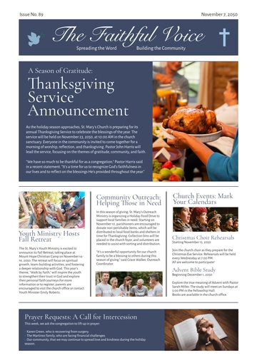
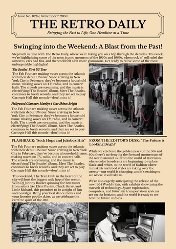
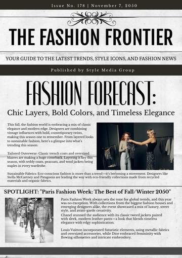
Layout: Dual-column format for balanced and structured readability.
Left Column: Contains the main portion of the article text, starting immediately after the byline.
Right Column: Continues the narrative, allowing space for embedded images, infographics, or pull quotes.
Text Design: Clear, legible serif or sans-serif font, optimized for print readability. Consistent font size throughout, with occasional use of bold or italicized text for emphasis.
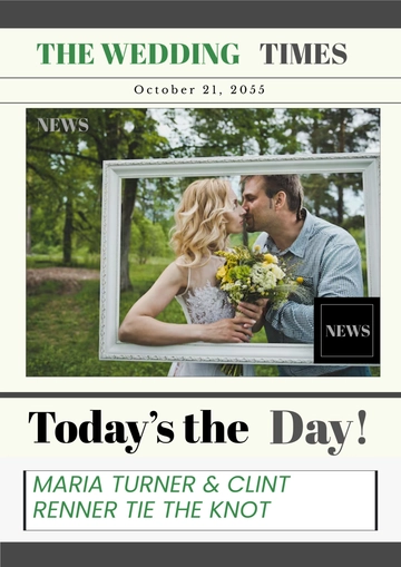
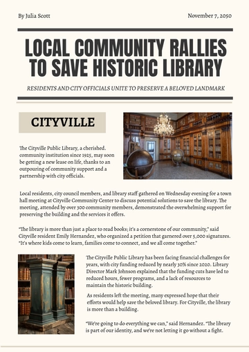
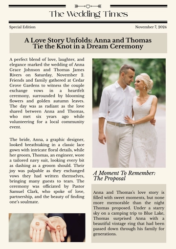
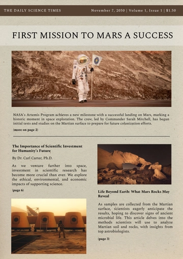
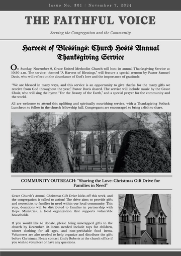
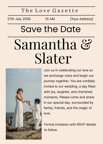
5. Image Placement
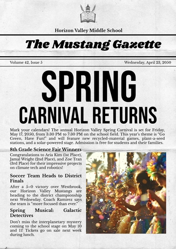
Position: Within the right column, usually placed strategically to break up text or illustrate key points.
Design: Image size is proportionate to the column width, ensuring it complements rather than overwhelms the text.
Caption: Directly beneath the image, in a smaller font, offering a brief description or credit.
6. Pull Quotes
Position: Interspersed within the article or placed at the bottom for emphasis.
Design: Enlarged, stylized text in a different font or color, often placed within a border or highlighted background.
Purpose: Highlights significant quotes from the article, drawing attention to key messages or themes.
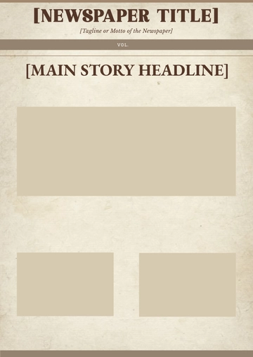
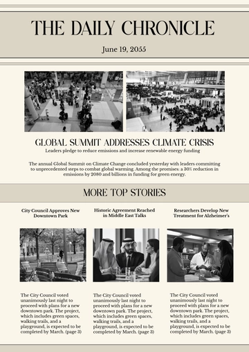
7. Additional Images or Graphics
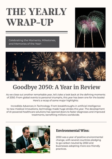
Position: Typically at the bottom of the page or within the columns, depending on the layout.
Design: Well-integrated, ensuring visual balance with the text. May include charts, infographics, or additional photos that support the article’s content.
Purpose: Provides visual interest and reinforces the article's message.
- 100% Customizable, free editor
- Access 1 Million+ Templates, photo’s & graphics
- Download or share as a template
- Click and replace photos, graphics, text, backgrounds
- Resize, crop, AI write & more
- Access advanced editor
Create visually appealing articles with our Newspaper Article Design Template from Template.net. This fully customizable and editable template is perfect for any publication, offering a professional design that can be easily edited in our Ai Editor Tool to suit your needs.
