Free Classic Newspaper Layout
Prepared by: [YOUR NAME]
Date: [DATE]
Introduction
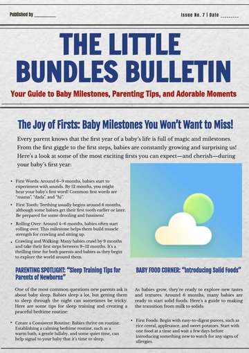
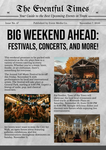
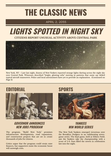
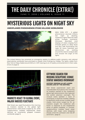
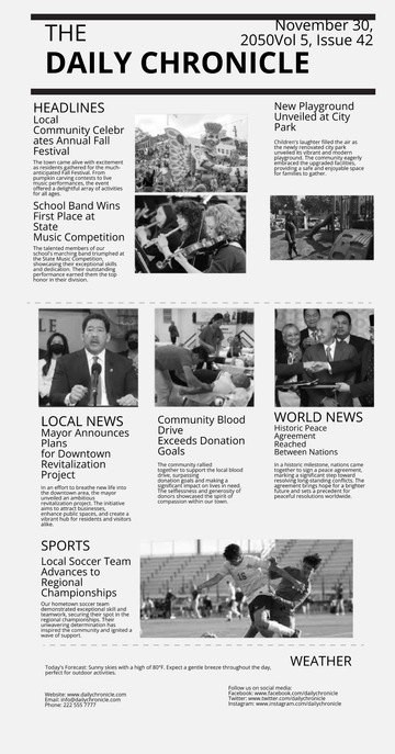
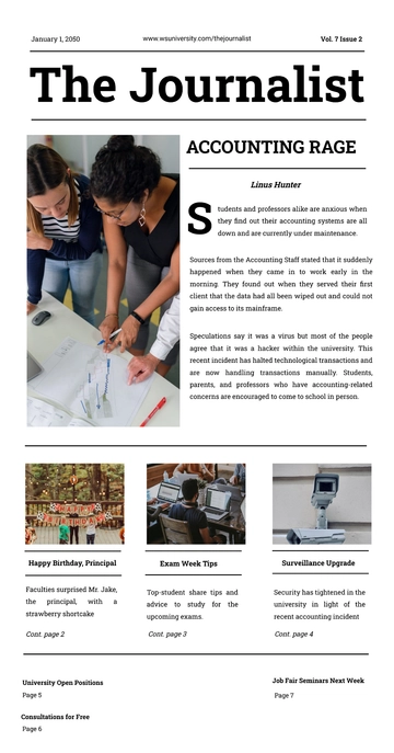
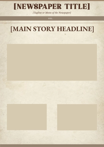
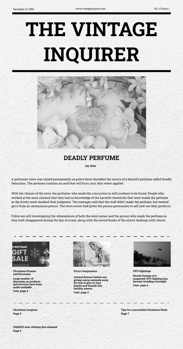
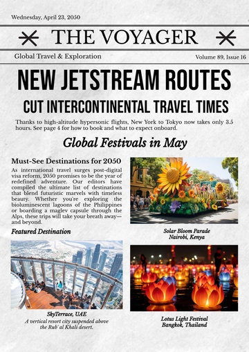
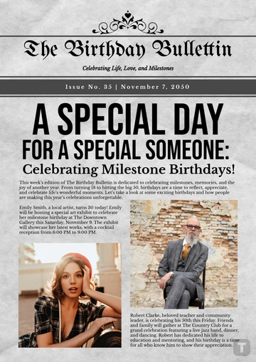
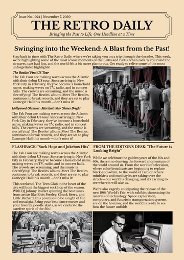
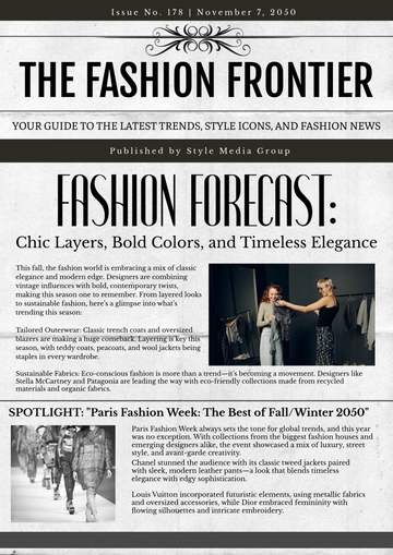
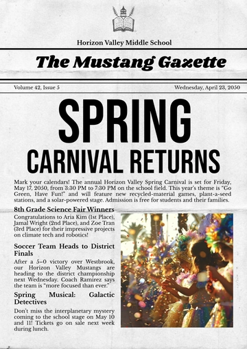
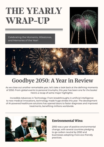
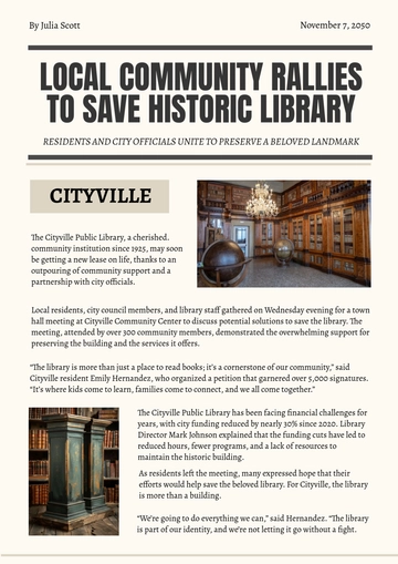
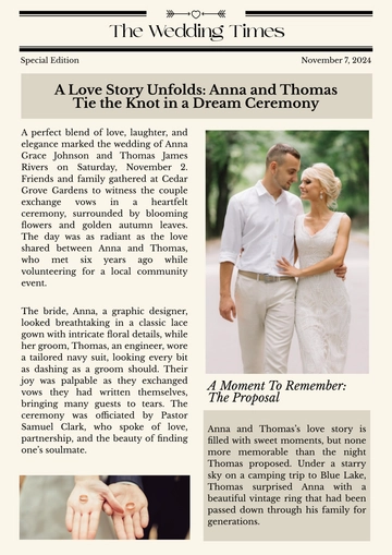
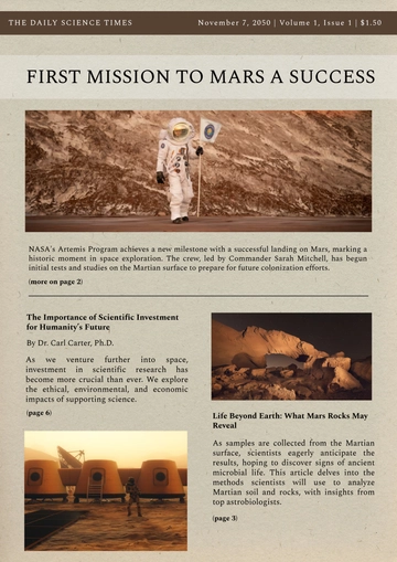
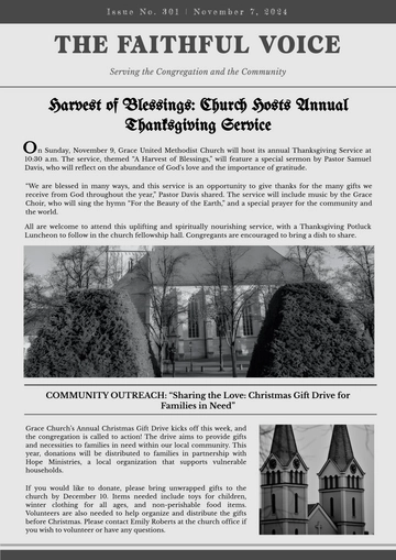
The classic newspaper layout is a design format that has stood the test of time, remaining relevant even as the media landscape has evolved dramatically. Characterized by its structured grid system, multiple columns, clear section divisions, and a balanced mix of text and images, this layout is visually appealing and highly effective in organizing and delivering information. Despite the rise of digital platforms, the principles underlying the classic newspaper layout continue to influence modern design, demonstrating its enduring value.
Purpose
The purpose of this article is to explore the elements that make the classic newspaper layout both timeless and effective. By examining the structure, balance of text and imagery, clear section divisions, and the grid system, we can understand why this layout remains a cornerstone of good design. Additionally, this article highlights the relevance of the classic newspaper layout in the digital age, showing how its principles continue to guide content presentation in various media.
A Timeless Design in the Digital Age
In an era dominated by digital media and rapidly evolving design trends, the classic newspaper layout remains a steadfast example of effective communication. This traditional design format, characterized by its structured grid system, multiple columns, clear section divisions, and a balanced mix of text and images, continues to play a crucial role in how news is presented and consumed.
The Structure of a Classic Layout
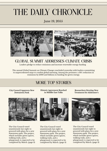
Adheres to a structured grid system, usually composed of three to five columns.
Headlines are bold and large, capturing the reader's attention immediately.
Subheadings and introductory paragraphs provide concise summaries to invite further reading.
Important stories are placed "above the fold" to ensure immediate visibility.
Balancing Text and Imagery
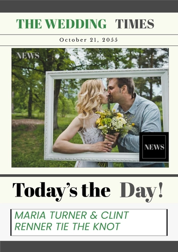
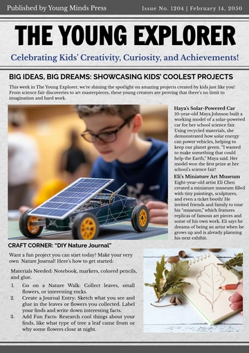
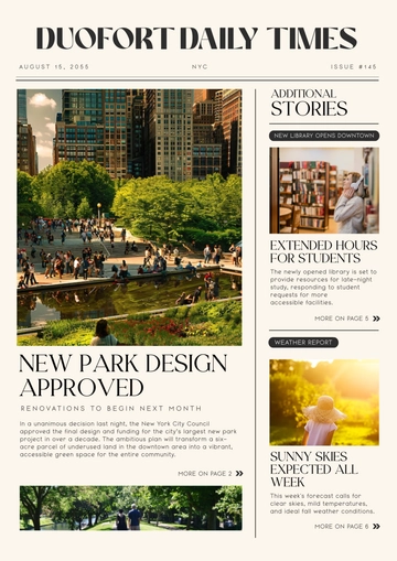
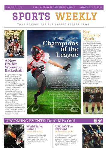
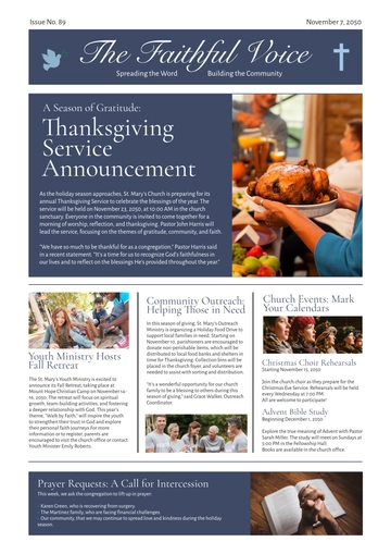
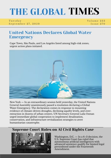
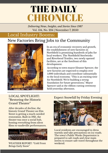
One of the key strengths of the classic newspaper layout is its balanced use of text and images. Photographs, illustrations, and infographics are strategically placed to complement the written content, adding visual interest without overwhelming the reader. This careful balance ensures that the newspaper remains visually appealing while still prioritizing the delivery of news.
Images often span the width of a column or multiple columns, depending on their significance to the story. This flexibility within the grid system allows for creative layout variations while maintaining overall consistency. Captions accompany images, providing context and enhancing the reader's understanding of the visual elements.
Clear Section Divisions
Sections such as news, opinion, sports, business, and entertainment are marked.
Section headings, color, shading, and borders distinguish different parts of the newspaper.
The organization aids in easy navigation, making the newspaper user-friendly.
The Grid System: A Blueprint for Clarity
The grid system ensures consistency and clarity, preventing cluttered or chaotic layouts.
Allows flexibility within a structured framework to accommodate different content types.
Pages can be adapted to feature large images or compact arrangements depending on the content.
The Enduring Relevance of the Classic Layout
Despite the rise of digital news platforms, the classic newspaper layout continues to hold relevance. Its principles of organization, clarity, and balance are timeless, serving as a foundation for effective communication in any medium. Even in digital formats, many news websites and apps emulate the classic layout's grid system, recognizing its value in guiding readers through content.
As the media landscape evolves, the classic newspaper layout stands as a testament to the enduring power of thoughtful design. It reminds us that, no matter how much technology advances, the fundamental principles of good design—clarity, organization, and balance—remain as important as ever in delivering information to the public.
Conclusion
In conclusion, the classic newspaper layout represents a perfect blend of form and function. Its structured approach to content organization ensures clarity and readability, while its balanced use of text and images maintains visual interest. Even as the media landscape shifts towards digital formats, the principles of the classic newspaper layout remain as relevant as ever. This timeless design continues to serve as a blueprint for effective communication, proving that good design transcends the medium in which it is used.
- 100% Customizable, free editor
- Access 1 Million+ Templates, photo’s & graphics
- Download or share as a template
- Click and replace photos, graphics, text, backgrounds
- Resize, crop, AI write & more
- Access advanced editor
Create eye-catching news pages with the Classic Newspaper Layout Template from Template.net. Fully customizable and editable in our AI Editor, this template offers a professional design that's easy to personalize. Perfect for any publication, it’s designed to be flexible and user-friendly, making your content shine with just a few clicks.
