Chapter
Introduction
In the world of catalogs and brochures, the art of presenting information in an aesthetically pleasing manner is paramount. This chapter delves into the design principles and visual strategies that enhance the effectiveness of catalogs and brochures, making them not only informative but also captivating. Whether for a product launch, an exhibition, or a corporate brochure, the aesthetics play a crucial role in engaging your audience and conveying your message.
The Essence of Aesthetic Design in Catalogs and Brochures
An aesthetically designed catalog or brochure captures attention and holds it, making your content memorable. This section explores key design elements such as layout, color schemes, typography, and imagery. These elements work together to create a cohesive and visually appealing document that aligns with your brand’s identity and message.
Key Design Principles
Layout and Structure
The layout is the foundation of any effective catalog or brochure. A well-organized structure ensures that information flows logically and is easy to navigate. Incorporate grids and alignment to create a balanced and orderly appearance.
Color Schemes
Color plays a vital role in setting the tone and mood of your catalog or brochure. Select colors that complement your brand and appeal to your target audience. Ensure that the color palette enhances readability and visual impact.
Typography
Choosing the right fonts is crucial for readability and brand consistency. Use a combination of fonts to create hierarchy and emphasis, but avoid using too many different styles to maintain a clean and professional look.
Imagery and Graphics
High-quality images and graphics are essential for visual appeal. Use them to highlight key features, products, or services. Ensure that all visual elements are relevant and contribute to the overall design theme.
Brand Integration
Consistency with your brand’s visual identity is key. Incorporate your brand’s colors, logos, and design elements throughout the catalog or brochure to reinforce brand recognition and coherence.
Example Design Layout
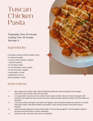
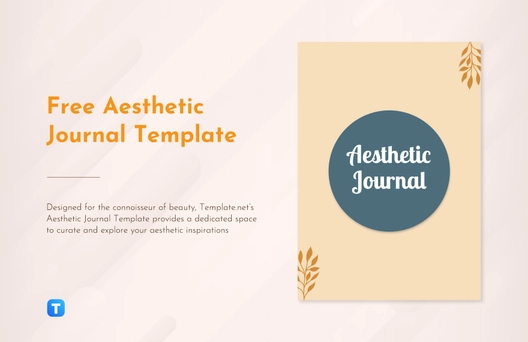
Here is a sample layout to illustrate how various design elements can be integrated into a catalog or brochure:
Section | Description | Visual Element | Color Scheme | Typography |
|---|
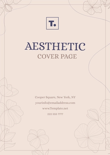
Cover Page | Eye-catching design with title and tagline | High-quality image | Brand colors | Bold, clean fonts |
Table of Contents | Organized list of sections | Simple icons | Neutral colors | Clear, readable fonts |
Introduction | Brief overview of content | Thematic imagery | Accent colors | Elegant fonts |
Product Sections | Detailed product information | Product photos | Complementary colors | Varied fonts for emphasis |
Testimonials | Customer feedback and reviews | Portraits of customers | Soft, contrasting colors | Italicized fonts for quotes |
Call to Action | Encouragement to take specific action | Bold graphics | Contrasting colors | Strong, direct fonts |
Contact Information | Company details and ways to get in touch | Logo and icons | Brand colors | Simple, legible fonts |
Back Cover | Additional branding and information | Logo and design elements | Brand colors | Consistent fonts |
Conclusion
Creating a visually appealing catalog or brochure involves thoughtful consideration of design principles and brand integration. By focusing on layout, color schemes, typography, and imagery, you can craft a document that not only informs but also captivates your audience. Implement these strategies to enhance the aesthetic quality and effectiveness of your catalogs and brochures.
Author: [YOUR NAME]
Email: [YOUR EMAIL]
Company Name: [YOUR COMPANY NAME]
Company Number: [YOUR COMPANY NUMBER]
Company Address: [YOUR COMPANY ADDRESS]
Chapter Templates @ Template.net
