Retail Branding Guide
I. Introduction
A. Purpose of the Retail Branding Guide
The Retail Branding Guide is designed to provide comprehensive direction for maintaining consistent branding across all retail environments, ensuring that every store location reflects the vision, mission, and values of [Your Company Name]. It consolidates visual, functional, and experiential branding elements into one cohesive document, which serves as the benchmark for how our brand is presented both internally and externally. This guide aims to guarantee that customers experience [Your Company Name]'s brand in a unified, high-quality way—whether they are visiting a physical store, engaging with our online platform, or interacting with our marketing materials.
Consistency across all touchpoints not only ensures that customers can easily recognize [Your Company Name] but also cultivates an environment of trust and professionalism. Whether a customer is stepping into a retail store for the first time or is a loyal repeat customer, they should feel immediately connected to the brand’s core values and messaging. This guide also assists in establishing best practices for how we communicate with our customers, ensuring that every interaction is aligned with our brand promise.
B. Importance of Consistent Retail Branding
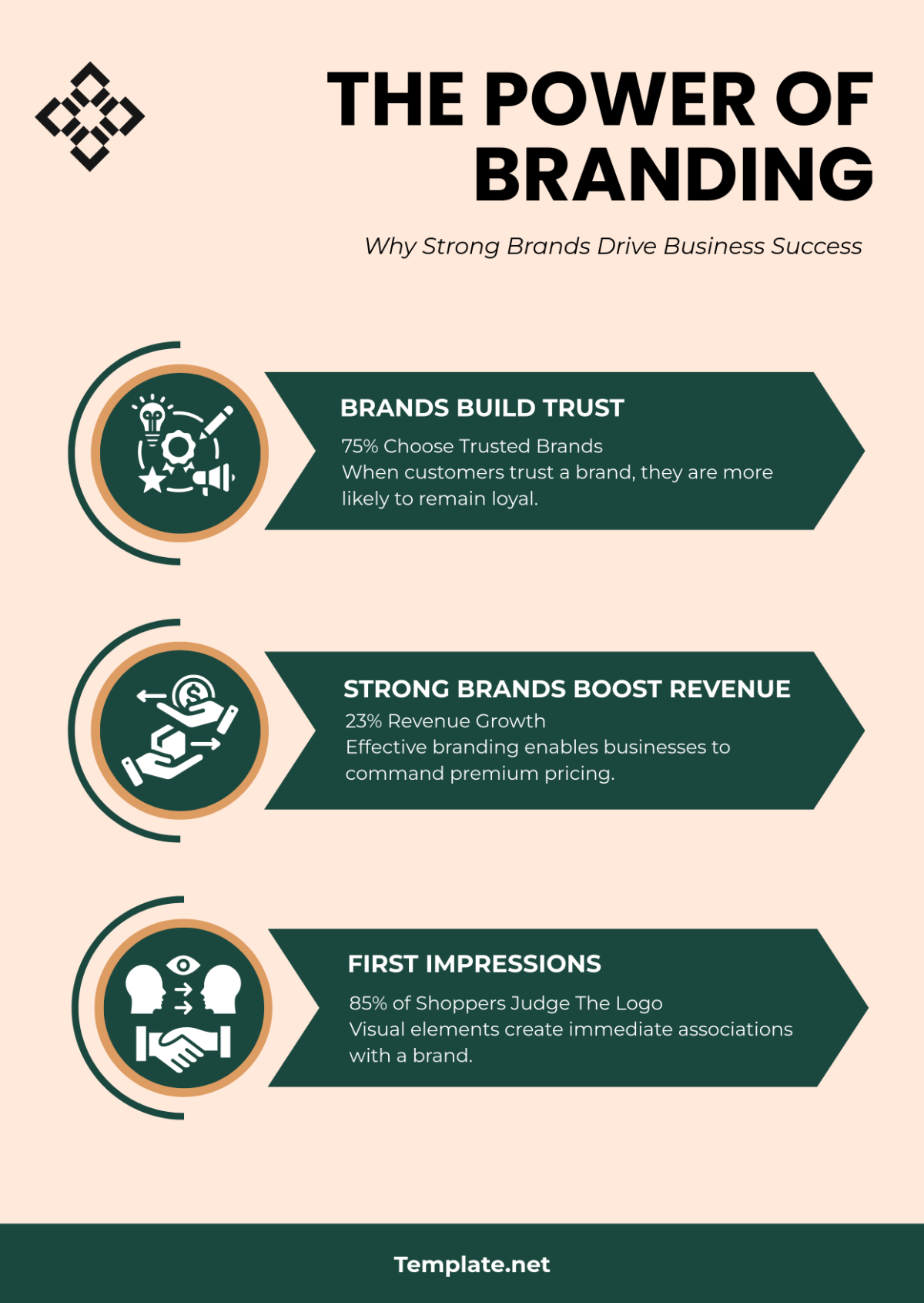
The significance of consistent branding cannot be overstated. In the competitive retail landscape, where consumer choice is abundant and attention spans are short, brand consistency plays a crucial role in distinguishing [Your Company Name] from its competitors. When a customer encounters a brand message, design, or experience that is clear and consistent across all platforms, it fosters a sense of reliability and familiarity. This results in greater brand loyalty, more substantial customer retention, and an increased likelihood of customers recommending [Your Company Name] to others.
Additionally, well-executed branding helps position [Your Company Name] as an industry leader. By presenting a professional, well-thought-out image, we demonstrate our commitment to quality and customer satisfaction, making it easier for customers to trust in our products and services. Over time, as branding consistency builds, the brand's perception in the marketplace strengthens, increasing its perceived value and long-term customer appeal.
II. Core Branding Elements
A. Brand Identity Overview
At the heart of every successful retail brand is a strong, distinctive identity. [Your Company Name]’s brand identity is more than just a logo or tagline—it’s a reflection of our core beliefs and values, as well as how we want our customers to perceive us. This identity is conveyed through various elements, such as our product offerings, our store environments, and how we interact with customers across different channels.
The Mission Statement of [Your Company Name] defines the broader purpose of our existence: “Delivering quality and innovation that exceed expectations.” This mission not only guides our strategic direction but also informs every decision made about product development, customer service, and overall store experience.
Our Core Values—integrity, creativity, customer-focus, and sustainability—serve as the foundation for how we do business. These values are evident in every facet of the brand, from the products we sell to the way we treat our customers and employees. Our brand personality, which can be described as friendly, professional, and forward-thinking, aims to evoke trust, excitement, and a sense of community. This personality resonates through every customer interaction, whether it's in-store, online, or through our customer service teams.
B. Logo Usage
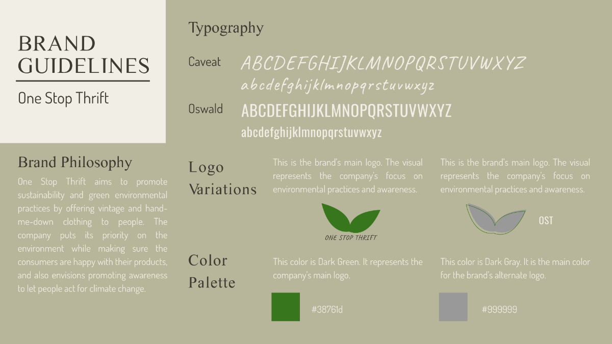
The logo is the visual embodiment of [Your Company Name] and should be used consistently to build recognition and strengthen brand association. When using the logo, it is imperative that it maintains its integrity by adhering strictly to the guidelines outlined in this guide.
The Primary Logo should be used in all major applications, including store signage, packaging, and advertisements. Its placement must be prominent, with sufficient space around it to prevent visual clutter. The Secondary Logo may be used when the primary logo does not fit within a specific design or context, such as smaller print areas or digital media where a compact version is necessary.
It is critical to remember that the logo should never be altered—whether by changing its proportions, colors, or adding other graphic elements. This ensures the logo’s effectiveness and maintains its ability to communicate the brand’s essence clearly and professionally.
Logo Variants | Approved Colors | Usage Contexts |
|---|---|---|
Primary Logo | Blue & White | Store signage, packaging |
Secondary Logo | Black & White | Digital media, press materials |
C. Color Palette
Color plays a vital role in branding, as it evokes emotions and establishes recognition. The use of our Primary Blue, Accent Yellow, and Neutral Gray creates a consistent visual language that customers immediately associate with [Your Company Name]. These colors, when used correctly, work harmoniously to enhance the brand’s visibility and appeal.
The Primary Blue (#0056B3) represents professionalism and trust, making it an ideal choice for our logo and primary signage. Accent Yellow (#FFC107), used sparingly, brings vibrancy and draws attention to key promotional materials, packaging, and in-store displays. Neutral Gray (#6C757D) serves as a background color, offering balance and sophistication without competing with the more vibrant tones.
It is also important to note that the color palette is designed to be accessible and inclusive. The contrast between these primary colors and their complementary tones ensures legibility and inclusivity for all customers, including those with visual impairments.
Color Name | HEX Code | RGB Value | Use Cases |
|---|---|---|---|
Primary Blue | #0056B3 | (0, 86, 179) | Logo, signage, uniforms |
Accent Yellow | #FFC107 | (255, 193, 7) | Packaging, décor |
Neutral Gray | #6C757D | (108, 117, 125) | Background elements |
D. Typography
Typography not only affects readability but also reinforces brand identity through style and tone. Our chosen typefaces—Montserrat for headings, Open Sans for body text, and Roboto Mono for special cases—are selected for their clarity, modernity, and versatility. These fonts, when used consistently across all communications, contribute to a cohesive visual identity.
The Montserrat Bold typeface used for headings is modern and strong, making it perfect for grabbing attention in both print and digital mediums. Open Sans Regular is clean and highly readable, ensuring that longer paragraphs of text are easy to digest and navigate. Roboto Mono is used selectively for tech-related materials, such as product specifications and digital interfaces, where a more structured and monospaced font is required.
By adhering to these typography guidelines, we ensure that [Your Company Name]'s written communication is always clear, professional, and aligned with the brand’s values.
III. Retail Store Design
A. Exterior Design and Signage
The exterior design of a retail store is the first physical touchpoint between a customer and [Your Company Name]. As such, it must embody the brand’s professionalism, approachability, and commitment to quality. The signage should be large enough to be easily visible from a distance, with proper contrast to ensure readability during both day and night.
The storefront design should focus on creating an inviting atmosphere, with the use of clean lines, minimalistic design, and transparent materials that allow passersby to see inside the store. Using natural light and open spaces also helps reinforce a welcoming vibe. The lighting must focus on highlighting the logo and window displays while also creating a cozy, upscale feel. Proper lighting creates an inviting ambiance that encourages foot traffic and highlights promotional displays.
B. Interior Layout and Décor
The interior layout is just as important as the exterior, as it defines the customer’s in-store experience. The store should be organized in a way that customers can easily navigate and find products. Zoning helps categorize product sections and offers clarity in the layout. For example, creating distinct areas for high-demand items, new arrivals, or seasonal promotions helps customers make decisions quickly.
Décor should reflect the values of simplicity and elegance. Minimalist furniture, neutral tones, and branded accents (such as display stands, mannequins, and feature walls) work together to create a visually appealing space. Every corner of the store should have a clear purpose, ensuring that it is both functional and aesthetically aligned with the brand.
C. Lighting and Ambience
Lighting plays a crucial role in setting the mood and influencing purchasing behavior. The goal is to create an environment that feels warm, inviting, and energetic while ensuring visibility of all products. The store should use general lighting to maintain an even and balanced illumination across the entire space. To emphasize high-traffic or promotional zones, use spotlighting to draw attention to key displays.
The overall soundscape within the store should also align with the brand’s personality. Soft, instrumental music can encourage a calm, enjoyable shopping experience. Music volume should be kept at a comfortable level—no louder than [60 decibels]—to prevent it from overpowering conversation or creating an overwhelming atmosphere.
IV. Product Presentation
A. Packaging Design Guidelines
Packaging serves not only as a protective cover for the product but also as an extension of the brand. It’s an opportunity to engage the customer visually and emotionally. All packaging for [Your Company Name] products should be designed with both functionality and aesthetics in mind. The product name, logo, and essential product details (such as weight, ingredients, and usage instructions) should be displayed clearly.
The materials used in packaging must align with our sustainability goals, emphasizing eco-friendly, recyclable, or biodegradable options wherever possible. This practice not only minimizes our environmental impact but also resonates with consumers who prioritize sustainability in their purchasing decisions.
B. Merchandising Standards
Merchandising involves presenting products in ways that make them appealing and easy to shop. Proper merchandising is vital for converting foot traffic into purchases. Planograms should be followed to ensure consistency across all locations, creating a familiar experience for customers no matter where they shop. Products should be arranged in a way that encourages discovery—placing complementary items together and rotating stock regularly to ensure freshness.
V. Customer Experience
A. Staff Training and Dress Code
Our team members are the face of [Your Company Name] and must reflect the brand’s standards of professionalism and customer service. Comprehensive training ensures that staff members are knowledgeable about product details, promotions, and the brand’s ethos. This is especially important for frontline associates who directly interact with customers.
Our dress code is designed to maintain a consistent, professional appearance while also ensuring comfort and practicality. Staff uniforms should be neat and clean at all times, and any accessories (such as name tags) should follow the brand’s guidelines.
Position | Uniform Color | Accessories Allowed |
|---|---|---|
Customer Associates | Primary Blue Shirt | Branded name tags, watches |
Store Managers | Neutral Gray Blazer | Branded pins, formal shoes |
B. Customer Service Principles
Customer service is a critical aspect of retail branding. Every interaction should reflect [Your Company Name]’s core values, focusing on efficiency, empathy, and resolution. Staff members should greet customers within [5 seconds] of entering the store, offering assistance without being intrusive. Staff should be trained to recognize opportunities for upselling, but always with the goal of improving the customer’s experience. When dealing with complaints or inquiries, aim for a first-contact resolution rate of [90%] to ensure customer satisfaction.
VI. Marketing and Communication
A. In-store Marketing Guidelines
In-store marketing is a direct reflection of [Your Company Name]'s values and message. All promotional materials, whether printed or digital, should adhere to the established branding guidelines. Posters, signage, and digital displays should all feature the approved color palette and typography, ensuring a consistent visual experience.
Promotion Type | Frequency | Placement |
|---|---|---|
Seasonal Sales | Quarterly | Entrance, checkout |
New Arrivals | Monthly | Display zones |
B. Digital Integration for Retail
With the rise of e-commerce and digital engagement, integrating digital touchpoints into the in-store experience has become crucial. Mobile apps, self-service kiosks, and online ordering are all components of a cohesive omni-channel strategy that links physical and digital retail experiences. By creating seamless transitions between online and in-store shopping, customers are empowered to shop at their convenience while interacting with the same unified brand experience.
VII. Monitoring and Updates
A. Measuring Branding Success
Measuring the success of branding is essential for determining whether the strategies put in place are achieving their intended results. Customer retention is one of the most telling indicators of success, with an ideal target rate of [85%] for repeat customers. Tracking sales growth is another key performance indicator (KPI), aiming for an annual target of [$10,000,000]. Regular brand audits and surveys should be conducted to assess customer perceptions and gather actionable feedback.
B. Updating the Branding Guide
Branding is not static—it evolves over time to reflect changing market trends, consumer preferences, and technological advancements. The Retail Branding Guide will be reviewed every two years to ensure that it continues to align with the needs of both the business and its customers. Regular updates will allow [Your Company Name] to stay at the forefront of innovation and maintain a fresh, relevant presence in the marketplace.
Conclusion
Adhering to the guidelines set forth in this Retail Branding Guide will ensure that [Your Company Name] remains a trusted, innovative, and recognizable brand. Every touchpoint, from store design to customer interactions, should reflect the same values and commitment to excellence. As we move into the future, the strength of our brand will continue to grow, guided by these standards.

