E-Commerce Brand Style Guide
I. Introduction
A. Purpose of the Brand Style Guide
[Your Company Name]'s guide serves as the blueprint for maintaining brand consistency across all platforms and customer interactions. It ensures that our visual and verbal identity remains unified, helping us build recognition and trust with our audience. Use this guide as a reference whenever creating or sharing brand assets, from marketing materials to social media content.
B. Overview of the Brand
[Your Company Name] is a customer-centric brand focused on providing high-quality, sustainable products that enhance daily life. Our mission is to blend style with functionality, offering a seamless shopping experience for our audience. This guide reflects the brand's essence and sets the standard for how we present ourselves.
C. How to Use the Brand Style Guide
This document outlines the correct usage of [Your Company Name]'s logos, colors, typography, and tone. Every team member, partner, or vendor involved in creating brand assets should refer to this guide to ensure consistency. If you have any questions or need clarification, please reach out to the brand manager.
II. Brand Identity
A. Brand Mission, Vision, and Values
Our mission is to provide innovative, high-quality products that make life easier for our customers. We strive to lead with integrity and sustainability, aiming to create lasting relationships with our community. Our core values are innovation, quality, sustainability, and customer-first.
B. Brand Personality and Messaging
We are approachable, friendly, and knowledgeable, with a passion for helping our customers make informed purchasing decisions. Our messaging is clear, concise, and focused on the benefits our products offer. Whether online or in-store, our brand conveys trustworthiness and a sense of community.
C. Tone of Voice Guidelines
Our tone is conversational yet authoritative, striking a balance between being friendly and professional. We use inclusive language and avoid jargon to ensure our message is clear to all audiences. The tone may vary slightly across platforms, but it should always reflect our brand's warmth and expertise.
III. Logo Usage
A. Primary and Secondary Logos
Our primary logo is the most recognized version of our brand and should be used in most instances. Secondary logos, such as stacked or monochrome versions, may be used when space or design constraints require it. Ensure that these logos are used appropriately to maintain the brand's integrity.
B. Logo Clear Space and Sizing Guidelines
To maintain the visibility and legibility of the logo, it is essential to provide a sufficient amount of clear space surrounding it. This clear space is crucial for preventing any visual obstruction or clutter that might compromise the logo's effectiveness. The recommended minimum clear space should be equivalent to the width of the logo itself. For printed materials, the logo must be at least 1 inch in height, and for digital platforms, a minimum of 80 pixels in height, ensuring visibility and legibility across mediums.
C. Correct and Incorrect Logo Usage
Please take care to ensure that the logo remains in its original form without stretching, distorting, or altering it in any manner. It is important that the logo is not placed on backgrounds that are excessively busy or distracting. Additionally, any color variations of the logo must adhere strictly to the established brand's color guidelines. Using the logo incorrectly can significantly reduce the brand’s effectiveness and diminish its ability to be easily recognized.
IV. Color Palette
A. Primary and Secondary Colors
Our primary color palette consists of a bold, modern shade of blue, complemented by white and gray for clarity and sophistication. Secondary colors include vibrant accent tones that should be used sparingly to highlight key elements such as buttons or calls to action. These colors should always complement, not overpower, the primary colors.
B. Color Codes and Usage Guidelines
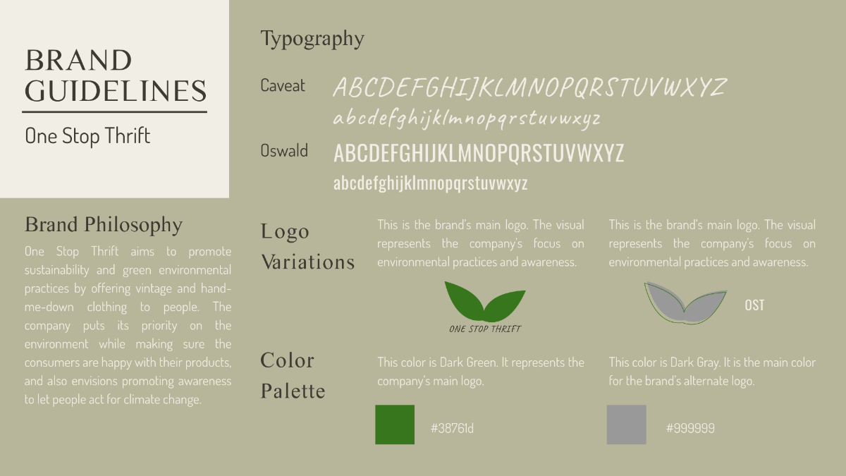
The primary colors are #0044CC (blue), #FFFFFF (white), and #808080 (gray). For secondary colors, use #FF5733 (red), #FFD700 (yellow), and #28A745 (green). Colors should be used in web, print, and product packaging in accordance with these exact codes to maintain consistency.
C. Accessibility Considerations
All color combinations should meet contrast guidelines to ensure readability for individuals with visual impairments. Backgrounds and text should maintain sufficient contrast, especially for web and mobile interfaces. Regular accessibility checks should be conducted to ensure compliance with WCAG standards.
V. Typography
A. Primary and Secondary Typeface Guidelines
The primary typeface is Helvetica Neue, which should be used for headlines and body text on digital and print materials. The secondary typeface, Arial, should be used for subheadings and smaller text when Helvetica Neue is unavailable. Both fonts are clean, legible, and designed to complement the brand's modern aesthetic.
B. Font Pairings and Hierarchy
Headings within the document should be presented using Helvetica Neue Bold, and these headings must be in large sizes to ensure they stand out prominently. For subheadings, it is recommended to use either Helvetica Neue Regular or Helvetica Neue Light, providing a clear distinction from the main headings while maintaining a cohesive font style. Use Helvetica Neue Regular for body text or Arial if needed, with only two font sizes for consistency. A clear font hierarchy enhances readability and creates an organized layout.
C. Web Safe Fonts
When using text on the internet, it is important to make sure that the chosen fonts are compatible and display correctly on all web platforms. If the font Helvetica Neue is not available, it is advisable to use Arial or alternatives available from Google Fonts, such as Roboto. These fonts resemble Helvetica Neue and ensure consistent text appearance across all web browsers and platforms.
VI. Imagery and Photography
A. Photography Style (Product and Lifestyle)
Product images should be high-quality, clean, and well-lit, showcasing the features of the product clearly. Lifestyle images should reflect our brand’s personality, with scenes that resonate with our target audience, conveying a sense of ease and enjoyment. Both types of imagery should align with our modern, approachable aesthetic.
B. Image Treatment and Composition
To achieve sharp and clear visuals, it is important to use bright and natural lighting. This means allowing ample natural light to illuminate your subject, thereby enhancing its details and features without artificial distortions. Maintain a consistent aesthetic by avoiding dramatic filters, opting for soft, natural tones instead. Ensure your product is the main focus through careful composition and arrangement for clarity and a cohesive presentation.
C. Image Sizing and Resolution
Images should be at least 1500px wide for product listings, ensuring sharp quality on both desktop and mobile. For banners and promotional images, aim for a resolution of 300dpi to ensure print quality. Consistency in image size and resolution maintains the professional appearance of the brand.
VII. Voice and Tone
A. Brand Voice Overview
Our brand voice is friendly, clear, and helpful. We aim to make every customer feel valued by speaking to them directly and offering solutions in a confident, yet warm manner. This voice should be present across all marketing materials and customer touchpoints.
B. Tone for Different Platforms
On the website, the tone should be informative and welcoming, guiding the customer through their shopping experience. On social media, our tone can be slightly more casual and conversational while still staying true to our professional nature. In customer service interactions, our tone should be empathetic and solution-oriented.
C. Specific Tone for Customer Interactions
In customer support emails, our tone should be understanding and proactive, offering solutions to issues swiftly and courteously. On social media, we should keep responses friendly but professional, maintaining the same level of helpfulness. Our goal is always to provide clear, supportive communication to enhance the customer experience.
VIII. Website and UI Guidelines
A. Website Layout and Structure
Our website should have a clean, intuitive layout that guides users smoothly from product discovery to checkout. Consistent navigation, visible call-to-action buttons, and easy access to support help create a seamless shopping experience. Every page should be easy to scan, with clear headings and well-organized content.
B. Product Page Design and Call to Actions (CTAs)
Product pages should feature high-quality images, a compelling product description, and key details such as price and availability. The CTA buttons, like "Add to Cart" or "Buy Now," should stand out with our secondary accent colors and be easy to locate. Keep product descriptions concise, emphasizing key benefits to encourage conversions.
C. Mobile Optimization and UX
The website must be fully responsive, providing a smooth experience on mobile devices. Text should be legible without zooming, and buttons must be easy to tap with a finger. Mobile users should have a streamlined checkout process with minimal steps to reduce cart abandonment.
IX. Social Media Guidelines
A. Profile and Post Design
All social media profiles should display our logo as the profile image and use the brand’s color palette for cover images. Posts should feature eye-catching visuals and a mix of product-focused and lifestyle content. Ensure that each post maintains the brand’s tone and visual style for consistency.
B. Content Style and Voice for Social Platforms
On Instagram, it is important to utilize vibrant and high-quality images that can capture the attention of viewers, paired with short and engaging captions that not only draw people in but also encourage interaction or evoke emotion. On Twitter, use a snappy, informative tone to communicate key messages efficiently, strategically using hashtags to boost visibility. Tailor content to each social media platform to reflect the brand's unique personality and strengths.
C. Engagement Strategy
Engage with customers promptly and kindly by addressing their inquiries and comments with responses that are both helpful and positive. When replying to customers, it is important to consistently use the brand's voice, maintaining a tone that is both professional and approachable. Additionally, encourage customers to generate content themselves and strive to create conversations that center around the core values of the brand.
X. Advertising and Marketing Materials
A. Online Ads and Banners
Please ensure that each and every digital advertisement you create is consistent with our brand’s visual identity by incorporating our logo, utilizing our designated color palette, and employing our specific typography. It is essential that the advertisement's copy is succinct and includes a definitive call to action, aimed at effectively driving conversions. When designing the ad, maintain a clean and uncluttered appearance by refraining from including an excessive number of elements.
B. Email Campaigns and Newsletters
Emails should be visually appealing, with a clear subject line and relevant content tailored to the customer. Use personalized greetings and product recommendations based on customer behavior. Ensure that the layout is responsive and easy to read on both desktop and mobile devices.
C. Promotional Assets and Affiliate Marketing
Promotional banners, flyers, and affiliate marketing materials should use consistent messaging and branding. Ensure that any discounts or offers are clearly stated, with terms and conditions easily accessible. Affiliates should be provided with approved logos, images, and key messaging to maintain consistency.
XI. Legal and Compliance
A. Copyright and Trademark Guidelines
Every logo, image, and piece of written content is protected by copyright laws, and under no circumstances should these materials be modified or altered without obtaining explicit authorization. The brand incorporates several trademarked components, including but not limited to its logo, which should be utilized strictly in observance of the specified guidelines. Any unauthorized application or misuse of the brand's assets may result in legal proceedings being initiated.
B. Advertising and Privacy Compliance
Please ensure that every action taken in relation to advertising fully complies with all relevant laws and regulations. As a part of this, it is crucial that any claims made in advertisements are both truthful and supported by evidence. Additionally, it is imperative to strictly adhere to privacy laws, including but not limited to the General Data Protection Regulation (GDPR) and the California Consumer Privacy Act (CCPA), to safeguard customer data. Furthermore, it is important to always provide a clear and comprehensive privacy policy both on the website and at the point of any data collection.
C. Updates and Revisions to the Brand Style Guide
This style guide is intended to be a dynamic and evolving document that will undergo revisions from time to time in order to incorporate any changes that may occur in either the brand itself or in the broader industry standards. It is important to make sure that you have access to and are working with the most up-to-date version of the guide. If you have any questions or require clarification regarding these updates, please do not hesitate to contact the brand manager for assistance.
