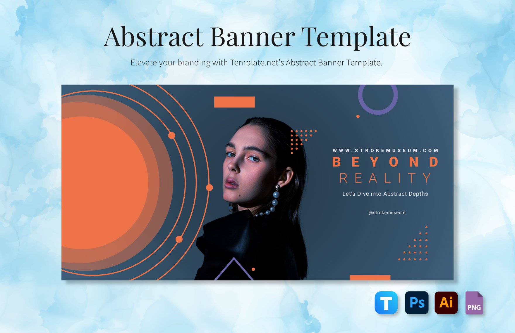
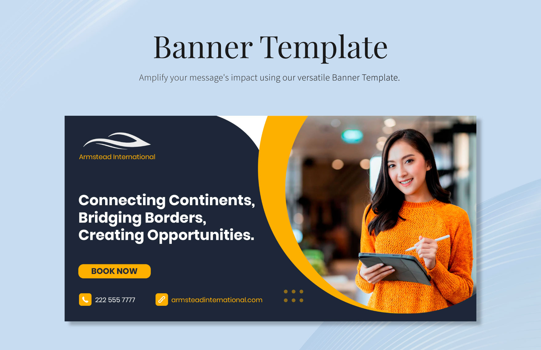
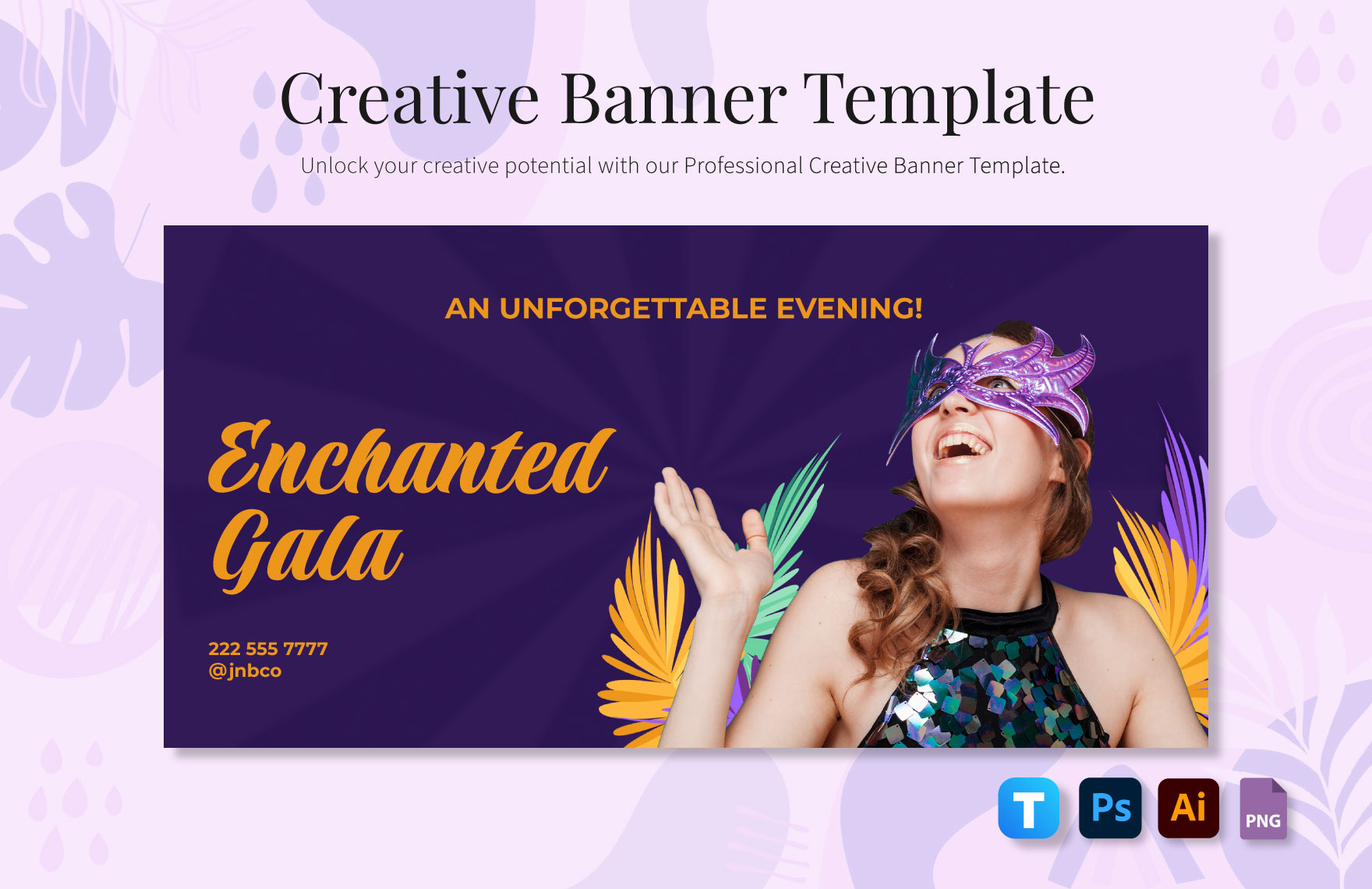
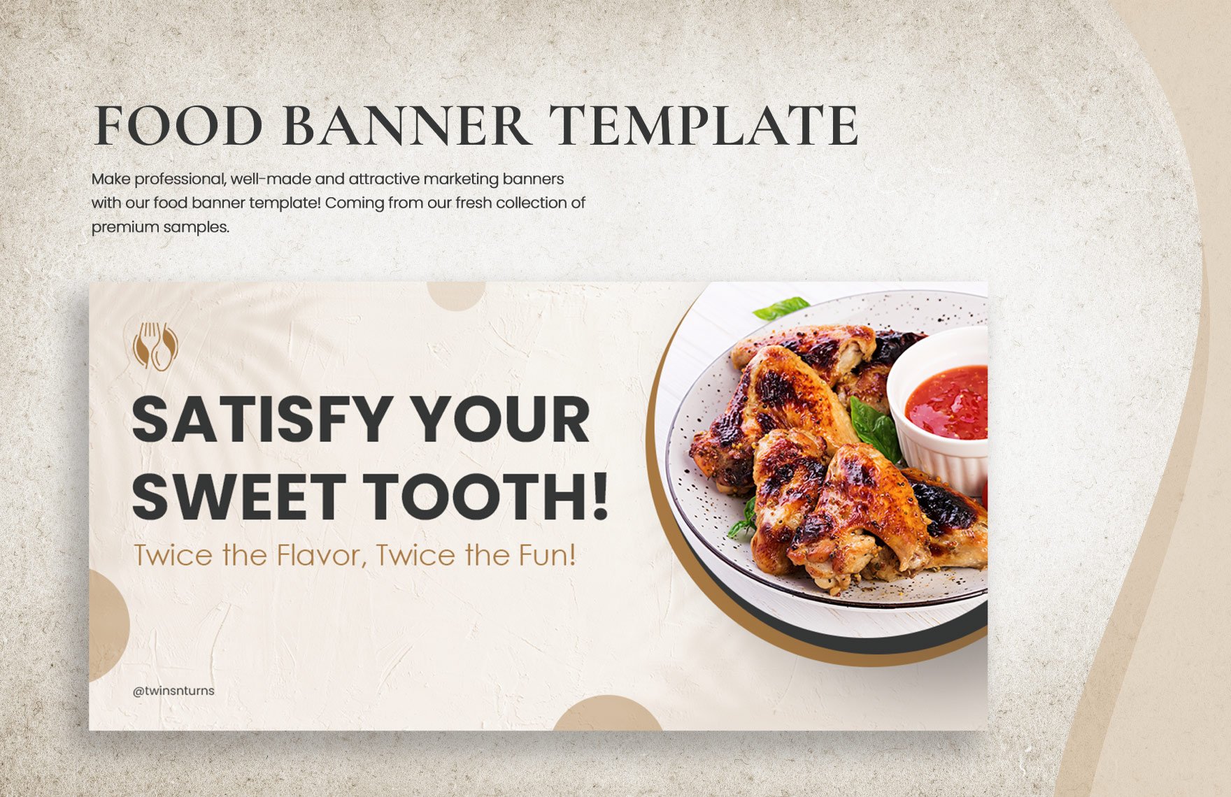
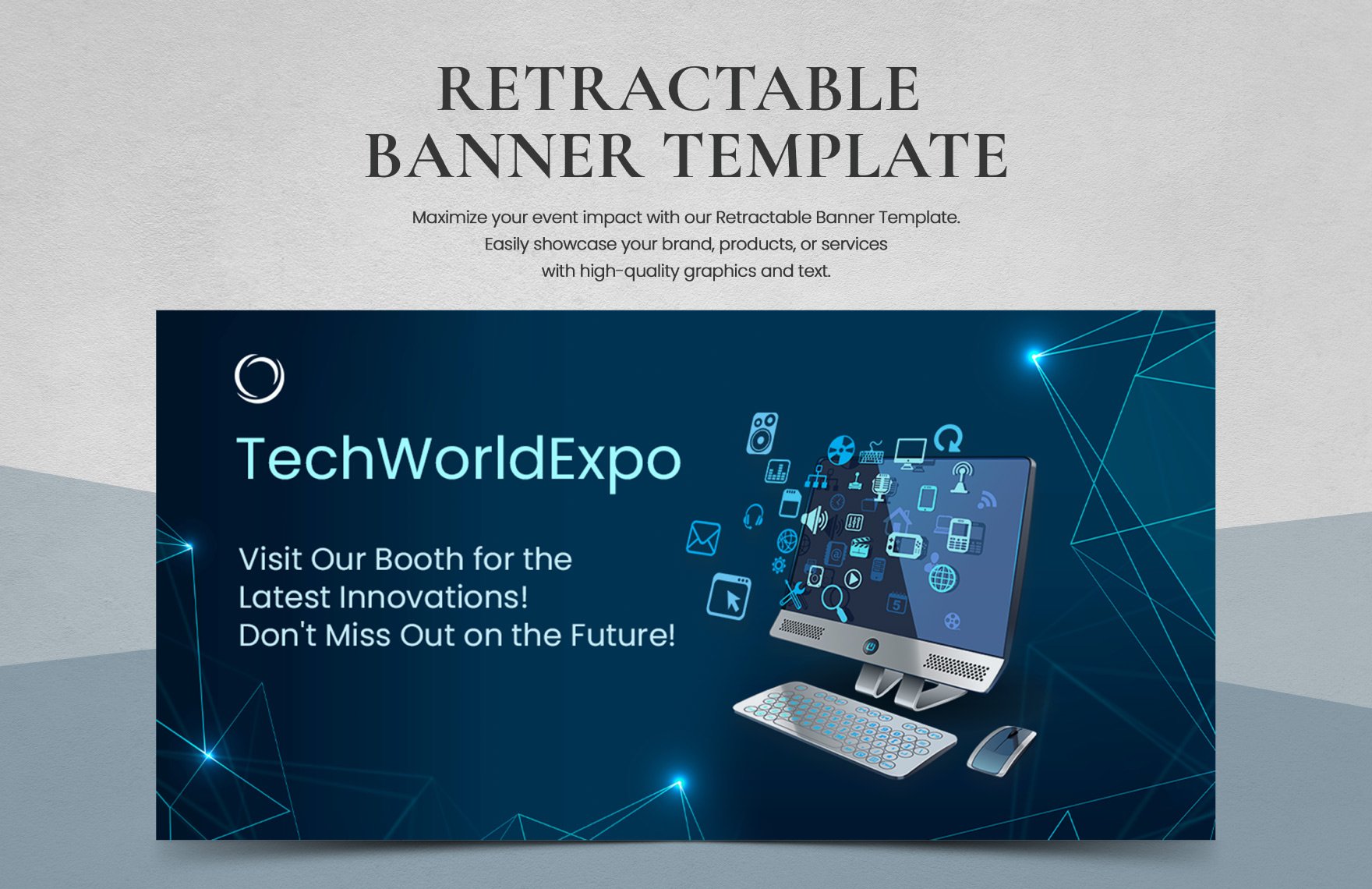
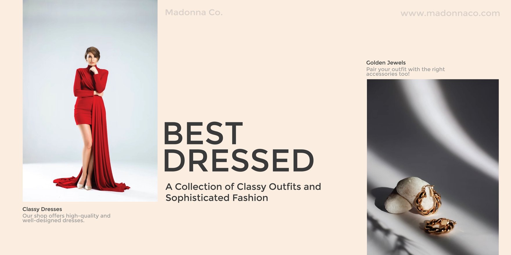
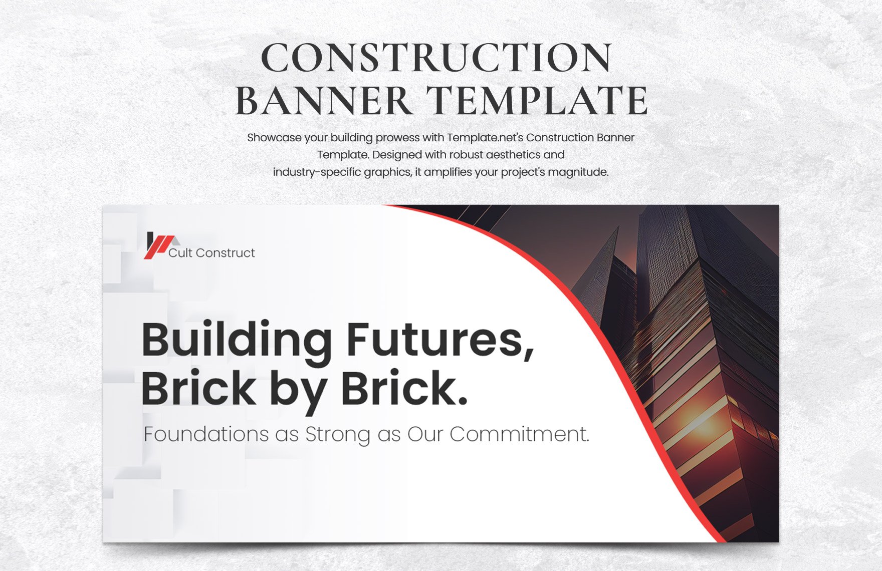
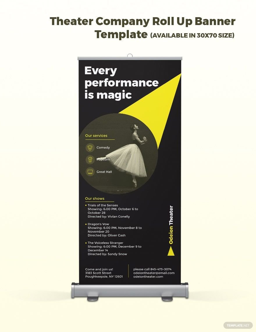
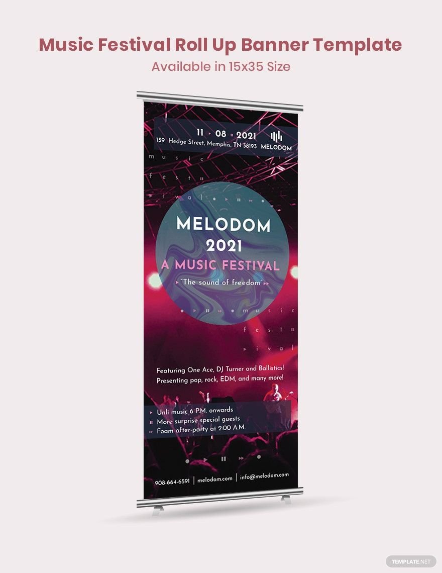
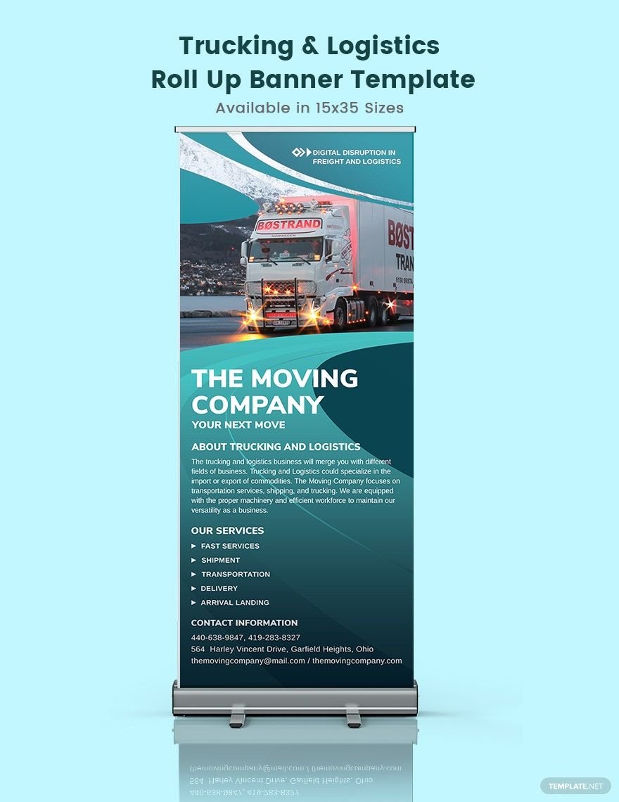
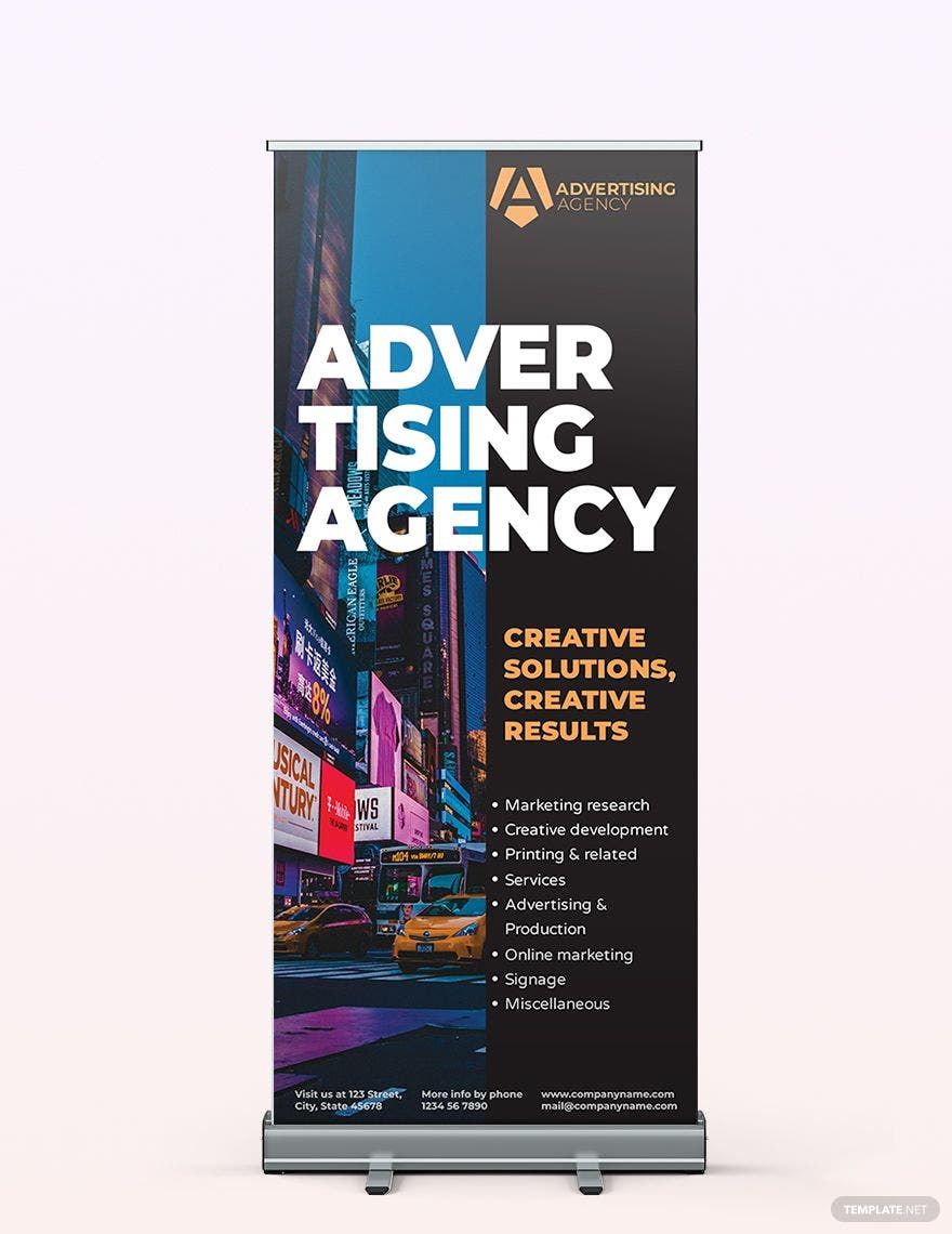
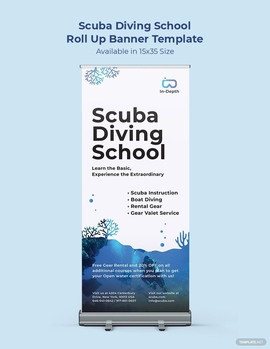
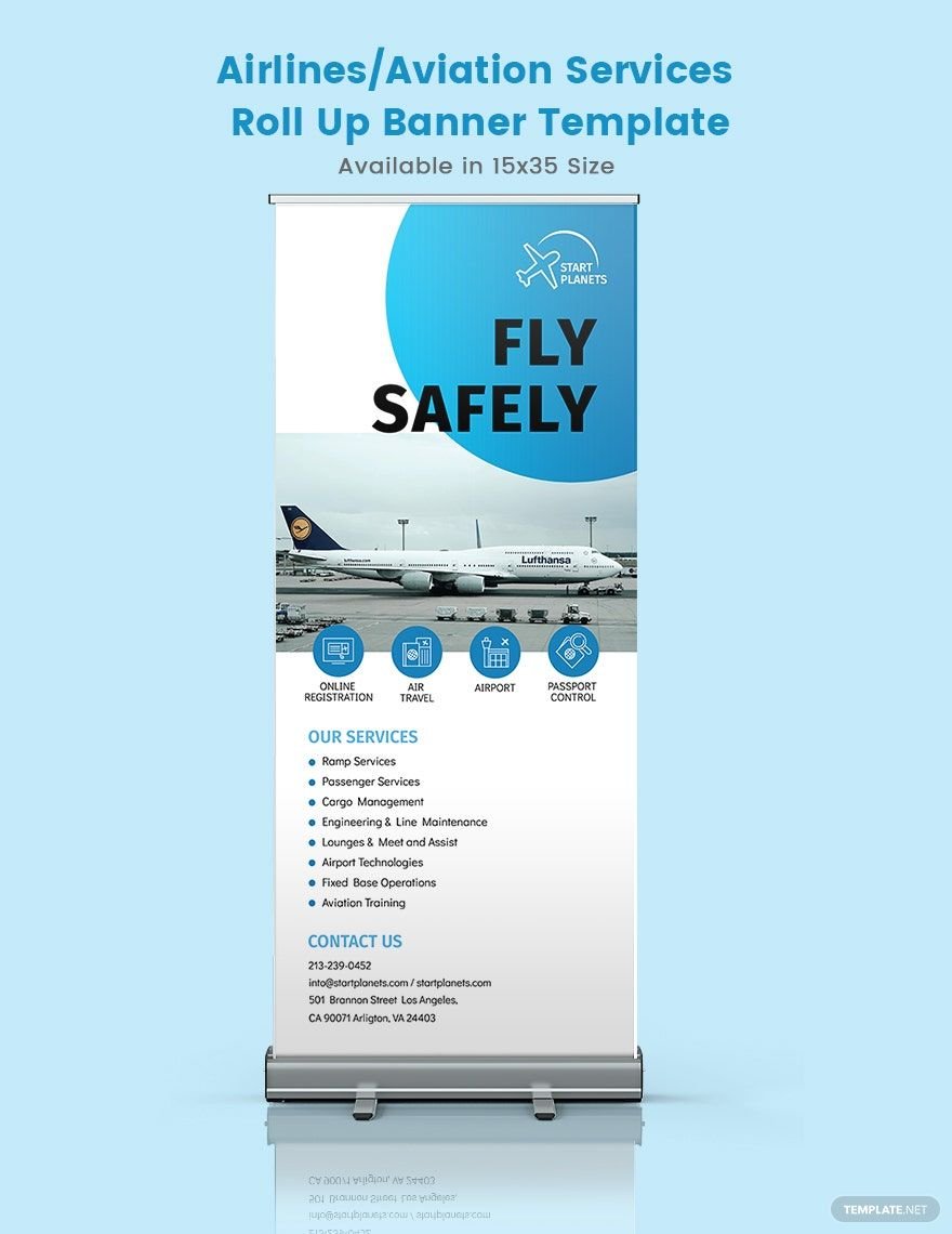
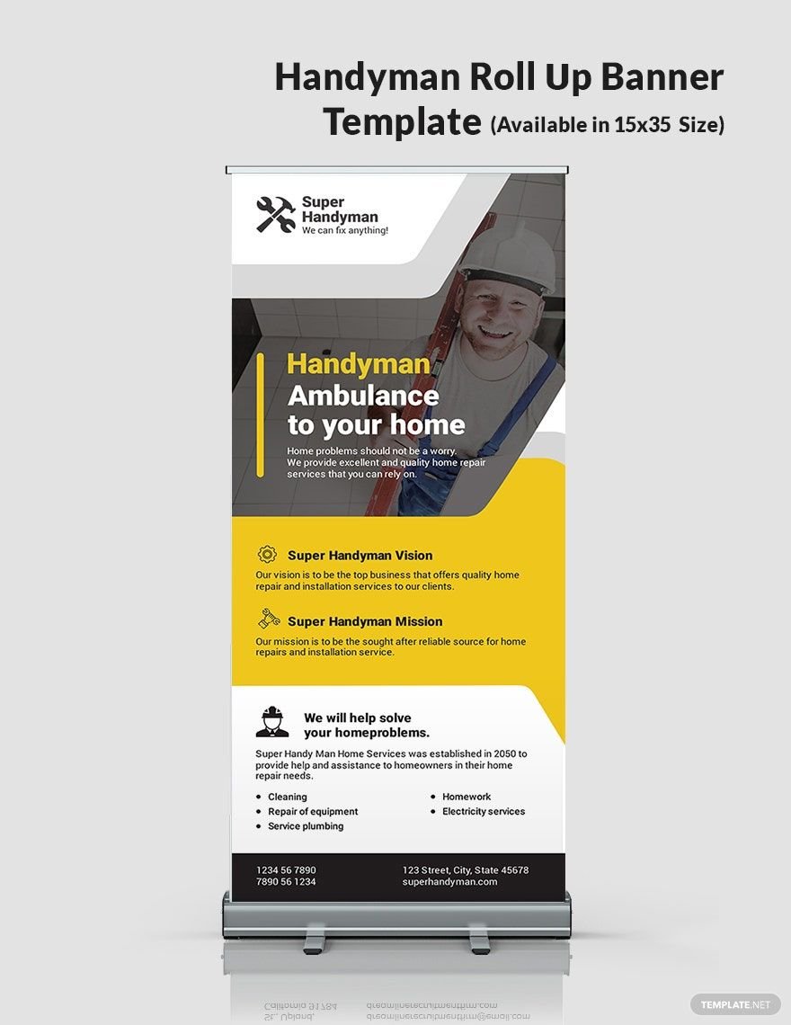
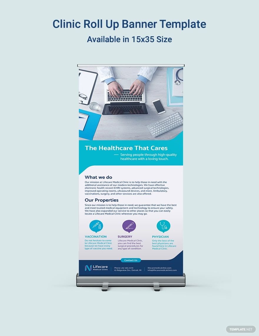
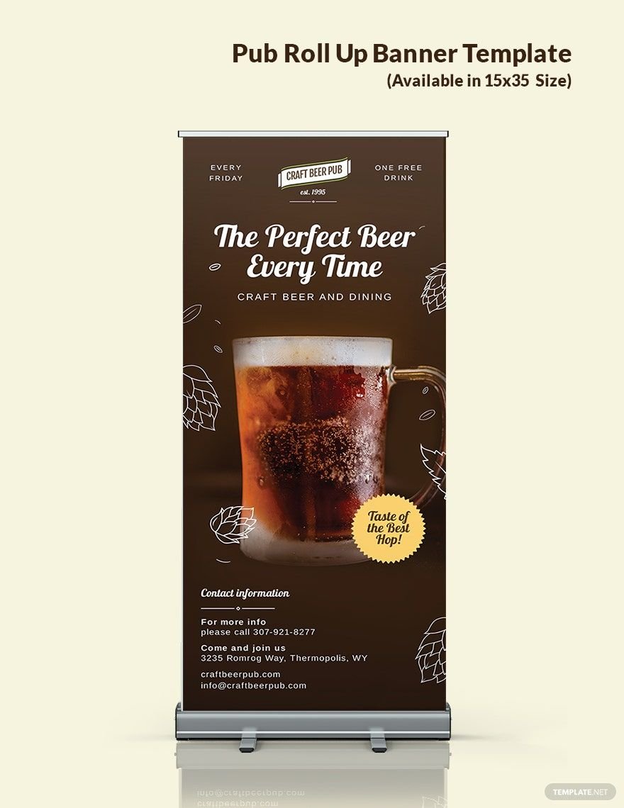
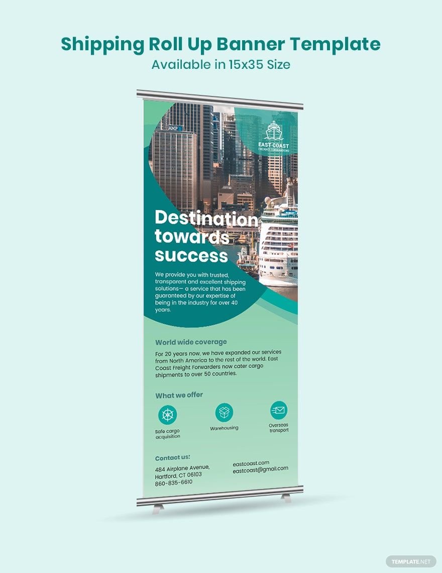
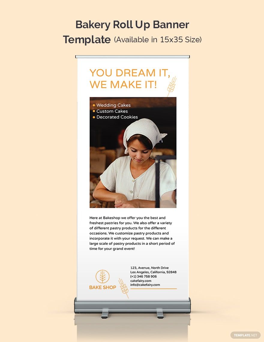
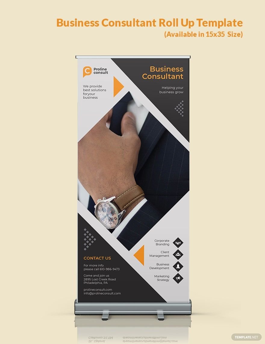
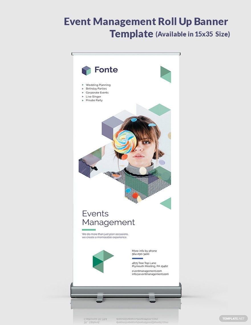
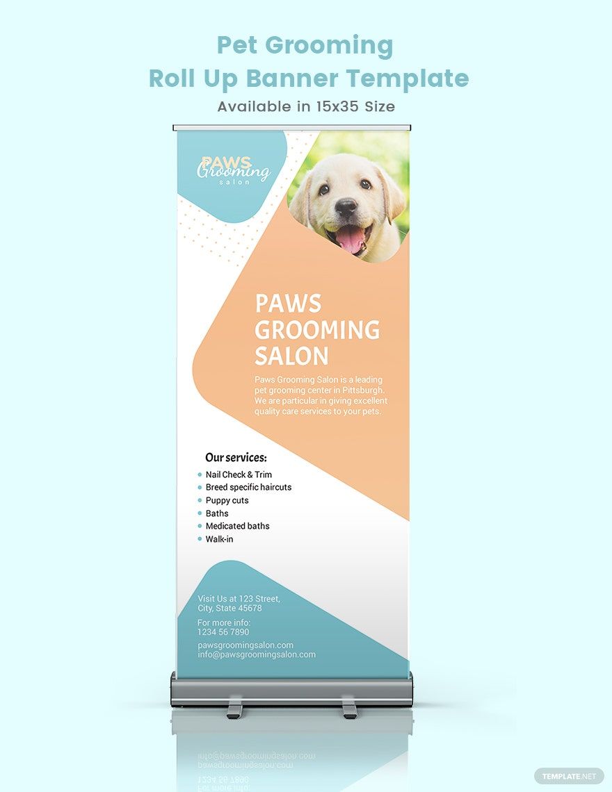
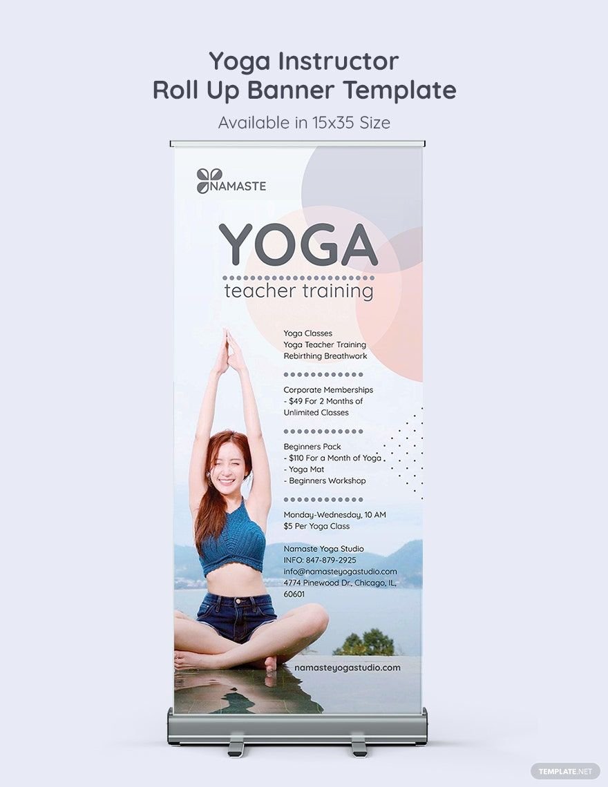
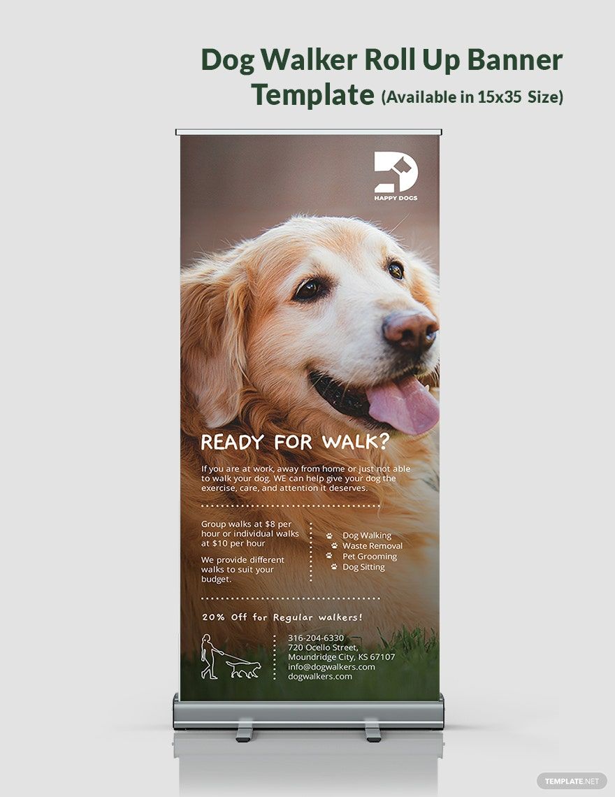
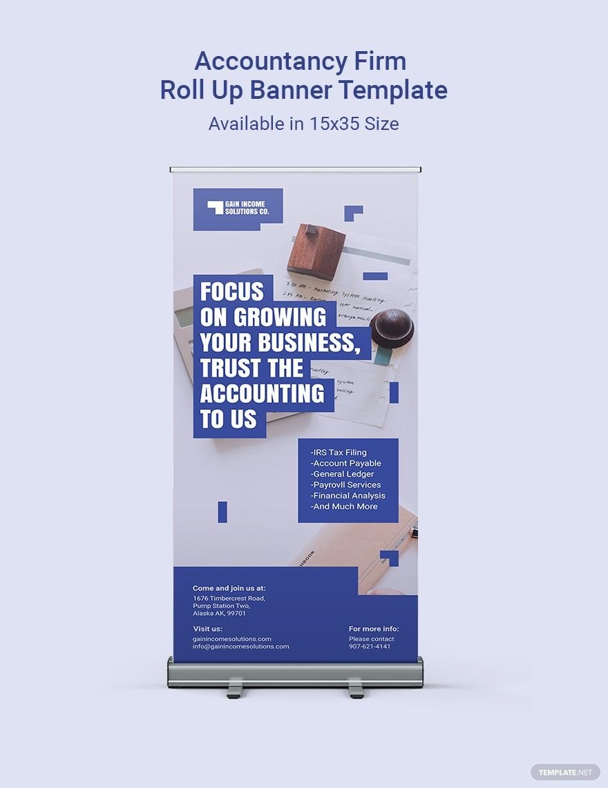
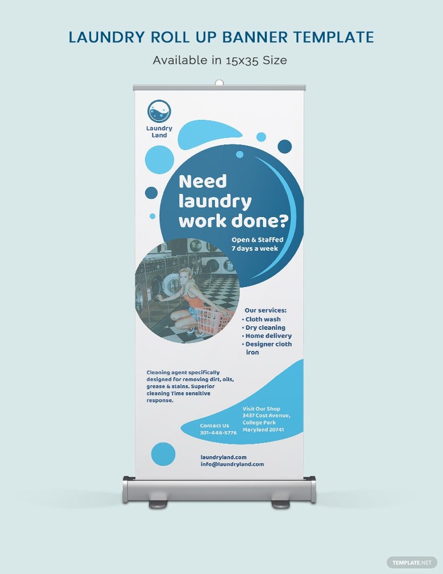
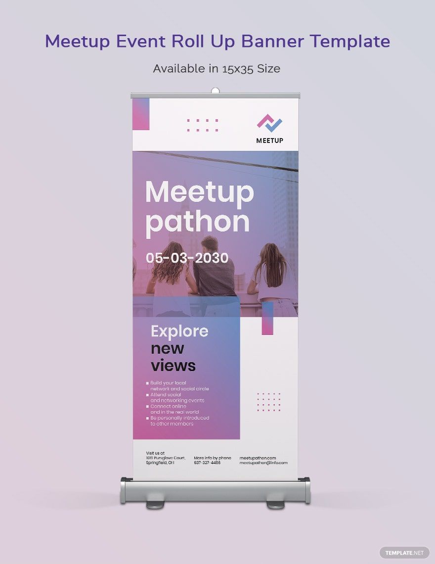
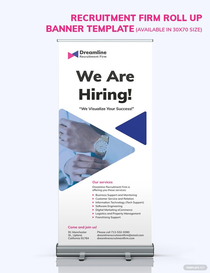
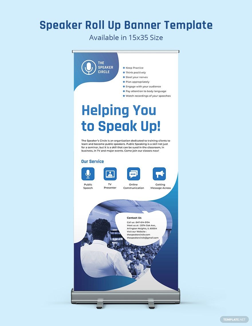
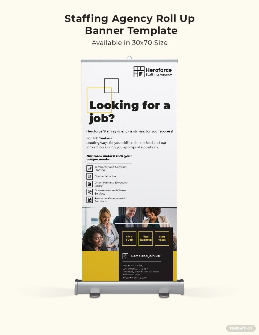
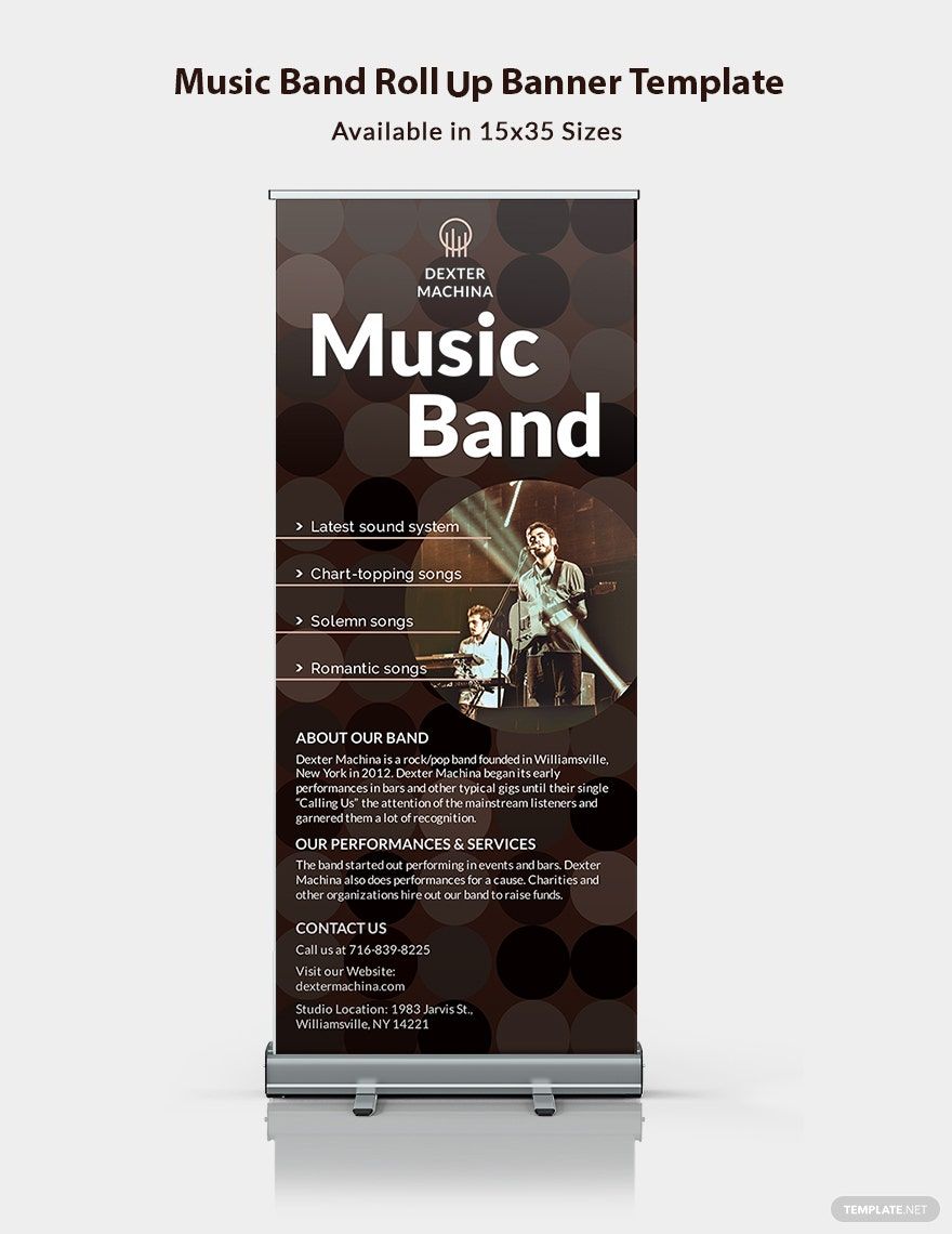
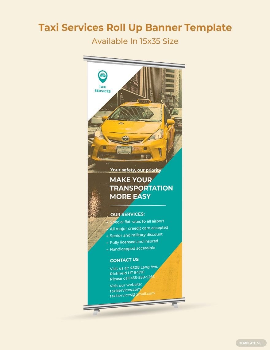
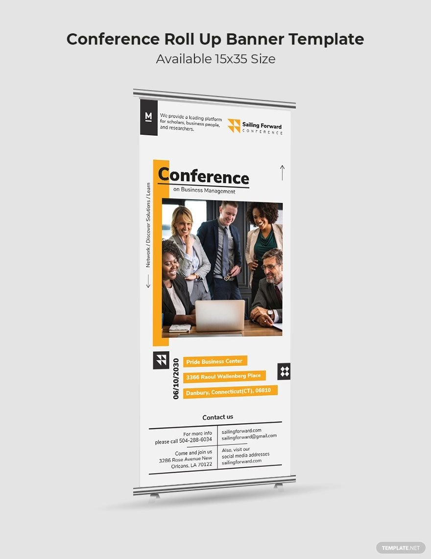
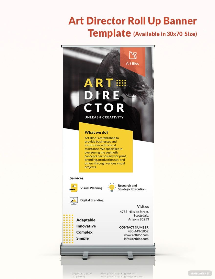
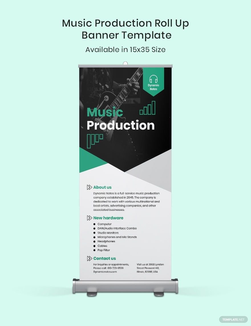
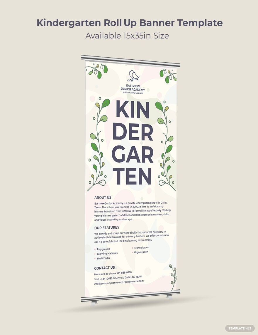
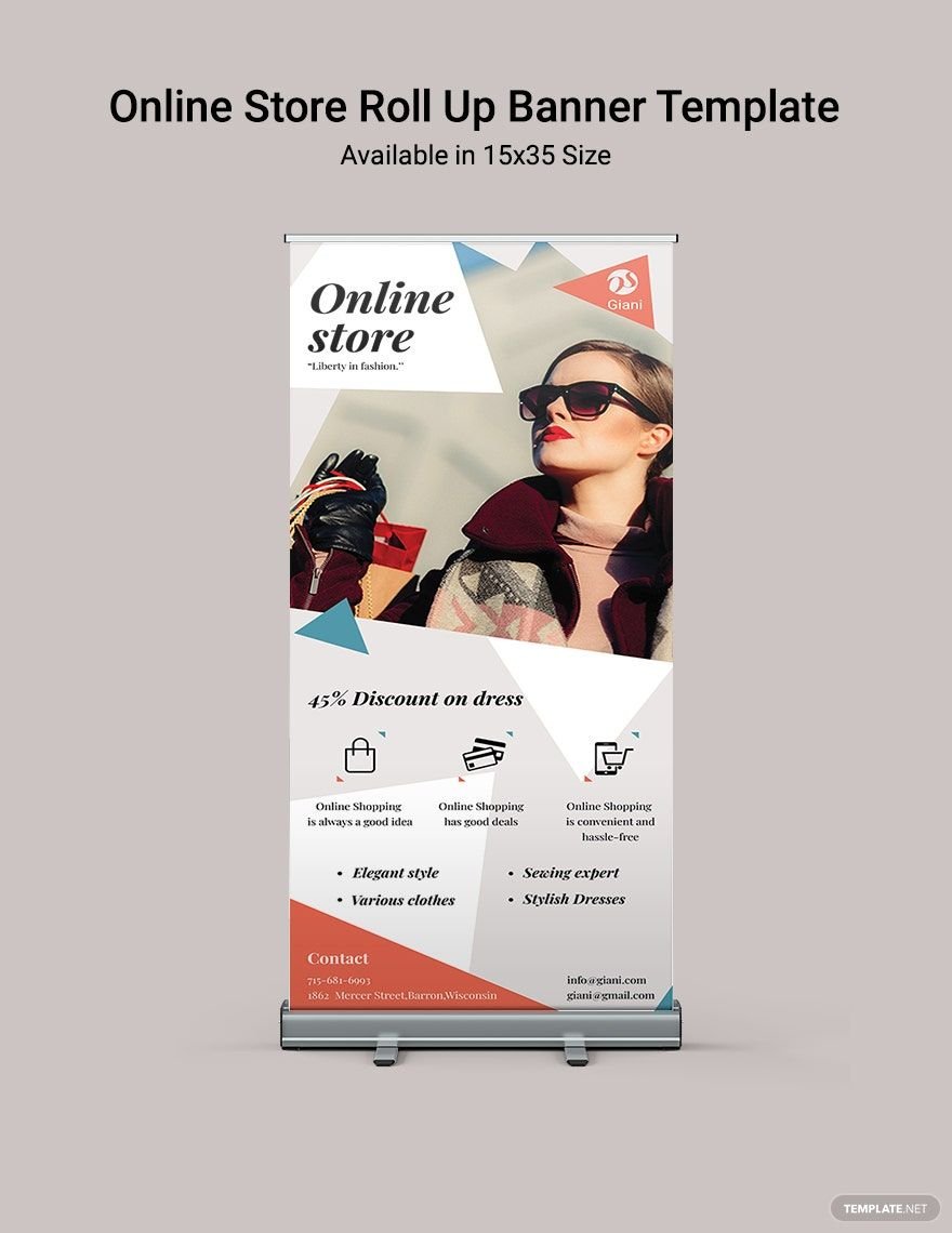
In need of attention-grabbing banner designs for your business promotions or event announcements? Make sure you get your hands on any of our high-quality and ready-made Banner Templates! These free templates are highly downloadable and compatible with Adobe InDesign for ease of access in the designing process. Our banner templates are purposely made to help you effectively promote your business' product and business sales or to efficiently announce the upcoming details of a big event you are organizing. Designed by creative professionals with high regard for quality, you can be assured it meets your design standards. These files are easily editable and printable, which will help you save time. Waste no more time and get these free Banner Templates in Adobe InDesign. What are you waiting for? Download for free today!
How to Create a Banner in InDesign
A banner is an effective way of marketing your business. An advertising banner is often one of the most efficient ways to promote your products and services or just to get individuals to recognize your brand.
Creating a banner in InDesign will engage you in a more creative environment. Since Adobe InDesign is a desktop publishing software application that's great for design work, it became known as one of the most used and popular tools in creating posters, flyers, brochures, and banners. It allows users to use quick design elements, time-saving effects, and support for typography.
This short guide will present useful and easy-to-follow steps for you to create an effective and compelling banner.
1. Determine the Type of Advertising
For you to have a clear vision in coming up with a banner design, it is best to know first what type of advertising you want to promote. For instance, you may do research on what a company banner is being used for, like promoting products and services. Particularly, if you are to create a banner for a real estate company, it should be used for general promotion, sale display, property sale, open house events or social media promotion.
2. Write a Winning Headline
Common mistakes when creating headline and header for banners is injecting too much information. Banners must convey a clear message to different audiences. It would be best to only create a catchy headline with only one or two sentences. Try to observe some major brands that the audience knows well and analyze how they attract people. Successful advertising banner keeps their headlines short, simple, and sweet. According to a science news, the average human being now has an attention span of eight seconds. It simply implies that people do not have much time to read your five-sentence banner. Be concise in your communication. Ask yourself, what do you offer to people? Or, what do you want them to do? As the saying goes, “Construct your headlines as an action and people are more likely to perform that action.”
2. Choose Size and Quantity
Whether it's an indoor, outdoor or a social media banner, don't go overboard with the biggest banner possible, but an optimum sized one that does the job. Choosing the quantity of banner is important as you would like to optimize their use by well-planned displays.
3. Design your Banner Excellently
Banner design is one of the crucial elements when crafting a banner. It grabs people's attention which leads them to focus on the message. You can add some refinements by using banner finishings and hanging accessories. Improve your design until you come up with the best one. These embellishments would be used by both digital and print banners.
4. Use Color Appropriately
Along with designing your banner, consider how you use the color properly. It has to blend well with the message. The banner design does not require you to incorporate a colorful and vibrant one. Utilize contrasting colors that are bold to help you emphasize key details. To illustrate, an online article reveals, using a black background with white, red or yellow text is a great way to make your message stand out. A banner design that utilizes white text on a light blue background gets ignored and fade away. Darker background with a lighter text color is the best combination. Too much color may off-put the audience and can lessen the impact of the banner.
5. Connect With the Audience
A banner is designed to connect and communicate with your audience. Make that medium to connect with them in a special way. In that way, you understand their concerns, needs, and wants.
