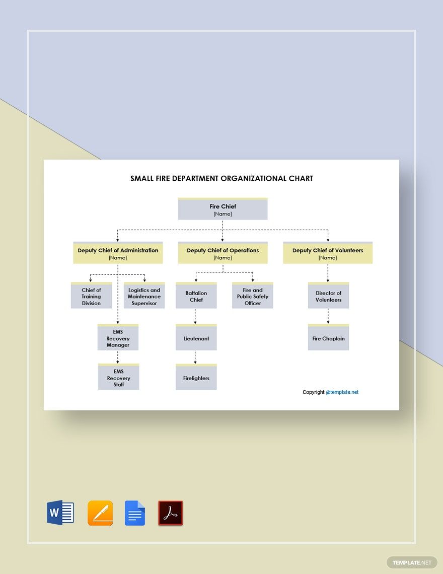
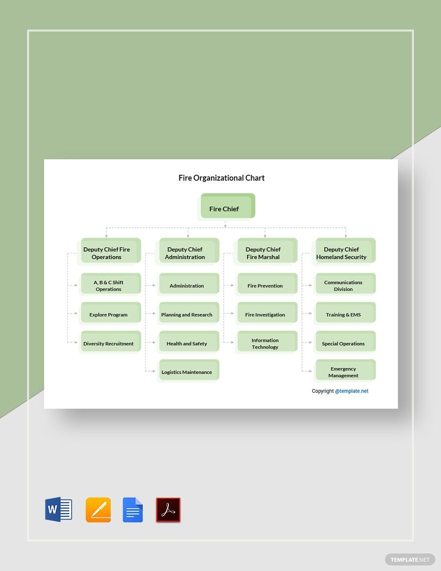
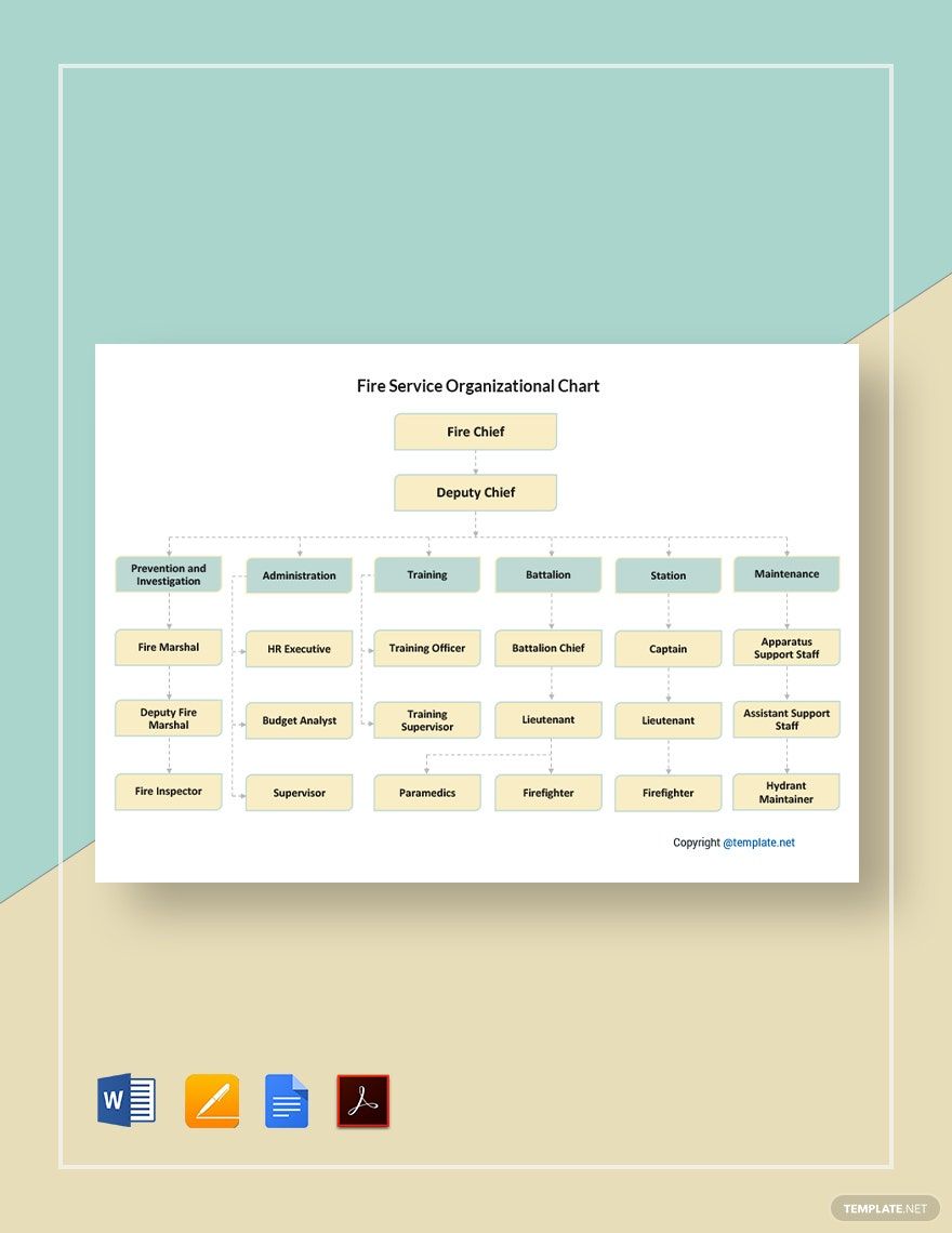
Fire officers save millions of lives every day. Aside from the strength they possess for fire rescue, firefighters also practice office discipline and firefighting structure to be more efficient. Firefighters also need a reliable reference for the chain of command. Our ready-made Fire Organizational Chart Templates in Adobe PDF are perfect for your administrative needs because you can just simply add the names and positions of your officers in our customizable templates. These professionally designed products are high-quality and 100% editable. Plus, these are printable and available in different sizes. Give clarity to all the fire protection officers with who to report. Download now and get the convenience you deserve!
Fire Organizational Chart Templates in PDF
Explore professionally designed fire organizational chart templates in Adobe PDF that are free, printable, and customizable. Download now!

Get Access to All Chart Templates

How to Create a Fire Organizational Chart in Adobe PDF
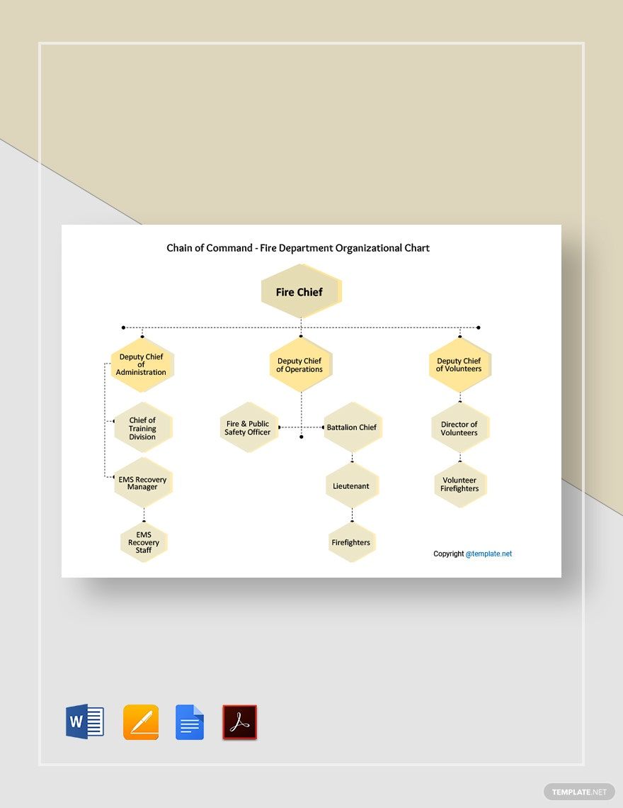
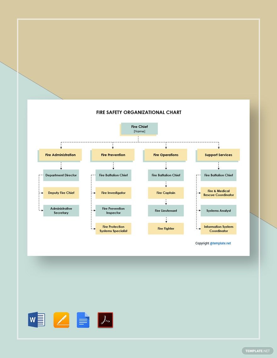
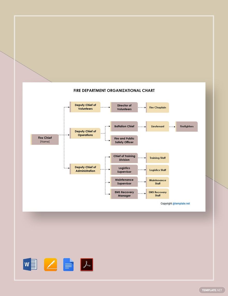
An organizational chart is a diagram that features the roles and responsibilities of employees in an entity, according to Investopedia. Therefore, a Fire Organizational Chart conveys the relationships between the officers in a fire station. This staffing chart projects the essential roles in the training department, maintenance department, operations department, volunteer fire department, and administration department hierarchy. This type of infographic can either present these departments individually or as a whole organization.
Capture your personnel's attention by finessing your organizational chart with the right touch. Here are the tips on how to create a fire organizational chart in Adobe PDF.
1. Choose the Right Size
Your newly hired firefighters will find your chart confusing when you contract each department as one. Divide your table according to department or division necessarily. Of course, prioritize showing your officers with significant positions along with their assistants because they will be the first to contact in case of an emergency and urgency with an employee.
2. Choose the Right Shapes and Colors for Each Level
Your chart becomes easier to understand when it has consistent colors and shapes for each organizational level. Put the same colors and shapes for superiors, and other identical colors and shapes for each level after.
3. Add More Staff Details
Include details such as contact information and email address in case someone in your department needs assistance.
4. Accentuate Assistant When Needed
Office superiors can be very busy and often unavailable. Unattended calls are inevitable for these positions. That is why you must include assistants in sidebars since these people have direct contact with your superiors.
5. Give Consideration to Distance
Ensure you use the right spacing for each shape for a more professional approach. Maintaining proper distance makes your chart neat and understandable.
Frequently Asked Questions
Are the fire department organizational structure and fire organizational chart the same?
They are often interchangeable, but they aren’t the same. The organizational structure focuses narrowly on the function, purpose, and responsibilities of each role. The organizational chart shows titles, names, and pertinent details along with shapes and colors.
What are the different types of fire organizational charts?
The following are the different types of fire organizational charts:
1. Functional Organizational Chart Hierarchy
2. Fire Divisional Organizational Chart
3. Fire Flat Organizational Chart
4. Fire Matrix Organizational Chart
What is a fire department organizational structure?
A fire department organizational structure provides the hierarchy in a company that outlines the roles and responsibilities of the employees. This gives clarity for firefighters to know who they should report to. This builds improves efficiency and productivity.
What is a fire functional organizational chart?
A fire functional organizational chart shows only the essential positions of an organization. It then branches down to the different divisions and departments. With each division, higher levels branch to senior managers then mid-managers, which is then followed by the next positions in the structure. This type uses a pyramid shape.
What are the purposes of a fire organizational chart?
1. It gives a more unobstructed review of the structure and hierarchy.
2. It gives employees direct access to their superior’s contact information and lets them easily report to leaders.
3. It reminds everyone of their roles and responsibilities in the organization.
4. Everyone can access other employees through the contact information provided in the chart.
5. It helps management keep track of their human resources. HR leaders can easily find a replacement or allocate more staff when needed.
6. Staff can easily spot promotion opportunities.
