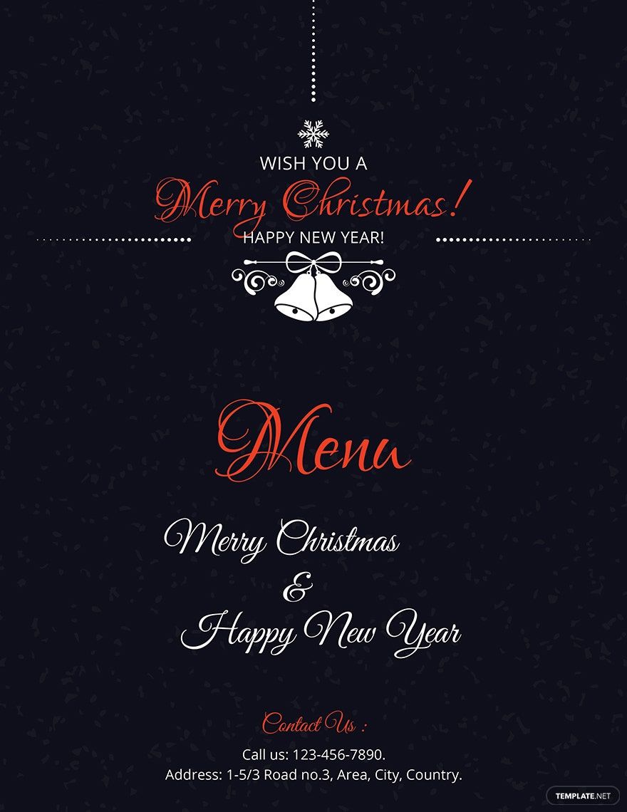
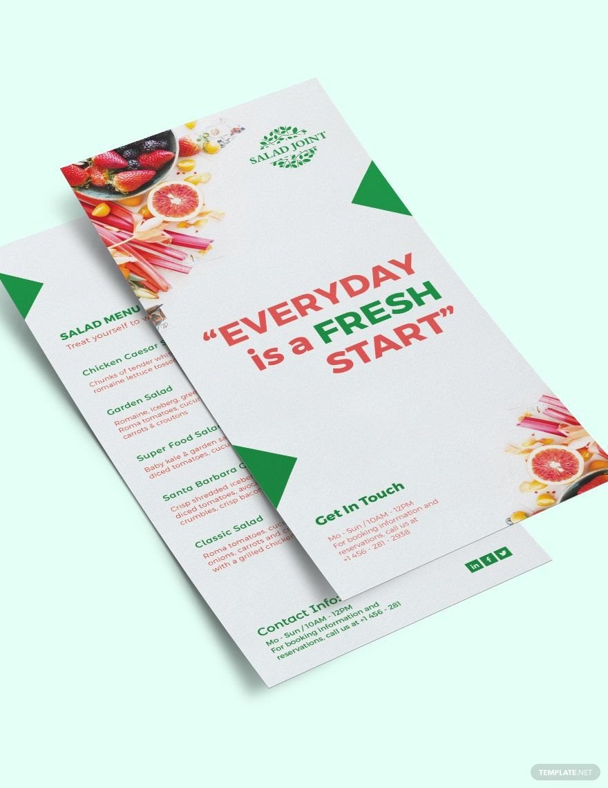
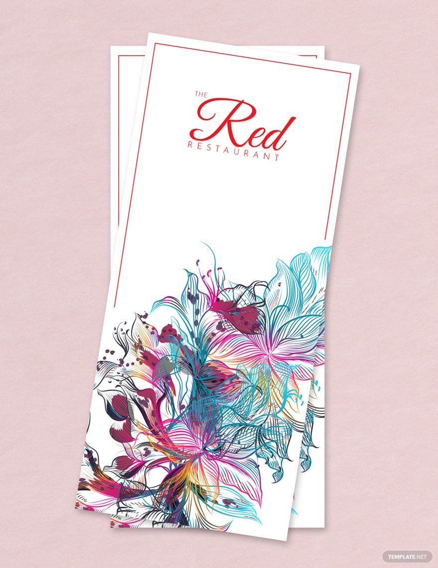
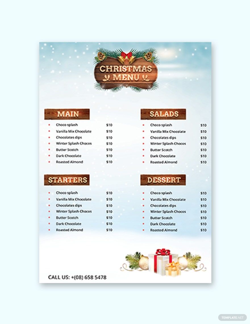
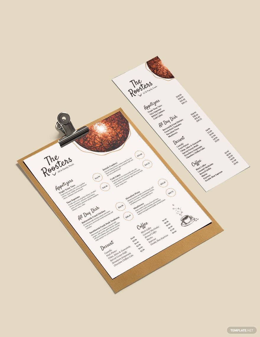
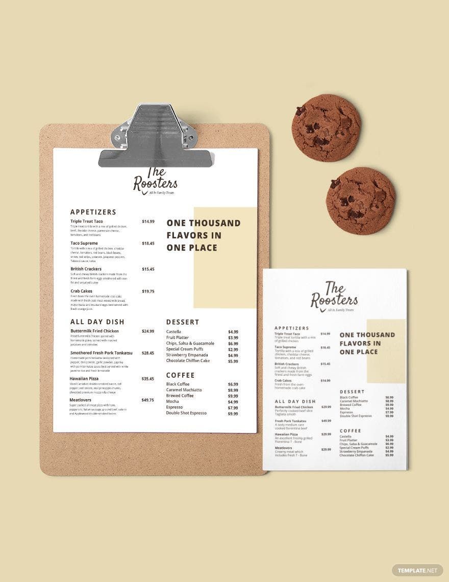
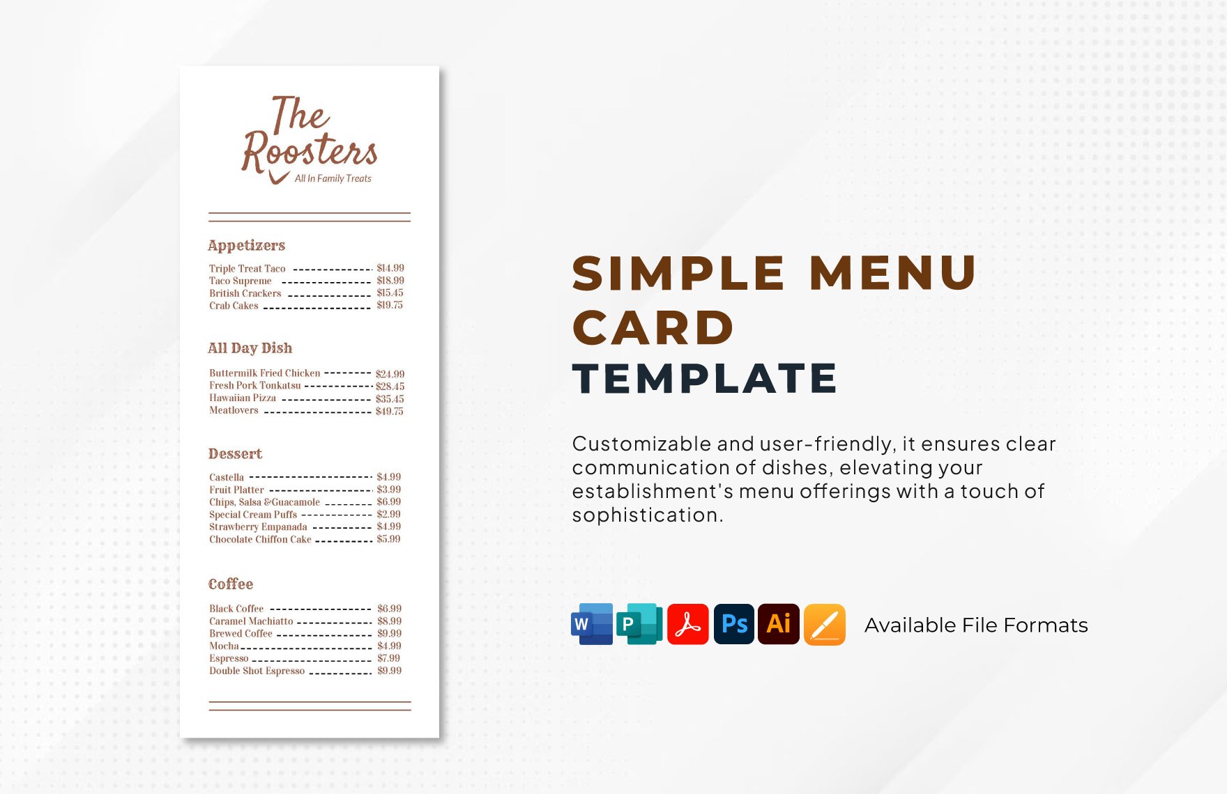
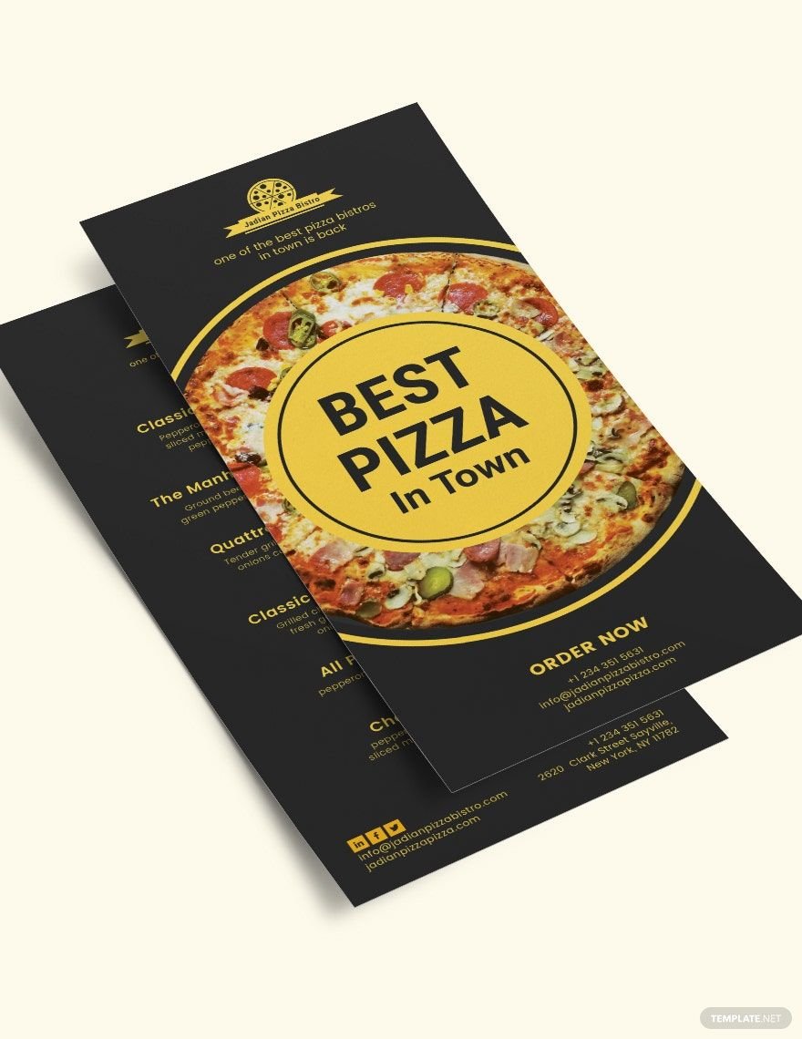
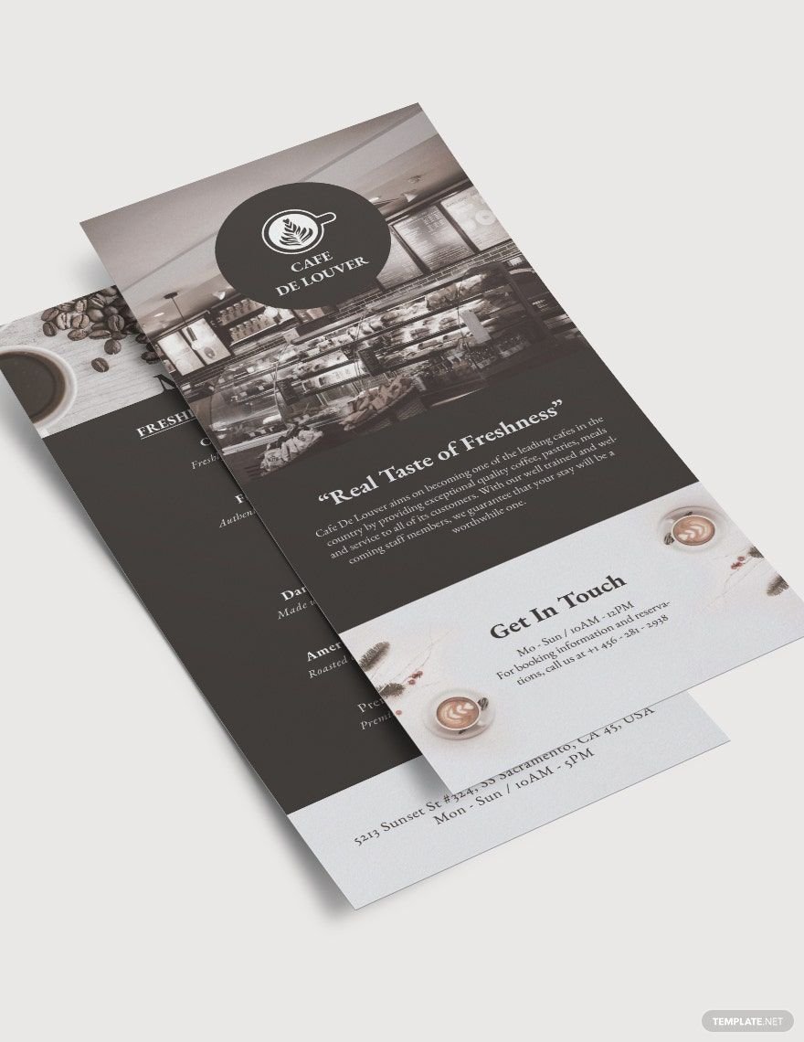
There's a significant contributing factor to how you present your particular restaurant's unique cuisine through your menu cards. Before customers get to taste them, they get to know them first through the menu you present. So make sure you can introduce and feature your appetizing offerings well! Don't fret too much as long as you grab one of our Free Ready-Made Menu in Pages! Thanks to our creative professionals, all premade elements are highly original, royalty-free, and high quality so you can feature your menu with crisp details and vivid colors. On the lookout for another file format you can work on? Here are our Illustrator, Word, PSD, and Publisher versions that are all instantly editable! Seize our premium products now while free!
How to Make a Menu Card in Apple Pages
It's a no-blame how restaurant-goers can be so fussy in checking out restaurants and looking through the menu cards. If you don't know where to begin in showcasing your dishes appropriately in your menu, here are comprehensive guidelines in making a customer-friendly and sales-oriented one.
1. First, List
Before you get to layout your menu card, it's highly advisable to make sure you gather first all your restaurant offerings from all sorts of food and beverages. This is so you can never have to spend a lot of time later on in designing after you've gathered all the pertaining details.
2. Sectionize your Offerings
After you have gathered and particularized your food and beverage offerings, it's now time to categorize them. This is to provide your customers with the ease of menu card browsing. You help them spend less time going through your food menu. Categorization of your menu also makes it appear you have a variety of selections.
3. Add Crisp Imagery
Together with the names of the dishes, entail each with brief descriptive labels on your restaurant menu card. These descriptions can help you attract customers in leading to try and get your recipes. Make it as vivid as possible. There are lots of dictionaries on the internet, mainly for food description; you can browse so you can exactly get the most appropriate and menu-worthy, mouth-watering terminologies. You can follow a specific pattern in sounding your description fancy. You can start by stating its preparation method, describe the appearance and texture, then taste.
4. Design according to Brand
Design your restaurant menu card with the pertaining elements that your unique restaurant's branding has. Correlate the color scheme, typographies, and other graphical elements. It would also be better if you indicate your logo and restaurant tagline, if you have, on your menu. This can be imprinted anywhere as long as it can be featured well, depending on your particular menu layout preferences. Ideally, the logo with its tagline at the top-most, before the listing of the dishes. Nevertheless, make sure the design won't overwhelm for the rest of your restaurant card menu content. Observe accordingly balance.
5. Entail Costs
Either it's yet a small restaurant or already a major one, don't hesitate to include the corresponding prices of your dishes in the restaurant menu. Make sure the prices are tailored precisely to how much it costs. Though sometimes this can affect the purchasing decisions of the customers, it's better than to trick them and make them feel fooled. Imprint it clearly and correctly. Moreso, any indications of misspelled pricing can lose the interest of clientele and might lead to a poor brand image for your food business.
According to a study from Cornell University, costumers tend to spend more and less conscious when they see a menu with word out prices. Instead of 10$, imprint it to ten dollars. Also, one common strategy used by many restaurateurs is by not entailing the currency at all, from 10$, indicate only 10. In this method, it doesn't point out or emphasizes that the customer is spending his or her bucks.
