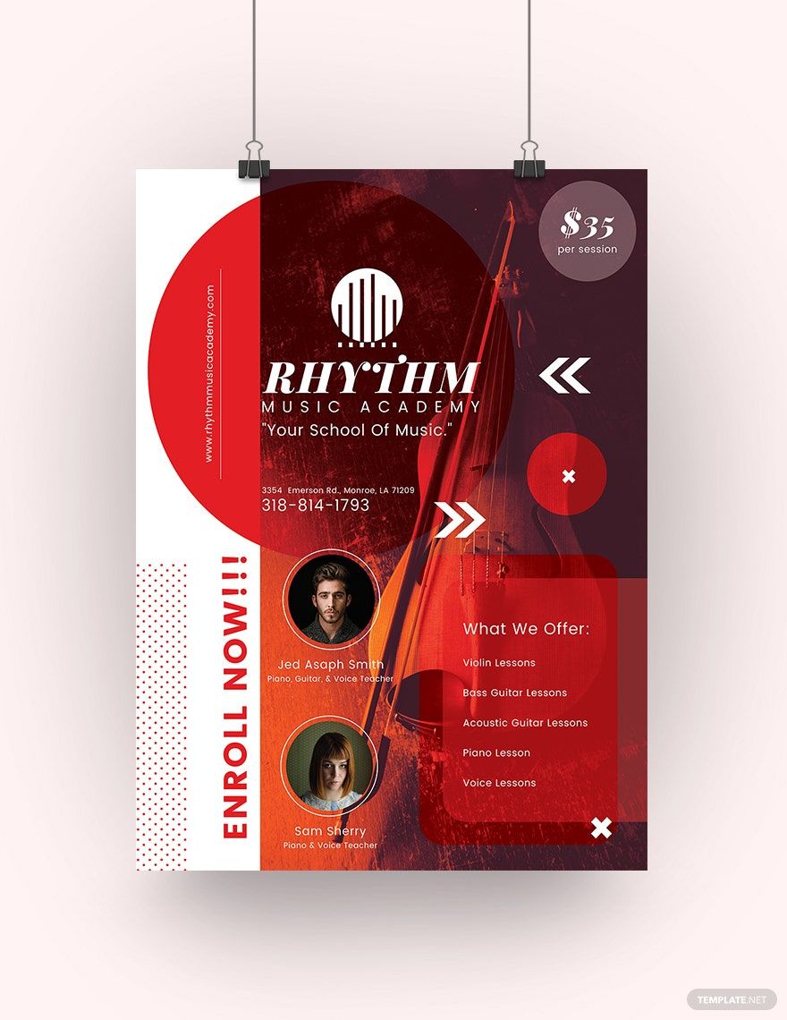
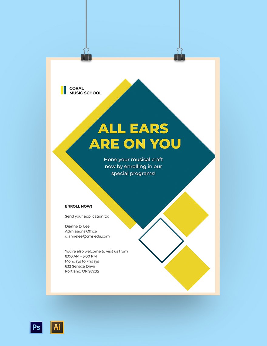
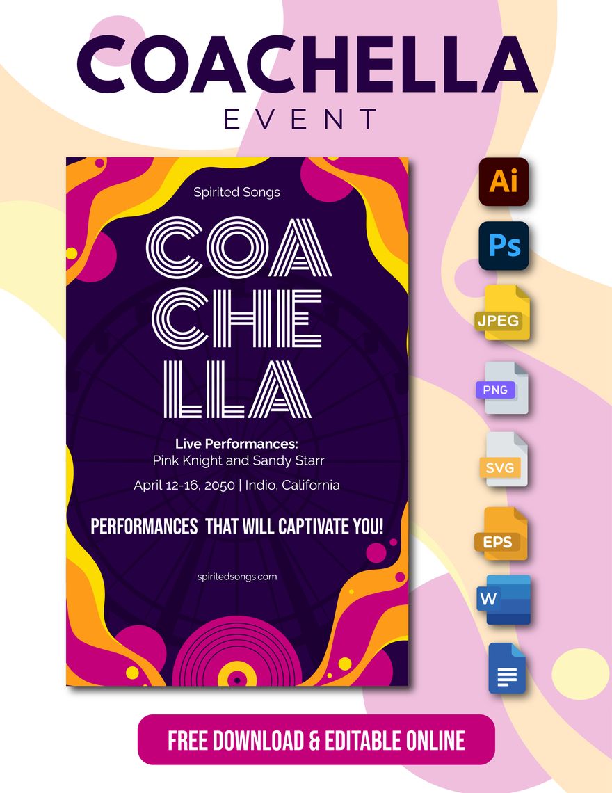
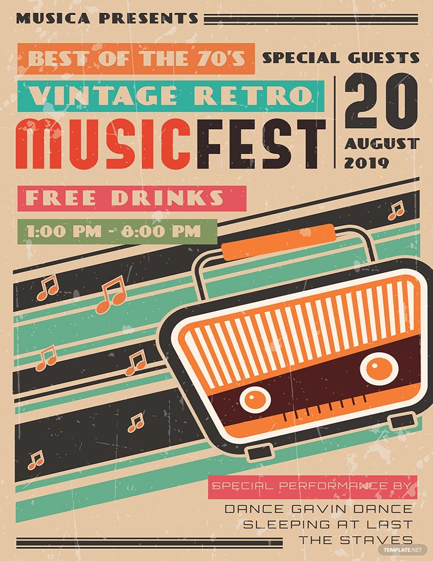
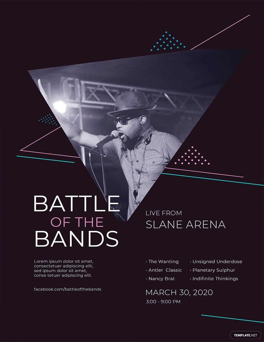
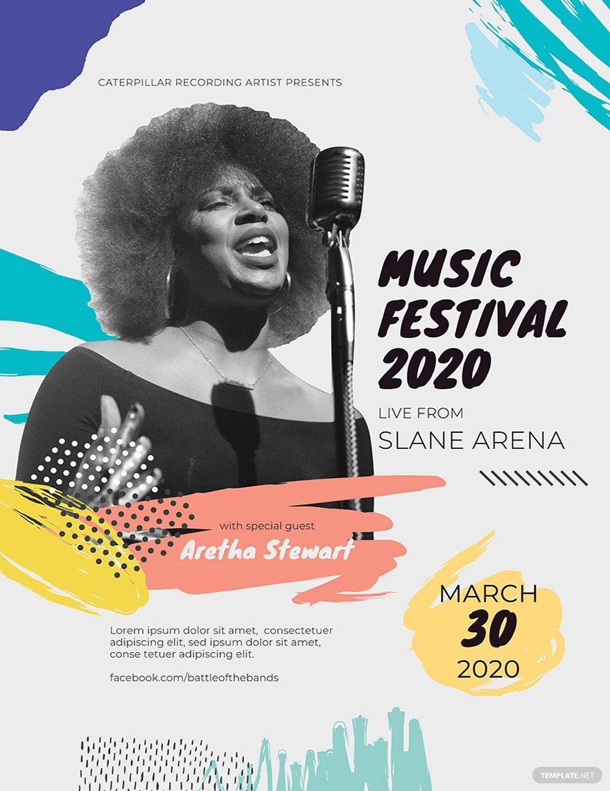
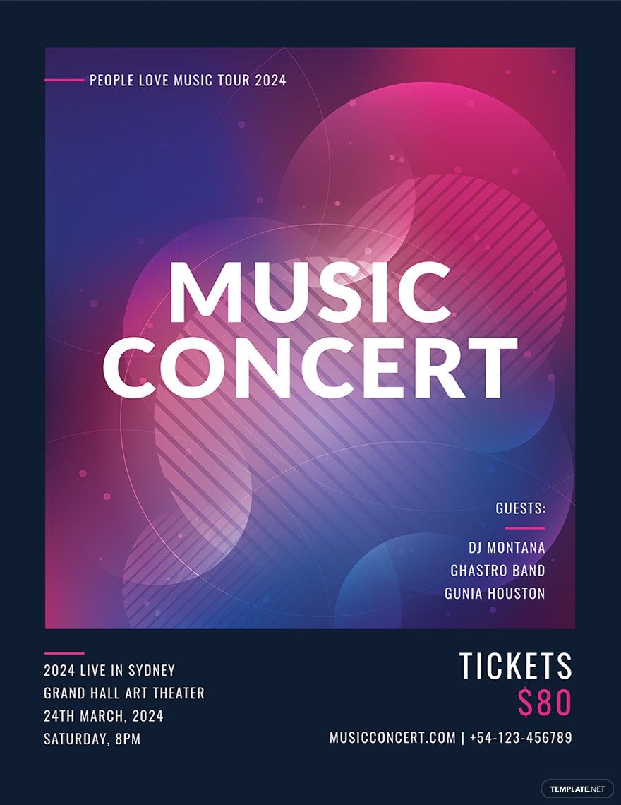
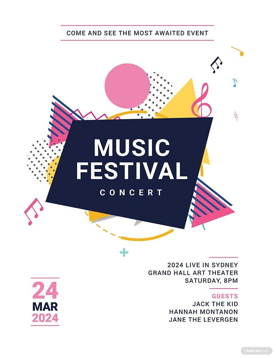
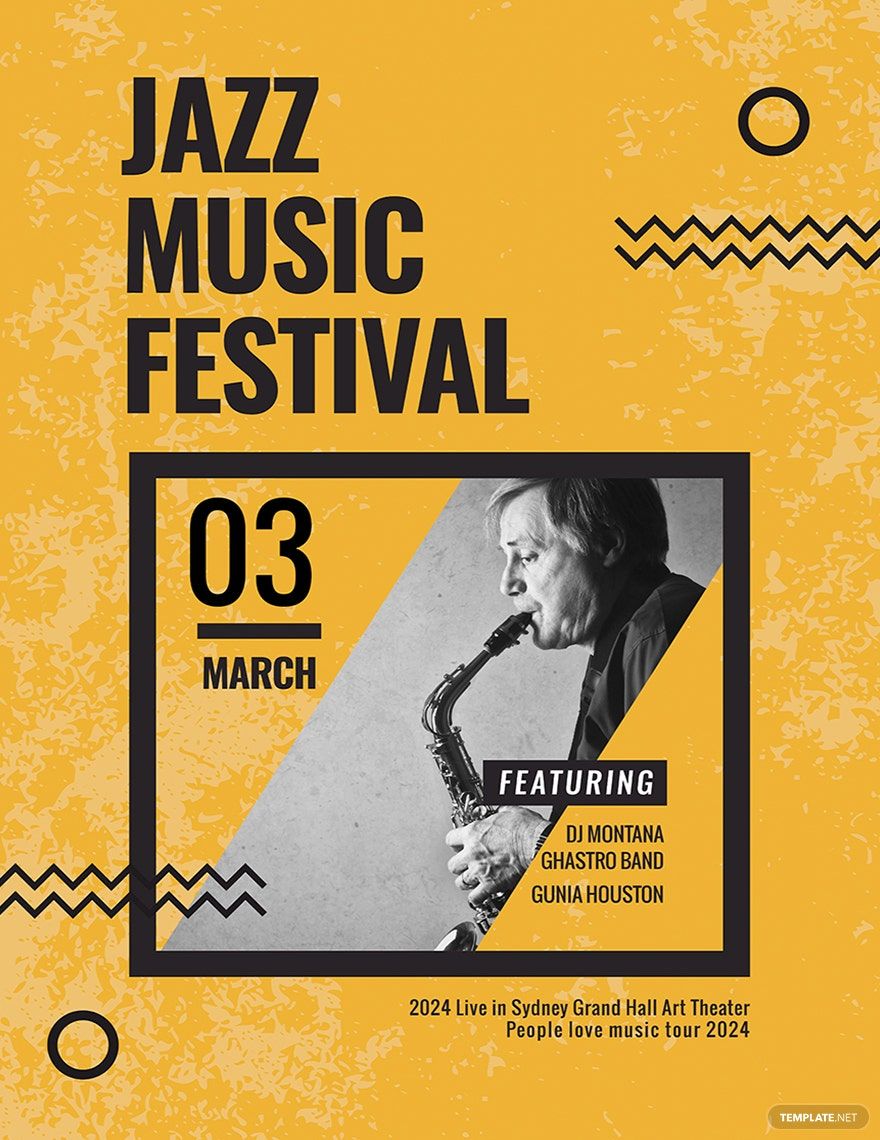
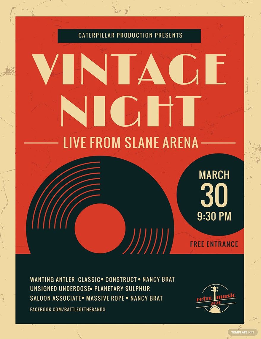
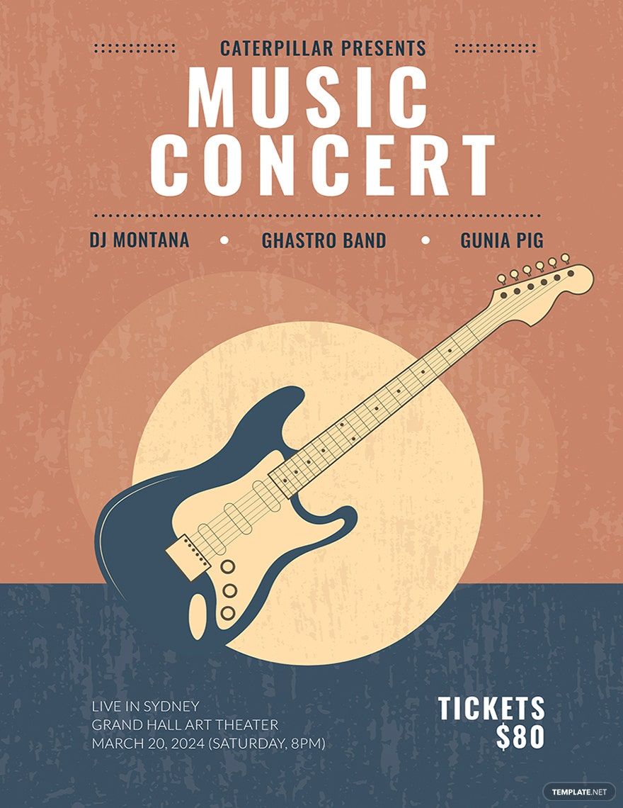
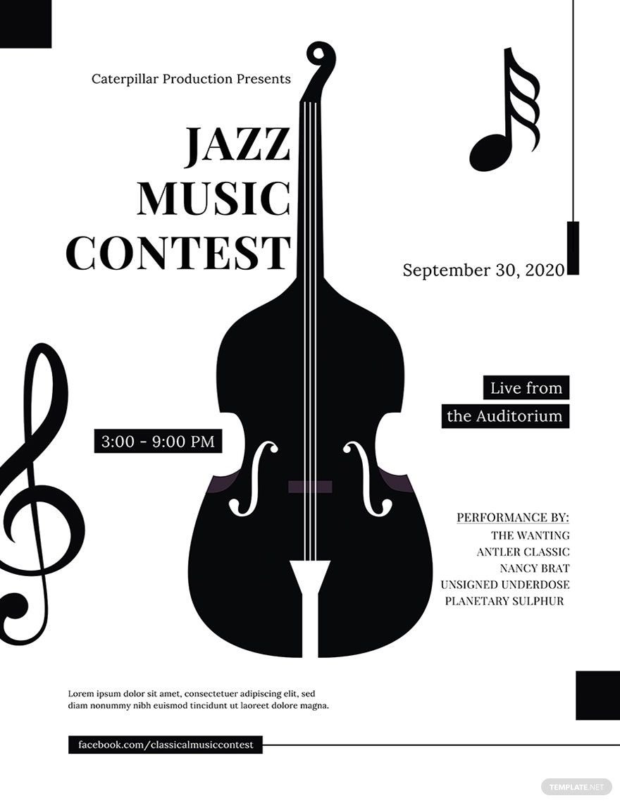
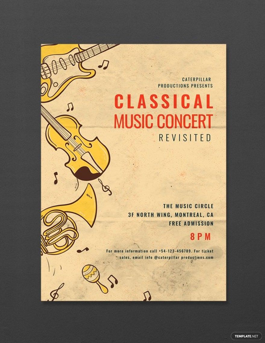
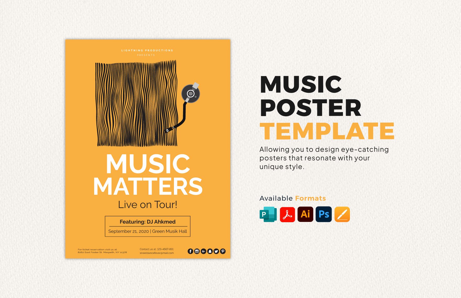
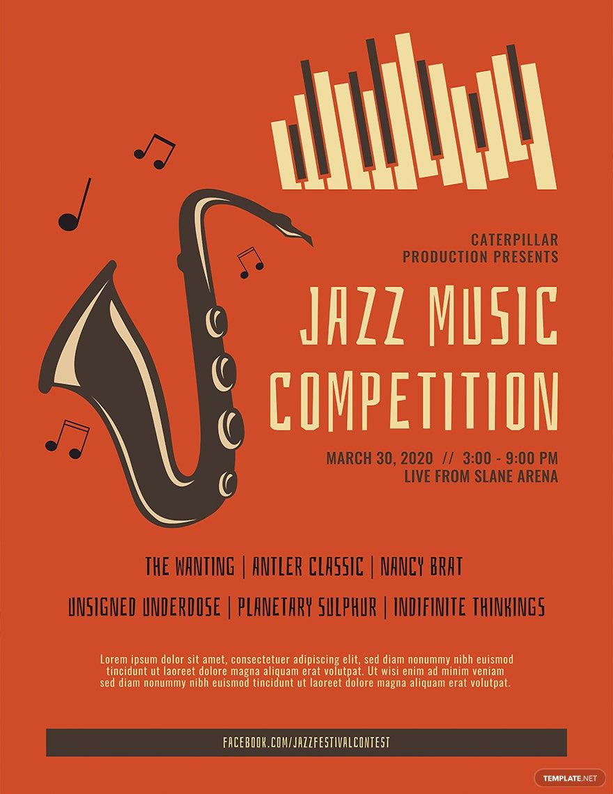
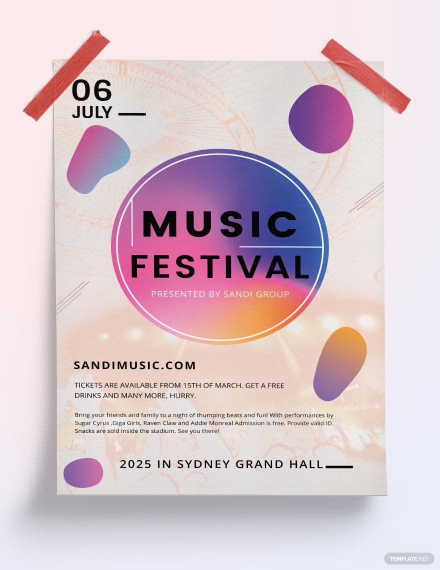
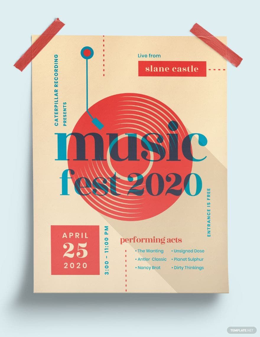
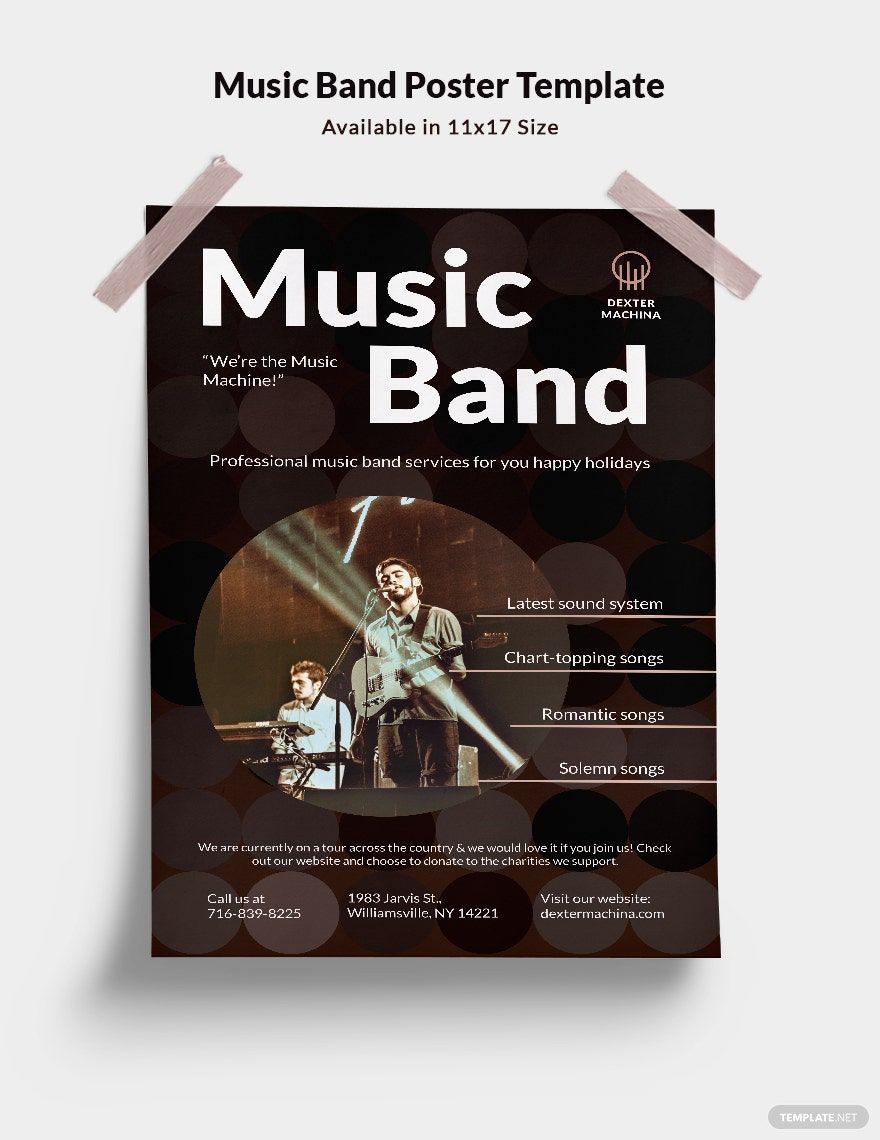
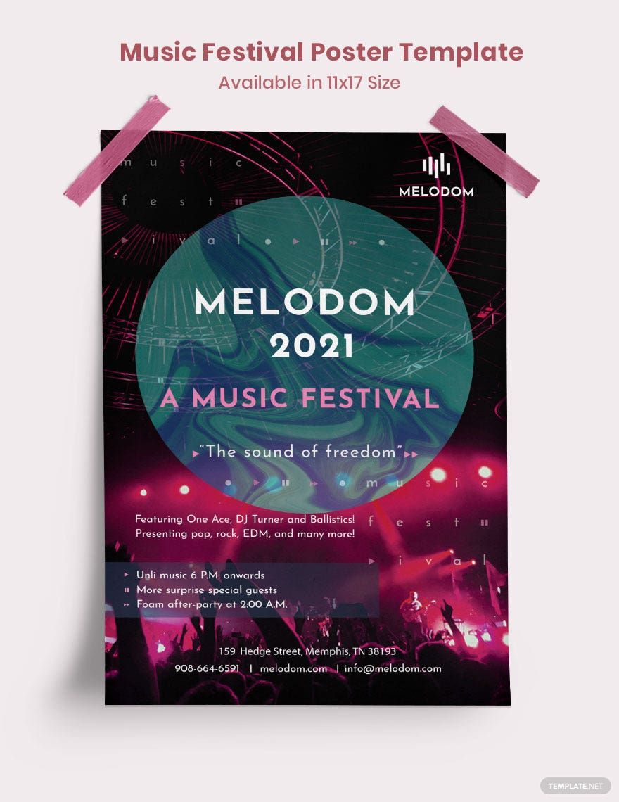
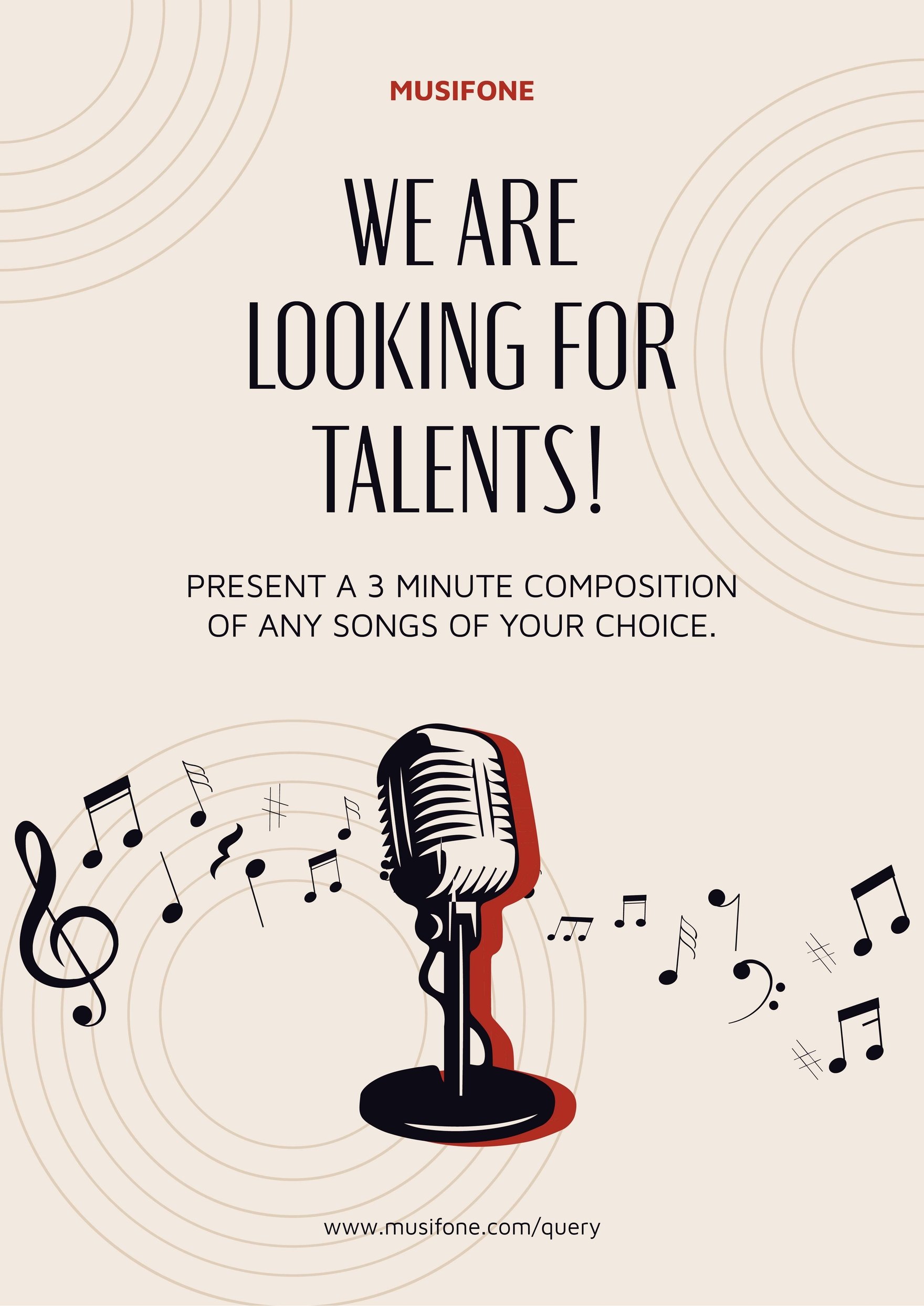
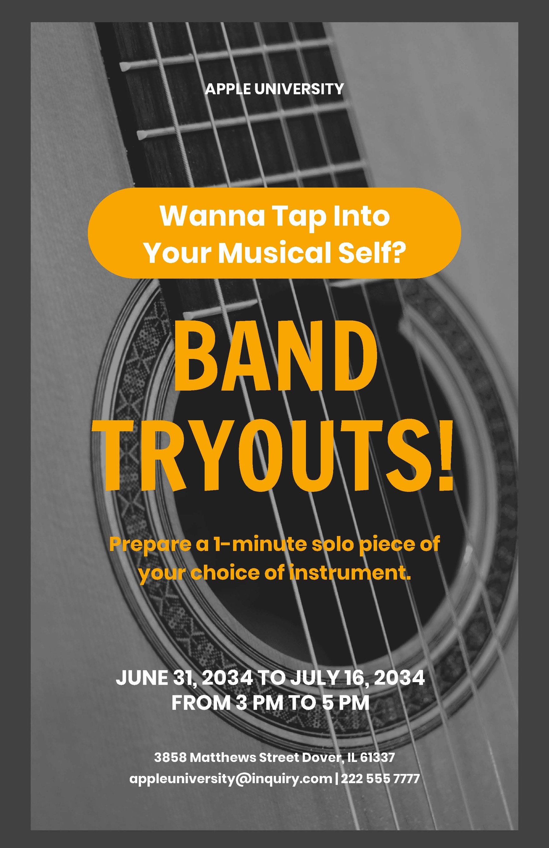
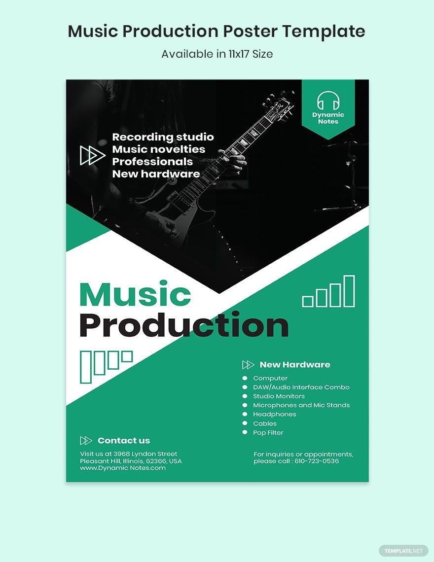
Music is an art that is made of different beats and rhythm that will make everyone either bob their heads or get sentimental with its dramatic melody. People listen to music as a getaway from something they are feeling or for inspiration. One way of enjoying music is by attending music festivals. If by chance you are about to promote your music festival but have difficulties in promoting, then you can download one of our array of Ready-Made Music Posters in PSD. Post the most eye-catching poster ever by customizing our easily editable and 100% customizable template in Adobe Photoshop. Download our template now while it's still available!
How to Create a Music Poster in Adobe Photoshop
Music festivals have become one of the most popular events nowadays. According to an article from Eventbrite, there are 32 million people in the US that have at least attended a music festival every year. That means the with these tons of music events that are emerging today, there will be a tight competition in each music events. Hence, event organizers come up with different modern marketing strategies to gather more audience.
Among the marketing strategies they developed is by producing a music poster. It sounds difficult to create but don't worry because we got it covered with our tips in making a music poster.
1. Make it Readable
One of the key components to draw the attention of the people to read your event poster is to make the texts readable even in a distance. The details written in your poster must be in the right font size and font. Bear in mind that not all people will take the time to look at your poster. The texts in the poster must be readable enough to make them glance at the poster.
2.Play with the Color Scheme
Aside from the texts written in the poster, color elements are also an important thing. It is a good thing to experiment with the color palette and try a different color scheme. It is up to you if you will use a high contrast color elements or stick with the monotone color palette such as pale and cool gradients. Think about the music genre of your event before choosing a color. Pair the background color of your poster on the music genre of your event.
3. Decide the Size and Location
Design is not only the essential factor you need to consider. The poster size is also the main thing. The size of your poster will affect the amount of design and the size of your texts in the poster. Ask yourself where you plan to locate your poster before choosing the poster size. Make sure that your poster will be noticeable once you post it in your chosen area. You can also post your poster on social media.
4. Prioritize the Graphic Design
Most people prefer visual than texts. That is why you need to prioritize the visual of your poster. Whether your visual is an illustration, text, or a photo, it must be dominant in your poster. Visualization is always the key to pique the interest of the people and make them read your poster. When you start designing your poster, make sure that the images and the typography of the poster are in the right contrast to make everything in balance and creative.
5. Never Forget the Call to Action
After the visual elements of your music poster, people will also take note of the headlines. Since the objectives of a poster are to inform or advertise to people about your music event, a 'Call to Action' is the solution. CTA's gives the people the feeling of want. It motivates the people to engage and participate in your music event. However, CTA's will not be effective if you don't use the proper phrases to convince them. To achieve that, put yourself in the shoes of the people and ask yourself 'what phrases will convince you to participate'? so that you will come up with an effective CTA.