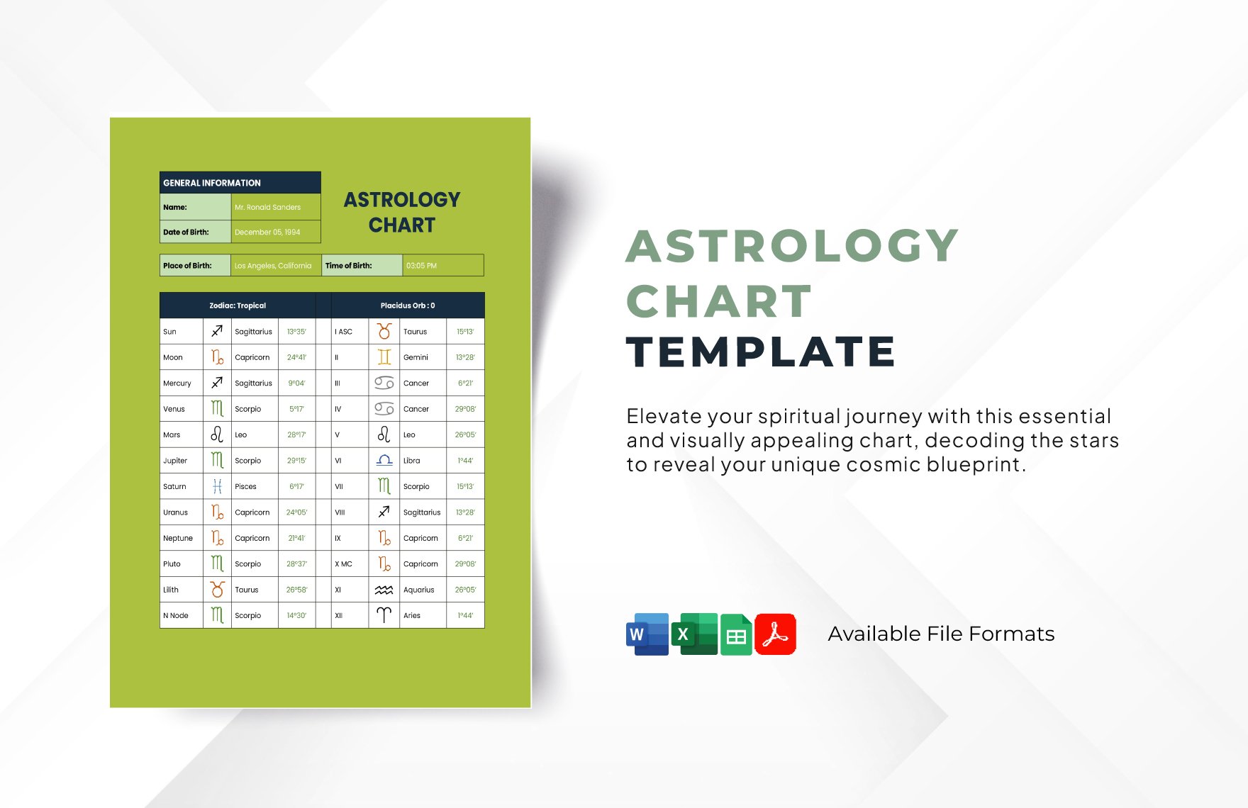
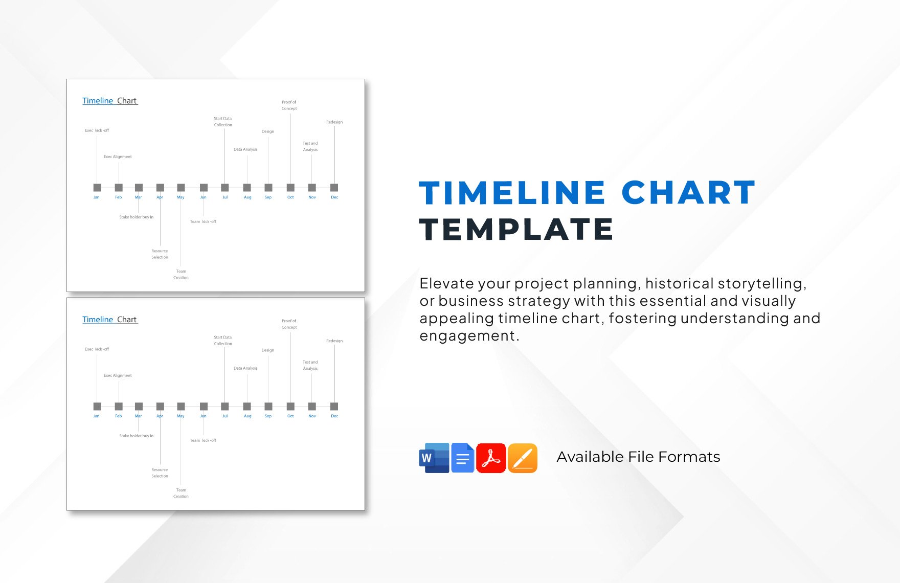
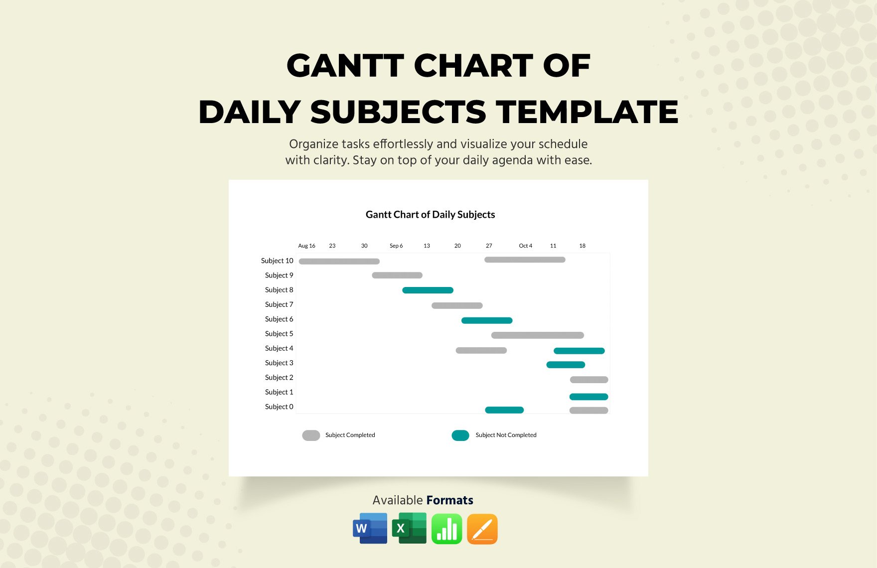
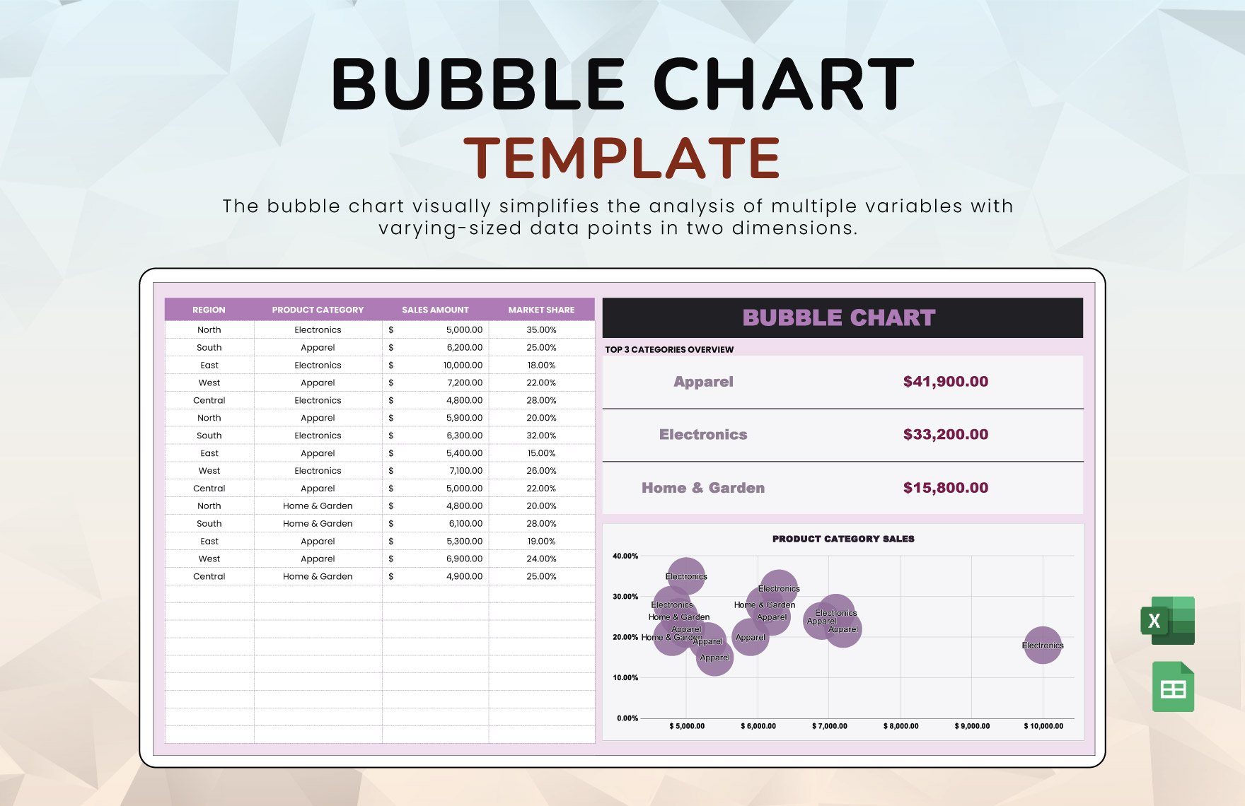
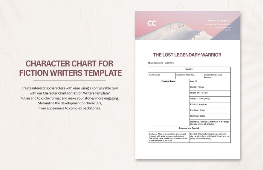
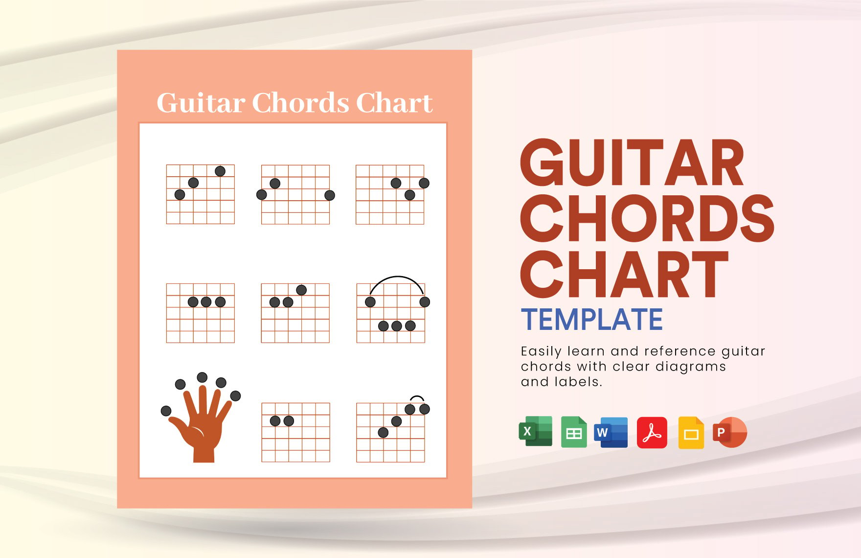
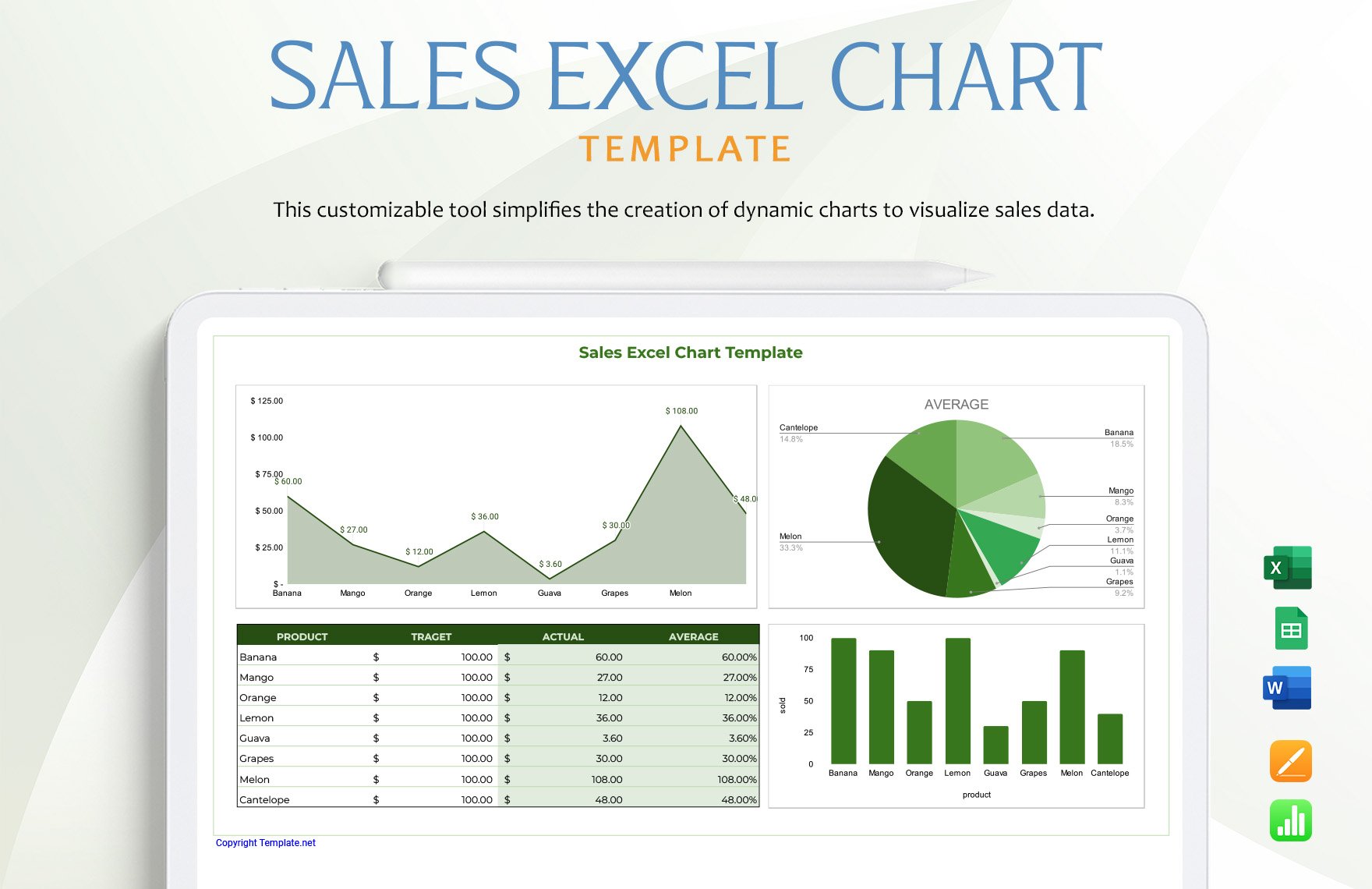
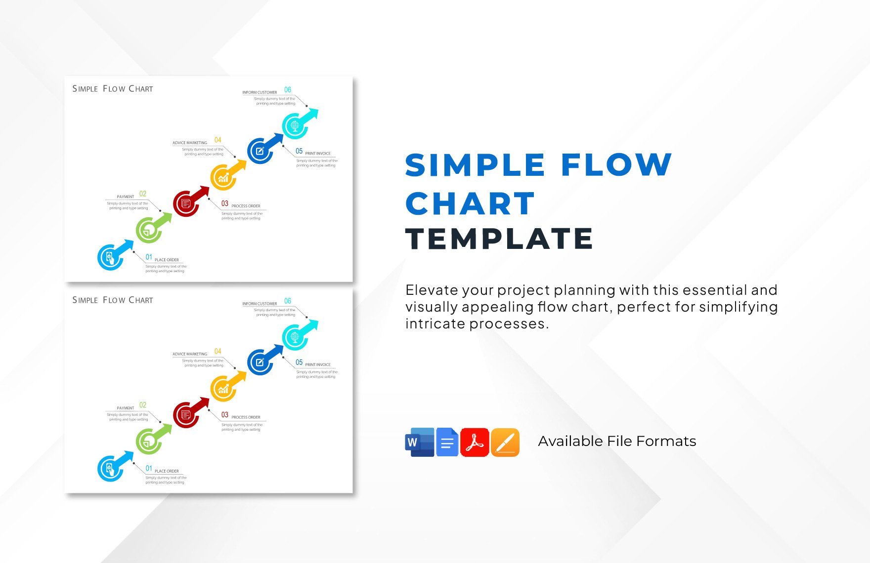
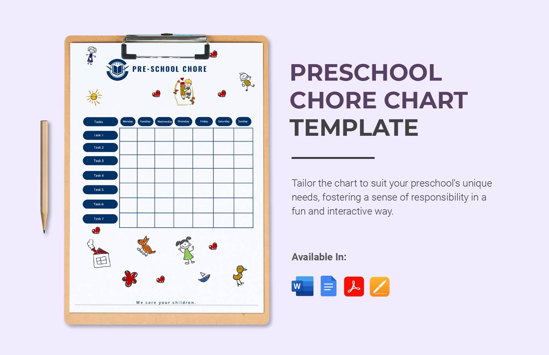
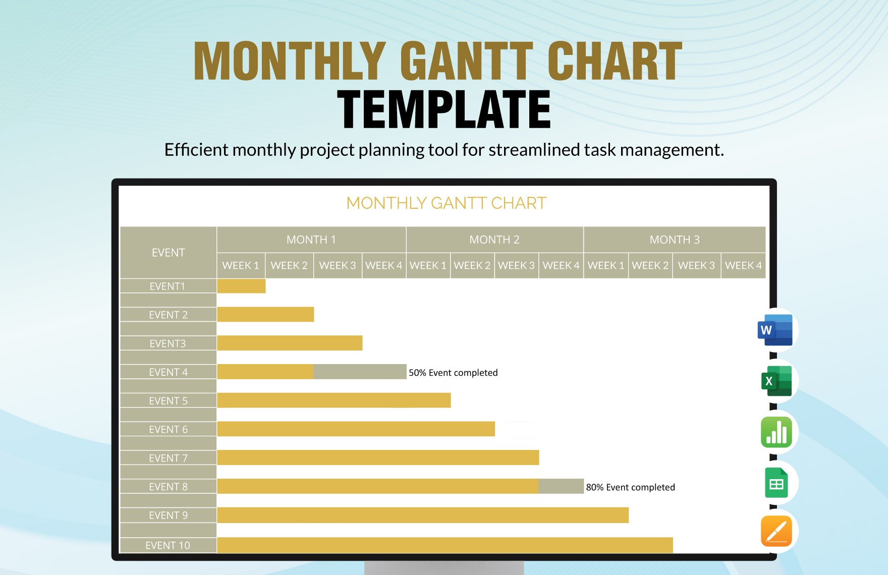
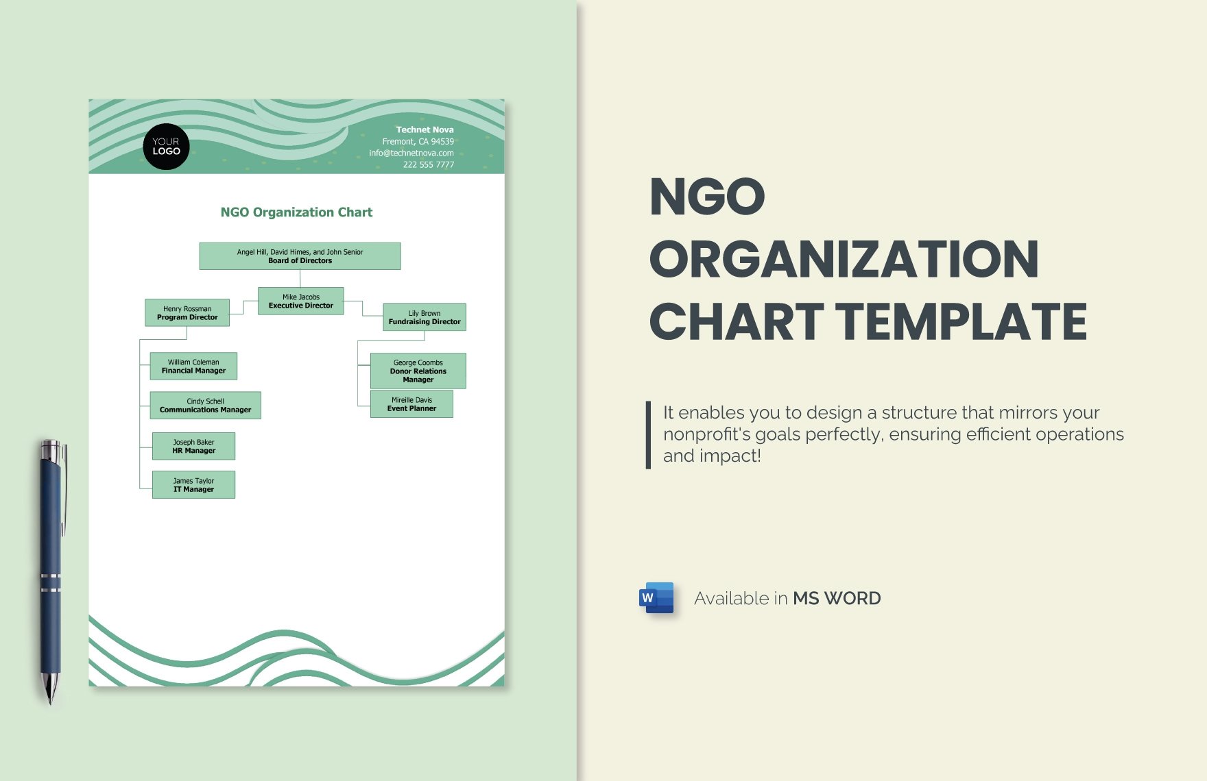
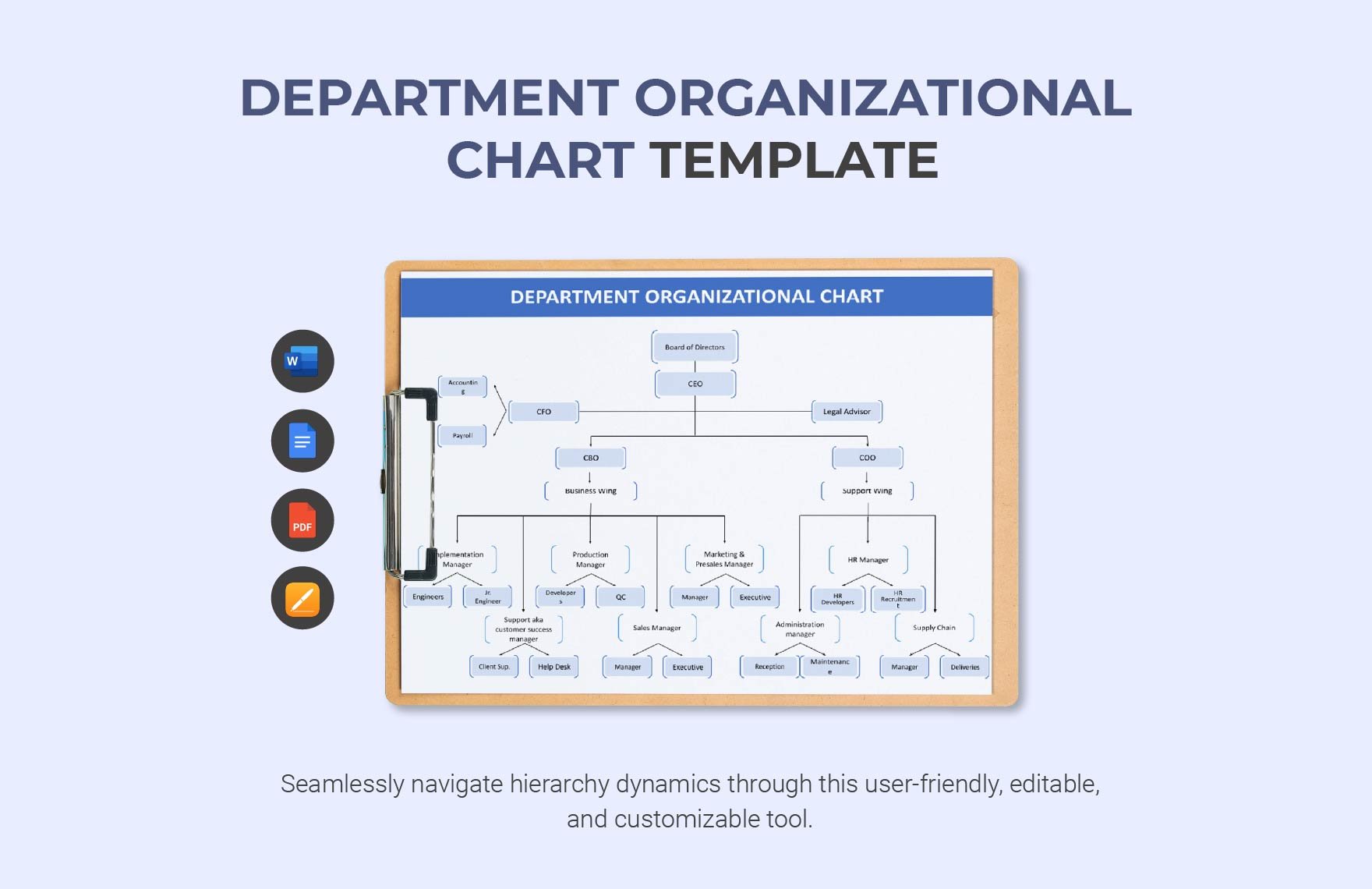
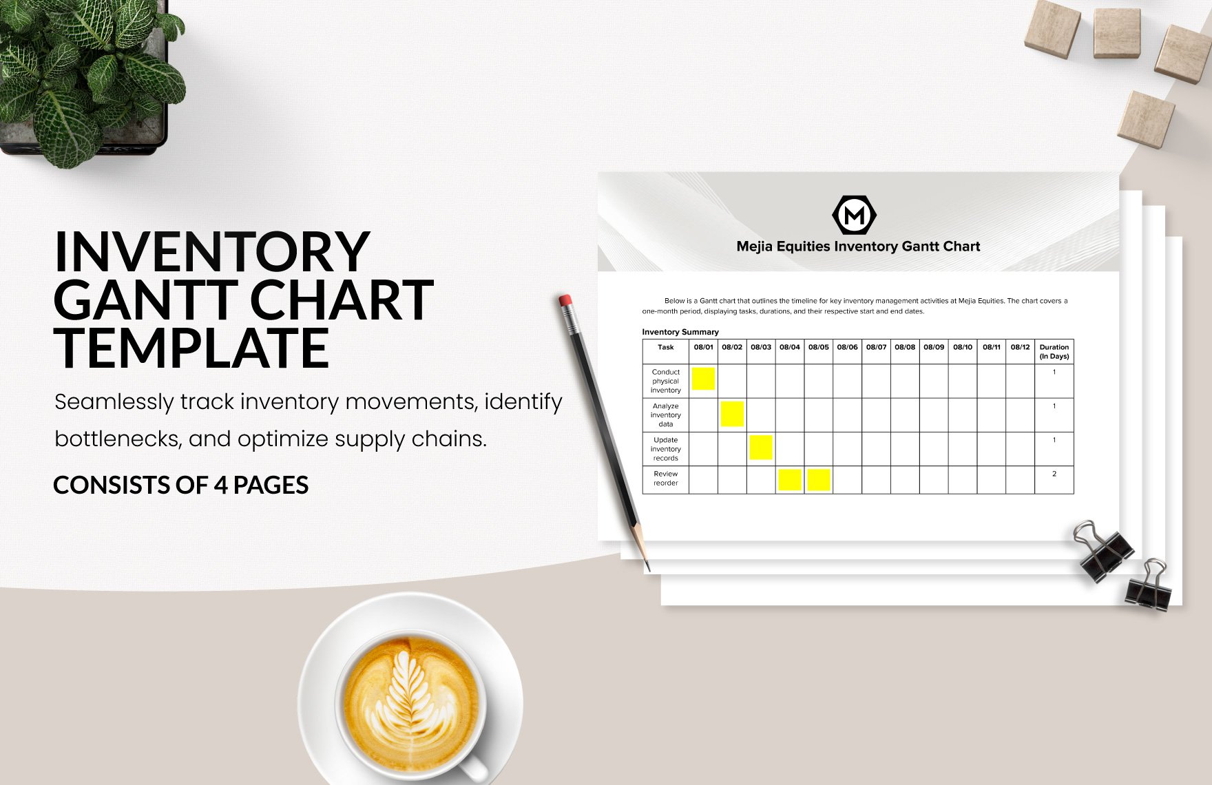
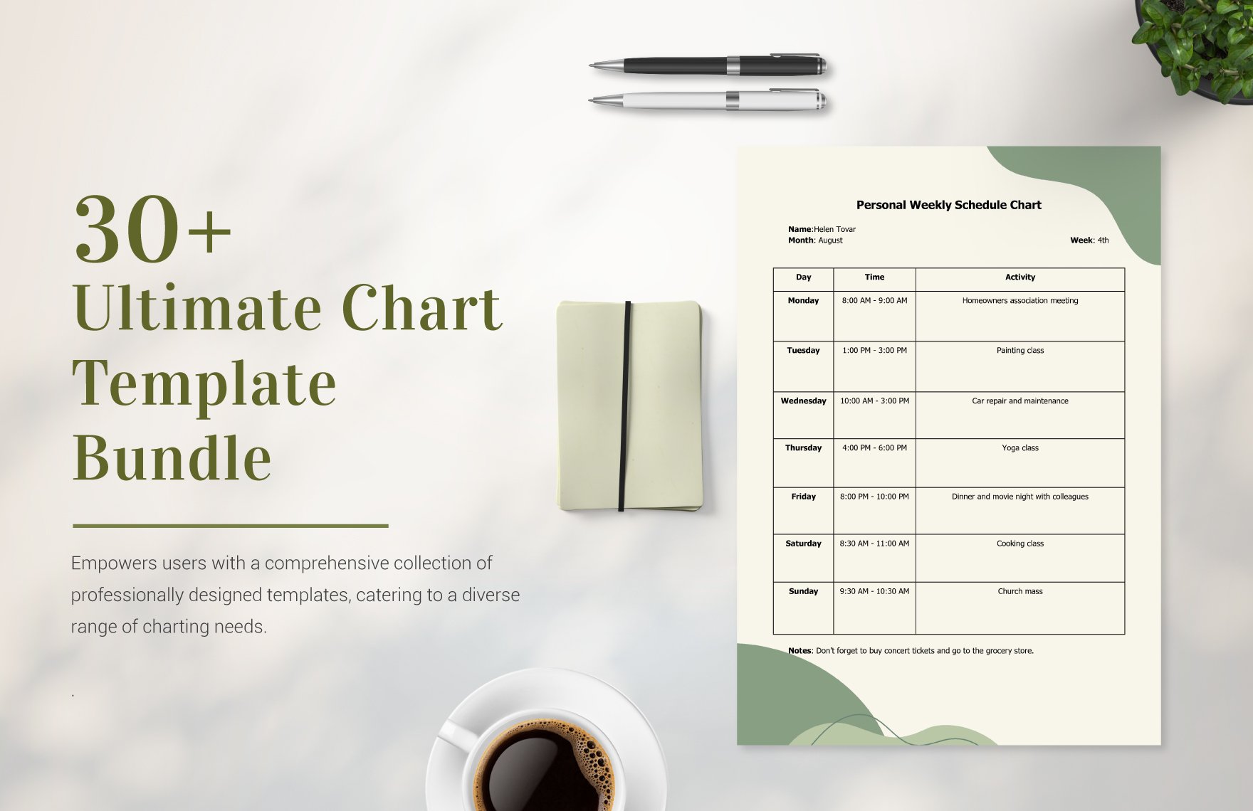
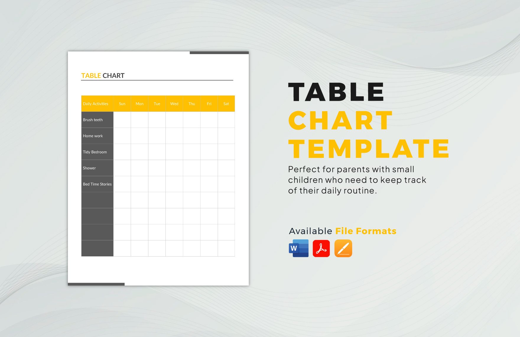
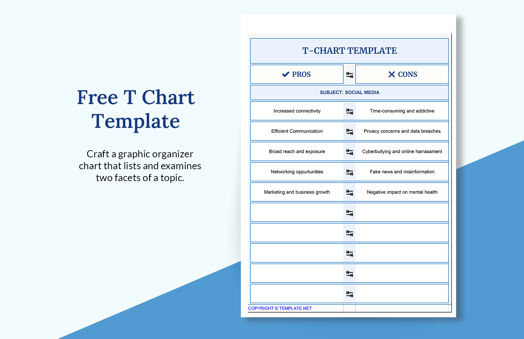
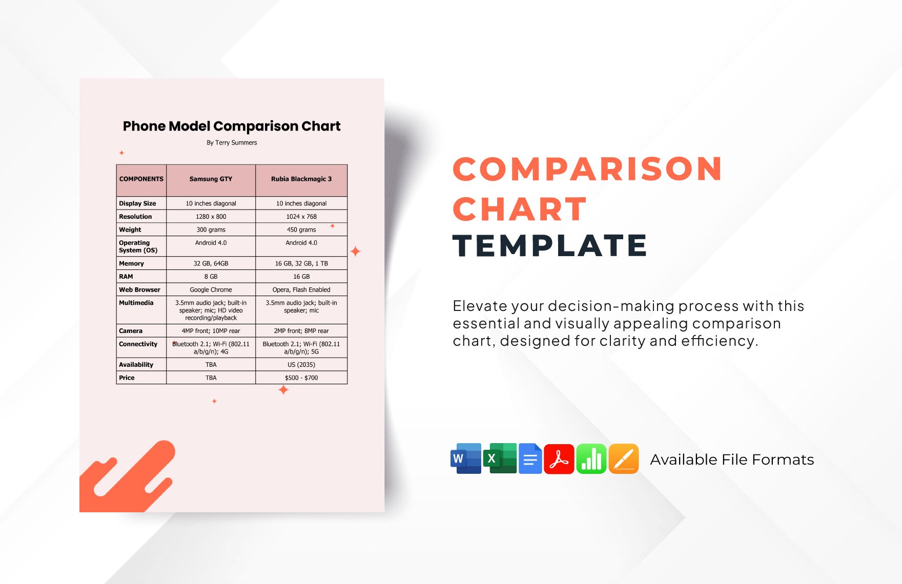
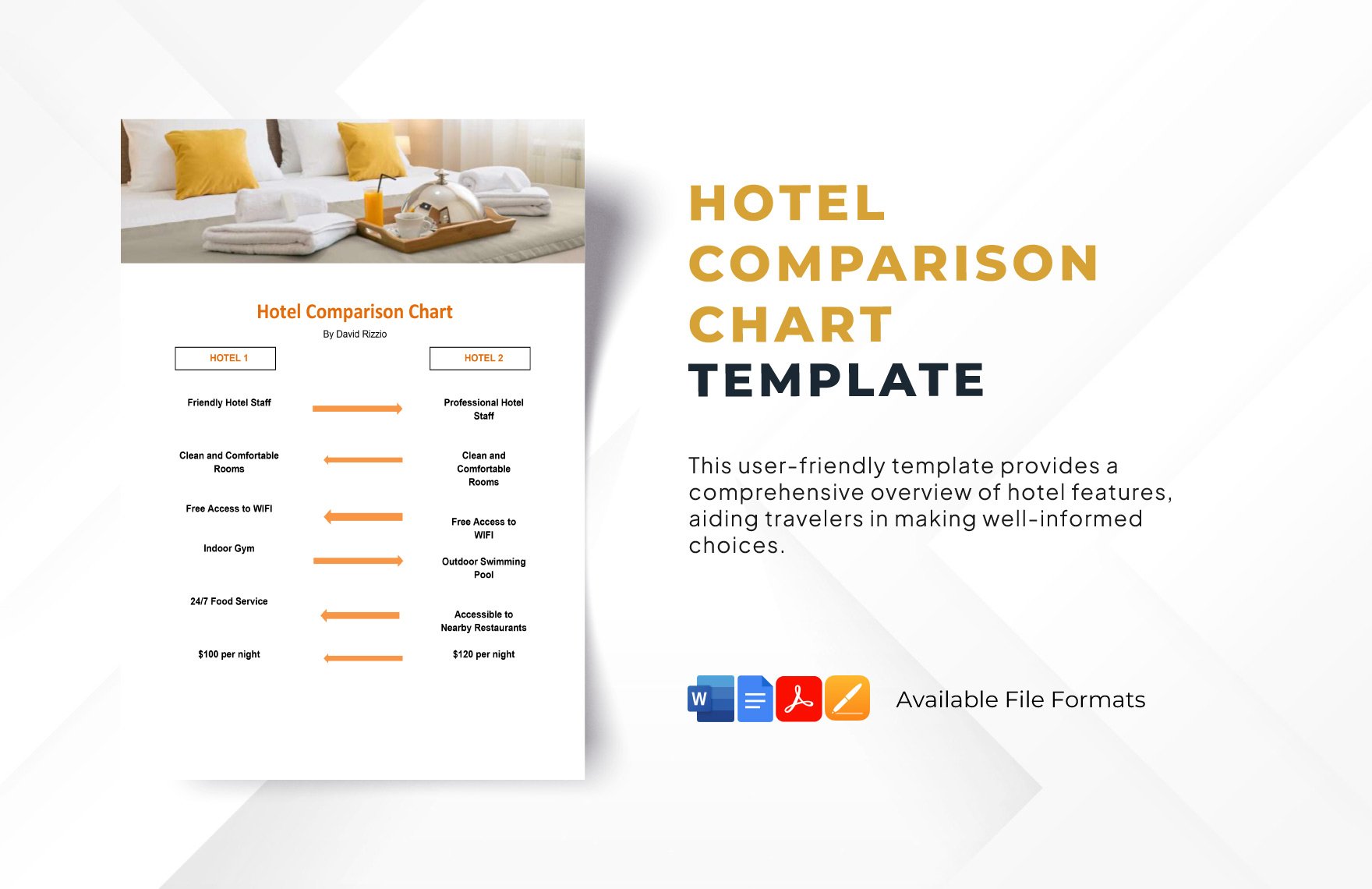
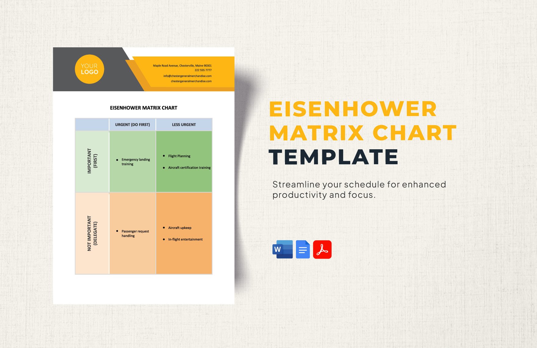
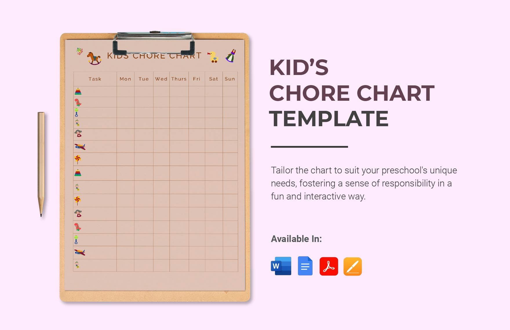
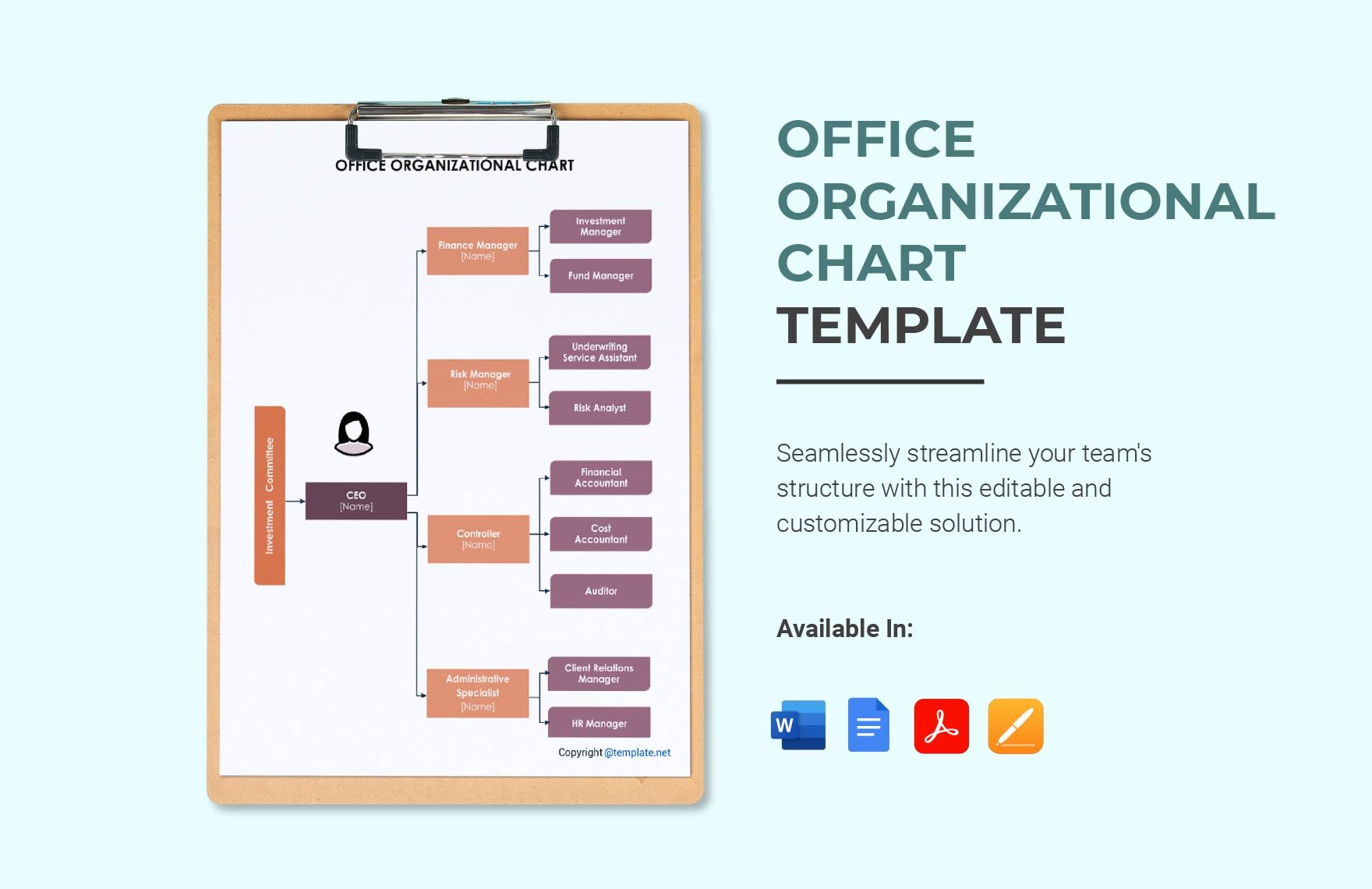
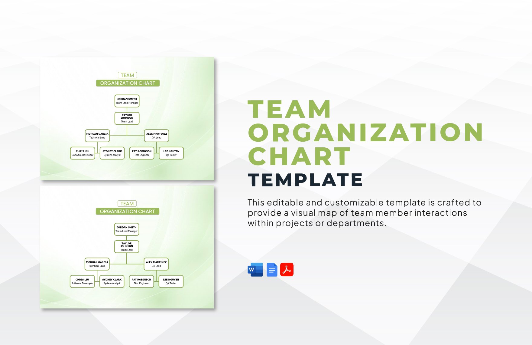
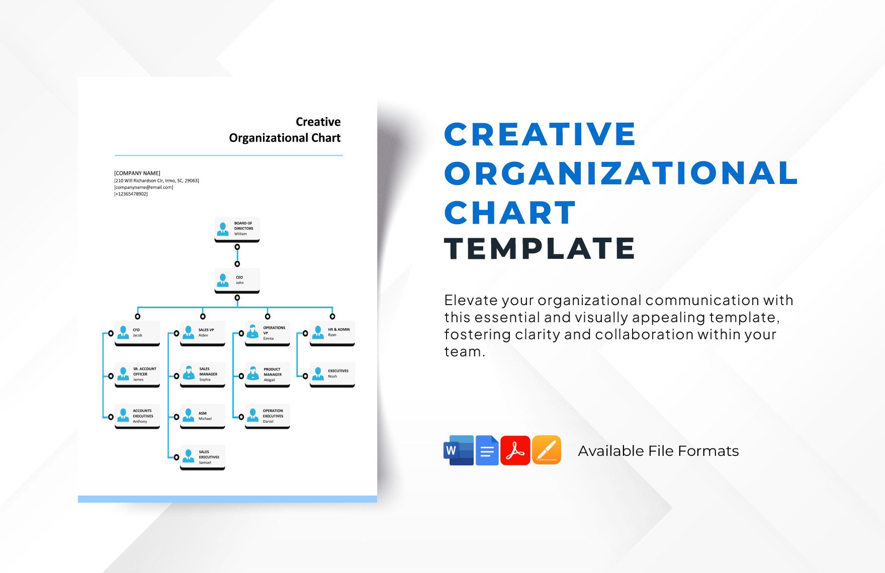
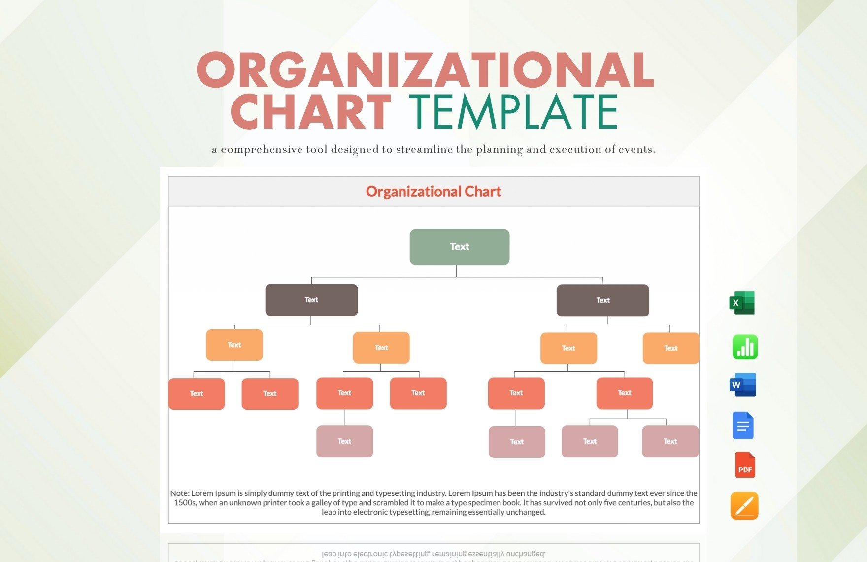
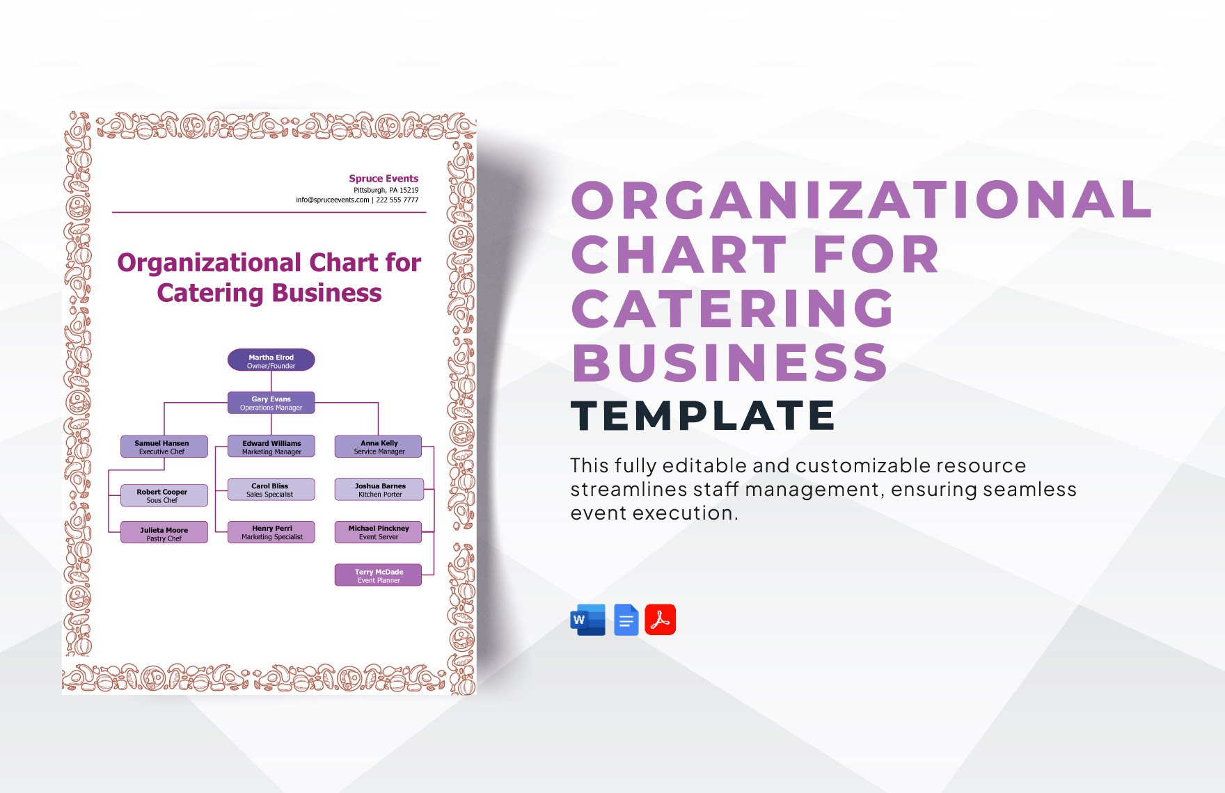
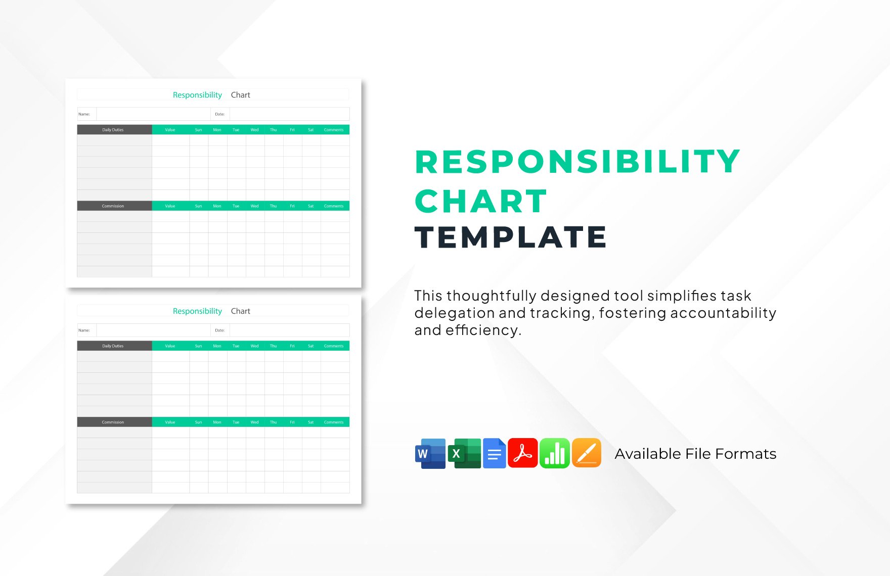
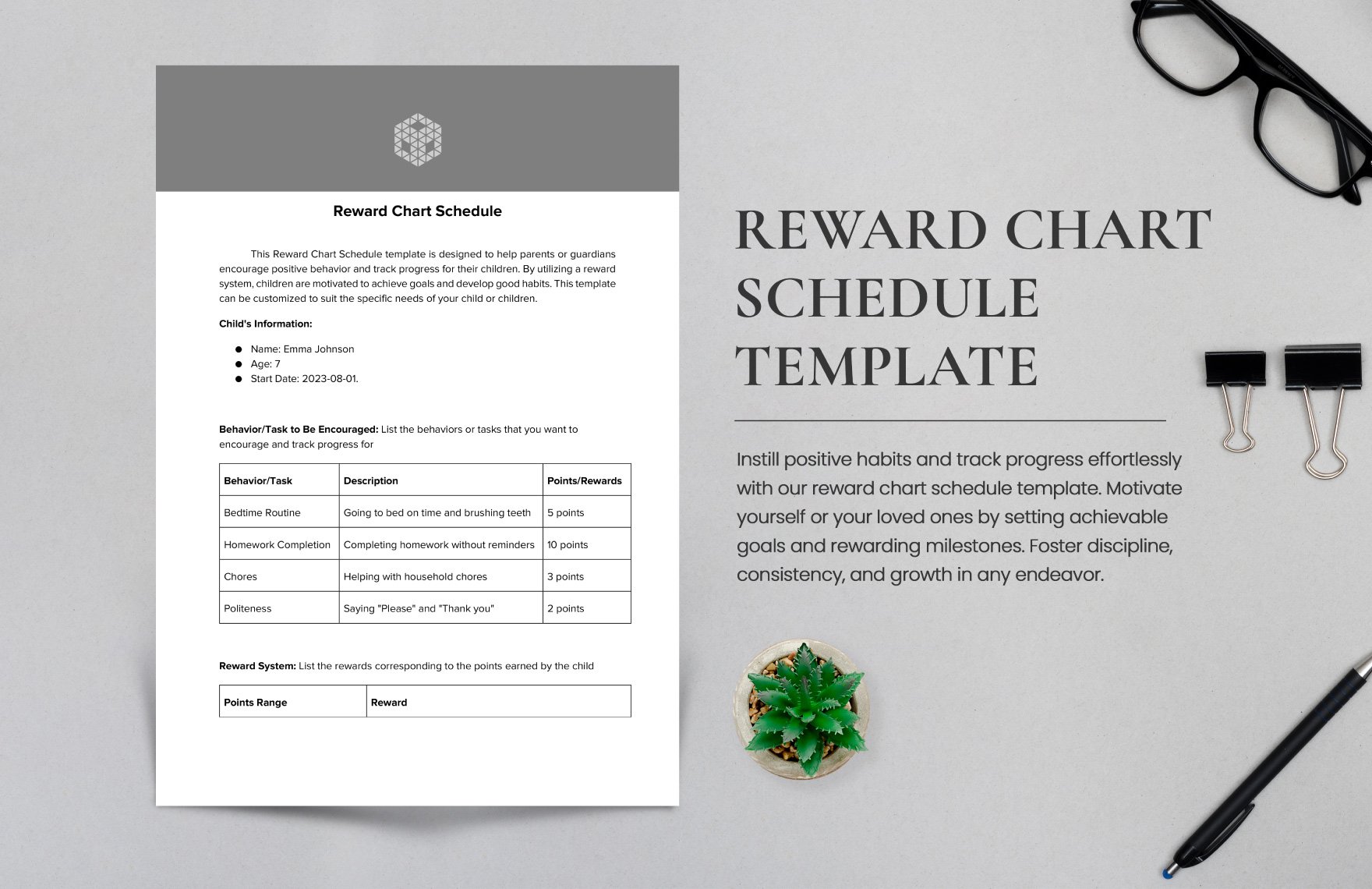
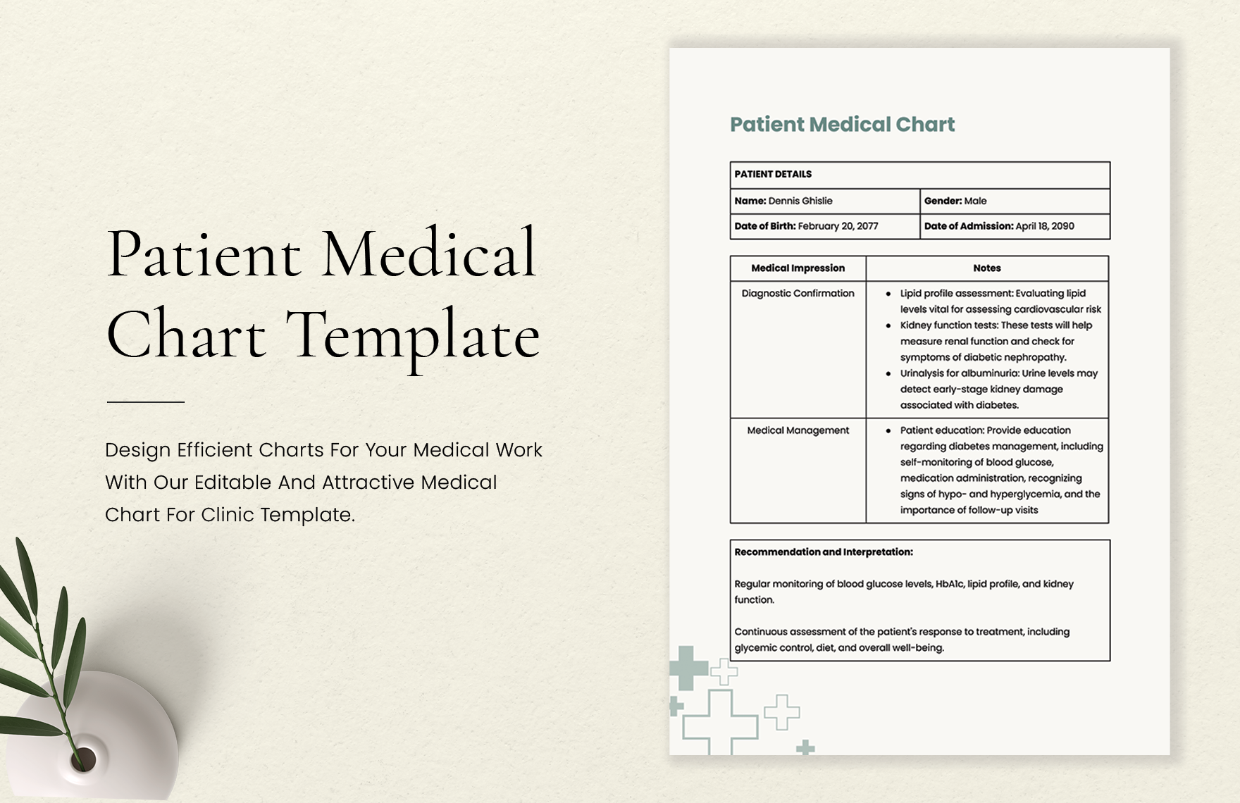
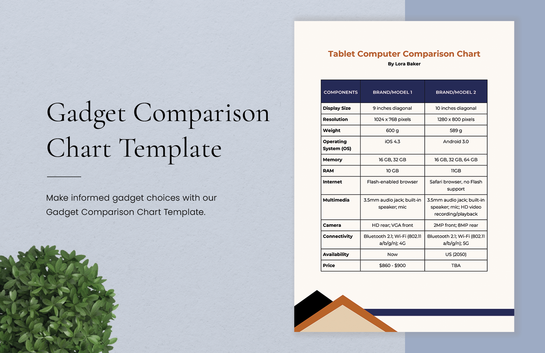
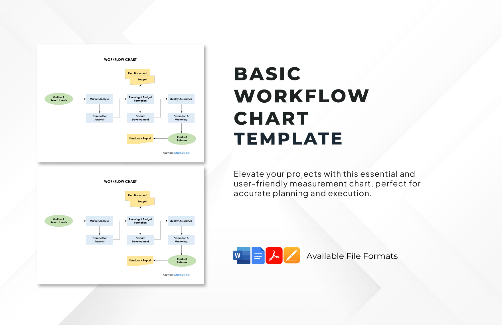
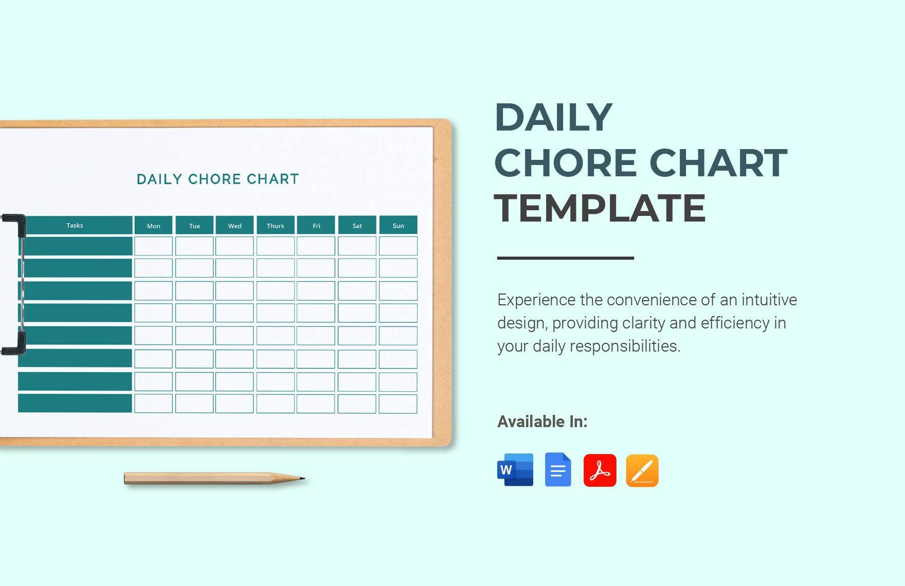
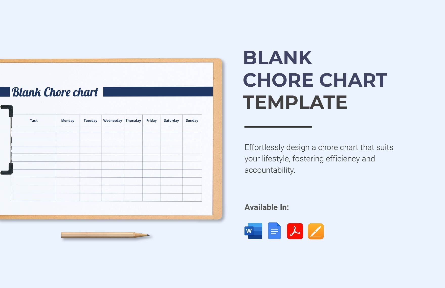
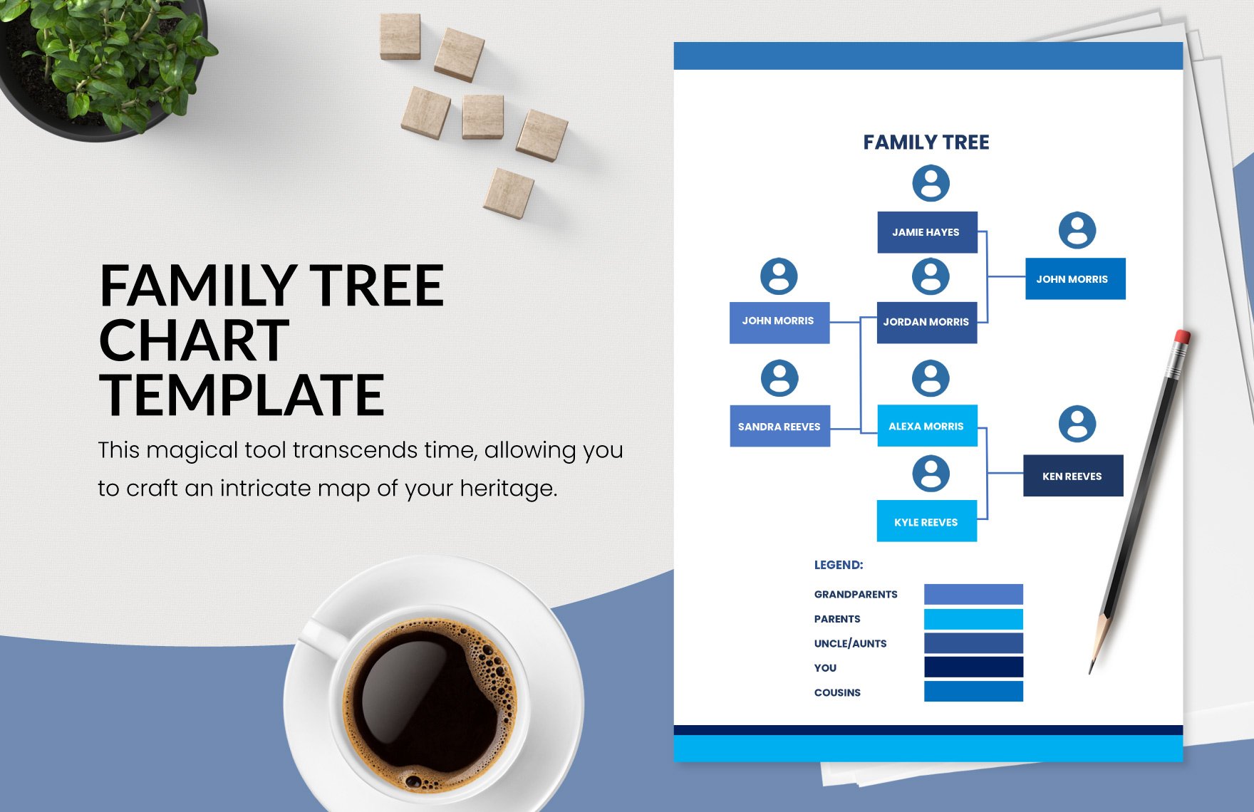
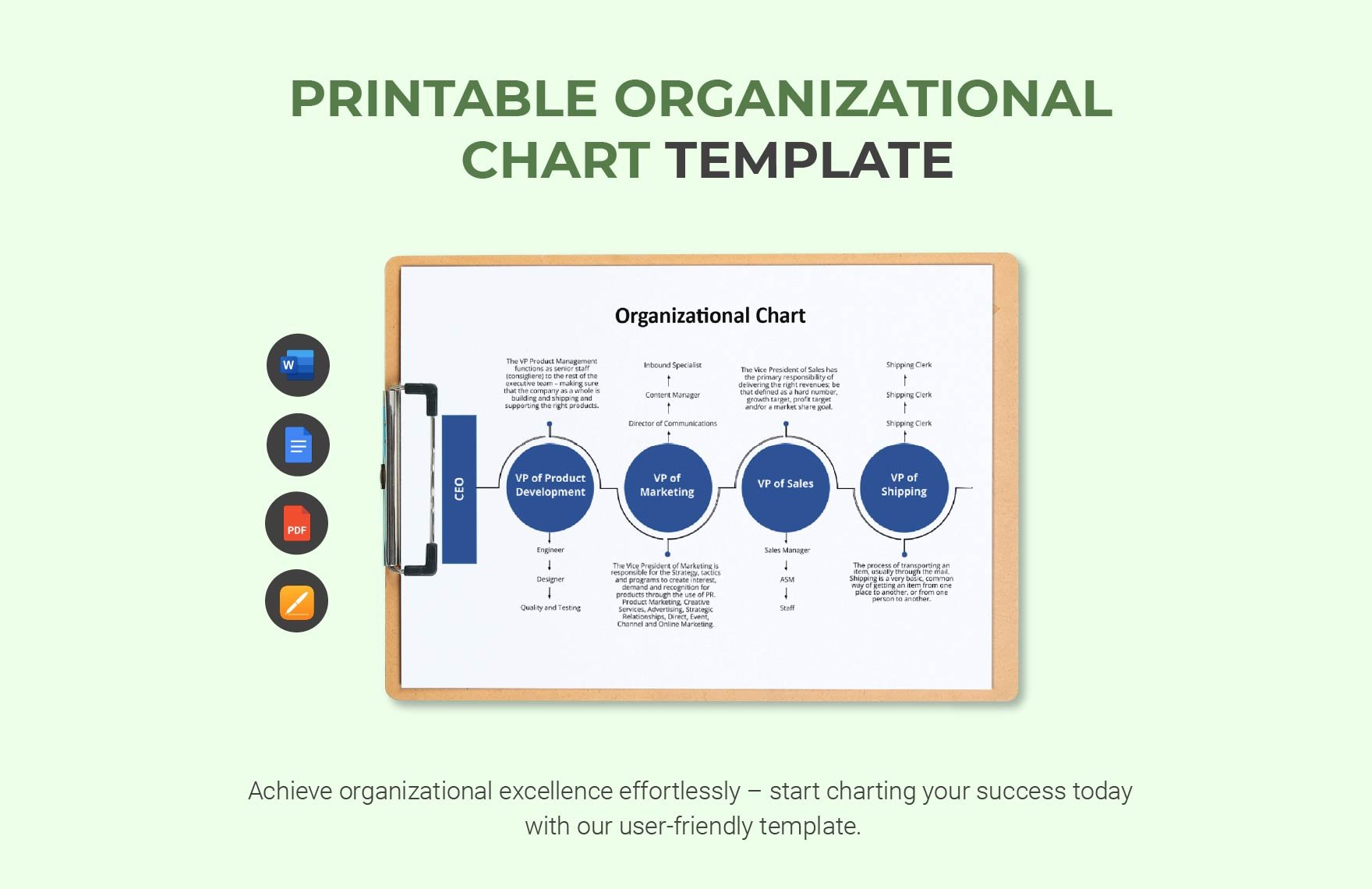
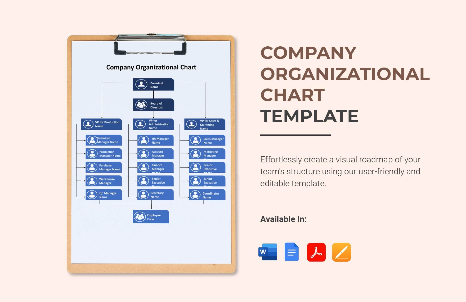
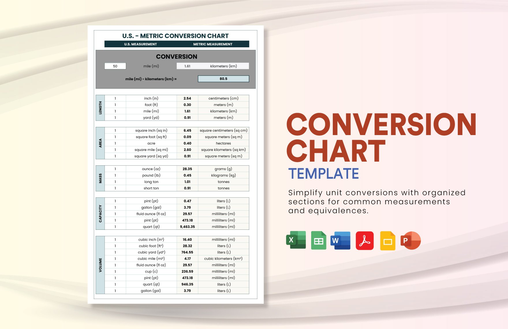
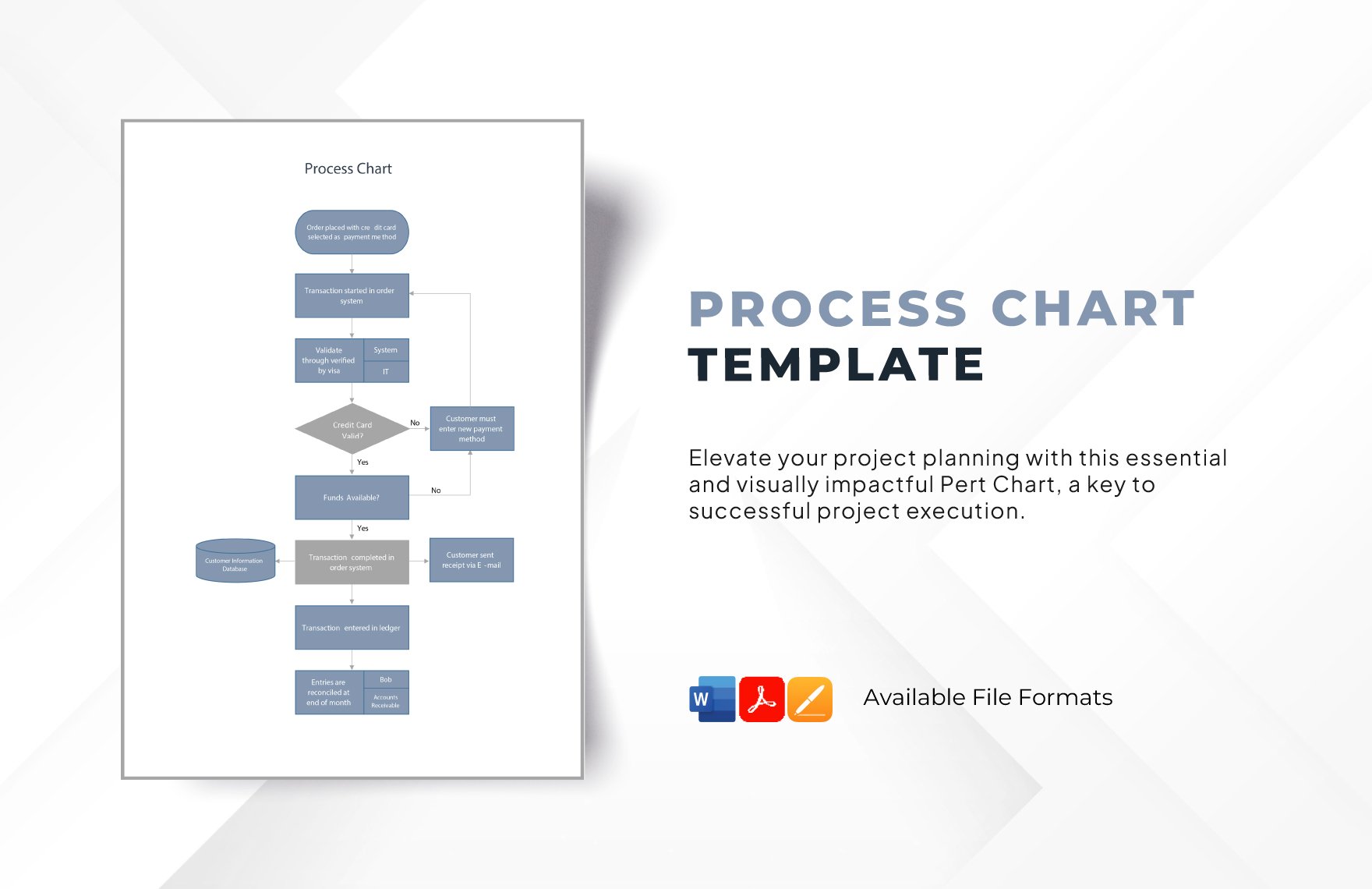
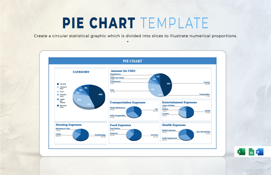
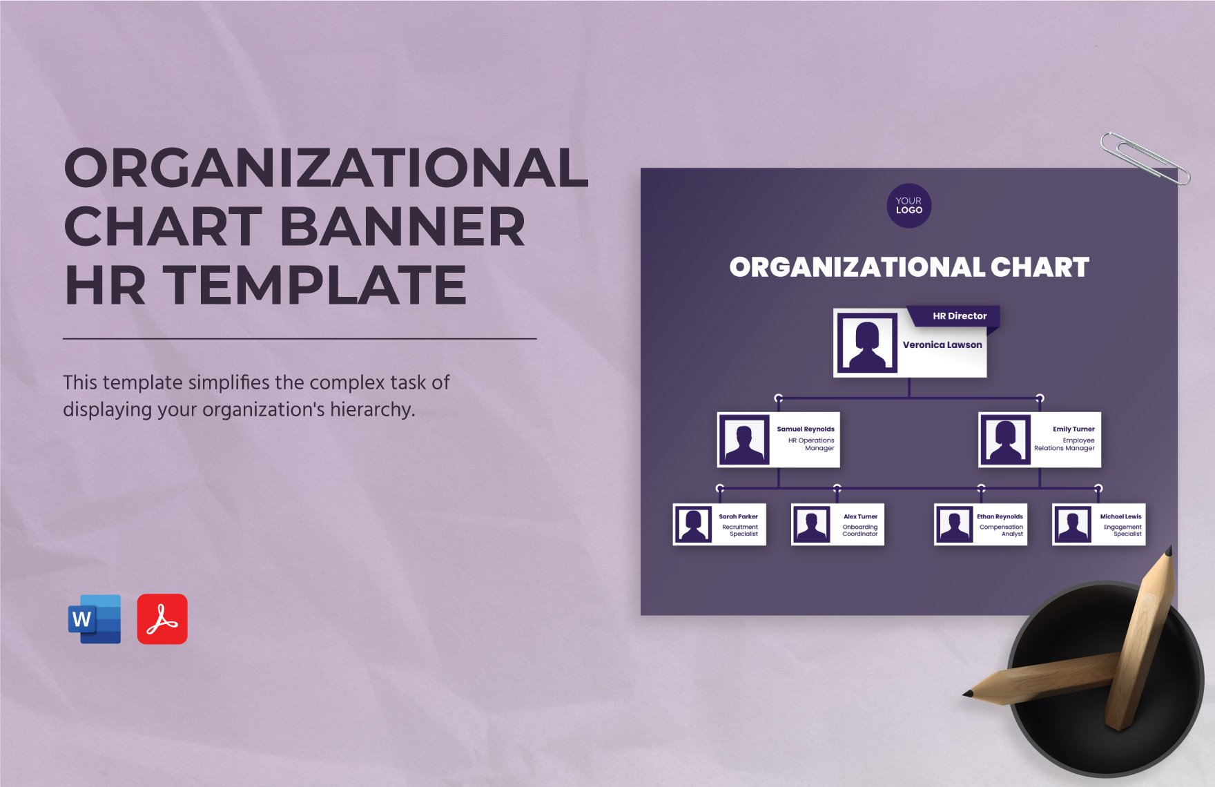
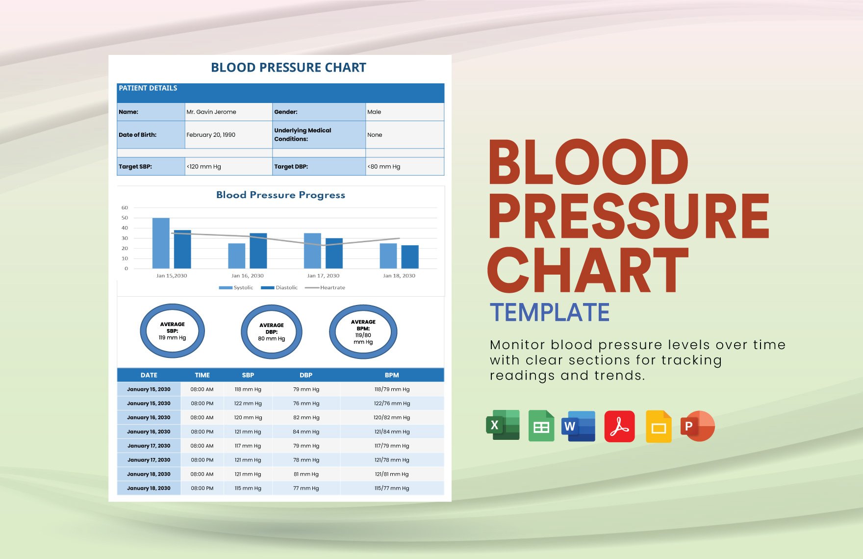
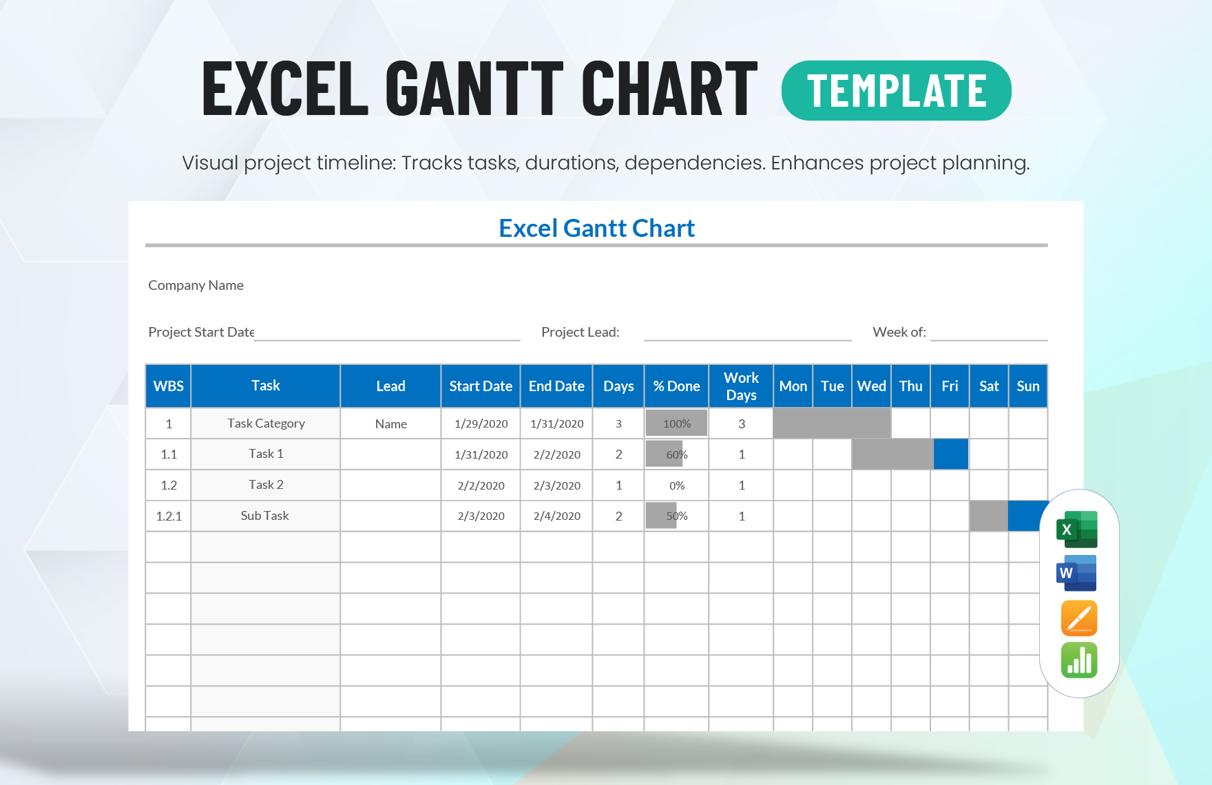
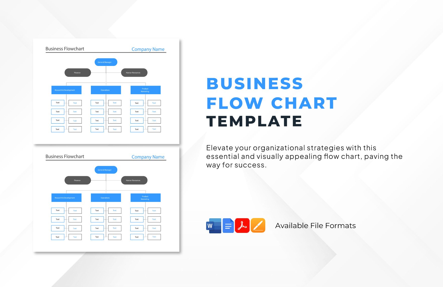
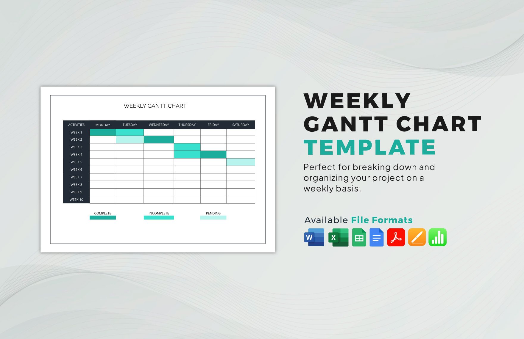
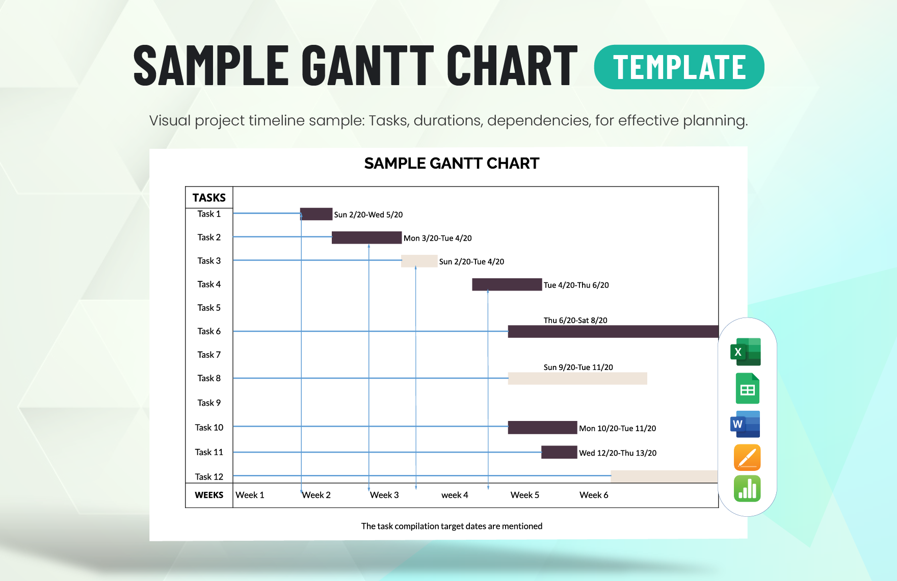
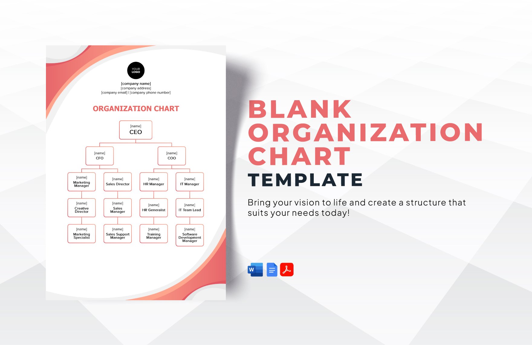
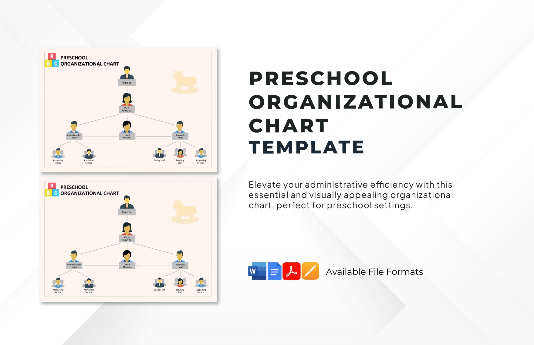
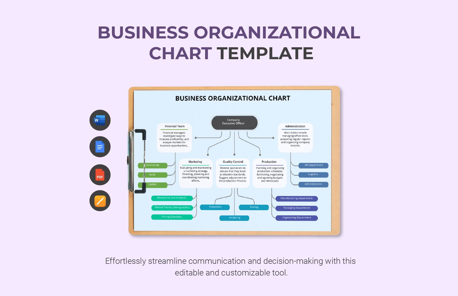
Get rid of the hassle of creating graphical data charts from scratch with the help of our ready-made chart templates. Lucky for you these high-quality and printable templates are 100% customizable in MS Word file format. Improve your productivity, be organized and communicate data even better by using our chart templates that are very effective in any kind of use whether its for company, school, or organization. From process charts, workflow charts, and comparison charts, we got them print ready for you! Let us help you improve your data documentation and report making that fits all business requirements by simply downloading these templates. Our easily editable and downloadable chart templates are perfect for immediate presentations and can easily be shared online through email and other online platforms. Available in A4 & US sizes, these templates are just waiting to be downloaded. Try these cost-free templates right now!
How to Create Charts in MS Word
Reports and presentations can easily be understood with the help of visual representations. It acts as a tool that helps us understand complex data by simply breaking them down in a more understandable and formal manner. One of the most commonly used visual representation tools is the chart. It is a diagram, picture, or graph which is intended to make information easier to understand. It is a way of presenting information by putting them in vertical rows and boxes.
Charts are best created in MS Word, this popularly used software tool is not just a word processor, but can also be a reliable chart maker. To guide you with your chart making, we have provided below some several guide steps to help you get started.
1. Make a Draft Layout
To begin the chart-making process, you have to start by making a draft layout of how should you present the chart logically and systematically. During this step, you should also decide what type of chart (pie chart, line chart, histogram, flow chart, etc.) are you going to use. The draft layout will serve as your reference as you go along the chart making process.
2. Provide The Details
After drafting a layout, you should now focus on providing the details. What most charts usually states are simplified quantities of data and their relationship to one another. Make sure that the details you are going to present in it are simple yet comprehensive. For instance, if you are developing a budget chart, mostly your details would be sets of numerical and qualitative data. To ensure that they are comprehensive yet kept brief, provide only what is necessary and stick to exact figures.
3. Present The Details Clearly
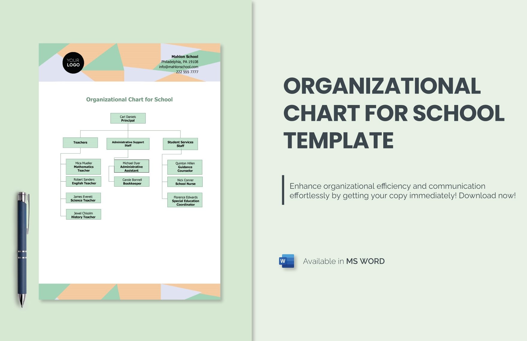
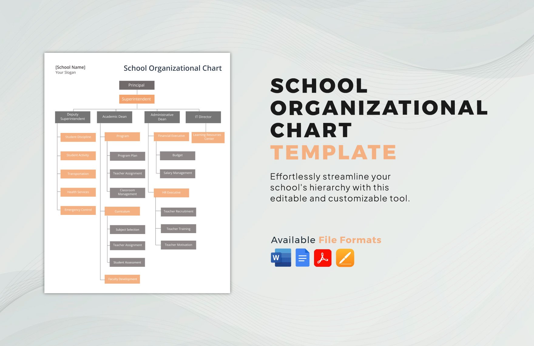
To create a concise and informative chart, it has to be understandable and presentable. The best way to do just that is to make sure that every detail presented in it are clear and simple. As much as possible, avoid including irrelevant details in it. This step also applies to any chart-making whether its classroom seating charts, holiday charts, or organizational chart.
4. Choose Proper Fonts and Sizes
In developing a sample chart, you have to be very particular with your usage of fonts and font sizes. This can say a lot about your chart making because this also contributes a lot to the formality and credibility of your charts. You may opt to use ready-made templates because most of them are pre-formatted already with standard Google fonts. We have curated them above. Check them out.
5. Observe Coherence
Every chart must be created with coherence because they act as a data conveyer to your excel reports and powerpoint presentations. Simply apply coherence in your chart-making by arranging the details accordingly and highlighting important details.


