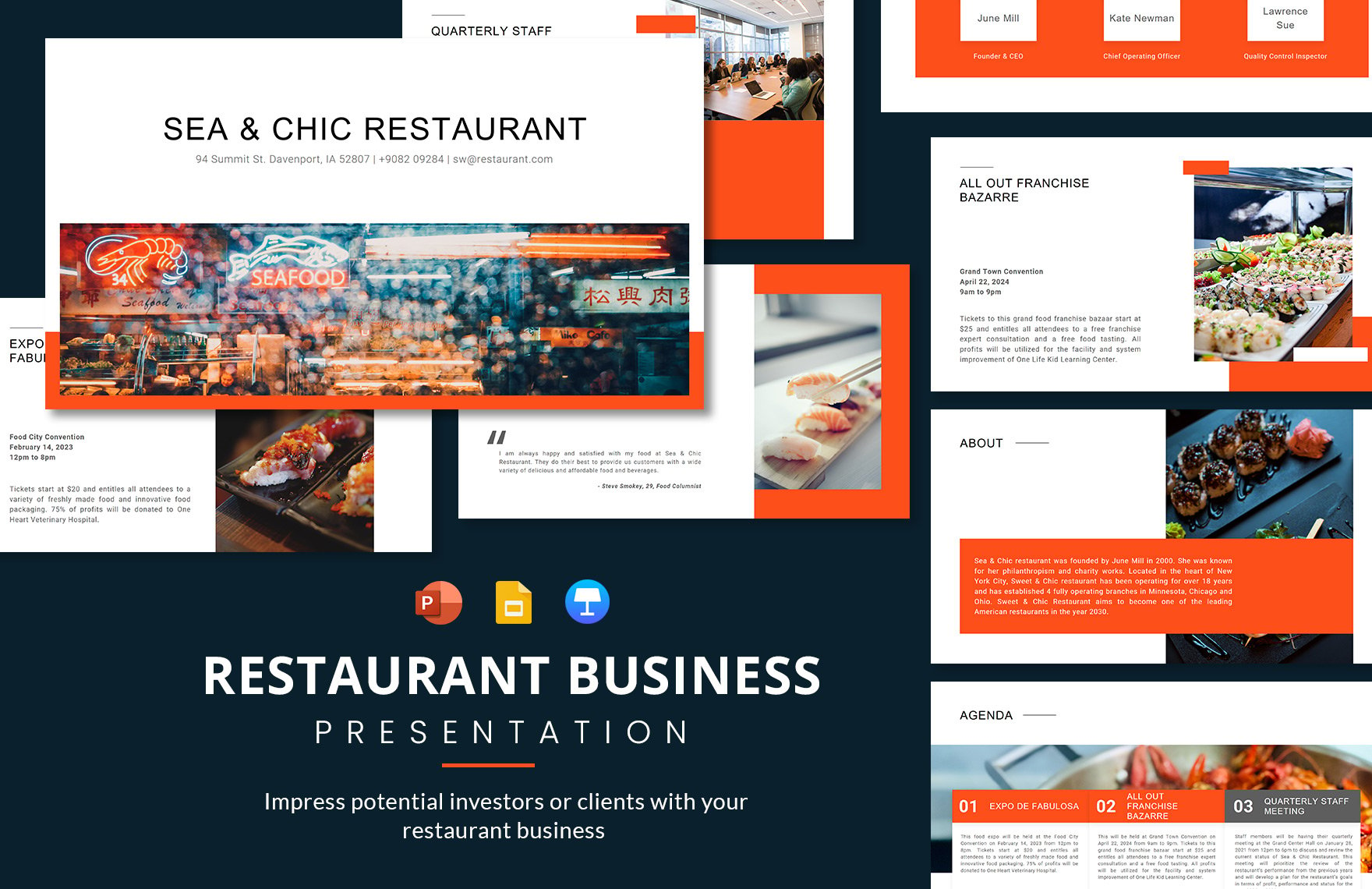
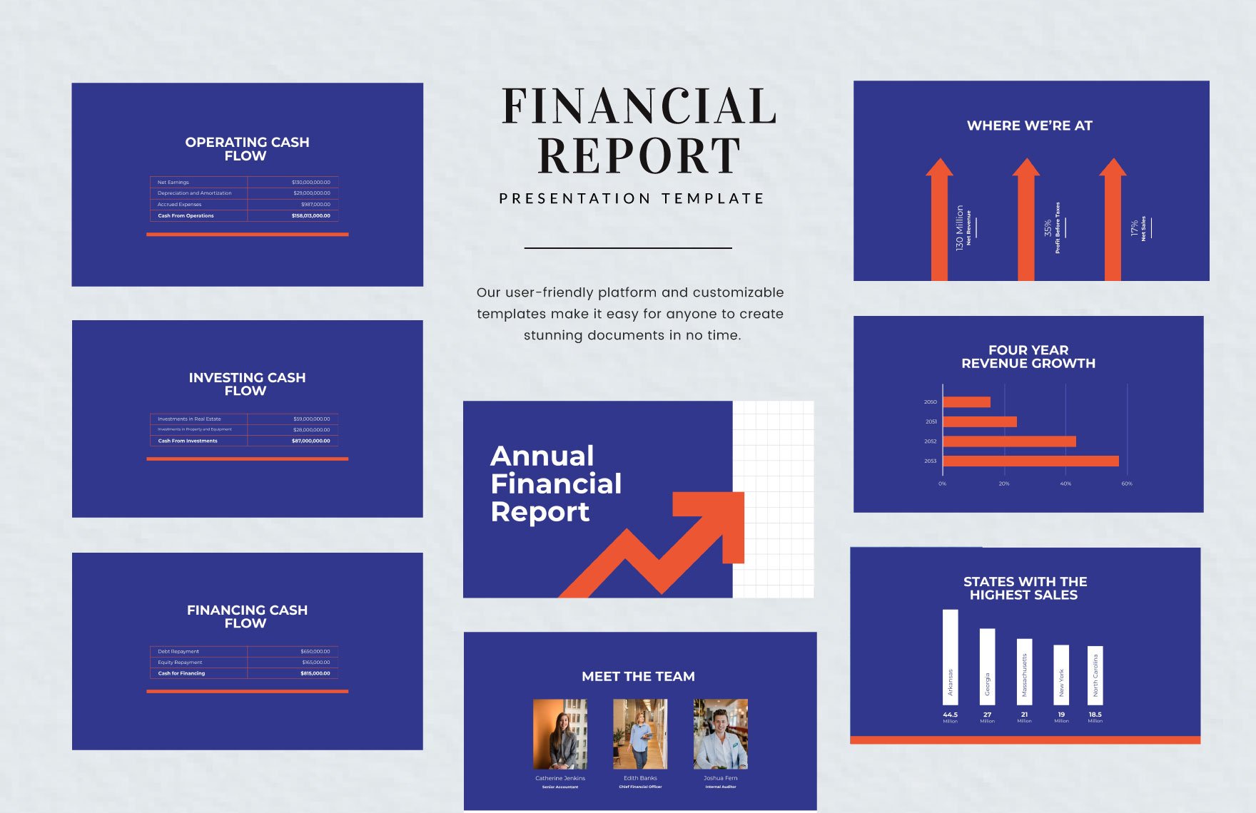
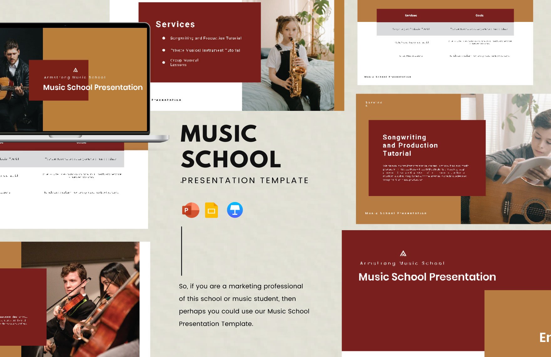
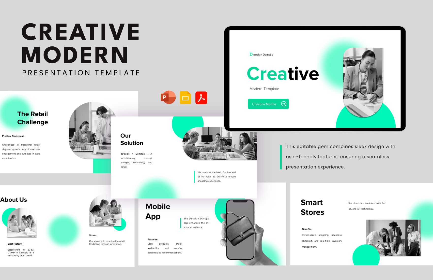
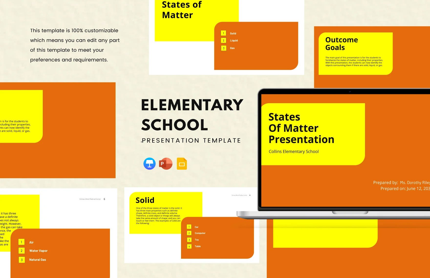
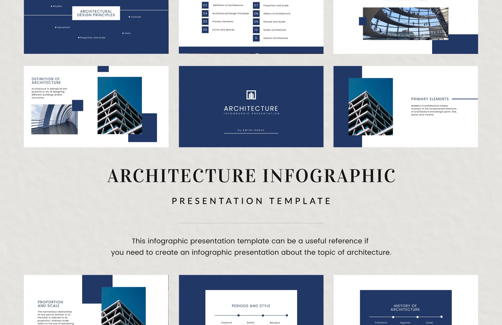
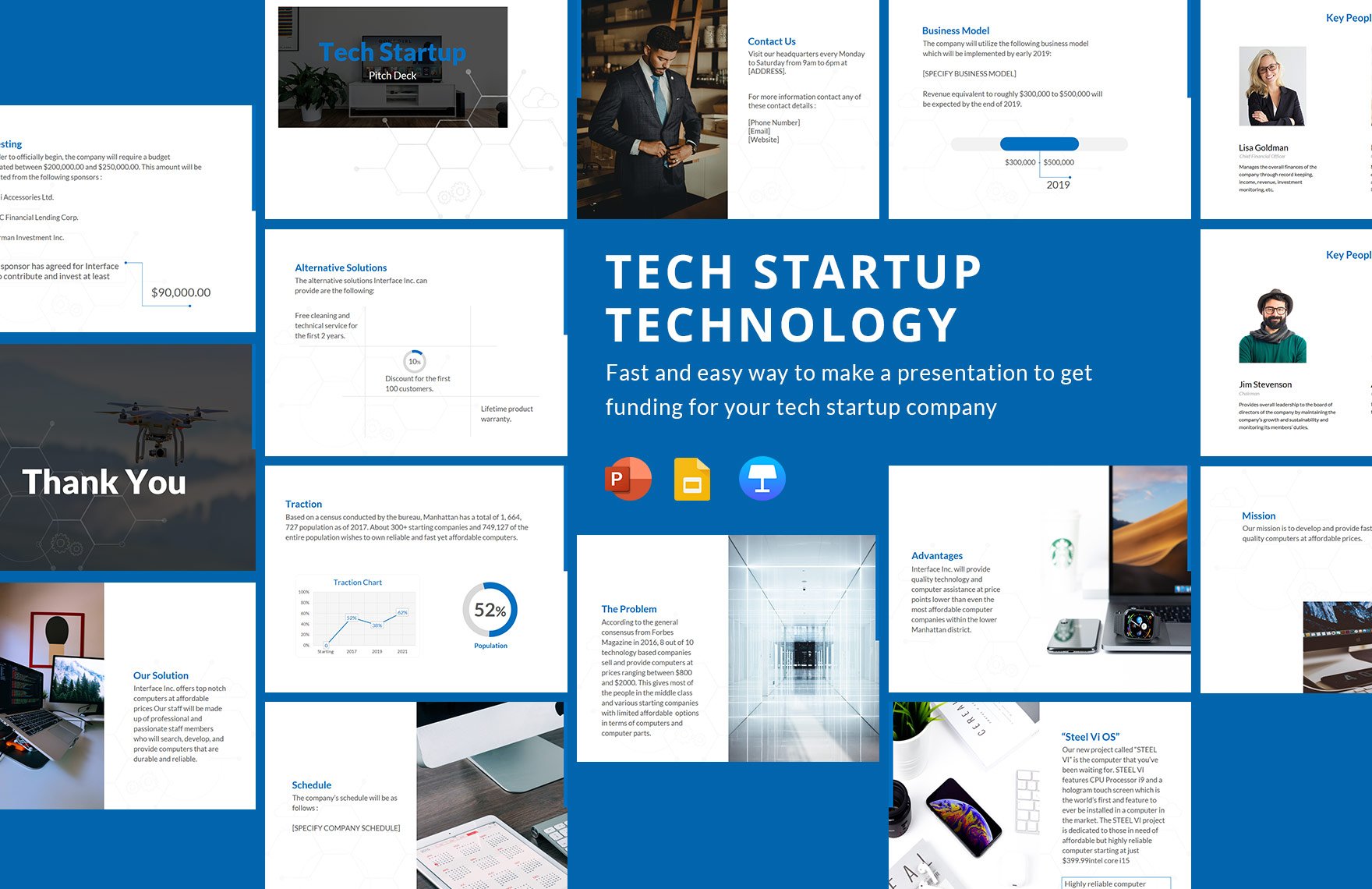
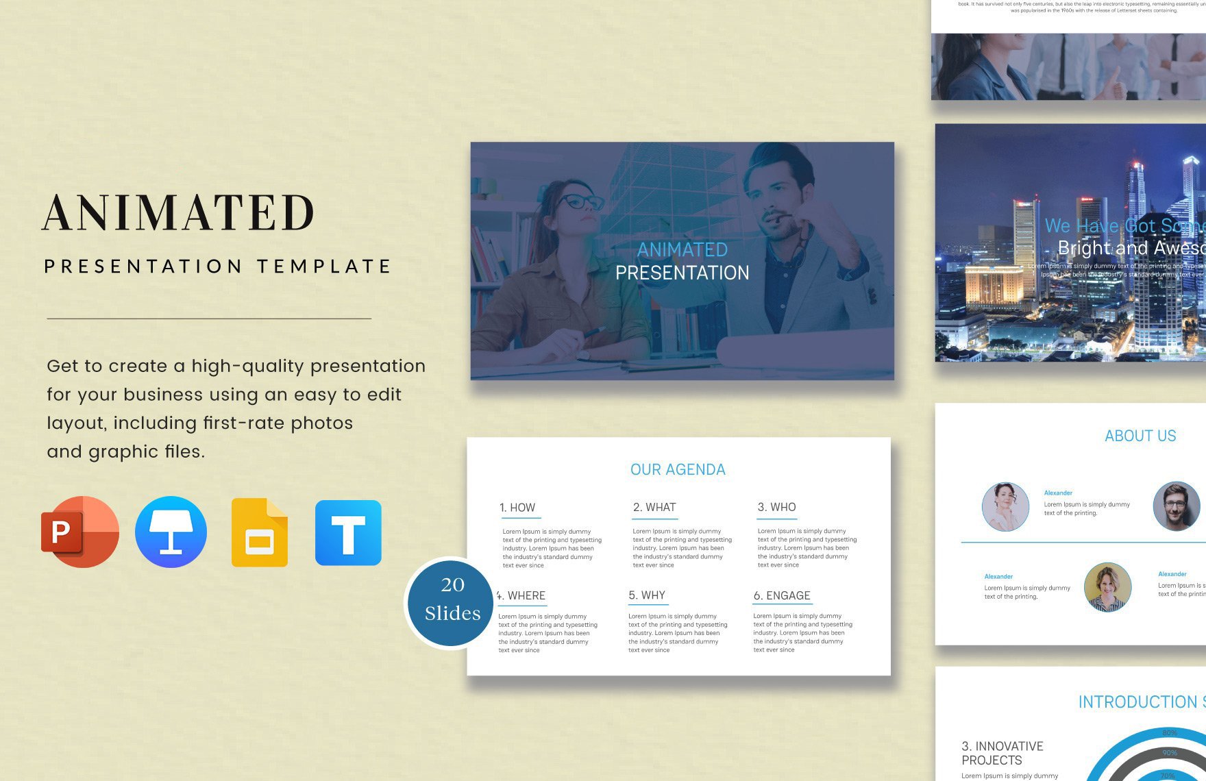
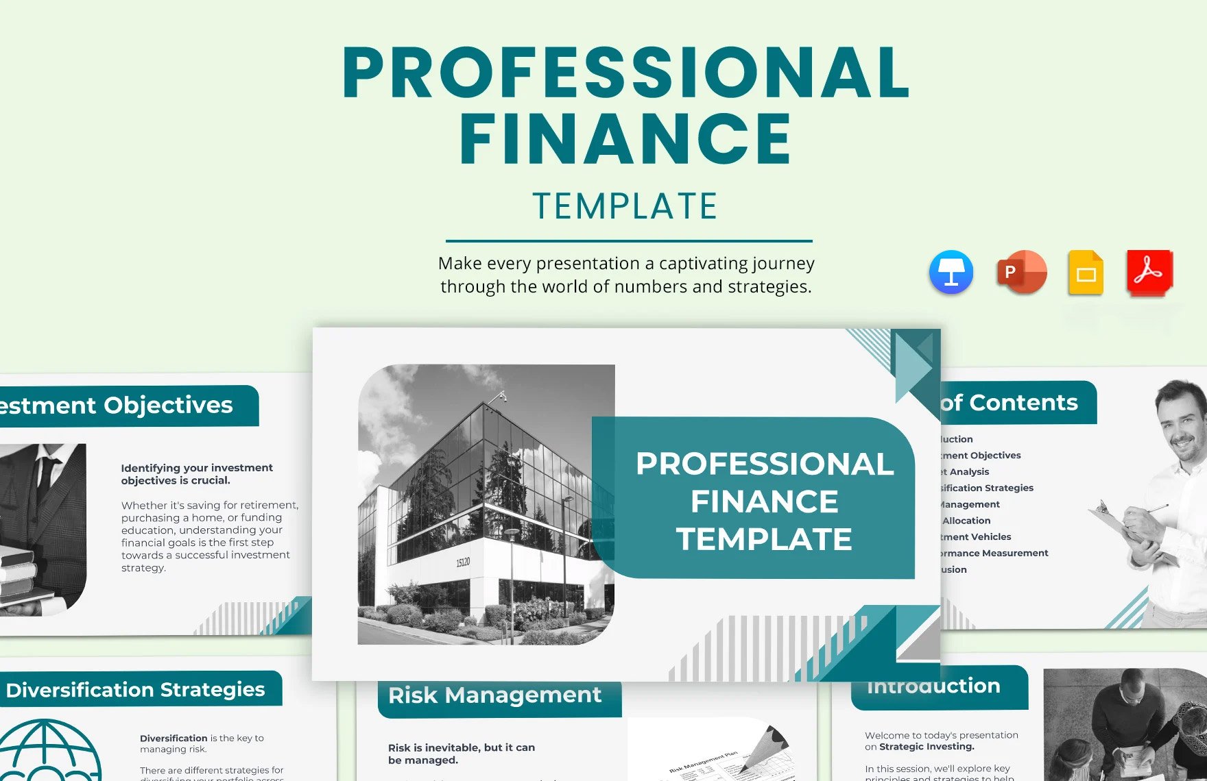
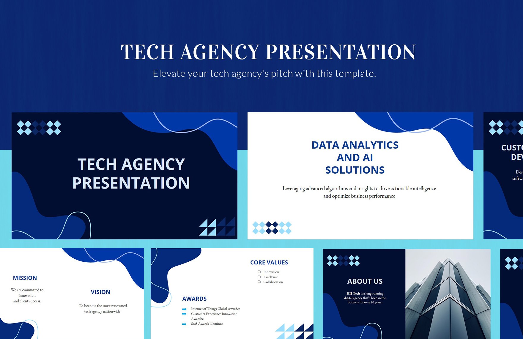
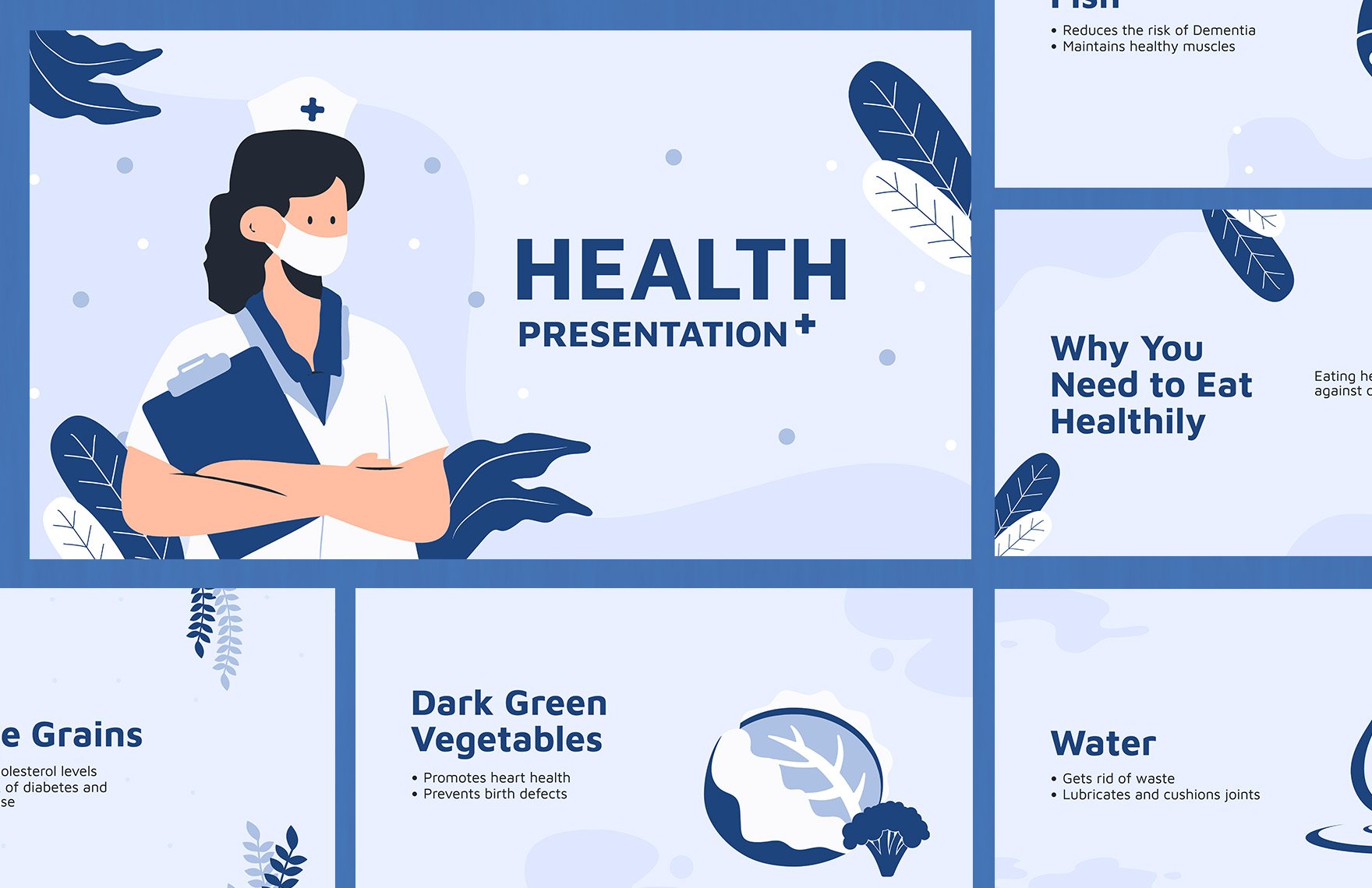
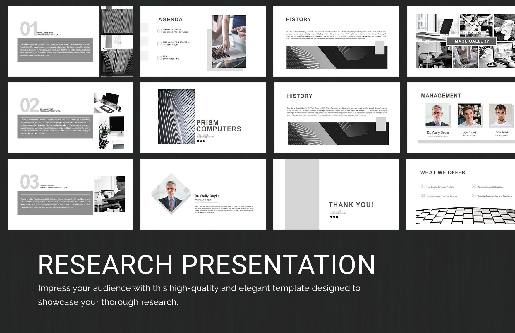
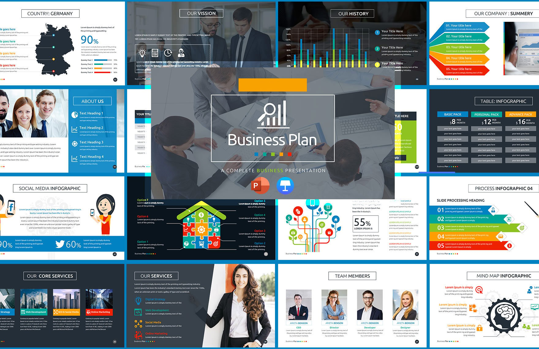
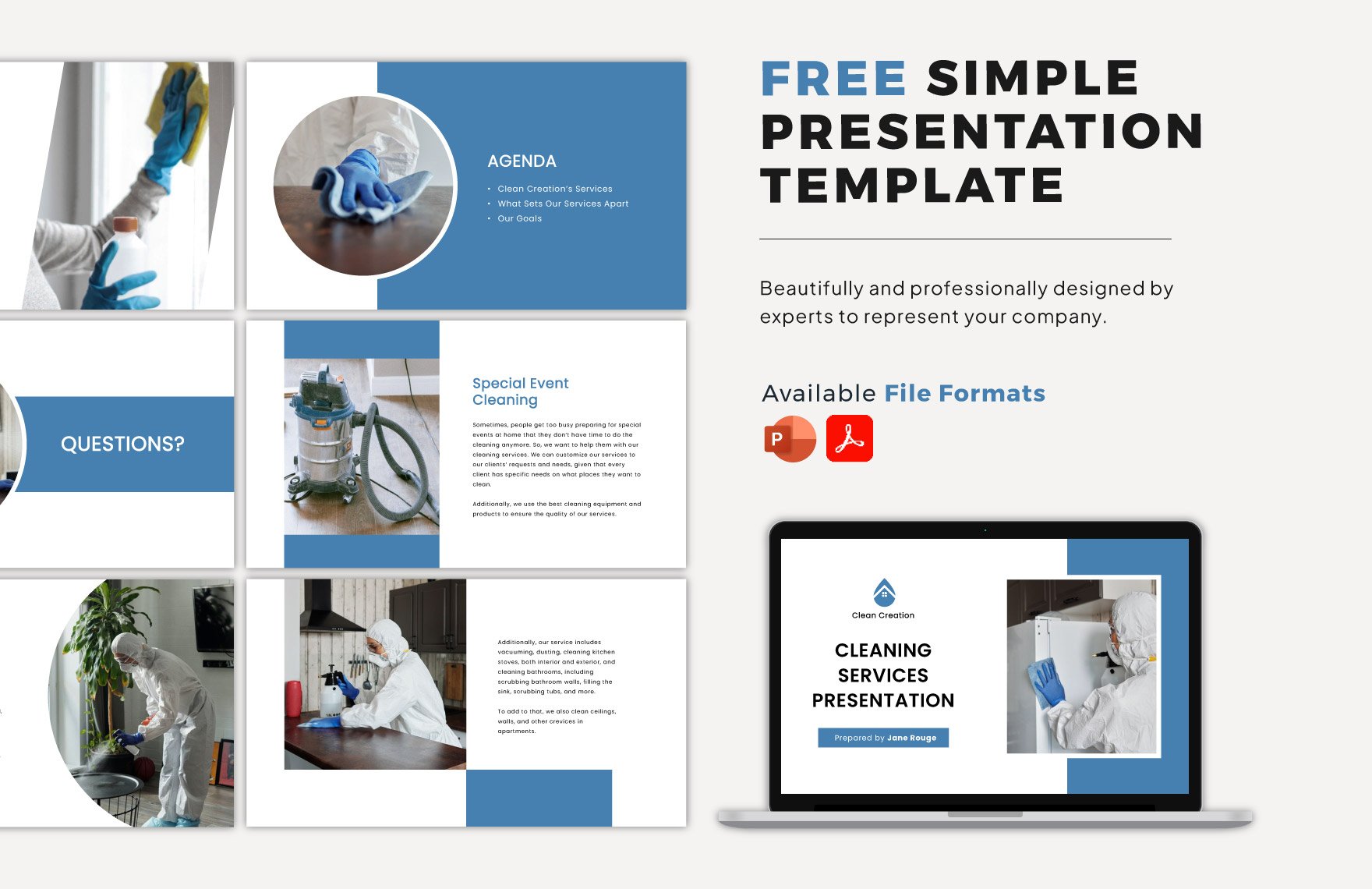
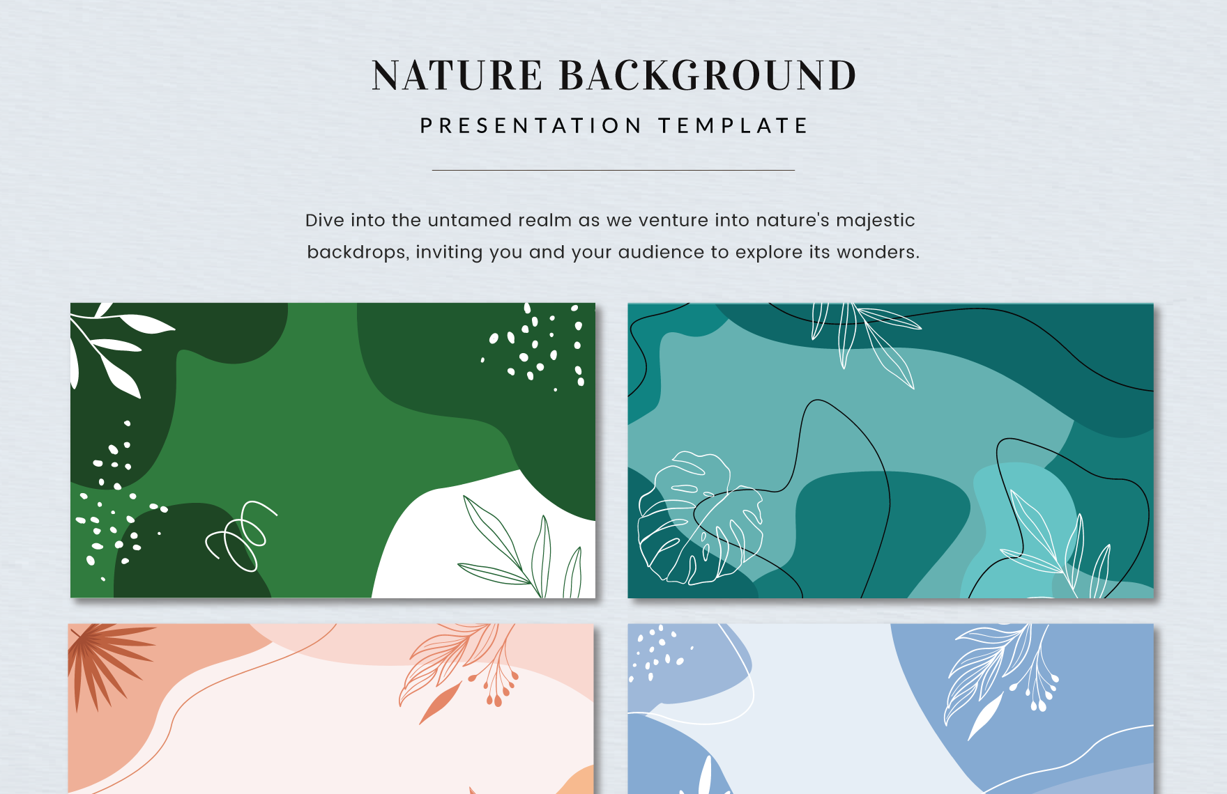
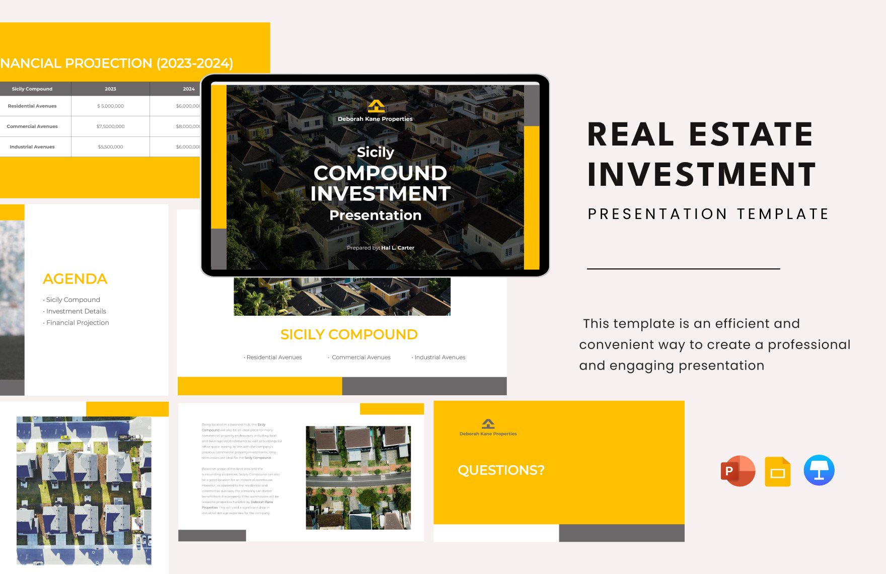
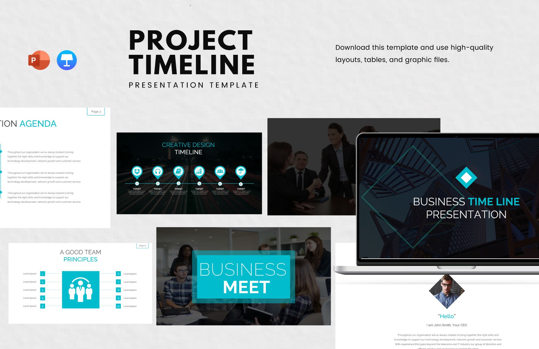
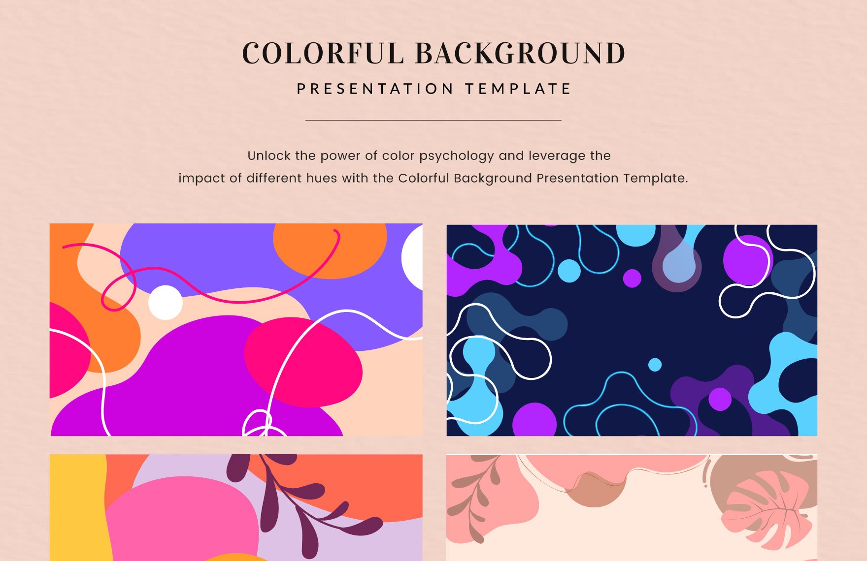
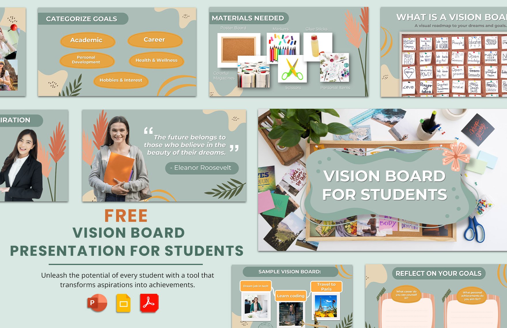
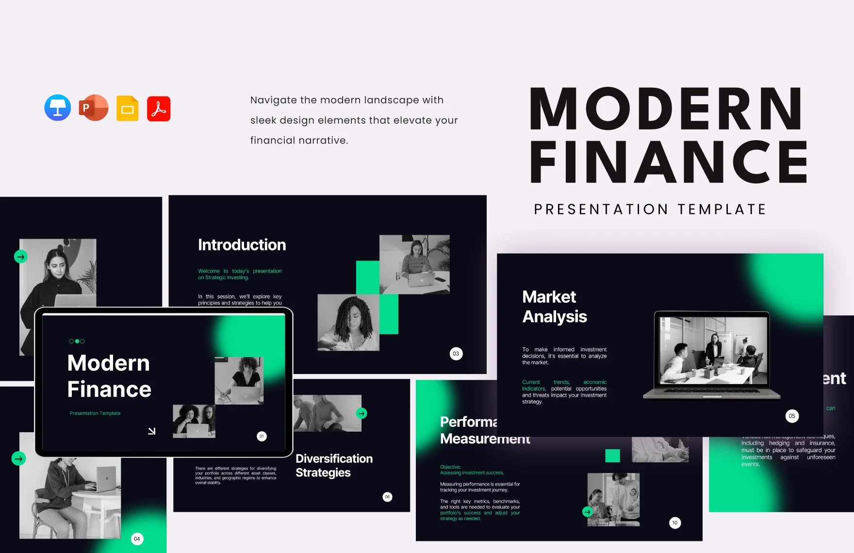
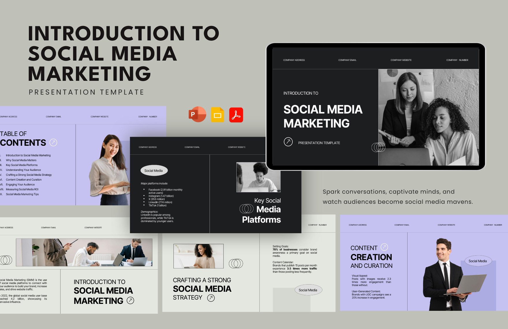
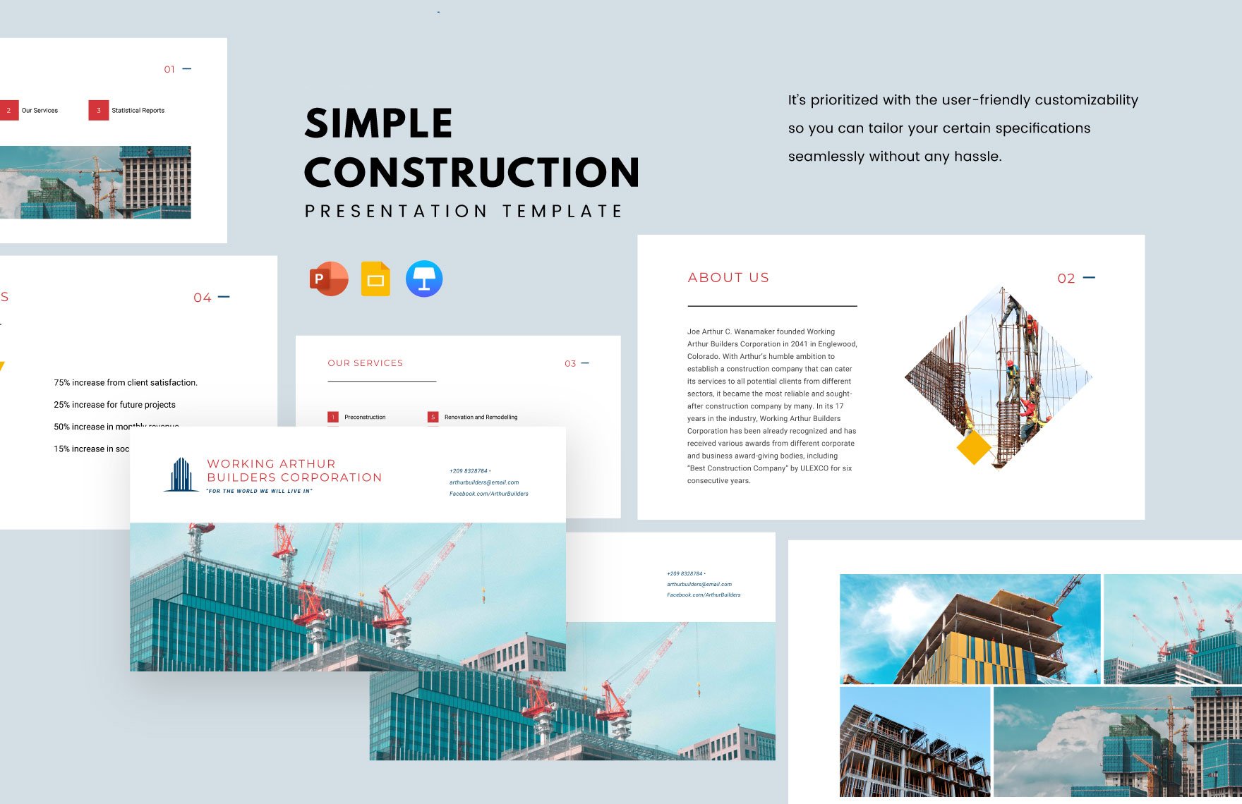
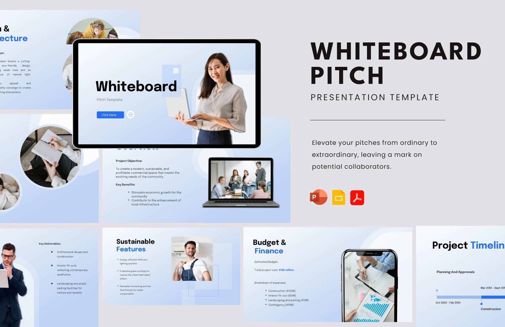
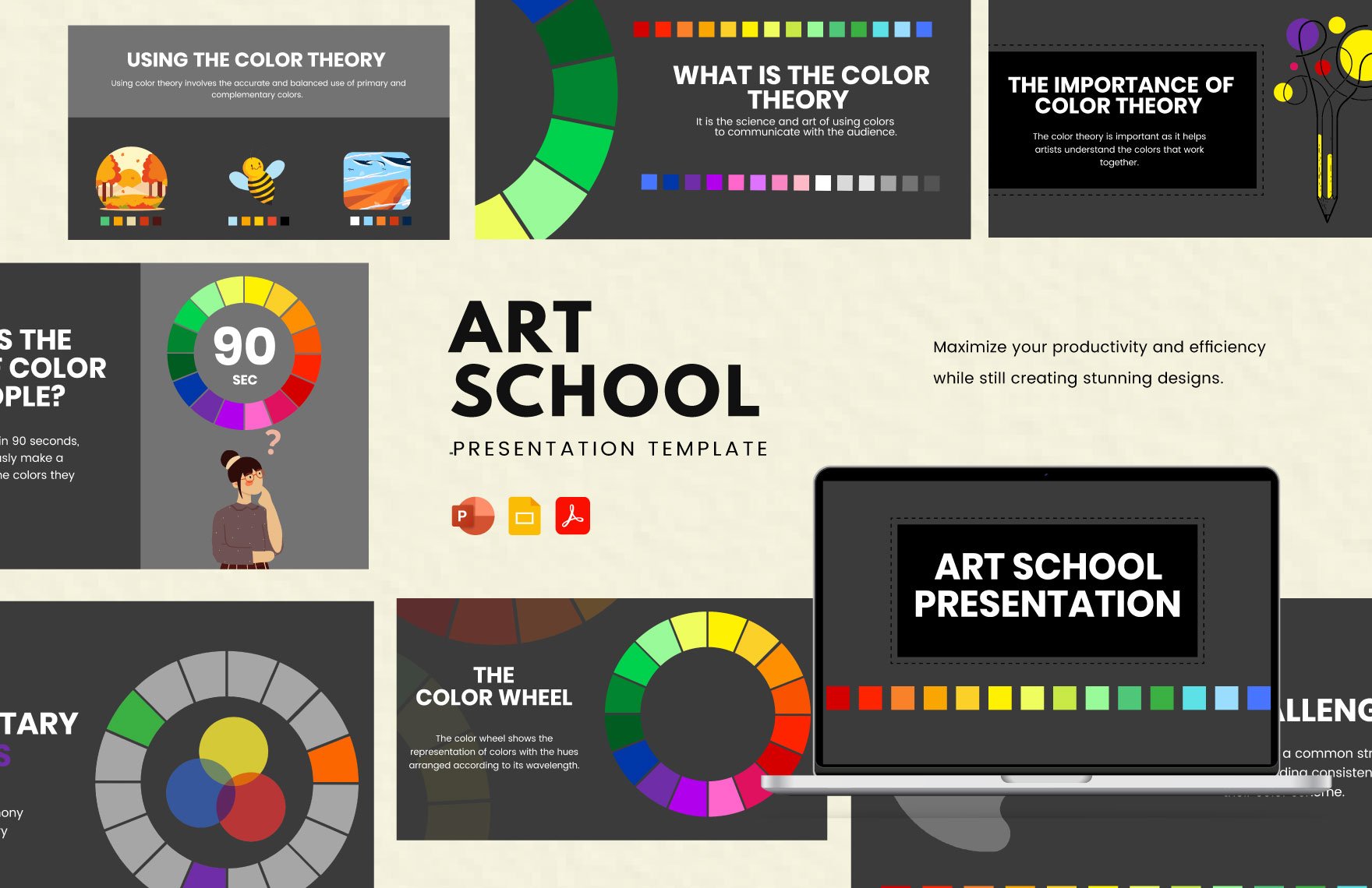
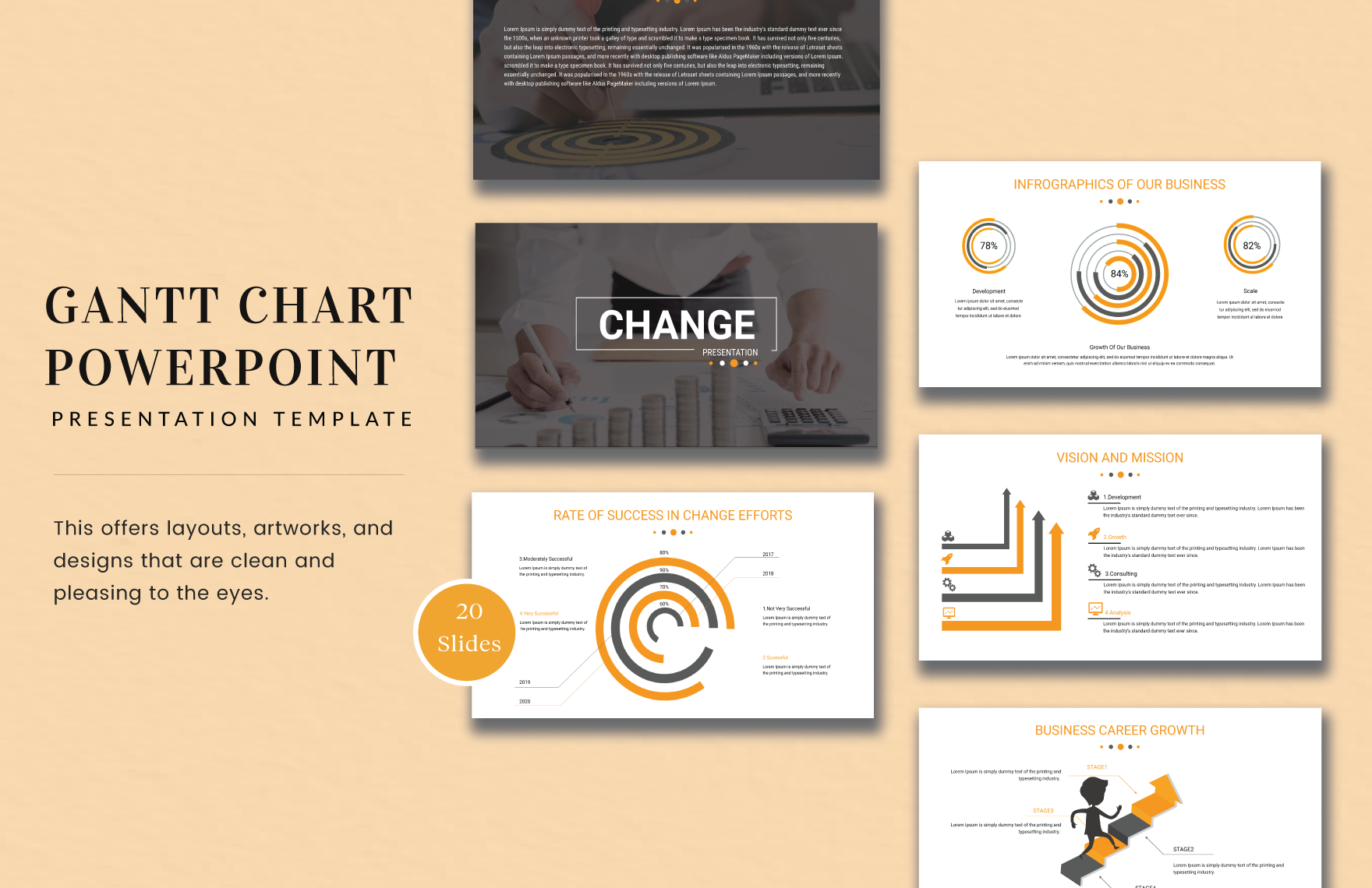
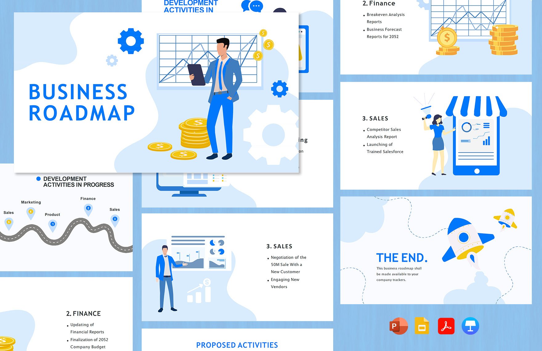
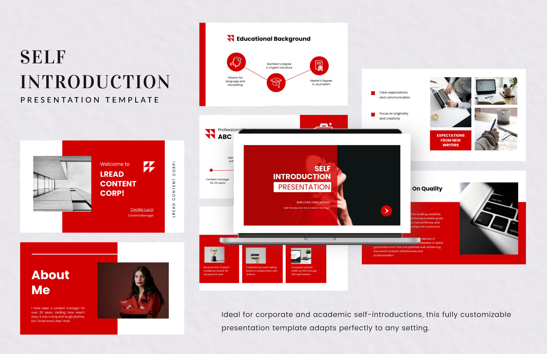
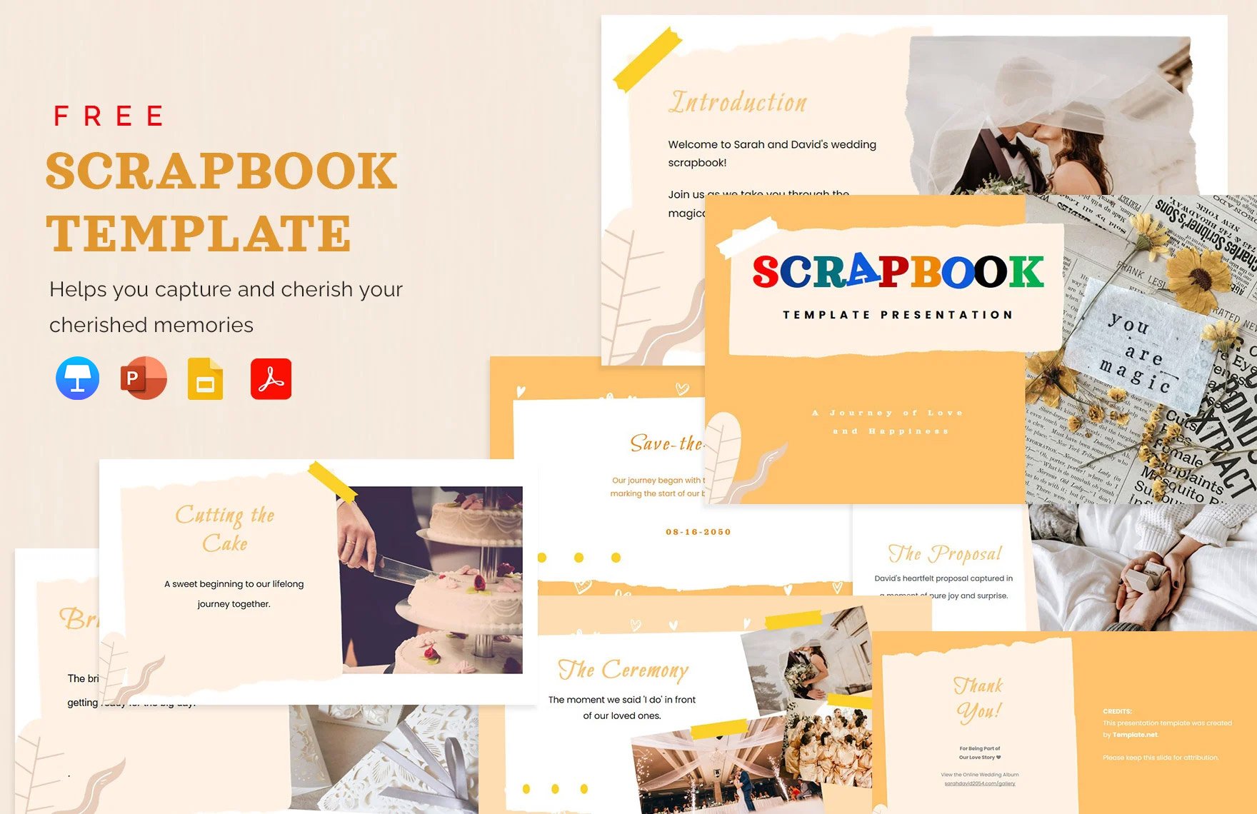
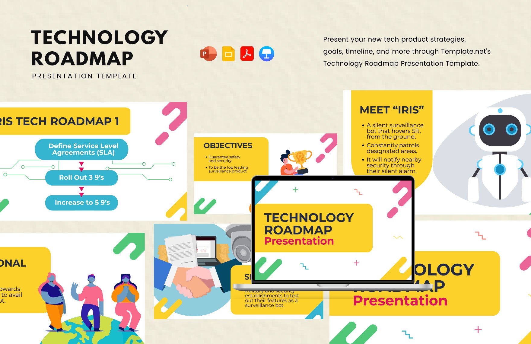
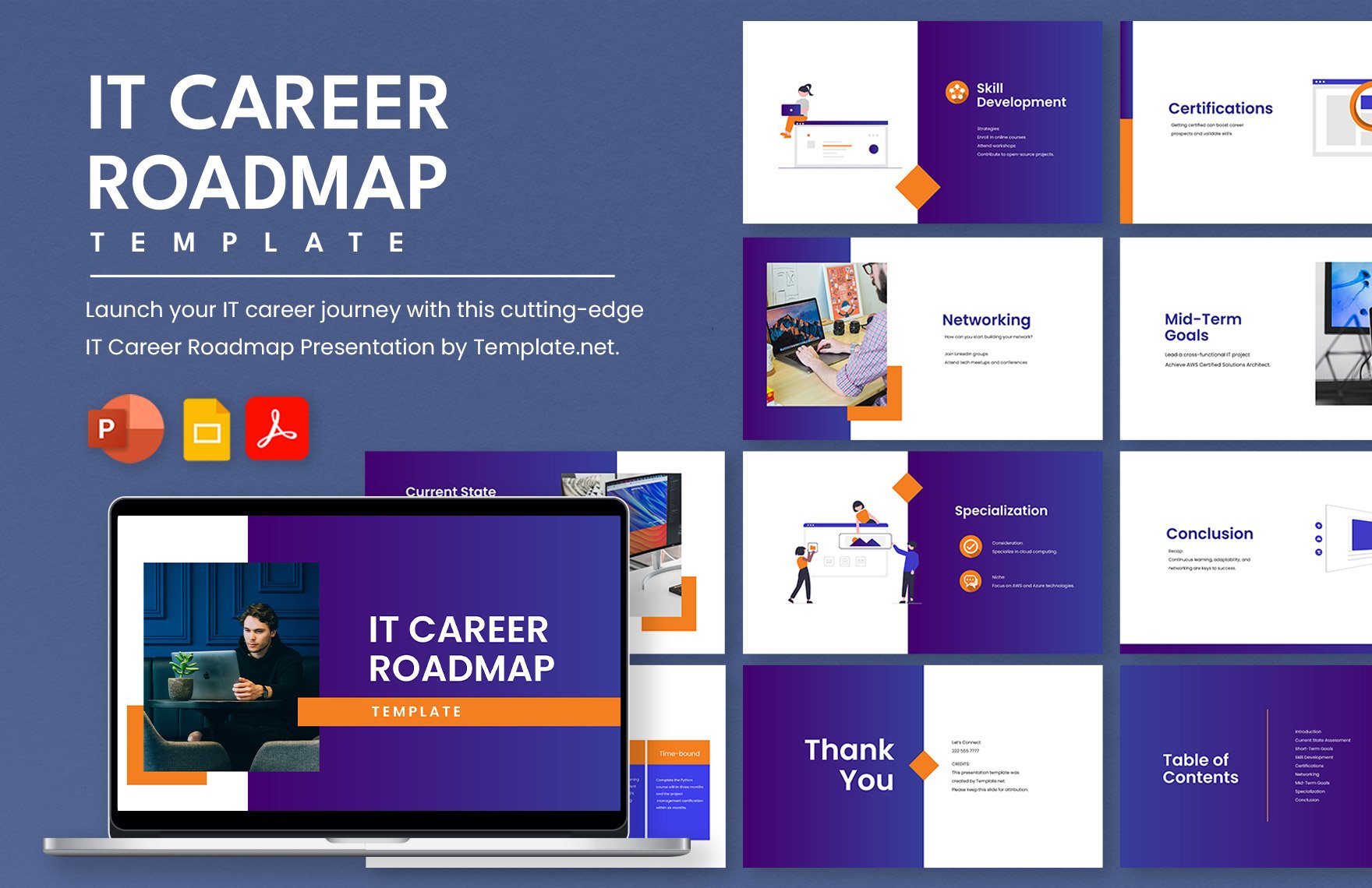
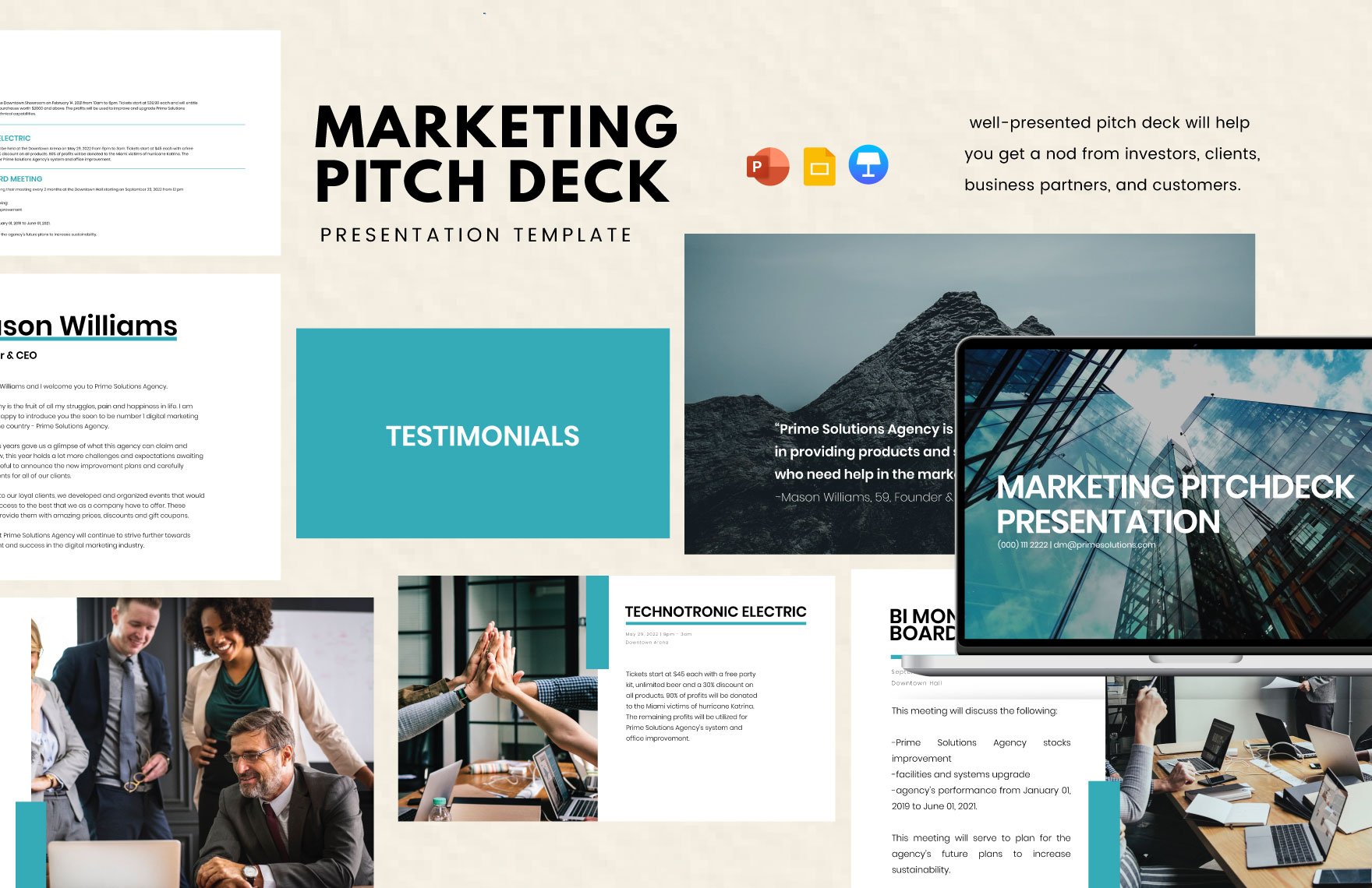
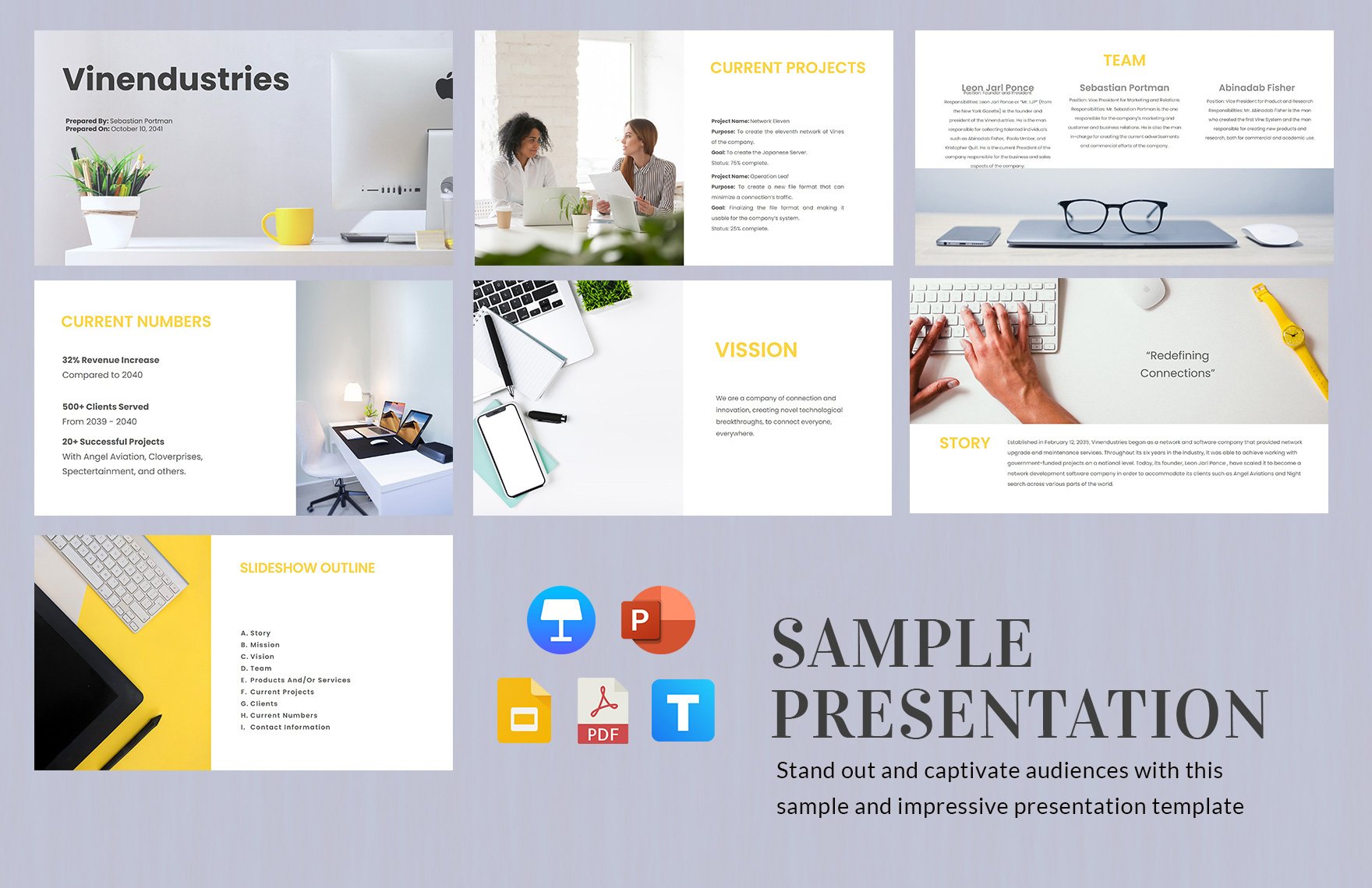
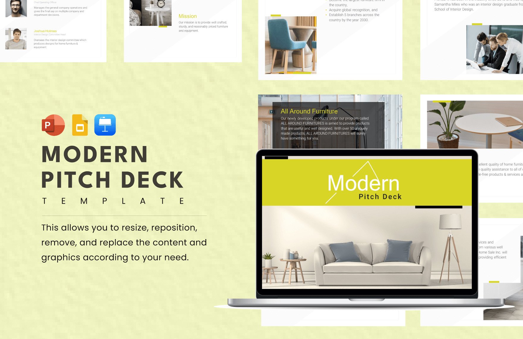
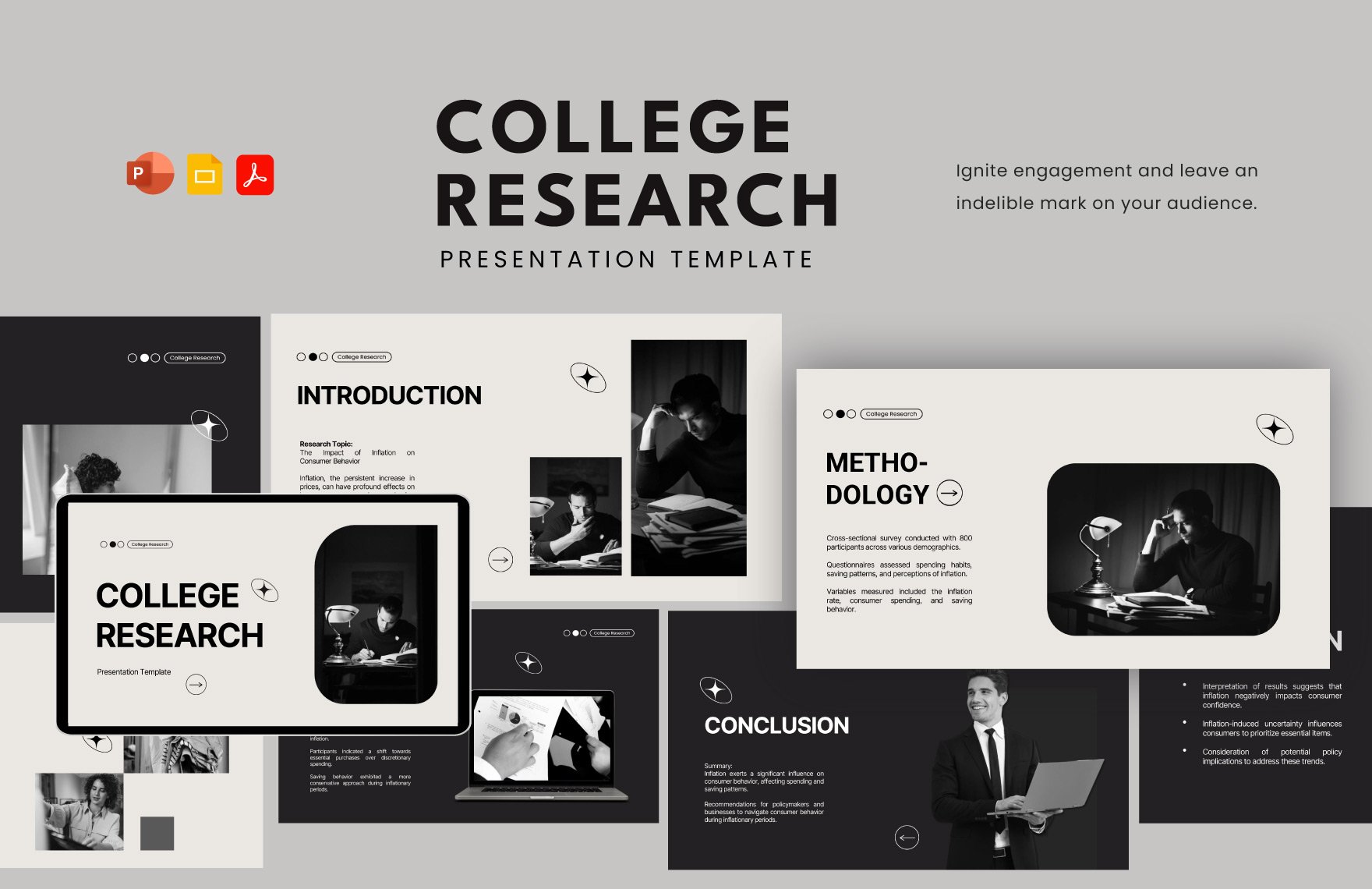
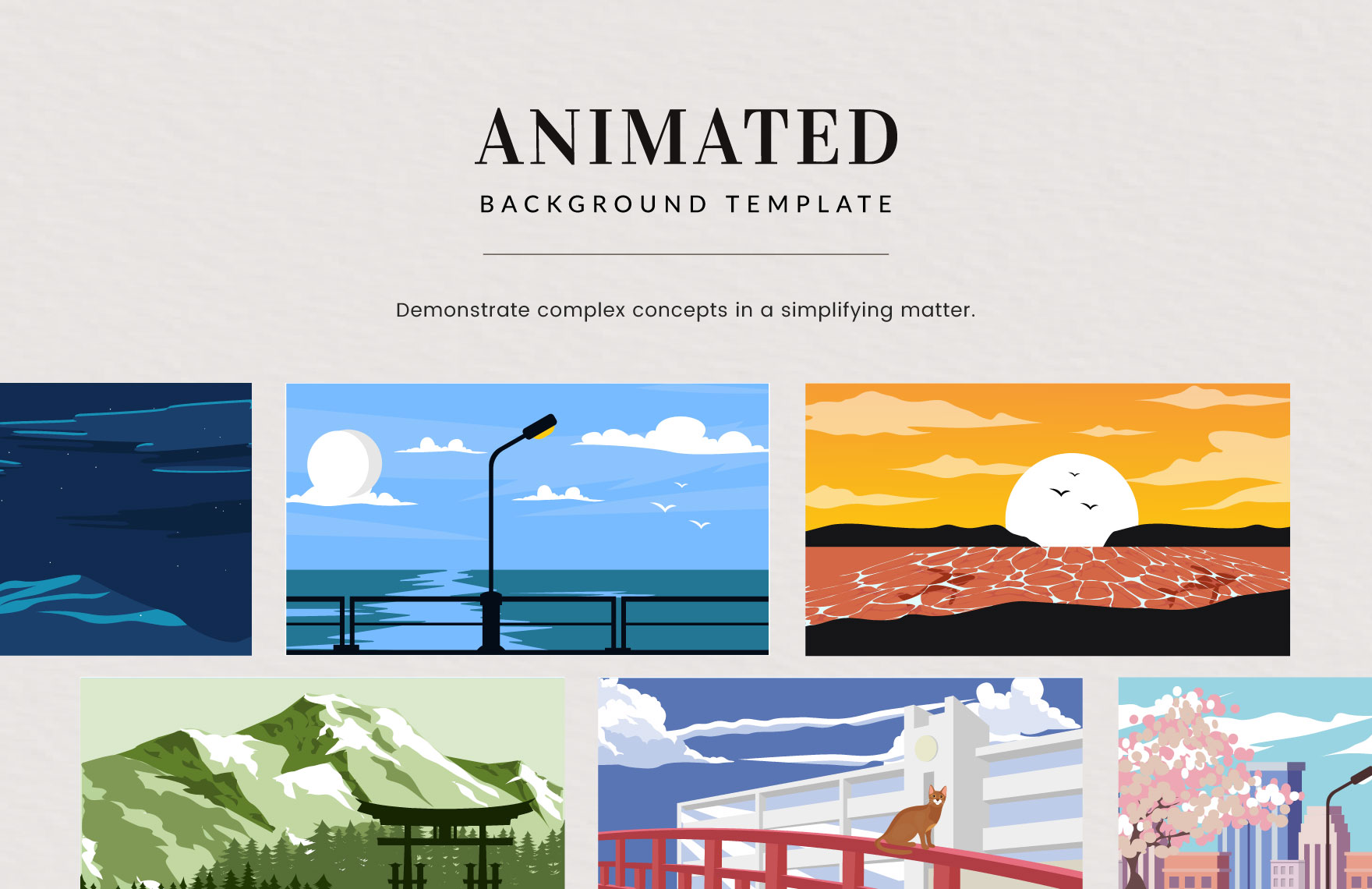
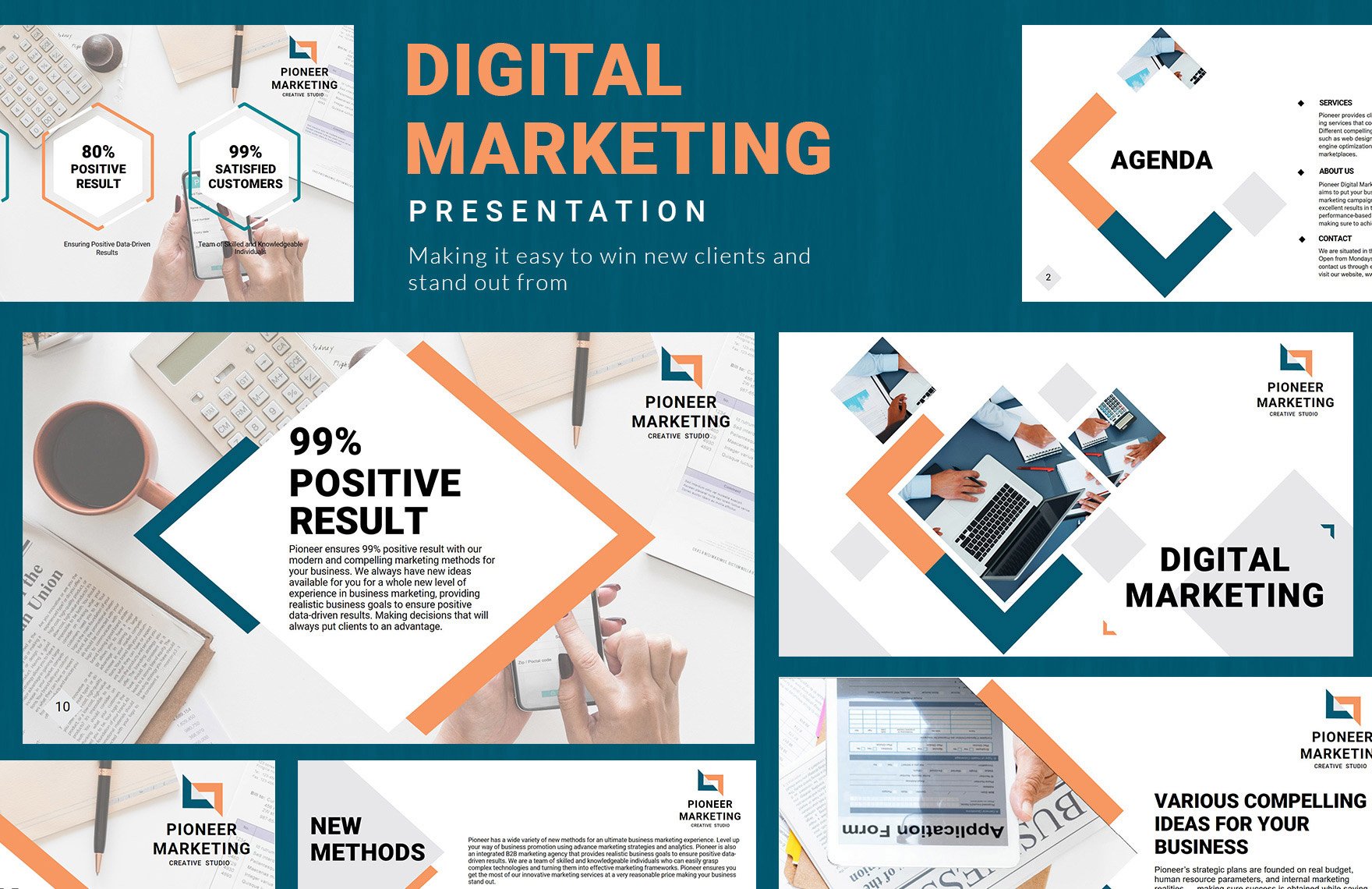
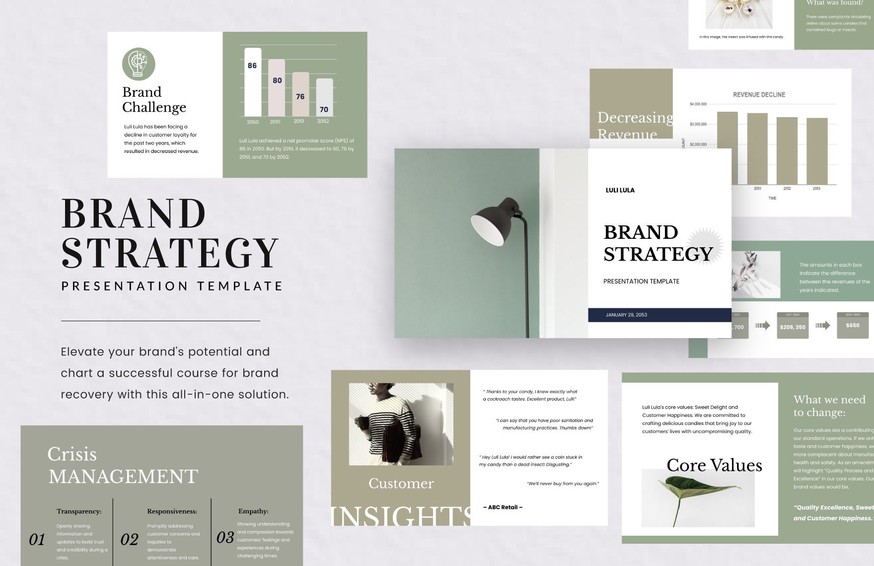
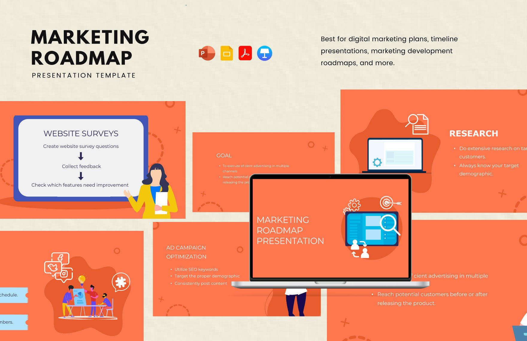
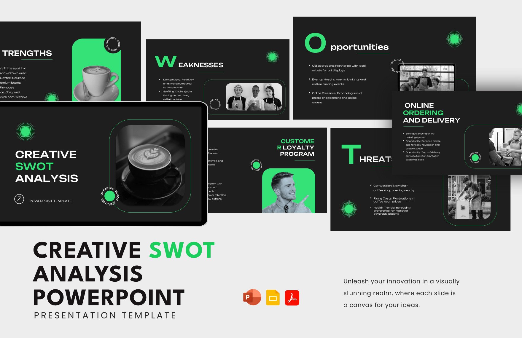
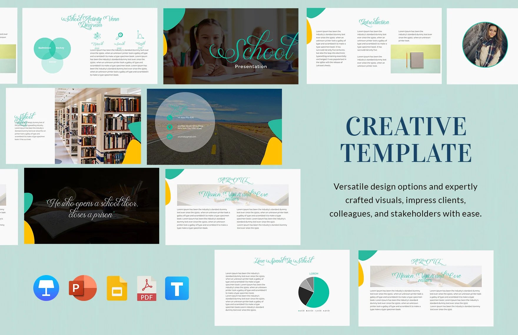
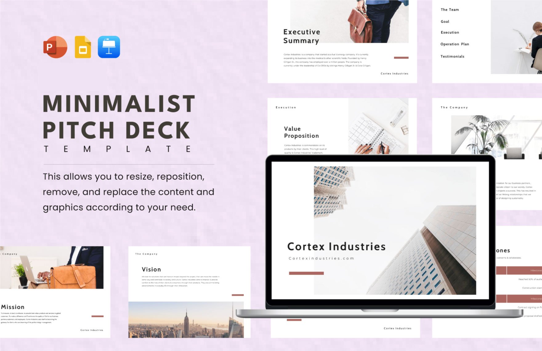
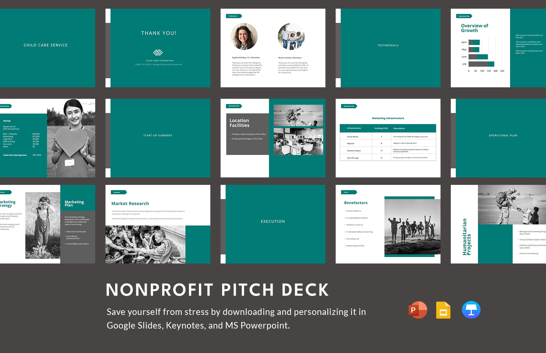
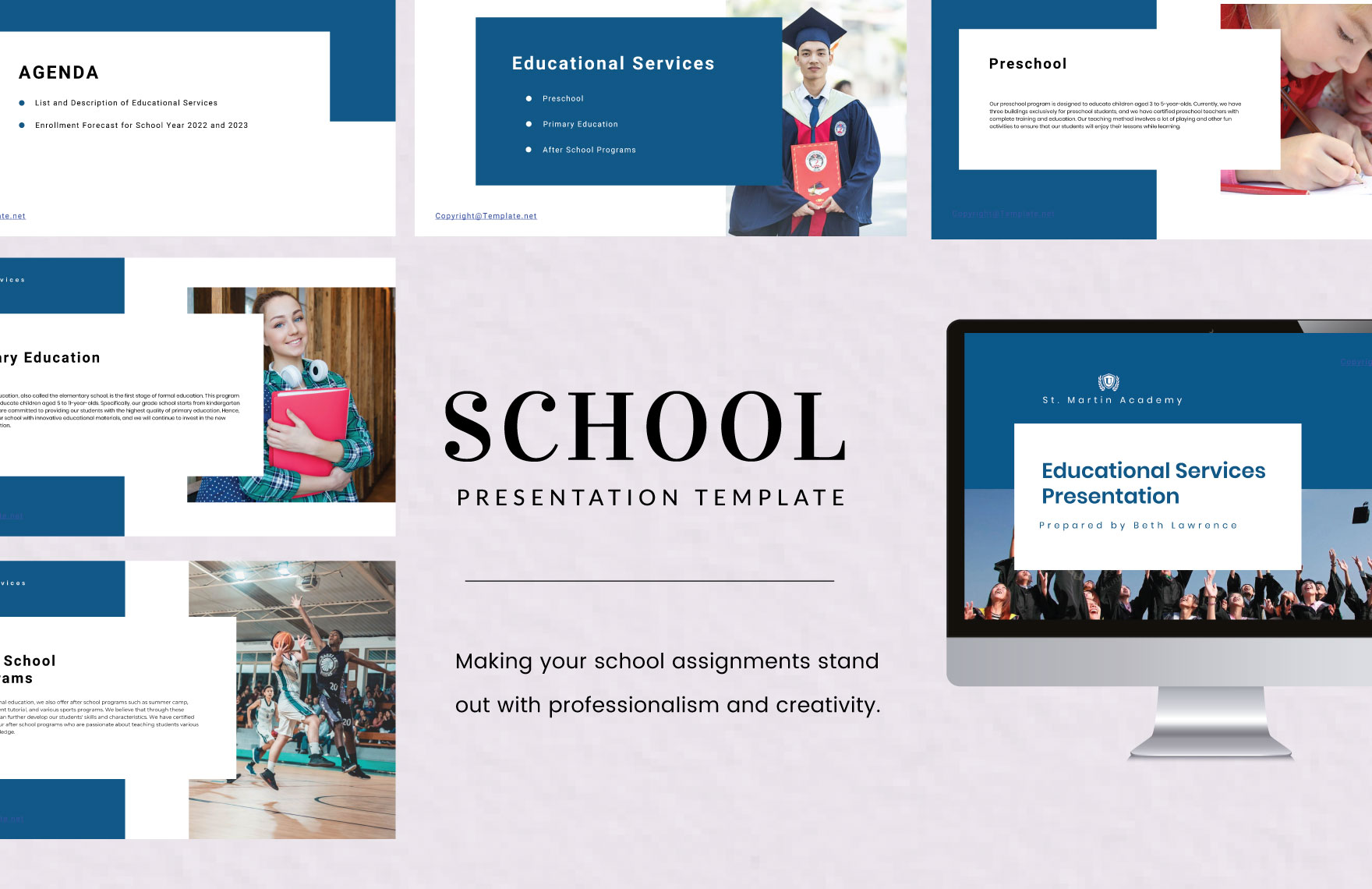
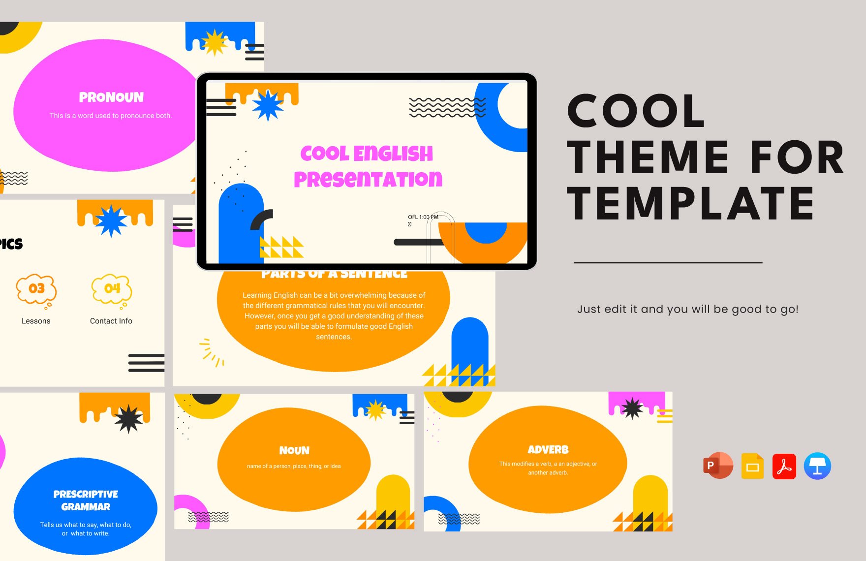
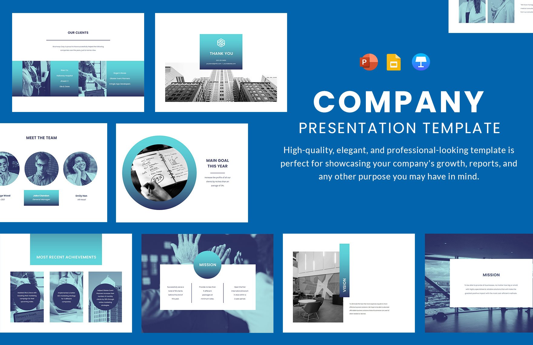
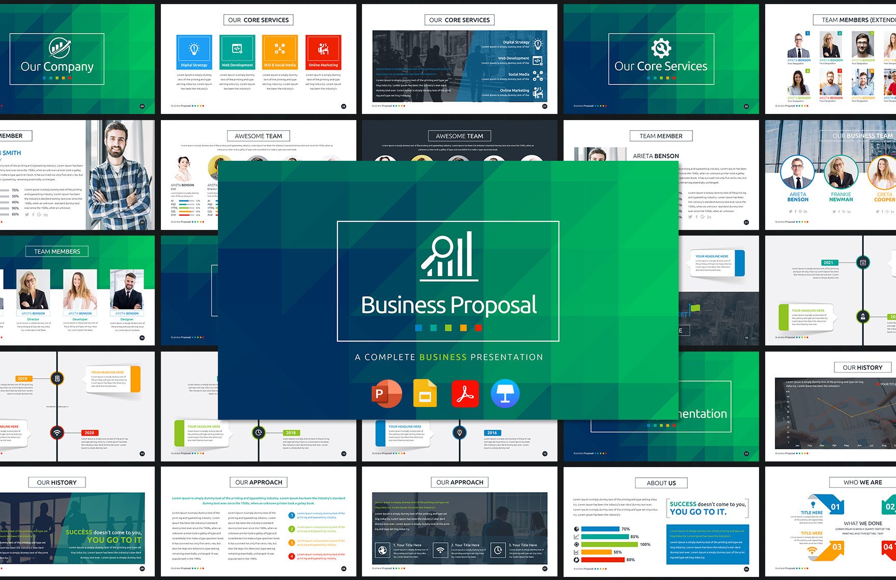
You happened to stumble upon a Ted Talk video, and you remembered you have an upcoming presentation, you want it to stand out as much as the video you saw. Well, if you are stressing about it, stop. We have the perfect solution for you. We offer our wide variety of presentation templates that you can use to present an eye-catching content. Download our templates anytime and anywhere and customize it in all versions of Microsoft Powerpoint to fit what you prefer. It has sample content, layout, images, and graphic files that are professionally-made. Secure a copy of one of our Keynote Presentation Templates and start making that killer presentation, now!
How To Make A Keynote Presentation In PPT
Research indicates that people learn through visuals more so than listening since visuals help in clarification of contents. Well, this makes sense as your brain is primarily a brain processor. We are not going into in-depth details around the brain. However, through visual aids, the audience can understand and remember your point better. That is why you need to create a perfect presentation that can not only help your audience but can also add to the enthusiasm for your audience for when you talk. Imagine having to present something to a class, or maybe even to a broader audience, you do not want to present a visual aid that is unpleasant to look at. Thus, we have prepared a list of tips to help you make yours more progressive:
1. Determine The Subject
First, know the topic of your presentation. Is it going to be a marketing presentation, or is it going to be purely business reports? Before starting it, focus on researching the topic, first. So that you can decide on what relevant and essential designs you are going to be incorporating for your pitch deck presentation.
2. Choose One Set Of Icons
A visual that looks neat and presentable helps in making your audience comprehend the information you are conveying. Having one set of icons will help you with that. Choose the right icons that are relevant to your subject. This adds context to your audience. Also, think of the number and the size of the icons you are going to use. Having too much can ruin the whole idea of a neat and perfect presentation.
3. Make An Outline
You don't want your presentations to be wordy. No one wants to read too much while someone is speaking. Thus, creating a chart of outlines or timeline charts for your topic can help with that. Choose the most important parts of it. If you put everything about the subject, you will most likely end up reading the whole presentation. No one likes listening to a speaker who sounds like they are presenting something they have memorized for a long time. Therefore, make sure that you know the topic very well so that you can present information through that outline you created. In addition to that, outlining helps you organize your ideas, it will allow you to connect data.
4. Choose From The Templates Above
Having something that can help you make the process faster is always a great idea. That being so, make sure that you check out our presentation templates above. This will give you pointers for your presentation through its professionally-made sample contents. Choose the best template that is the best fit for your topic.
5. Review And Practice
Practice is the sole criterion, they say, but a lot of practices lead you to perfection. Get help from a professional, have them evaluate your work, including the graphics and design of your visual aids. List their constructive comments and work on it.


