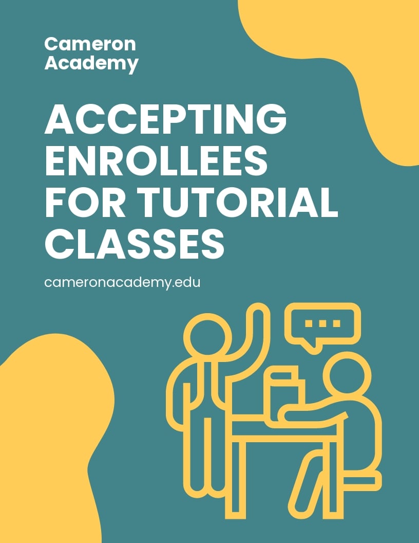
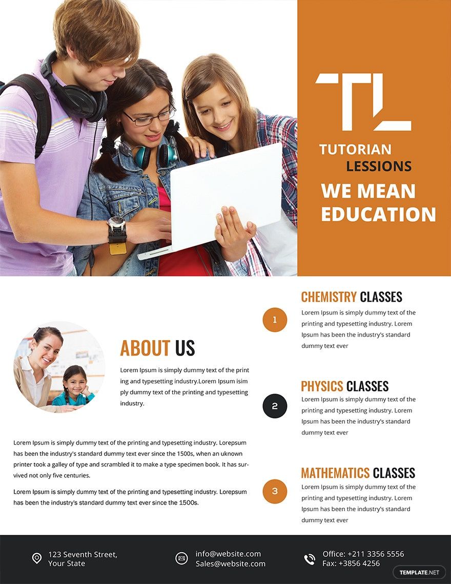
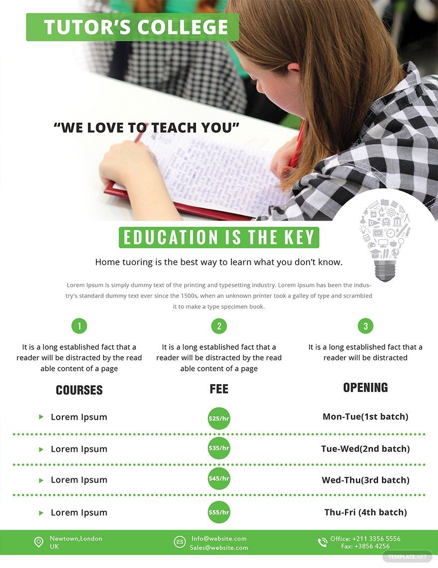
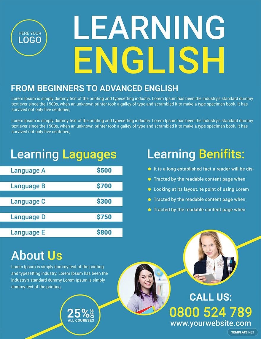
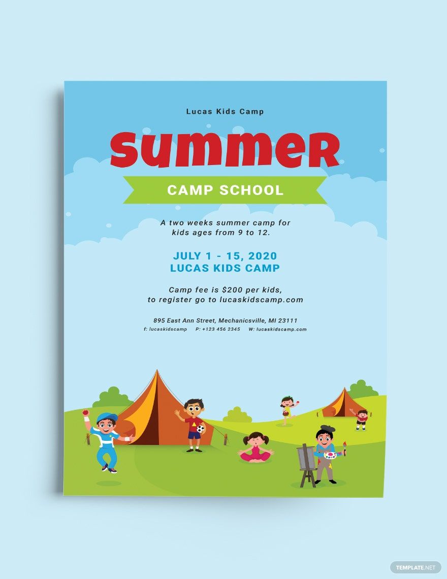
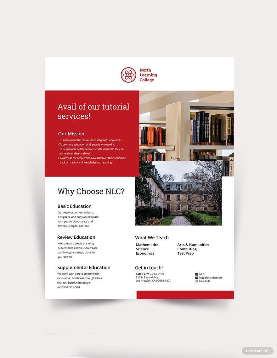
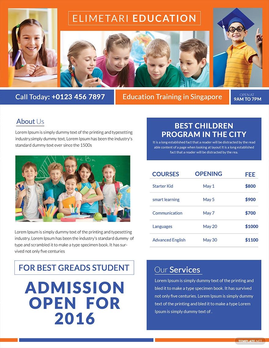
Poor report cards, unmotivated in doing school works, and sloppy in doing assignments, if you're child showcases these kinds of traits, then that could only mean one thing—private tutoring is what they need! To help them excel, investing in tutoring programs would probably be the best choice. Learning institutions and tutoring centers can now improve their advertising strategies with the help of our professionally made Tutoring Flyer Templates in PSD. With our collection of 100% customizable templates, creating an effective and engaging business flyer can be done in a heartbeat. These high-quality templates are printable in (US) 8.5x11 inches + Bleed size. Engage customers with your excellent quality service when you download these templates today!
How to Create Tutoring Flyers in PSD
According to the National Center for Education Statistics, there were a total of 2.1 million high school dropouts in 2017 with ages that ranged from 16 and 24. One of the reasons why is because of academic failure. This is a national concern that needs to be addressed quickly to save and help the youth. Good thing there are learning centers and institutions that are offering private or free tutoring programs that they can avail.
Are you one of those learning centers that offer tutoring programs this summer? If yes, then ace your competitors by creating an engaging advertisement material with the helpful tips that we have listed down below.
1. Develop a Remarkable Headline
One of the effective ways to make your print advertising material more catchy is through your headline. It's usually the first thing that your readers will notice in your promotional flyer. Create one with relevance to its purpose. Think outside of a box and don't settle for boring ones. The more compelling you create your headline, then the higher your chances are in successfully delivering its purpose. You may develop it in a question form or simple statement that'll bring a lot of impact for your flyer.
2. Layout It Effectively
Draw more attention to your flyer by strategically arranging all of its elements. Doing this will not only make it more appealing but would also help readers understand its key message. Don't try to fit in all the information in one space. Maximize every white space and corner of your flyer. When it comes to creating marketing materials, always remember the golden rule—include only important details.
3. Keep Things Balanced
When it comes to designing flyers, we tend to integrate a lot of details in it. If you want to make it more professional, then this is the first thing that you should avoid doing. Although integrating a lot of visual and written elements in your flyer can make it visually overwhelming, chances are also high that your readers will get lost and will not understand what your flyer is trying to communicate. Take a look at our sample flyers and make them as your reference in designing your tutoring flyer.
4. Use Graphic Fonts
From conceptualizing a catchy headline down to the design process of your tutoring flyer, it's now time to choose the appropriate typeface that you're going to use. Fonts often attribute a different feel or look for your flyers, so you have to be extra careful in choosing. For instance, if you're promoting your math tutor and chemistry tutor services, then go with fonts that depict trustworthiness and dependability. Don't try to be experimental with your choices and limit it to 2 or 3 typefaces only.
5. Don't Forget Your CTA's!
Drive results with your marketing materials by including some call-to-action details in it. Directly state what you want from your audience. If you want them to avail of the services that you offer, then state it in your business flyer. CTA's will help you convince your readers and encourage them to take the next step.