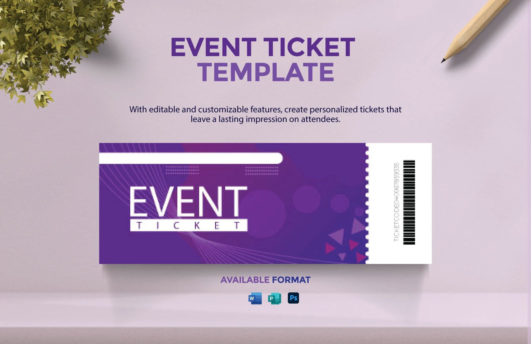
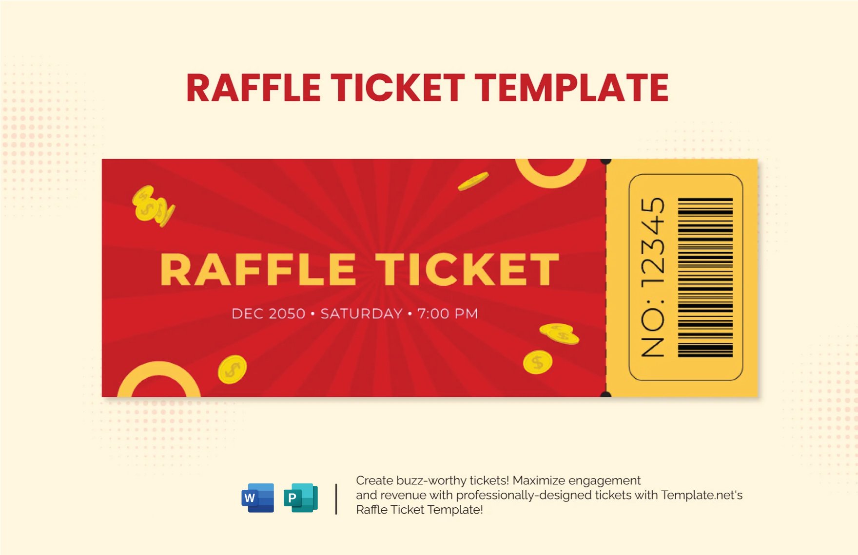
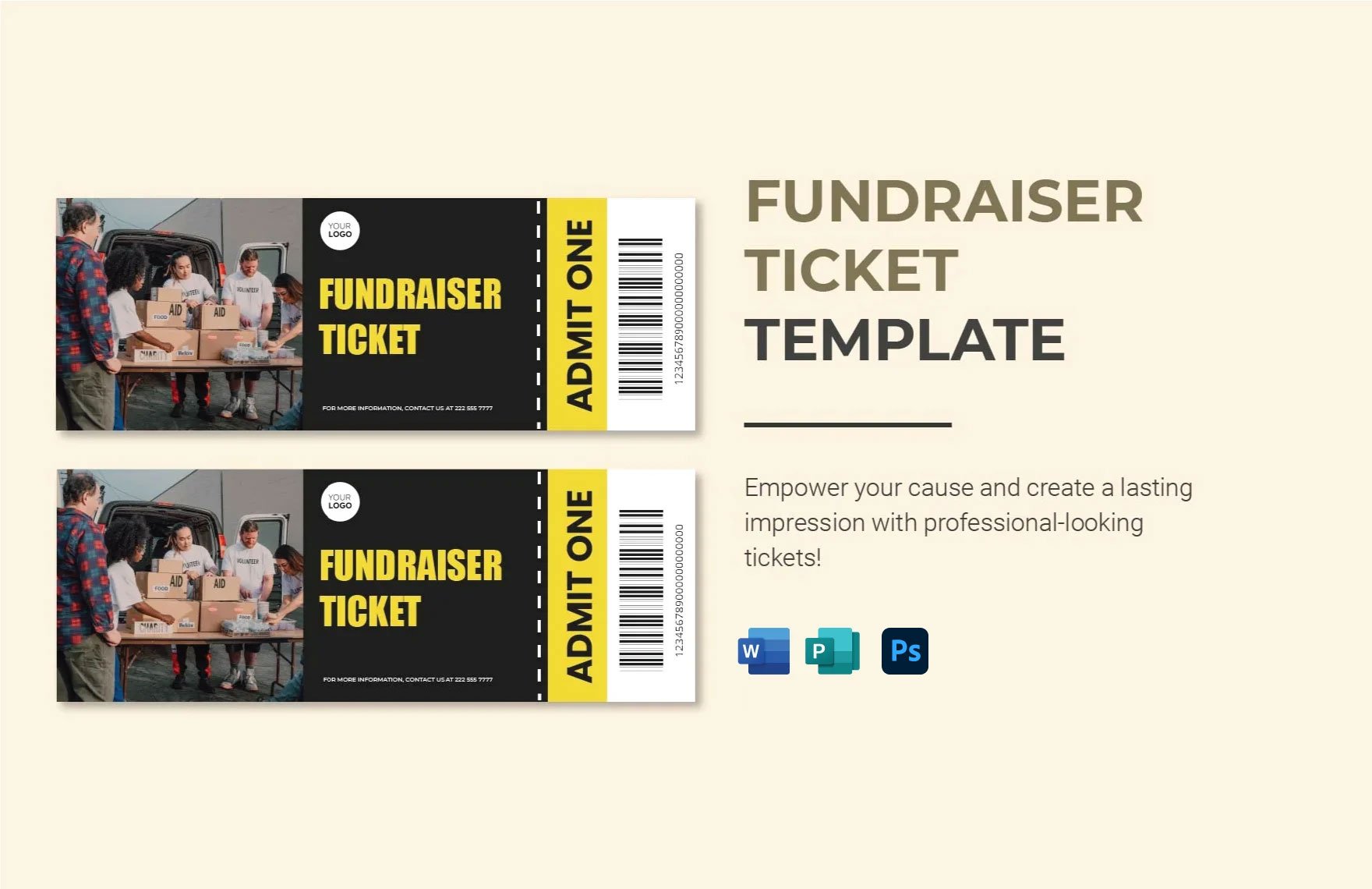
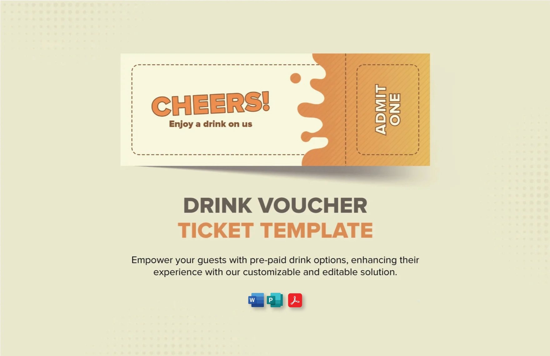
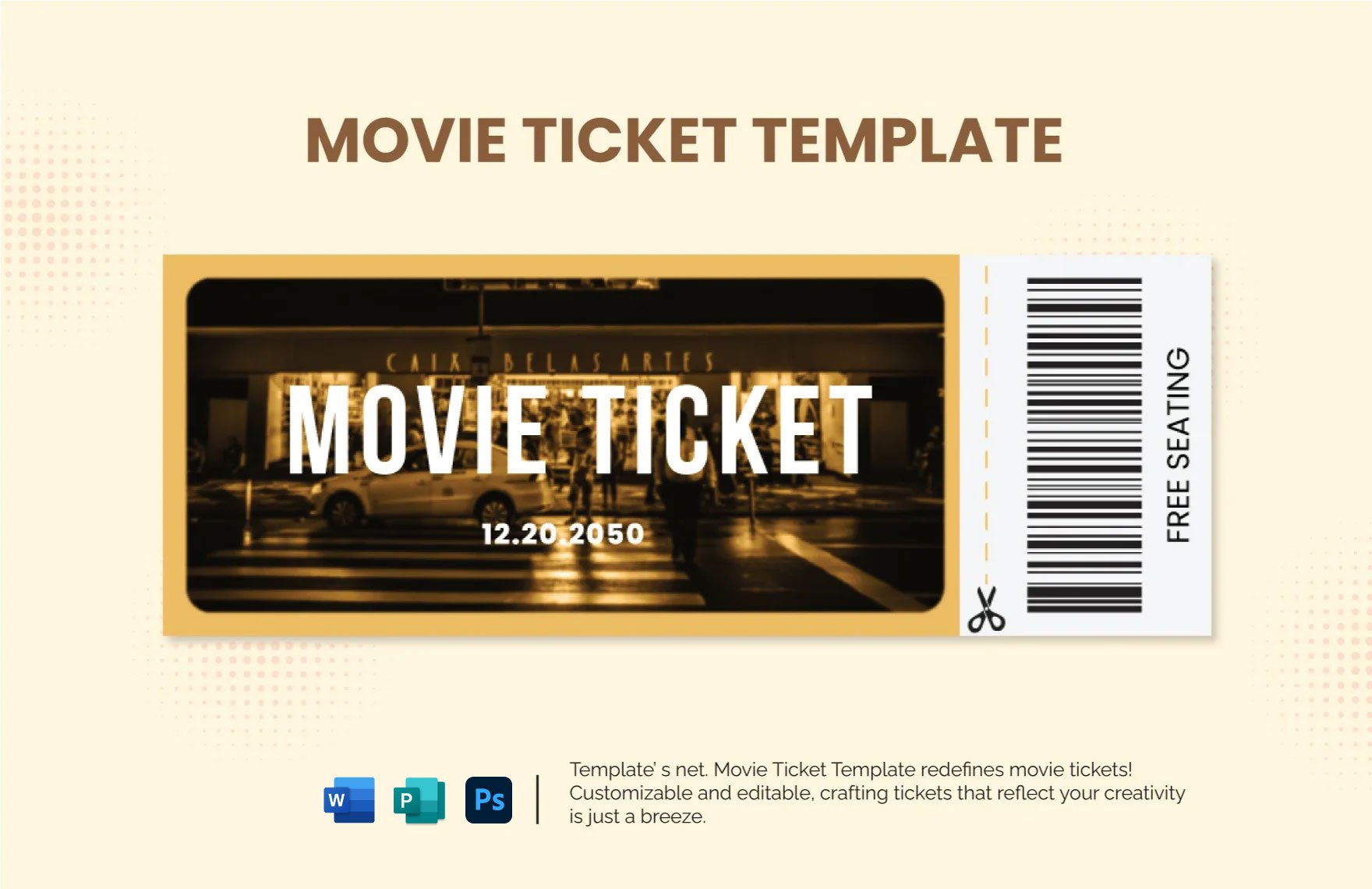
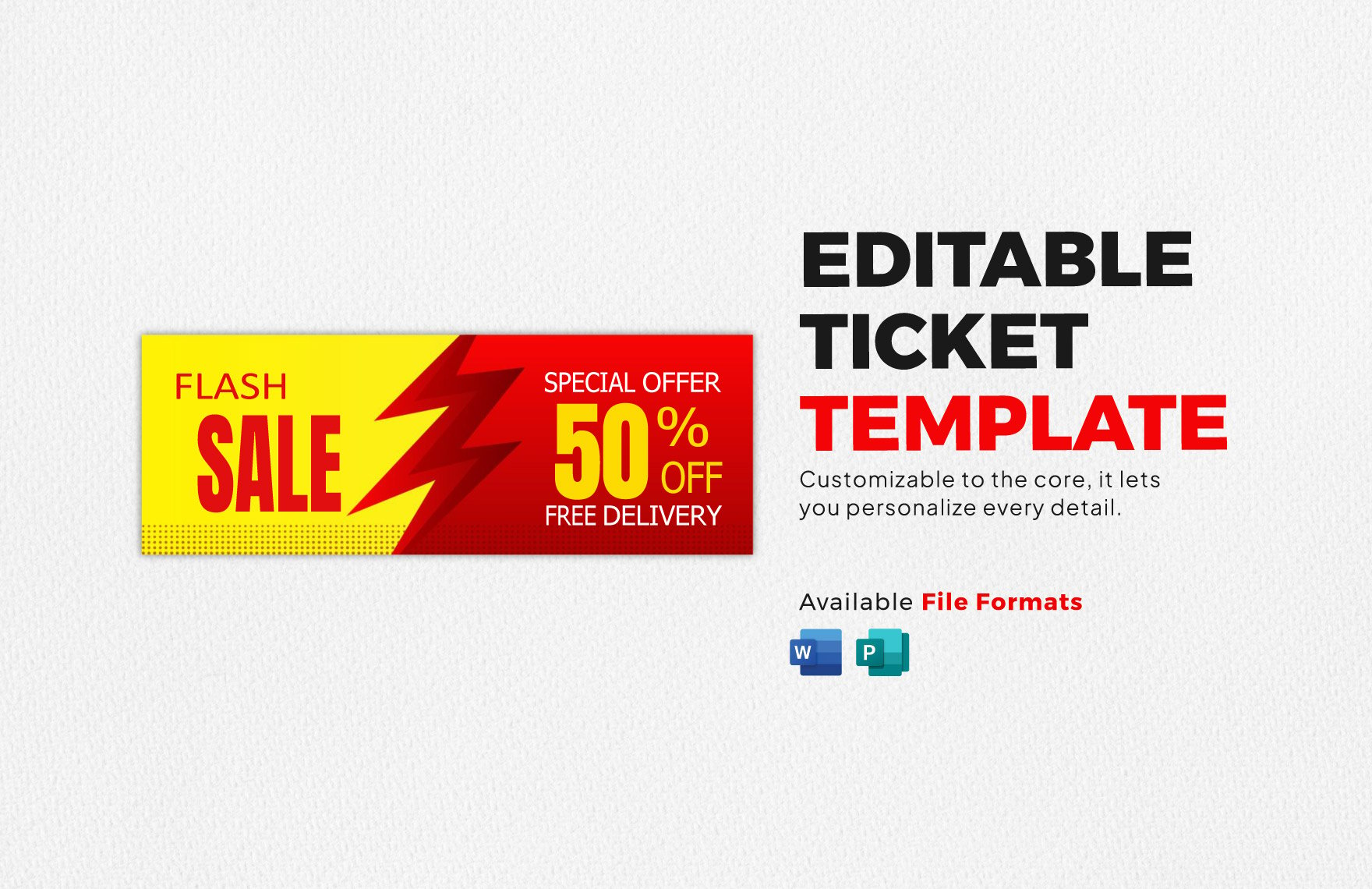
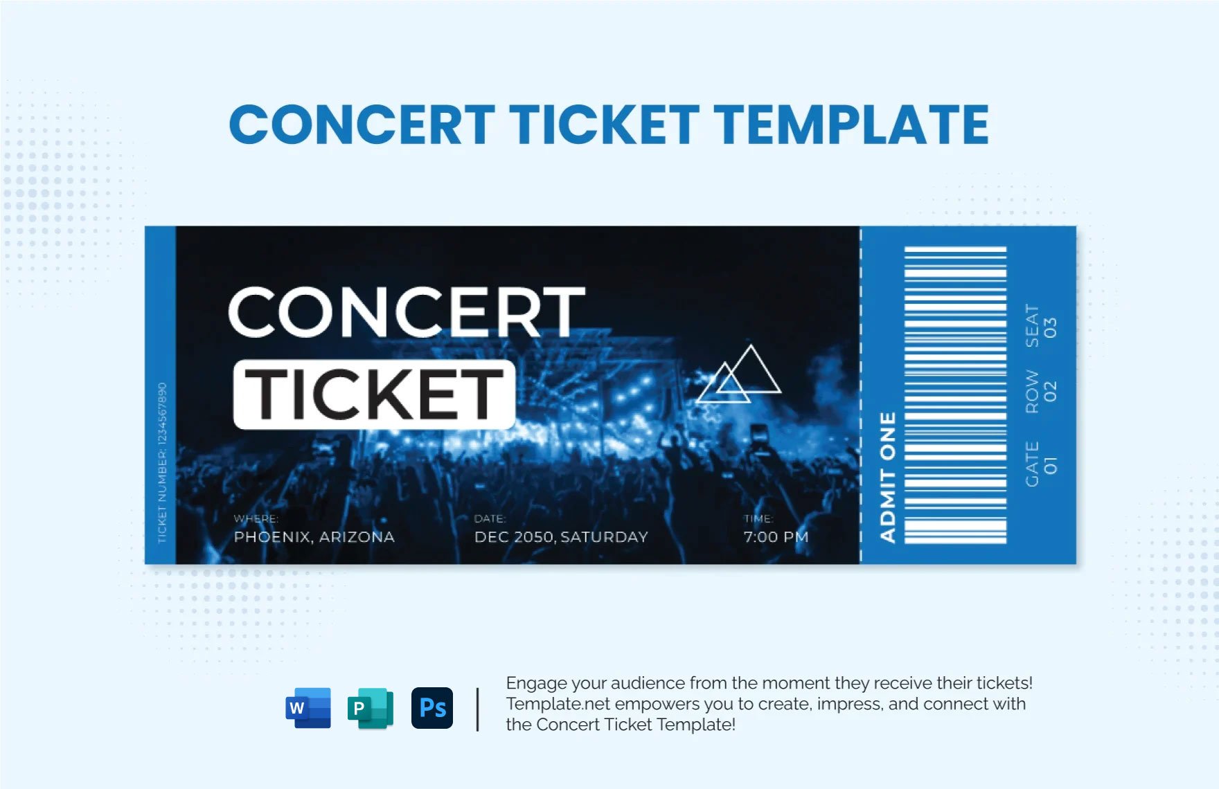
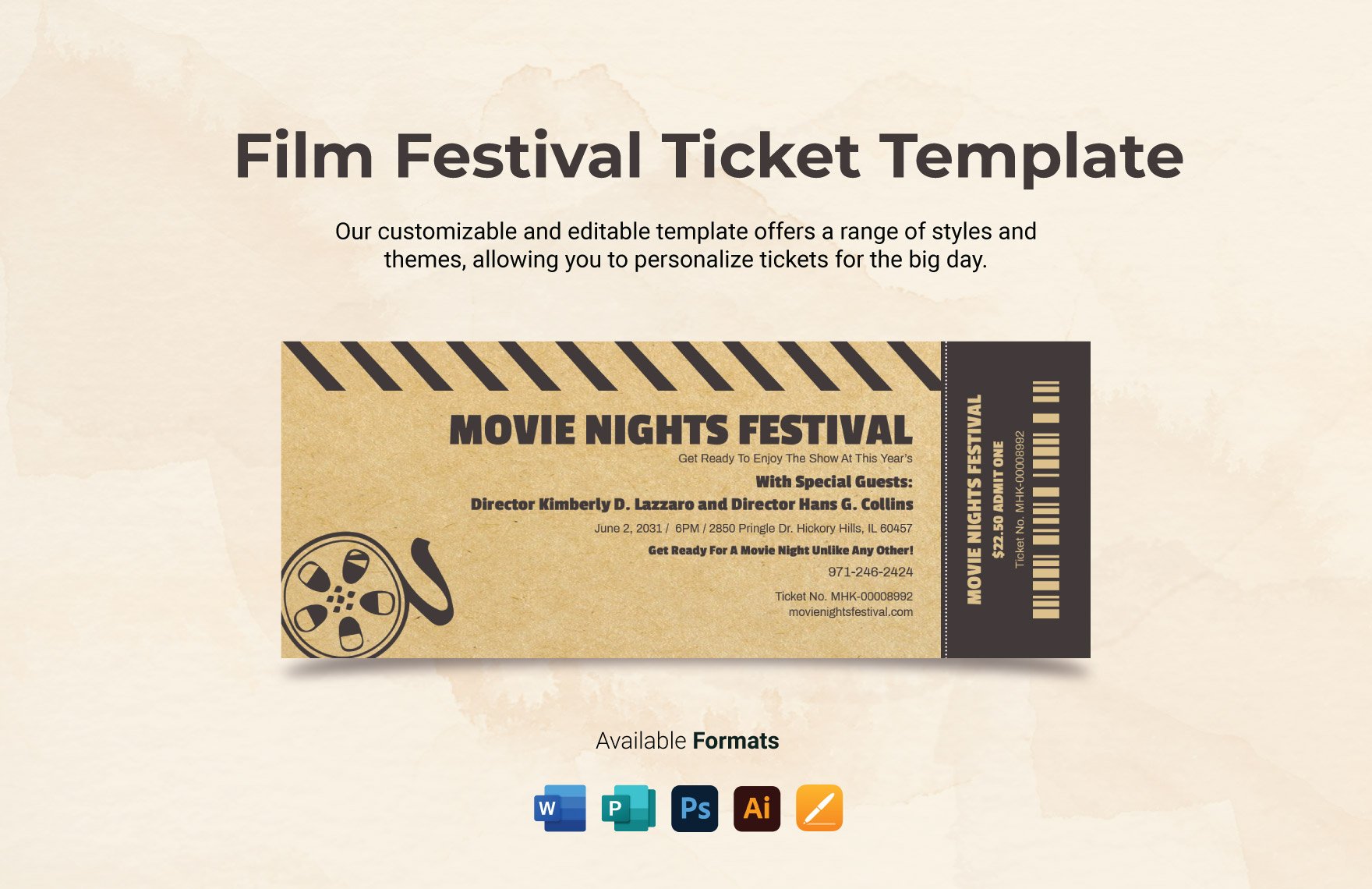
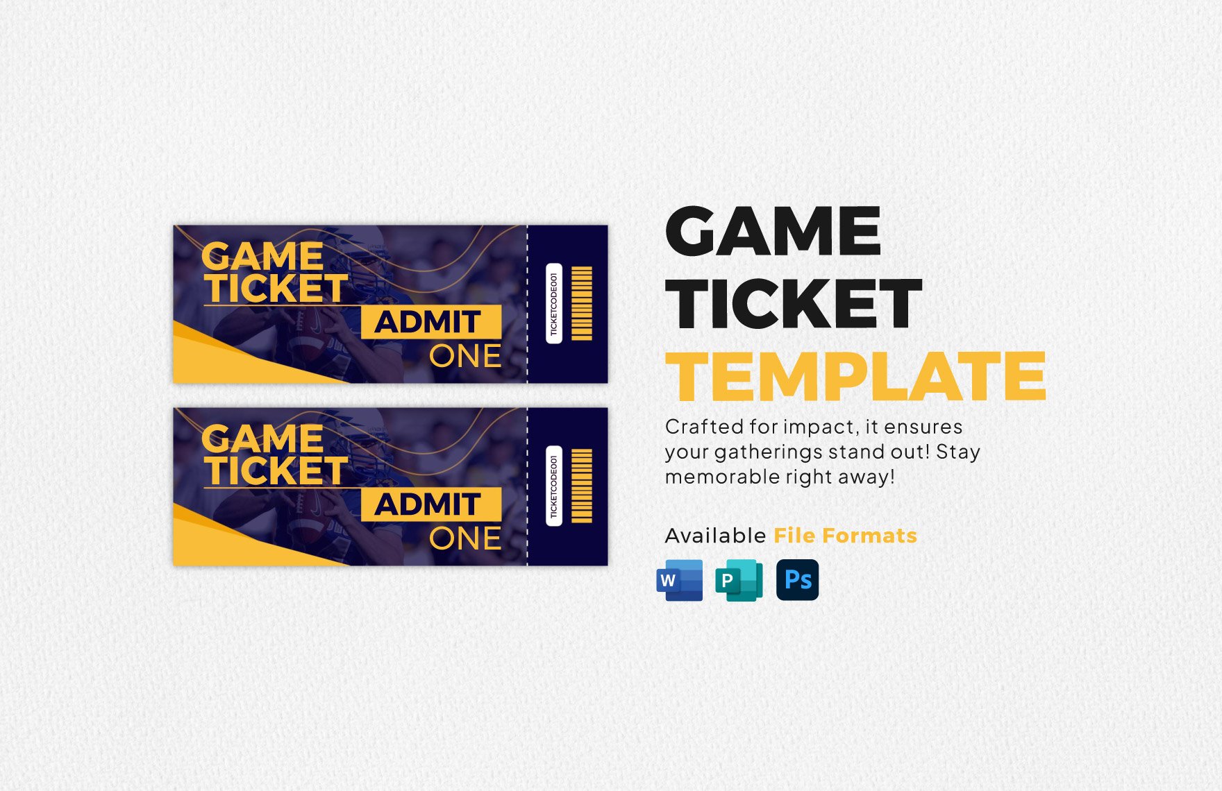
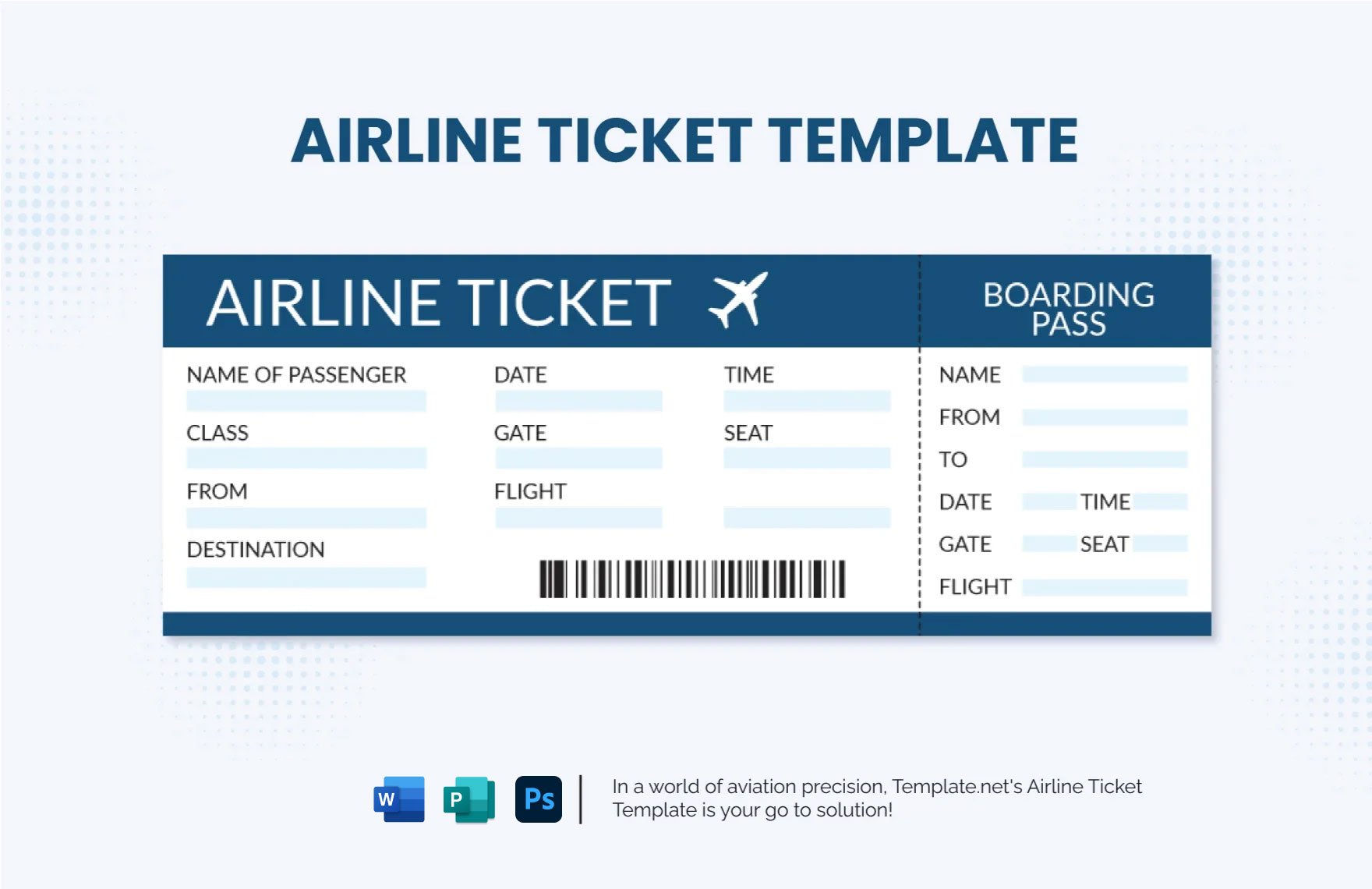
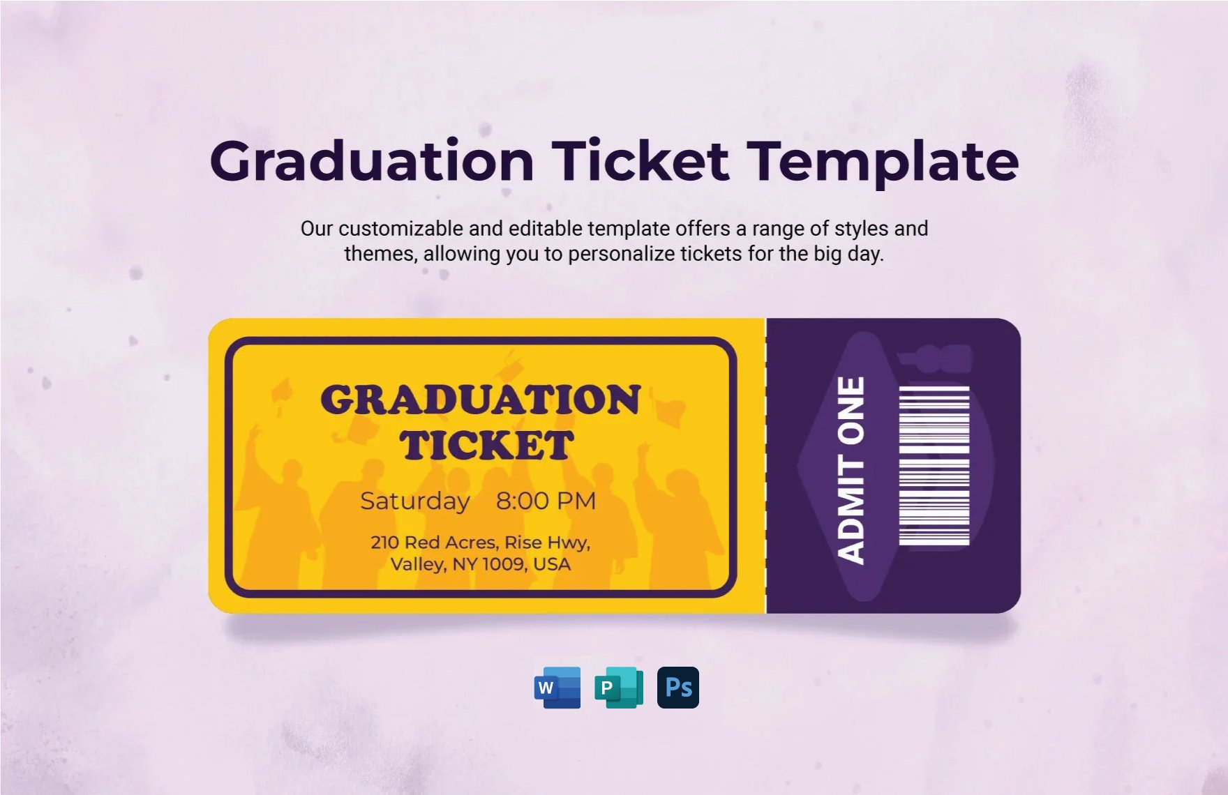
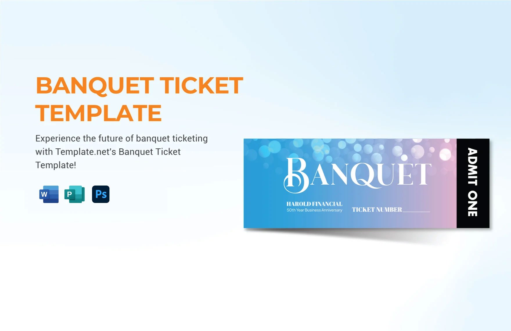
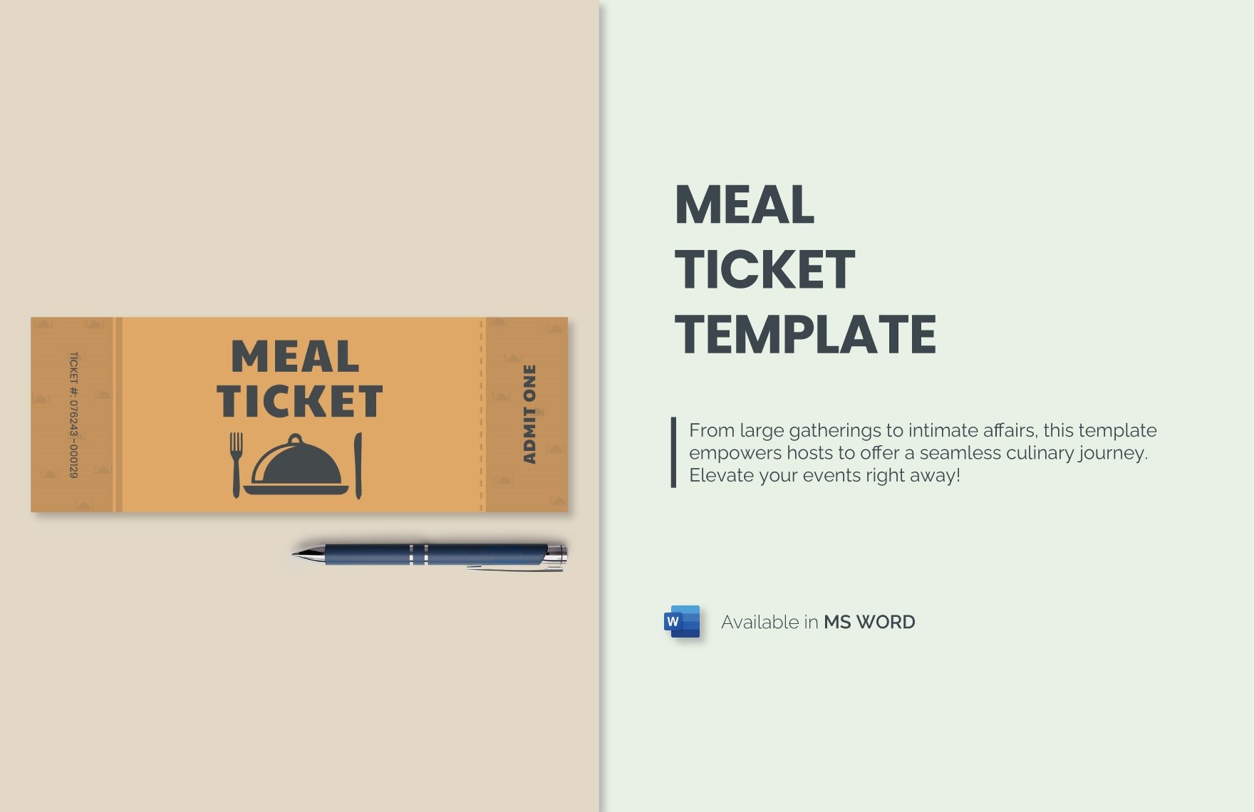
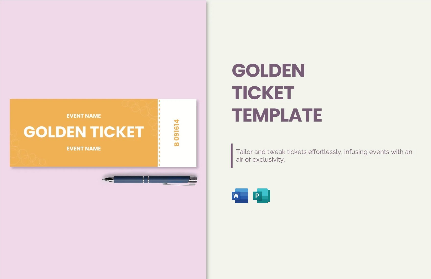
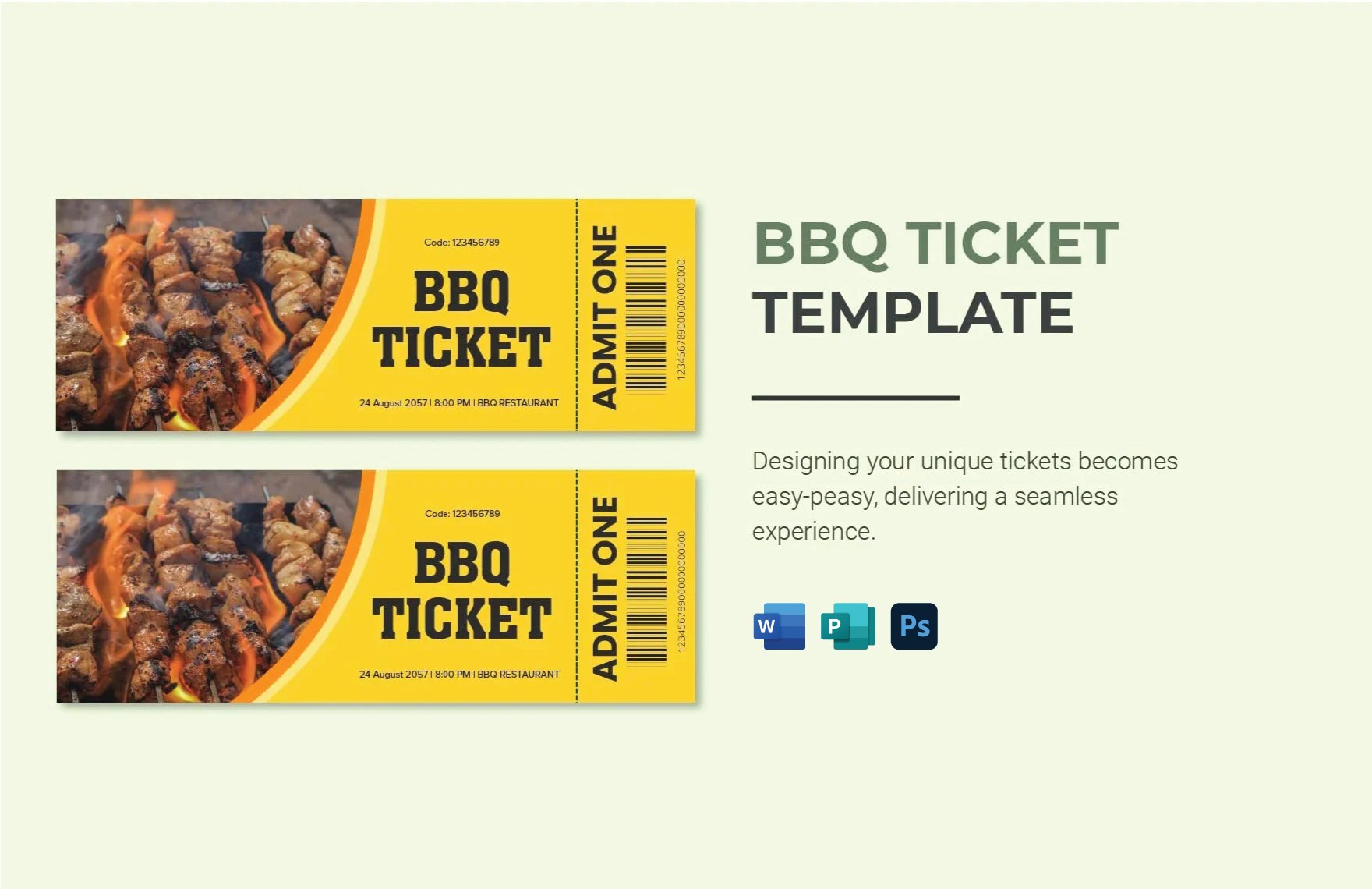
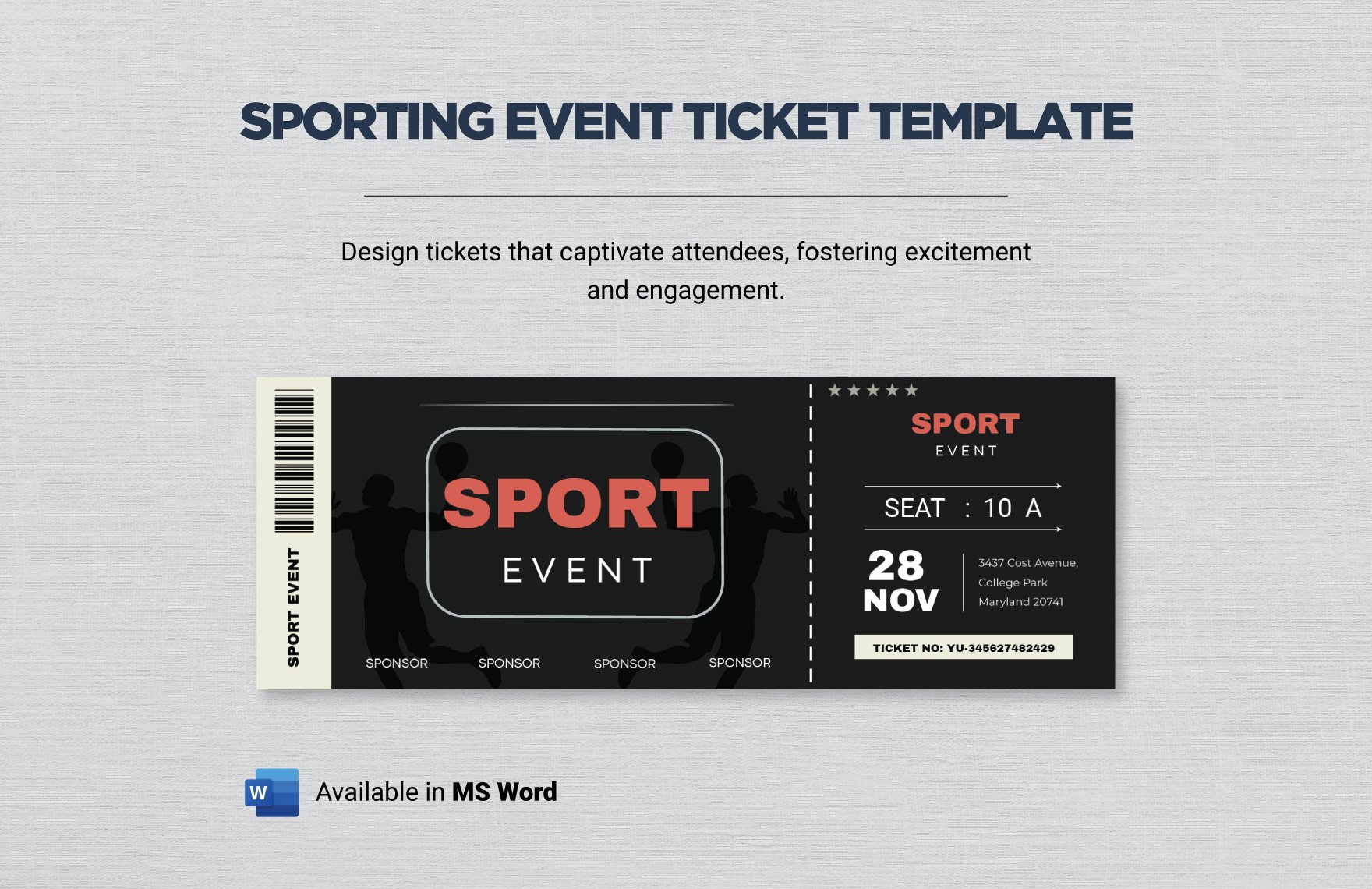
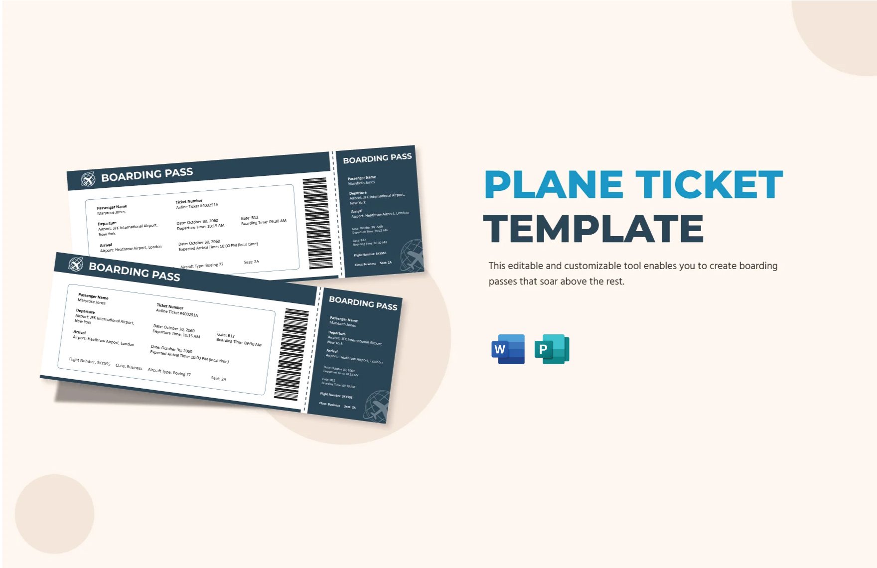
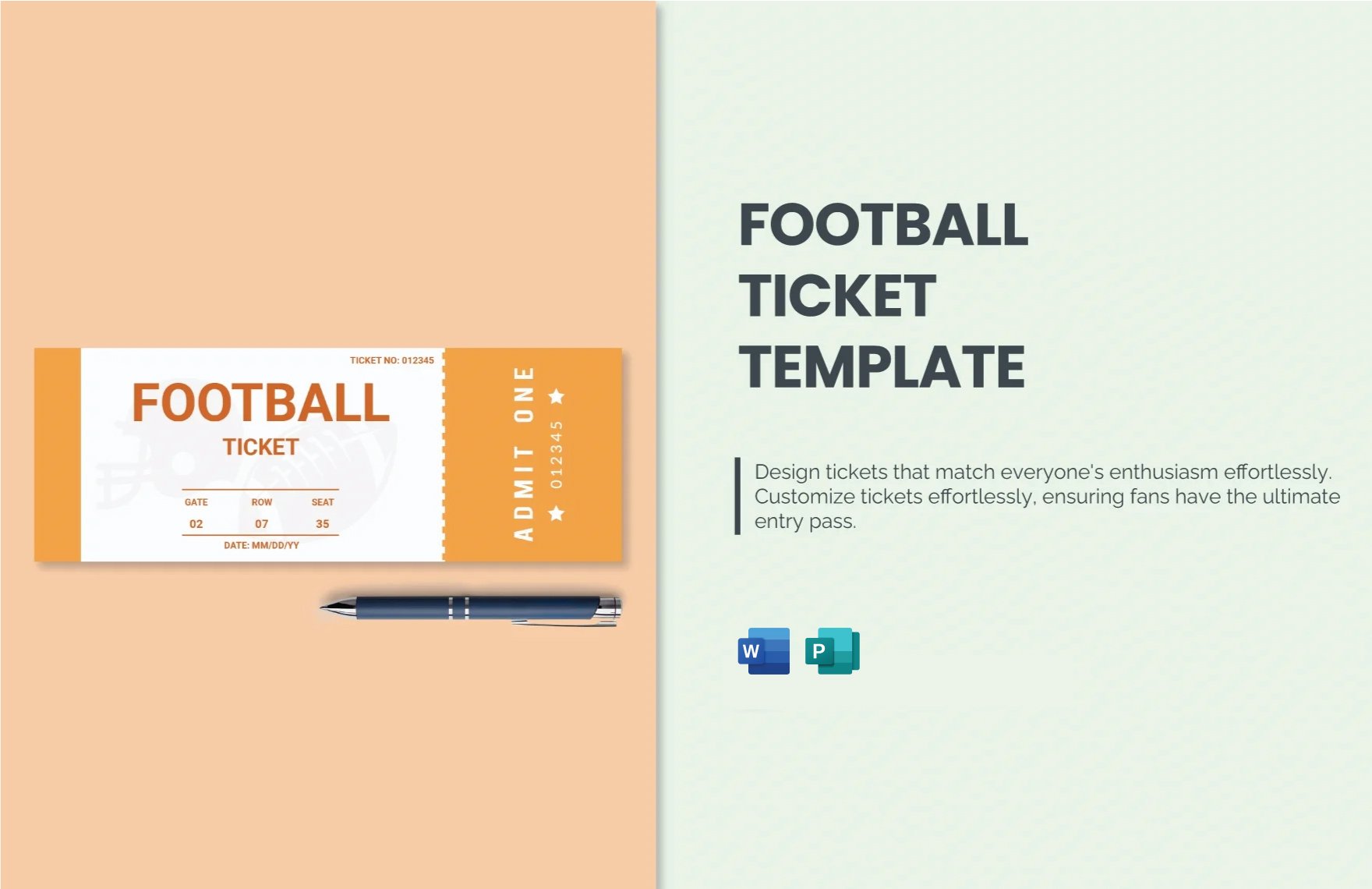
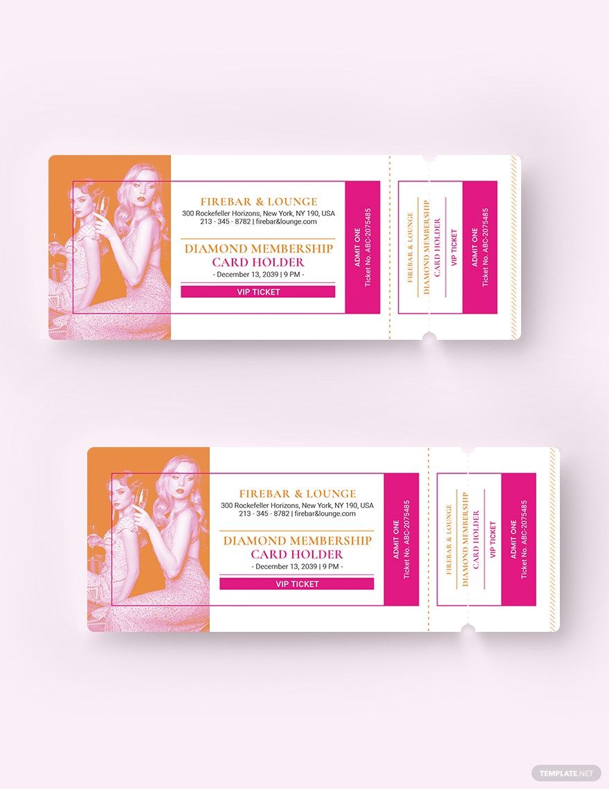
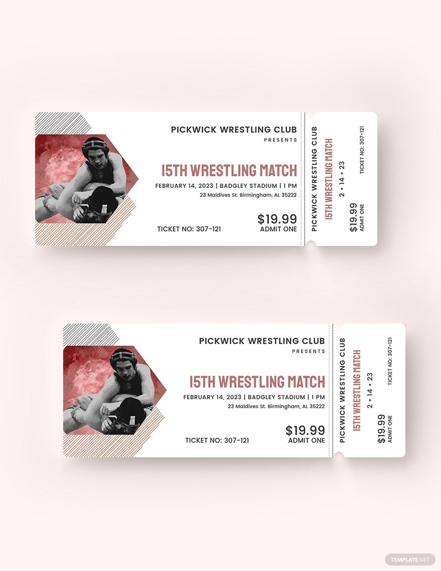
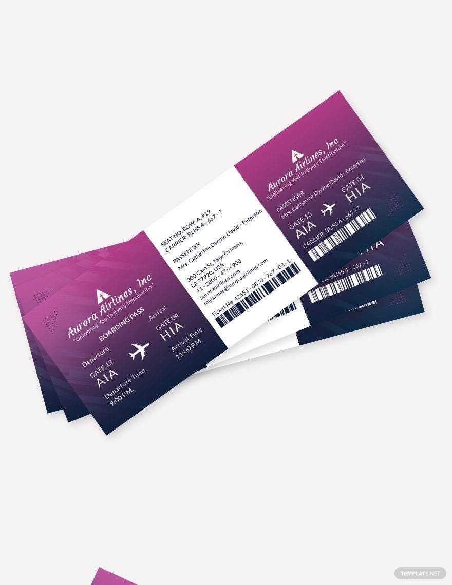
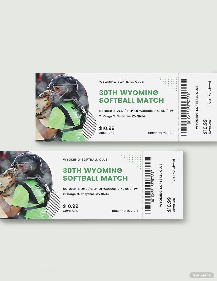
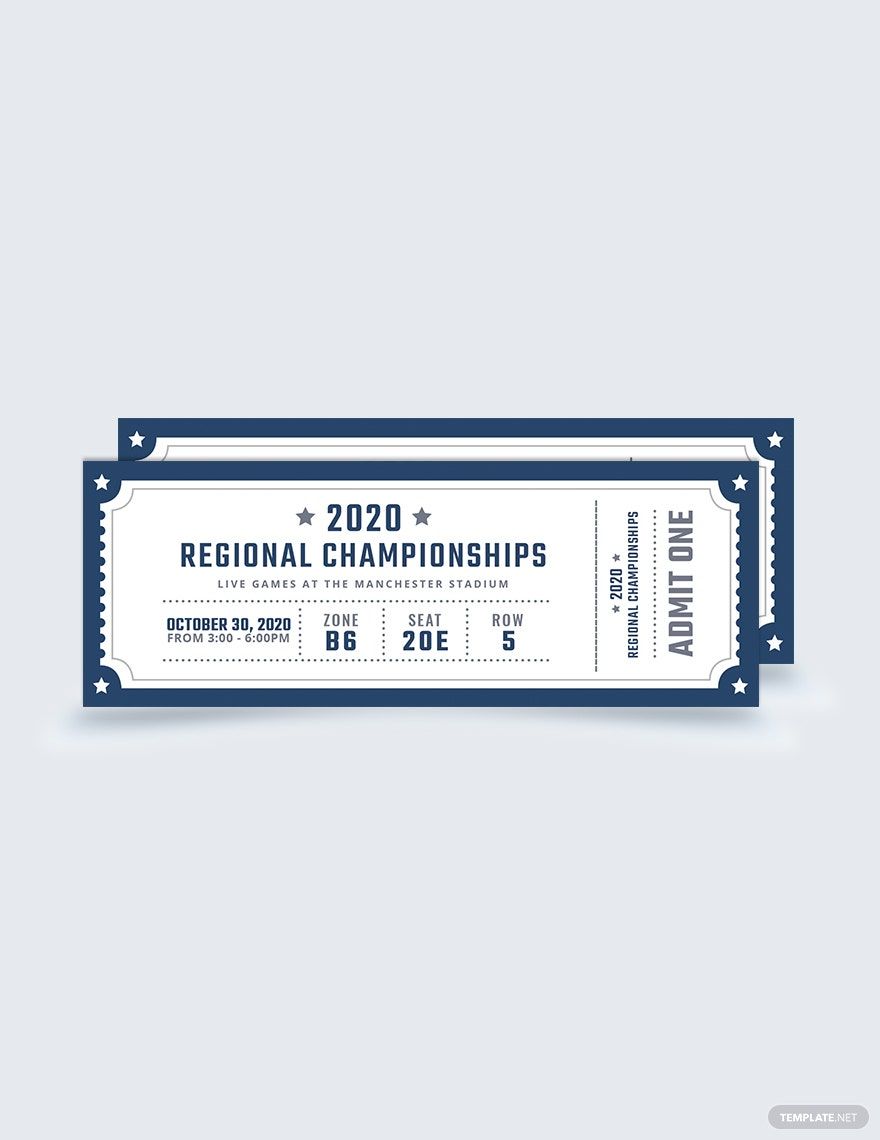
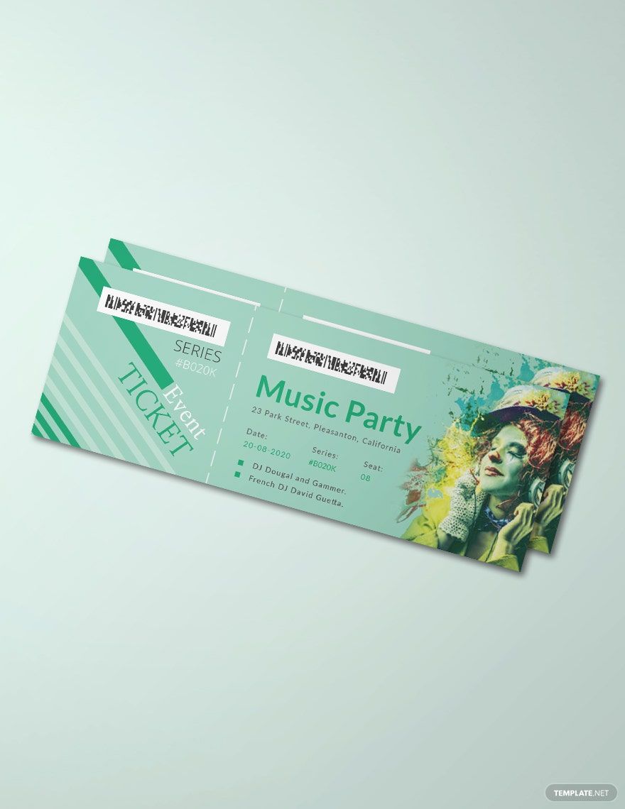
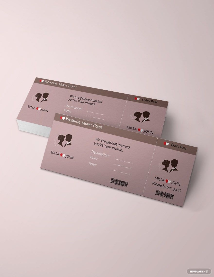
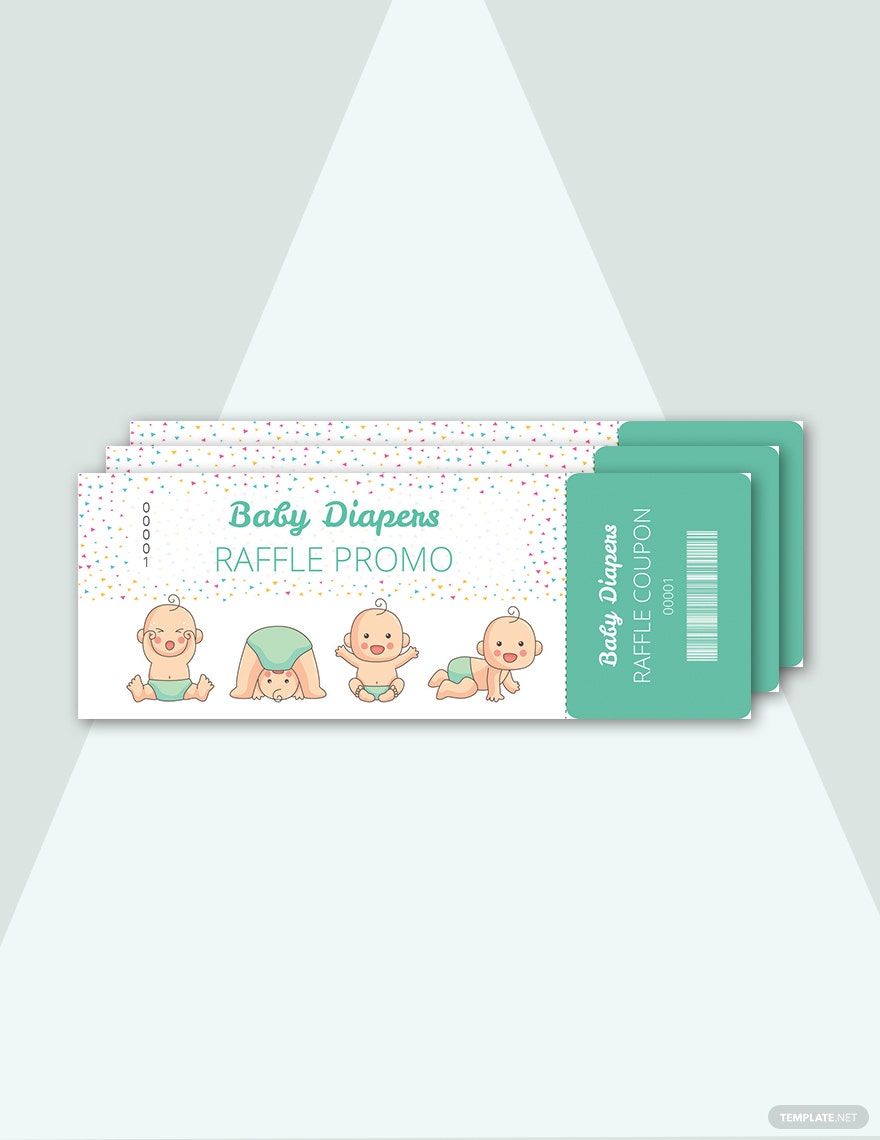
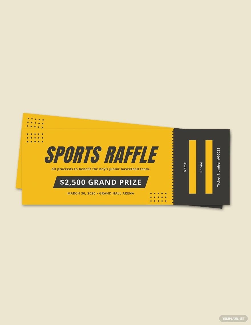
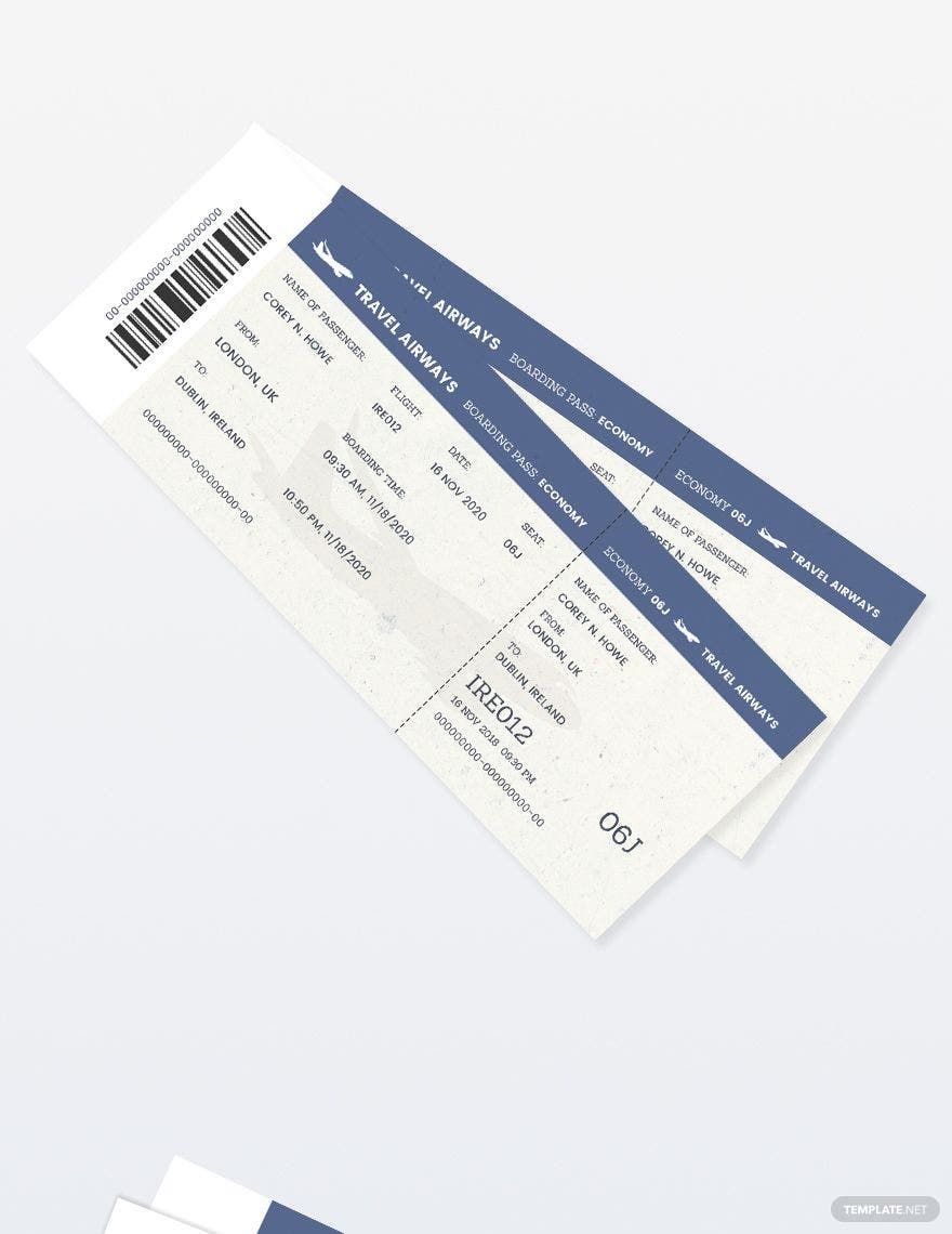
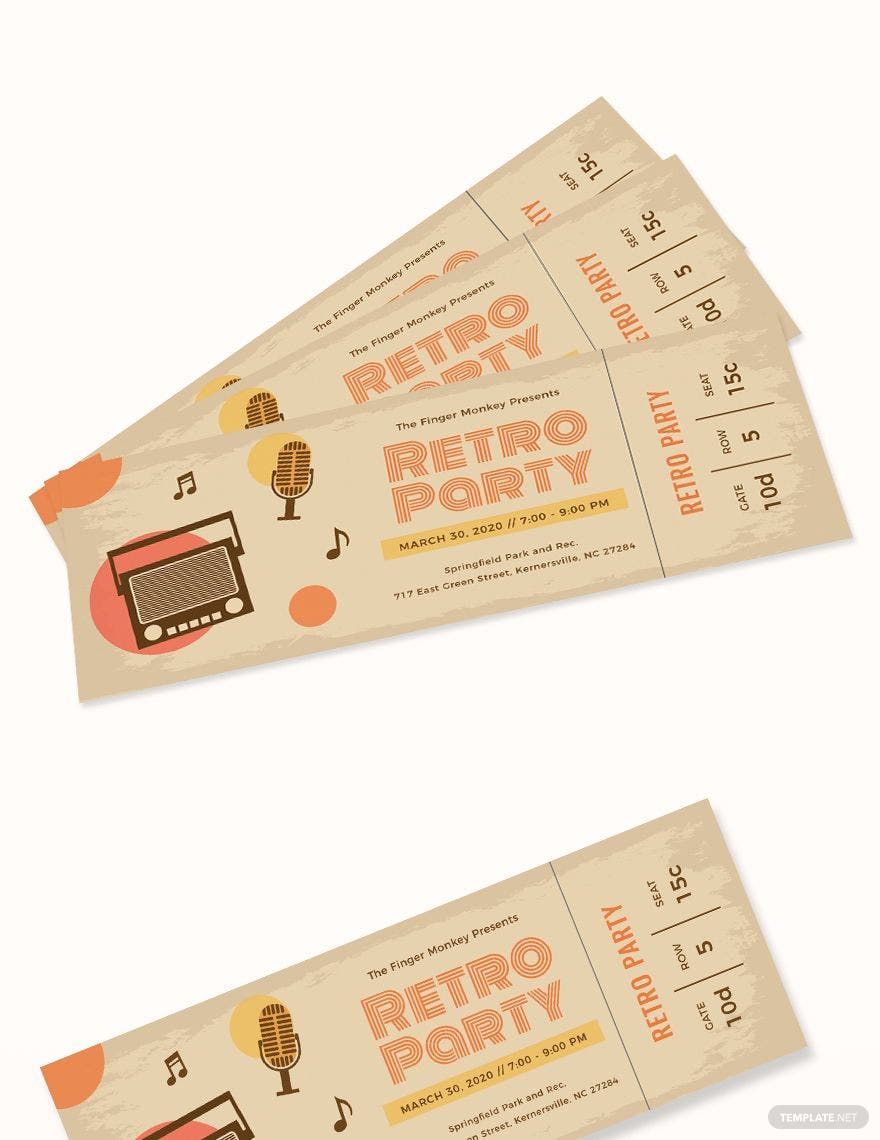
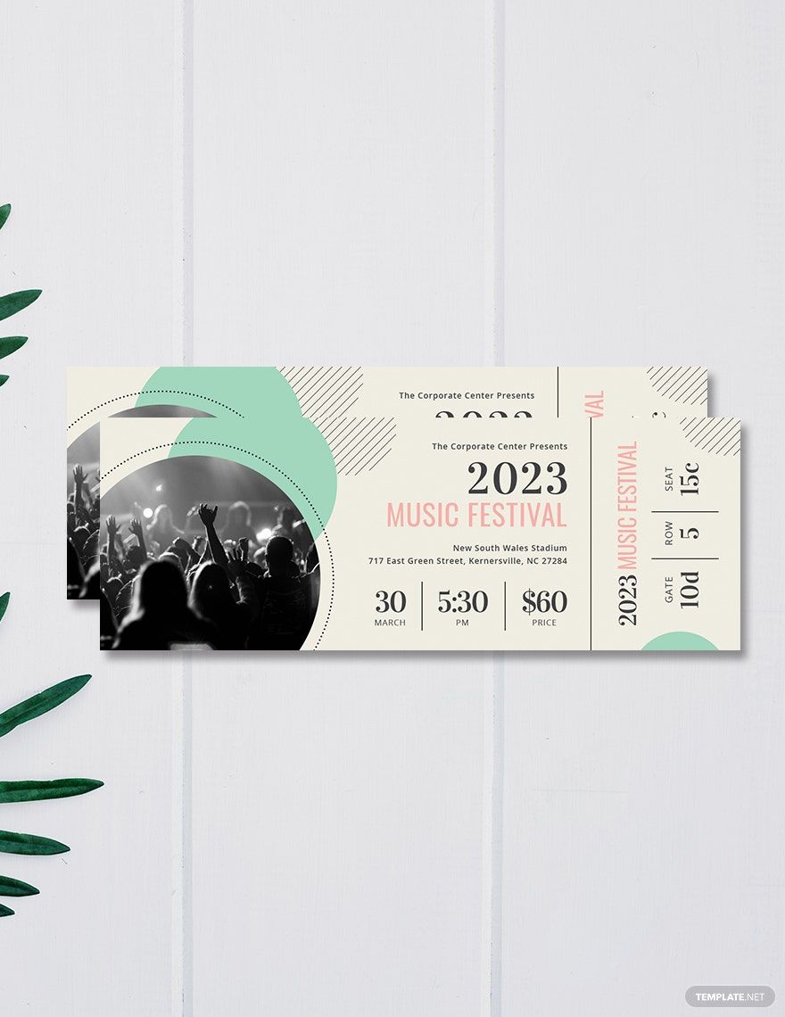
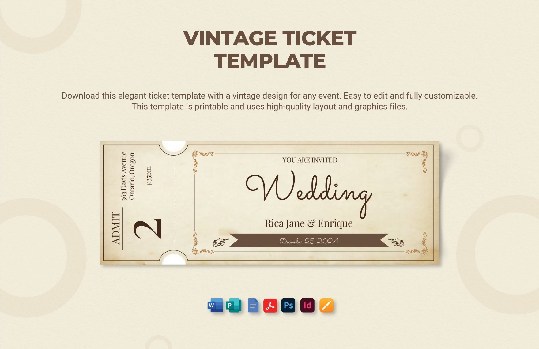
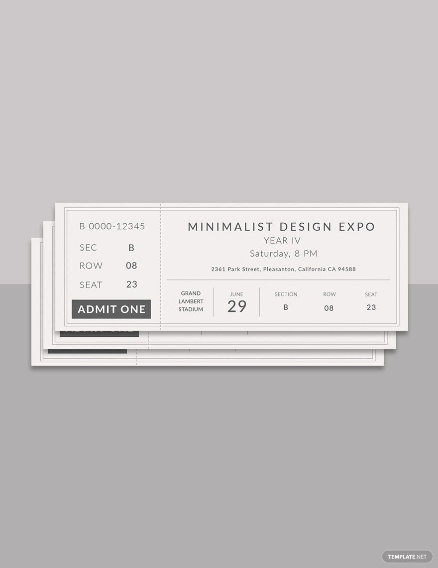
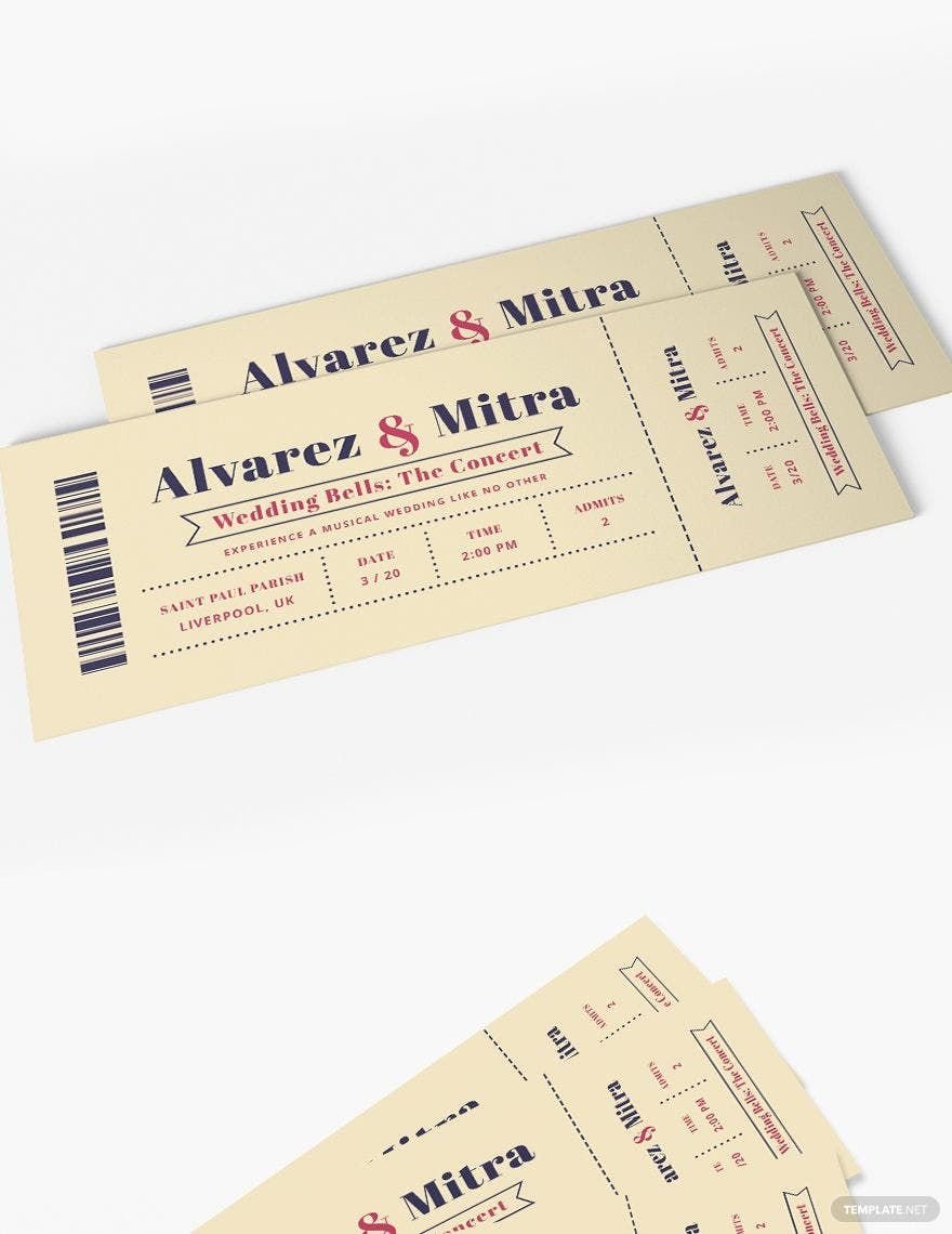
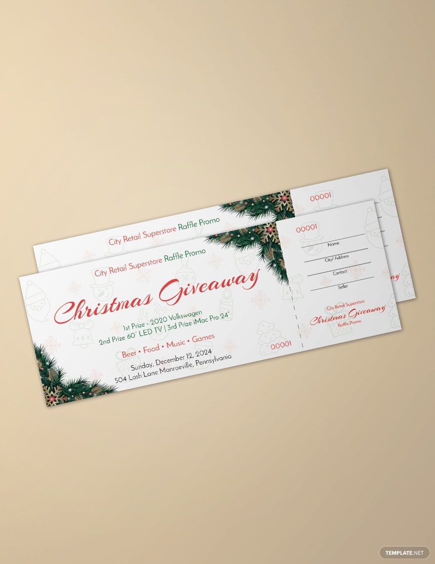
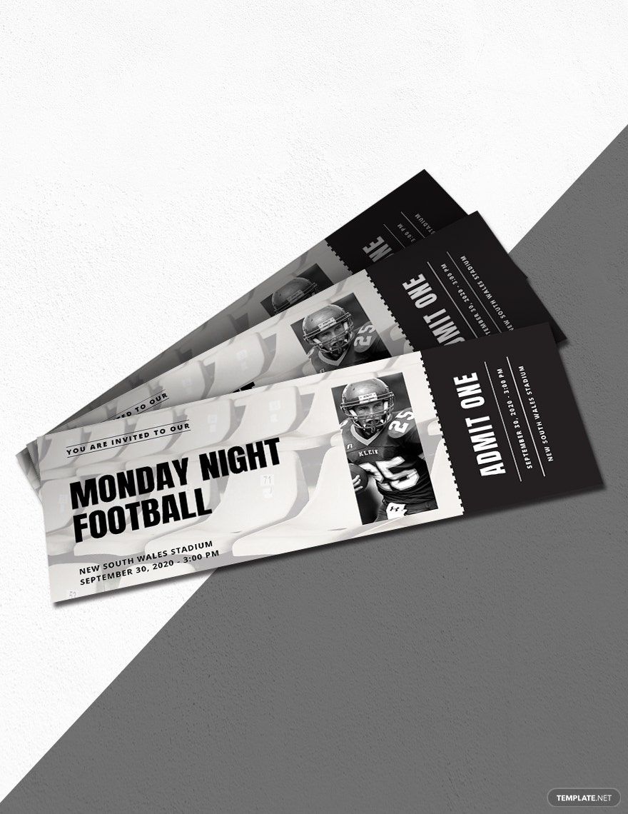
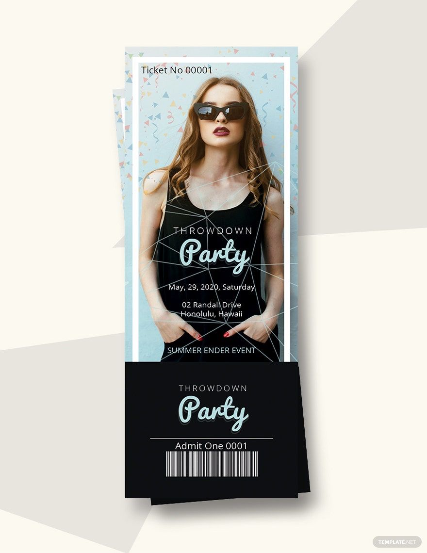
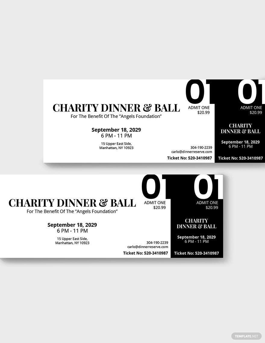
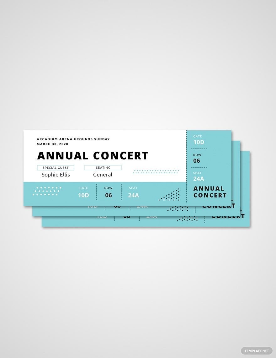
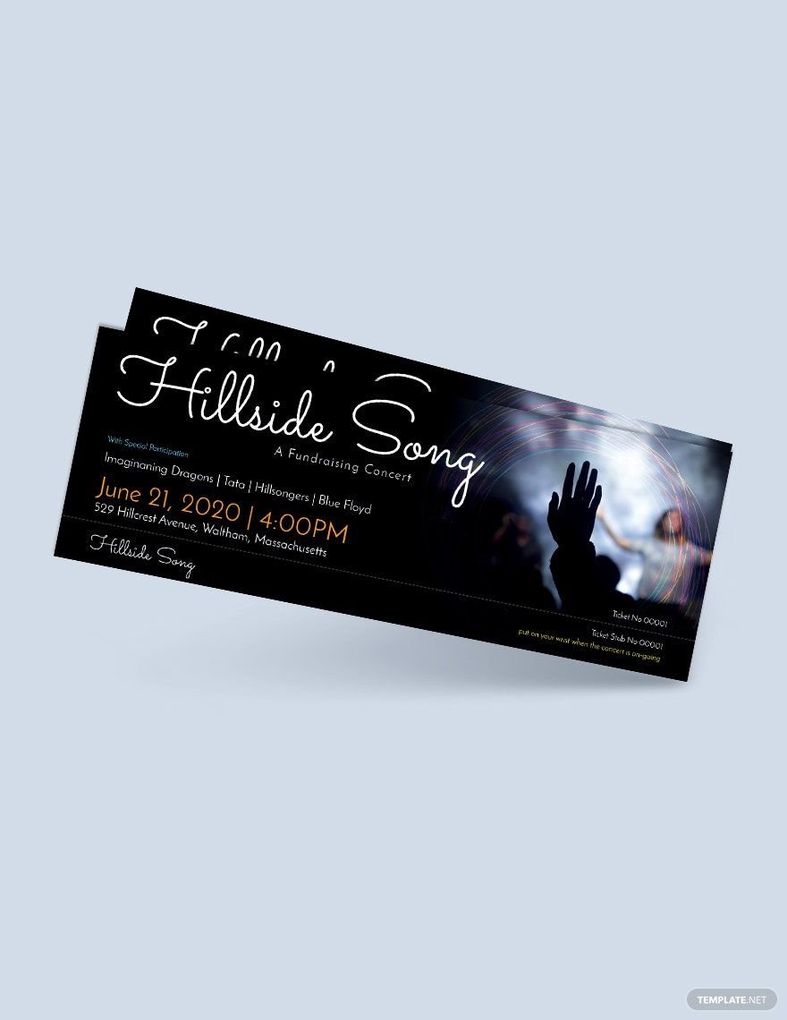
Download one of our premium templates you can use for creating an eye-catching and effective ticket templates. The files are ready-made and professionally handcrafted for the customer’s convenience. We have a variety of ticket designs you can get including for admissions, events, and raffle draws. Printing is also made easy as our files make use of CMYK color space with 300 DPI resolution. Use our templates to create high-quality movie tickets, sports tickets, concert tickets, plane tickets, meal tickets, and others just within minutes of download. Creative image suggestions are used for better presentation with suitable fonts, colors, text, textures, backgrounds, and more. Available in 2x5.5 inches with bleed. Open and edit our templates in all versions of MS Publisher.
What Is a Ticket?
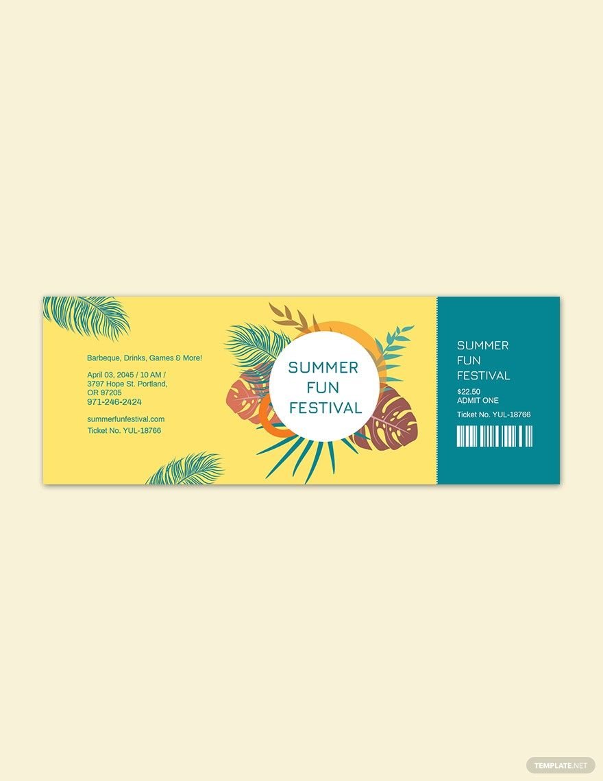
A ticket is a small piece of paper or card that entitles the holder to enter places such as the cinema or a museum, join a raffle or contest, or even access to public transport like trains, boats, or airplanes. A ticket can also act as a receipt for one who has voted for an election. The purpose of the ticket would vary on what the holder is paying for.
How to Make a Ticket on Publisher?
The process of designing and printing tickets has changed over the course of the years. It started out being crafted by hand, using ink and machine to duplicate copies for distribution. Since the rise of the computer, tickets have changed in terms of design. Programs such as Adobe Photoshop have allowed designers to become more creative in making tickets. In this article, we are going to look at some tips when creating tickets through Microsoft Publisher.
1. Identify the Purpose of the Ticket
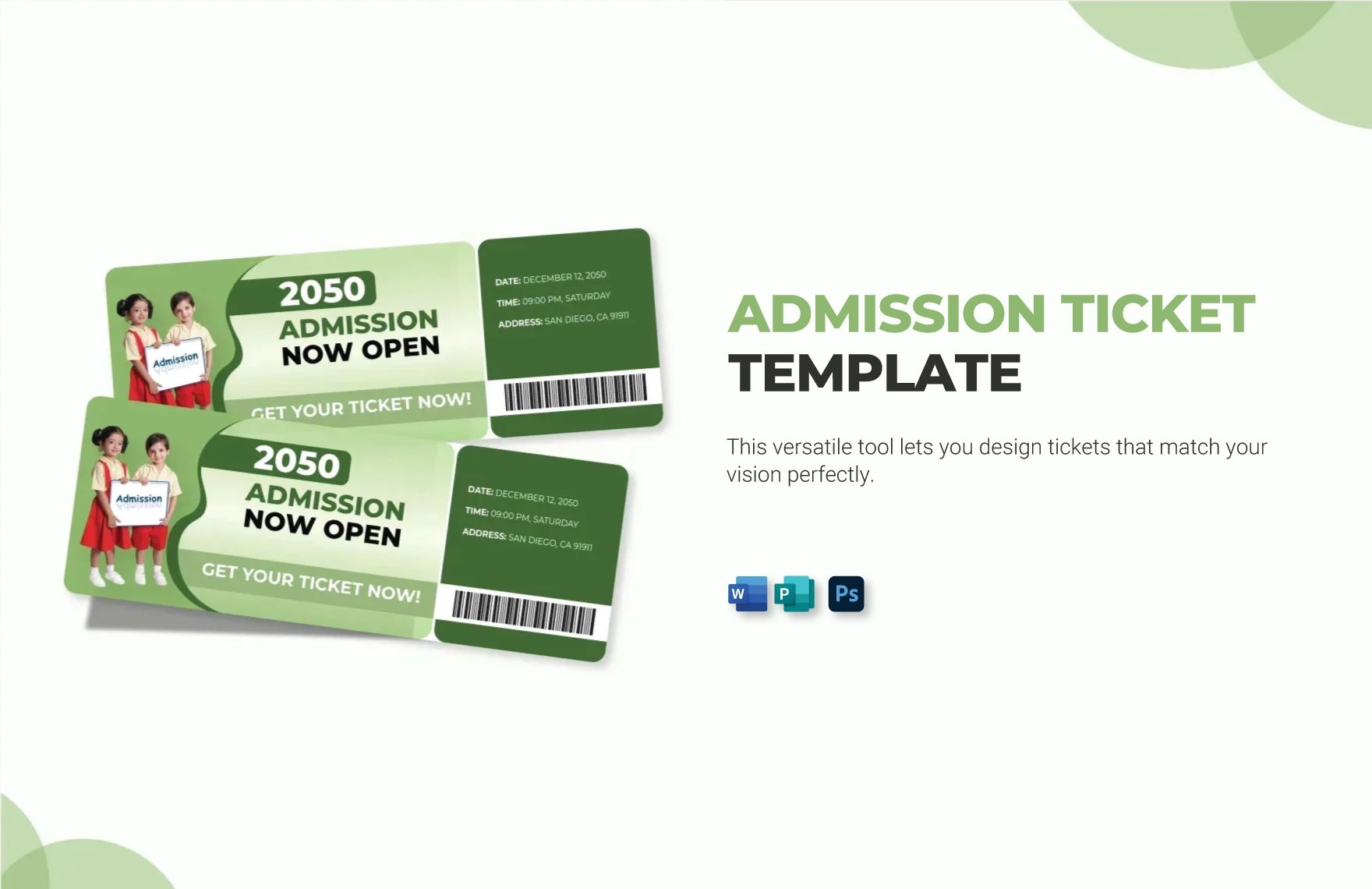
Tickets serve several different functions for the holders. The early known tickets allowed holders to enter places for entertainment such as movie theaters or museums. These are known as admission tickets. They evolved to allow holders to enter events such as sports and concerts. These became known as sports tickets and concert tickets.
2. Ticket Layout and Rough Draft
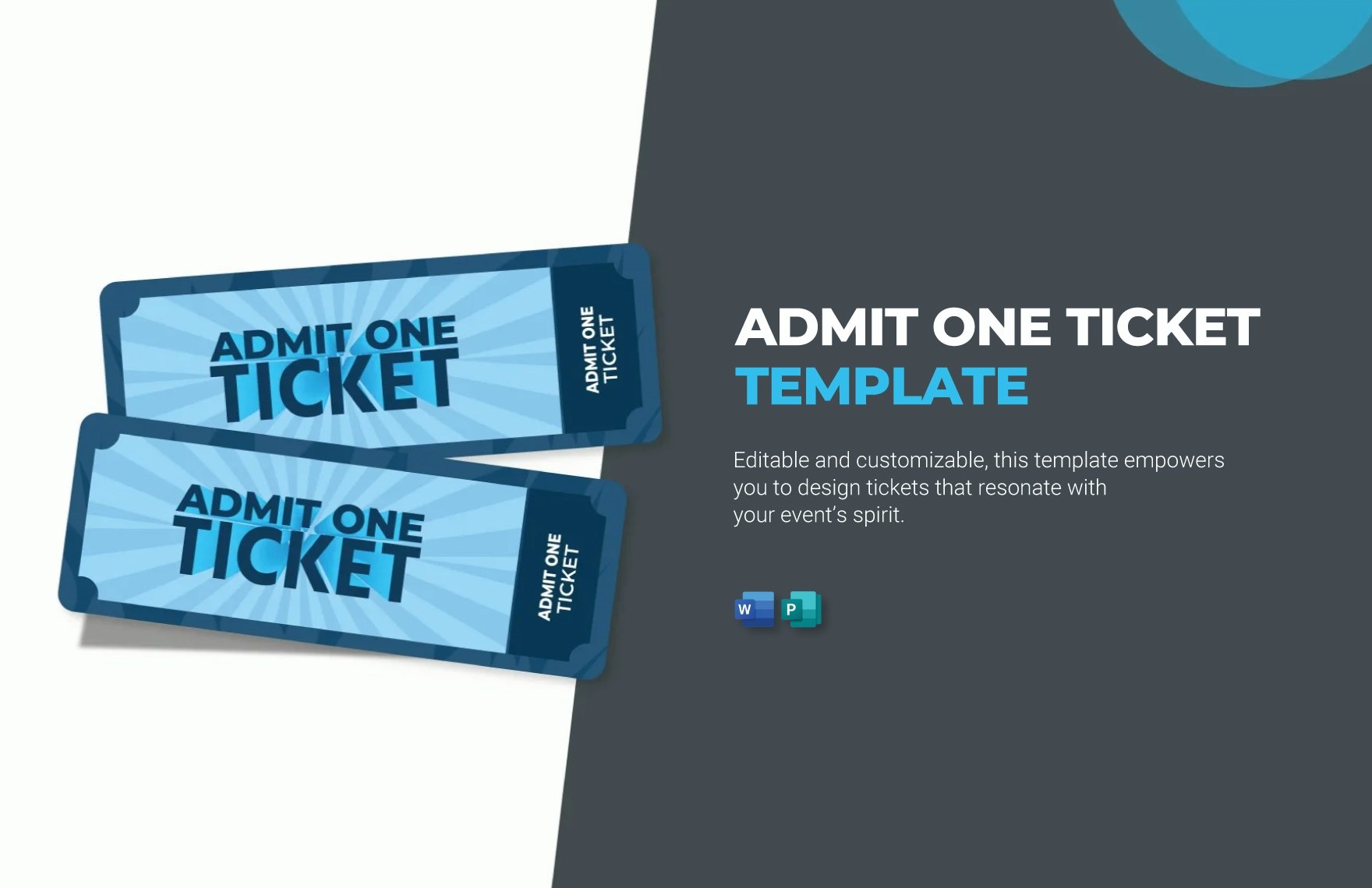
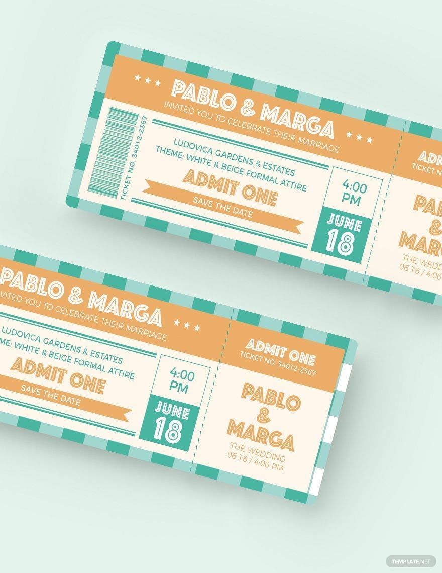
The early designs of tickets were short stubs with 'Admit One' and a series of numbers printed on it. However, they have evolved to designs with more elements. So in order for you to follow, you will first have to create some rough drafts. Start with a series of maybe three to five drafts that allows you to focus on the layout. This will prepare you to create the actual design.
3. The Content on Your Ticket
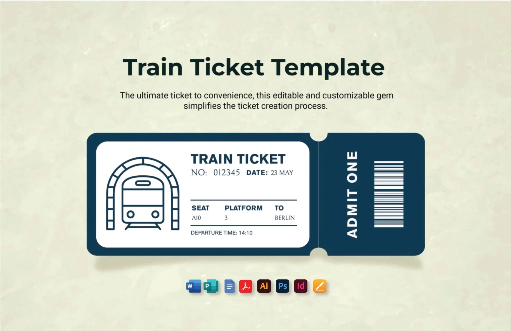
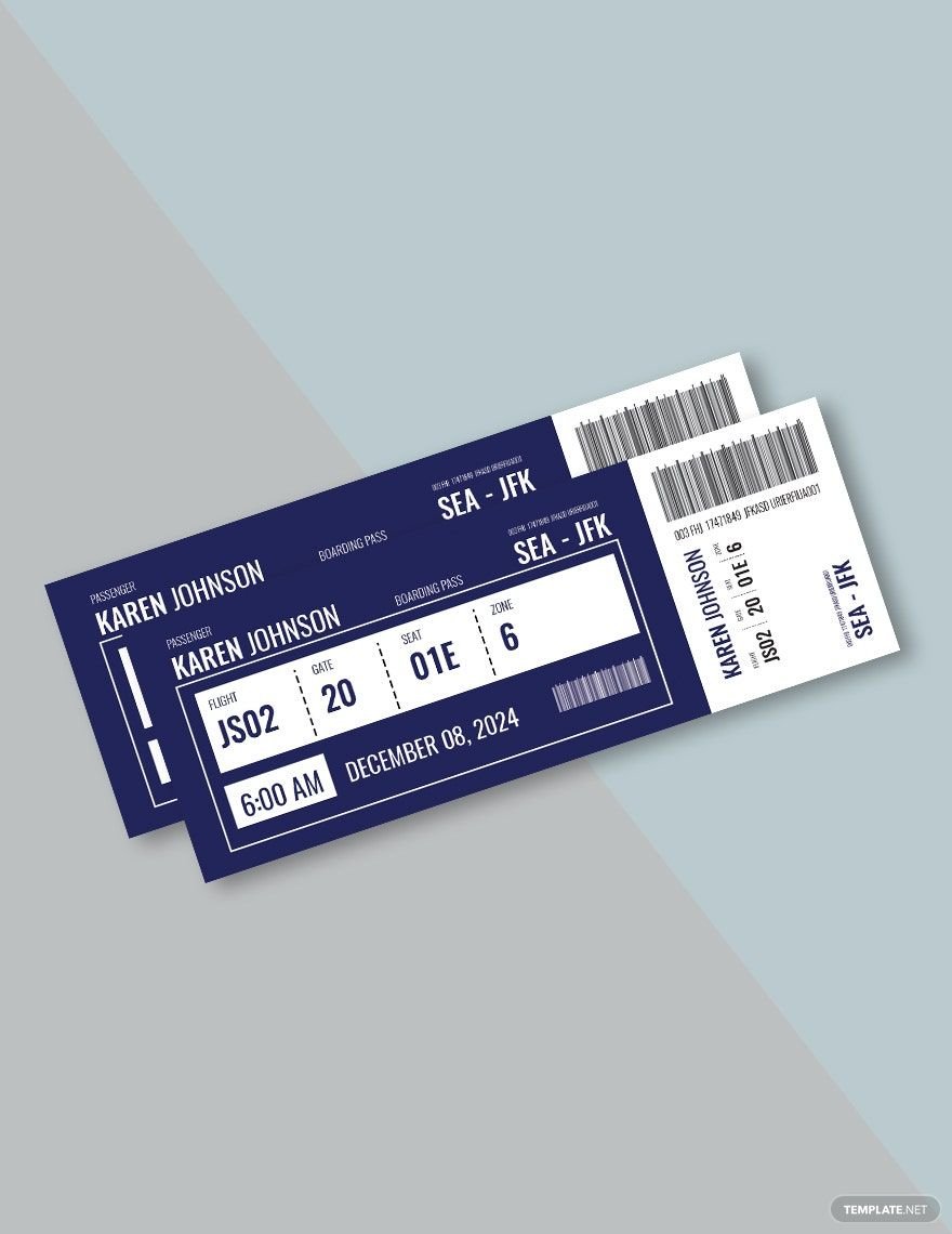
Refer back to the purpose of your ticket. This should help you identify what content your ticket should have. Let's use a travel ticket as an example. These tickets usually give us information about where we're traveling from and where we're going. It also gives us the date and time of the departure as well as which gate or terminal we need to enter to get on the vehicle.
4. Creating Your Ticket Design
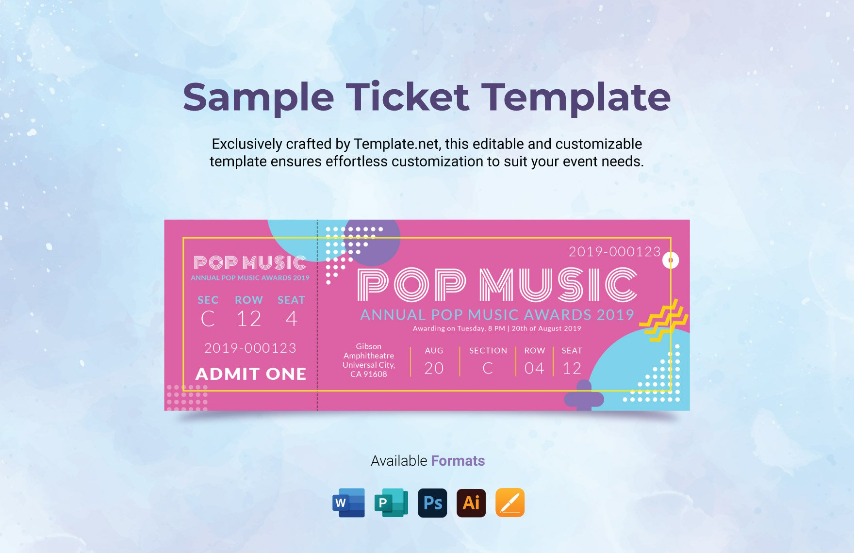
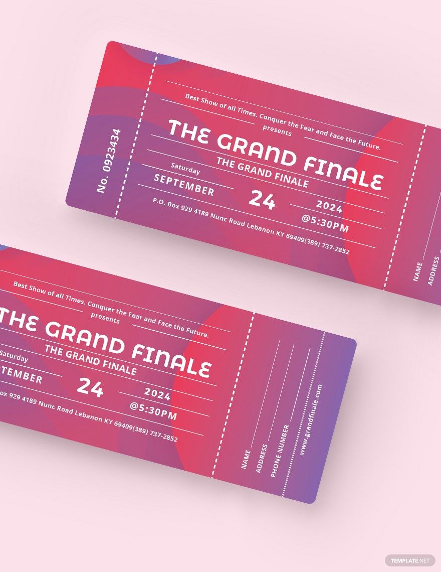
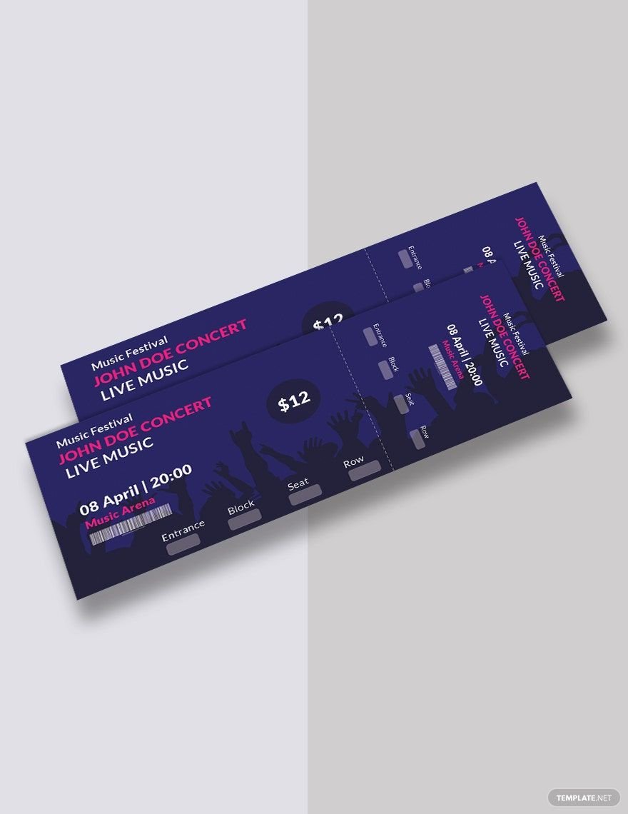
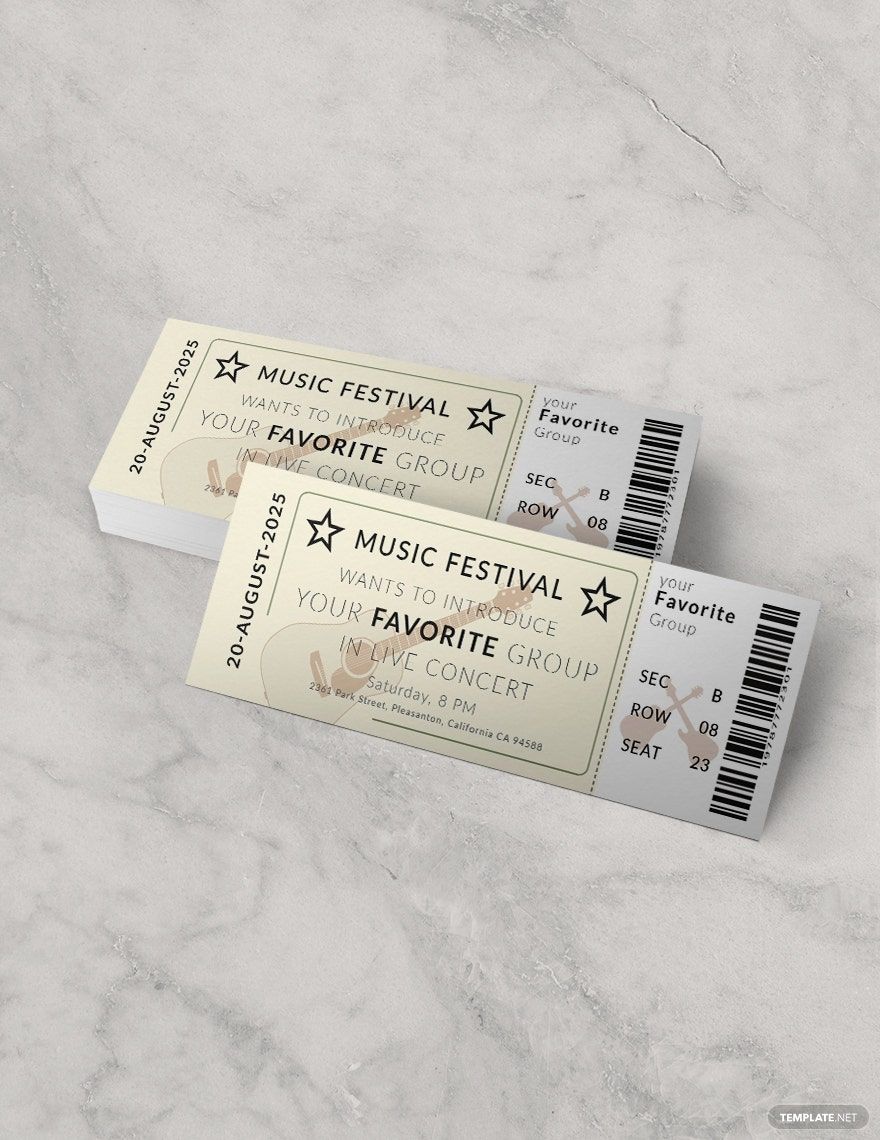
As mentioned earlier, the designs for admission tickets had a series of numbers along with 'Admit One' printed on it. Since the function of tickets has expanded, your ticket design will have to coincide with the purpose of the ticket. Concert tickets have varying designs. Some appear blank with just the information printed on it. Others now include a picture of the singer or band performing along with details like the date and time of the concert, the seat number, and what privileges the holder is entitled to.
5. Review and Print
When you've finished designing your ticket, take a while to breathe and rest. Staring at your own design for too long might make it look ugly when it's actually decent. After getting a break, review your design and see if there is anything out of place. Proofread your content and information to check for any spelling, grammar, or punctuation errors. Change what you can, save your file, and have it ready for printing.
