How to Calculate Margin of Error in Microsoft Excel
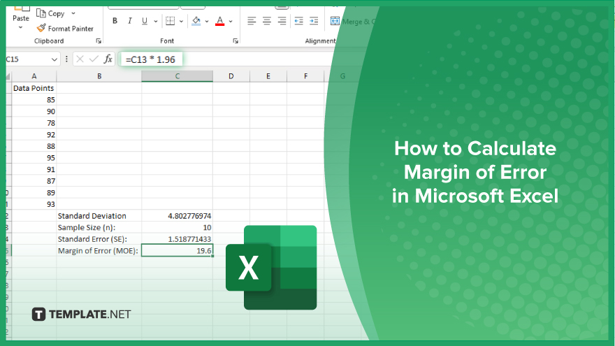
Microsoft Excel simplifies the process of calculating the margin of error, enabling you to measure the accuracy of your statistical…
Jun 11, 2024


May 20, 2024
Microsoft Excel users, are you struggling to effectively visualize your data? In this article, we’ll show you how to add a secondary vertical axis in Excel.

Understanding how to add a secondary vertical axis in Microsoft Excel can significantly enhance your ability to visualize data. This feature allows you to compare multiple data series on the same chart with precision. Here’s how:
Open Microsoft Excel and load the spreadsheet containing the data you want to chart.
Highlight the data range you want to include in your chart. This may involve selecting multiple columns or rows depending on your dataset.

Navigate to the “Insert” tab on the Excel ribbon and choose the desired chart type. Click on it to insert the chart into your spreadsheet.
Right-click on one of the data series in the chart. This will open a context menu.

From the context menu, select “Format Data Series.” This will open a pane on the right side of the Excel window.
In the Format Data Series pane, navigate to the “Series Options” tab.

Locate the option labeled “Secondary Axis” and check the box next to it. This tells Excel to display this data series on a secondary vertical axis. Click “Close” to apply the changes and close the Format Data Series pane.
You may also find valuable insights in the following articles offering tips for Microsoft Excel:
Yes, you can add a secondary vertical axis to most types of charts in Excel, including line charts, column charts, and scatter plots.
Adding a secondary vertical axis allows you to compare two different data series with different scales on the same chart, improving clarity and insight.
No, adding a secondary vertical axis in Excel is a straightforward process that can be completed in just a few clicks.
Yes, you can customize the appearance of the secondary vertical axis, including its title, scale, and formatting options.
No, adding a secondary vertical axis in Excel will not affect the accuracy of your chart; it simply provides a clearer representation of your data.

Microsoft Excel simplifies the process of calculating the margin of error, enabling you to measure the accuracy of your statistical…
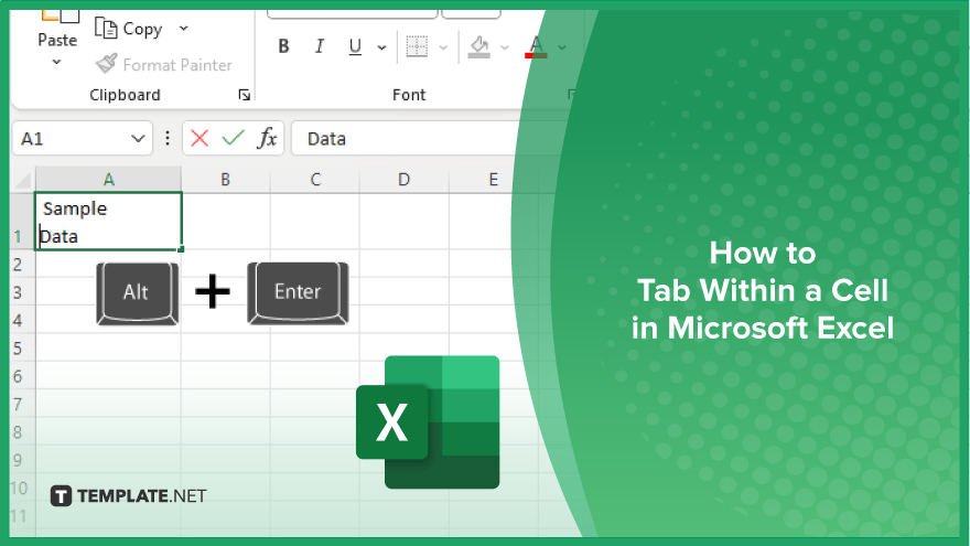
Microsoft Excel users often need to format data within a single cell, and one common requirement is to indent text…
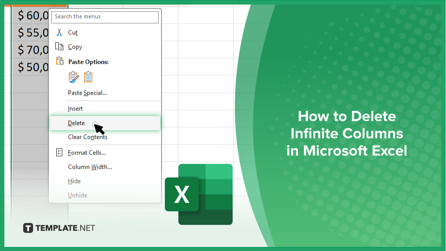
In Microsoft Excel, dealing with infinite columns can be a headache, cluttering your workspace and slowing your workflow.…
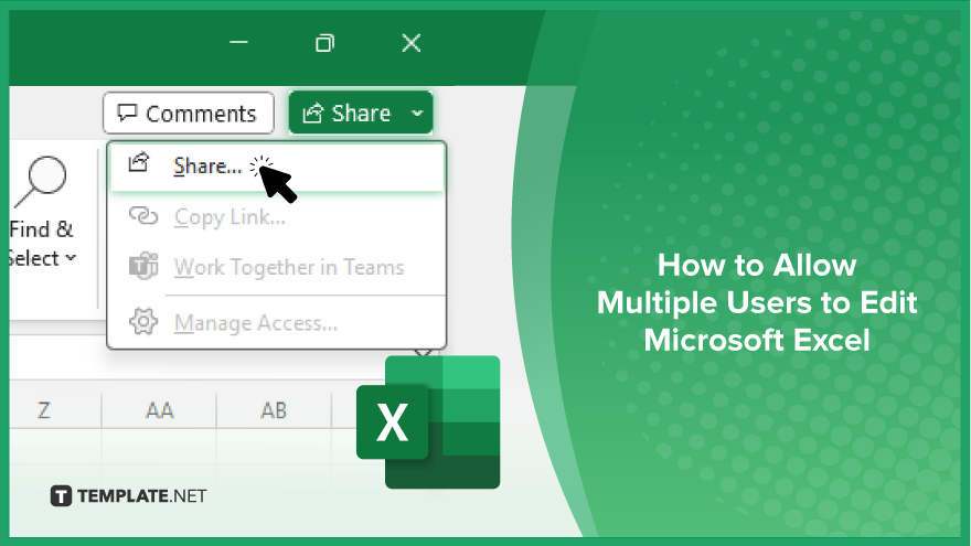
Microsoft Excel revolutionizes teamwork by allowing multiple users to edit spreadsheets simultaneously. This collaborative feature streamlines workflow and boosts productivity…
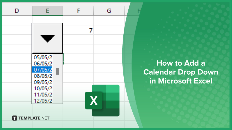
In Microsoft Excel, simplifying data entry just got easier with calendar drop-downs. Learn how to integrate this feature into…
Microsoft Excel users, have you ever encountered the frustration of being unable to edit or interact with a…
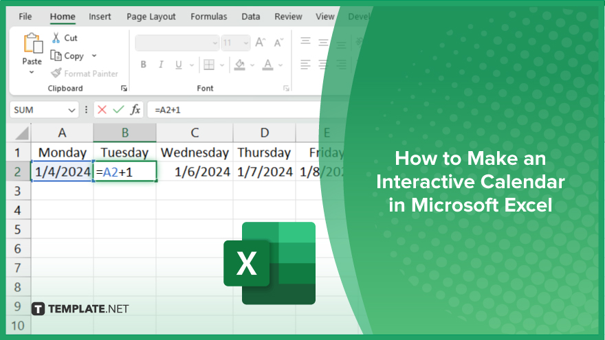
Microsoft Excel is not just for crunching numbers—it can also be transformed into a powerful planning tool by integrating interactive…
Microsoft Excel users, are you struggling to effectively visualize your data? In this article, we’ll show you how…
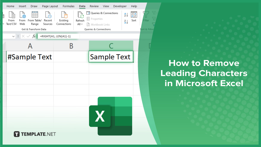
Microsoft Excel provides versatile tools to refine your data, including removing leading characters from cell values. This skill is crucial…