


How to Create Graphs in Microsoft Excel
Microsoft Excel is an essential tool for creating detailed, professional graphs that present data clearly and effectively. This guide covers everything you need to know to transform raw data in spreadsheets into visually appealing and informative graphs, ideal for business presentations, academic research, or personal projects.

How to Create Graphs in Microsoft Excel
-
1. Initiating Graph Creation with Data Selection
Creating a graph in Microsoft Excel begins with selecting the relevant data. This is a crucial step to ensure that your graph accurately represents the information you wish to convey. Start by highlighting the cells containing your data, including any column or row headers. These headers are vital as they serve as labels for your graph’s axes, providing context to the data being visualized.
-
2. Selecting the Appropriate Graph Type
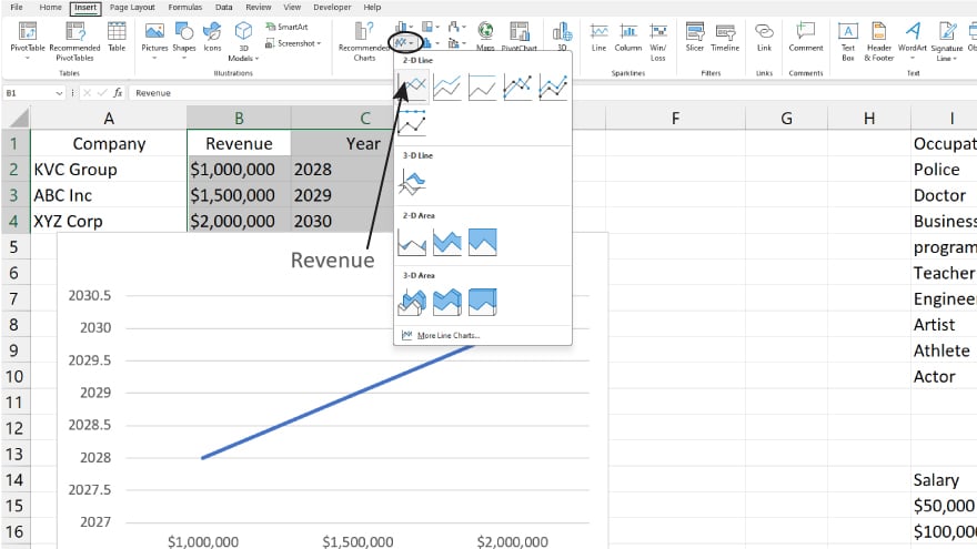
Once your data is selected, the next step is to choose the most suitable type of graph for your presentation. Navigate to the ‘Insert’ tab located at the top of the Excel interface. Here, you’ll find various graph options. Click on the specific icon representing the graph type you need. If you’re unsure about which graph to use, simply hover over the icons to preview how your data will be presented in each graph format. This step is pivotal in ensuring that your graph effectively communicates the intended message.
-
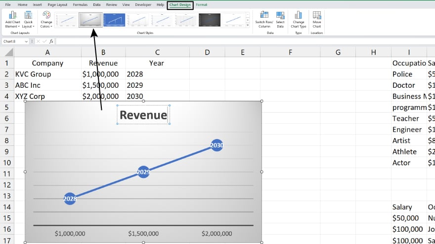
3. Customizing Your Graph for Enhanced Clarity
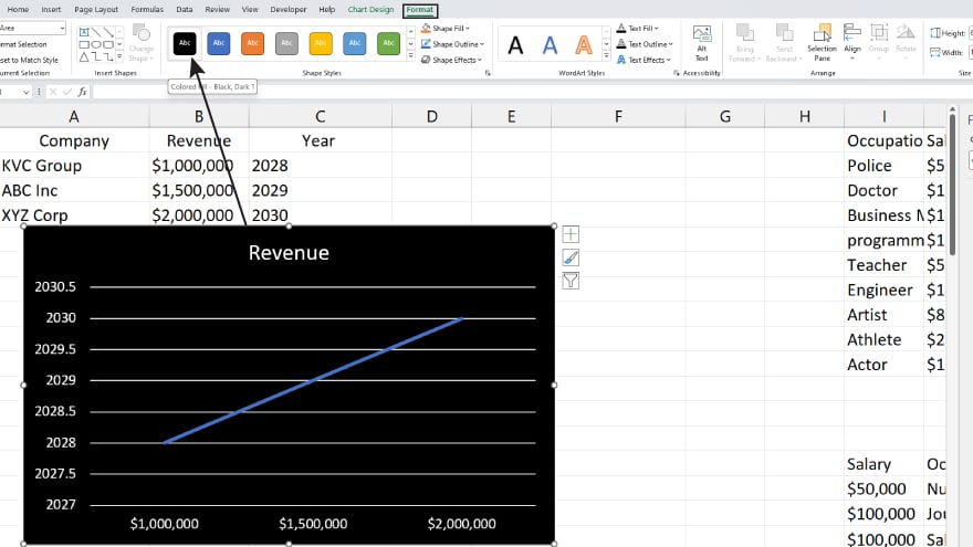
After selecting the graph type, Excel will generate a basic version of your graph. This is where customization comes into play. Click on the generated graph to access the ‘Design’ and ‘Format’ tabs. In these sections, you can modify colors, fonts, and other design elements to make your graph more engaging and comprehensible. Don’t forget to add crucial elements like a title, axis labels, and a legend to provide complete information. For more specific data representation adjustments, use the ‘Select Data’ option in the ‘Design’ tab.
You may also find valuable insights in the following articles offering tips for Microsoft Excel:
4. Advancing Your Graphing Skills with Sophisticated Techniques
As you grow more comfortable with the basics of Excel graphing, exploring advanced techniques can elevate your data presentation. Discover how to create combination graphs that showcase diverse data types on a single plot, or dynamic graphs that update automatically with data changes. Use Excel’s ‘Chart Tools’ for adding analytical features like trendlines, error bars, and statistical indicators. These advanced elements are instrumental in offering a deeper analysis of your data, leading to more insightful conclusions and decisions. Or, learn how to make a chart in Excel.
FAQs
What is a graph in Excel?
A graph in Excel is a visual representation of data, made by plotting selected numerical values on an axis.
How do I start creating a graph in Excel?
Begin by selecting the data range you want to graph, then choose an appropriate graph type from the ‘Insert’ tab.
Can I customize the appearance of my Excel graph?
Yes, you can customize your graph using the ‘Design’ and ‘Format’ tabs to change colors, and fonts, and add elements like titles and labels.
How do I choose the right type of graph for my data in Excel?
Select a graph type that best represents the relationships and patterns in your data, like a bar graph for comparisons or a line graph for trends.
Is it possible to update a graph automatically when new data is added in Excel?
Yes, graphs in Excel can automatically update when you add new data to the source range.
More in Excel

