How to Calculate Margin of Error in Microsoft Excel
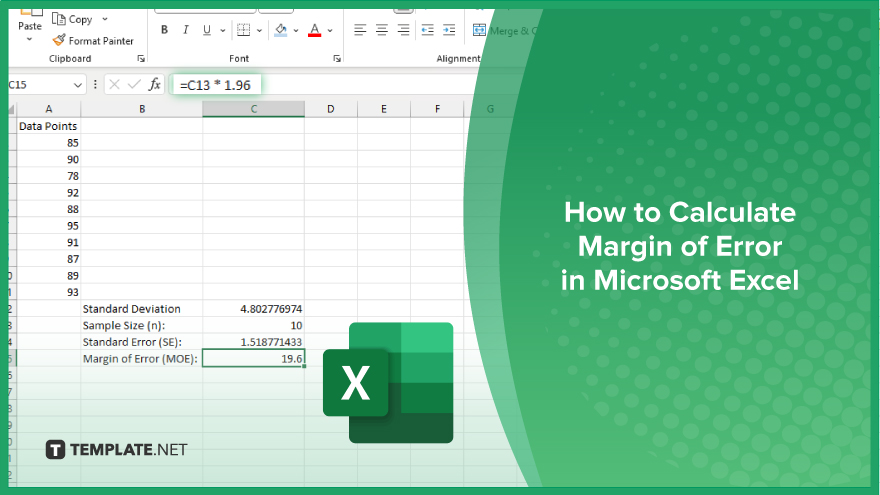
Microsoft Excel simplifies the process of calculating the margin of error, enabling you to measure the accuracy of your statistical…
Feb 26, 2024
Unlock the power of Microsoft Excel as we delve into the art of visualizing data with Venn diagrams. In this guide, we’ll walk you through the simple steps to transform your Excel data into clear, concise Venn diagrams, offering a powerful tool for illustrating relationships.
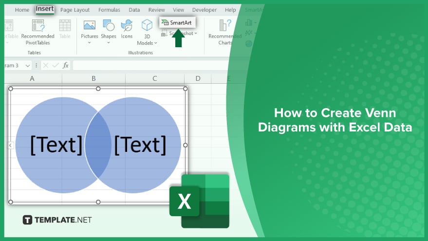
Venn diagrams are graphical representations that showcase overlapping sets and their unique elements. By following specific steps and utilizing Excel’s functionalities, users can effectively communicate complex data patterns and associations through clear and intuitive Venn diagrams.
The first step in creating a Venn Diagram in Excel is to prepare the data. This involves organizing the data in a way that makes it easy to create the diagram. For example, if you are comparing two sets of data, you would need to create a table with three columns – one for each set of data, and one for the common elements.
It’s important to ensure that the data is accurate and complete before you start creating the diagram. Any errors or omissions in the data can lead to inaccurate results. Therefore, it’s a good idea to double-check the data and make any necessary corrections before you proceed.
Once the data is prepared, you can start creating the Venn Diagram. In Excel, this is done using the ‘Insert’ tab on the ribbon. From there, you can select ‘SmartArt’, then ‘Relationship,’ and finally ‘Venn Diagram.’ This will insert a blank Venn Diagram into your spreadsheet.
Next, you need to add the data to the diagram. This is done by clicking on the diagram and then selecting ‘Text Pane’ from the ‘SmartArt Tools’ tab on the ribbon. In the text pane, you can enter the data for each circle and the overlap. The data should be entered in the same order as it appears in your table.
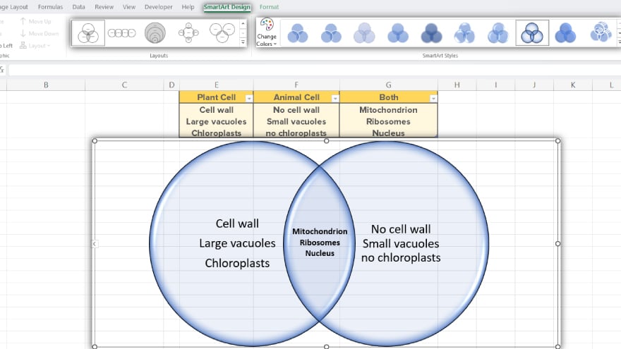
After the data has been added, you can format the Venn Diagram to make it more visually appealing. Excel provides a variety of formatting options, including changing the color and style of the circles, adding a title and labels, and adjusting the size and position of the diagram.
It’s also possible to customize the diagram further by adding additional shapes, lines, or text boxes. However, it’s important to remember that the main purpose of a Venn Diagram is to clearly illustrate the relationships between the data sets, so any additional elements should not distract from this.
You may also find valuable insights in the following articles offering tips for Microsoft Excel:
Yes, Excel provides features like SmartArt and custom shapes to easily construct Venn diagrams directly within the program.
Organize your data with clear categories and intersections, as this helps Excel accurately represent relationships in the Venn diagram.
Excel offers various customization options, allowing you to modify colors, labels, and other visual elements to suit your preferences.
Yes, by employing dynamic range names and formulas, you can ensure that your Venn diagrams automatically adjust as your data changes.
Yes, Excel provides other visualization tools like scatter plots and pivot charts, but Venn diagrams remain a powerful option for illustrating set intersections.

Microsoft Excel simplifies the process of calculating the margin of error, enabling you to measure the accuracy of your statistical…
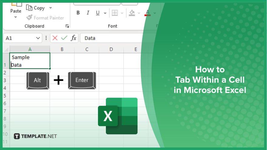
Microsoft Excel users often need to format data within a single cell, and one common requirement is to indent text…
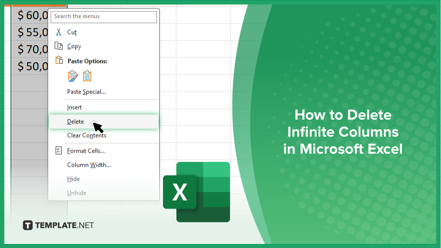
In Microsoft Excel, dealing with infinite columns can be a headache, cluttering your workspace and slowing your workflow.…
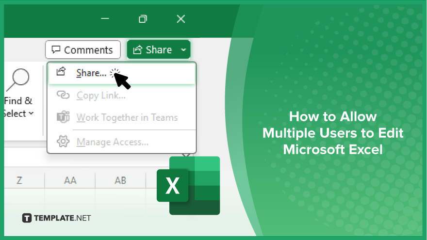
Microsoft Excel revolutionizes teamwork by allowing multiple users to edit spreadsheets simultaneously. This collaborative feature streamlines workflow and boosts productivity…
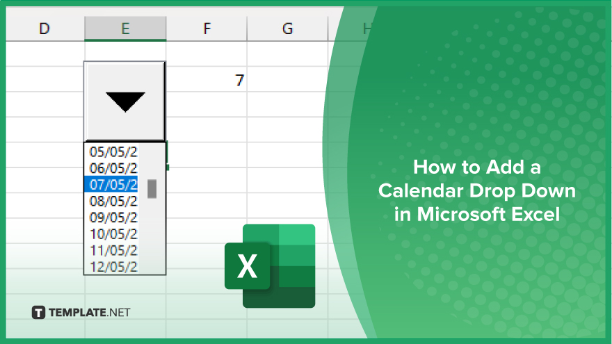
In Microsoft Excel, simplifying data entry just got easier with calendar drop-downs. Learn how to integrate this feature into…
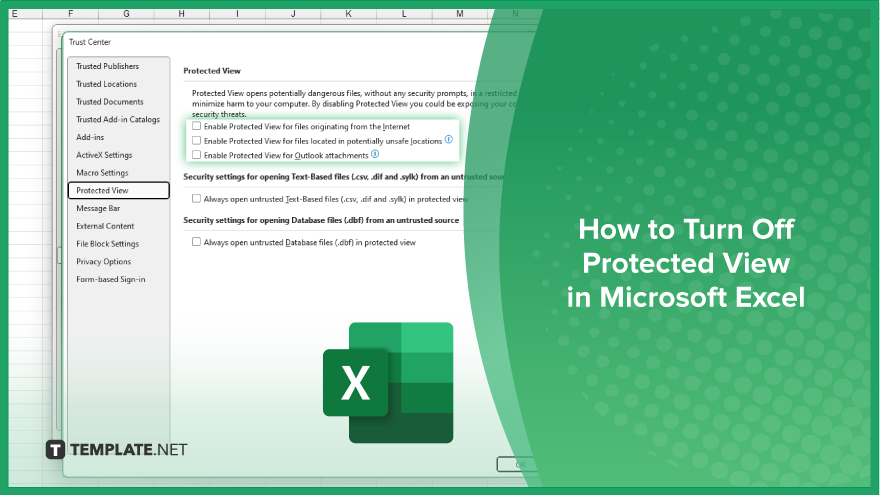
Microsoft Excel users, have you ever encountered the frustration of being unable to edit or interact with a…
Microsoft Excel is not just for crunching numbers—it can also be transformed into a powerful planning tool by integrating interactive…
Microsoft Excel users, are you struggling to effectively visualize your data? In this article, we’ll show you how…
Microsoft Excel provides versatile tools to refine your data, including removing leading characters from cell values. This skill is crucial…