How to Calculate Margin of Error in Microsoft Excel
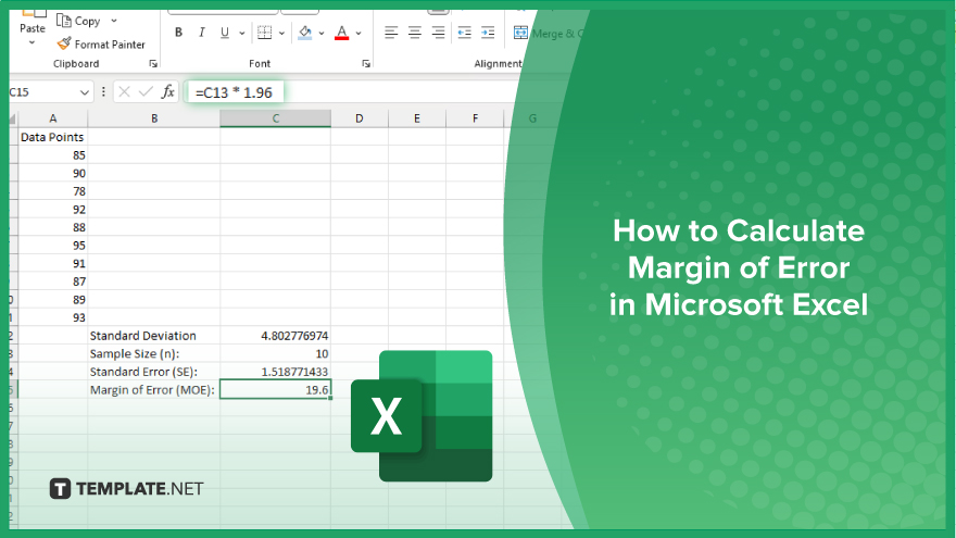
Microsoft Excel simplifies the process of calculating the margin of error, enabling you to measure the accuracy of your statistical…
Feb 27, 2024
Microsoft Excel is not just a tool for data entry and calculation; it’s also an excellent platform for visualizing data. In this guide, you’ll learn how to make a graph in Excel, turning your raw data into informative and engaging charts.
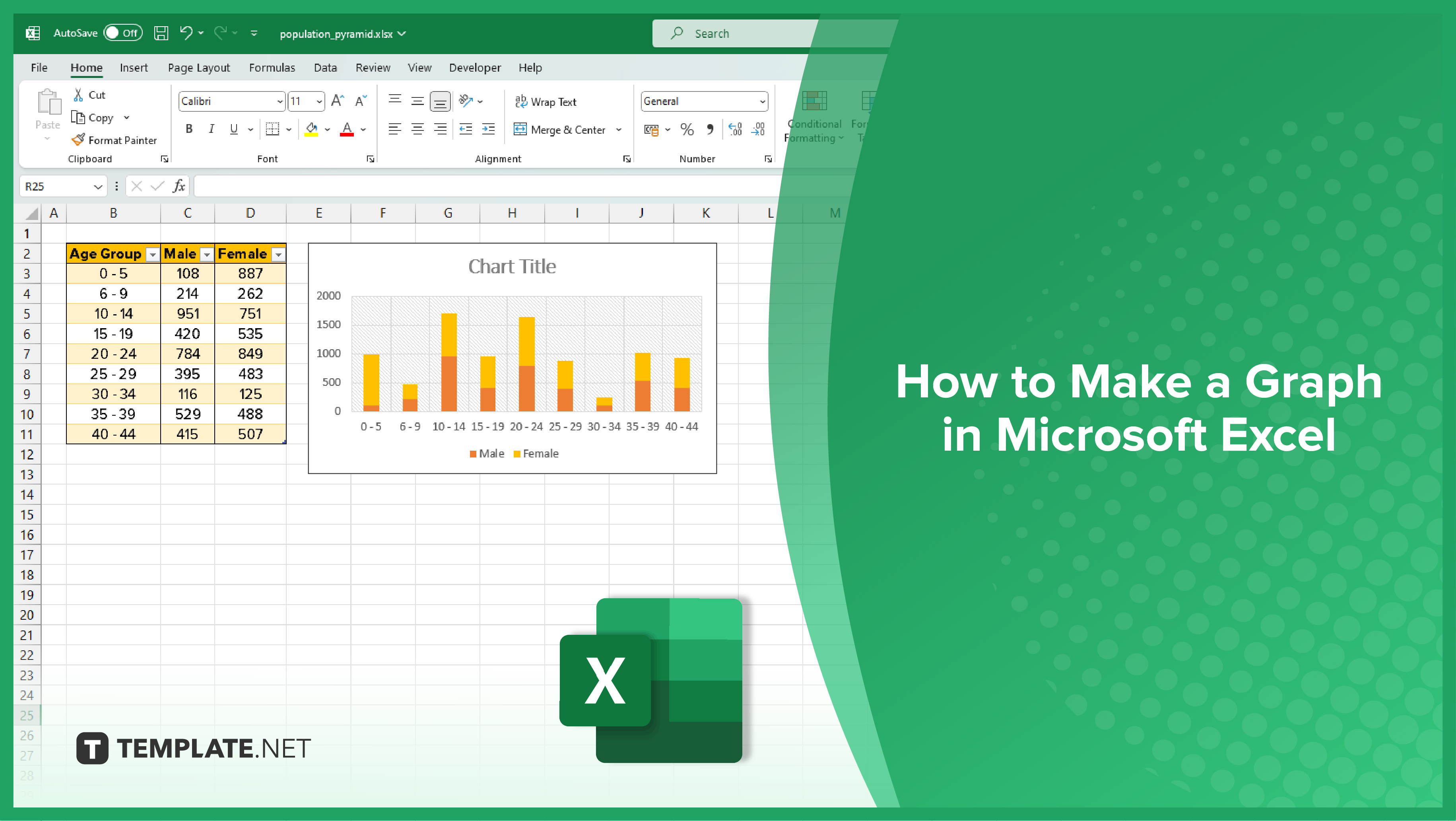
The journey to creating an effective graph in Excel begins with data selection. Click and drag your mouse over the cells containing the data you want to graph. If your data is organized into rows or columns, a simple click on the respective row or column header will select the entire set. It’s important to remember that the selection method impacts your graph’s structure. Selecting a single row or column prompts Excel to generate a graph with one data series. Conversely, selecting multiple rows or columns will result in a graph with various data series, offering a more comprehensive view.
After selecting your data, proceed to insert a graph by navigating to the ‘Insert’ tab on Excel’s ribbon. This action reveals a variety of graph types from which you can choose. Select the graph style that best suits your data, and Excel will introduce a basic version of it into your spreadsheet. This initial graph is a blank canvas, ready to be transformed and customized to better suit your presentation needs.
The final step is to personalize your graph, making it not only visually appealing but also easy to interpret. Click on the ‘Chart Tools’ tabs in the Excel ribbon to explore a range of customization options. Here, you can modify the graph’s colors, add essential labels and titles, and adjust the scales of the axes. Labels and titles are particularly crucial as they provide context to your data. A well-chosen title conveys the graph’s purpose, axis labels clarify the dimensions, and a legend makes it easy to understand the representation of each data series. These customizations are key to transforming your graph from a simple visual into an insightful, clear representation of your data.
You may also find valuable insights in the following articles offering tips for Microsoft Excel:
Begin by selecting the data you want to graph, either by dragging across the cells or clicking the row/column headers.
Excel allows you to create various graphs, such as bar, line, pie, column, and area charts, among others.
Yes, you can create a graph with multiple data series by selecting multiple rows or columns of data.
Use the ‘Chart Tools’ tabs in the Excel ribbon to add and customize titles, axis labels, and legends.
Yes, under the ‘Chart Tools’ tabs, you have options to change the graph’s style, color, and overall appearance.

Microsoft Excel simplifies the process of calculating the margin of error, enabling you to measure the accuracy of your statistical…
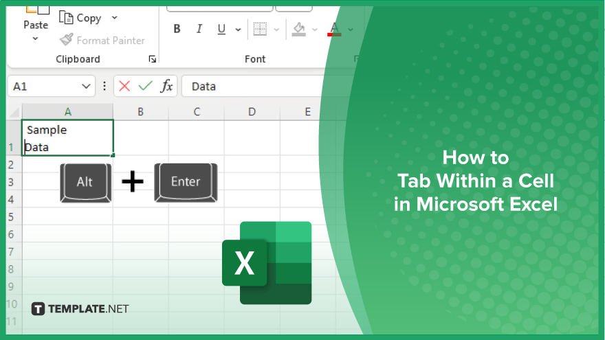
Microsoft Excel users often need to format data within a single cell, and one common requirement is to indent text…
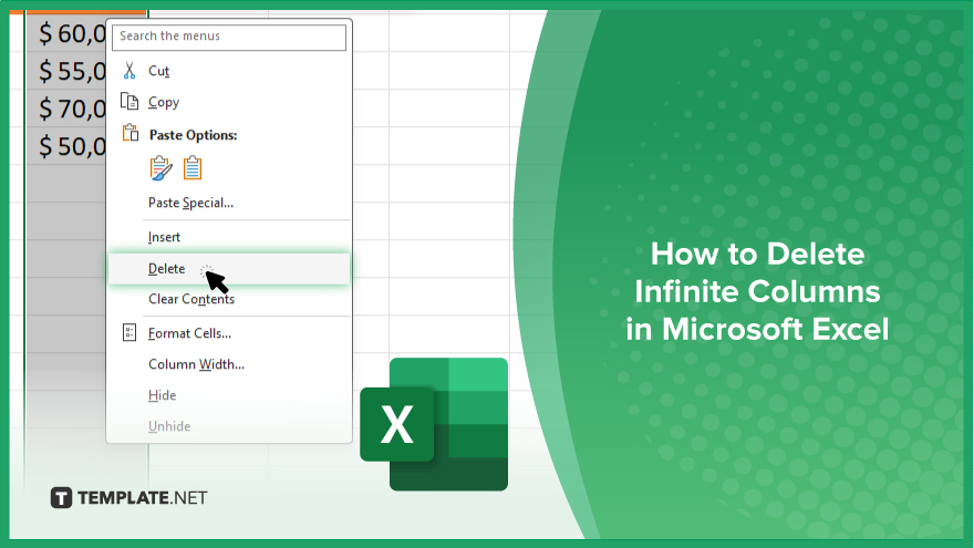
In Microsoft Excel, dealing with infinite columns can be a headache, cluttering your workspace and slowing your workflow.…

Microsoft Excel revolutionizes teamwork by allowing multiple users to edit spreadsheets simultaneously. This collaborative feature streamlines workflow and boosts productivity…
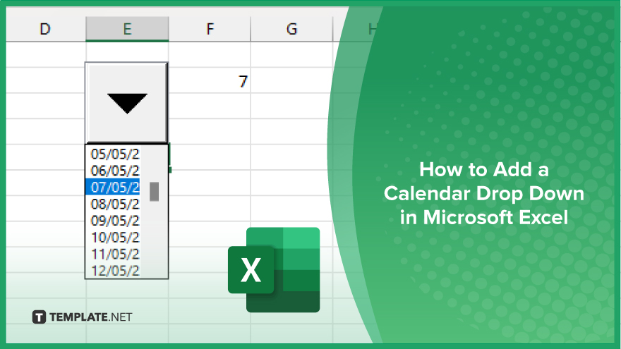
In Microsoft Excel, simplifying data entry just got easier with calendar drop-downs. Learn how to integrate this feature into…

Microsoft Excel users, have you ever encountered the frustration of being unable to edit or interact with a…
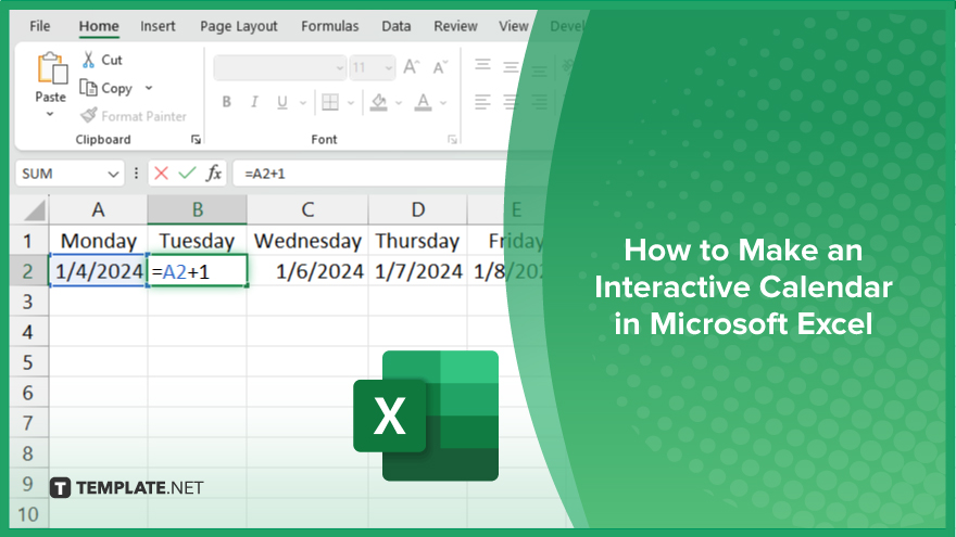
Microsoft Excel is not just for crunching numbers—it can also be transformed into a powerful planning tool by integrating interactive…
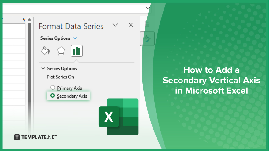
Microsoft Excel users, are you struggling to effectively visualize your data? In this article, we’ll show you how…
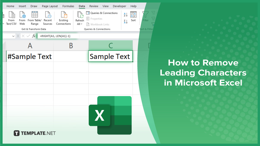
Microsoft Excel provides versatile tools to refine your data, including removing leading characters from cell values. This skill is crucial…