


How to Calculate Margin of Error in Microsoft Excel
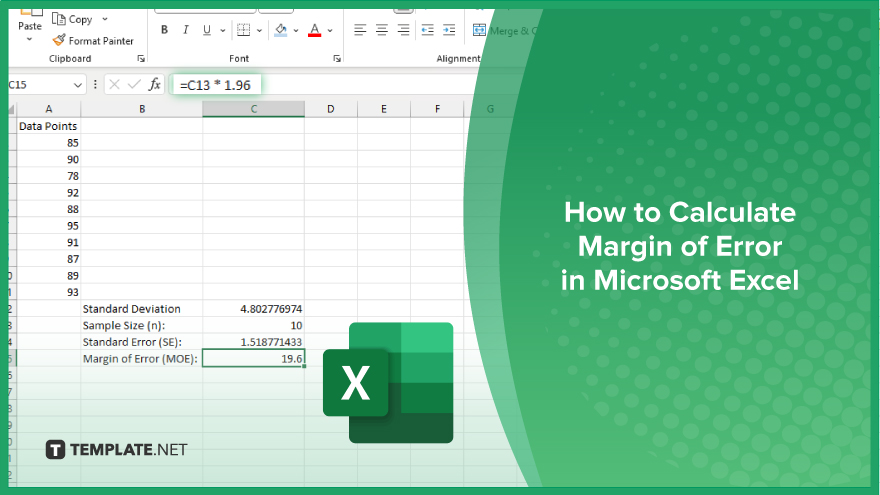
Microsoft Excel simplifies the process of calculating the margin of error, enabling you to measure the accuracy of your statistical…
Jun 11, 2024


Jan 17, 2024
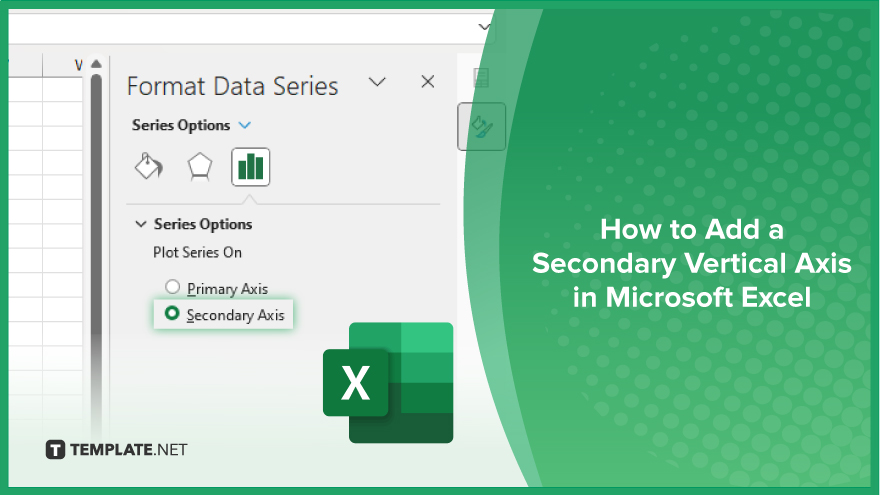
Microsoft Excel offers dynamic tools for data visualization, and learning how to switch axes is key to presenting your data more effectively. This guide walks you through the simple steps to reorient your charts, ensuring your data is displayed clearly and accurately.


To begin switching axes in Microsoft Excel, the first action is to select the chart you wish to modify. Click on your desired chart to activate it. This action will highlight the chart and bring up the Chart Tools tabs on the Excel ribbon. Once the chart is selected, you will notice the ribbon displaying specific options for chart manipulation. These options are conveniently organized under two tabs: ‘Design’ and ‘Format.’ The tools you need for switching axes are located under the ‘Design’ tab. If you need more help with charts, check out how to make a chart in Excel.

With your chart now selected, move to the ‘Design’ tab on the Excel ribbon. Look for the ‘Data’ group within this tab. Here, you will find the ‘Switch Row/Column’ feature. When you click this option, Excel will interchange the data on the x-axis with that on the y-axis, effectively switching the axes of your chart. Please note that this feature is applicable only if your chart is designed with two axes. If your chart includes only one axis, the ‘Switch Row/Column’ option will appear inactive or greyed out. Also, learn about the top 10 Excel chart shortcuts you need to know.
Upon selecting the ‘Switch Row/Column’ option, Excel will instantly apply the changes to your chart. It is vital to verify these adjustments to ensure that the axes have been switched as intended. Examine the data labels on both the x-axis and y-axis. Post-switching, the labels that were previously on the x-axis should now be on the y-axis, and the labels from the y-axis should have moved to the x-axis. If the labels remain unchanged, you may need to revisit the previous steps to ensure the process is completed successfully.
You may also find valuable insights in the following articles offering tips for Microsoft Excel:
Click on your chart, go to the ‘Design’ tab, and select ‘Switch Row/Column’ in the Data group.
Switching axes are only available for charts with two axes, like bar and line charts.
If the option is greyed out, it means your chart is not compatible with axis switching, typically because it has only one axis.
Switching axes only changes the chart’s visual representation, not the underlying data.
Yes, you can manually adjust axis labels even after switching axes for further customization.
Microsoft Excel simplifies the process of calculating the margin of error, enabling you to measure the accuracy of your statistical…
Microsoft Excel users often need to format data within a single cell, and one common requirement is to indent text…
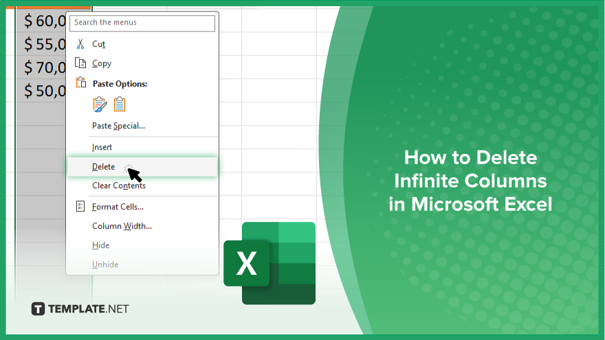
In Microsoft Excel, dealing with infinite columns can be a headache, cluttering your workspace and slowing your workflow.…
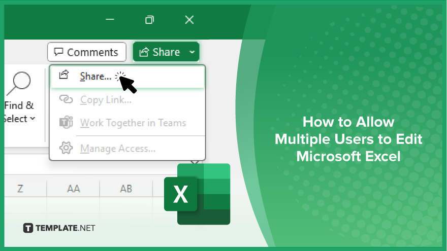
Microsoft Excel revolutionizes teamwork by allowing multiple users to edit spreadsheets simultaneously. This collaborative feature streamlines workflow and boosts productivity…
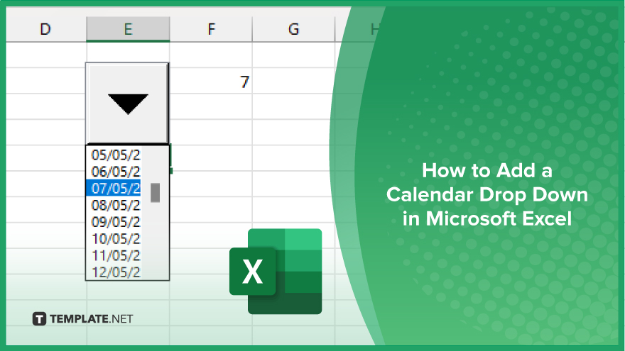
In Microsoft Excel, simplifying data entry just got easier with calendar drop-downs. Learn how to integrate this feature into…
Microsoft Excel users, have you ever encountered the frustration of being unable to edit or interact with a…
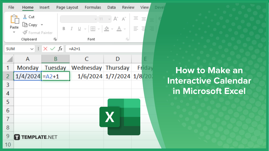
Microsoft Excel is not just for crunching numbers—it can also be transformed into a powerful planning tool by integrating interactive…
Microsoft Excel users, are you struggling to effectively visualize your data? In this article, we’ll show you how…
Microsoft Excel provides versatile tools to refine your data, including removing leading characters from cell values. This skill is crucial…