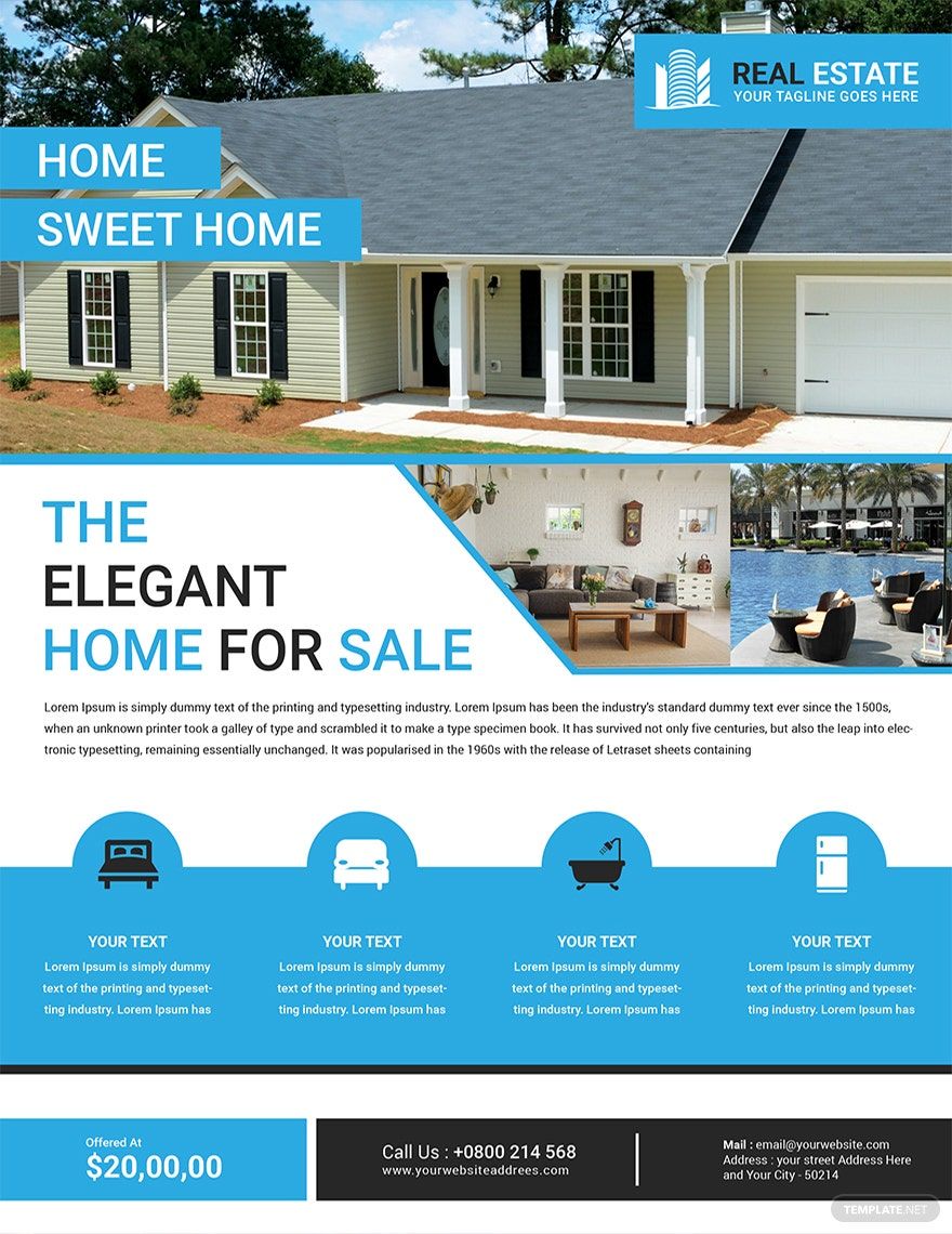
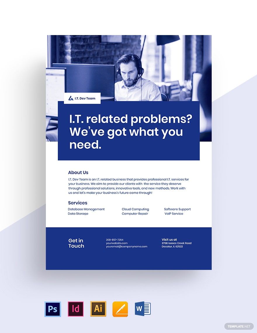
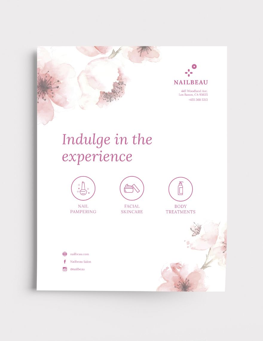
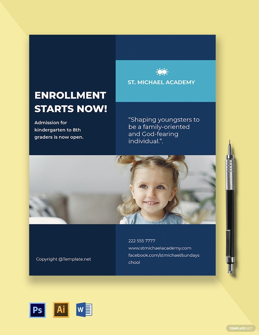
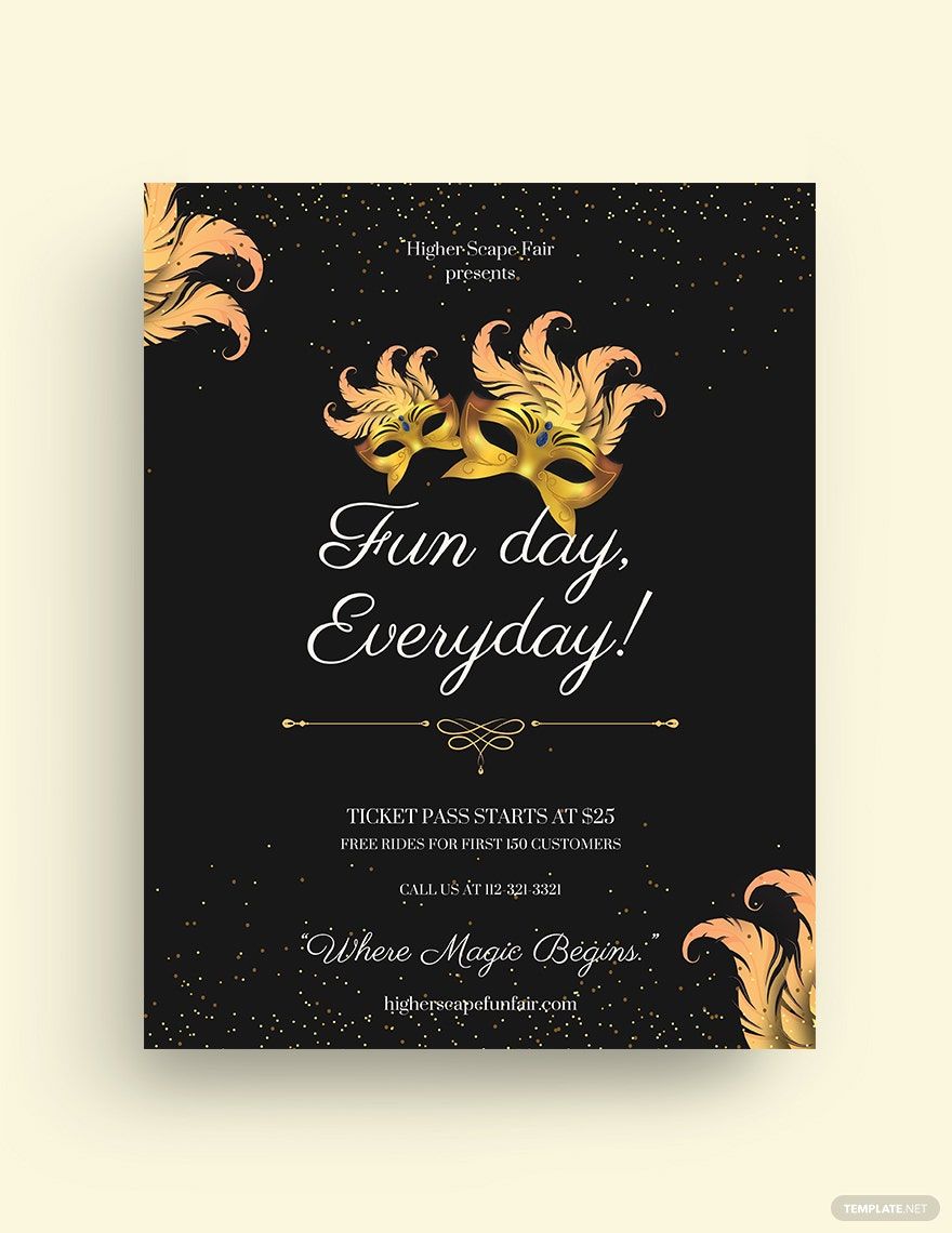
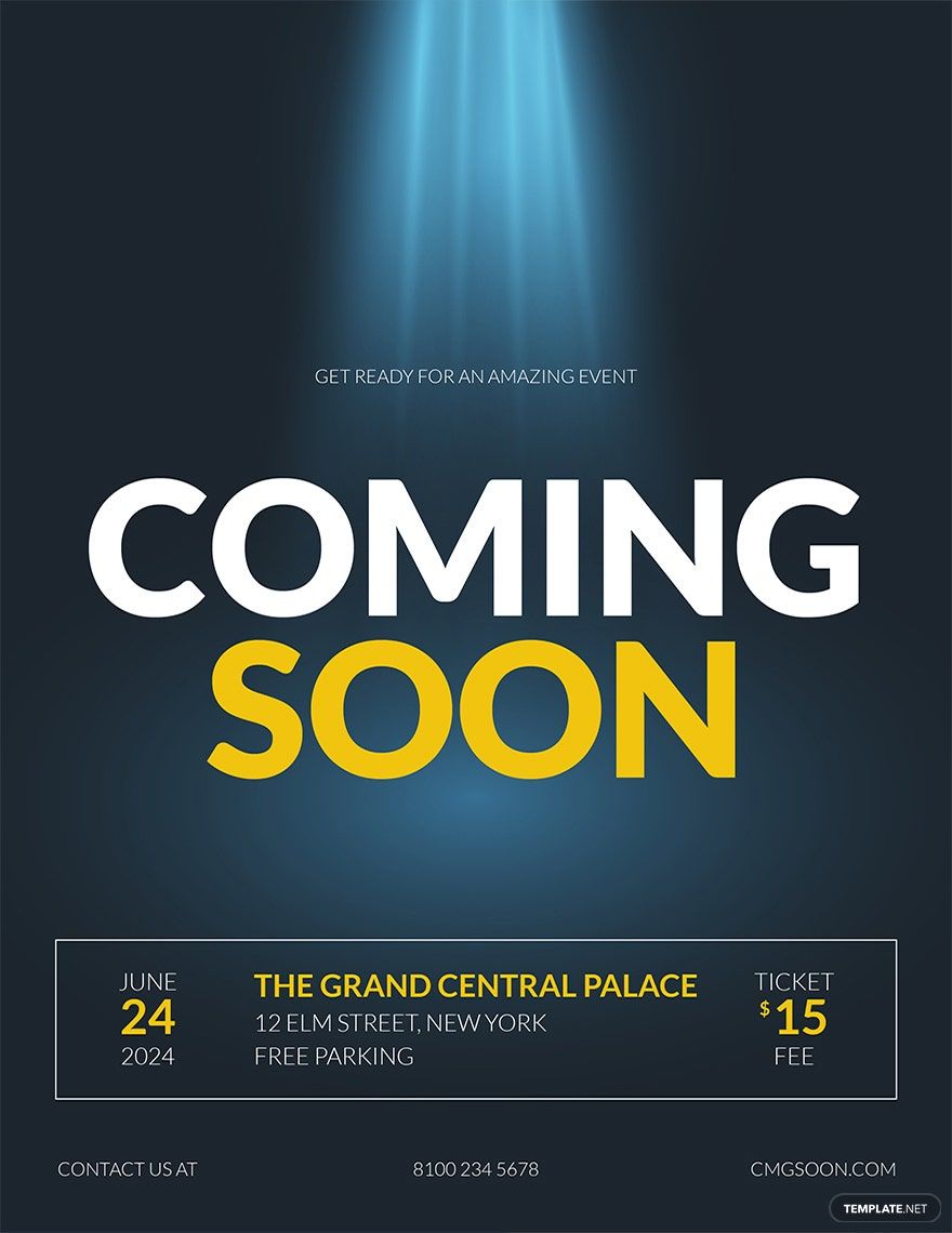
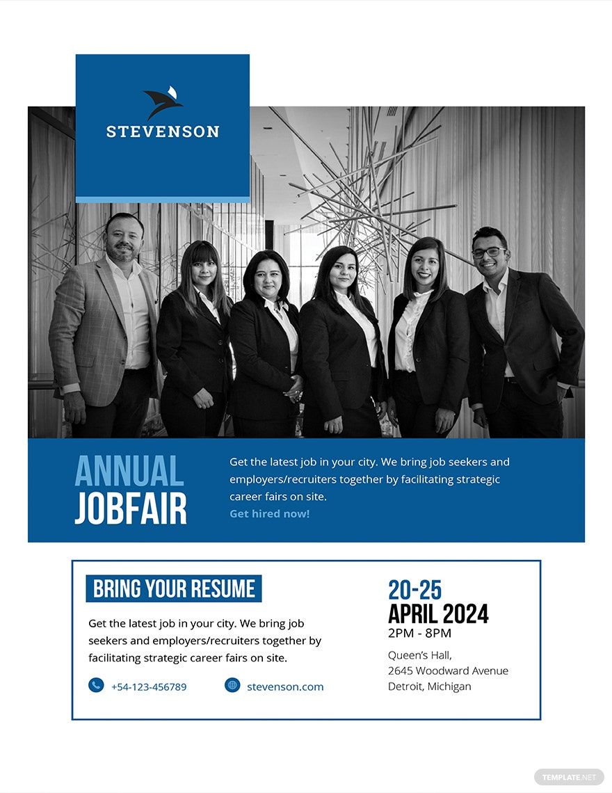
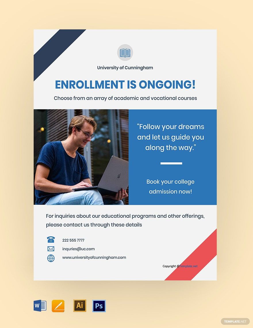
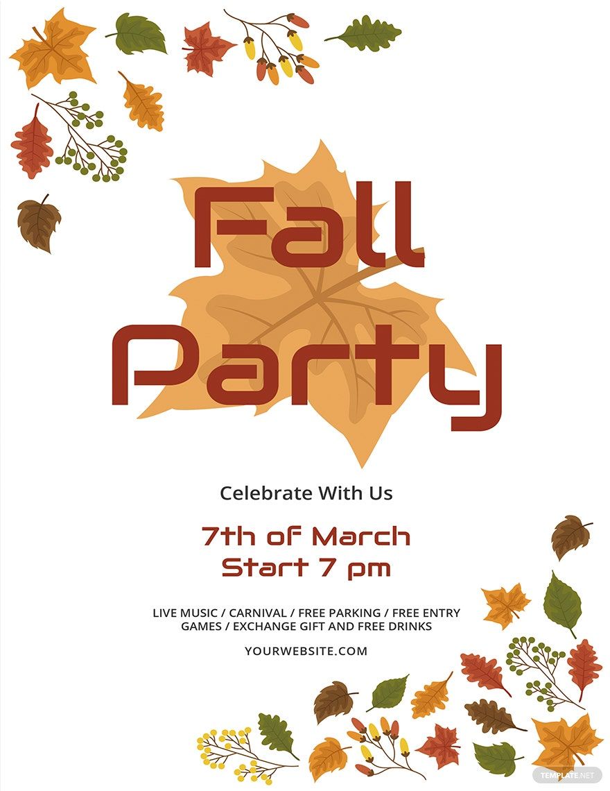
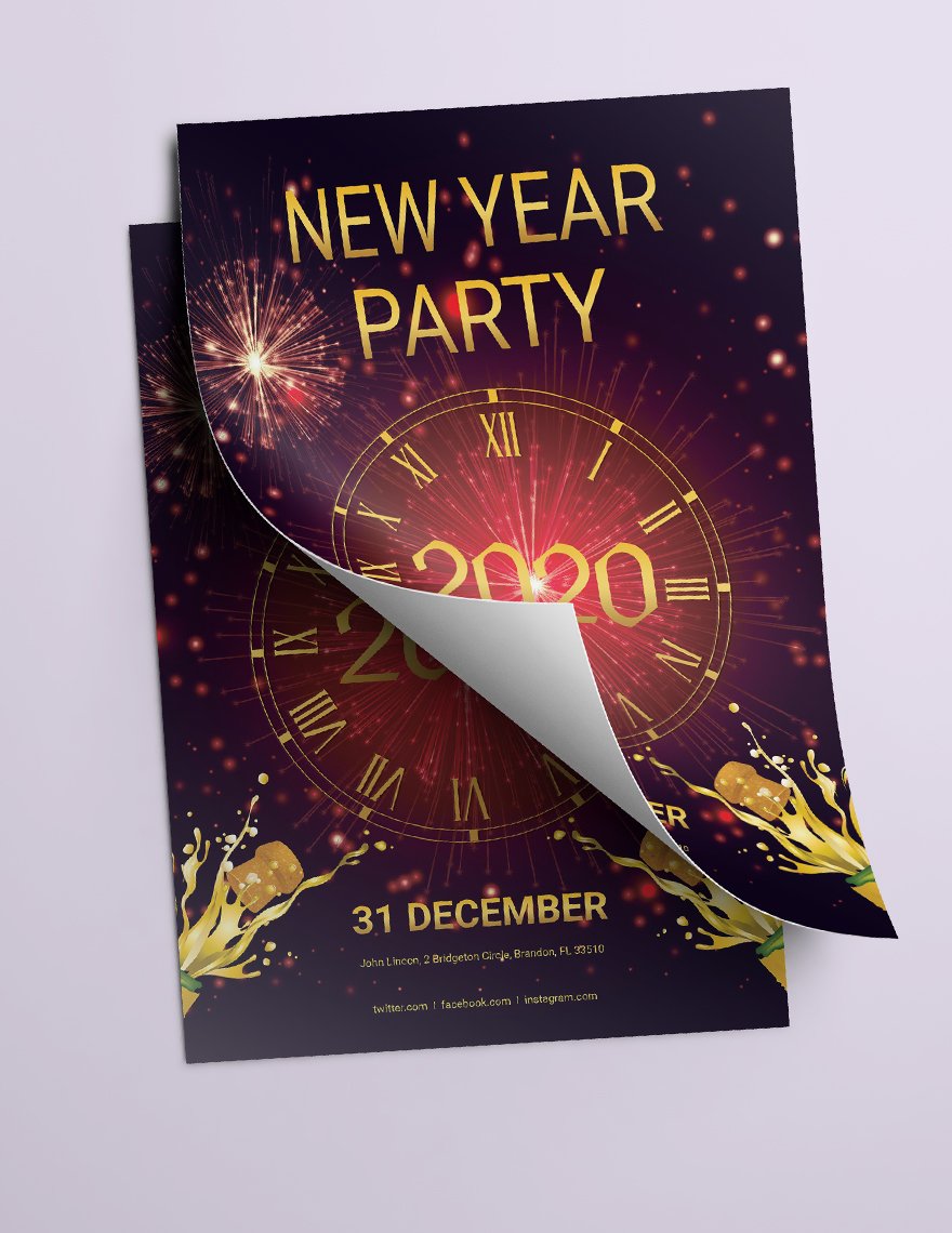
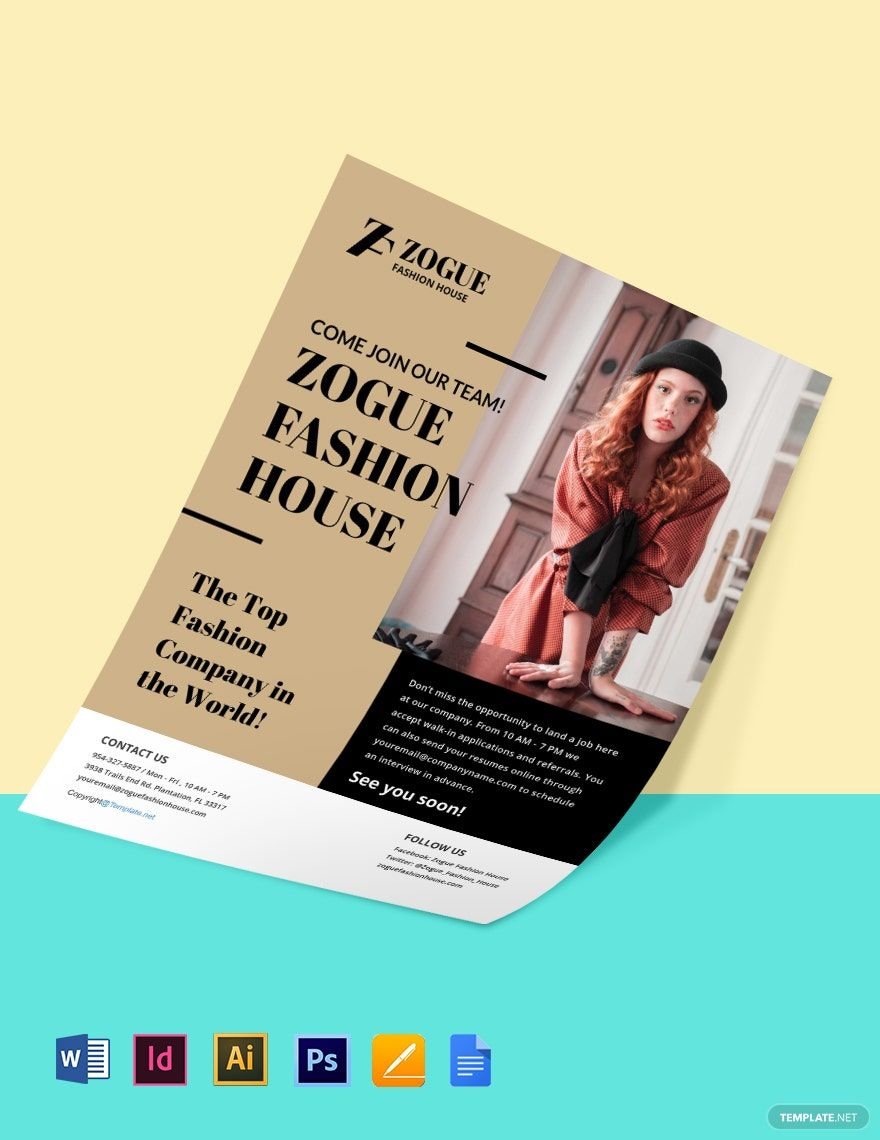
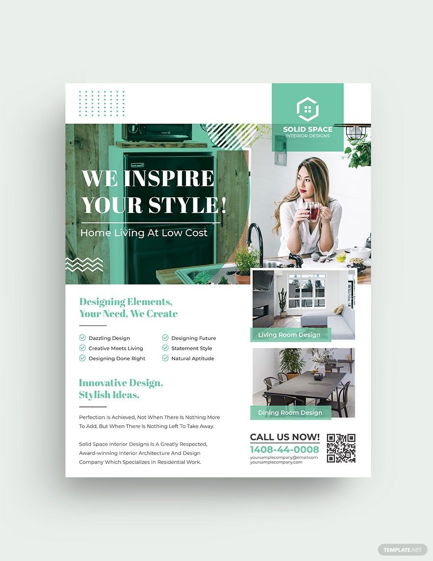
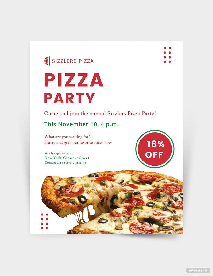
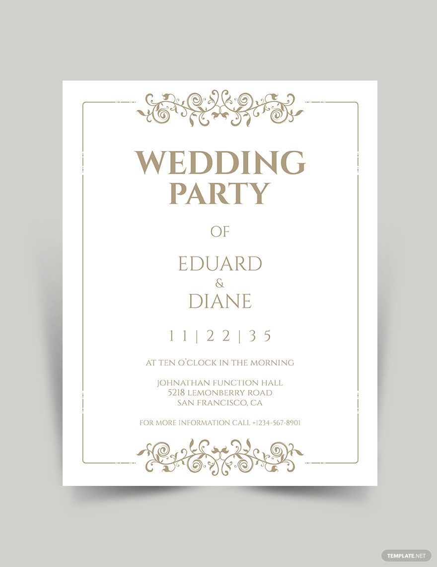
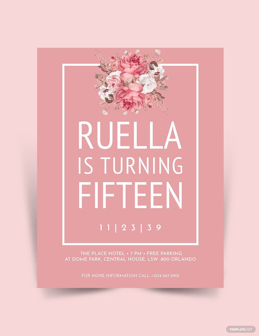
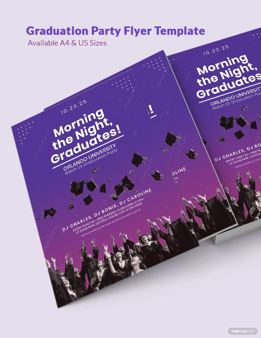
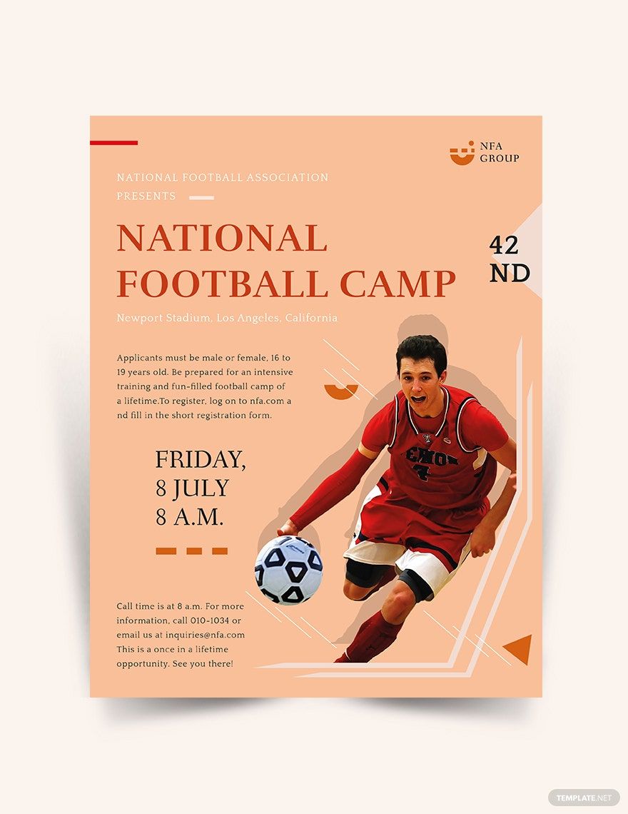
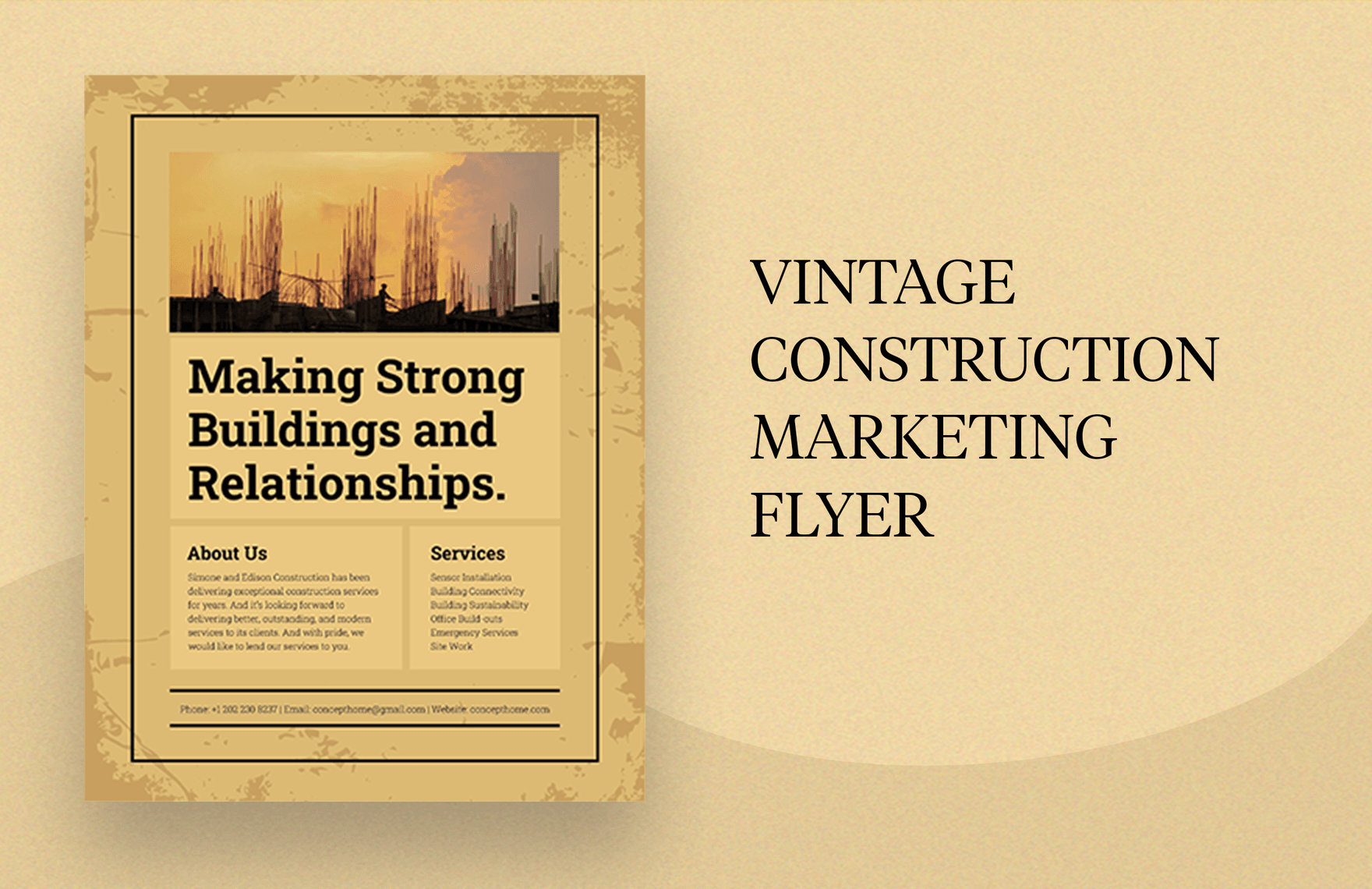
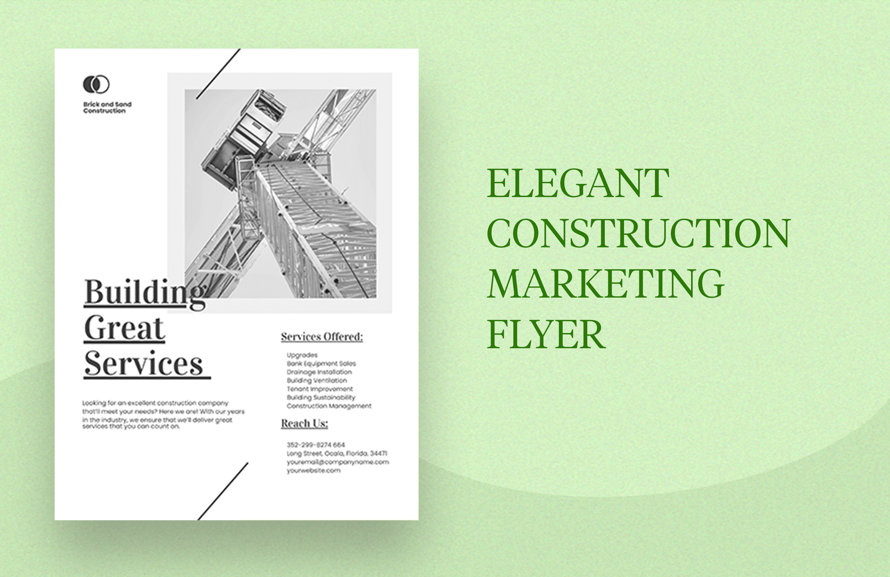
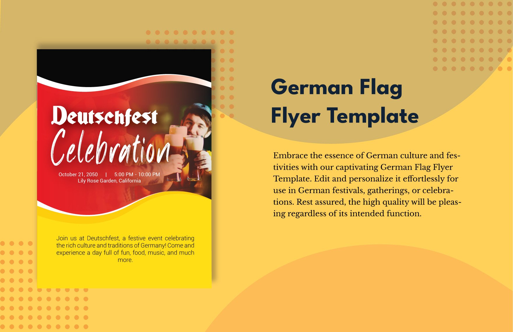
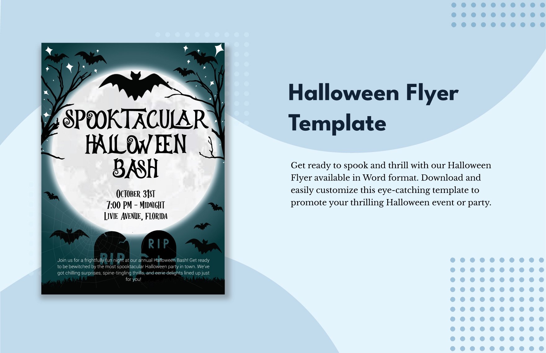
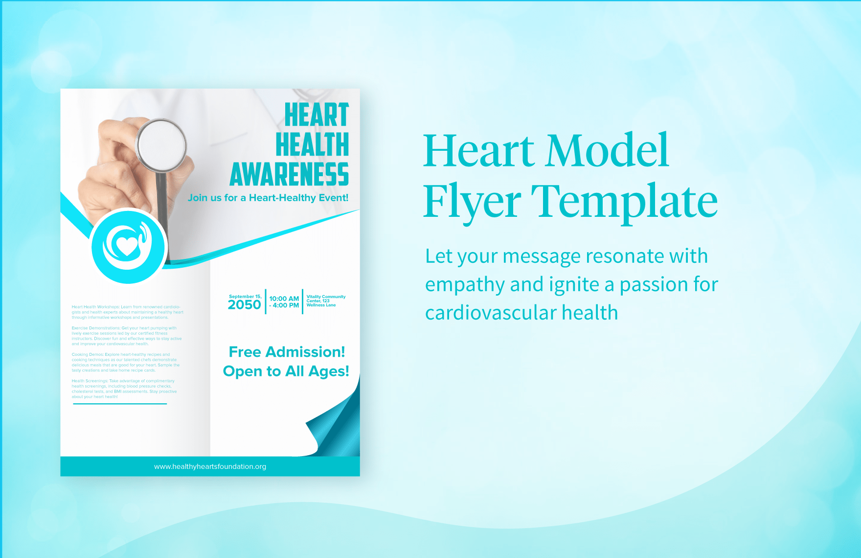
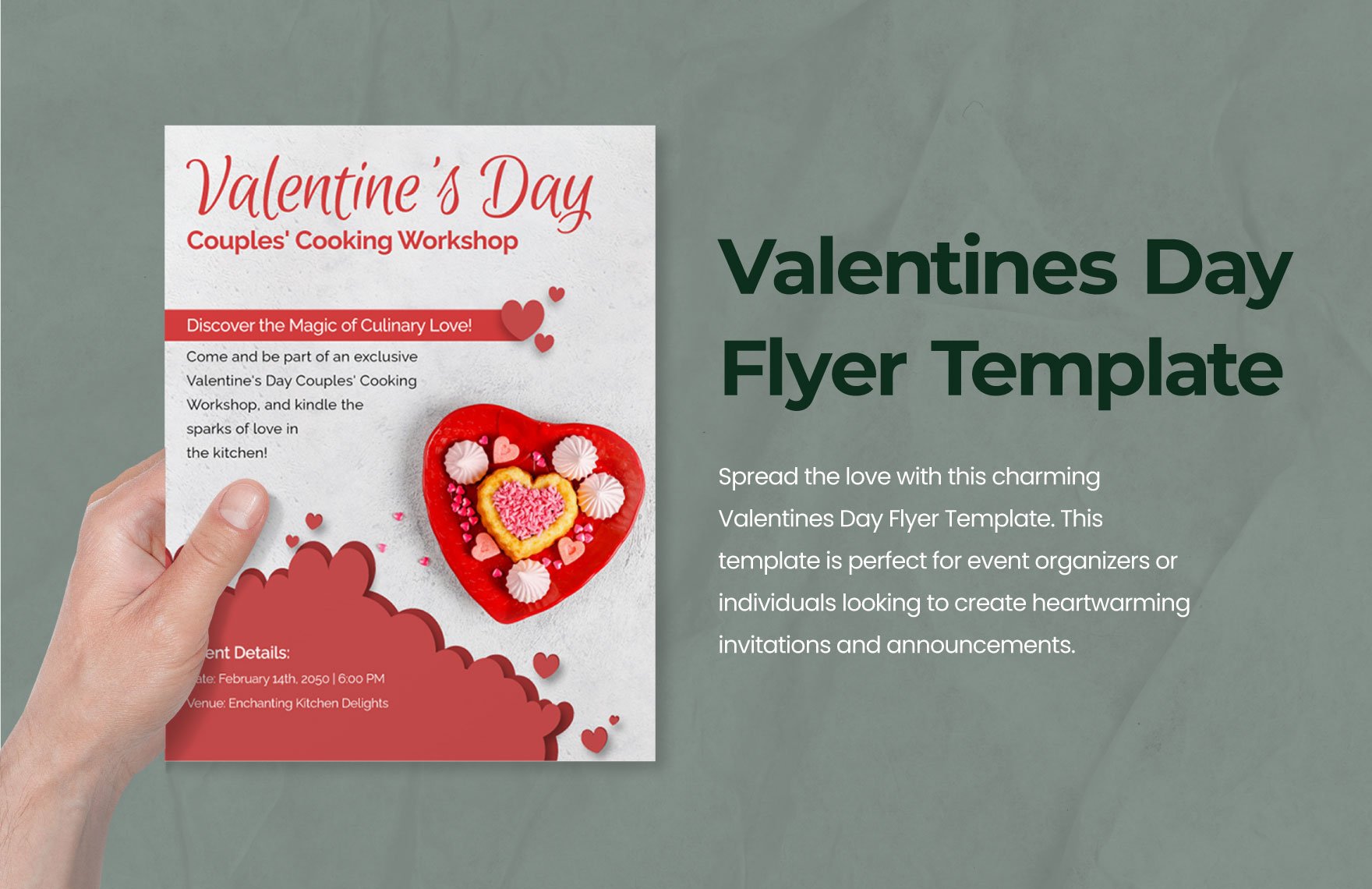
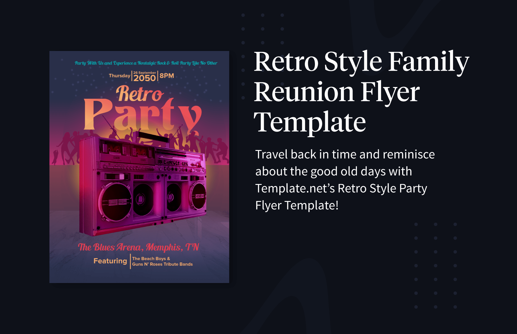
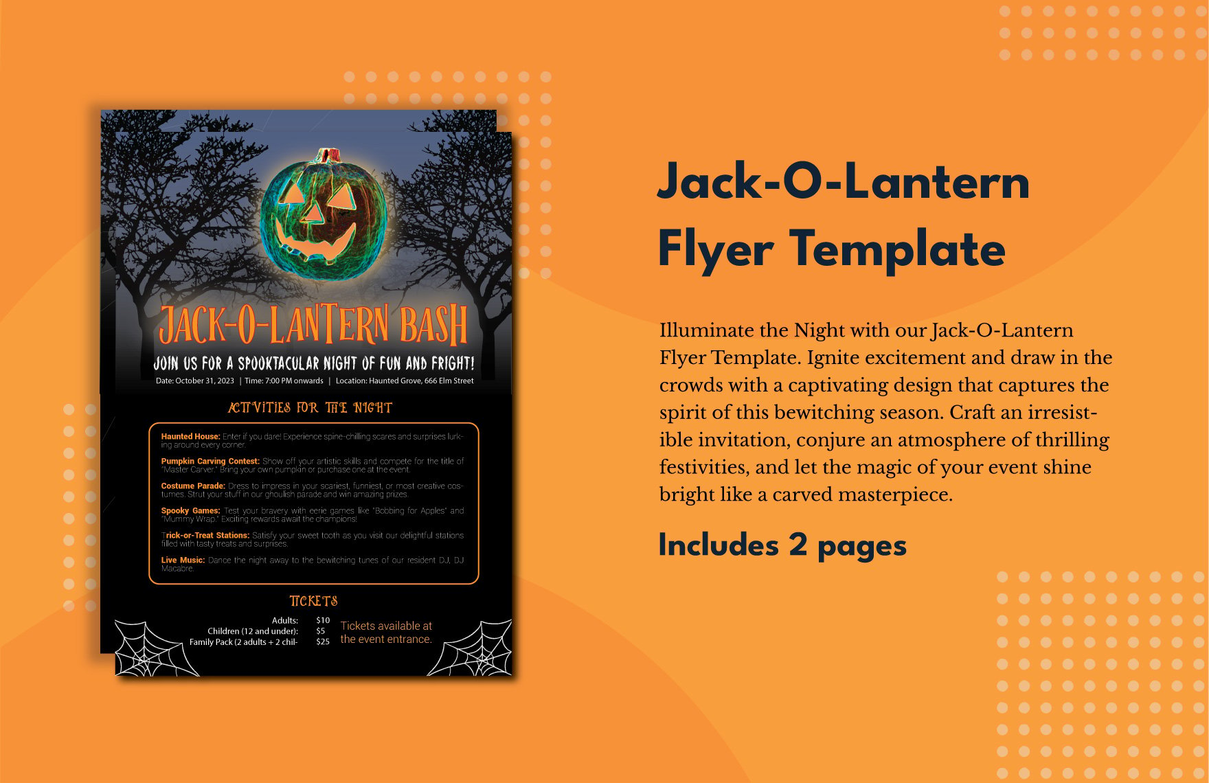
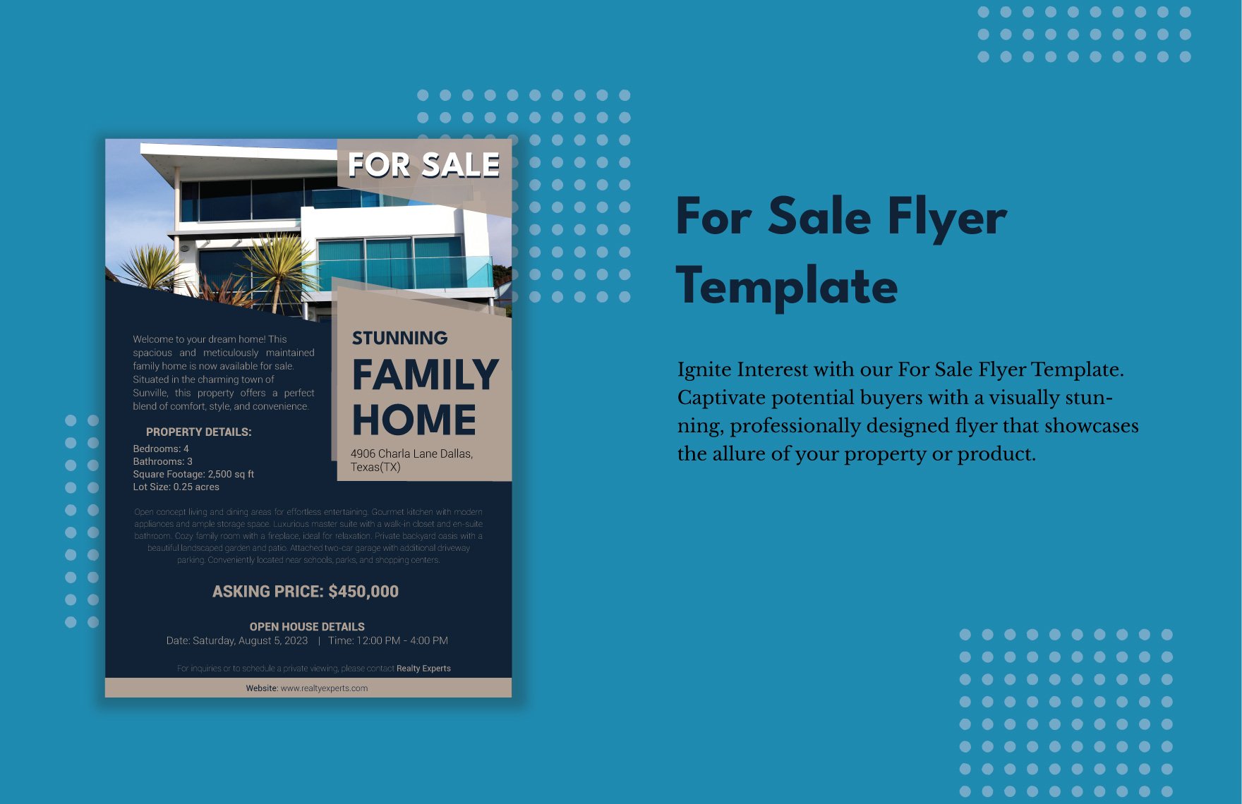
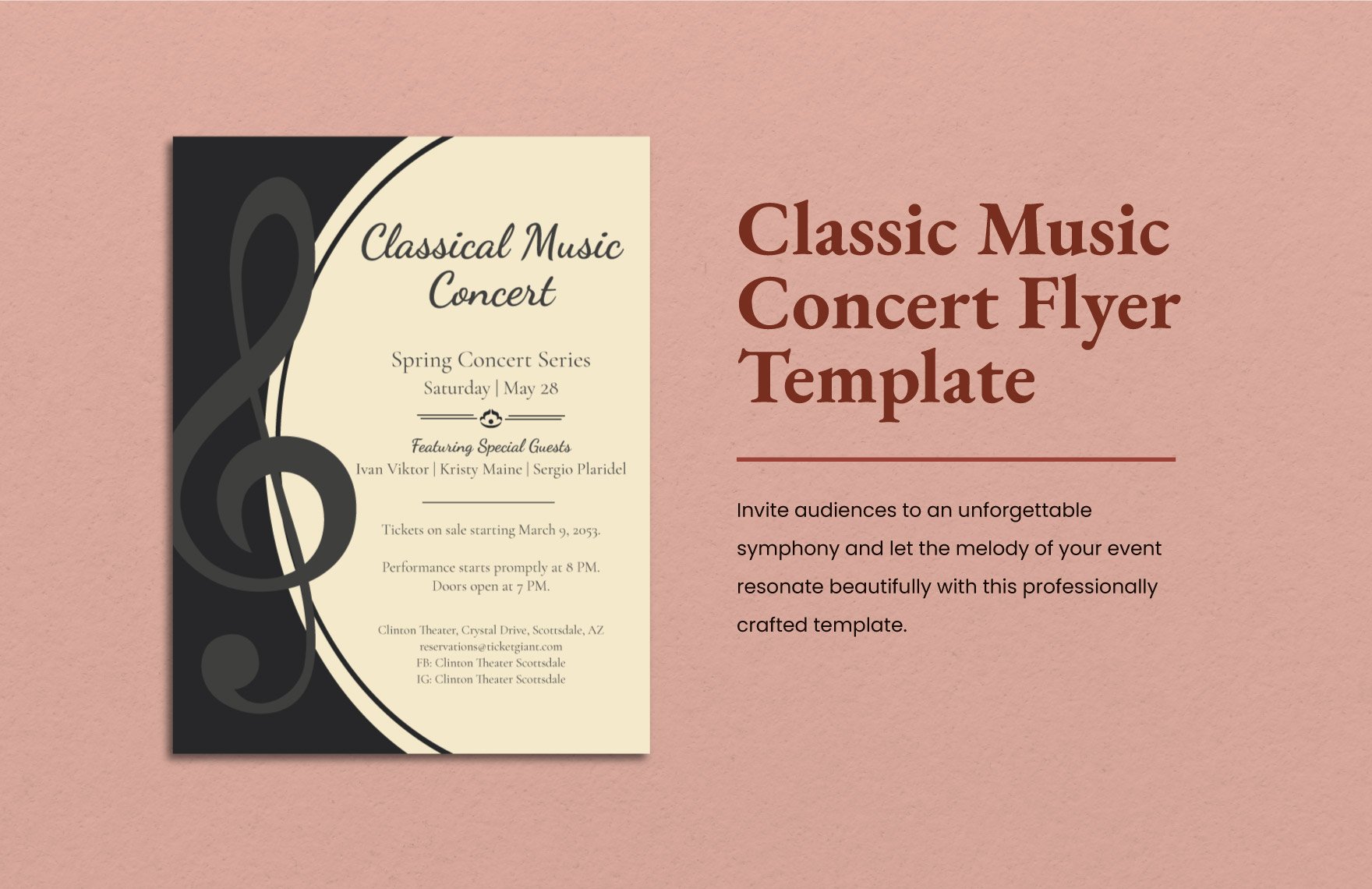
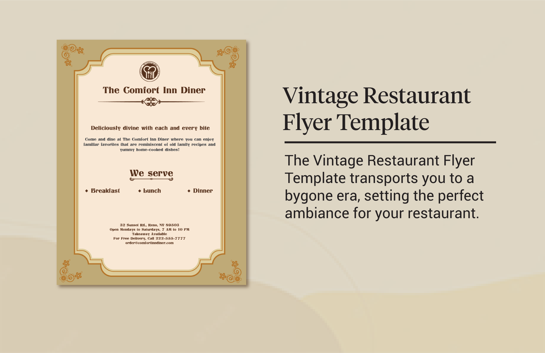
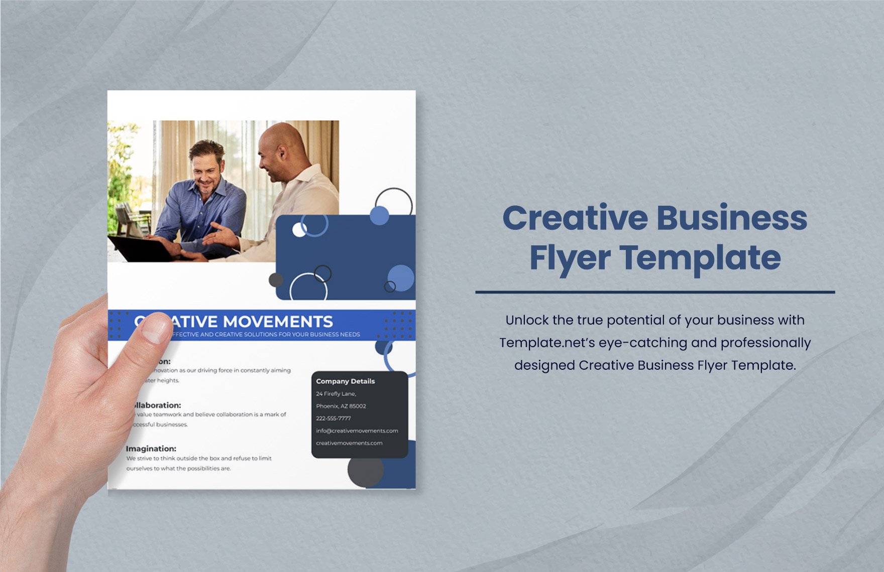
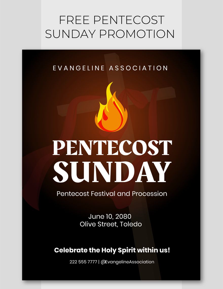
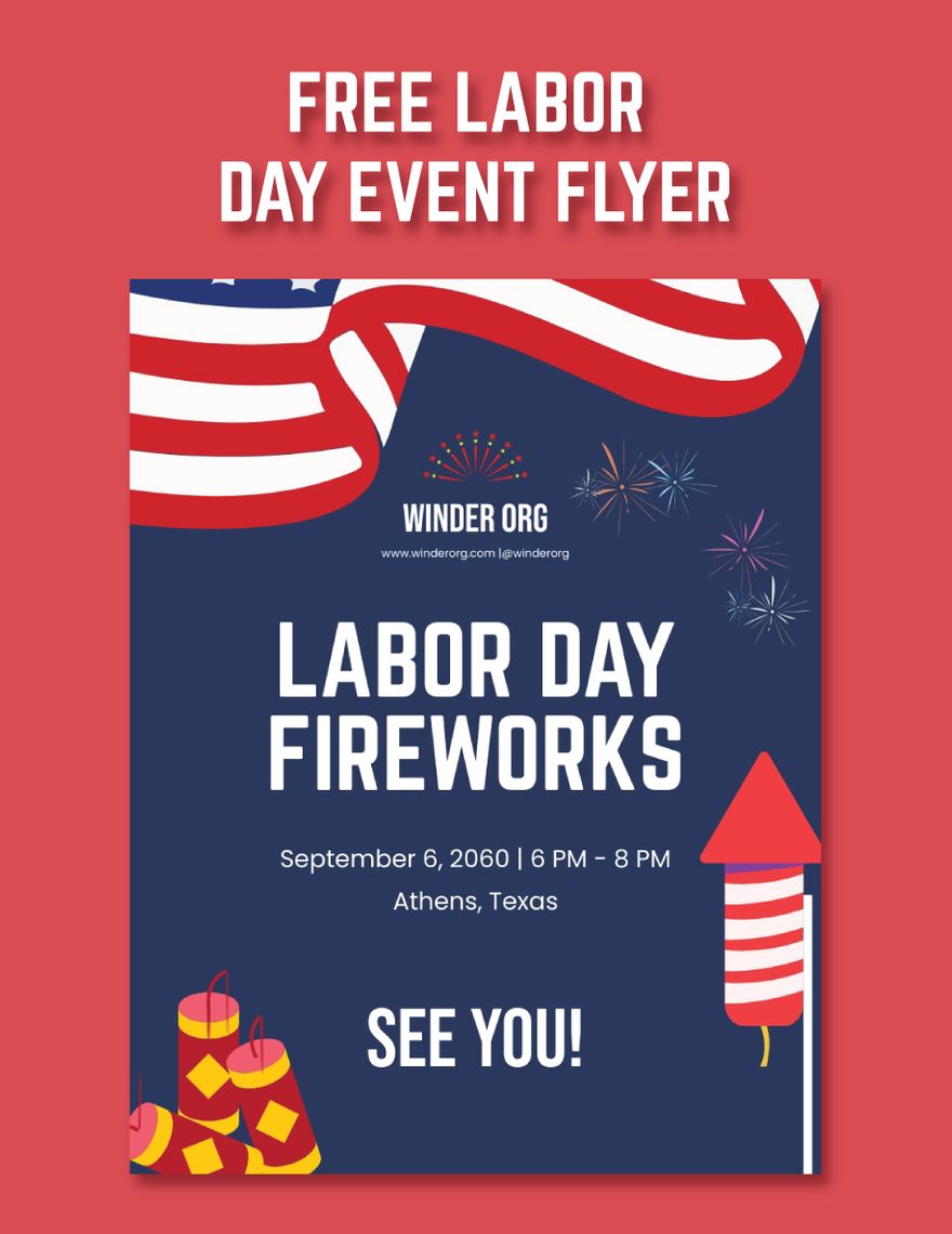
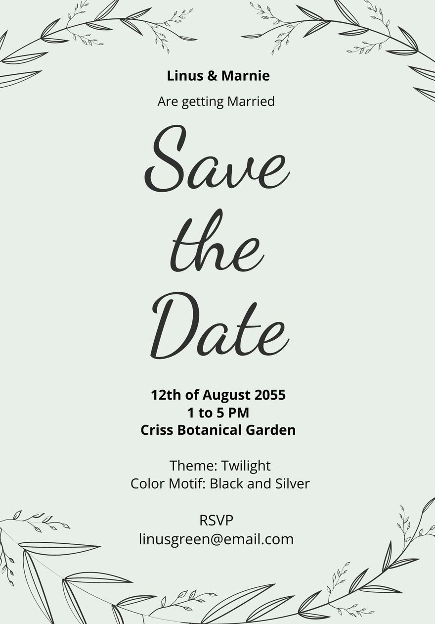
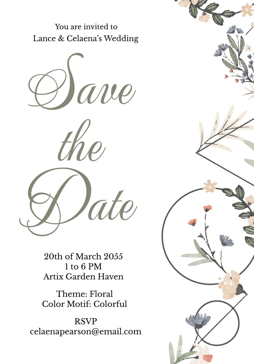
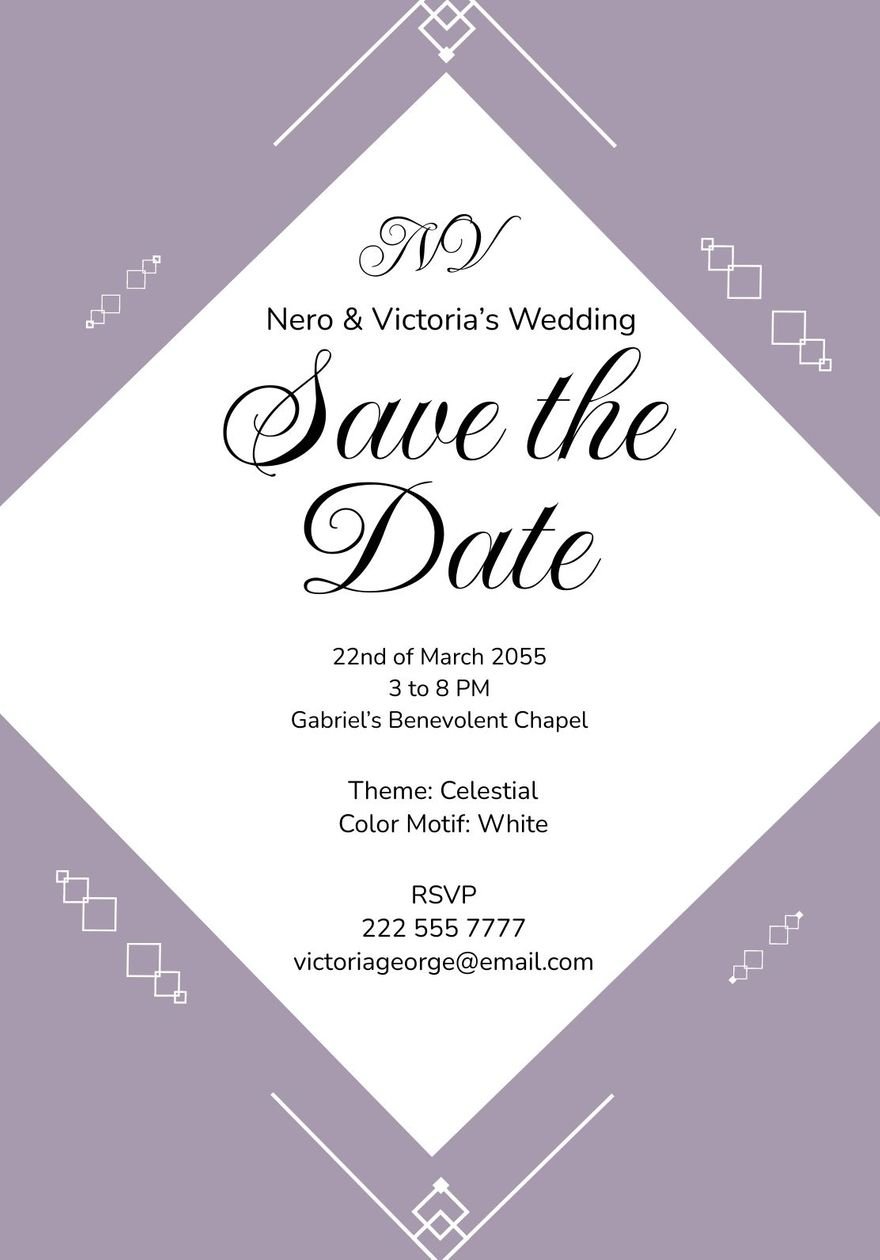
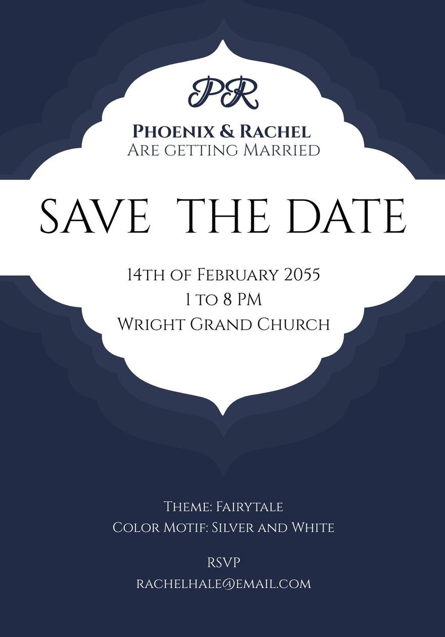
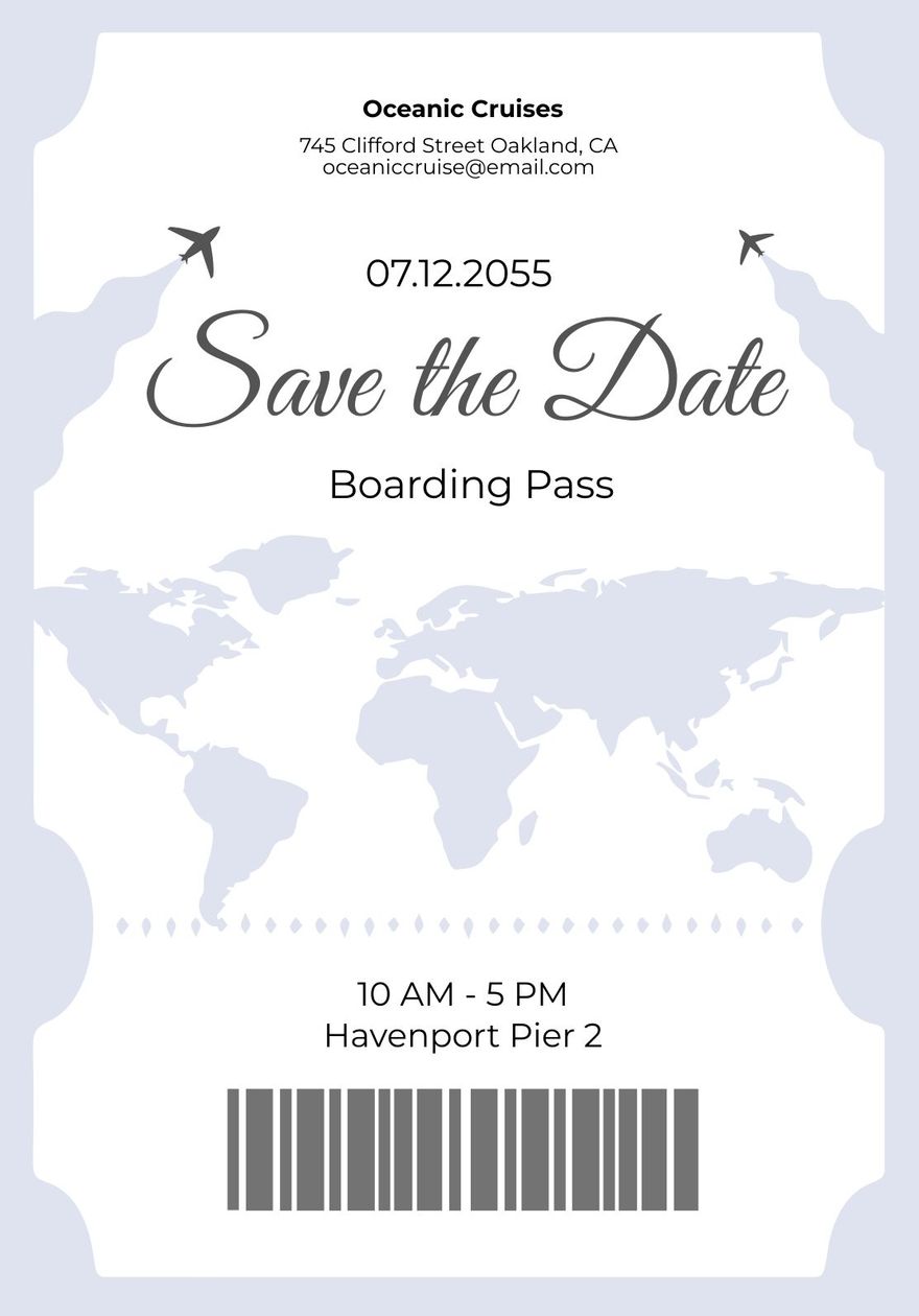
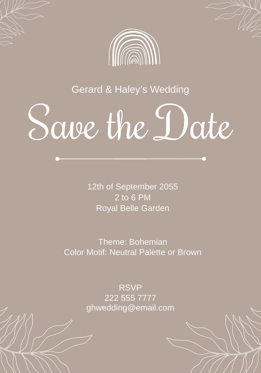
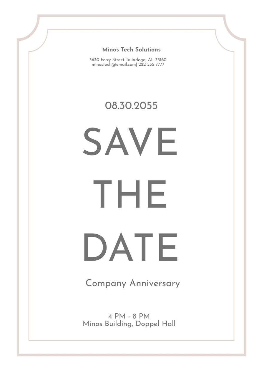
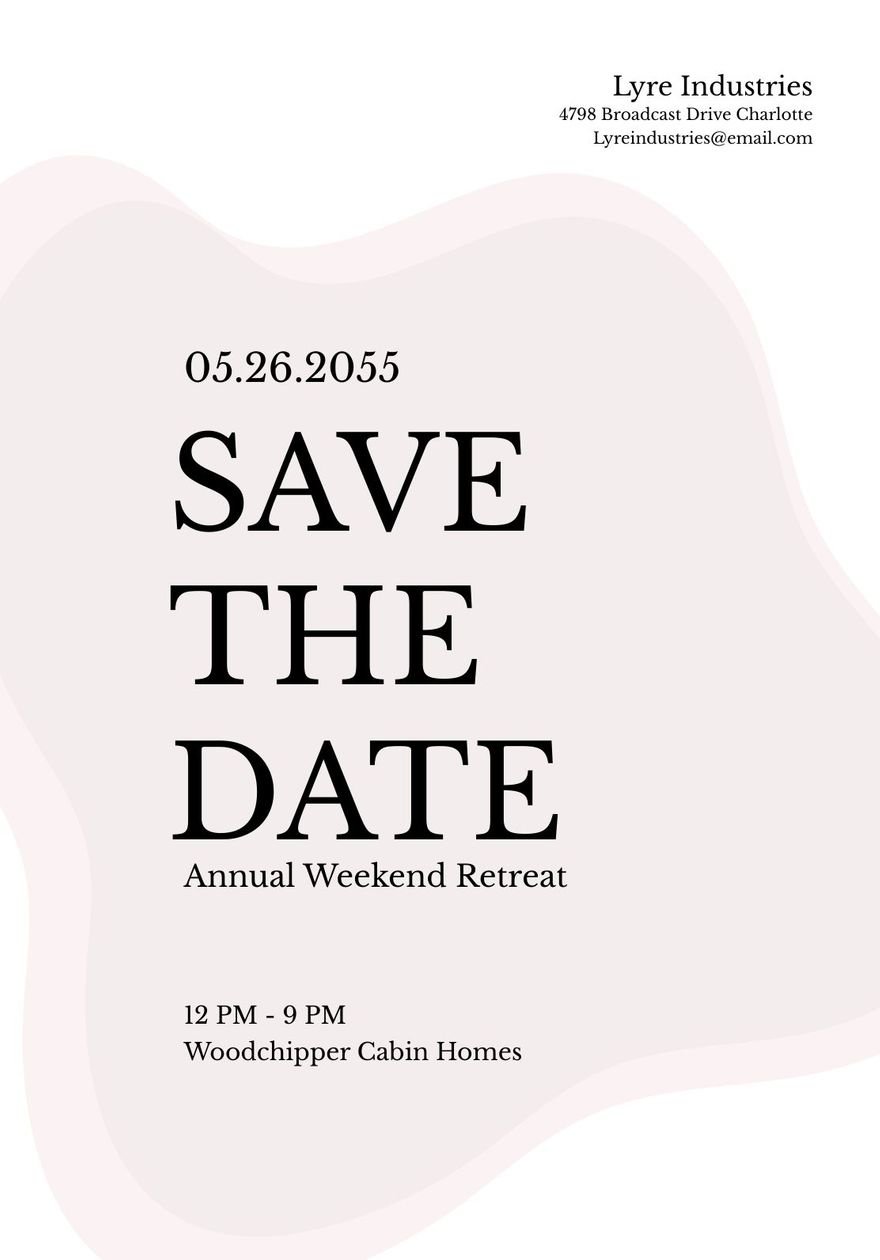
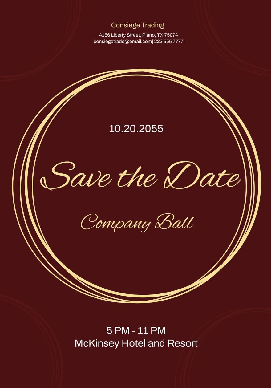
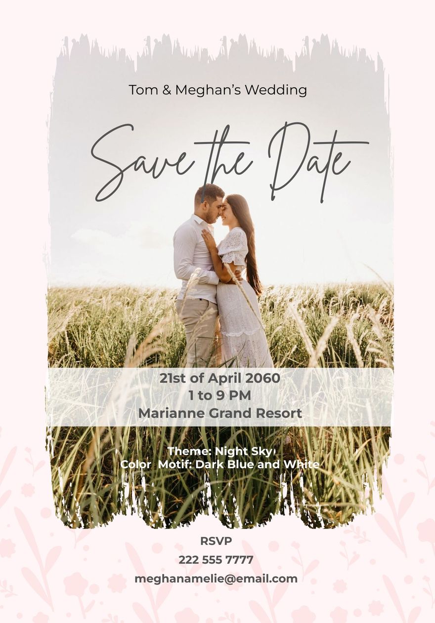
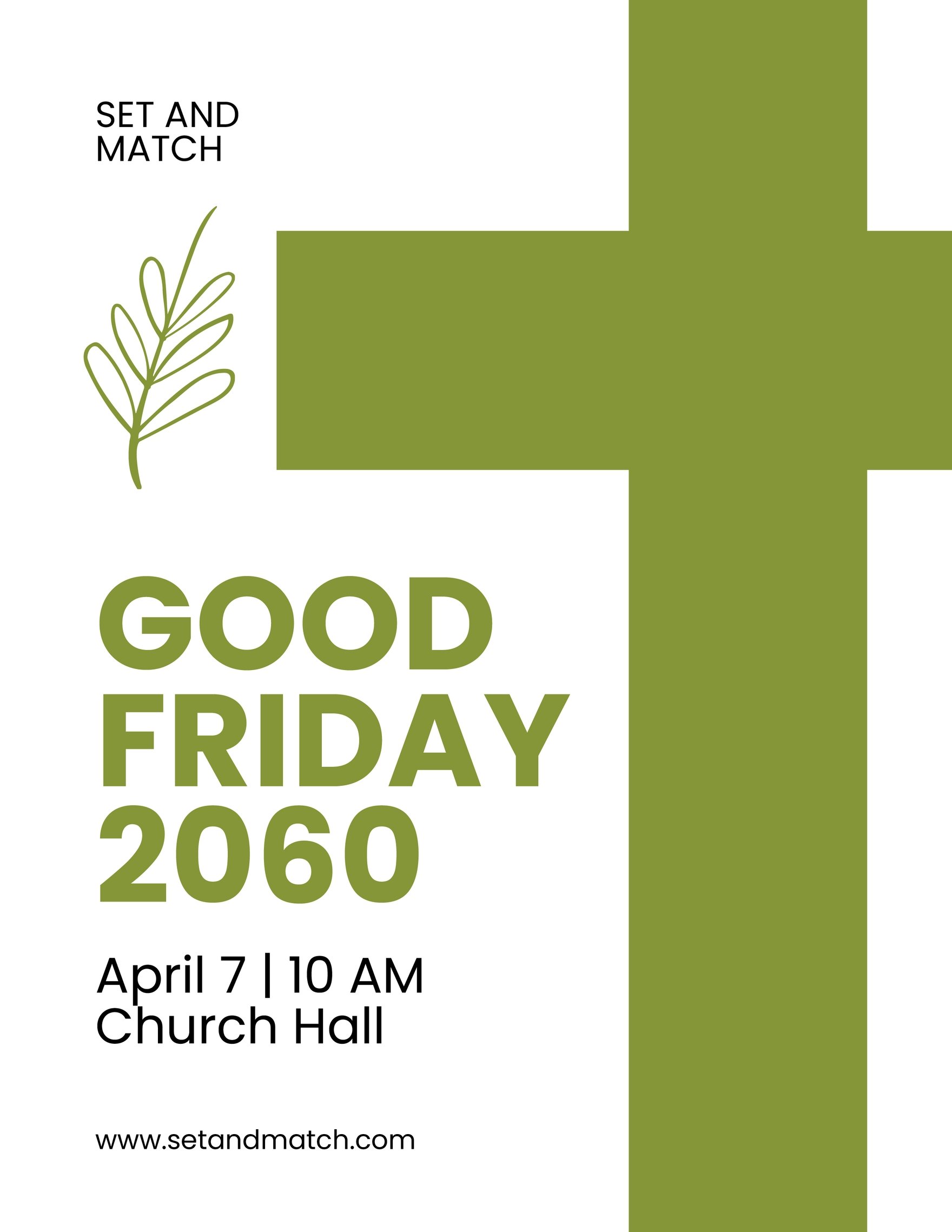
We won't just encourage you to make elegance as your flyer's main design theme, but we are also providing with our excellent selection of our Ready-Made Photoshop Elegant Templates that composed of Elegant Real Estate Flyer, Elegant New Year Party Flyer, Elegant Open House Flyer, and many others. You may also avail our church brochure template, advertisement poster template, and travel agency flyer template in PSD file format. Each template is packed with relevant images, striking graphics, royalty-free fonts, and appropriate original copy. But apart from such features, what makes these templates even more beneficial on your end is that these are highly customizable enough. You can further modify it according to your design needs. Whether making an attractive flyer for a summer party, winter party, fashion show, raffle, or supermarket sale, these templates are all helpful for you. Don't miss out on this great deal and download our Ready-Mad Elegant Templates in the form of PNG or PSD.
How To Make An Elegant Flyer In Adobe Photoshop
A flyer is not a new platform. Some colonists were outraged by the Stamp Act (1765) during the War of American Independence and assembled together in congresses and conferences on anti-stamp acts. In the 2000s, some states in certain places have legislation or ordinances that prohibit or restrict leafleting or flyering. Private property owners can put up "Post No Bills" signs. This happens especially on wooden fences covering construction sites or vacant lots.
Every day, we get to see flyers in the mail, at our office or school, on community bulletin boards, or in shop windows. Flyers are pieces of paper that often end up in the garbage, trampled down on the road, or buried under a stack of bills. But if it's designed well, flyers could capture your attention and perhaps even get you to do something. We have prepared easy steps to make an elegant flyer.
1. Put Your Flyer Design In Contrast
Contrast is a significant design principle that helps in the graphic design to highlight key aspects and focal points. By establishing a focus on one component, it enables to structure and construct a hierarchy. Use contrast in colors, typefaces (types and sizes), backgrounds, forms, etc if you want to highlight the design of your professional flyer or leaflet.
2. Make Use of Only One Focal Point
Do not produce a fuss in the layout of your flyer or poster by focusing on too many design components. It could distract the overall design. A flyer's main message in a crowded flyer design can be destroyed. Use one focal point and organize around it the remaining secondary components. Use one creative or high-resolution picture that best conveys the flyer's bottom line.
3. Add Color
In graphic design, colors are no less essential. Colors applied to each element and the color you select influences the mood of the original design. Sticking to 2-3 colors and selecting only those color alternatives that complement each other is another easy rule for selecting colors for your simple flyer design. It's difficult to create a color scheme, so you'll need some useful tools to select an ideal color scheme.
4. Arrange Design Elements
For all kinds of business design, an ancient golden rule of thirds works. Flyer design is no exception. The rule of thirds helps organize the flyer design's focal components in the most visible fields. What are these areas of visibility? These are four horizontal and vertical grid intersections. These intersection points should be placed as close to the most important components.
5. Use Suitable Fonts
Each typeface has its particular style, usage intent, and application field. There are fonts that are only used for the main text, as they are easily readable. But for titles and significant words or text, they do not work at all. Make a wise choice in selecting your fonts.


