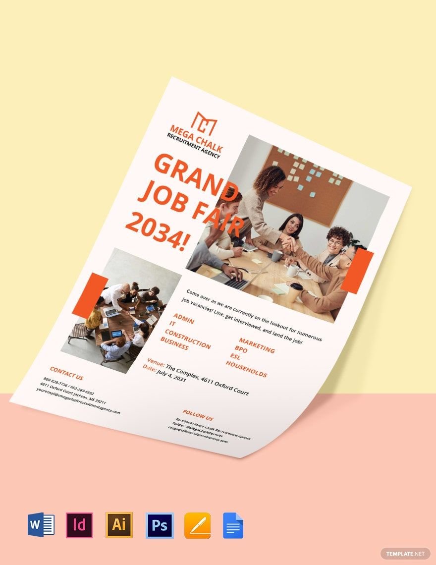
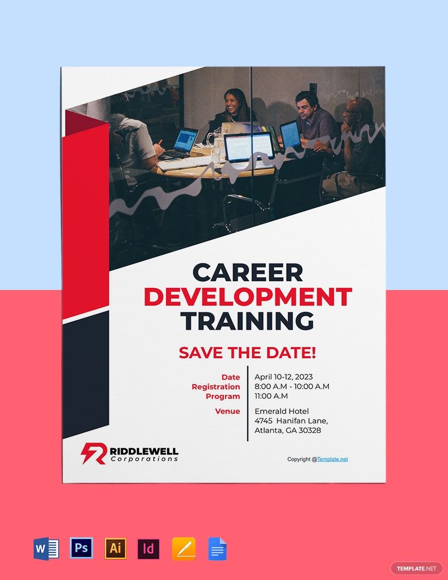
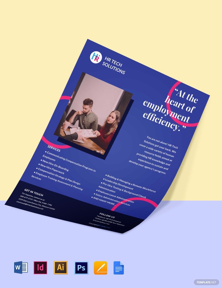
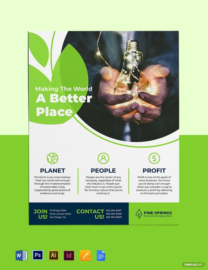
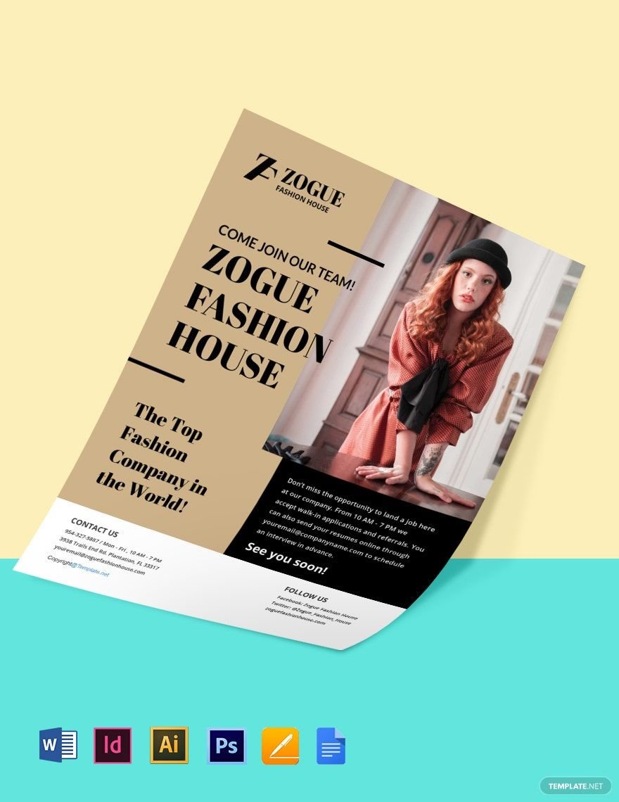
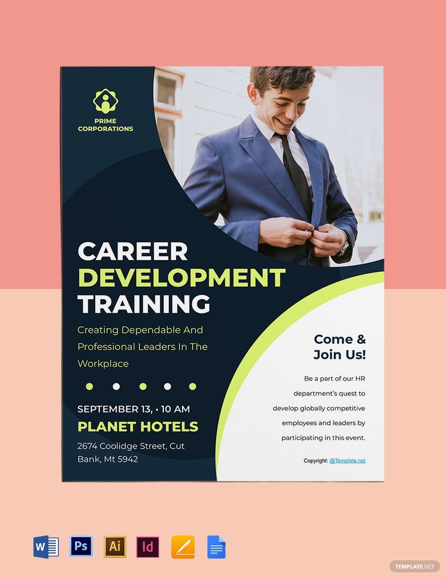
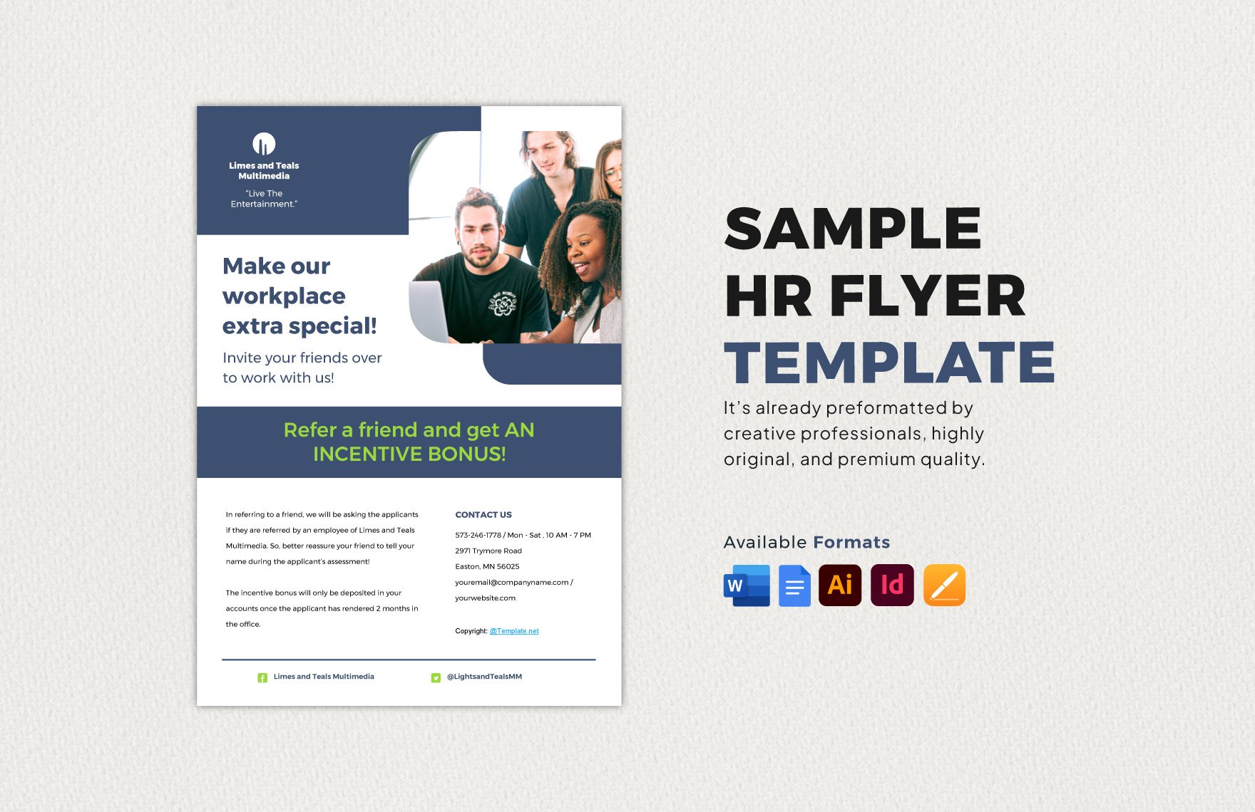
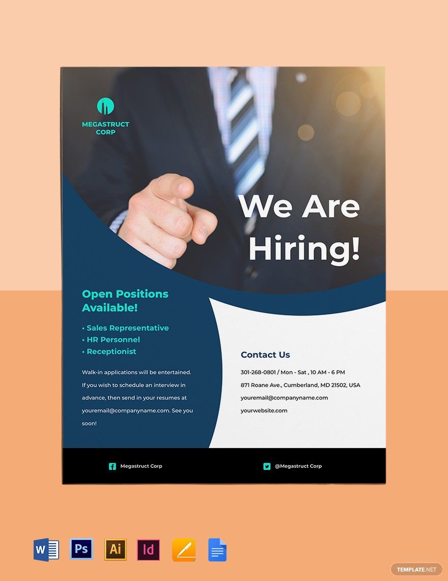
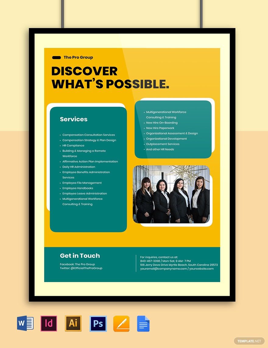
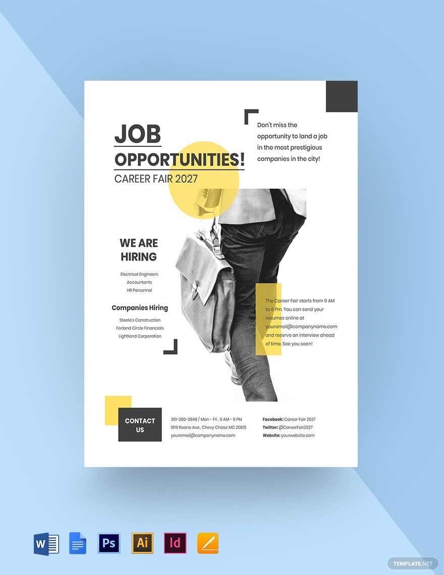
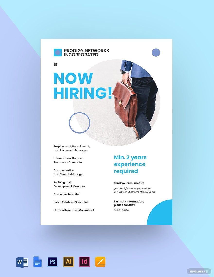
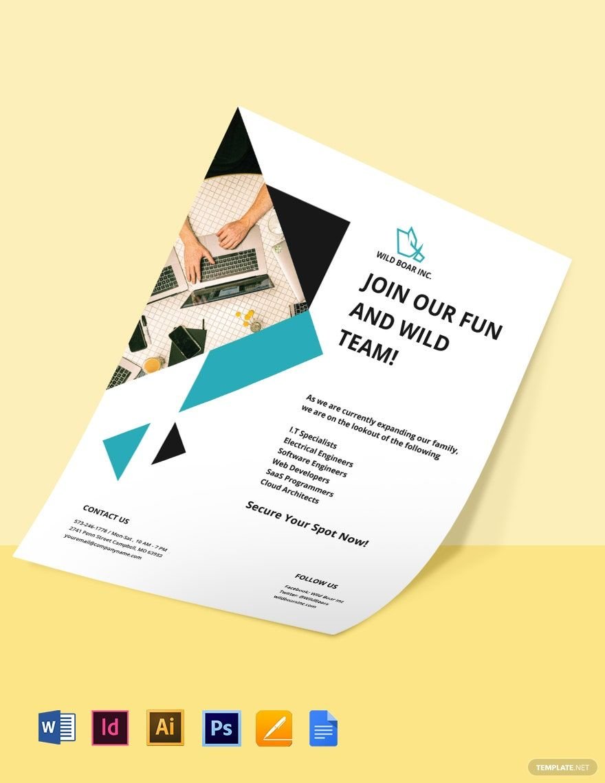
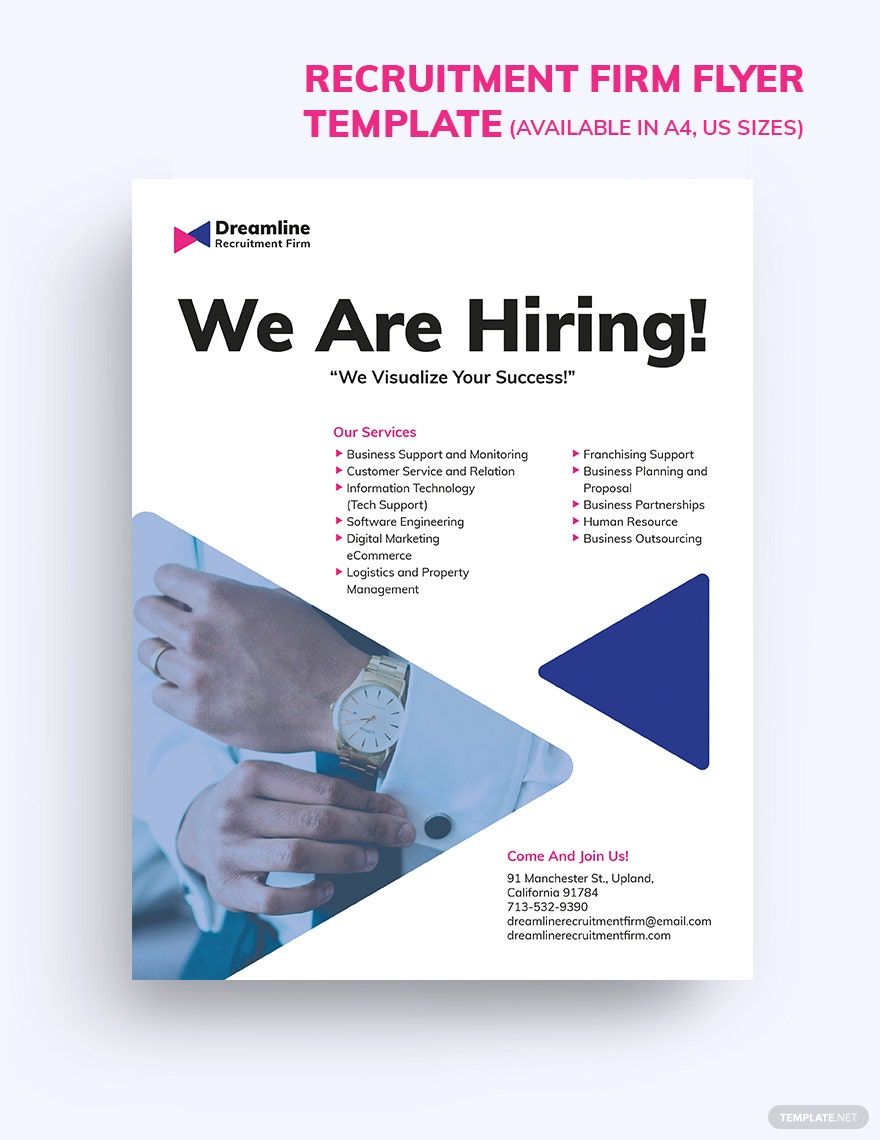
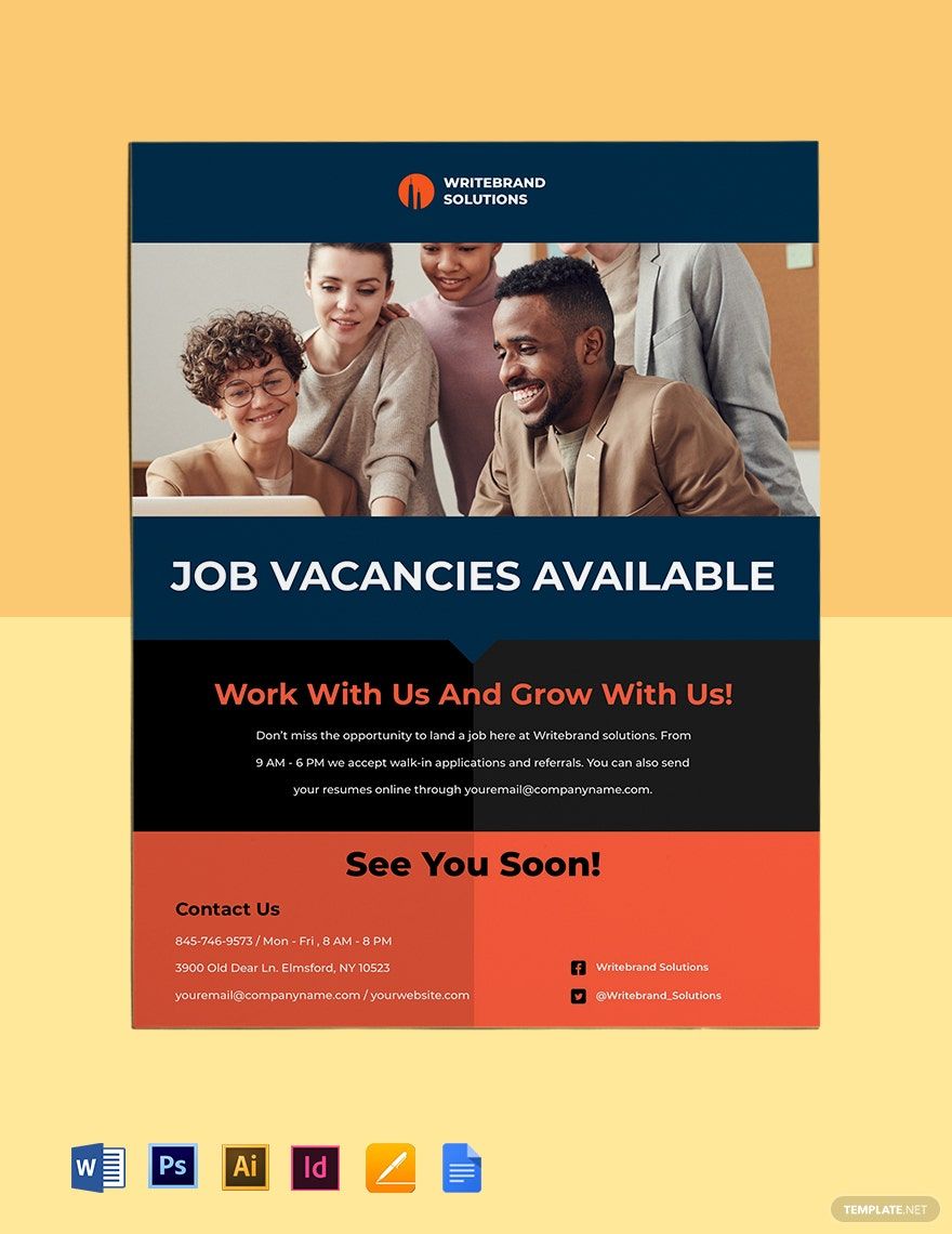
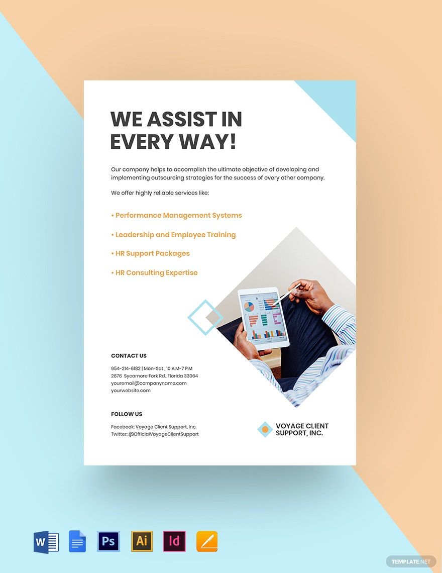
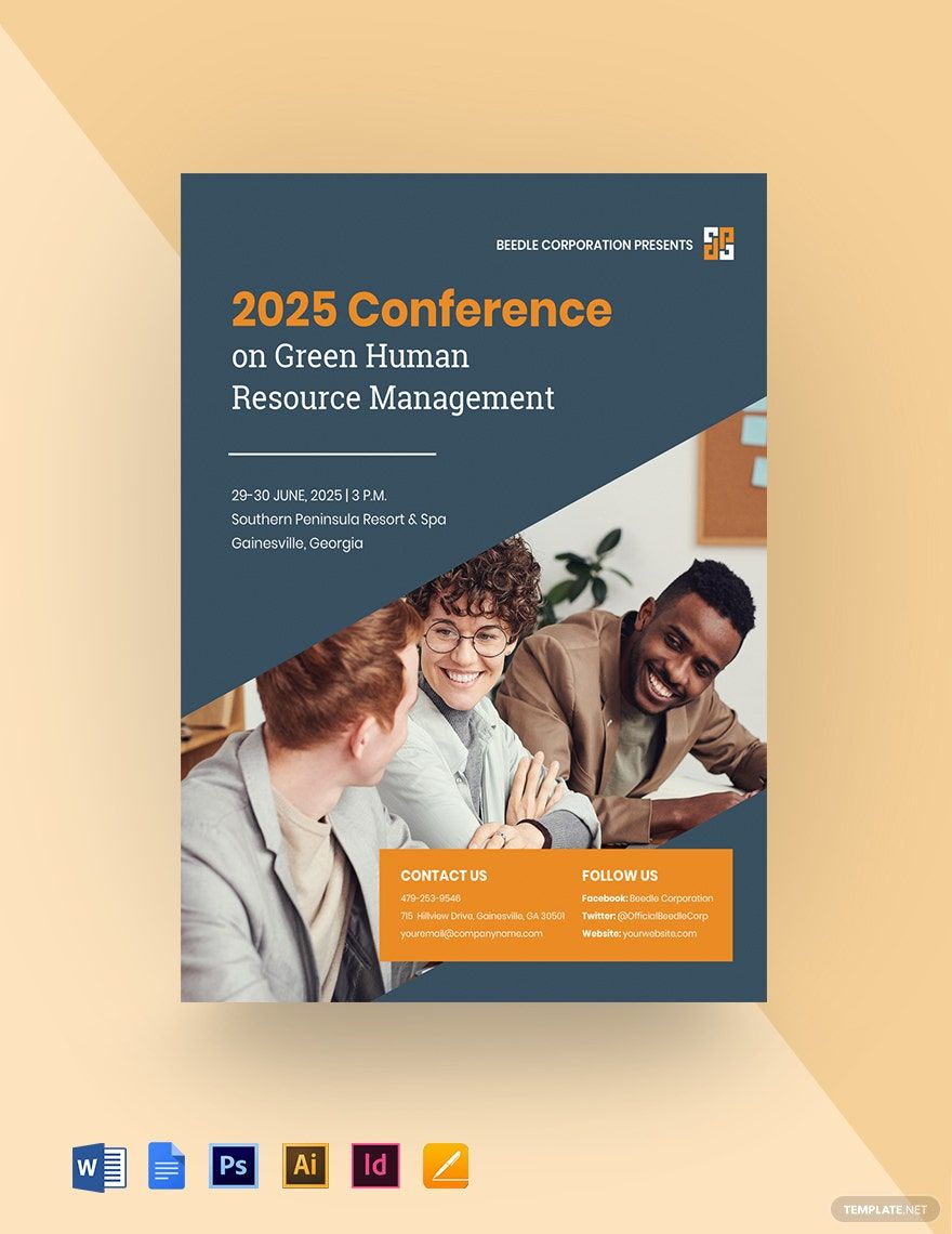
Flyers carry your message through a personal connection to the people — that's the kind of contact that is strong enough to boost growth in foot traffic to your market. Your flyers may tackle employment coaching, job opening, business consulting, hr training, or employee training. But how are you going to create an effective flyer without starting from a blank paper? Well, fret no more as we offer you our modern HR Flyer Template In Google Docs that comes with an easily editable and customizable feature that lets you personalize its ready-made content. Our team of professional graphic designers programmed this template with a beautifully-designed layout to ensure that it easily draws the attention of your potential audience. Plus, it supports both Mac OS and Windows. Hit the download button now to avail of all the inclusions!
How to Create an HR Flyer In Google Docs
Although the marketing of flyers is comparatively cheap and fairly easy to do, advertising costs will increase over time. Small companies are particularly vulnerable to those costs. According to smallbusiness.chron.com, flyers can never be outdated because they complement all kinds of companies and help them reach their promotional goals effectively. Thus, the four primary reasons why they are still efficient are their price-effectiveness, effectivity with no effort, visible design, and appealing image.
We've compiled simple tips to help you draw people to your human resource team by creating a polished poster that reflects your brand image and looks cool on any display area.
1. Keep it Brief
Remember, your flyer's space is only limited, considering the relevant designs that must be included. That is why you have to keep your text short and concise. Taking into account also how limited is the attention of your potential audiences, they might be overwhelmed when you put too many details or information on your simple flyer, and for sure, you don't want that to happen. Just a tip: Write only those that are essential.
2. Manage the Texts
Your text's presentation will influence your reader's attention. Long sentences at first impression look like giant blocks of text that can shut off your mind. White space that is the zone around that aspect of design tends to minimize this burden. However, like all advertising techniques, a well-made flyer will surely suit your target audience well, which depends heavily on your customer persona. Nonetheless, using language is often a good idea that is easily understood by the target market.
3. Add Color
You may want to incorporate the essence of the activity or gathering itself into your company flyer. Looking at your professional flyer will bring the audience to the experience and encourage them to visualize what the environment would be like. Adopting bold color combinations and variations, even at a distance, can make your flyer attract the eye. Remember, color theory is not an advertising innovation. The use of color may elicit some reader sentiment. Thus, use it to bolster your message.
4. Include Contact Information
This is quite noticeable but can quickly be overlooked. Always fill in a flyer with your contact details. Generally, the lower part is the perfect location for easy access. Pull out a bold-colored website address or ensure that the time and date of the activity or transaction is set to a large size.
5. Incorporate Photos
Fuzzy and jagged photos will shut any audience off. Even worse, viewers can equate pictures with low quality to unprofessional facilities and lack of creativity. Just a tip: use clear and sharp pictures always for your event flyers.
How to Create an HR Business Card in Pages
According to smallbusiness.chron.com, a corporate business card will portray your core business identity — not simple, given that the card measures just 2 inches by 3.5 inches. And it's a challenge for you to be wise in getting your information across that small card. You can't really expect to have your business card give the full narrative about your business. What you'll need to expect it to do is to maintain the appearance that people will remember professionally.
If you're an HR manager and don't know how to make an effective business card, then you got us covered with the easy steps below.
1. Create an Excellent First Impression
Your human resource business card tells a lot about your firm. Your layout will express your principles, set your small business apart from the market, and allow people to come to get in touch. If your working method is organized and concise, then the business card will represent those attributes. And, if your goods or services are humorous and imaginative, consider using pastels and a descriptive catchphrase to convey those characteristics.
2. Choose a Suitable Size
It's crucial to know what type and shape your card will have before you plan to develop your business card. This not only affects the length of the text and the amount of data that you can provide but also expresses details such as whether you are a modern or bold social outcast. Lateral rectangular cards are the shape that is popular for most individuals. Diagonal cards are less popular and can be used to distinguish between you and your adversaries.
3. Look for Appealing Design
To make your creative card noticeable and inclusive of the goods or services you offer, pick shades, and visual elements that are aligned with your corporate industry. If you're selling luxury goods such as accessories, you could be presenting this in a detailed manner. Or, if you're skilled in a timber framing or woodworking type, you can include a snapshot of your work to highlight your field of expertise.
4. Be Consistent
It will be simpler for your clients to identify and acknowledge you if you stay consistent with your website. Unless you don't have a homepage or other campaign materials, but your organization has an existing logo or is particularly popular for something, try to incorporate this to your business card layout.
5. Incorporate Exact Contact Details
Specific contact information, exact wording, and the option of a legible font in a readable scale are all items that must be reviewed three times. Ensure to mention your small or large company, phone number, homepage, email address, and social networking sites handles, other than your name and position, where appropriate for your operations.
6. Hire a Designer
If you're fortunate enough to know someone who has an idea of how to create print illustrations, a simple 20-minute might help ensure it's all ready to be applied to your layout. They'll be reasonably sure the features like your branding on your physical card look sleek and simple. It is essential to ensure that your photos are the appropriate resolution and that your content columns are an optimum legibility size.
The great business card must give an impression of what your current company is about while giving exact details about your business and your position there. Even though there is just a small area, you'll surely offer people more than your name and address when you think and plan creatively. If you think you can't create a business card on your own, then you must download our professional HR Business Card Template In Illustrator that comes with ready-made suggestive content. It also supports both Mac OS and Windows. Download our template now to get a chance to attract prospective business partners and clients!
6. Proofread the Document
It is off-putting once the document includes errors. Small details like grammar, spelling, or punctuation errors may take your audience's attention away from the data itself. Spell check your data before sending it to your company for printing.
