


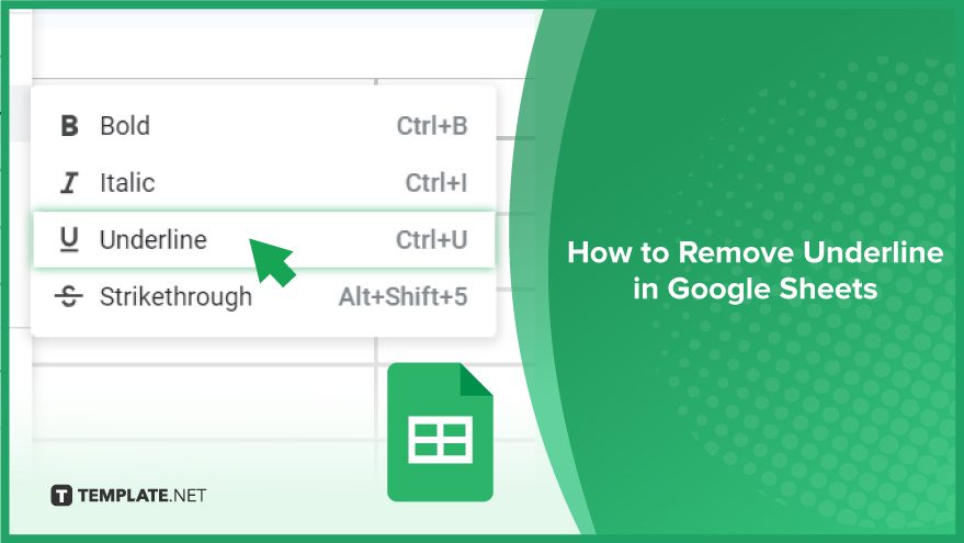
How to Remove Underline in Google Sheets
Google Sheets not only excels in data management but also offers flexible text formatting options, including the removal of underlines. Ideal…
Feb 12, 2024


Jan 23, 2024
Standard deviation, a key statistical measure for gauging data variability, plays a crucial role in fields like finance, science, and engineering. In this guide, we’ll delve into the practical application of standard deviation bars in Google Sheets – a widely utilized spreadsheet program with robust data analysis tools.

Elevate your data analysis game in Google Sheets by mastering the art of adding standard deviation bars to scatter plots. In just a few steps, we’ll guide you through the process, empowering you to bring unparalleled clarity and precision to your data visualization. Let’s dive in.
The journey begins with the preparation of your data. Before diving into standard deviation bars, ensure your dataset is well-organized. Familiarize yourself with the values you aim to analyze and structure your data in a format that Google Sheets can effortlessly comprehend. Typically, each row or column should represent a distinct variable, with each cell holding a singular data point.

Once your data is primed, proceed to create a scatter plot. Select the pertinent data, navigate to the “Insert” menu, and opt for “Chart.” Within the chart editor, choose the “Scatter” chart type. Your scatter plot will seamlessly integrate into your spreadsheet, forming the foundation for enhanced data visualization.

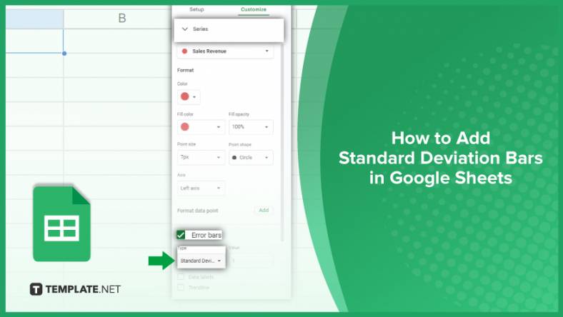
With your scatter plot in place, it’s time to introduce standard deviation bars. Click on the chart to highlight it, then select the three dots in the upper right corner and choose “Advanced edit.” Within the chart editor’s “Customize” tab, access the “Series” option. Here, you can seamlessly add error bars to your chart. Choose “Standard deviation” as the error type, letting Google Sheets automatically compute and apply standard deviation bars, elevating your scatter plot’s analytical depth.
You might also gain useful advice from these articles that offer tips for Google Sheets:
Click on your scatter plot, select “Advanced edit,” go to the “Customize” tab, and under “Series,” choose “Standard deviation” as the error type.
Yes, within the “Customize” tab, adjust settings like color, style, and thickness to tailor the bars to your preferences.
Once you select “Standard deviation” as the error type, Google Sheets handles the calculations and application seamlessly.
Yes, the process is similar; click on your chart, access “Advanced edit,” and under “Series,” choose “Standard deviation” for the desired error bars.
Standard deviation bars visually represent the variability around each data point, aiding in a clearer understanding of data dispersion and trends.
Google Sheets not only excels in data management but also offers flexible text formatting options, including the removal of underlines. Ideal…
Google Sheets offers a wide range of features that can help you organize, analyze, and manipulate data effectively. One…
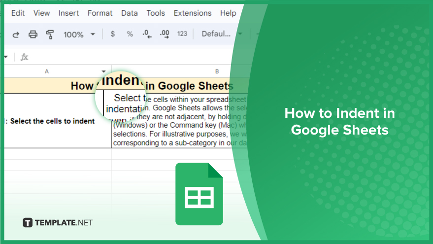
Indentation in Google Sheets is a handy feature that can significantly enhance the readability and organization of your…
Google Sheets is a vital component of the Google Workspace suite that empowers users with diverse functionalities for efficient data…
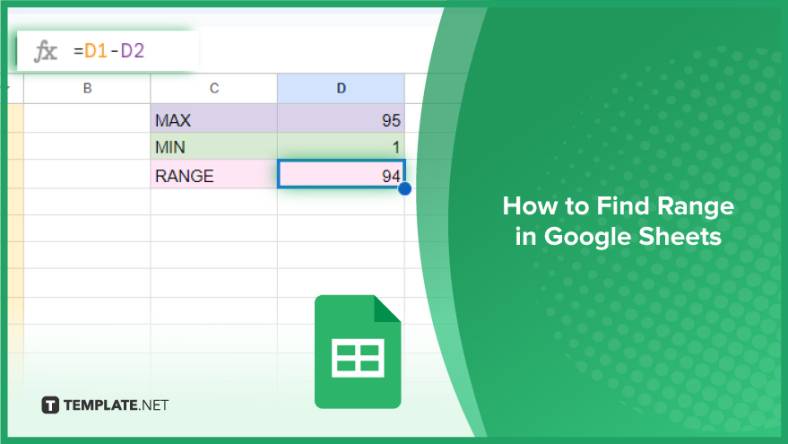
Google Sheets simplifies the process of statistical analysis, particularly in calculating the range of a data set. This guide will walk…
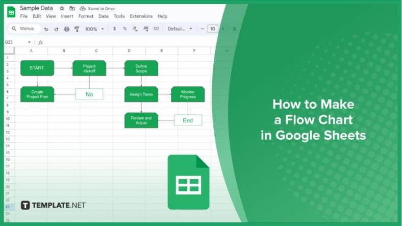
Google Sheets is a popular spreadsheet application that offers a variety of features that can be used to create flow…
Standard deviation, a key statistical measure for gauging data variability, plays a crucial role in fields like finance, science, and…
Google Sheets is a versatile spreadsheet application that allows for a variety of formatting options, including the addition of lines. This…

Personal loan trackers are one of the ways people can manage the finances of their property and gain financial power…