![How To Make/Create an Invitation in Google Docs [Templates + Examples]](https://images.template.net/wp-content/uploads/2023/07/How-To-Make_Create-an-Invitation-in-Google-Docs-Templates-Examples-788x443.png)
How To Make/Create an Invitation in Google Docs [Templates + Examples]
To formally invite someone or a group of people to an event or activity, you will need to send out…
Jun 04, 2025
The mobile presentation size will depend on the audience it is designed for, the environment in which it will be seen, and its format, particularly when it comes to mobile devices. Mobile presentations have categories where they are mostly used: education, healthcare, business, photography, banking, marketing, etc.
Mobile presentation sizes refer to the optimized dimensions and aspect ratios used for creating presentations designed specifically for mobile devices. Common formats include 16:9 and vertical 9:16 layouts, with recommended sizes like 1080×1920 pixels for clear, full-screen viewing. Choosing the right mobile presentation size ensures readability, smooth navigation, and visual appeal on smartphones and tablets. Proper sizing enhances user engagement, supports mobile-first strategies, and improves accessibility across various mobile platforms.

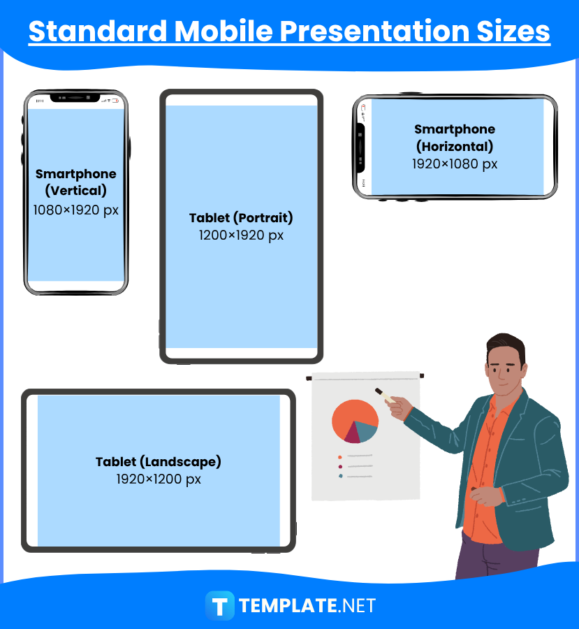
| Device Type | Recommended Size (pixels) | Aspect Ratio | Use Case |
|---|---|---|---|
| Smartphone (Vertical) | 1080 × 1920 | 9:16 | Instagram Stories, mobile-first slides |
| Smartphone (Horizontal) | 1920 × 1080 | 16:9 | YouTube mobile videos, horizontal slides |
| Tablet (Portrait) | 1200 × 1920 | 10:16 | Tablet-friendly presentations |
| Tablet (Landscape) | 1920 × 1200 | 16:10 | Horizontal tablet presentations |
The 4:3 aspect ratio, also referred to as the “standard aspect ratio,” is utilized and perfect for mobile presentations. The dimension of 1024 pixels by 768 pixels, or 10.67 inches by 8 inches, is identical to the 4:3 aspect ratio.
Widescreen, or 16:9, is frequently utilized for highly visual content and ought to be your first choice when making mobile presentations. This is due to the widescreen 16:9 aspect ratio, with dimensions of 1920 pixels by 1080 pixels, or 13.3 inches by 7.5 inches, that practically all contemporary projector screens, mobile devices, televisions, and computer displays use.
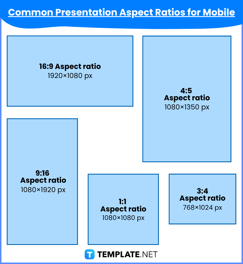
| Aspect Ratio | Dimensions (pixels) | Best For |
|---|---|---|
| 16:9 | 1920 × 1080 | Universal, widescreen presentations |
| 9:16 | 1080 × 1920 | Mobile stories, reels, vertical slides |
| 4:5 | 1080 × 1350 | Instagram posts, social content |
| 1:1 | 1080 × 1080 | Square slides, Instagram carousels |
| 3:4 | 768 × 1024 | Older mobile devices, tablets |
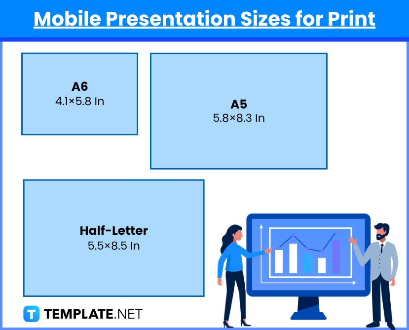
| Paper Size | Size (inches) | Usage |
|---|---|---|
| A6 | 4.1 × 5.8 | Compact mobile-sized print presentations |
| A5 | 5.8 × 8.3 | Handheld printed mobile presentations |
| Half-Letter | 5.5 × 8.5 | North American print for mobile slides |
The 4:3 aspect ratio (1024 x 768 pixels, or 10.67 x 8 inches) is utilized when the mobile presentation is meant to be printed out because it is easily adaptable to the US letter paper size (8.5 x 11 inches). This standard mobile presentation size lets you incorporate visual images of a quality good enough for printing.
For printing mobile presentations in the legal paper size (8.5 x 14 inches), you can either use the 4:3 aspect ratio (1024 x 768 pixels or 10.67 x 8 inches) or the 16:9 aspect ratio (1920 x 1080 pixels or 13.3 x 7.5 inches). Most individuals prefer to use the 4:3 aspect ratio since it is more adaptable for paper prints.
When the mobile presentation is intended to be printed out, the 4:3 aspect ratio (1024 x 768 pixels, or 10.67 x 8 inches) is used because it is easily convertible to the A4 paper format (8.3 x 11.7 inches). You can include graphic elements of a quality suitable for printing to display your presentations to the target audience using this typical mobile presentation size.
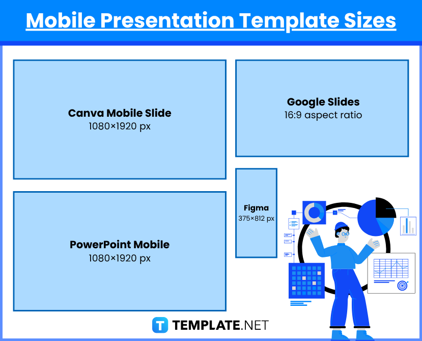
| Design Platform | Template Size (pixels) | Use Case |
|---|---|---|
| Canva Mobile Slide | 1080 × 1920 | Instagram/Facebook story decks |
| PowerPoint Mobile | 1080 × 1920 (custom) | Custom mobile-first slide decks |
| Google Slides | 16:9 or 9:16 custom ratio | Mobile presentations |
| Figma/Adobe XD | 375 × 812 (iPhone 13 ref.) | Mobile UI mockups or vertical decks |
Your mobile presentation can be shared on any digital platform as long as you save it in PDF format. For the best image quality on desktop and mobile devices, set your presentation’s dimensions to 479 x 246 pixels for maximum visibility on Facebook feeds, but if your mobile presentation includes images that should be highly featured, you can go higher at 1,080 x 1,350 pixels.
If you want a great-quality display while sharing your mobile presentation template on Instagram, set it to the 4:3 aspect ratio, which is comparable to 1024 by 768 pixels. However, as most Instagram users scroll through their feeds, it is preferable to scale your mobile presentation to a 4:5 aspect ratio, or 1,080 by 1,350 pixels, for the optimum Instagram vertical view quality.
Messenger is the best digital software you can utilize for sharing your mobile presentation. Should you decide to use the platform for your mobile presentations, don’t forget to incorporate the standard sizes of either the 4:3 aspect ratio, which is equivalent to 1024 pixels by 768 pixels, or 10.67 inches by 8 inches, or the 16:9 aspect ratio, which is equivalent to 1920 pixels by 1080 pixels, or 13.3 inches by 7.5 inches, and is regarded as the preferred aspect ratio for on-screen presentations over 4:3.
The LinkedIn platform is the most used business and professional software, particularly for sharing mobile presentations. The video file size for the LinkedIn presentation must be between 75 KB and 200 MB, and the presentation’s dimensions must be between 256 pixels by 144 pixels and 4096 pixels by 2304 pixels (all the other text in your mobile presentation can be at least 24 to 28 points, with titles of between 36 and 44 points in size).
In business, you need to try to make your presentation as brief and clear as you can and base its duration on how long it will take you to properly discuss the subject with your audience. When creating PowerPoint mobile presentations for your business, you might want to consider the 10-20-30 rule. According to this rule, the ideal number of slides for any presentation is 10, the maximum time you should speak is 20, and the smallest font size that should be on your slides is 30 points.
Your mobile presentation’s size will be influenced by its intended audience, viewing environment, and format. It’s a good idea to take your intended orientation into account while creating a mobile presentation template in Adobe Photoshop. The ideal mobile presentation template sizes are 720 x 1080 pixels for vertical and 1080 x 720 pixels for horizontal, with a dpi range of 75 to 300, depending on the output quality and resolution necessary.
Adobe Illustrator is the best tool for creating the proper media, background, and design for your mobile presentation templates. If you want Illustrator to run more rapidly, select 80 dpi; nevertheless, 335 dpi is recommended for higher quality. Depending on your presentation objectives, the resolution should be changed to 1080 by 720 pixels or 720 by 1080 pixels.
The most commonly used sizes by users for a mobile presentation are either a 4:3 aspect ratio (1024 pixels by 768 pixels) or a 16:9 aspect ratio (1920 pixels by 1080 pixels).
You can simply copy the image or logo that you want to add to your presentation and paste it into the page slide that needs it.
The popular pixel sizes used for mobile presentations include 1024 x 768 pixels and 1920 x 1080 pixels.
All other text should be at least 24 to 28 points in size, with titles needing a font size of 36 to 44 points.
You could employ the rule of three to organize your presentation (for instance, the introduction, middle, and conclusion should be the three key components of your presentation).
The best size for a presentation on your mobile device is either the 4:3 or 16:9 aspect ratio.
Choose the main idea you want to convey to the audience, and then create an interesting presentation that has three parts: the introduction, the middle, and the conclusion.
The presentation’s main body should fulfill the informational and purposeful commitments made in the introduction.
A solid rule of thumb is to keep the number of slides in brief presentations to a minimal level; you shouldn’t require more than ten slides.
Many experts would say that a perfect presentation should last no more than 20 minutes, but the length of your presentation should be determined by how long it will take you to completely engage your audience in the subject.
![How To Make/Create an Invitation in Google Docs [Templates + Examples]](https://images.template.net/wp-content/uploads/2023/07/How-To-Make_Create-an-Invitation-in-Google-Docs-Templates-Examples-788x443.png)
To formally invite someone or a group of people to an event or activity, you will need to send out…
![How To Create an ID Card in Google Docs [Template + Example]](https://images.template.net/wp-content/uploads/2023/07/How-To-Create-an-ID-Card-in-Google-Docs-Template-Example-788x443.png)
ID cards are used as a way to represent an individual to the company or organization they work or volunteer…
![How to Make an ID Card in Microsoft Word [Template + Example]](https://images.template.net/wp-content/uploads/2023/07/How-to-Make-an-ID-Card-in-Microsoft-Word-Template-Example-788x443.png)
ID cards are an essential part of any employee working for a company or an organization to be recognized as…
![How To Make/Create a Book Cover in Google Docs [Templates + Examples]](https://images.template.net/wp-content/uploads/2023/07/How-To-Create-a-Book-Cover-in-Google-Docs-788x443.png)
Aside from protecting a book, book covers are specifically designed to attract readers and convey the essence of the book.…
![How To Make/Create a Book Cover in Microsoft Word [Templates + Examples]](https://images.template.net/wp-content/uploads/2023/07/How-To-Create-a-Book-Cover-in-Microsoft-Word-788x443.png)
A book cover is the outer layer of a book that is used to protect its contents. Book covers are…

Job vacancy is a common scenario in companies and organizations. Employees leave for all kinds of reasons and when they…
Save the date sizes are usually the same size as a formal invitation. But there are a number of different…

Script is a popular word that is frequently used in the entertainment world. There are a variety of areas and usages…
Presentations may not look as pleasant as how you design them with pictures, animations, videos, and other graphic designs without…