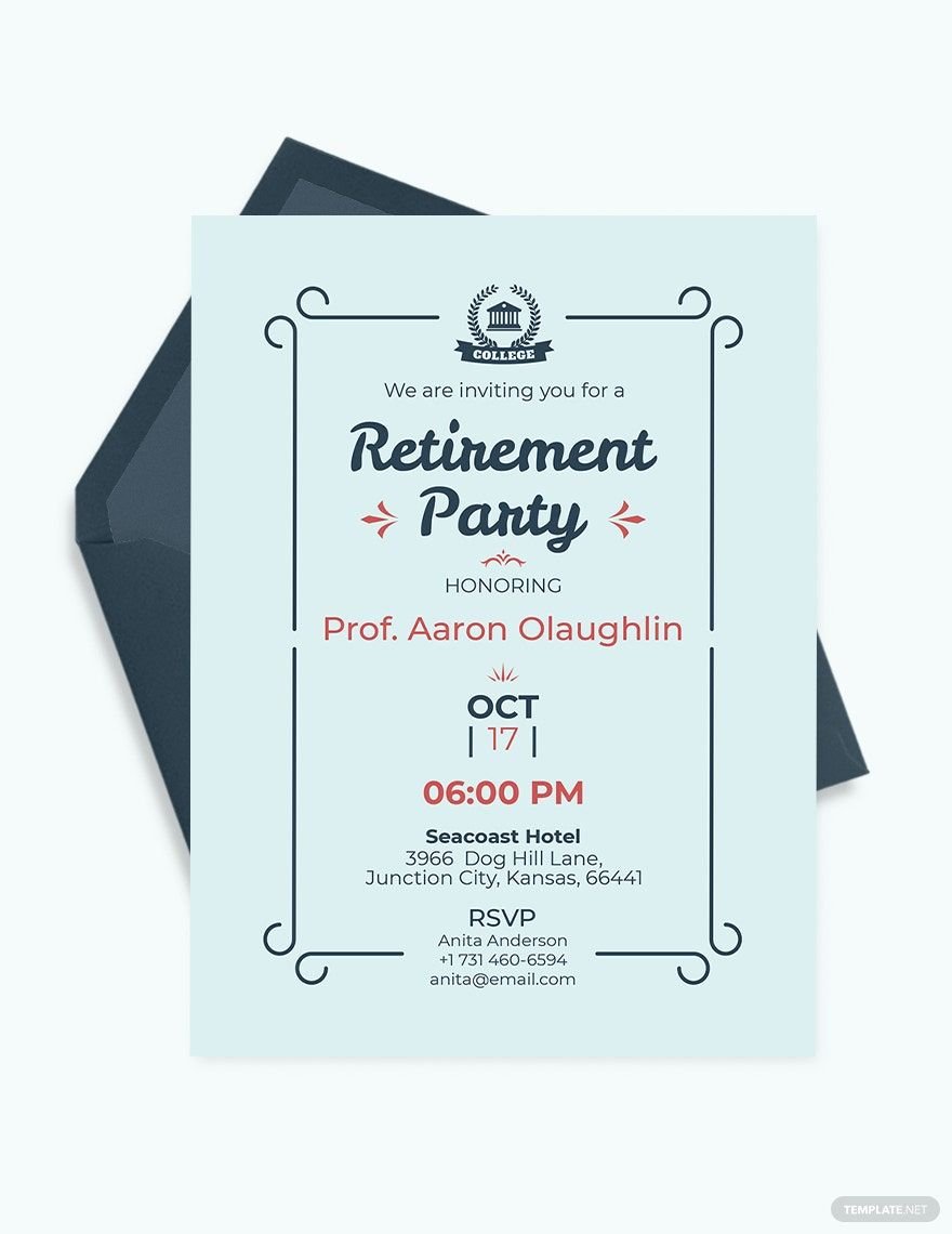
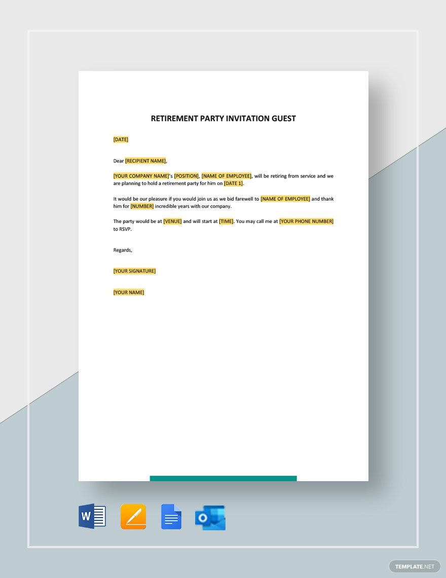
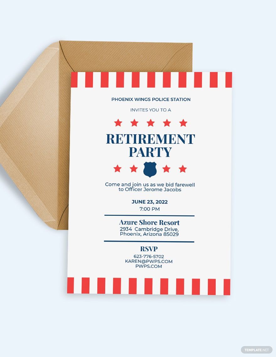
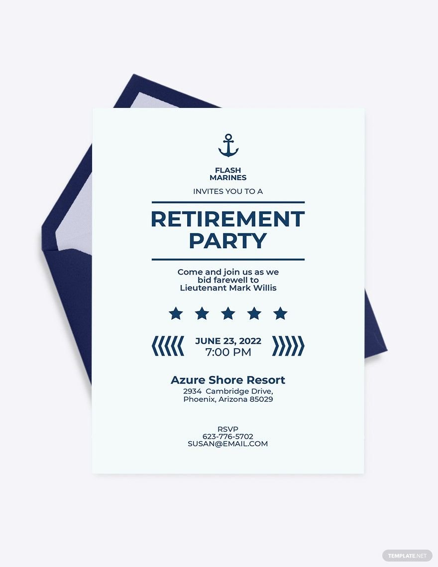
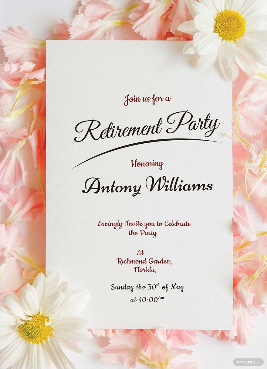
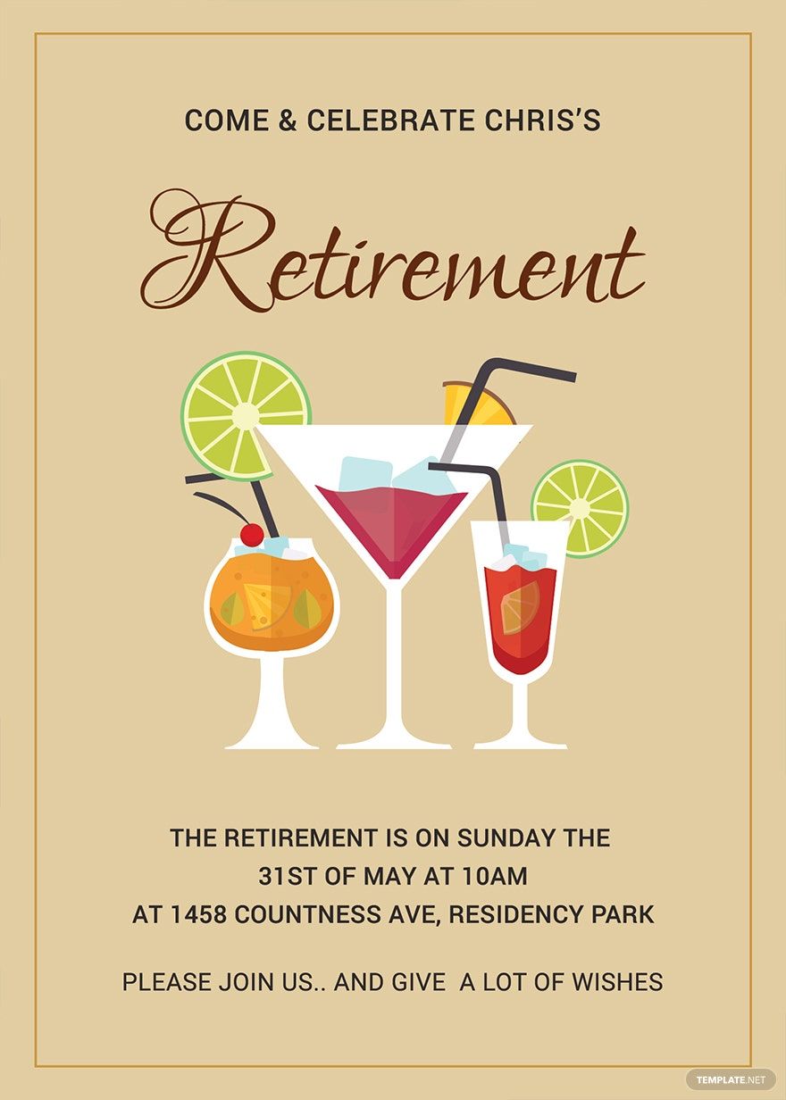
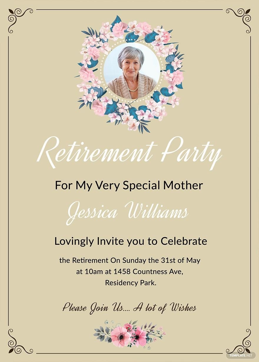
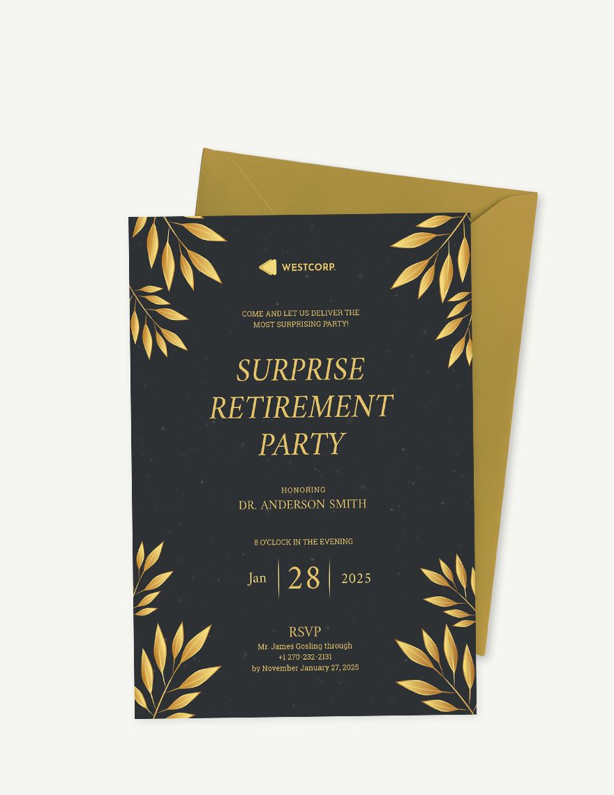
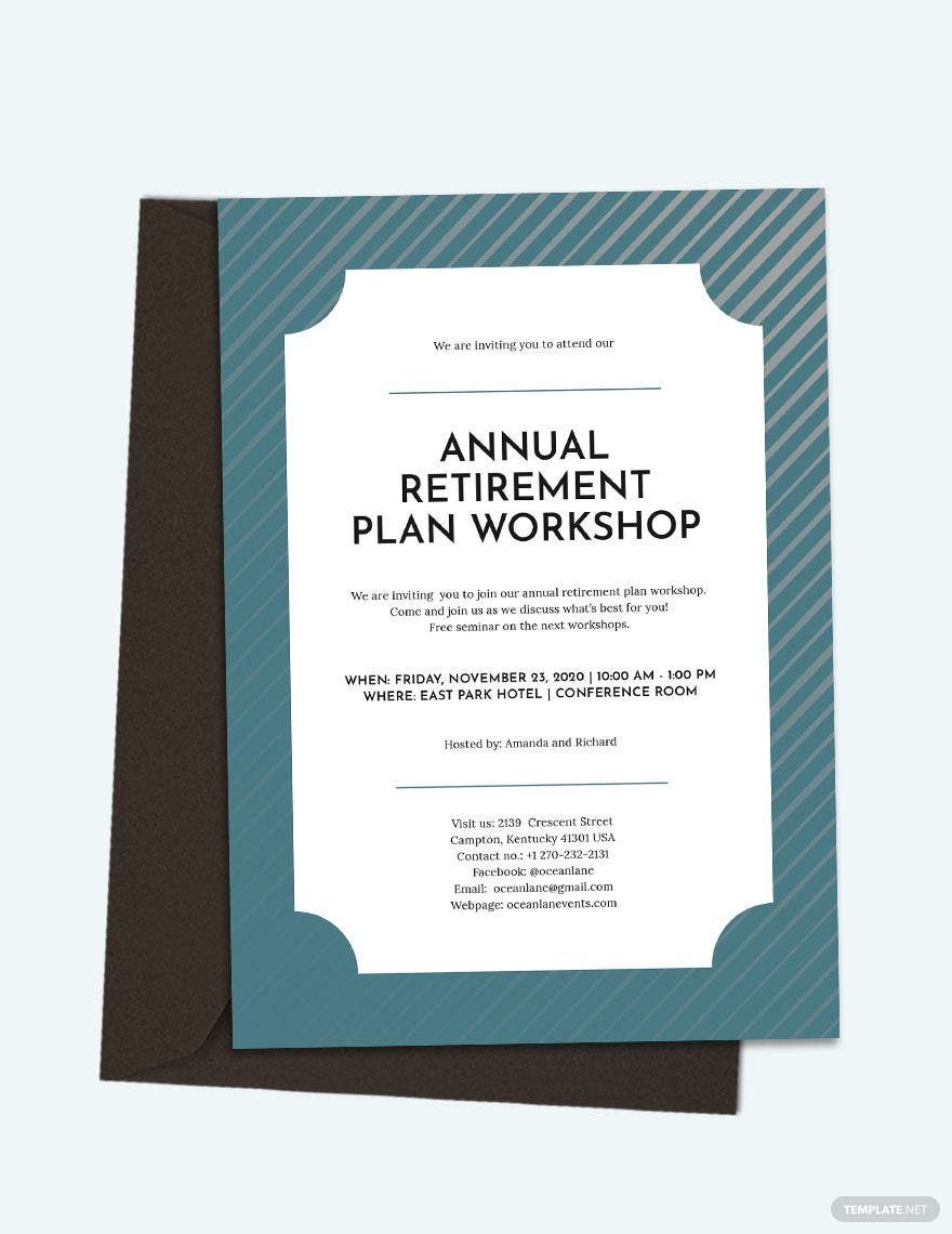
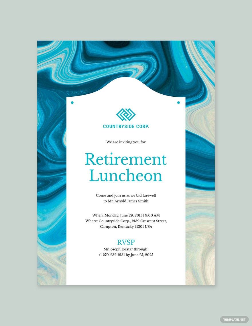
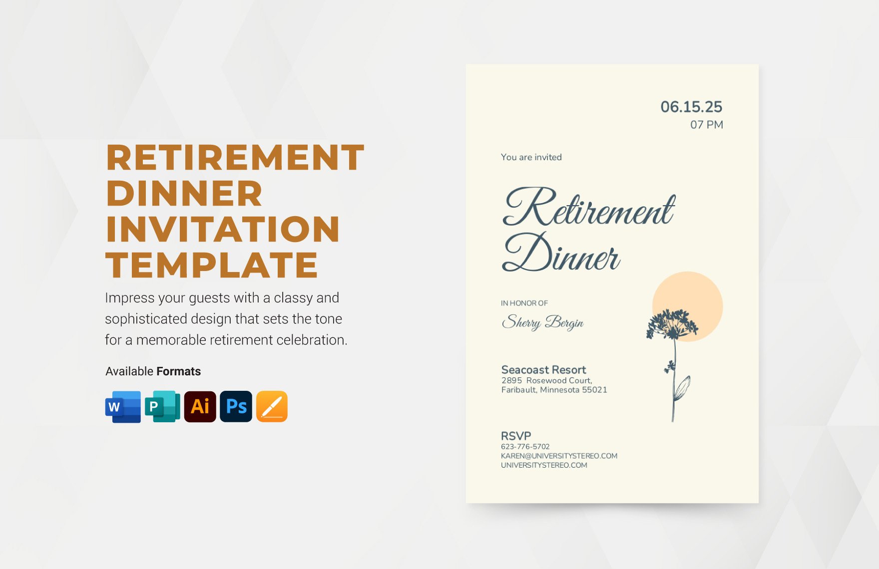
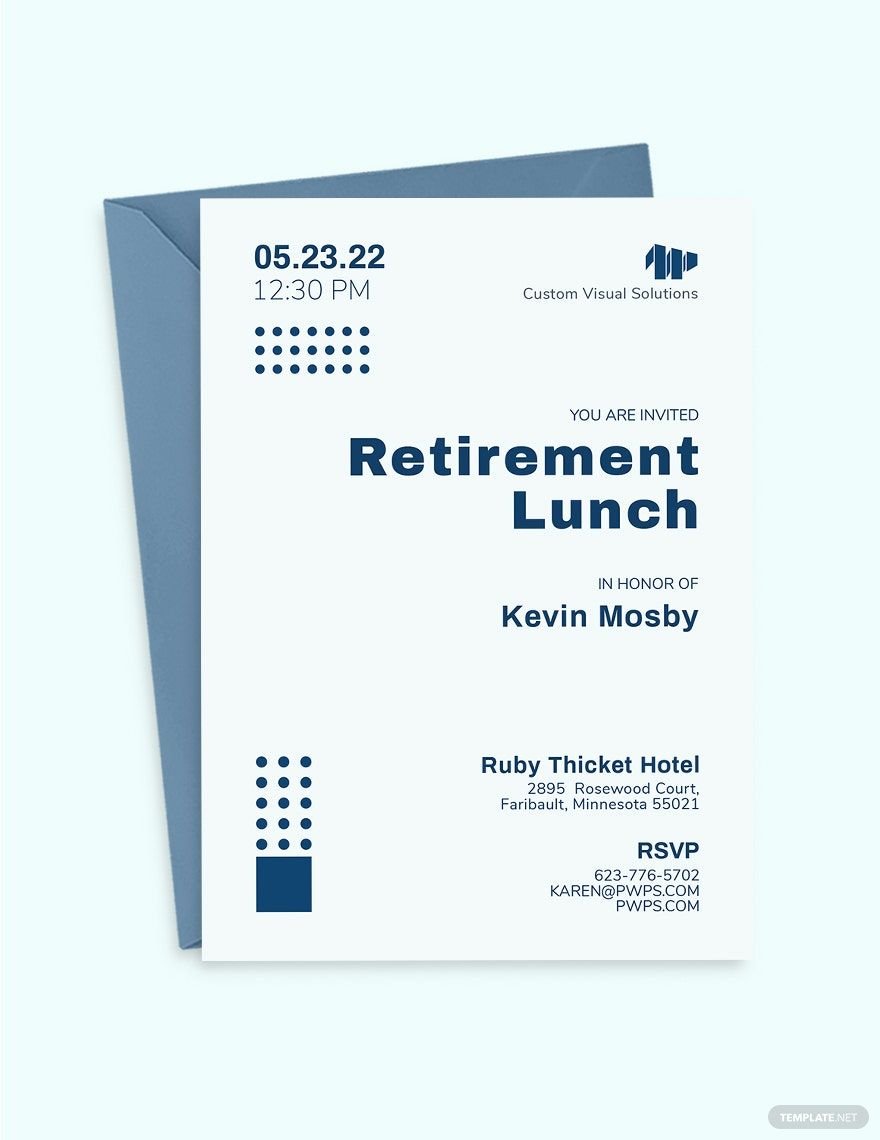
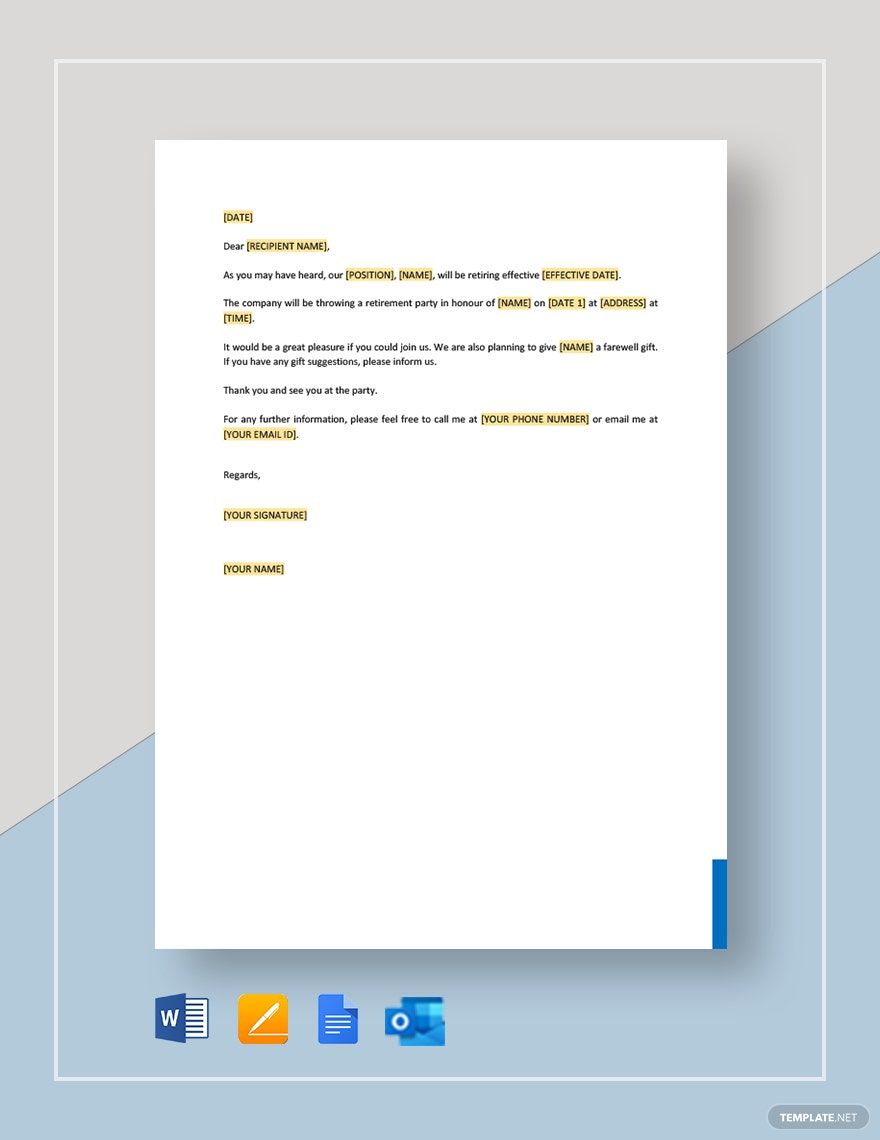
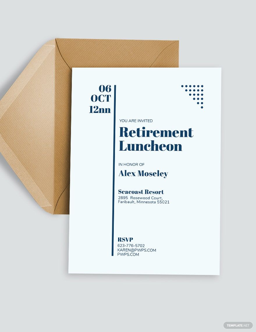
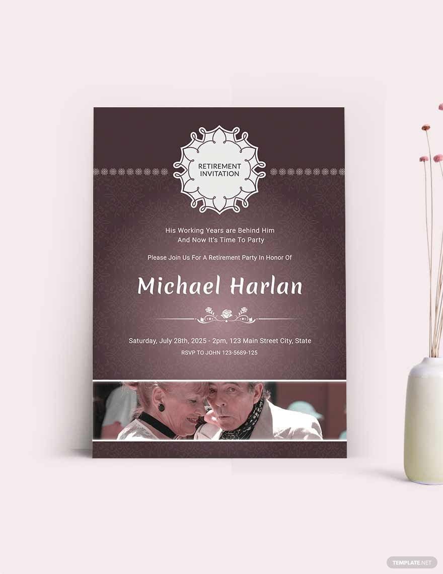
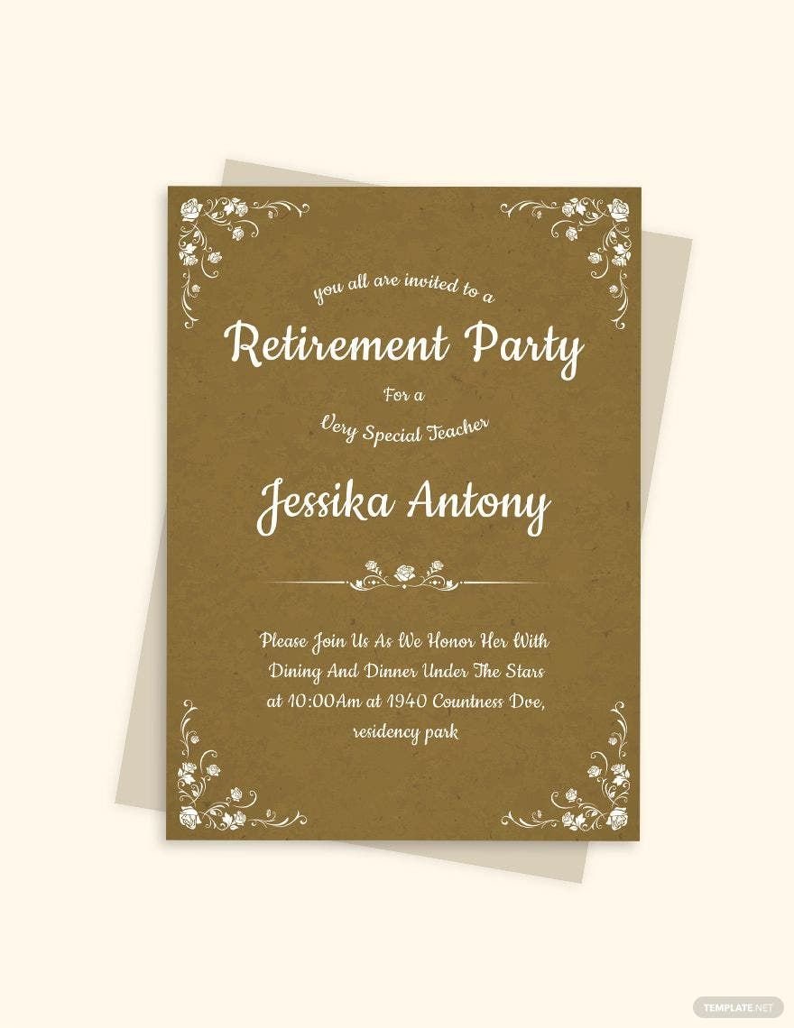
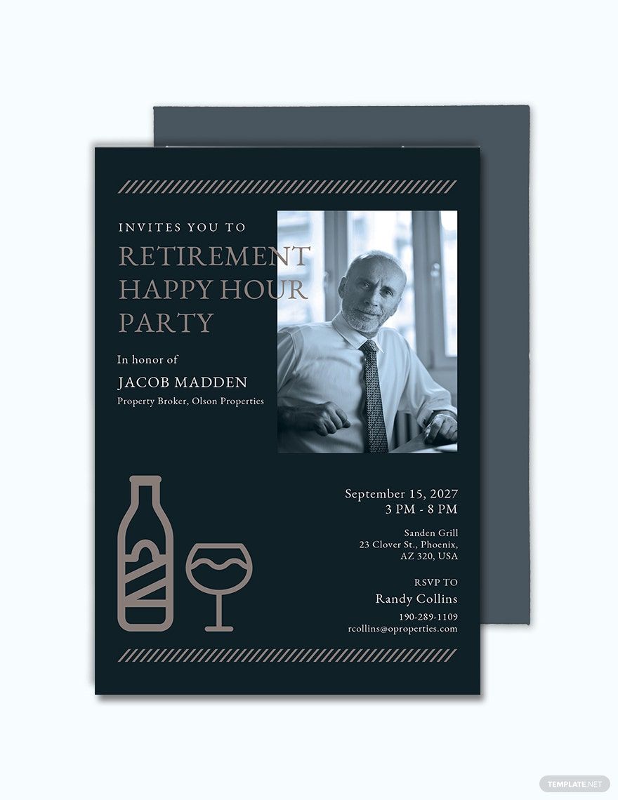
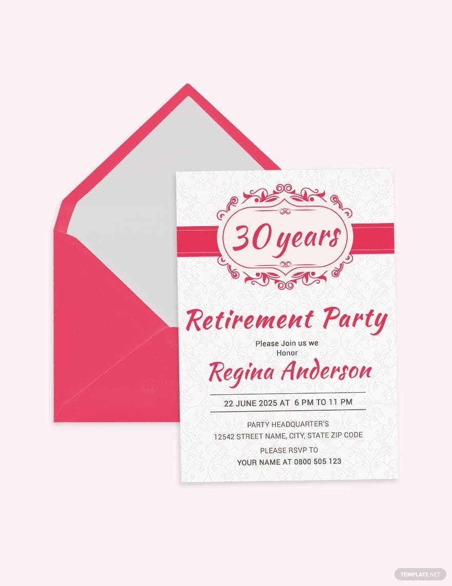
Giving a bittersweet farewell to a bustling eight to five life of paper works, monthly quotas, and endless meetings is indeed very satisfying. It brings both relief and satisfaction knowing that you’ve reached the end of your hard work and your life will drastically change from then on. Gather the people whom you’ve shared coffee breaks and late office hours with through our high-quality Retirement Invitation Templates in Apple Pages. These templates come with original high-resolution artworks and graphic design for the best results. These are conveniently accessible and 100% customizable across various devices. Download now and start celebrating endpoints as a joyous occasion!
How to Make a Retirement Invitation in Apple Pages
The Balance Careers describes the significance of retirement as a major shift from the edge of one’s career toward’s a brand new chapter. For many, they see it as a starting point of a completely new life. Like any other transition, an employee’s retirement is a hard twist to pull, but it can be made memorable with a celebration with people who have contributed and stuck with that person towards the end of his or her professional life. Invite them over by sending a special party invitation that you can make by following the steps below:
1. Establish a Theme
In order to come up with a theme for your invitation card, consider the nature of the occasion. Keep it casually simple if you’re staging an intimate dinner gathering with only a few guests. If you’re organizing a dance party with several people from the company, your invitation’s layout should follow suit by including modern neon color streaks or retro disco artworks. Identifying the theme will determine your output’s overall visual presentation and will help you pick which fonts, border, colors, and other design elements to follow.
2. Use Complementing Colors
Your colors should not only complement each other but they also should correlate to your theme. Your layout and color palette shouldn’t come into conflict. If you hope to achieve an elegant and formal look for your professional invitation, avoid glaring and luminous colors. On the other hand, if the occasion is fun and casual, make do with pastels and other bright hues. Stick to two or three shades to avoid overwhelming your layout. Colors are a great visual asset, but having numerous tinges in a single layout could potentially ruin the entire output.
3. Limit Your Content
An event invitation's primary role is to inform its recipient about the core details—what the occasion is about and when and where it is expected to take place. Any lengthy statement has no place in an invitation’s surface, stick to the who, what, when, and where questions. If it’s applicable, include a one-line instruction regarding the dress code or if there is a no-gift policy, among others. To allow queries or clarifications, don't hesitate to leave a contact number.
4. Choose a Template
If you think that you’re running on an impossible deadline, skip them all by using an invitation template. These are ready-made materials that come with graphic designs and suggestive content. All you need to do is to choose a layout that closely resembles your theme and replace the written content with your own details. Since templates are highly editable, altering the layout and color scheme is allowed.
5. Print on a High-Quality Stock Paper
Aiming to achieve a flawless invitation design that reflects the event seamlessly is different from choosing the best stationery for it. It’s never enough to have a praise-worthy layout, it should be paired with high-quality paper material. Avoid using light and bland stock paper to prevent degrading your invitation’s value. Use a heavier stock to bring out the best of your layout.