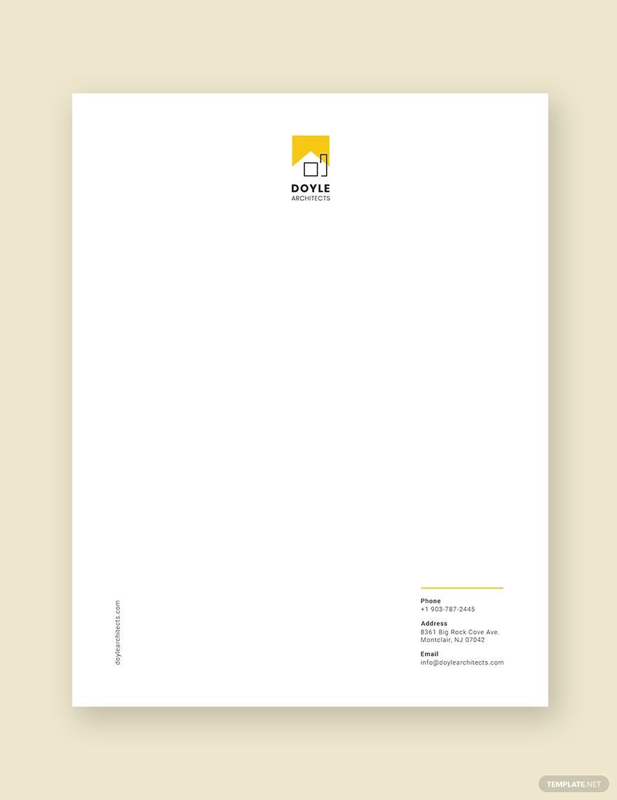
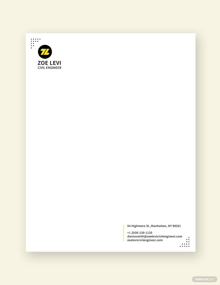
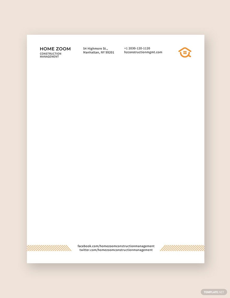
The construction industry is a busy and fast-changing world. Letters are written and sent here and there to put some plans into action. With that, construction companies have to use letterheads to make their letters professional and formal. Letterheads are a good way to increase the company's brand reputation to prospective recipients. Level up your company's branding by using our Construction Letterhead Templates in InDesign format! Our creative team crafted templates that are 100% customizable, editable, downloadable, and printable. Don't miss our excellent deals. Get your message sent by downloading these templates today!
How to Create an Impressive Construction Letterhead in InDesign?
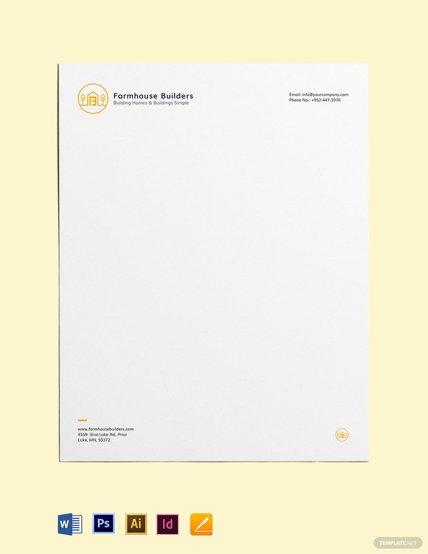
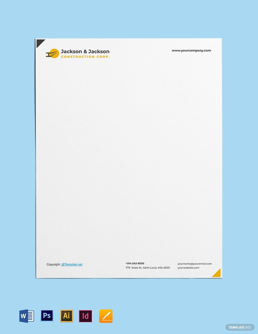
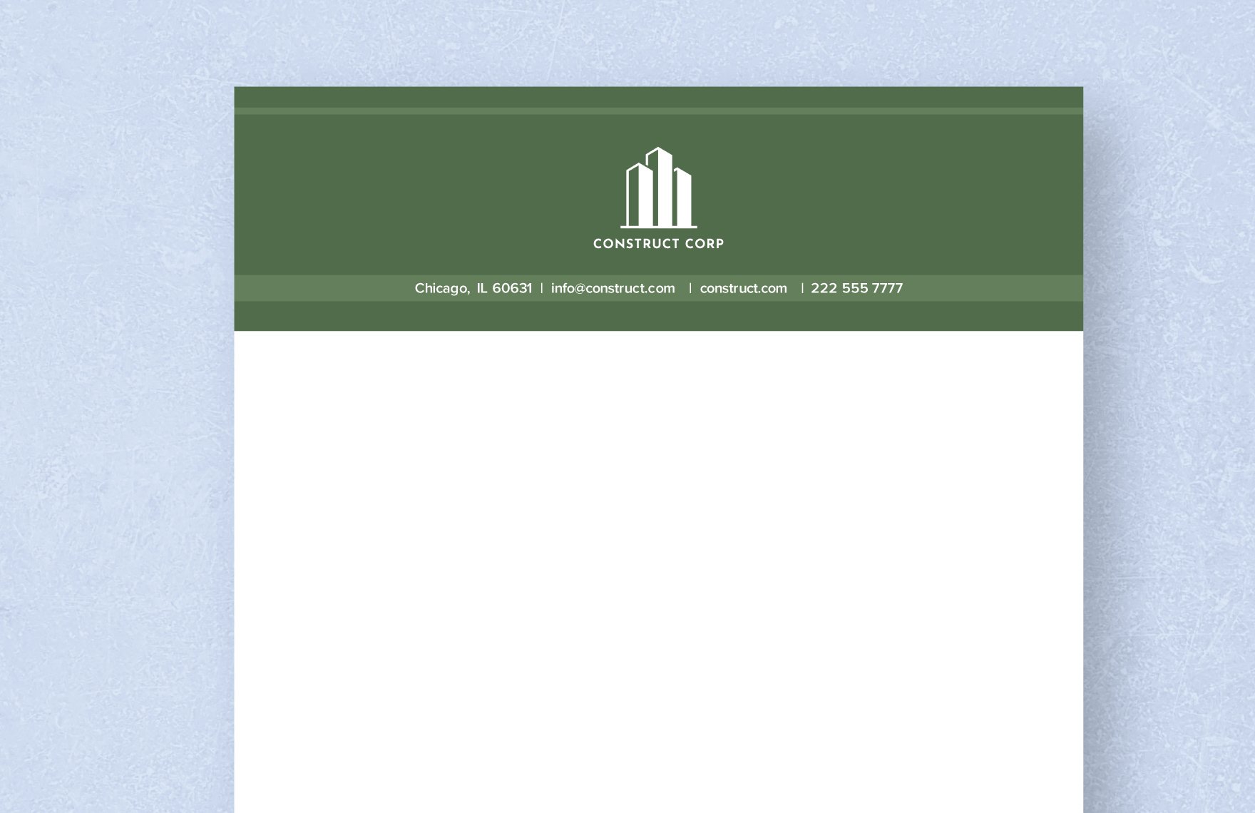
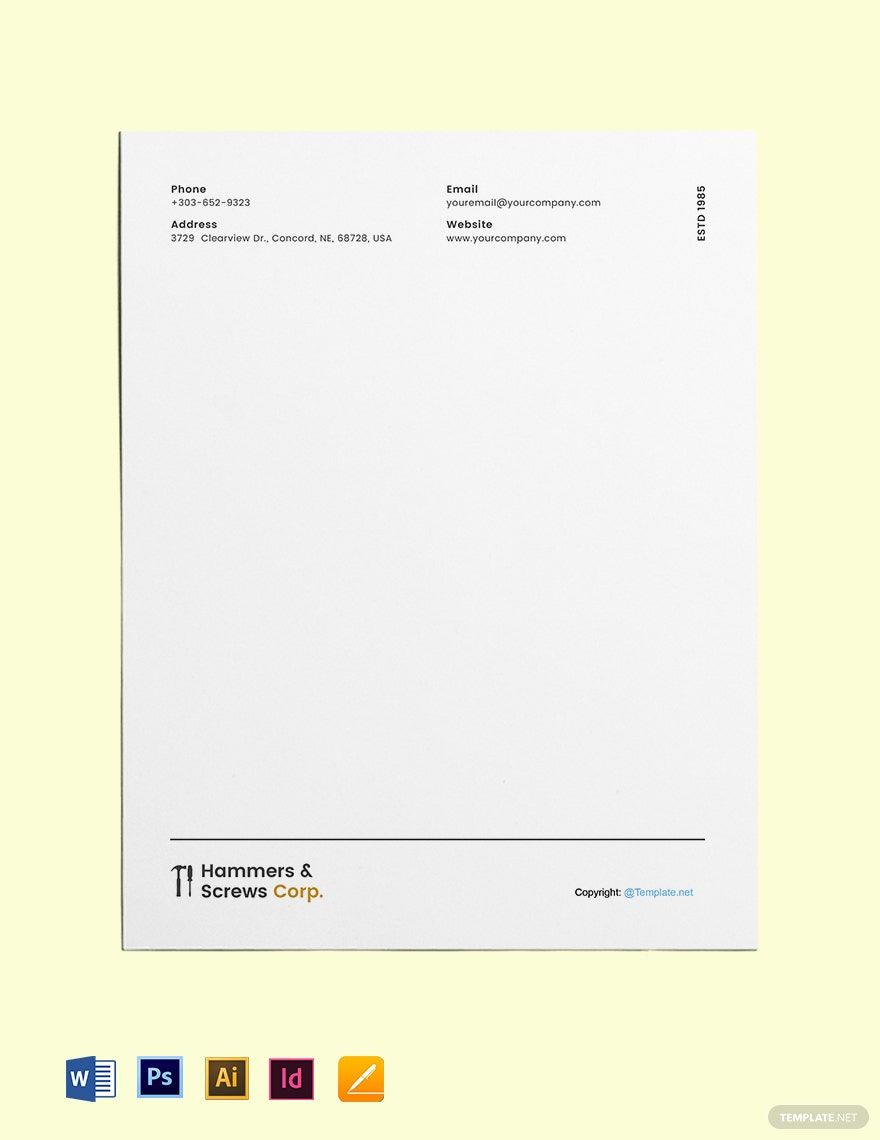
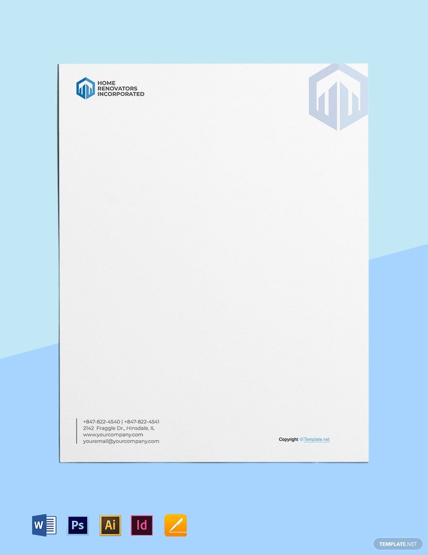
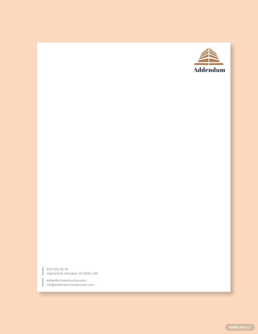
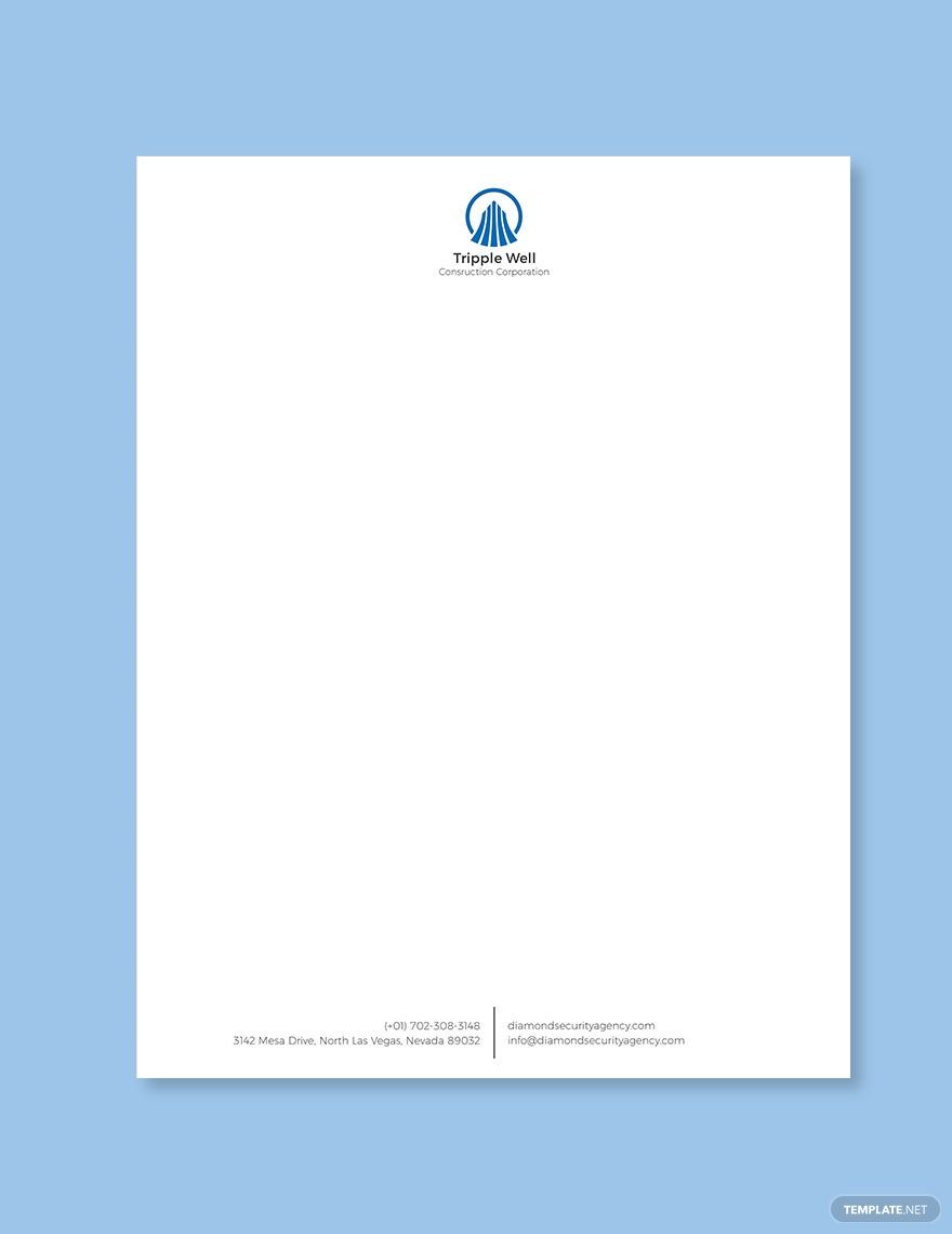
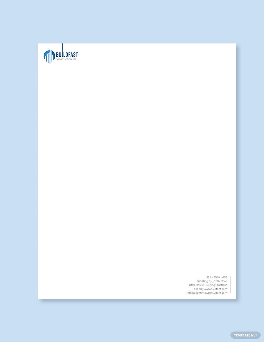
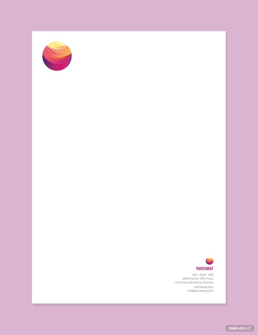
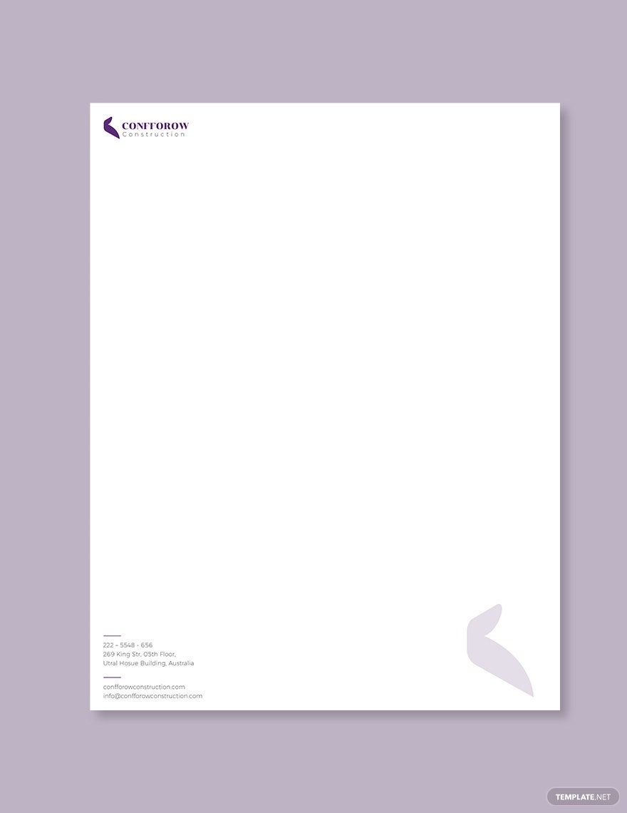
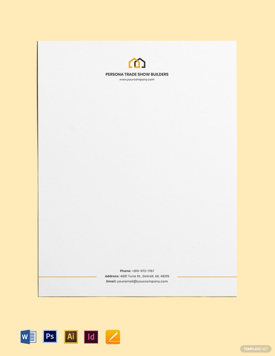
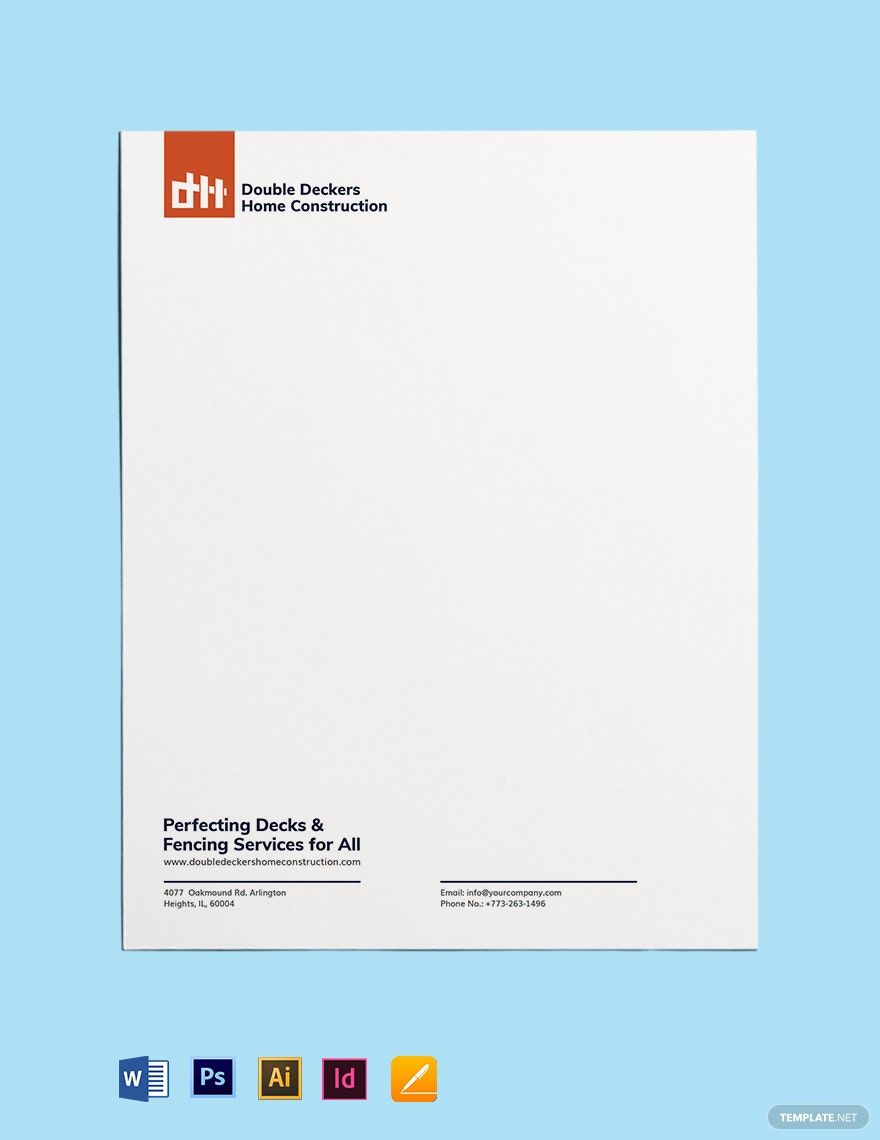
A letterhead is a heading that includes the name of the company, logo, address, contact number, and email address. It is used to show the message to the recipient. Most letterheads are located at the upper left corner, high center, or top right corner of your letter.
Leaving a long-lasting impression can persuade more clients especially in the construction field. With your letterhead, you can make that possible. Letterheads are the first thing people notice when receiving a formal letter from business establishments and construction firms. This is the right time to make a good impression with the help it. If you are having a hard time thinking about how to create one, we've prepared some tips that you can use below.
1. Get Info
In making the letterhead, you need to have the basic information such as the construction company's name, address, email address, and contact numbers like you have in your construction business cards. These elements make up your simple letterhead. Since it's in the heading, it should be complete and impressive to the eyes of the recipient.
2. Make the Layout
Once you've gathered all the necessary information, open a blank document in Adobe InDesign on your laptop or personal computer. Adobe InDesign allows you to craft your letterhead with ease. Its tools are easy to use and navigate.
3. Use Your Logo
Your logo means a lot in your letterhead. It establishes the identity of your business and makes people remember and recognize it. Make it a highlight in making your letterhead. It should look professional and eye-catching at the same time. Pick a font that looks clean and easy to read for everybody. You can include the tagline of the company if you want. Place it below the logo to grab more attention.
4. Organize Your Letterhead
If you think that you're not satisfied with the display of your sample letterhead, you can always rearrange it taking some idea from other construction posters or flyers. Organize the information properly. Determine the right font size that you should use when putting in the basic information. Put the address of the company first, followed by the contact numbers and email addresses right after. Leaving contact information to your clients makes your business transaction easier and manageable. It would be easier for the client and your business partners to interact and communicate with you, such as addressing concerns, making reservations, and answering queries. Leaving out any contact information on your business letterhead might lead your customers to go to another client.
Include the official website for your business as well. Make sure that the letterhead falls on the right spacing and doesn't take up too much space. Leave a good amount of space for writing the content.
5. Save and Print
Take one last look at your template to see if they still need to be done. Put in some last-minute changes if needed. Save the file in your devices for future use. If you think your printable letterhead looks good, print it and make as many copies as you want.