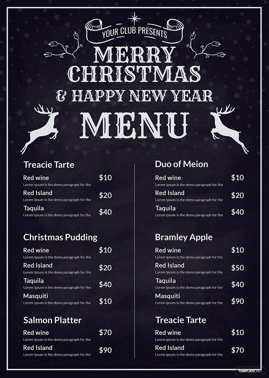
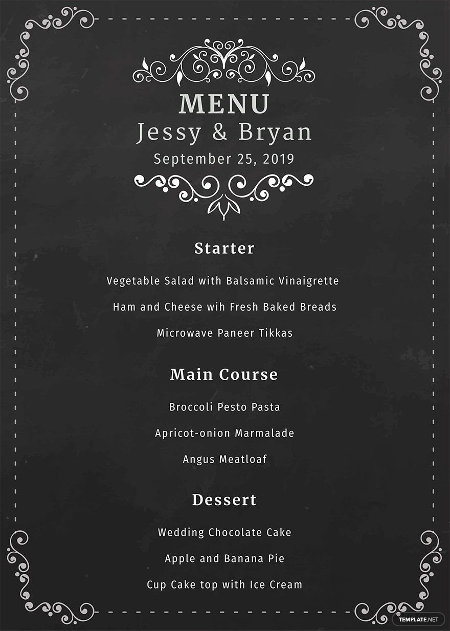
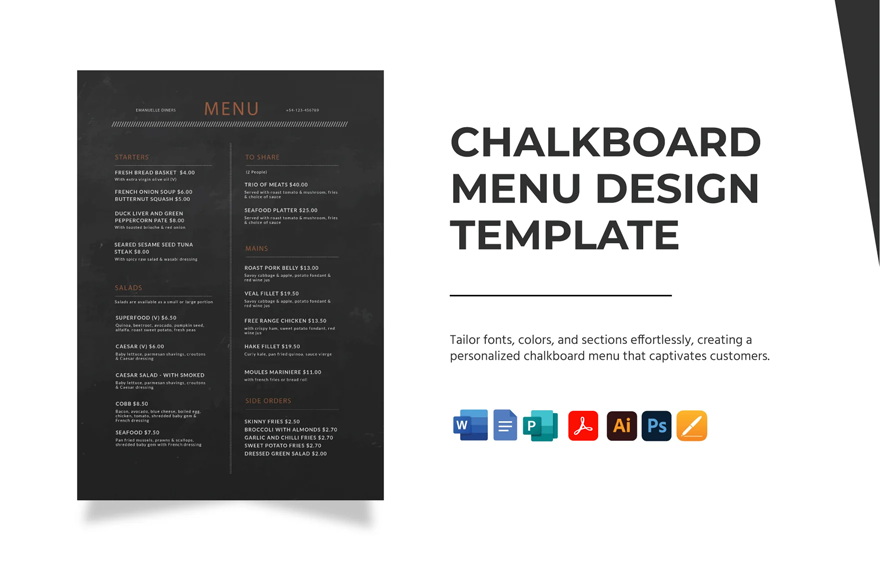
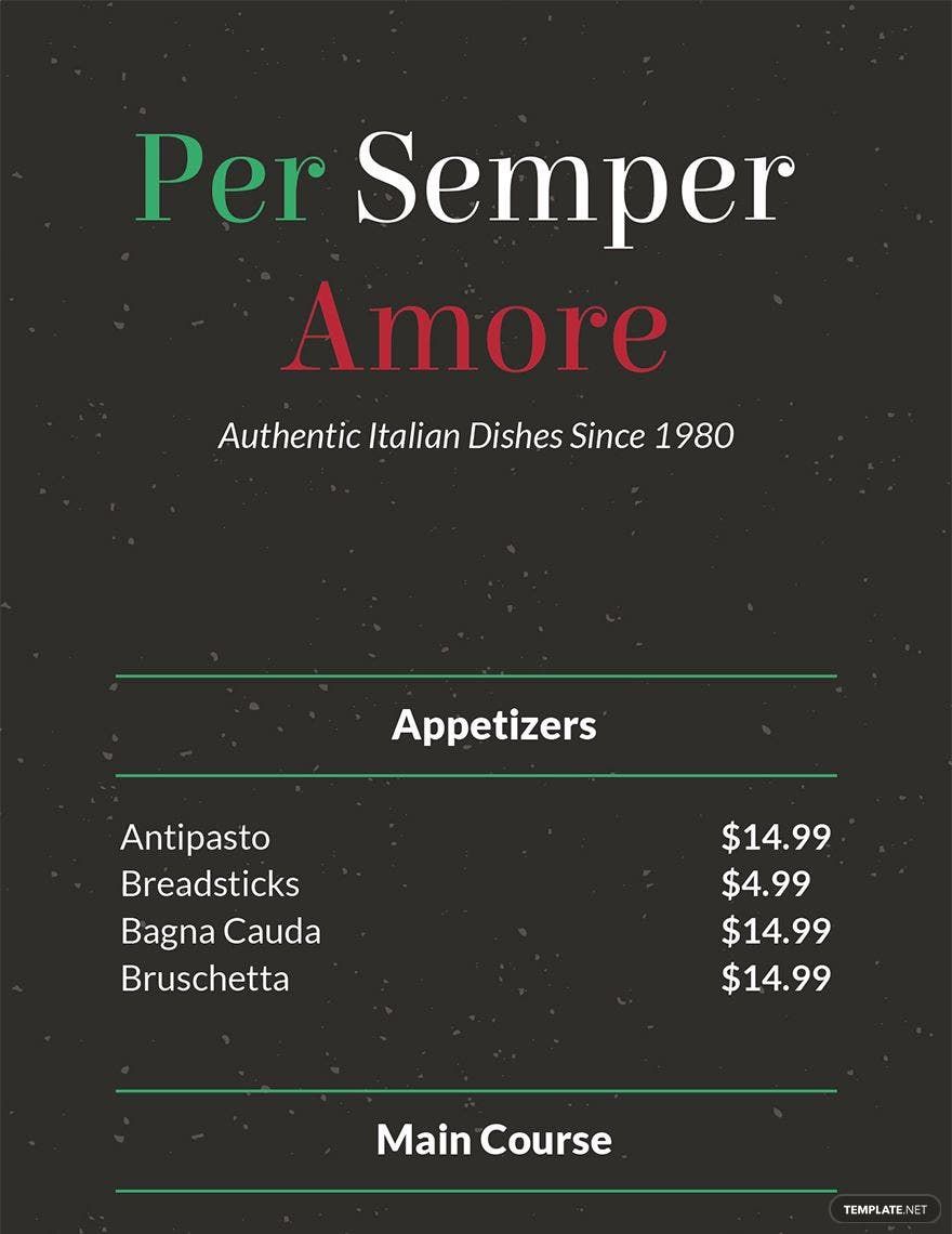
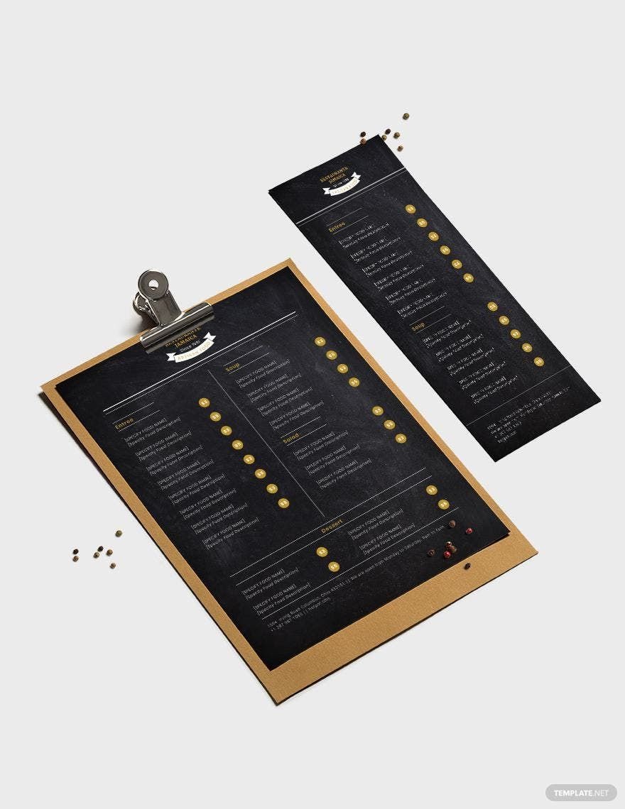
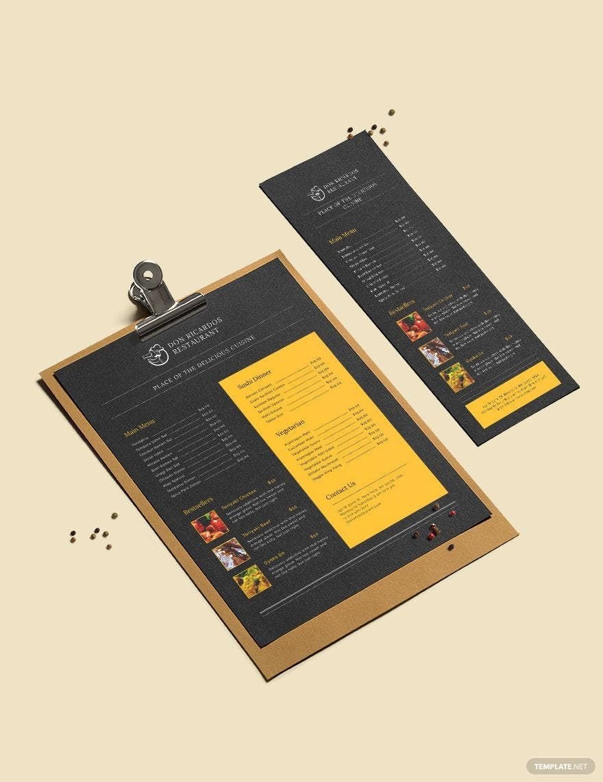
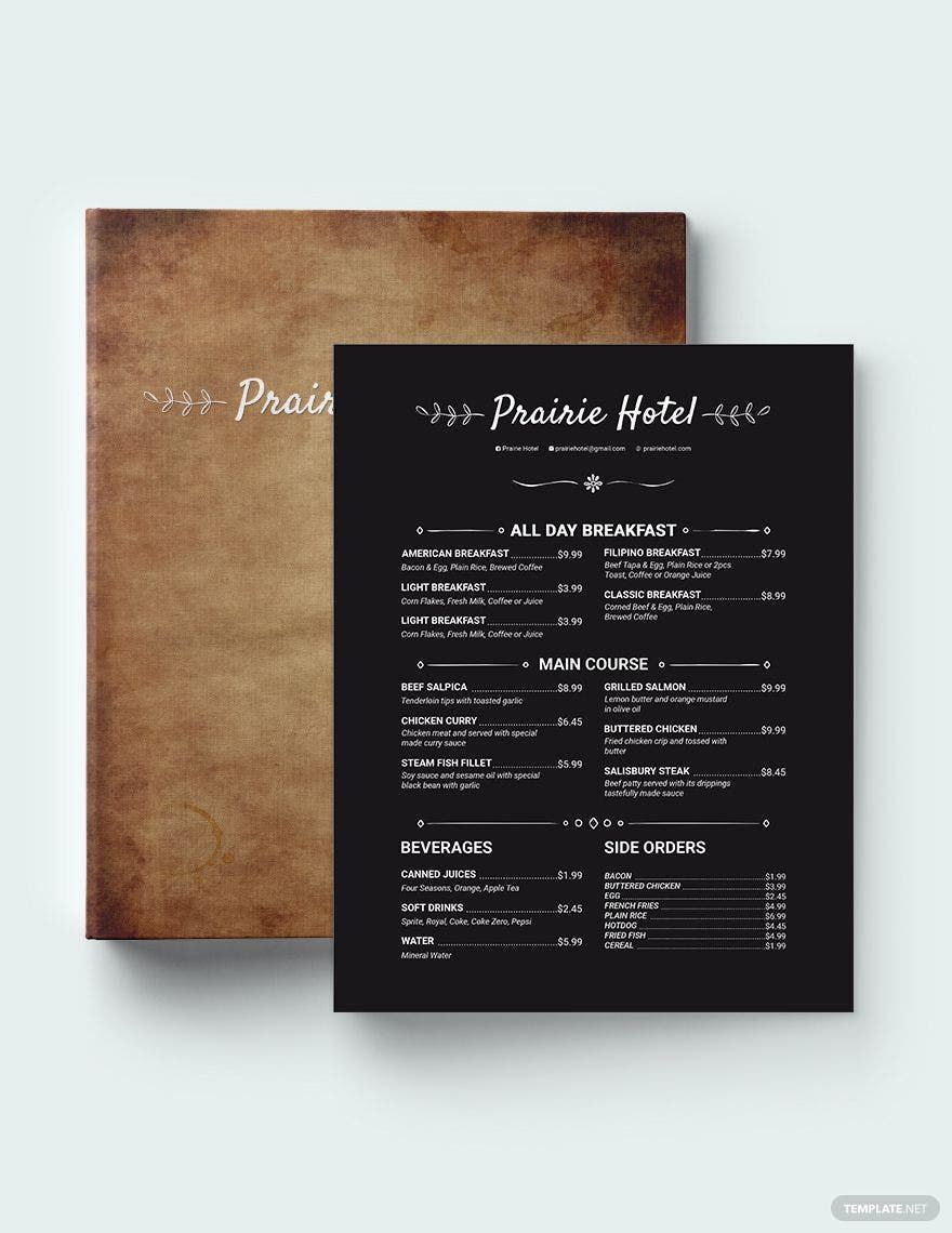
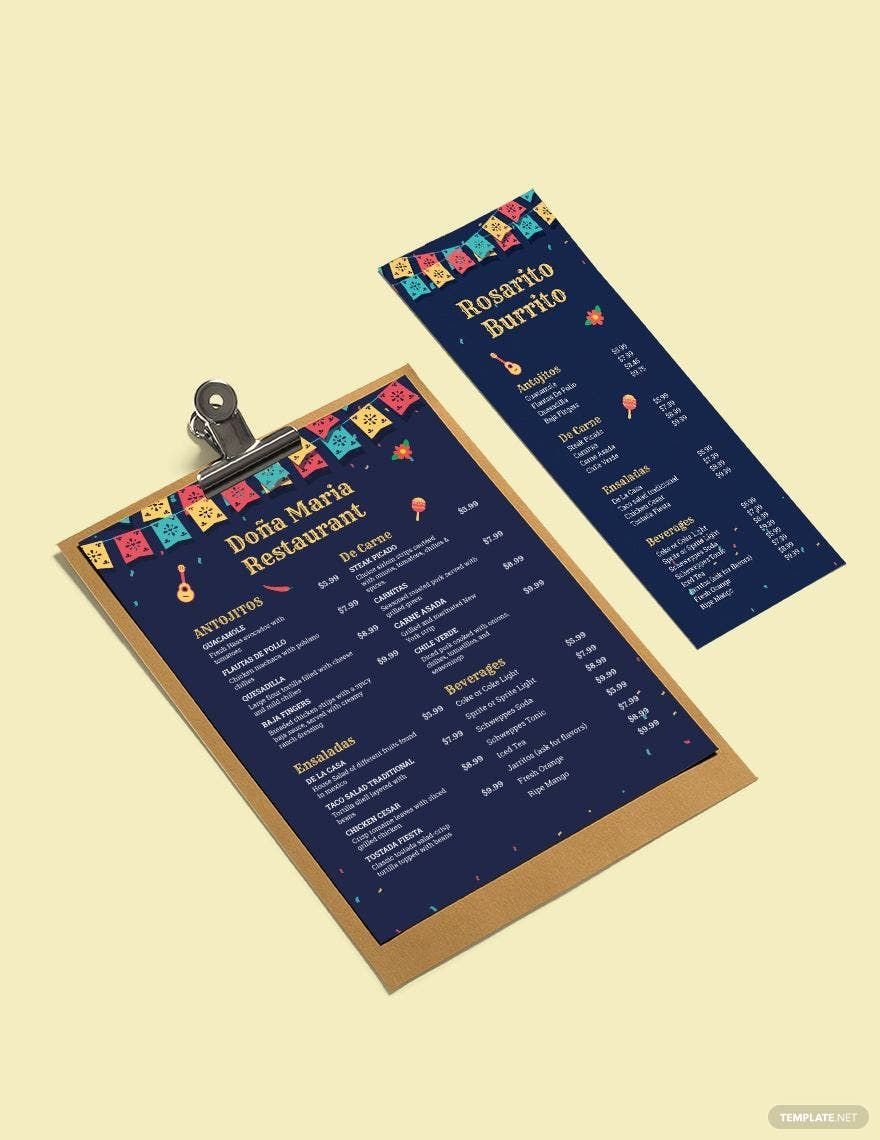
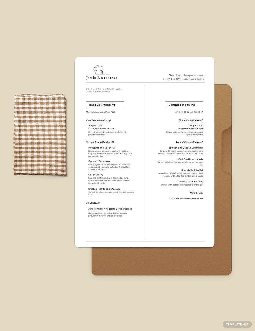
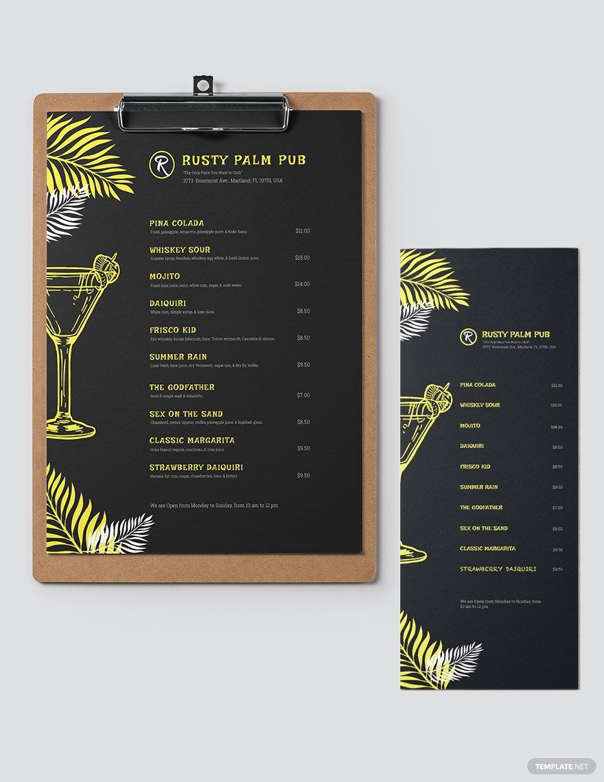
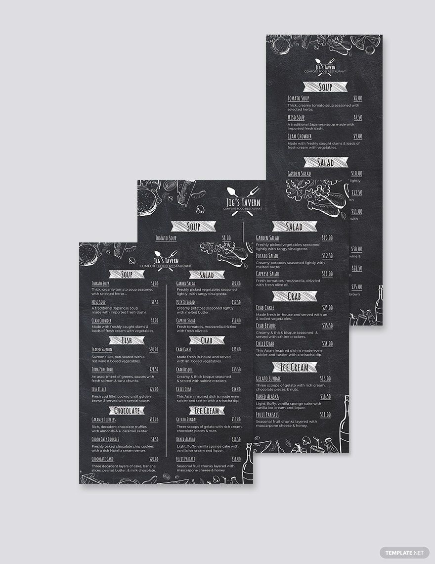
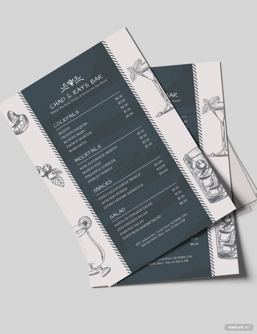
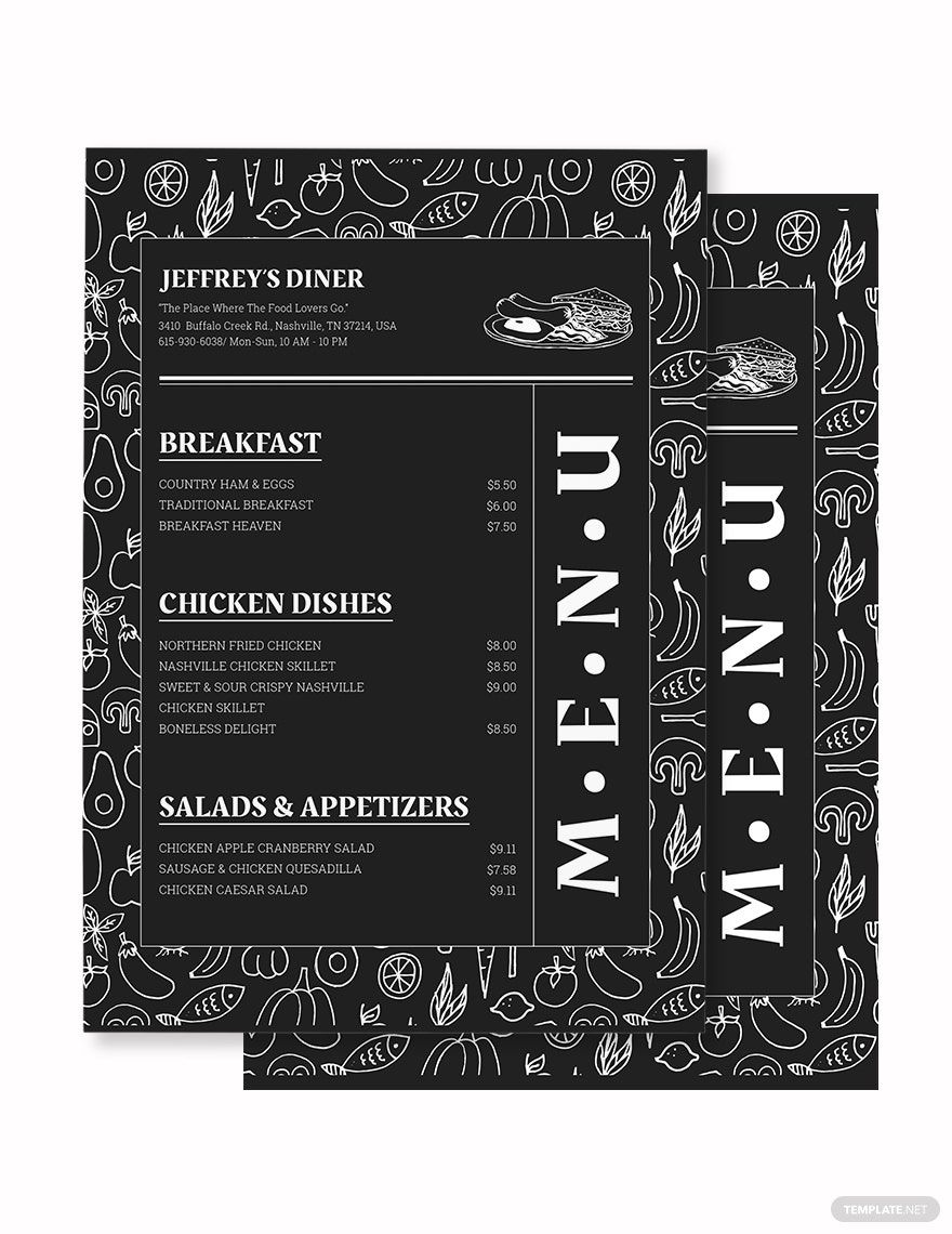
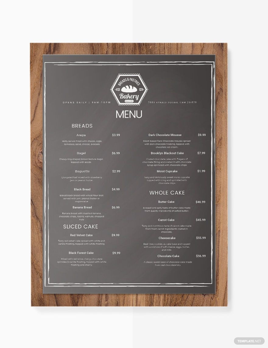
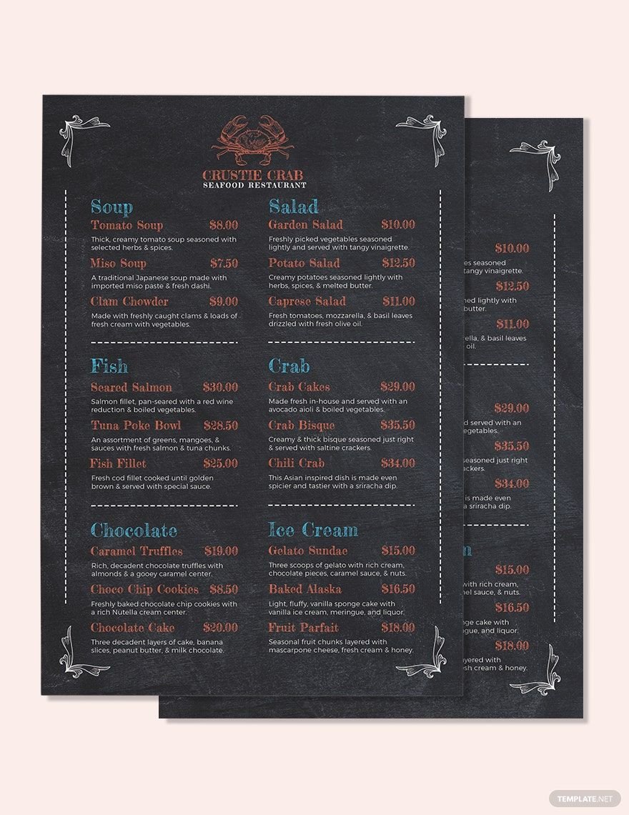
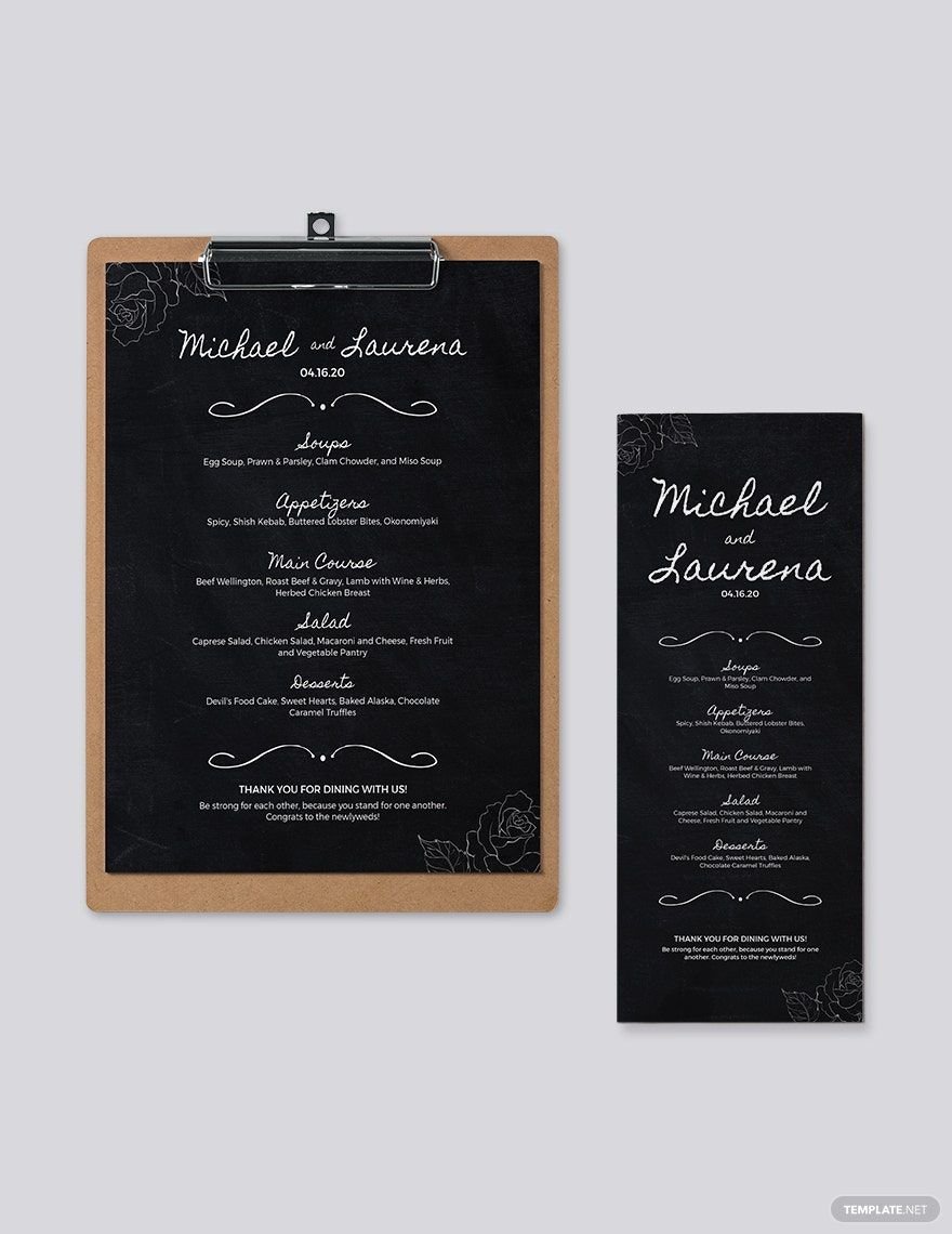
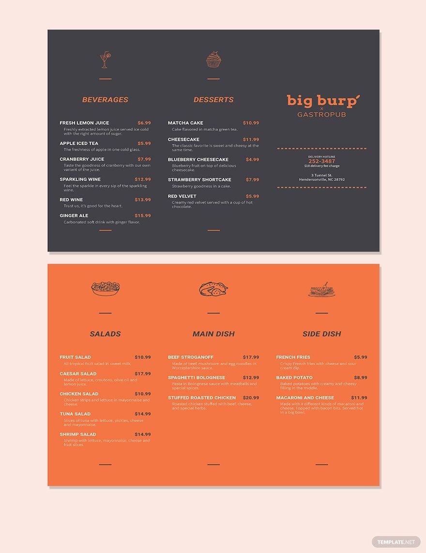
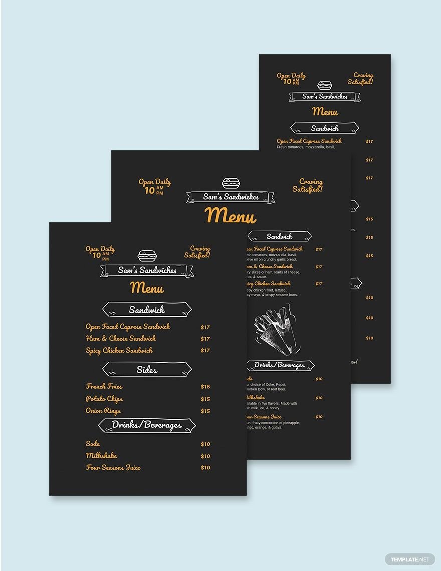
Does your restaurant need a bit of pizazz in the menu design department? Perhaps you are looking for a more retro vibe that is perfect for snack bars, coffee shops, or bistros. Worry not because we have a variety of Chalkboard Menu in PSD. These are 100% editable and is compatible with Adobe Photoshop whenever and wherever you are. Any restaurant owner or manager can now easily format a great menu design for their customers and lure them into ordering your food items. Improve your restaurant business and entice your customers when you get any of our templates today.
How to Make a Chalkboard Menu in PSD
The author of Slim by Design, Brian Wansink, who is also a marketing professor and the director of the Cornell Food and Brand Lab has created a few design hacks that encourage restaurant diners to order meals that are healthier over the processed and unhealthy meals that the establishment offers. The power of a great menu design really has an impact on how diners react to your offerings.
With that being said, we believe it is safe to assume that a more beautiful and appealing menu can really boost the sales of the restaurant, as well as the consumers’ attitude on how appetizing your meals seem. So if you want a menu that features hand-drawn–like designs that give off a more vintage look to your menu, read more and you’ll find that our tips on making a chalkboard menu can be helpful for your establishment.
1. Layout a Conducive Placement for the Food Choices
It is said that the placement of the food item can affect its overall sales. Some of the smartest placements for the offerings are the top middle, back of the menu, under large headers, top right, and top left. What’s great about using Adobe Photoshop to layout the design of your menu is that it is highly easy to do and can be modified when you aren’t completely satisfied with how it looks.
2. Choose Bold Typography for Headers
The headers organize the menu by sectioning off the appetizers to the main courses or the desserts. Not only that, but it also adds spice to the way the menu looks. You don’t want the headers and main text to look the same. It makes reading the menu more of an effort. Some diners want just one thing, and if they’re having a difficult time looking for what they want, it can put their dining experience in your establishment off. Modern menus are easy to read and pleasant to the eyes.
3. Don’t Be Afraid of Color
Having a plain white font for a chalkboard menu can be too reminiscent of being at school. Adding color to your menu makes it more appealing as long as the colors mesh well together. Take a look at the color wheel and see which ones look good together so you can have a creative menu for your establishment.
4. Ensure Other Marketing Tools Are Cohesive with the Menu
Whether you want to use brochures, flyers, or business cards to let more people learn about your business, you have to ensure all your advertising materials match each other. Branding is highly necessary so that your customers and clients can have an immediate association with the restaurant through the designs and tools they are using.
5. Make Sure You Are Happy with the Outcome
Once you are done designing your restaurant menu, take one last look at the final product. Maybe you’ll see certain parts of your menu that you want to be changed like the color, spacing, or even the fonts used. While it doesn’t mean that if you don’t like it, neither will your customers, it’s good to be fulfilled with your creations before publicizing them so that you will always be proud of the tools that you’ve produced for your establishment.
