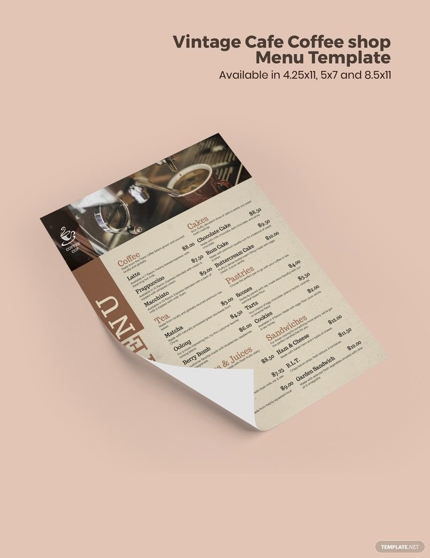
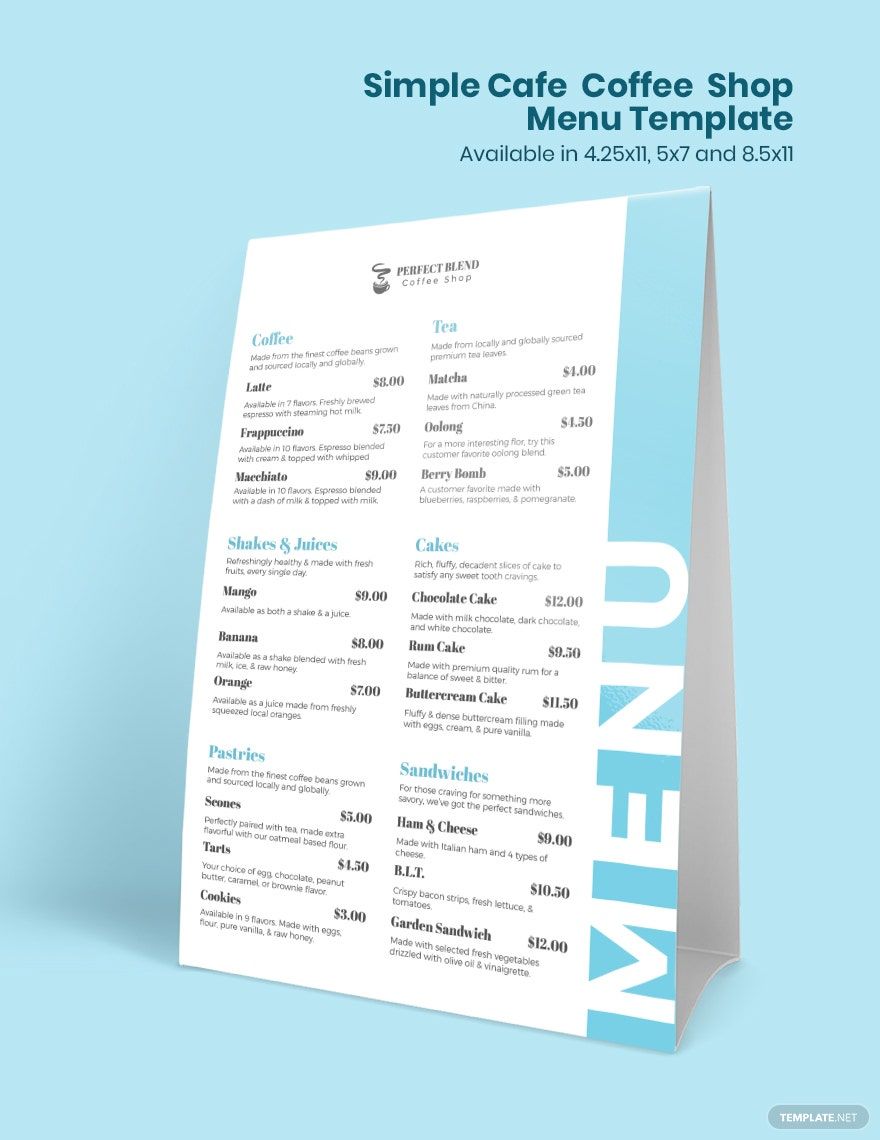
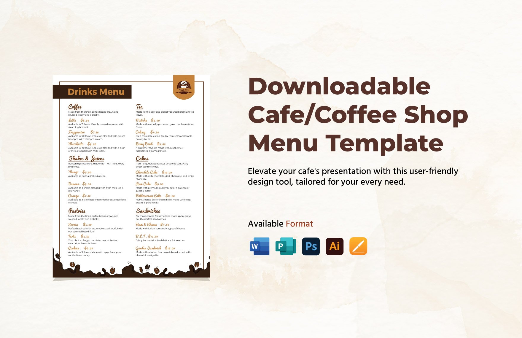
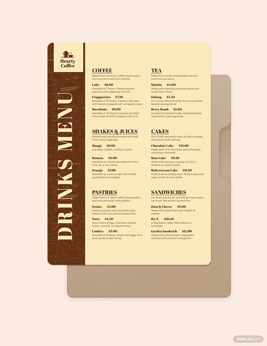
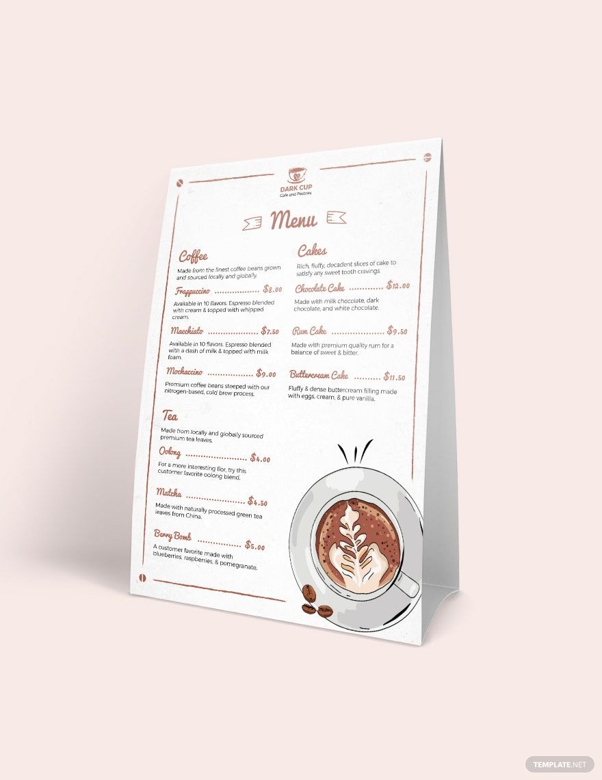
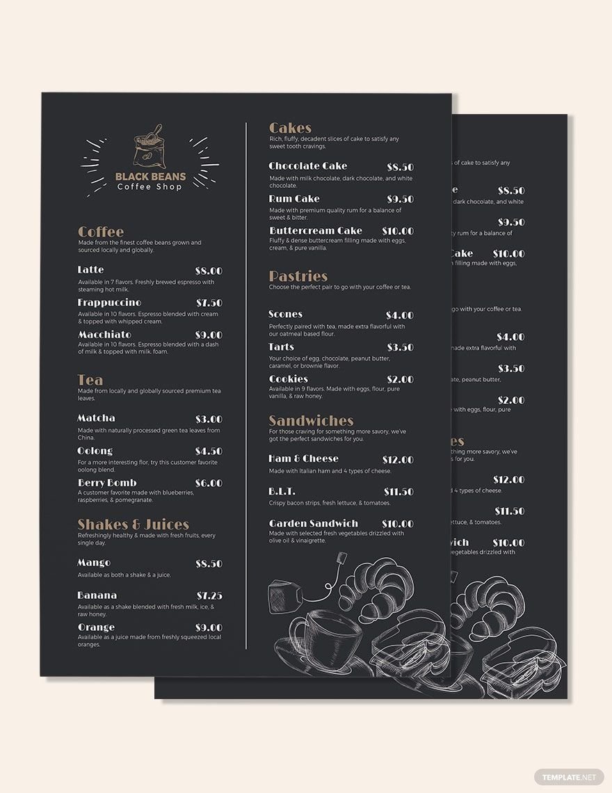
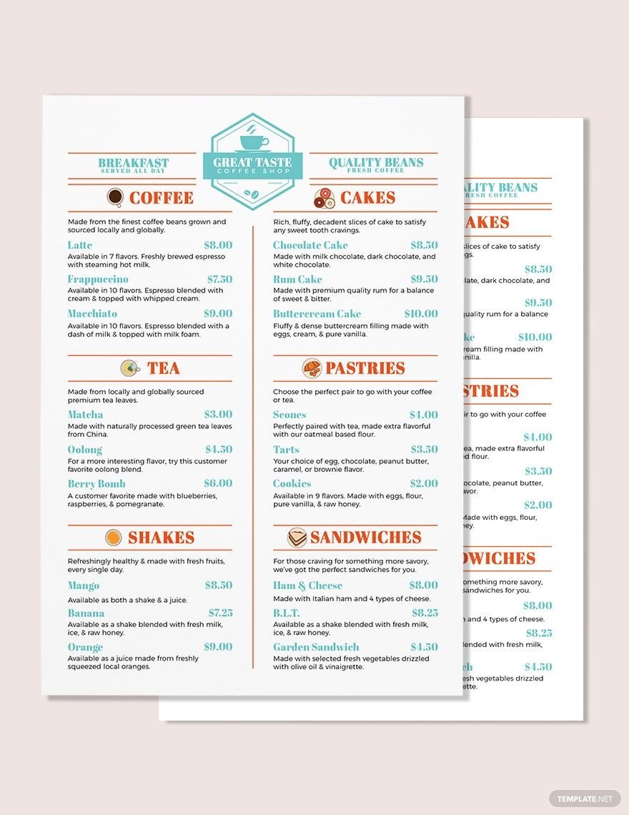
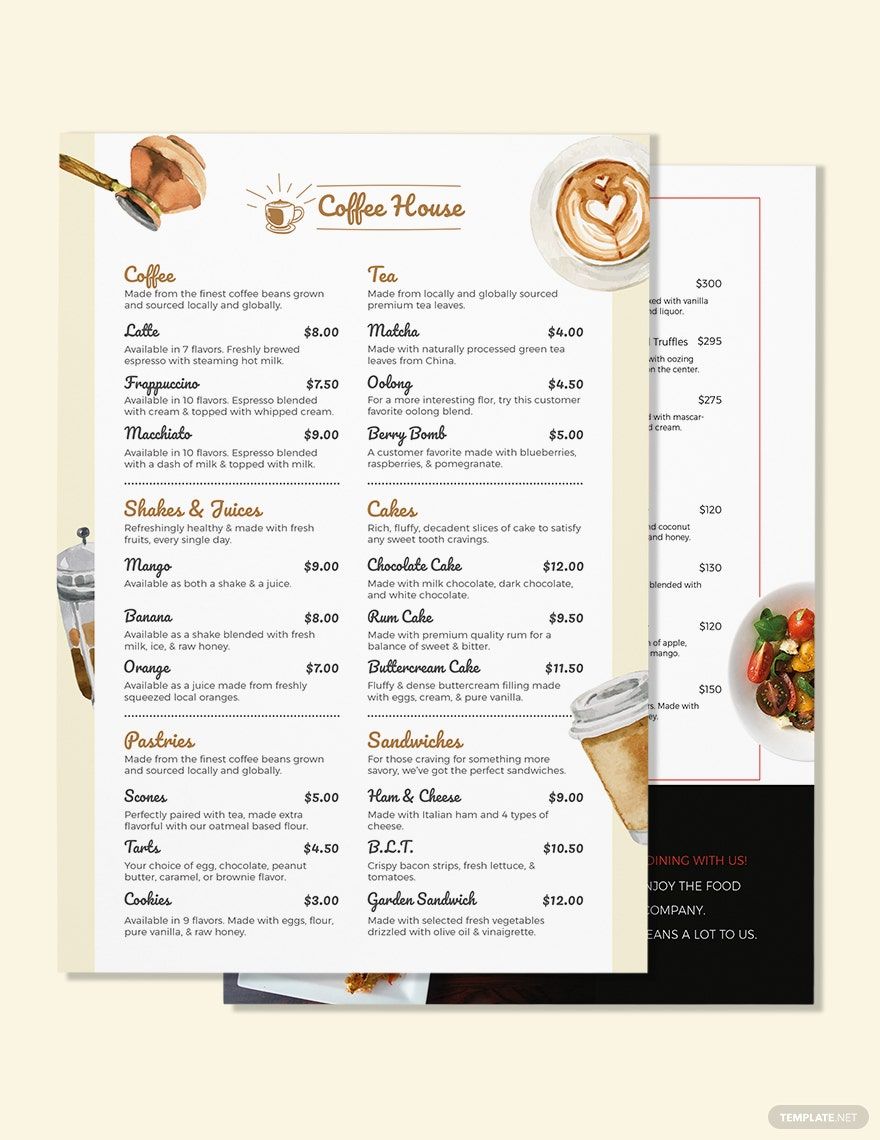
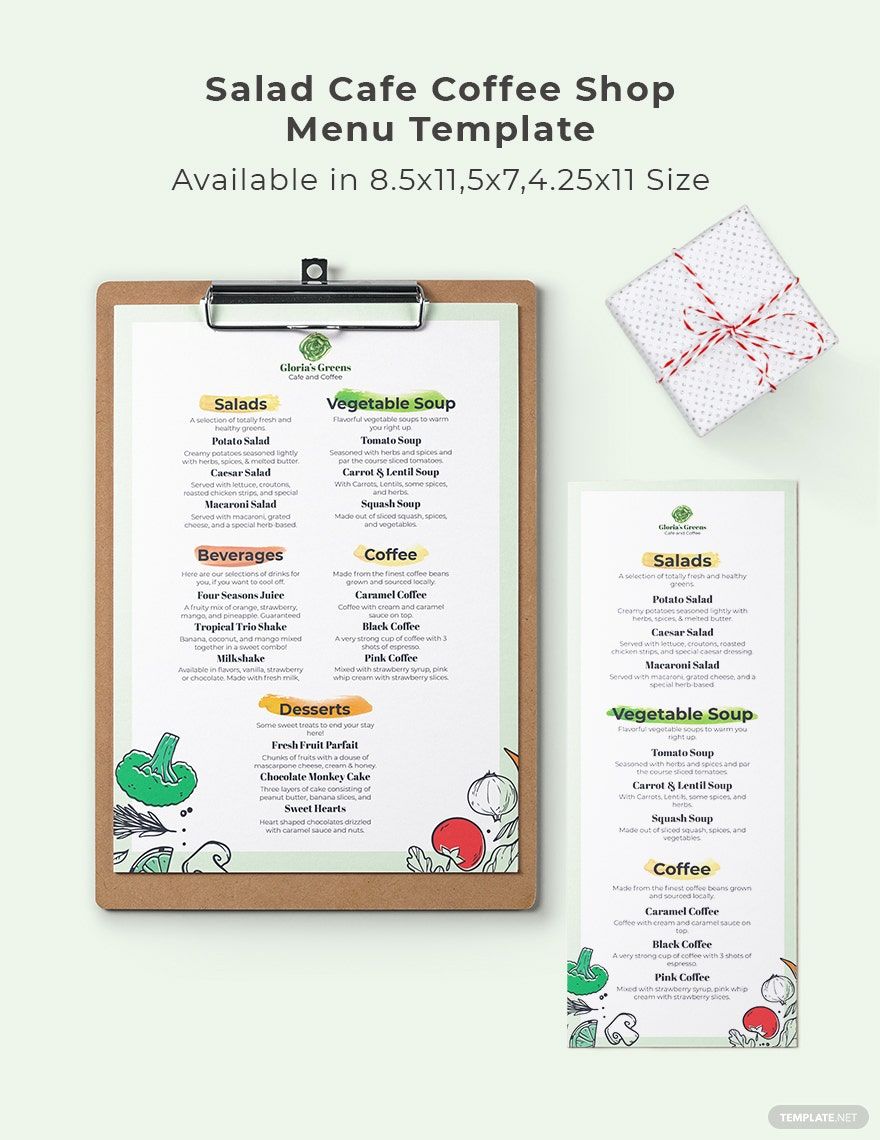
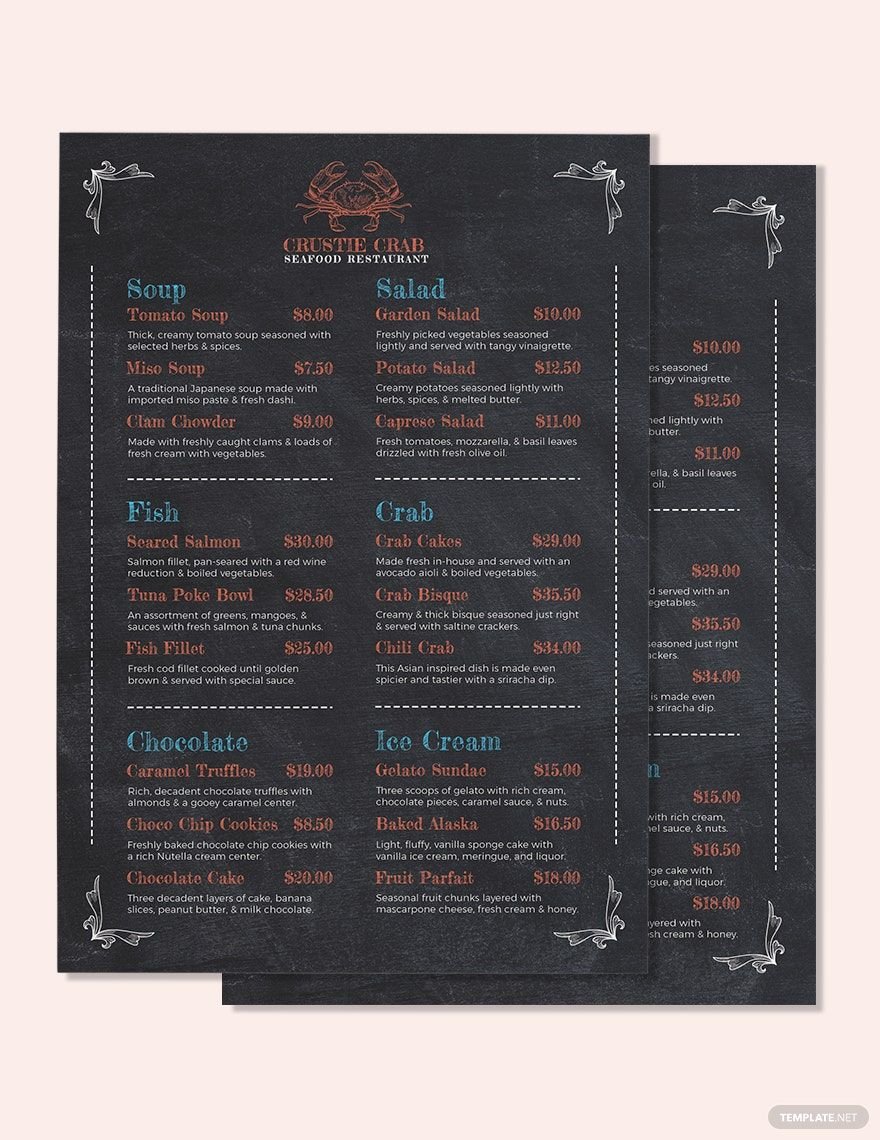
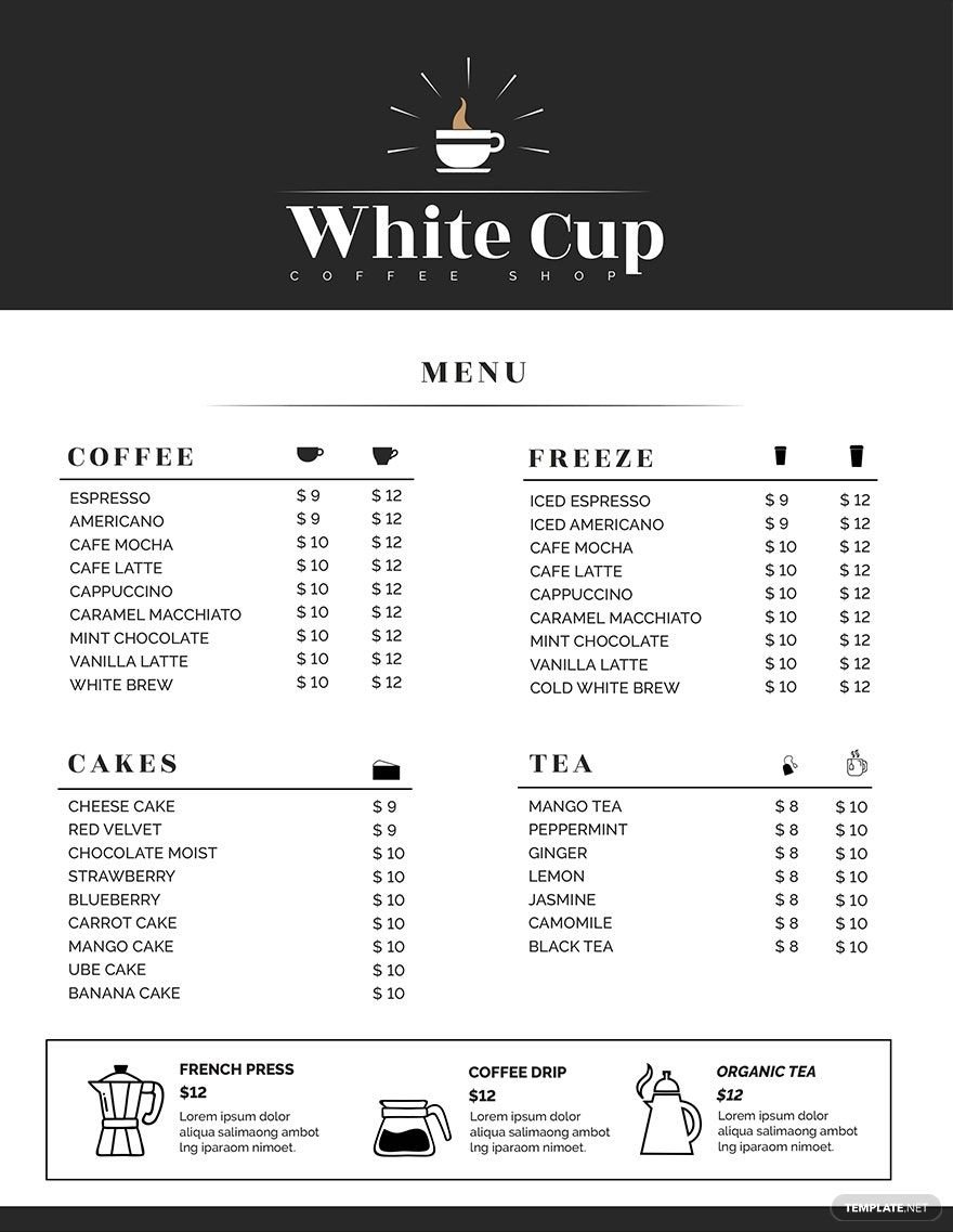
It is stereotypical that a menu is viewed by people as simply a list of dishes and beverages served and its charges. However, a menu serves many purposes. It can set the tone of the establishment and promotes profitability. Never disregard the importance of a menu. Running a coffee shop is not exempted from having a menu. Customers would want to know what coffees, snacks, and coffee-based drinks are offered in the establishment. Save yourself from the hassle by downloading our ready-made Coffee Shop Menu Templates accessible in Adobe Photoshop. Quick and easy to edit Menu in PSD. Printable both commercially and at home. Get your work done faster when you use our easily editable templates.
How to Make a Coffee Shop Menu in Photoshop
The number of coffee drinkers is rapidly growing. Based on a study by the National Coffee Association, 64% of 3,000 Americans drink a cup of coffee daily. Opening a coffee shop nowadays will be a good investment since it's a booming industry. Although the name implies it only serves coffee, you may serve other dishes such as cakes and pastries, which match well with coffee. Not all people know this though. And for that reason, a menu is in order. Not having one is unacceptable. Here are some steps to help you with the creation of your coffee shop menu card through the trusted software, Adobe Photoshop.
1. Consider the Placement Layout
The best coffee shop menu is creative and easy to read. So be cautious of your simple menu's layout. Ask yourself this question. Where do people look at first? You need to consider the eye-scanning patterns of humans. The typical eye-scanning pattern for people is like reading a book, from top left to the right corner. Figure out the best and appealing layout that will perfectly match the tone of the cafe. Make sure that your design matches your layout.
2. Categorize Items
It is really appealing to have a well-planned menu. Keeping the items highly organized is a top priority. Don't mix up the drinks and snacks your cafe offers. Arrange and categorize items to make it easy for your customers to browse through. Having a coffee list, a frappe list, a snack list, and a dessert list category is a must to avoid overwhelming customers. It is okay that you don't categorize every item, as long as the groupings are somewhat connected. Also, you can give your best sellers their own category. You can utilize lines, boxes, and symbols to categorize items.
3. Limit Usage of Photos
Placing photos on your menu design is advantageous. Photos will help your costumers browse your menu and decide what they want to order. However, you might have heard of the saying "too much of anything is bad." Well, this still fits well with any modern menu. Don't hastily place coffee-related photos on your menu. You can add maybe three to five photos on your coffee shop menu. Photos used in the menu need to be exactly what you offer. Don't mislead your customers.
4. Keep in Mind the Pricing
It is your goal to let customers choose the drinks or snacks that appear and sound good, not by its price. It is advisable that you avoid using currency signs on your minimalist menu. This is a good way to take the focus of the customers from the prices. The menu should focus on what you are serving instead. You can decrease the font sizes of the prices. You can mix up the prices of your items. Also, you can utilize the nontraditional pricing technique where you use one decimal instead of two (e.g. 6.5 instead of $6.50).