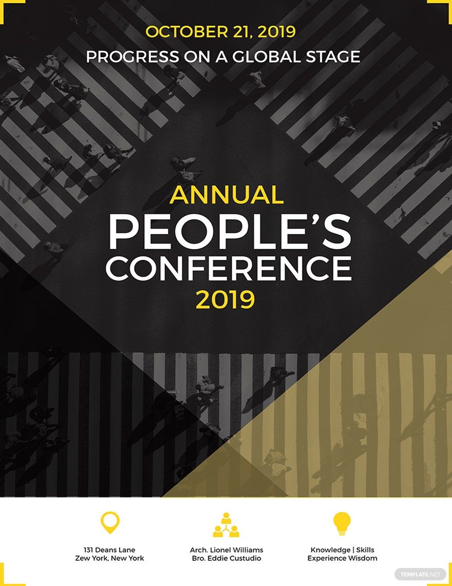
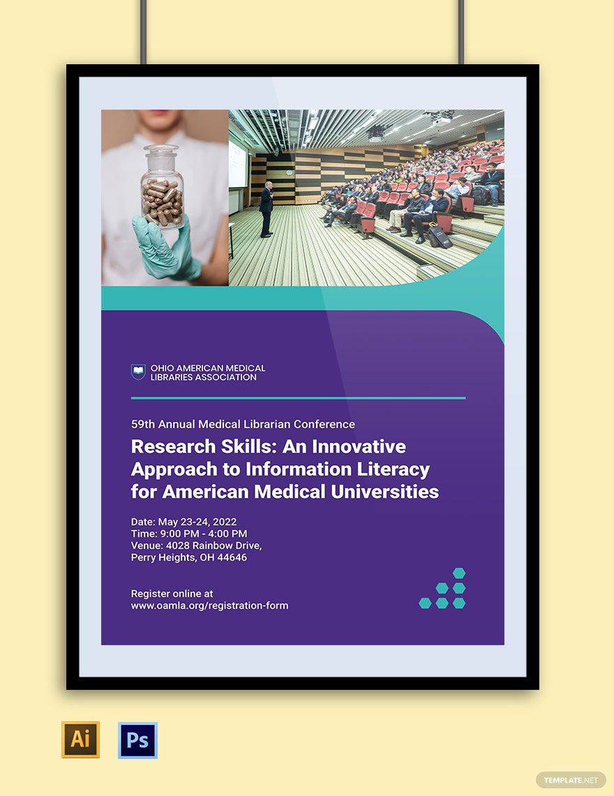
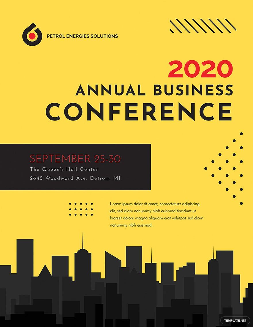
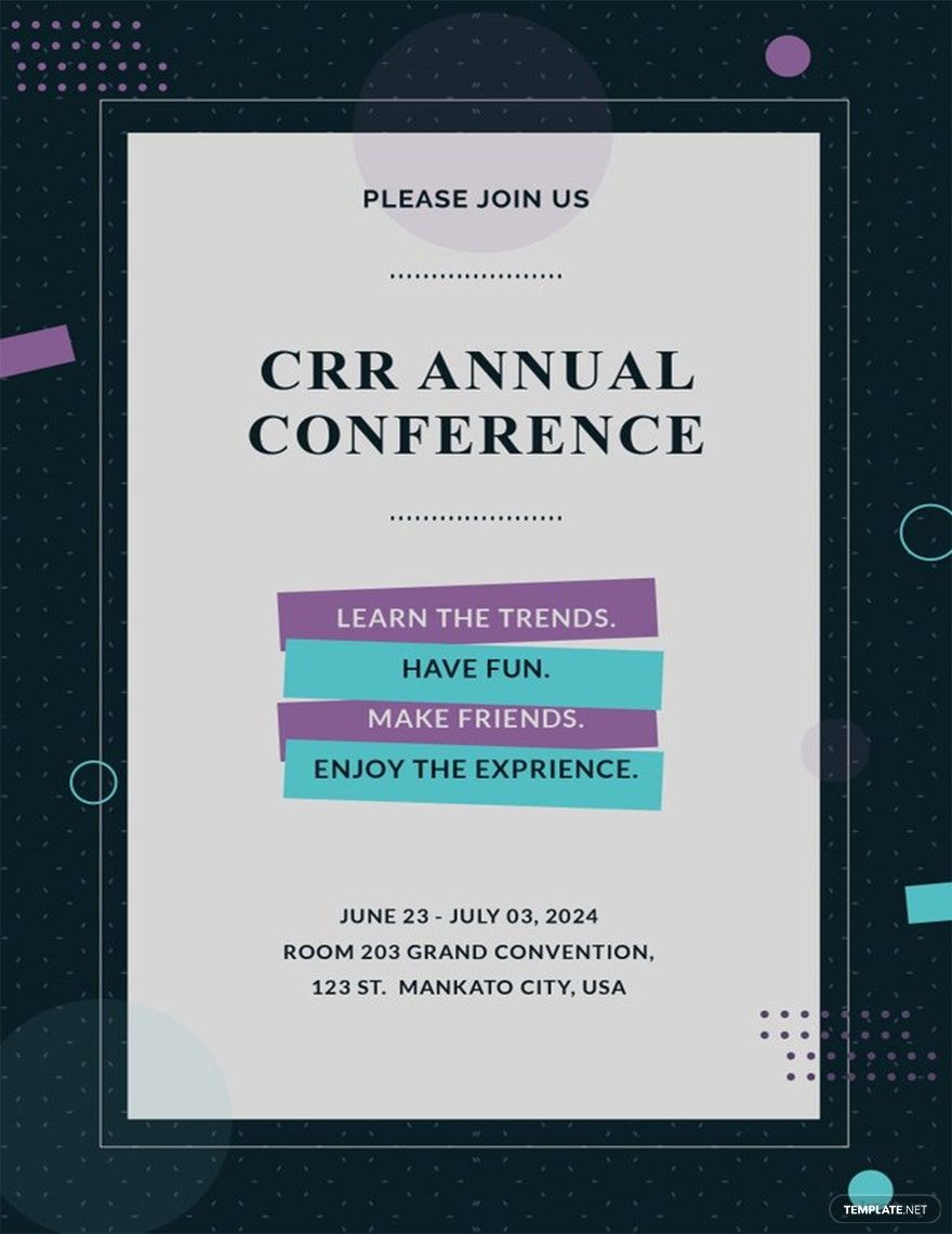
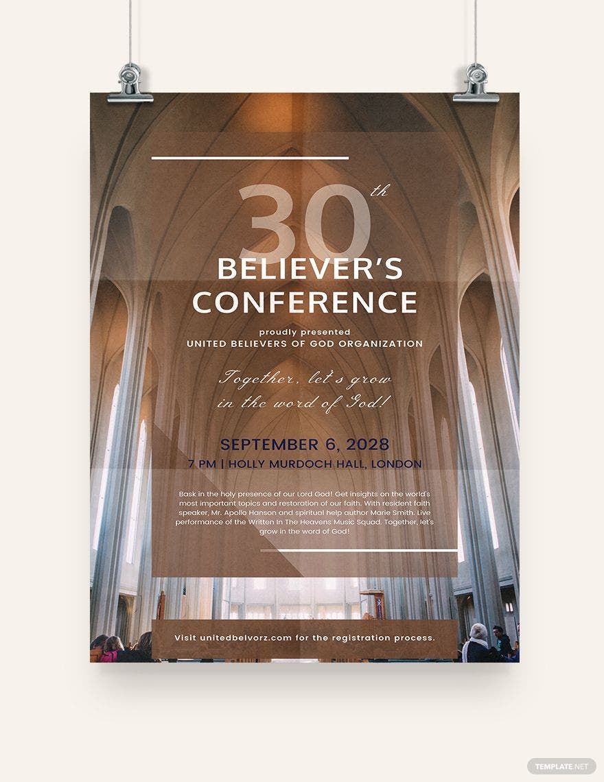
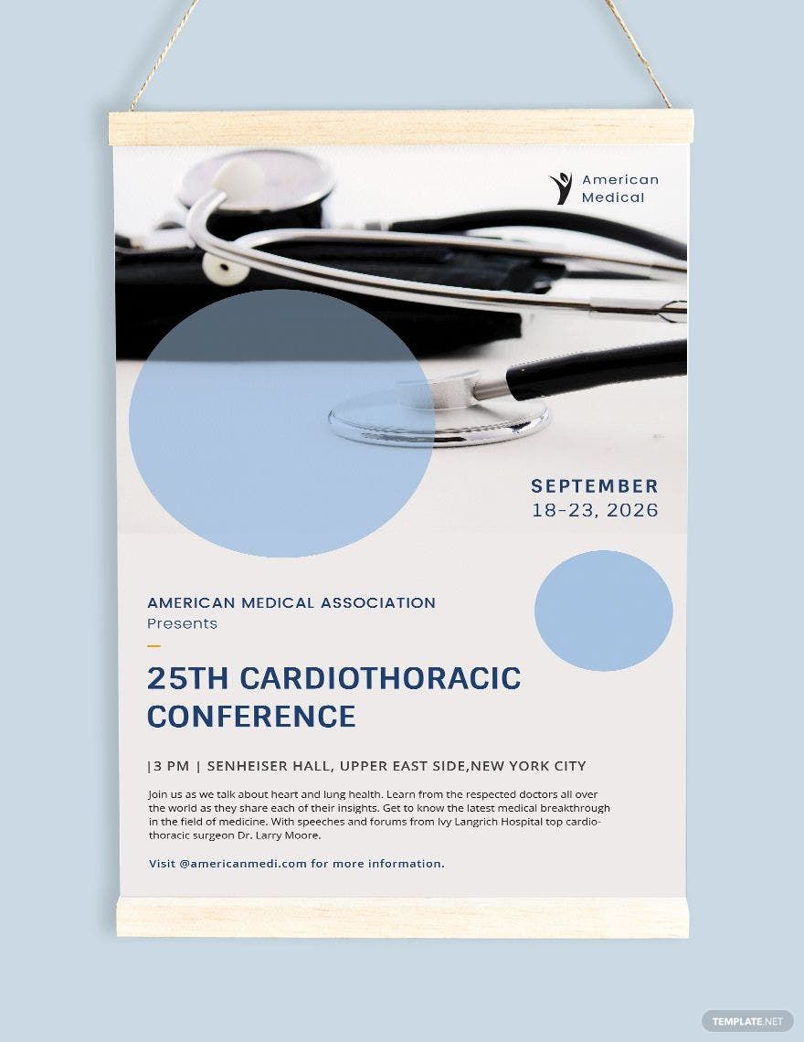
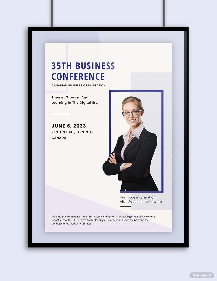
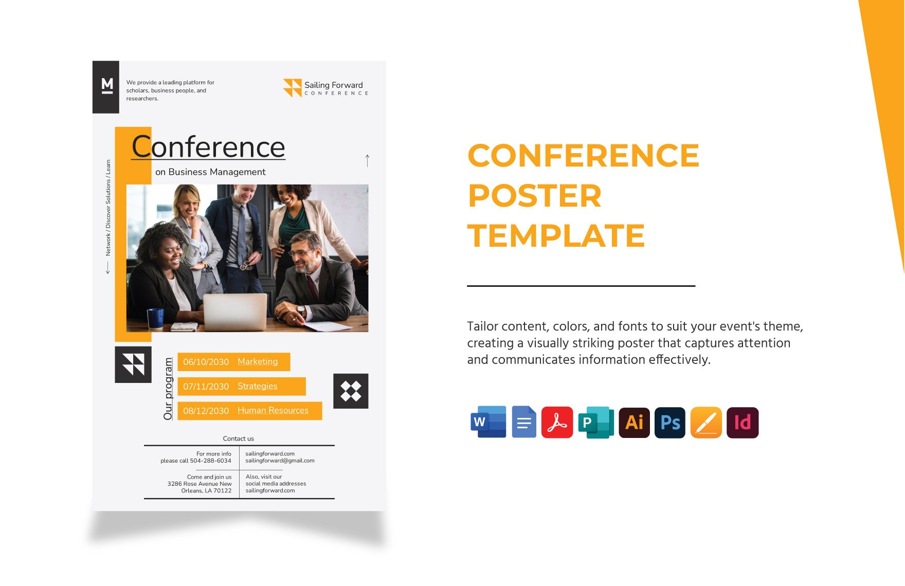
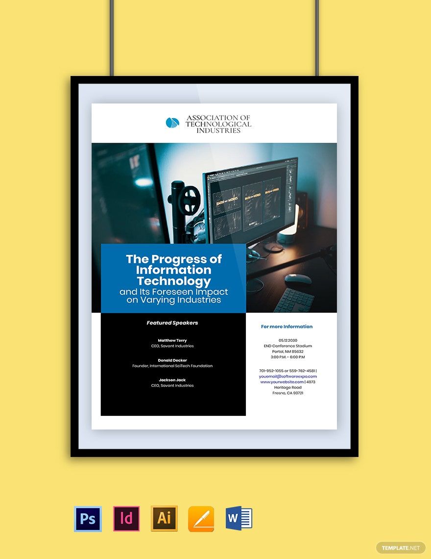
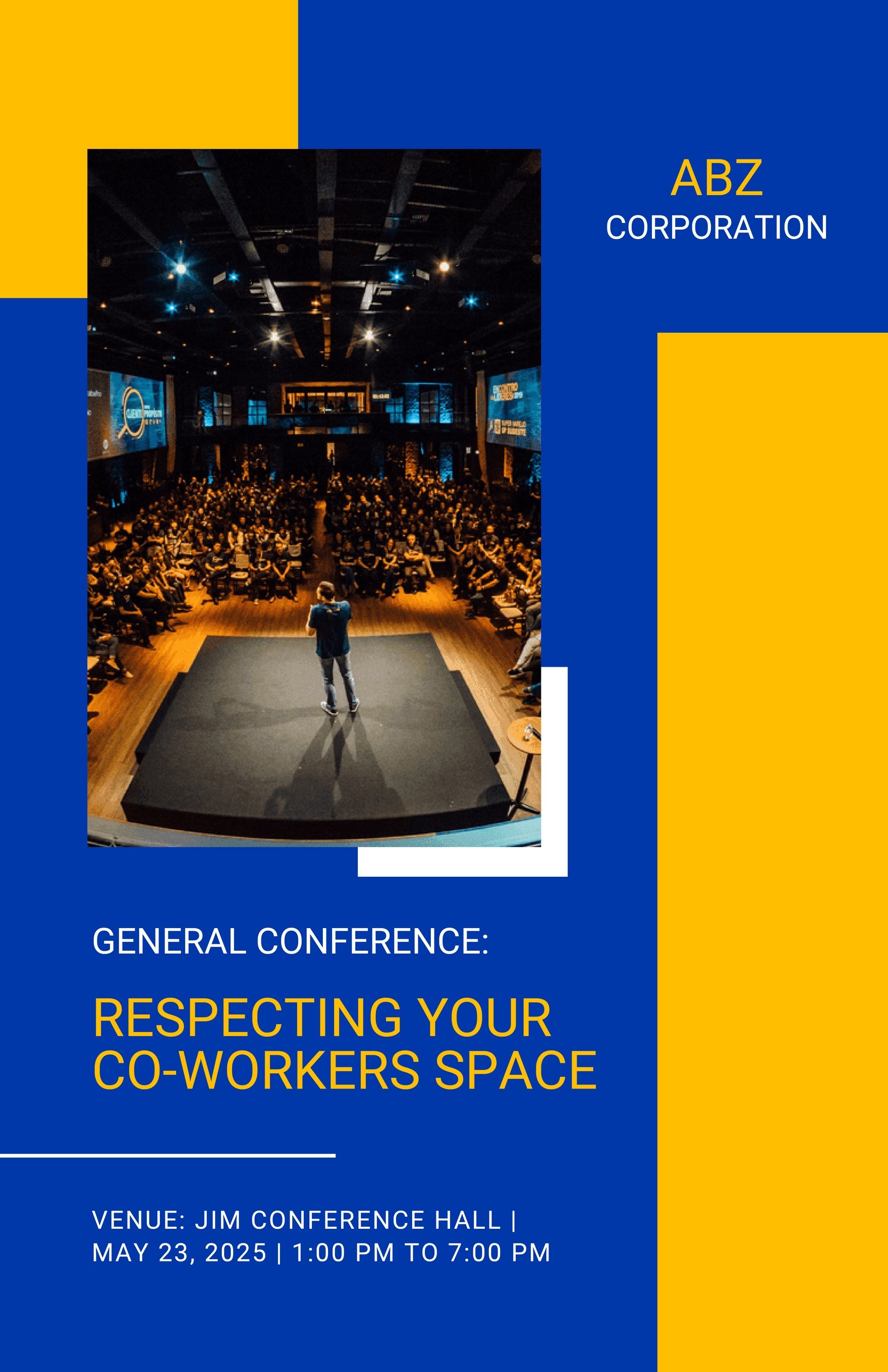
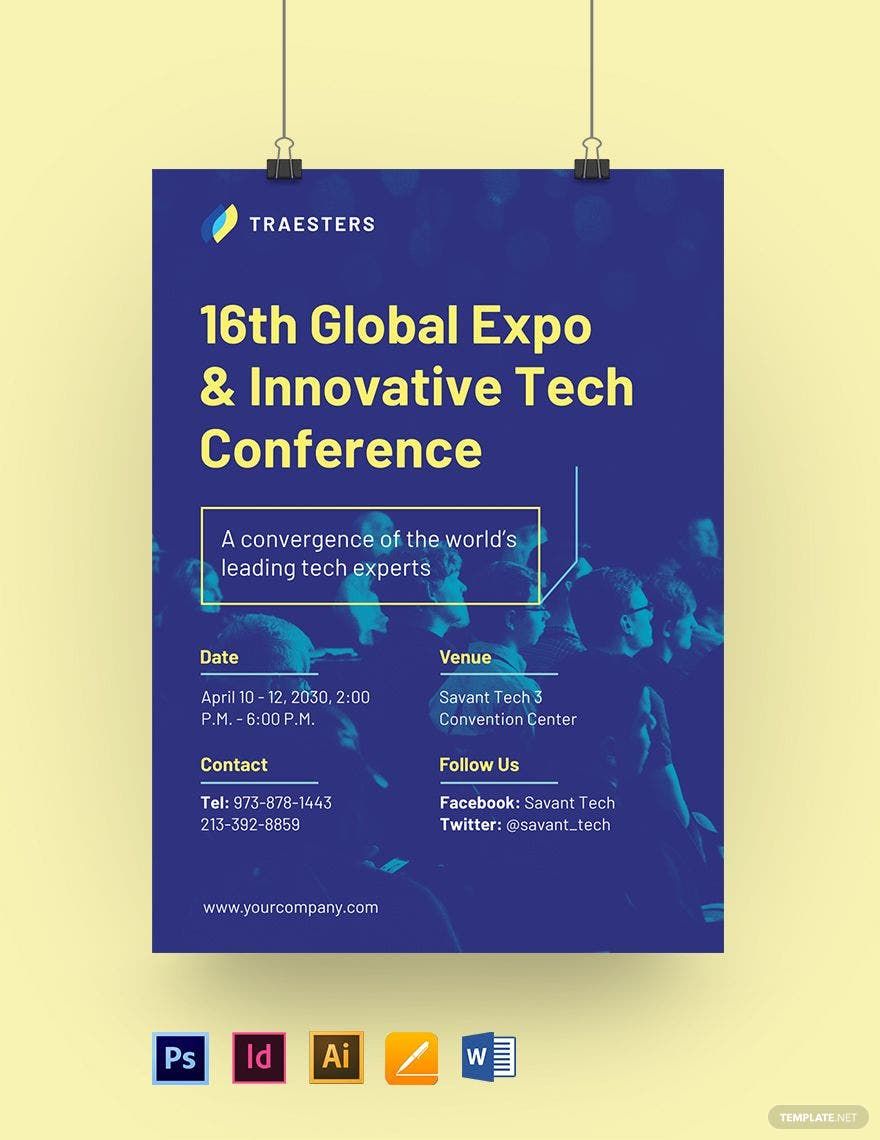
A conference poster is an efficient advertisement and promotional resource for most corporations, firms, organizations, and professional businesses. Consequently, these types of posters may be used to allocate and influence other organizations about various conference visual invitations, perspectives, and research. If you aim to create a conference poster that would greatly attract your audiences, our beautifully designed Conference Poster Templates in Adobe Illustrator (AI) is here to serve you with various layout design elements that you can use. By using these 100% customizable Posters in Illustrator, you're going to experience the effective editing without asking for a professional. Easily editable, high-quality, and creative, our collection of templates will help you create an attractive poster. Download now!
Conference Poster Templates in Illustrator
Explore professionally designed conference poster templates in Illustrator. Customizable and downloadable for a professional touch. Start designing today!
Transform Your Conference Promotions with Conference Poster Templates in Adobe Illustrator by Template.net
Bring your event promotions to life with pre-designed Conference Poster Templates in Adobe Illustrator by Template.net. Whether you’re launching a major conference or hosting a small seminar, create professional-grade posters quickly and easily with no design experience. Showcase your event’s highlights or introduce your keynote speakers with customizable layouts that cater to both print and digital distribution. These free pre-designed templates allow you to effortlessly produce eye-catching posters with downloadable and printable files available in Adobe Illustrator format. No need for extensive design skills - embrace the simplicity of beautiful pre-designed templates that save both time and resources, allowing you more focus on other important aspects of your conference planning.
Explore more beautiful premium pre-designed templates in Adobe Illustrator to elevate your marketing materials and broaden your creative horizons. Template.net offers a regularly updated library of designs, ensuring you have access to the latest trends and styles for any occasion. Once your masterpiece is complete, download or share via link/print/email/export to maximize the reach of your event. Dive into a mix of free and premium templates for utmost flexibility and professional appeal. Unleash your creativity and captivate your audience, utilizing carefully curated Conference Poster Templates that stand out at every event.
Frequently Asked Questions
What are the following elements of a poster?
Here are some of the concrete examples so you will know what to incorporate into your poster design process:
- Lettering style
- The relevance of the purpose
- Attractive color schemes
- Informative content
- Branding elements
What are the different types of posters?
The essential types of posters are listed below.
- Advertising Posters
- Event Posters
- Propaganda Posters
- Movie Posters
- Educational Posters
- Music Posters
- Pin-up Posters
- Decorative Posters
How are posters printed?
Posters are published just like any promotional collateral for the print advertisement. Professional high-end printers can be used if you would like posters that do not meet the traditional print dimensions. It is safe to visit your nearest print shop for this sort of printing.
What is the difference between a poster and a flyer?
A poster is a promotional medium packed with insightful and appealing design to attach to a flat surface. In comparison, a flyer is a piece of document that includes more or less the same bits of information that is meant to be circulated or distributed to its audiences.
What are posters made of?
A poster is generally made of a moderate grade poster with a glossy finish. Rich-colored paintings are used for a highly vivid image and gloss-finished surface. Most posters were using Tyvek-based paper resources to make it more resilient and immune to tearing.
